Why Do Fonts Matter in Memes?
Internet memes first appeared back in the 90s, during the active development of the internet. They have become a true sociocultural phenomenon: they are a universal method of communication, a mirror of society, and even a tool for influencing public opinion. And while memes were once just a part of digital folklore, today they are increasingly used as a marketing and branding tool—and in this case, choosing the right font is especially important.

Why should you put thought into choosing a font for memes?
- To avoid distorting the meme’s meaning
- To support the visual identity of a brand or project
- To give the meme the right emotional tone
- To ensure the message gets through to the user
Let’s figure out how to achieve these goals and choose the best meme fonts.

How to Choose the Right Font for Memes
The font in a meme serves not only an aesthetic but also a semantic function. Here are the key aspects to consider to find the best option:
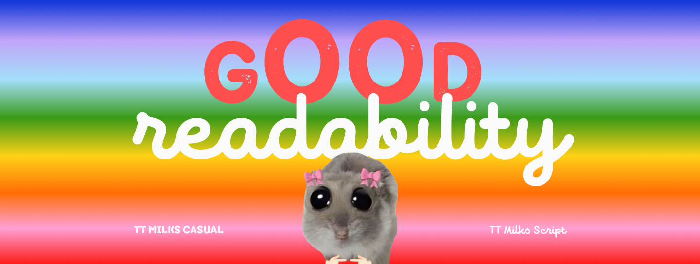
- Readability. This is the most obvious and, at the same time, the most important task, which is often overlooked. But it’s the readability of a font that determines whether the message conveyed through the meme reaches the user. The font must be easy to read even at low resolution or when used on a complex background. We’ve talked in detail about how to choose a readable font here.
- Optimal Size and Weight. A font that is too small or thin will get lost, while one that is too large and bold will steal the spotlight. It’s important that the text interacts harmoniously with the image, so all elements complement, rather than shout over, each other.
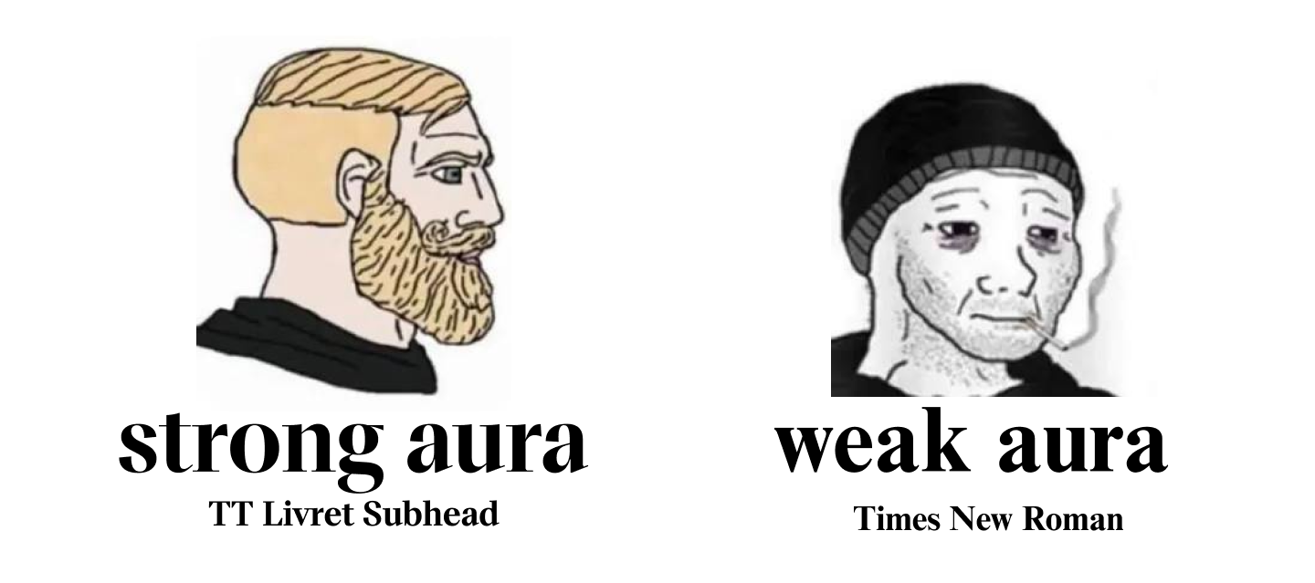
- Emotional Tone. Different fonts carry different moods: they can be cheerful, serious, aggressive, or calm. It’s important that the font reflects or emphasizes the essence of your meme.
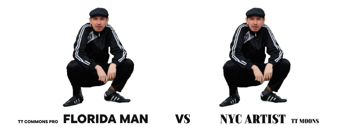
- Contextual Appropriateness. For example, using an elegant serif typeface in an ironic meme can create a powerful contrast between form and content.
- Minimalism. An excess of decorative elements distracts from the main point. The simpler the form, the faster and easier the message is to read. A clean look is often the most effective.
- And don’t forget that you need to purchase a license to use many fonts. You can find a detailed guide to licensing here.
What Happens If You Choose the Wrong Font for Memes?
Mistakes in choosing a font for memes won’t lead to catastrophic consequences, of course, but they can contribute to your meme going unnoticed and failing to have the desired effect.
Here are some of the potential problems:
- Loss of Impact. Text on a meme set in a font that is too thin and small will be perceived as a footnote and will either go unread or be seen as detached from the context.

- Tone Mismatch. A soft and romantic font in an aggressive meme will create dissonance and turn sarcasm into an awkward attempt to be cute.

- Deconstruction of Meaning. If a handwritten font is used in a meme about IT specialists, the joke loses its connection to the context and is perceived as a random collection of words.
- Outdated Feel. If you use outdated fonts, the meme itself risks seeming irrelevant. A user might think the meme is years old and won’t bother sharing it with friends.

What Is the Most Popular Font Used in Memes?
The most popular meme font is considered to be Impact—a grotesque sans serif typeface created in 1965 by Geoffrey Lee. Its key feature is an extremely bold weight and tight letter spacing, which makes the text look dense and powerful.

But why did Impact become the “king of memes”? Let’s break it down.
The first factor is its visual characteristics. Its narrow proportions allow more text to fit into a small area, while its substantial boldness grabs attention. At the same time, thanks to its simple forms, the font is highly readable in short captions and remains legible even on a detailed background. This is what font is commonly used in memes for a reason.
The character of Impact can be called confident and even slightly aggressive, which allows it to fit perfectly into the context of most memes and enhance the provocative or comedic effect—it doesn’t “speak,” it “shouts.”

An equally important criterion for Impact’s success is its accessibility. The font was part of the Core Fonts for the Web package, came pre-installed on Windows, and was available on macOS with the installation of additional packages like Microsoft Office, making it a universal tool for content creators.
Moreover, the first meme generators (like Quickmeme or Meme Generator) used Impact as the default font, cementing it as part of the genre’s visual language.
However, despite its popularity, Impact has become a bit of an artifact and a symbol of a specific era. So, what can you replace it with? We’ll tell you below!
Modern Alternatives to Popular Meme Fonts
In this collection, we offer modern alternatives to Impact and other popular fonts for memes. They will allow you to make your meme creation original and fresh without straying from the familiar visual aesthetic.
TT Bluescreens Black instead of Impact
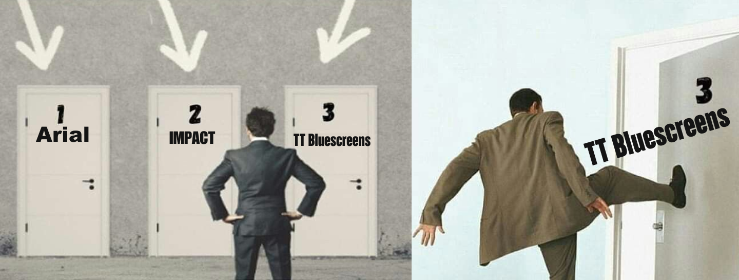
Among Impact’s graphic features are its maximum weight and narrow proportions—the letters are “pressed” together, creating a monolithic effect.
TT Bluescreens, a Neo-Grotesque with narrow proportions, looks similar yet far more stylish and modern. It’s a font with a calm but memorable character that will attract attention, be highly readable, and allow you to fit more characters into a small space. Its black weight is a fantastic alternative.
TT Commons™ Pro instead of Arial
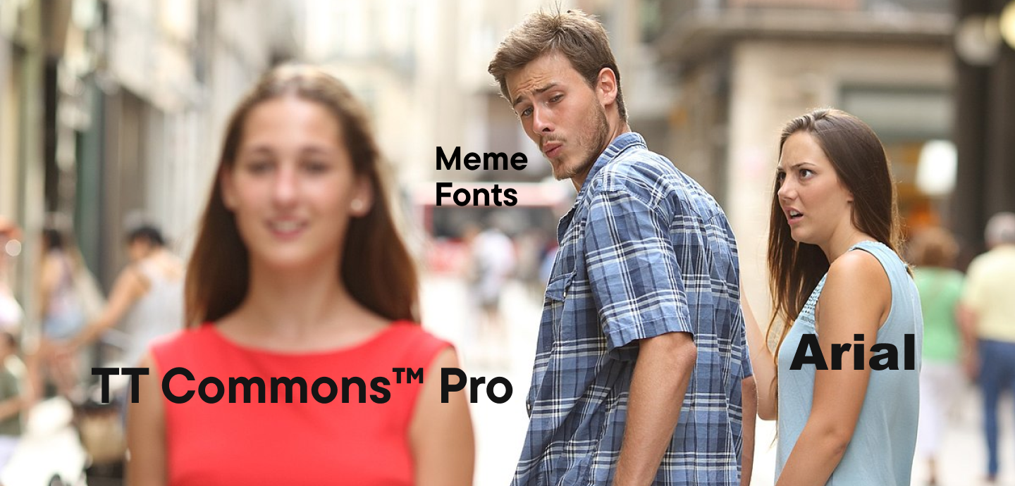
Arial is one of the most widespread fonts in the world, found almost everywhere. It is distinguished by its clean lines, versatility, neutral character, and high readability even at small sizes.
It can easily be replaced by the geometric sans serif TT Commons™ Pro—one of TypeType’s most sought-after fonts. It looks concise and stylish, yet neutral, reads perfectly at any size, and doesn’t draw unnecessary attention to itself.
TT Neoris instead of Helvetica
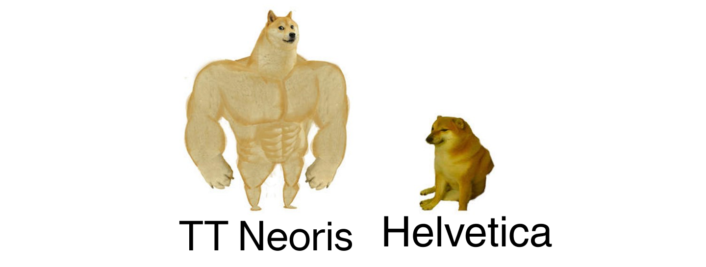
Helvetica is not just a font; it’s a cultural phenomenon. Created in 1957 by Swiss designers Max Miedinger and Eduard Hoffmann, it became a symbol of modernism, functionality, and neutrality. It can be found literally everywhere.
The concise neo-grotesque TT Neoris is an excellent alternative to this famous font. It is even more functional, looks sleek, yet stylish and fresh. It also reads excellently and looks harmonious in almost any context.
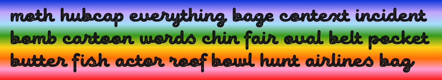
TT Marks instead of Comic Sans MS
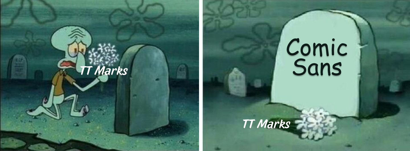
Comic Sans MS has become a meme in itself in the world of fonts. It elicits either a smile or irritation. Created in 1994 by designer Vincent Connare for Microsoft, it was originally intended as a friendly alternative to formal fonts, mimicking handwritten text in comic books. However, this font is often seen as a symbol of poor taste.
If you want to add a touch of spontaneity to your meme and use a handwritten font for the caption, try TT Marks. It is inspired by classic American sign painting. It has a hand-crafted feel, a slight casualness, and street charm. It’s a good option for original memes.
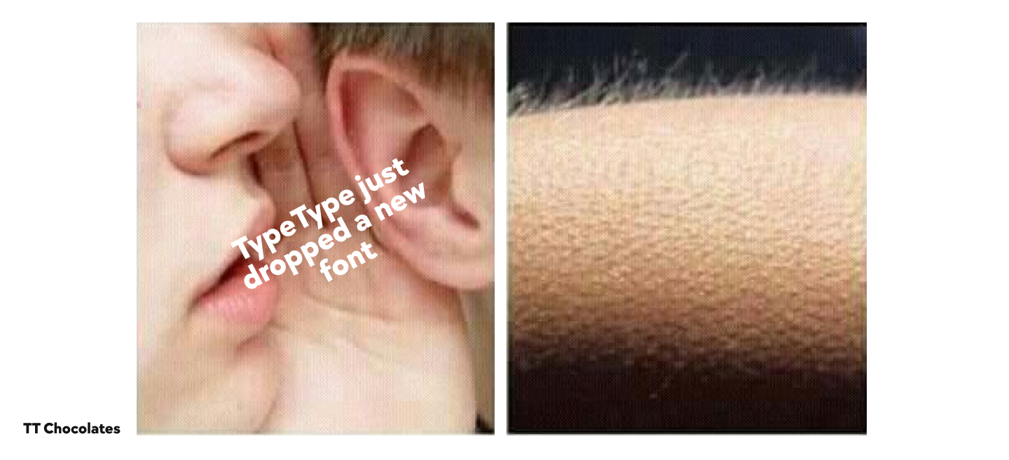
TT Chocolates instead of Montserrat
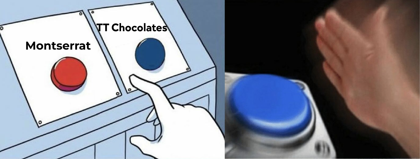
Montserrat is a geometric sans serif with clean lines, open forms, and a neutral yet friendly character. Thanks to its wide proportions and even weight distribution, it reads excellently. It is a versatile but not cold font that looks “human.”
The elegant Humanist sans serif TT Chocolates has similar qualities. It has a pleasant, friendly character that is intuitively perceived as something familiar. Its narrower proportions allow more characters to fit on a line. And thanks to its dynamic forms, TT Chocolates reads well, allowing the eye to glide easily along the line.
TT Wellingtons instead of Myriad Pro
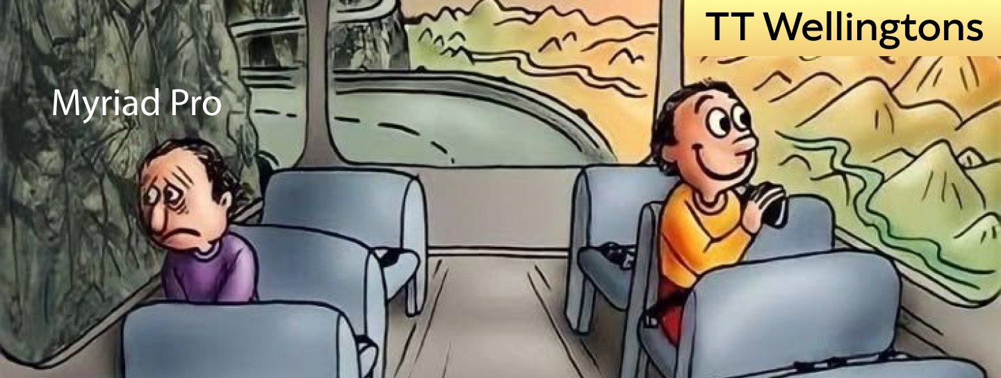
Myriad Pro is one of the most recognizable and widely used Humanist sans serifs. This font combines a neutral corporate style with a light friendliness.
A more interesting alternative is the Humanist sans serif TT Wellingtons, whose forms allude to the movement of a broad-nib pen. It’s a modern font with a concise, yet human and memorable character.
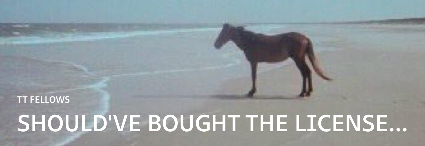
TT Fellows instead of Calibri
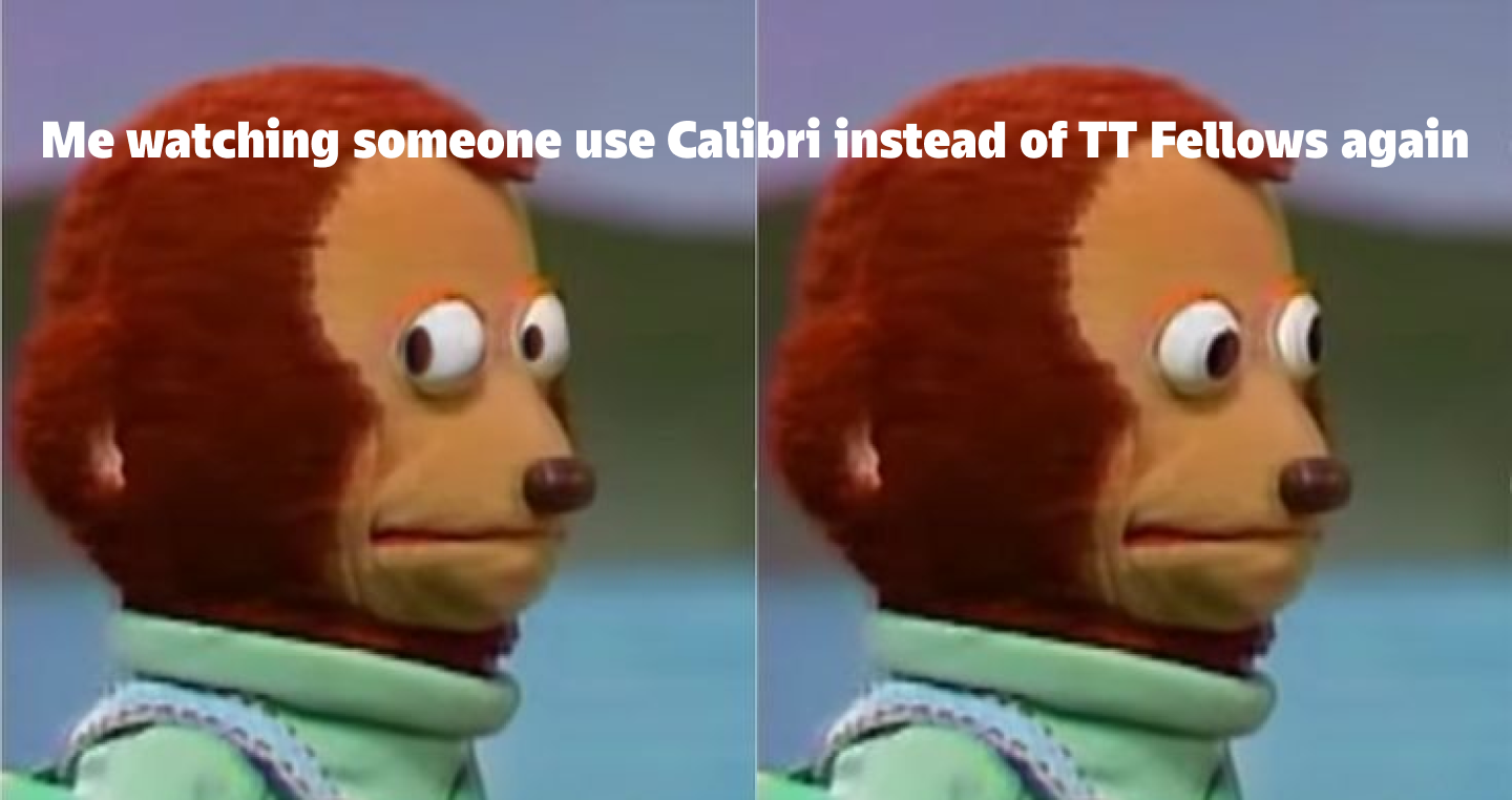
Calibri is a well-known sans serif font designed by Lucas de Groot in 2004. Since 2007, it has been the default font in Microsoft Office, replacing Times New Roman. Thanks to its clean and soft forms, it reads well on screens.
Try using TT Fellows instead—a Humanist sans serif with open forms and mechanistic motifs. This font has a calm and neutral character, and in its bold weights, it looks even softer and friendlier, allowing you to adjust the caption’s character without sacrificing readability.
Conclusion
The font in a meme is a tool for managing attention. A well-considered choice enhances the effect, while a randomly selected option can distort the meaning or fail to convey the message to the user entirely. If you’re in doubt, try A/B testing: you’ll see that the response to the same meme will differ depending on the meme font used. Now you have all the tools to create the best meme fonts for your content.
FAQ
What is the most popular font used in memes?
Impact is the most frequently used font. It is extremely bold, condensed, and “loud,” making the text visible even on busy backgrounds and in low resolution.
Where can I download the best free fonts for making memes?
Many “meme-style” fonts come pre-installed on most systems. You can also use free fonts offered by type foundries (such as TypeType).
Important: If you download a font from the internet, always check the license to avoid copyright infringement
Which fonts are most commonly used in memes?
Aside from Impact, memes often feature “universal” system fonts and popular sans serifs like Arial, Helvetica, and Calibri, as well as more distinctive options like Comic Sans and Montserrat.
How do I choose the right font for different types of memes?
To choose the right font, look at readability, size/weight, and how the text interacts with the background. Crucially, match the style to the meaning: the font in a meme is part of the joke, not just a caption.
Are there fonts suitable for niche or specific meme formats?
Yes, there are fonts that suit niche memes, but context is key. For example, a handwritten font in an IT meme might kill the joke, whereas a deliberately elegant serif can sometimes heighten the irony through contrast.
What are some modern alternatives to classic meme fonts like Impact or Arial?
As an alternative to Impact, you can use TT Bluescreens Pro Black, and instead of Arial, try TT Commons™ Pro.
How can I use a meme font generator to create memes quickly?
To create memes quickly, use any meme generator that allows you to select fonts and sizes. These services often default to Impact, but the font can be changed to set a different mood.
Which fonts are easiest to read on meme images?
Simple, dense sans serifs work best: no unnecessary decoration, confident stroke thickness, and normal spacing.
Are there recommended fonts for caption-style memes?
For short captions, bold and compact fonts in the spirit of Impact are ideal. For more conversational captions, neutral sans serifs like Arial work well, where the tone is set by the phrase, not the letterforms.
How does font choice affect the humor or tone of a meme?
The font sets the emotion: one might look aggressive and enhance the “punchline,” while another softens the phrase and turns sarcasm into awkward cuteness. Therefore, hitting the right tone often determines whether the meme is funny.