
Text is everywhere in design: on websites and in mobile apps, on advertising banners and product packaging, on posters and flyers. Why is typography important? Because well-executed text design helps capture the viewer’s attention, emphasize meaning, and convey a message. Most graphic design tasks are impossible to solve without understanding the basics of typography.
This article is for anyone who wants to learn the main typographic terms, principles, and techniques.
What Does the Term “Typography” Mean?
In its modern sense, typography is the art and technique of arranging type to make written language legible, readable, and appealing when displayed. This includes choosing a font, adjusting its parameters, and organizing the text on the page. The goal of typography is to harmonize textual and graphic elements and to make the design as expressive and user-friendly as possible. It helps create a visual hierarchy, highlight the necessary accents, and guide the user’s attention.


Where is Typography Used in Design?
Typography is used in a wide variety of fields—essentially, anywhere graphic design contains textual elements. For example:
- Web design (websites, interfaces, mobile apps)
- Print materials (books, magazines, newspapers, business cards)
- Advertising and branding (logos, outdoor ads, packaging)
- Social media (posts, stories, ad creatives)
- Infographics, presentations, and much more
Therefore, learning the essentials of typography is useful not only for designers but also for other professionals who work with information.
Examples of Good and Bad Typography
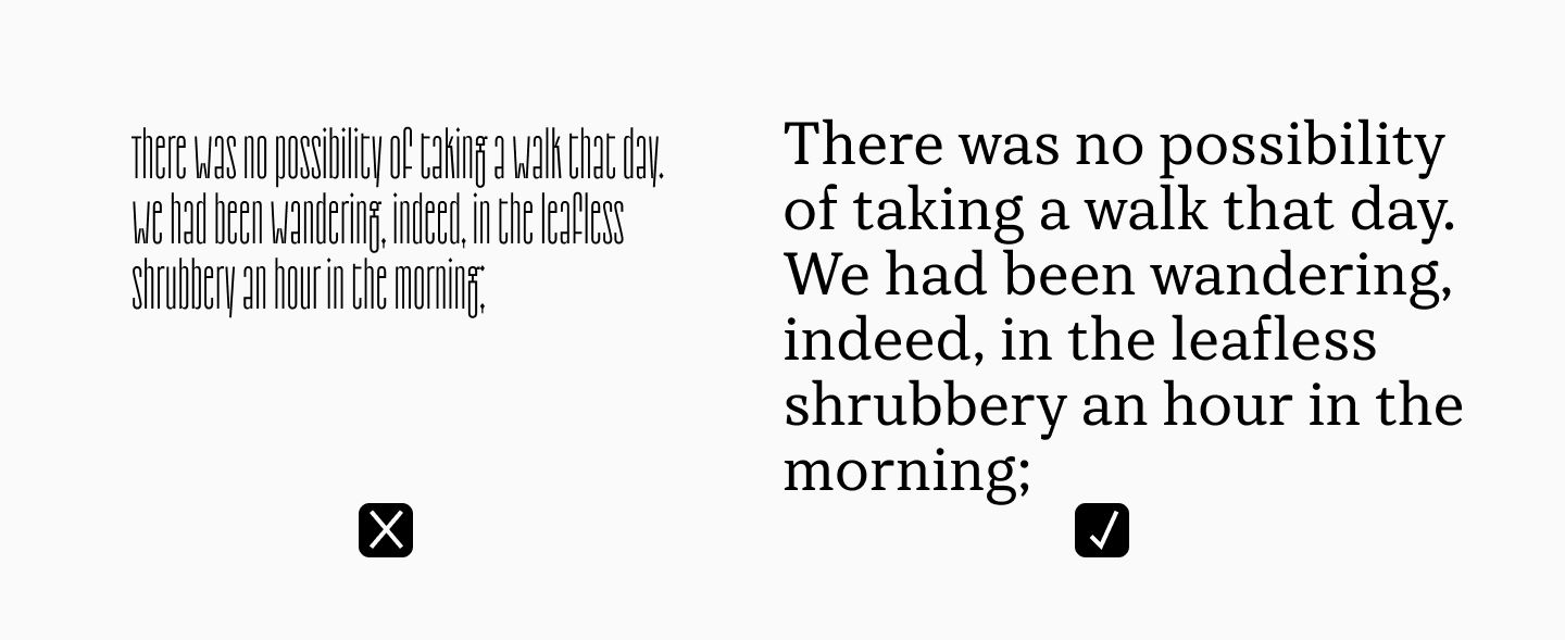
- Good typography: A website with a clear structure, proper line spacing, and readable fonts.
- Bad typography: Text without margins, a tiny font size, and random font pairings.
Research by the Nielsen Norman Group shows that users, on average, read only 20–28% of the text on a web page. Good typography helps retain their attention and makes the information easier to digest.
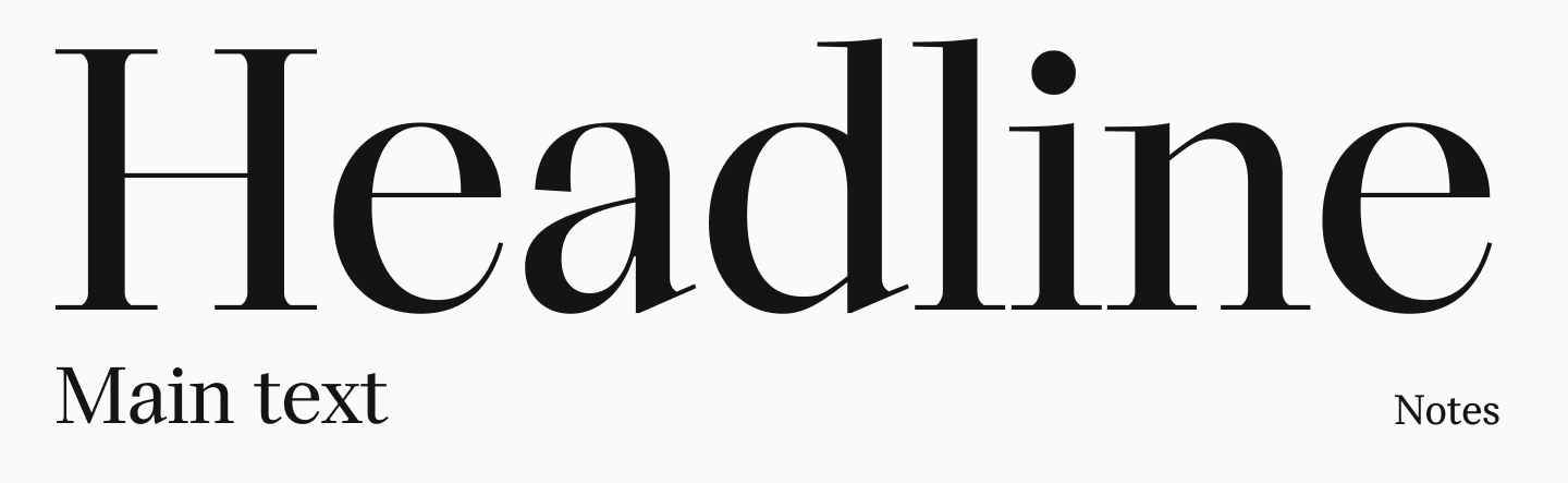
The Main Elements of Typography
Now, let’s break down the main typographic terms to understand what elements typography is composed of.
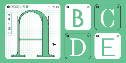
Font and Typeface
The words “font” and “typeface” are often used interchangeably. Even in professional circles, the word “font” is used universally and can mean both “typeface” and “font style”. The confusion is compounded by the fact that there is no universally accepted terminology, and different font designers rely on different interpretations. However, to understand the principles of typography, it is important to grasp the difference between these terms.
A typeface (or type family) is a set of fonts that are stylistically related but have different styles.
A font is the complete set of characters for typesetting, unified by a single style. That is, it is the file itself, the carrier of the type.
A font style is a specific font within a typeface that has certain graphic characteristics distinguishing it from other styles, such as weight, slant, width, and other parameters.
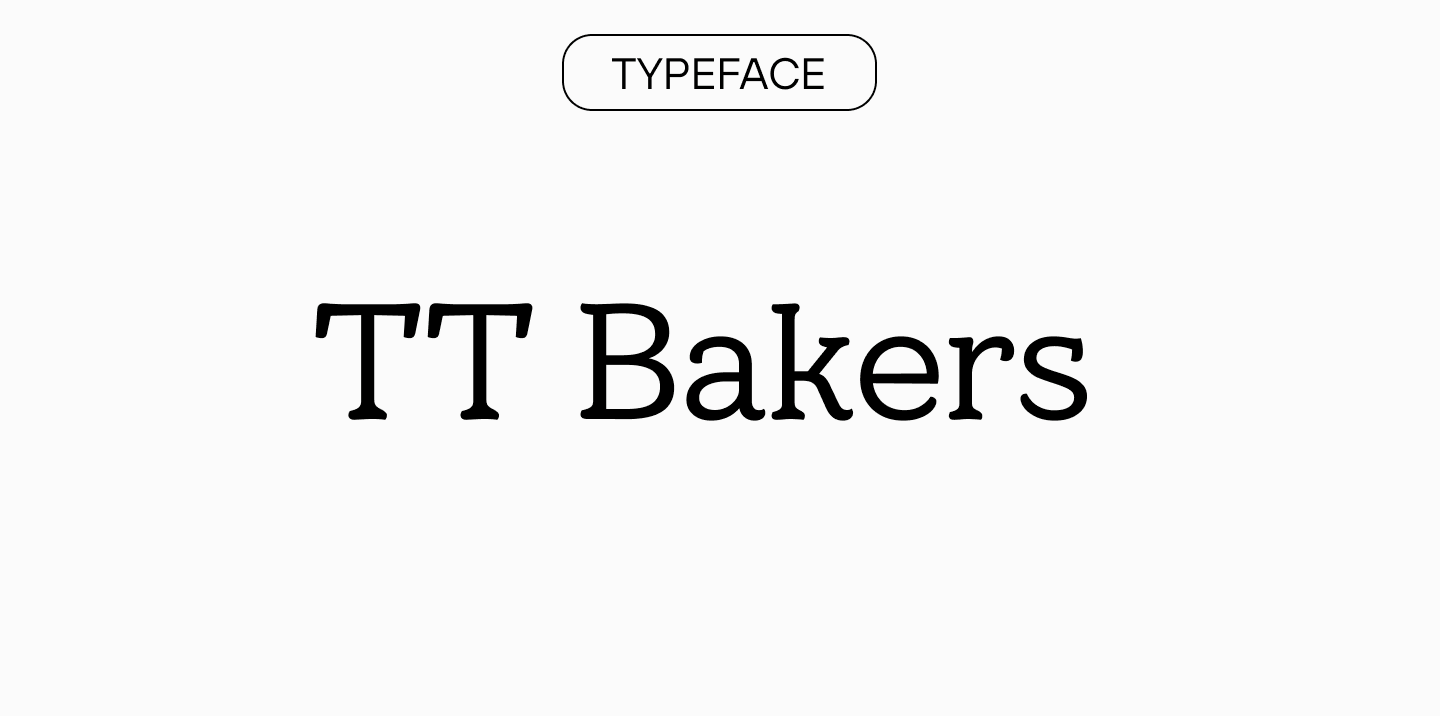
Often, the word “font” is used to refer to both the typeface itself and a specific font style. You can usually understand what is meant in a specific case by the context. For example, when we say that TT Norms® Pro is the font that supports the most languages among other fonts in the TypeType collection, we mean the TT Norms® Pro typeface. And if we suggest using the font TT Livret Text Regular as the most optimal for setting large amounts of text, we mean a specific font style.
You can understand the meaning of these terms more deeply in our article.
Font Style, Weight, and Slant
These concepts relate specifically to the term “font style.” So, let’s take a closer look at this concept first.
A font style is the appearance of a font. Within a single style, all the characters of a font will have a uniform weight, width, or, for example, be slanted. A subfamily can include fonts of different styles, united by a common feature. A typeface, in turn, brings together various subfamilies.

Weight is the thickness of the character elements relative to their height. Fonts can be light (e.g., Thin or Light styles) or heavy/bold (e.g., Bold or Black styles).

Slant refers to “oblique” fonts—these are fonts that are usually drawn as a companion to the original upright style. The glyphs of the characters do not change, they just acquire a slant. They are mainly characteristic of sans-serifs. The original function of oblique fonts was to highlight a specific part of the text or to emphasize information.
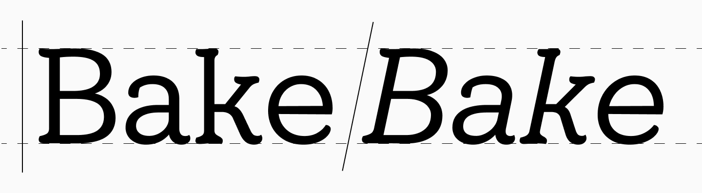
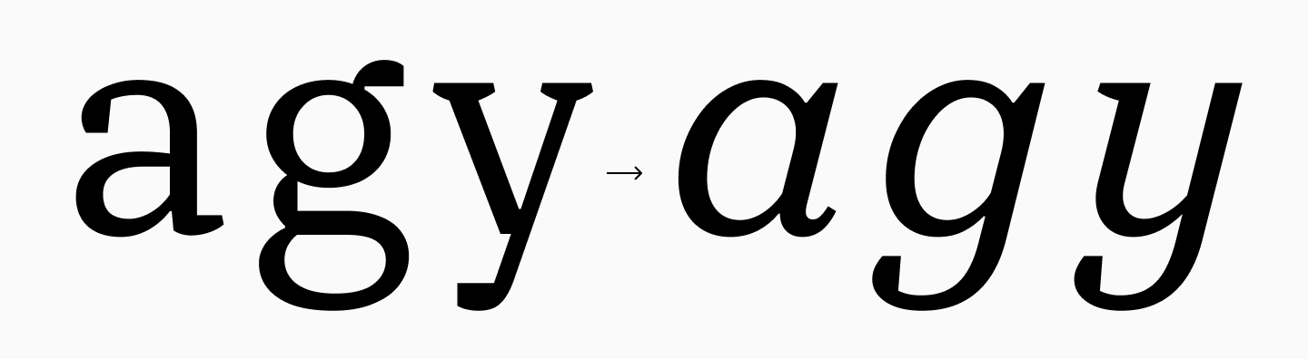
There are also italics (true italics)—historically, this term denoted cursive fonts, but today it is used more broadly to include both true italics and oblique fonts. These are slanted fonts where the glyphs of the lowercase characters change to a cursive form. They can be created as a separate, full-fledged font, not just as a supplement to an upright style. They are mainly characteristic of serif fonts.
Point Size
Point size is the height of a font, i.e., its vertical size. It is measured in typographic points (pt) and determines how large the text will appear on screen or in print.

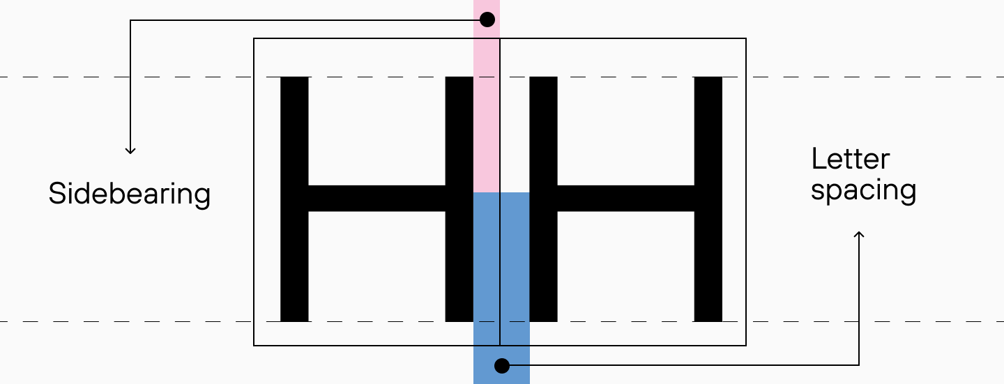
Sidebearing and Half-Sidebearing
A half-sidebearing is the distance from a character to the edge of its type block. It can be either positive or negative. The two half-sidebearings of adjacent characters form the sidebearing. This is an important parameter for the letter spacing of the entire font style. It determines how dense or loose the font will appear.
Leading, Kerning, and Tracking
Leading (or line-height) is the vertical distance between lines of text, more precisely between their baselines (from the baseline of one line to the baseline of the next). Simply put, it’s what many people know as line spacing.

Kerning is the selective increase or decrease of the space between two characters, determined by the combination of their shapes. This is done to create the most even typesetting possible.
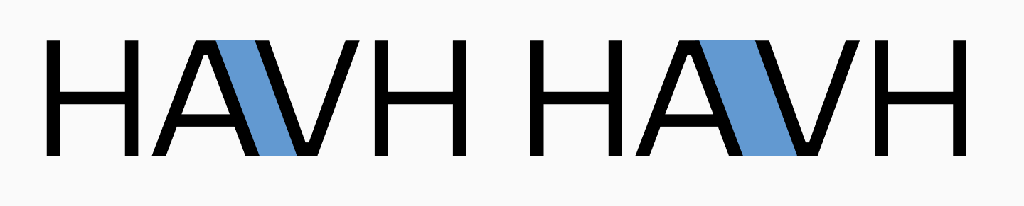
Tracking (letter-spacing) is the adjustment of the distance between all characters, i.e., the letter spacing. Tracking allows you to uniformly change this interval, making the spaces between letters larger or smaller. The text remains uniform thanks to kerning.
You can read more about the difference between these terms and the settings for each parameter here.
Types and Styles of Typography
There is no strict classification of typography by direction, but certain approaches can be identified. Let’s look at some of them below.
Classical and Modern Typography
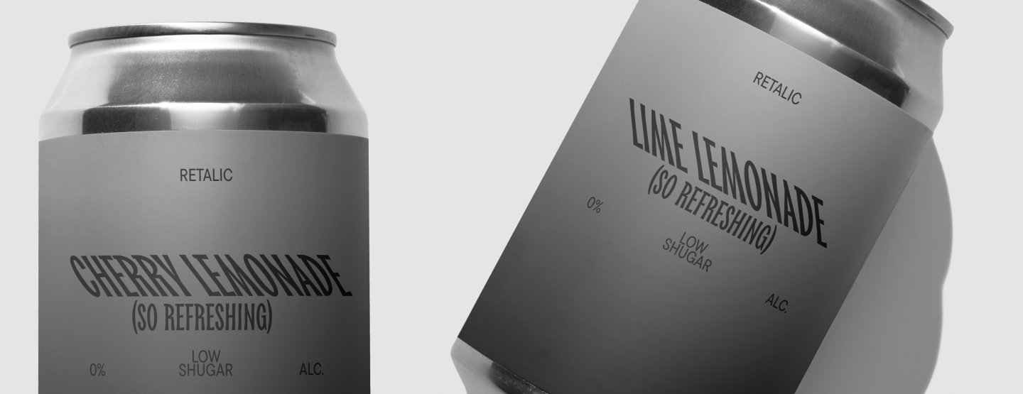
Classical typography involves the use of traditional serif and sans-serif fonts that have stood the test of time. It is based on principles of symmetry, harmony, and strict proportions. The classical style is particularly popular in book publishing, printing, and corporate documents.

Modern typography is freer in its forms. Designers use non-standard fonts, bright accents, and an asymmetrical grid. Here, violations of the rules of classical typography are permissible. This approach is common in the digital environment: on websites, in application interfaces, and on social media.
Custom and Brand Typography
Custom typography is the selection of fonts and the formatting of text for a specific project, taking into account its goals and objectives.
Brand typography is the application of typographic principles to create a recognizable visual identity for a brand, which includes the selection of unique or the use of custom brand fonts. In this case, typography enhances the existing corporate style and helps to convey the brand’s values.
Typography in Web Design and Print Materials
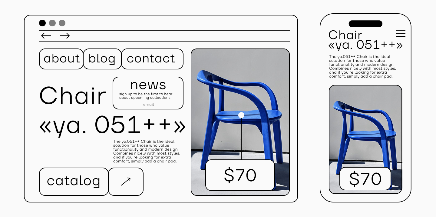
Web design requires responsive fonts: they must look equally good on screens of different sizes. Other parameters are also important to configure, considering that the page will be opened on different devices. We have discussed in detail how the choice of font in web design affects user perception here.
In the case of printed products, there are also nuances. Not all fonts are suitable for printing due to differences in print quality and the specifics of transferring ink to different surfaces. For example, lines that are too thin may not print, and letters that are too thick or narrow may stick together. You can learn more about working with fonts in book layout from our article.

Basic Principles of Typography
So, what techniques help make text easy to perceive and visually harmonious? Let’s consider the main principles of typography.
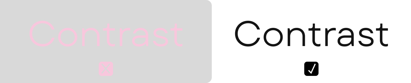
Color and contrast
When choosing a font color, it is important that it contrasts with the background on which the text will be placed. In addition to the classic option of black font on a white background, there are many other combinations. To check the contrast of colors, you can use a special service.
Hierarchy
Headings, subheadings, lists, and accents help the reader navigate the text and find the necessary information more quickly. Therefore, it is important not only to use the right font but also to create a visual hierarchy in the text. For this, you can use oblique fonts, different weights, point sizes, and font styles. A classic combination is a text font and a display font (we have talked about each of these types here).
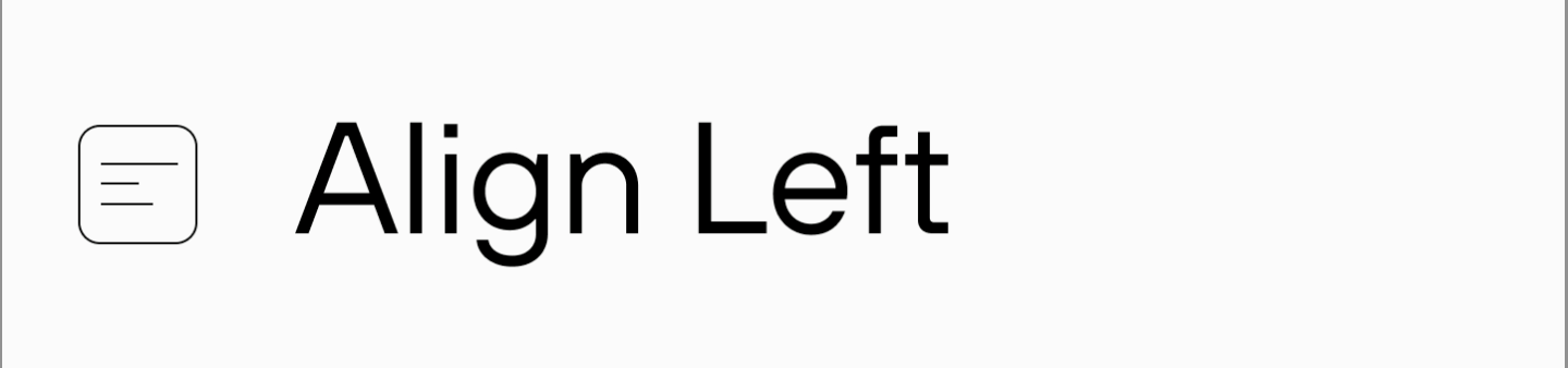
Alignment
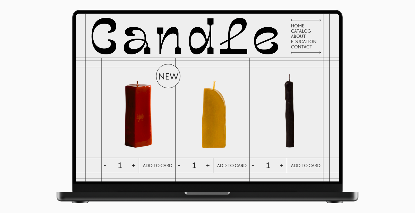
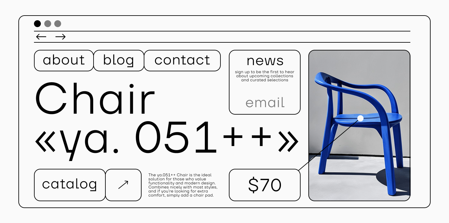
The classic alignment options are left, right, center, and justified. In text page layout, centered alignment is most often used for headings and left alignment for the main text, as it corresponds to the reading direction in the European tradition.
On book and magazine covers, posters, and flyers, in packaging design, and so on, you will most often see centered alignment. However, in this case, different alignment options may be appropriate, including non-standard ones. Here, the inconvenience for reading can emphasize the project’s concept, make it more daring and unusual.
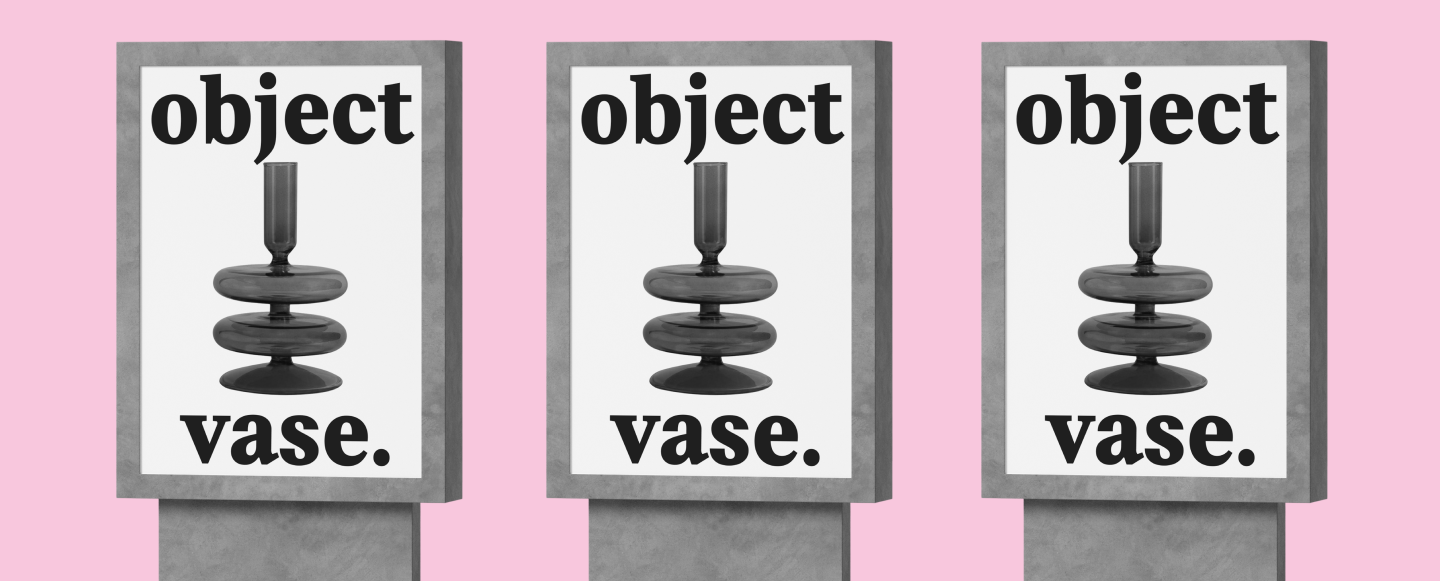
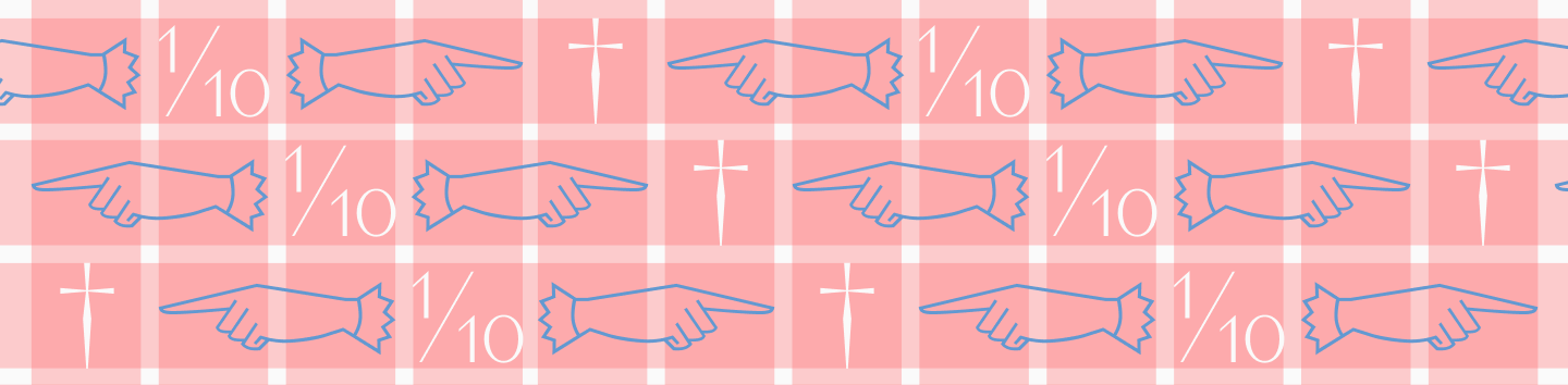
Repetition and Rhythm
Repetition is one of the basic principles of composition, ensuring the structure and integrity of the visual solution. It is used to create rhythm, emphasize key elements, and unite individual parts of the design into a single system.

Main types of repetition:
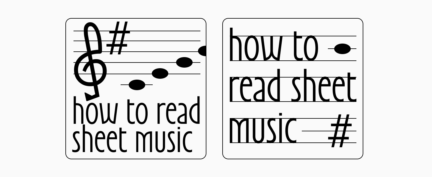
- Repetition of forms. Using the same geometric shapes or lines in different parts of the layout increases visual consistency.

- Color repetition. Working within a limited palette (usually 3-4 shades) helps to build harmonious compositions and enhances stylistic integrity.

- Textural repetition. Repeating certain textural solutions (e.g., a grid or graininess) helps to set a unified character for the visual series.
- Repetition of fonts. It is optimal to limit yourself to two or three fonts or styles, assigning their roles: one for headings, another for the main text, and a third for emphasis within the text.

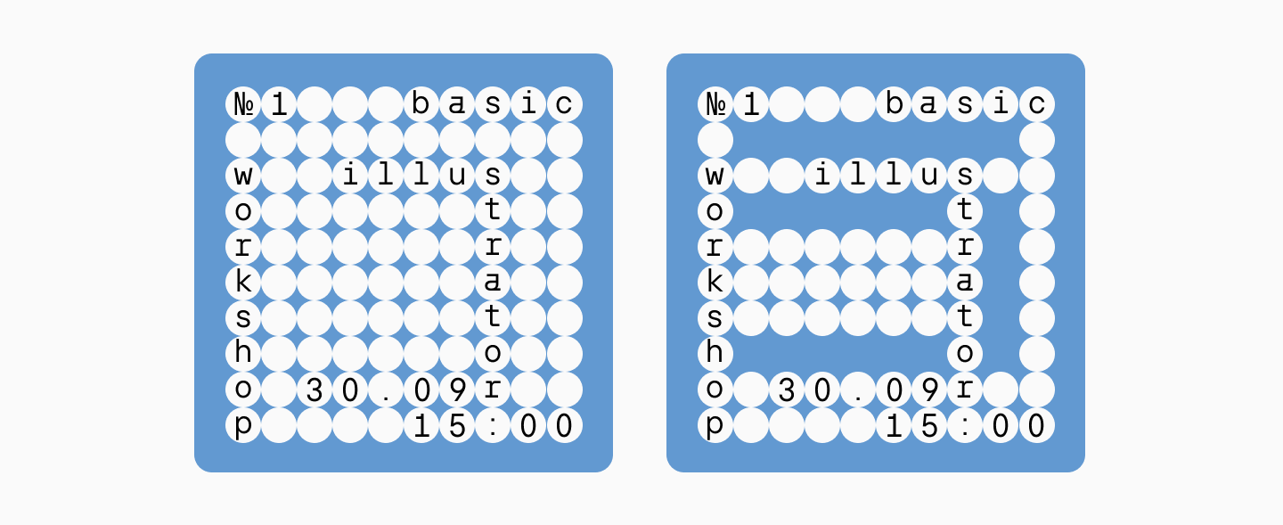
- Repetition of text formatting principles. For example, if you use dots to format a list, use the same format for other lists within the project. Or if you highlight one quote in italics, format other quotes in the same way.
How to use repetition correctly?
- Maintain balance. Excessive duplication makes the composition monotonous. It is important to combine repetition with variety.
- Work with patterns. Repeating patterns can be used as background solutions or decorative accents.
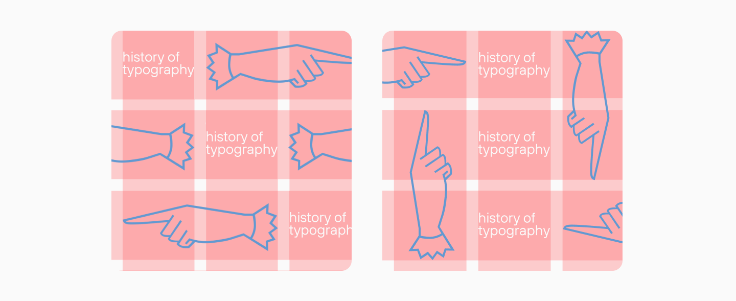
- Apply variations. Repeating elements can be varied in size, saturation, or shade, which creates dynamics and prevents monotony.
Proportions
Proportions in typography concern the ratio of the width and height of letters and characters in a font, as well as the intervals between them, lines, and paragraphs. The correct use of proportions—the ratio of line width to font size, leading (line spacing), and letter spacing—is critical for creating legible and visually appealing texts.

Readability and Perception
Readability is the ease of perceiving not individual letters, but the entire text as a whole. The readability of a font is determined by how comfortable and easy it is for the reader to “glide” over the lines of text without being distracted or “stumbling.” One of the components of readability is the legibility of individual characters.
For typography to work in the user’s interest, you need to approach the choice of font and the formatting of the text comprehensively. The first step is to ensure basic legibility by choosing a suitable font, and then check its readability and configure additional parameters.
This is a complex job. We have discussed in detail how to improve the legibility and readability of text in a separate article.
Basic Rules for Working with Typography
Let’s consider the main rules that will help you avoid mistakes and make your text functional.
How to Choose a Font for a Task?
The main principle is that the font must correspond to the purpose of the communication. It is unacceptable to use a decorative handwritten font in a scientific article, and a dry, official sans-serif would look strange on a party flyer.

For the main text, it is better to use neutral fonts with good readability (e.g., TT Travels Text). They are versatile and suitable for both web and print. For headings, you can choose more expressive fonts with decorative elements. For example, TT Travels Next.

For a deeper study, we have a detailed guide on choosing a font for a project.
Combining Fonts
Do not use more than two or three fonts in one project—this will help to avoid clutter and maintain harmony. The rule “less is more” is appropriate here.
For fonts to combine well, it is important that they have both common features and differences. The easiest way is to take different styles of the same typeface: they differ in a number of parameters, but at the same time remain within the same style. You can also use proven classic combinations, for example, serif + sans serif.
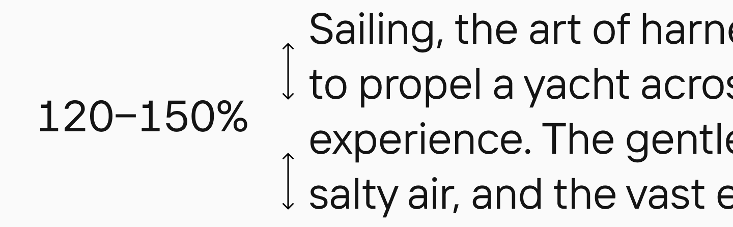
Optimal Spacing
The optimal value for leading is usually in the range of 120–150% of the point size. Too little leading impairs readability, and too much makes the text “torn.”
Typography and Grid
A modular grid is a tool that helps to organize a layout using columns, rows, and the spaces between them. It sets the guides along which the designer arranges text, images, buttons, and other site elements. Using a grid helps to make the page predictable and structured.

Why is Typography Important in Graphic Design?
Typography affects not only the appearance of text in design but also many other aspects. In particular:
Perception of Information
Well-configured typography parameters help the viewer to navigate quickly. Studies show that users stay on a site longer if the text in it is structured and user-friendly.
Emotional Impact
Different fonts have different characters and have different emotional impacts. For example, the team of the online cinema Ivi after a rebranding turned to TypeType—we needed to create a corporate font that would emotionally fit the new image of the company.
To understand whether the character of the font is important for users and whether the emotional perception of different options differs, ivi specialists conducted a study. The results showed that the reaction to different fonts differs. The emotional perception of the more characteristic fonts, sketches of which we created as part of the project, was much brighter than the perception of the standard option that was previously used on the online cinema’s website.
Improving Communication Efficiency
Typography helps to highlight key accents, reduce the time spent searching for information, and increase trust in the brand. For example, a company that uses a single corporate font in advertising, on its website, and in its application looks more professional, reliable, and becomes more recognizable. This strategy is used by major brands today.
Conclusion
Typography in graphic design is not just about choosing a beautiful font. It is a system of rules and techniques that helps to assemble graphic and textual elements into a cohesive composition, manage the viewer’s attention, improve the user experience, and enhance communication.
What to Read and Where to Learn Typography
Here is a list of literature that TypeType font designers recommend for a deeper study of the topic:
- An Essay on Typography by Eric Gill
- The New Typography. A Handbook for Modern Designers by Jan Tschichold
- The Form Of The Book by Jan Tschichold
- Stop Stealing Sheep & Find Out How Type Works by Erik Spiekermann
- The Elements of Typographic Style by Robert Bringhurst
- Designing Type by Karen Cheng
- Typography: A Manual of Design by Emil Ruder
FAQ
What is typography in graphic design?
Typography is the art and technique of arranging type so that written language is legible, readable, and visually appealing. It includes choosing fonts, adjusting their parameters, and organizing text on a page or screen.
Why is typography important in visual communication?
Typography helps capture attention, emphasize meaning, guide the viewer’s eye, and communicate a message clearly. In design, text is not only information but also a visual element that shapes perception.
What are the basic principles of typography?
The basic principles include contrast, hierarchy, alignment, repetition, rhythm, proportion, readability, and perception. Together, they help make text visually harmonious and easy to understand.
What is the difference between typeface and font?
A typeface is the overall design system or family, while a font is usually a specific style or file within that system. In everyday and even professional speech, these terms are often used interchangeably, which is why the distinction can be blurred.
How does typography influence user experience?
Typography affects how easily users read, scan, and understand information. Good typography improves navigation, highlights key content, and makes interfaces, websites, and layouts more user-friendly.
What are common typography mistakes to avoid?
Common mistakes include using fonts that do not match the task, choosing poor font pairings, setting text too small, ignoring margins and spacing, using weak contrast, and creating a layout without hierarchy.
How do designers create effective typographic hierarchy?
Designers create hierarchy by using headings, subheadings, lists, accents, different weights, sizes, styles, and sometimes contrasting fonts. This helps readers quickly understand what is most important.
What role does spacing play in typography?
Spacing controls how text is perceived and read. Leading defines the distance between lines, kerning adjusts space between specific letter pairs, and tracking changes spacing across a whole text fragment. Correct spacing makes typography more even and readable.
How does typography impact branding?
Typography helps create a recognizable brand identity. Brand typography supports a company’s visual style, communicates its values, and makes the brand more consistent across different media.
What are examples of good typography in design?
Good typography can be seen in a website with a clear structure, readable fonts, proper line spacing, and logical hierarchy. Bad typography, by contrast, may use tiny text, no margins, and random font combinations.