There are fonts that simply exist in the system. And then there are those that become part of the visual habit of an entire era. Calibri is exactly such a case. For millions of people worldwide, it has long been not just the default font in Microsoft Office, but the standard voice of business correspondence, resumes, presentations, reports, and spreadsheets. Everyone has seen it, even if they didn’t know its name.
Why does one font become almost invisible, yet define the appearance of a massive number of documents? Why is it chosen time and time again? And why, when Microsoft finally decided to change the long-standing defaults and replace Calibri, did it become not just a technical update, but a shift in a visual era?
In this article, we will explore what the Calibri typeface is, who designed it, why it became so widely popular, its key characteristics, where it is used, the difference between Calibri and Arial, Times New Roman, Helvetica, Verdana, and Cambria, and what typefaces can be considered a worthy replacement today.
What Is Calibri Font
Calibri is a sans serif font created for the everyday digital environment. You wouldn’t call it particularly distinctive, but that is exactly where its strength lies. It doesn’t argue with the content, doesn’t steal attention, and avoids creating unnecessary visual noise.
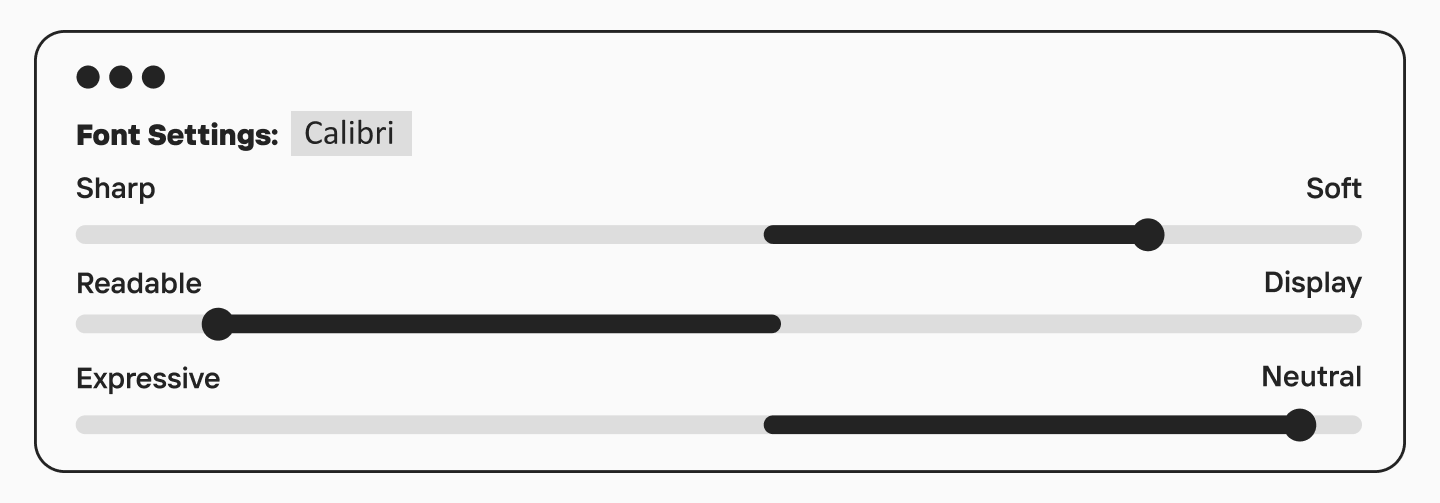
Calibri belongs to the humanist sans serif category. It features a soft design, rounded stroke endings (softer curves), a friendly character, and excellent readability in body text. Unlike the more rigid official office fonts of the older generation, Calibri looks less formal and less mechanistic. Thanks to this, it was long perceived as a contemporary and modern choice, yet not cold.
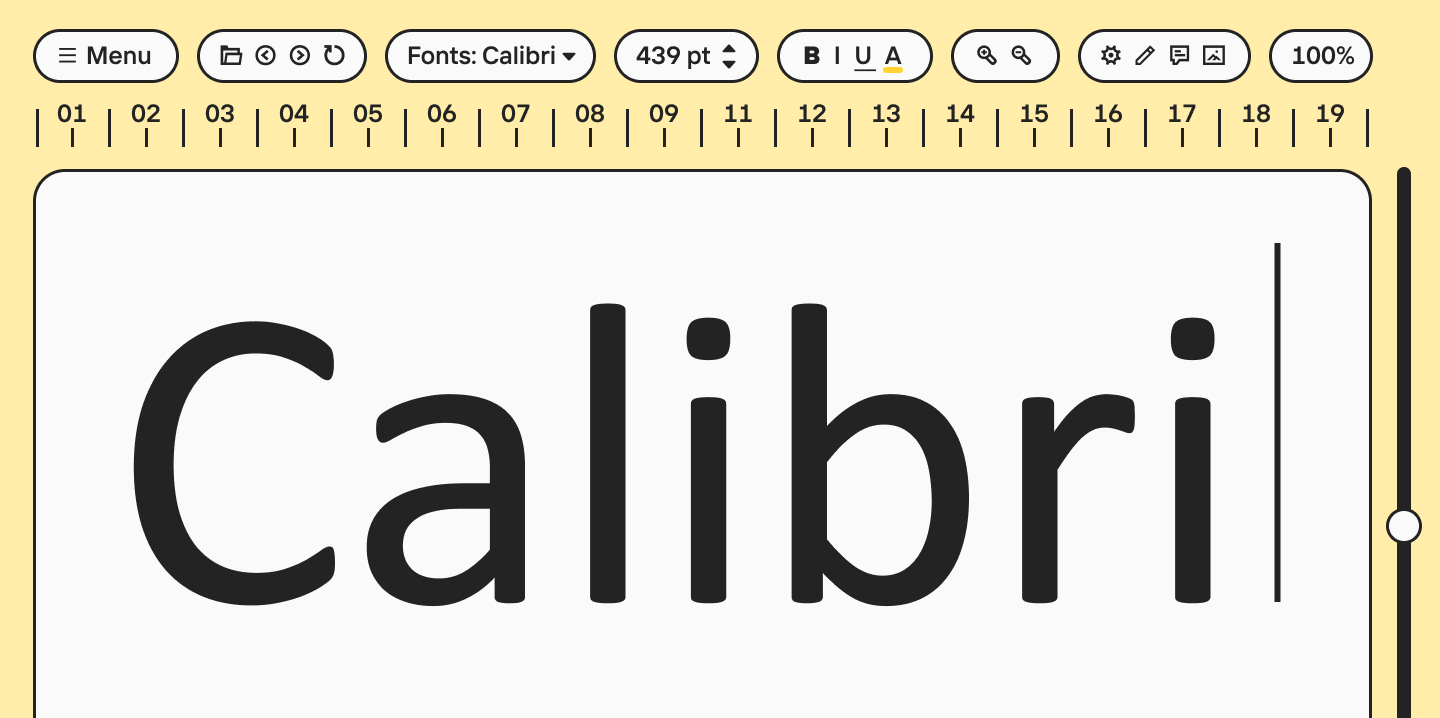
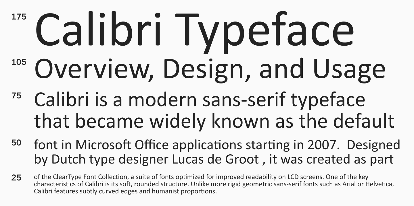
Visually, what does Calibri font look like? It is easy to recognize by its clean letters and overall cohesive typesetting. It does not look too narrow or too wide, does not seem overly geometric, and does not veer into calligraphy. It is a very well-balanced typeface. It is pleasingly soft but lacks weakness; it offers neutrality without being boring. This exact balance made it a perfect option for a huge number of tasks—from printed documents and academic writing to presentations and displays.
Learn more about font categories and their unique characteristics here.

Calibri Font History
The Calibri font history is closely tied to the history of Microsoft Office and how digital typography changed in the early 2000s. This typeface was created by Dutch type designer Lucas de Groot. The family was included in the ClearType Font Collection—a package of fonts developed specifically for clearer rendering and comfortable reading of text on screens.
This is an important point. Calibri did not just appear as a new office font, but as a solution to a specific technical challenge. At that time, Microsoft was actively developing the ClearType sub-pixel rendering technology (rasterizer), and they needed a font that would render exceptionally well in a digital environment: in long documents, tables, emails, and interfaces that people read from a monitor every day.
When Microsoft Office switched to Calibri as the default, it was a very noticeable step. Previously, the visual standard for business texts had long been Times New Roman and Arial. The former was closely tied to the print tradition, the latter to a more severe systemic neutrality. Calibri offered a third path: modern, screen-optimized, soft, and friendly. This is why it so quickly became the new norm.
Over time, Calibri turned into the visual background of office culture. It survived a huge number of Word, Excel, and PowerPoint versions, and became a fixture in templates, corporate documents, presentations, internal files, and cover letters. Even after Microsoft announced the transition to Aptos, Calibri remained a font that is instantly recognized as the symbol of an entire digital generation.
Calibri Font Family Characteristics
The success of Calibri is explained not by a single flashy trick, but by a combination of several well-thought-out features. First of all, it is the softness of the design. The font has minimal aggressive geometric edges, harsh angles, or overly dense, closed apertures. Because of this, text in Calibri looks friendly and remains highly legible even during long reading sessions on a screen.
The second important feature is its compactness. Calibri is quite economical in its letter spacing, allowing you to fit a lot of text into a line without feeling cramped. This is especially useful in office documents, tables, presentations, and interfaces where space is limited but information is abundant. Compared to Verdana and Helvetica, Calibri looks denser but not overloaded.
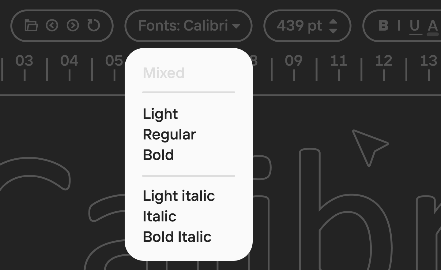
The third important characteristic is versatility. The complete Calibri font family includes the core working font styles: Calibri Regular, Calibri Bold, Calibri Italic, and Calibri Light. For most everyday tasks, this is plenty. Regular works perfectly as body text, Bold helps build hierarchy, Italic is suitable for neat accents, and Light is great for more airy and modern designs.
Calibri Examples and Samples
What Is Calibri Font Used For
The primary environment for Calibri is, of course, Microsoft Office. But its influence did not stop at Microsoft Word. It was widely used in Excel, PowerPoint, Outlook, internal company documents, official correspondence, resumes, memos, presentations, and countless templates that were reproduced from document to document for years.
Is Calibri a professional font? Yes, if you understand professionalism as practical reliability. It is not a bespoke studio brand typeface, nor is it a font with a strongly pronounced authorial voice. But for the office environment, business communication, working files, and standard documents, it proved to be almost perfect. It knows how to be neutral without being generic, modern while remaining incredibly familiar.
Is Calibri a good font for a resume? In most cases, yes. It is clean, readable, clear, and does not evoke unnecessary associations. For a conservative environment, someone might still choose Times New Roman, and for a more tech context, something like Inter or Helvetica. But Calibri remains a safe choice, especially if the document needs to look excellent in a standard office setting. It’s a great option for a clean CV.
With the web, the situation is more complex: as a fully-fledged webfont for free embedding, it is inconvenient. Free alternatives are usually chosen for such tasks. This is why web design more frequently uses typefaces with similar goals but with a much clearer license, rather than Calibri.
Calibri Accessibility
One of the reasons for Calibri’s popularity is its accessibility in the most practical sense of the word. Why is Calibri more accessible? It is a highly readable font. It doesn’t force the user to strain, doesn’t look excessively strict, and doesn’t fall apart at a small size. For an office font, this is a critically important quality because it is read not by designers in ideal conditions, but by all sorts of people on all sorts of screens and monitors.
Calibri was designed for the digital environment, and it shows in its behavior. It handles long reading well, works clearly with numbers and service symbols, and its soft curves make the text visually less aggressive. For mass business communication, this turned out to be a huge advantage.
Can You Download and Use the Calibri Font?
Calibri is not distributed as a free or open-source font for separate download; it is part of the Microsoft ecosystem. Official Microsoft typographic documentation states that you cannot install the font separately, and Calibri itself is included in Microsoft products and services where intended.
For the average user, this means the following:
- You cannot download Calibri for free as a standalone open font.
- You can legally use Calibri if it was installed alongside licensed Microsoft products.
- For print, documents, presentations, and desktop applications, this access is usually enough.
- For the web, apps, servers, and distributing font files (like a WOFF format), you need separate rights or a commercial license.
Therefore, if you need a font with a simpler and more transparent integration model, especially for a website, it is usually wiser to choose an alternative.
Calibri vs Other Fonts: Head-to-Head Comparison
Calibri vs Aptos: Microsoft’s Default Fonts Differences
The transition of Microsoft Office from Calibri to Aptos marked the end of an entire era in digital typography. Calibri, having held the post of the default font for over fifteen years, was created during the dominance of ClearType technology and low-resolution monitors. Its soft, slightly rounded shapes and humanist character were meant to make reading from a screen as comfortable and friendly as possible. However, over time, this font began to be perceived as too familiar and even conservative, demanding the creation of a new visual language suited for modern high-definition standards.
Aptos, which replaced it, is a classic neo-grotesque inspired by the Swiss design school of the mid-20th century. Unlike the soft and compact Calibri, Aptos features stricter geometry, open apertures, and crisp stroke cuts. The softness was replaced by a confident clarity of lines. One of the key functional differences in Aptos is its focus on character distinguishability. While in Calibri the lowercase ’l’ is a simple vertical line that is easy to confuse with the uppercase ’I’, Aptos introduces a distinctive curve at the bottom. This detail not only improves readability but also gives the typeface its own identity.
Calibri vs Arial
The comparison between Calibri vs Arial allows us to see the deep difference between two approaches to creating versatile fonts for business and everyday correspondence. Arial, created in the early eighties, was long the primary standard for operating systems (OS), embodying a pragmatic and functional style. Calibri, conversely, became a symbol of the transition to a softer, more human aesthetic. Unlike Arial, which is often criticized for being overly rigid and mechanistic, Calibri belongs to the humanist sans serif category. Its distinguishing feature is its rounded corners and more natural proportions that resemble the movement of a pen or hand.
From a technical application standpoint, these fonts solve different problems. Arial was created as a universal font capable of rendering adequately on any device, even at the lowest resolutions, making it visually “rough” in details. Calibri, on the other hand, was specifically developed for text anti-aliasing technology, allowing for subtle nuances and soft transitions to be integrated into its design. In a contemporary context, the choice between them often boils down to a question of tone: Arial is chosen for the most neutral, official documents, while Calibri is better suited for modern corporate communication.
Calibri vs Times New Roman
In terms of designing font systems, the difference between Calibri and Times New Roman represents a fundamental shift in understanding readability. Times New Roman is a classic transitional serif font with pronounced contrast and sharp serifs that act as visual guides. In typesetting, this font creates a strong rhythm, which is ideal for multi-page, long printed documents.
Unlike Times New Roman, where dynamics are driven by stroke contrast, Calibri places emphasis on rounded stroke endings and the curvature of lines, which minimizes visual noise when reading from a monitor. This font is much more compact: it has shorter ascenders and descenders, allowing for tighter line spacing without losing legibility.
Calibri vs Helvetica
Comparing Helvetica vs Calibri reveals a fundamental conflict between functional modernism and humanist warmth. Helvetica, created in 1957, is the absolute gold standard of the closed neo-grotesque. Its design is subordinated to the idea of maximum neutrality and objectivity: horizontal stroke terminals and closed apertures create a sense of mathematical precision and static balance. However, this same density of characters and lack of distinct details sometimes make it difficult to read long text passages in a digital environment, as letters can blend into a solid mass.
Calibri, by contrast, represents a more plastic and “alive” approach to designing a sans serif, expressed in open letterforms and soft, rounded stroke edges. Calibri wins out thanks to its compactness and more generous letter spacing, which prevents the visual clustering of characters.
Calibri vs Verdana
The Verdana vs Calibri comparison is an analysis of two different strategies for adapting a font to the technical constraints of its time. Verdana, created in the mid-90s, was designed as a radical solution for screens with extremely low resolution. It is distinguished by its wider proportions, large x-height, and loose spacing.
Calibri was designed for an era when text-smoothing technologies had reached maturity, allowing designers to abandon the excessive width of Verdana in favor of elegant curves and a narrower skeleton. From a typographic perspective, Calibri is much more economical: it allows significantly more text to fit on a line without feeling cramped. If Verdana is the “all-terrain vehicle” built to work in the harsh environment of bad monitors, Calibri is the ergonomic city car where the primary focus is on soft lines, aesthetics, and information density in modern interfaces.
Calibri vs Cambria
Comparing Calibri vs Cambria is primarily a conversation about designing typefaces within a single system: both belong to the ClearType Font Collection, created specifically for the clearest possible rendering of text on screens. However, while Calibri is a soft and flexible sans serif, Cambria is a robust contemporary serif designed for prolonged reading of complex texts. Unlike traditional book fonts, Cambria possesses a strong skeleton and very sturdy, massive serifs that maintain their shape even at small point sizes.
Cambria’s proportions are more squared, giving the text an academic weight and reliability. At the same time, Calibri, due to its lack of serifs and rounded terminals, looks significantly lighter and more dynamic. A specific functionality is embedded in Cambria’s design: it was engineered for scientific and business documentation, where an abundance of formulas and special characters requires a clear structure. Calibri, on the other hand, takes on the role of a universal communicator, offering a more informal and friendly tone.
Calibri vs TypeType Fonts
From a professional standpoint, TypeType fonts win out due to their technical features and customization capabilities. While Calibri is limited to a standard set of styles, modern TypeType fonts include a multitude of weights, variable axes, and OpenType options (like an OTF format)—such as alternative characters, ligatures, and various types of figures (lining and oldstyle figures).
Browse all of TypeType’s sans serif fonts in this section to find the perfect alternative to Calibri.
Fonts Similar to Calibri
Closest Font to Calibri
Finding a worthy alternative or replacement to Calibri requires understanding the balance between the softness of a humanist sans and strict functionality. If the main goal is to maintain identical typesetting so that the text doesn’t “jump” and takes up exactly the same amount of space, Carlito will be the perfect solution. A close Calibri relative, this font was specifically designed as a metrically compatible equivalent, making it indispensable when switching between different operating systems like Windows and Mac without losing document structure.
For those who want to follow the most current standards of the digital environment, Aptos is a logical choice. As the official successor to Calibri in the Microsoft Office suite, it retains a familiar professional aesthetic but offers sharper, geometrically precise shapes that are better adapted to high-resolution screens. If Calibri seems overly soft or outdated, it is worth looking at Inter or Roboto. These fonts set a modern, technological tone while providing high typesetting density and excellent readability in long data sets.
In cases where the exact character of the font—its openness and friendliness—is important, you should explore Open Sans or Source Sans 3. They inherit the same humanist logic of character construction but offer a wider palette of weights and nuances suitable for both web interfaces and complex print typography.
Free and Commercial Alternatives
Free Alternatives to Calibri:
- Carlito — One of the fonts most similar to Calibri. Its main advantage is that it is metrically compatible with Calibri, meaning it helps preserve a similar layout when substituting the font. Moreover, Carlito is freely available and supports Latin and Cyrillic.
- Inter — A font like Calibri, this modern, versatile sans serif is ideal for interfaces and digital environments. Distributed under the open OFL license, it is suitable for both documents and the web.
- Roboto — One of the most common free fonts for screen use. It is often chosen as a more technological and neutral replacement for Calibri in interfaces and web design. Google Fonts distributes it as a freely embeddable family.
- Open Sans — A calm and highly versatile alternative with great readability in body text. It is suitable for websites, presentations, documents, and digital content, especially if a soft, unobtrusive tone is needed.
- Source Sans 3 — An open humanist sans serif that works beautifully in long texts and interfaces. It is one of the most logical free options if what you like about Calibri is specifically its friendly, working character.
Commercial Alternatives to Calibri:
- Aptos — The official successor to Calibri in Microsoft Office. This is the most obvious replacement for those who want to maintain a connection with the visual logic of the Microsoft ecosystem but switch to a more contemporary typeface. Aptos is available within Microsoft products and also appears as a commercially licensable family through distributors.
- Avenir Next — A more premium and refined alternative with a broad system of weights. Suitable for branding, interfaces, and business communication when you need a higher-status and typographically rich analog of an office sans serif. The family is distributed as a commercial product.
- Frutiger — One of the classic humanist sans serifs, close to Calibri in readability and clarity of forms, but with a more distinct, “authorial” feel. It is a great choice for navigation, corporate systems, and brands that need mature, stable typography.
- Helvetica Now — A modern commercial version of the famous Helvetica. Suitable for those who need a stricter, more neutral, and high-status alternative to Calibri for the corporate environment and visual systems. Distributed under a commercial license.
- FF DIN / DIN Next — A rational and incredibly popular commercial alternative for interfaces, navigation, presentations, and brand systems. In mood, it is a stricter and more engineered option than Calibri, but in a business environment, it often solves similar tasks.
Calibri Font Replacement Options
If you need an equivalent for documents, look to Carlito. If you want the most current office standard, look to Aptos. If the task involves websites, interfaces, and a more modern visual communication system, consider Inter, Roboto, Open Sans, or Source Sans 3. The choice depends not only on what font looks like Calibri visually but also on where it will be used.
Calibri Font Pairing
We’ve broken down some ready-to-use combinations below, and in this article, we explain how to successfully pair fonts on your own.
Calibri + Constantia
Constantia is a soft, rounded serif. It supports the friendly character of Calibri without creating excessive strictness.
Calibri + Palatino
A classic serif with pronounced calligraphic strokes. It adds authority and elegance to the pair, which simple Calibri sometimes lacks.
Calibri + Fira Sans
A combination of two humanist sans serifs of different calibers. Fira Sans possesses a more pronounced dynamic and sharpness of characters. A nuanced contrast emerges in this pairing: Calibri seems calmer and more neutral, while Fira Sans sets energetic accents in subheadings.
Calibri + Open Sans
Open Sans is a “workhorse.” Paired with Calibri, they look very clean and professional, while not tiring the eye during long reading sessions.
Calibri + Roboto Slab
Roboto Slab is a modern slab serif. It is friendlier than classic serifs and resonates well with the humanist character of Calibri. Together, they create the image of a high-tech yet accessible product. Frequently used in web design and interfaces.
Conclusion
Calibri is not just “that default font from Word.” It is a typeface that became the standard for business communication for many years. It didn’t try to be trendy or flashy. The purpose of this font was different: to be convenient, legible, modern, and as versatile as possible. And Calibri succeeded at this task almost perfectly.
FAQ
What is Calibri font?
Calibri is a humanist sans serif font created for digital documents, interfaces, and the office environment. It was the default font in Microsoft Office for a long time.
Who designed Calibri font?
Calibri was designed by Lucas de Groot for the ClearType Font Collection.
Is Calibri a sans serif font?
Yes, the font type Calibri belongs to is a sans serif, specifically a humanist sans serif.
What does Calibri font look like?
It looks clean, soft, neat, and modern: with rounded stroke terminals, a calm rhythm, and excellent screen readability. You can see a Calibri font sample image in the section above.
Is Calibri a good font for a resume?
Yes, it is a good and safe choice for resumes (CVs), especially if the document will be read in a standard office environment.
What font is closest to Calibri?
Carlito is most often named as the closest font to Calibri.
What are the best Calibri alternatives?
Among the most successful alternatives are Carlito, Aptos, Inter, Roboto, Open Sans, and Source Sans 3.
Is Calibri a professional font?
Yes, for documents, presentations, and business communication, it is a completely professional and reliable font.
Why is Calibri considered accessible?
Because of its great Calibri accessibility; it is highly readable on screens, doesn’t overload the text, and is comfortable for everyday use.
Is Calibri a web safe font?
As a local font in a font stack—yes. But for full use on the web, designers usually select alternatives with a more convenient license and format.