top_banner_ttnormspro0426
TT Biersal
6 styles
Type foundryFonts & StylesSans SerifTT Biersal

TT Biersal

TT Biersal is a display sans serif with a playful, adventurous spirit. It is notable for its extreme slant angle in both italic and retalic styles.
Single style: from $43.99
Full family: from $129 6 styles

Buying Options

Choose the fonts and licenses you want. Then, press the "Add to Cart" button

Any questions about the font or licences? Write us.

Choose the fonts you want

Package offer:
per style $21.50
from  $129
6 styles
from  $129
from $43.99
from $43.99
from $43.99
from $43.99
from $43.99
from $119
Package offer:
per style $23.80
from  $119
5 styles
from  $119
from $43.99
from $43.99
from $43.99
from $43.99
from $43.99
from $119
1 style
from $119
from $119

Any questions about the font or licences? Write us.

Select font licenses

You must specify a font package or style before selecting a licence

Choose the licenses you want

On request
On request
On request
On request
On request
On request
On request
On request
On request
On request
No selected items
Total
$0

Testers

TT Biersal
Size
Features
Turn on all

TT Biersal is a Elastic display sans serif

TT Biersal
Size
Features
Turn on all

In traditional typefaces, italic font styles perform supporting tasks: they serve to arrange text blocks logically. We decided that this font would push beyond these constraints, so we maximized the values of the italic font styles. As a result, this font’s style turned out to be extremely expressive! The roman font style of the TT Biersal typeface has a hand-made feel and combines asymmetrical cuts in the upright characters with sharp oval forms. Slanted font styles stand out for an extreme tilt in italics and reverse italics, with the slant angle ranging from −40 to +40 degrees. This creates a truly remarkable style and sets a powerful reading rhythm. In the variable font, you get a slant angle dynamics of 80 degrees. In addition, the typeface features a party-themed variable icon set and a set of ligatures with unconventional forms.

TT Biersal
Size
Features
Turn on all

The font family consists of 6 font styles: 1 roman, 4 italic, and one variable

TT Biersal
Size
Features
Turn on all

TT Biersal is an excellent choice for festivals, animation, packaging design, and covers

TT Biersal
Size
Features
Turn on all
Variable axes
Slant

vase 1/3

TT Biersal in design

Description

About font family TT Biersal
230+ Language support

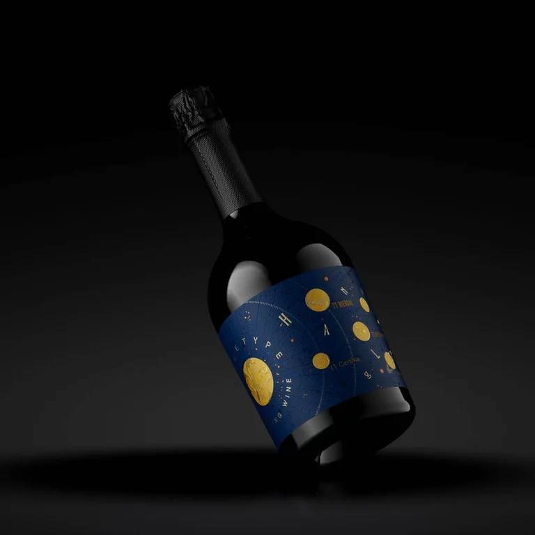
Introducing our new expressive TT Biersal—an authentic and energetic typeface inspired by early 20th-century typography.

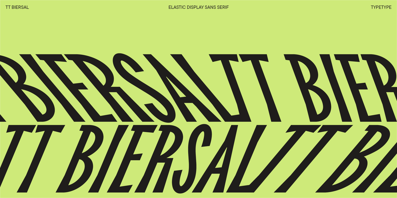
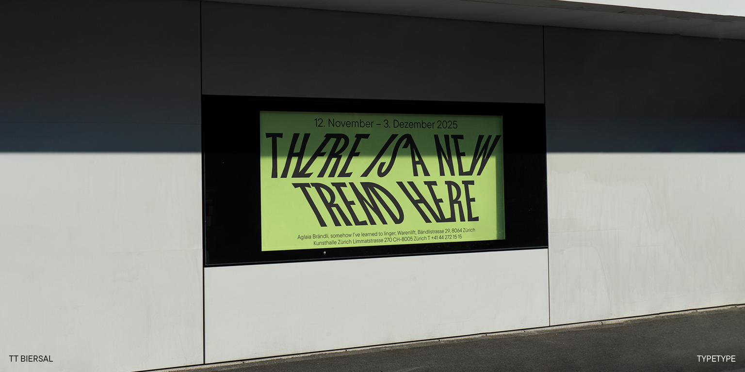
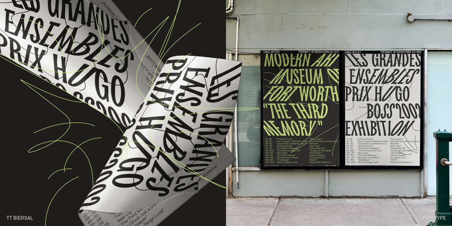
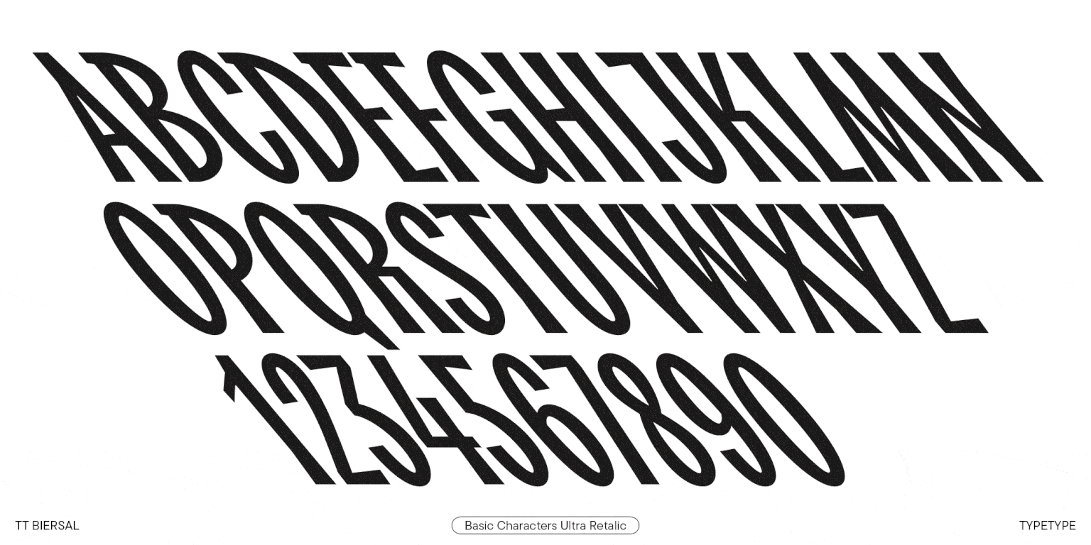
TT Biersal is a display sans serif with a free-spirited, playful, and adventurous nature. The concept of this font was sparked by a German poster from the early 1930s. We aimed to maintain the proportions of the reference along with an unpolished, lively feel of its lettering. As a result, we got a vibrant, dense font with narrow proportions and asymmetrical forms.

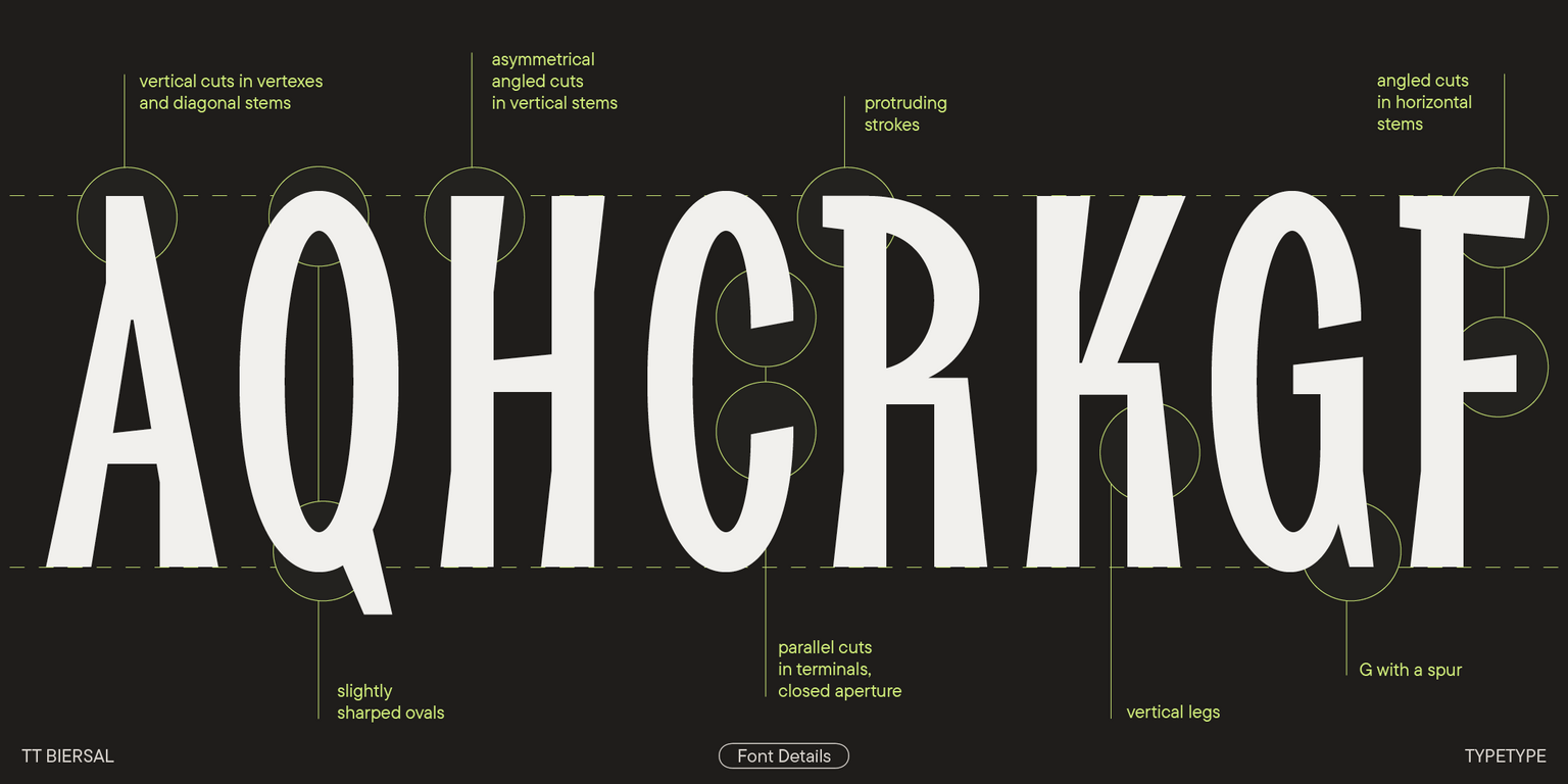
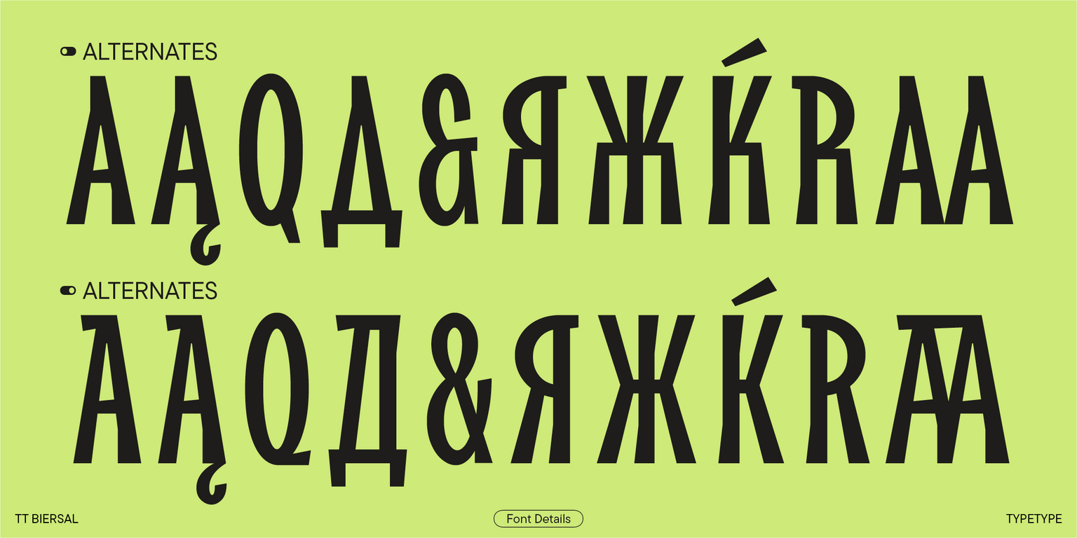
The key features of TT Biersal are asymmetrical angled cuts in square and diagonal characters. They infuse the font with a hand-made feel as if someone cut out small pieces of paper, glass, or stone and put together a modular collage. Unconventional parallel cuts in the terminals of round letters make the setting look dynamic. Some letters, such as «E,» «P,» and «B,» feature slight extensions as though the strokes overshot the vertical stems in fast writing. Also, the ovals are tapered to match the sharp angles of square characters.

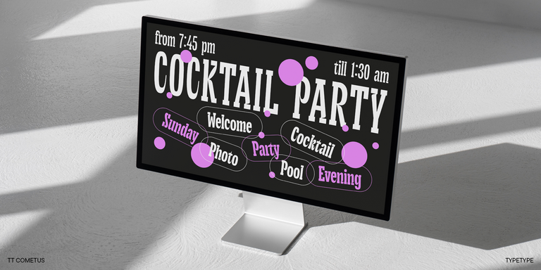
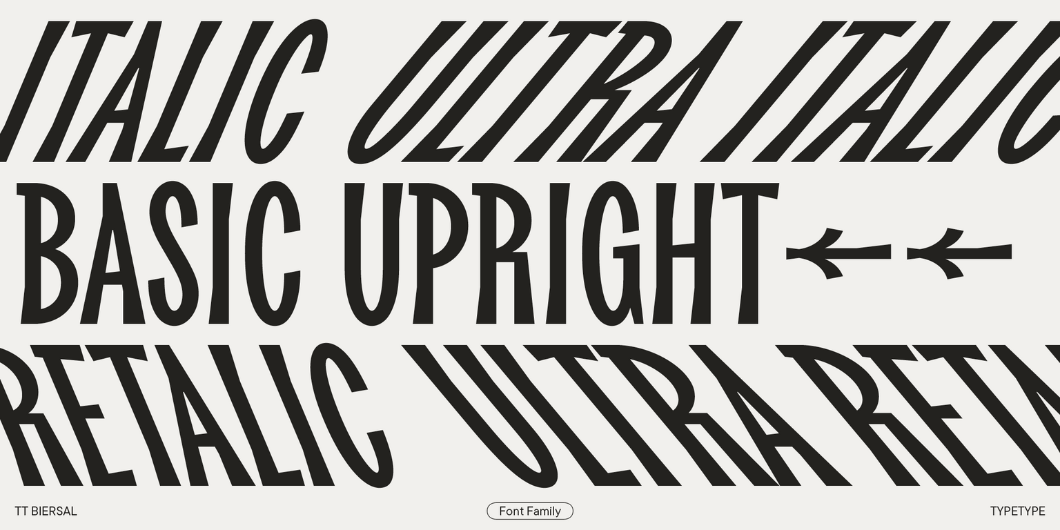
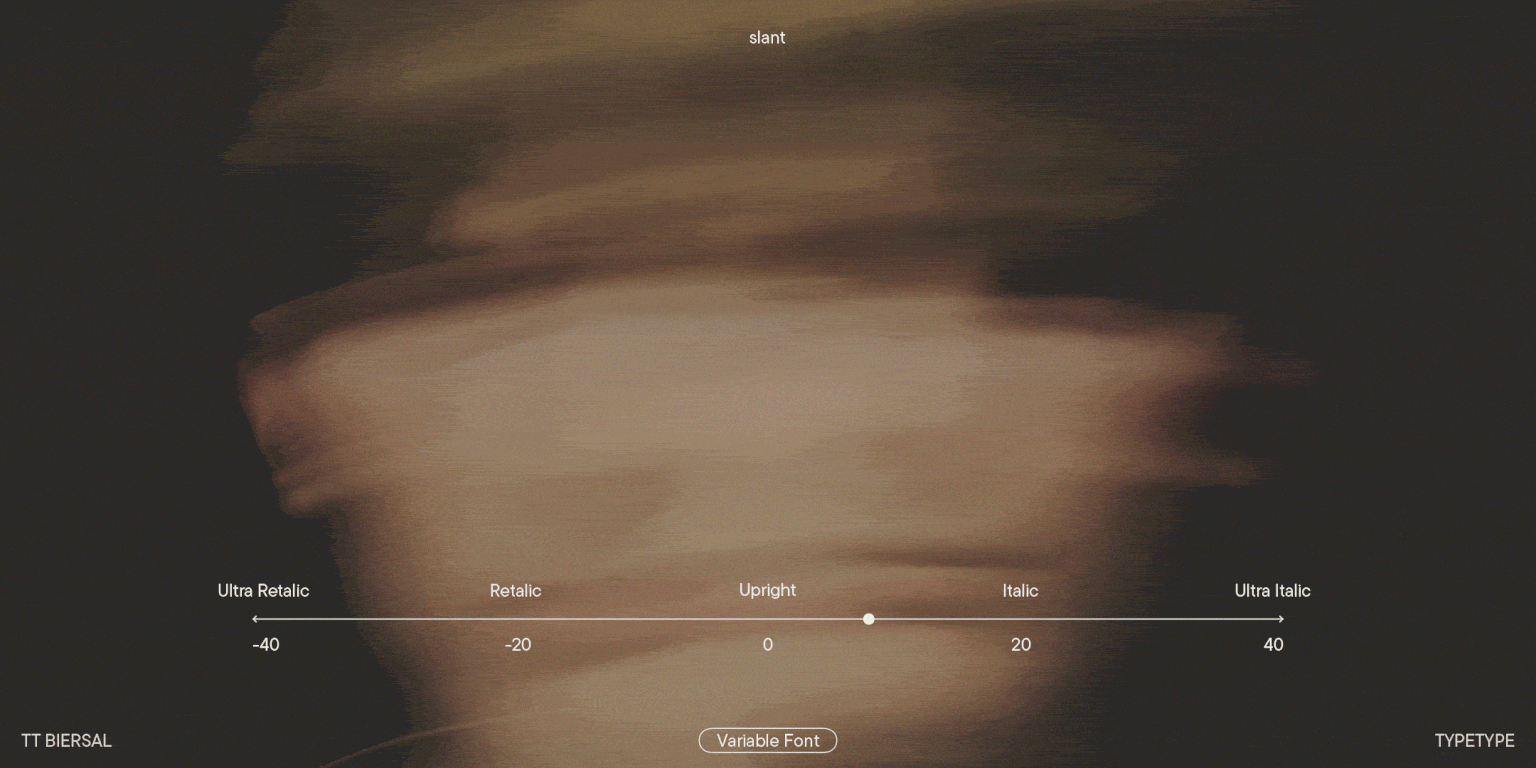
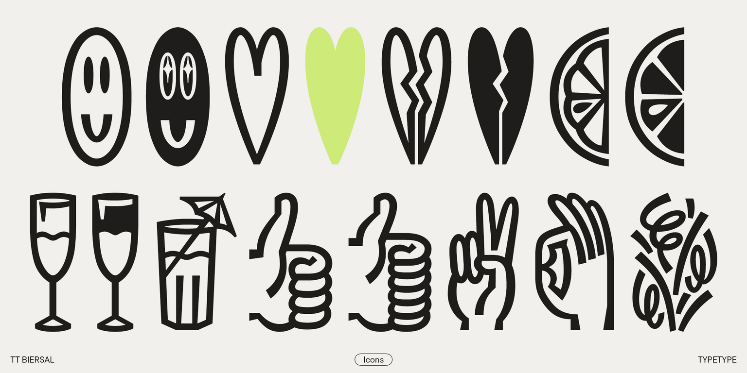
Due to its angular cuts, asymmetrical diagonals, and dense setting, the font’s design may remind you of intertwining branches against a clear blue sky. Italic font styles make TT Biersal look even more dynamic and swift as we added an extreme slant, from -40° to +40°, to retalics and italics. When combined, text blocks with different angles may create the feeling of movement or shadow. In addition, the typeface features a party-themed icon set.

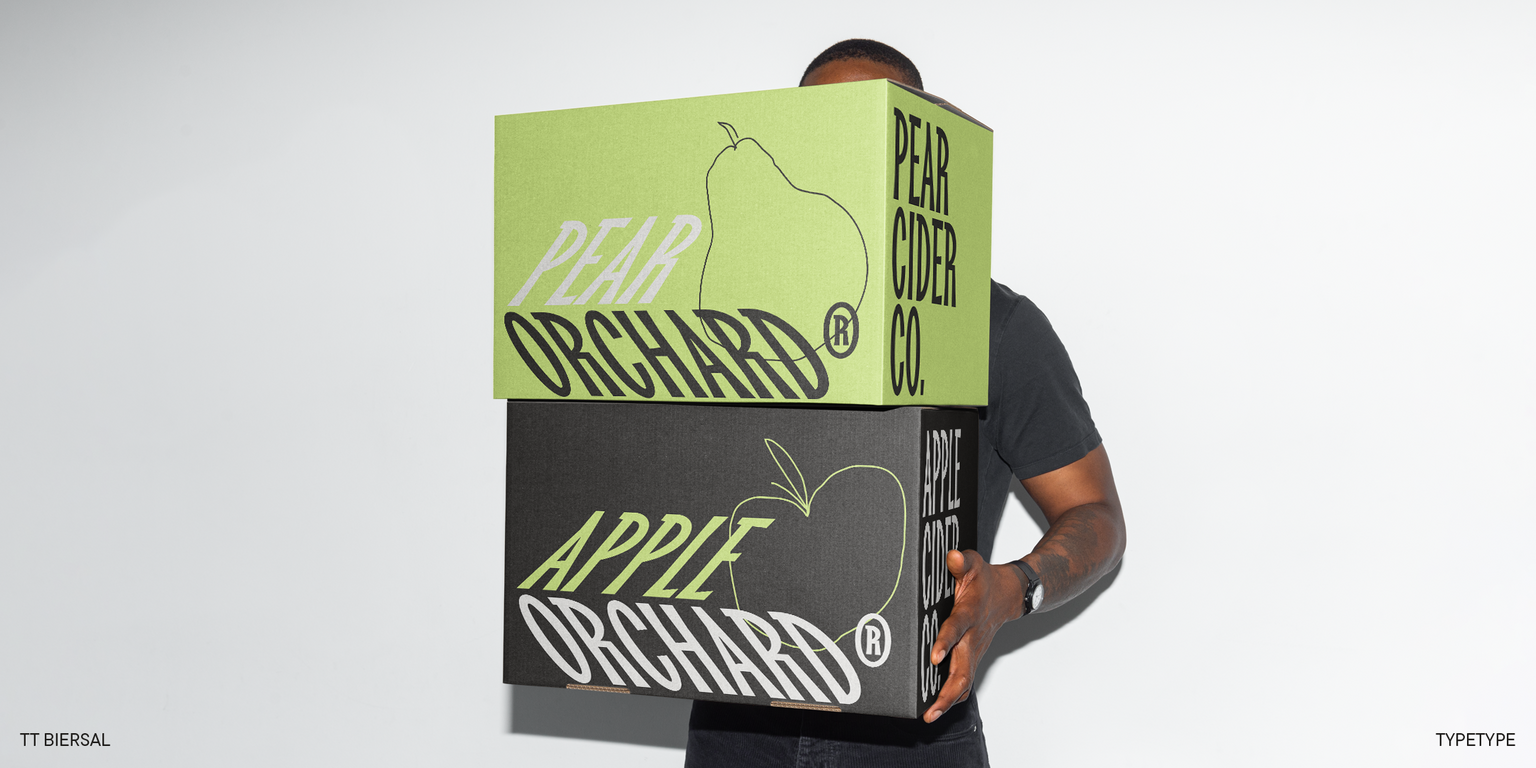
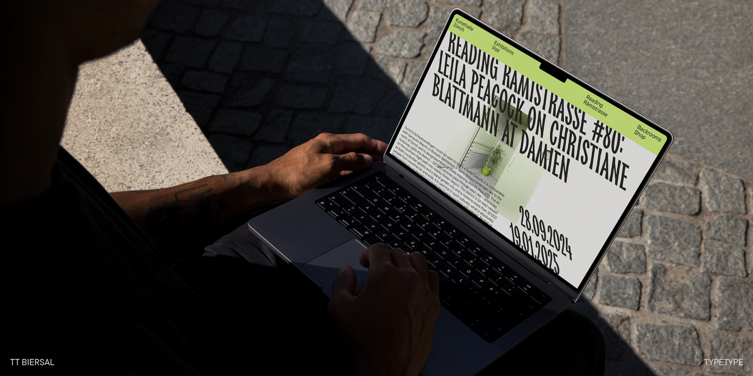
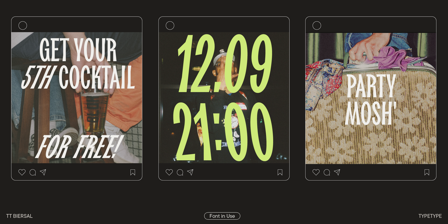
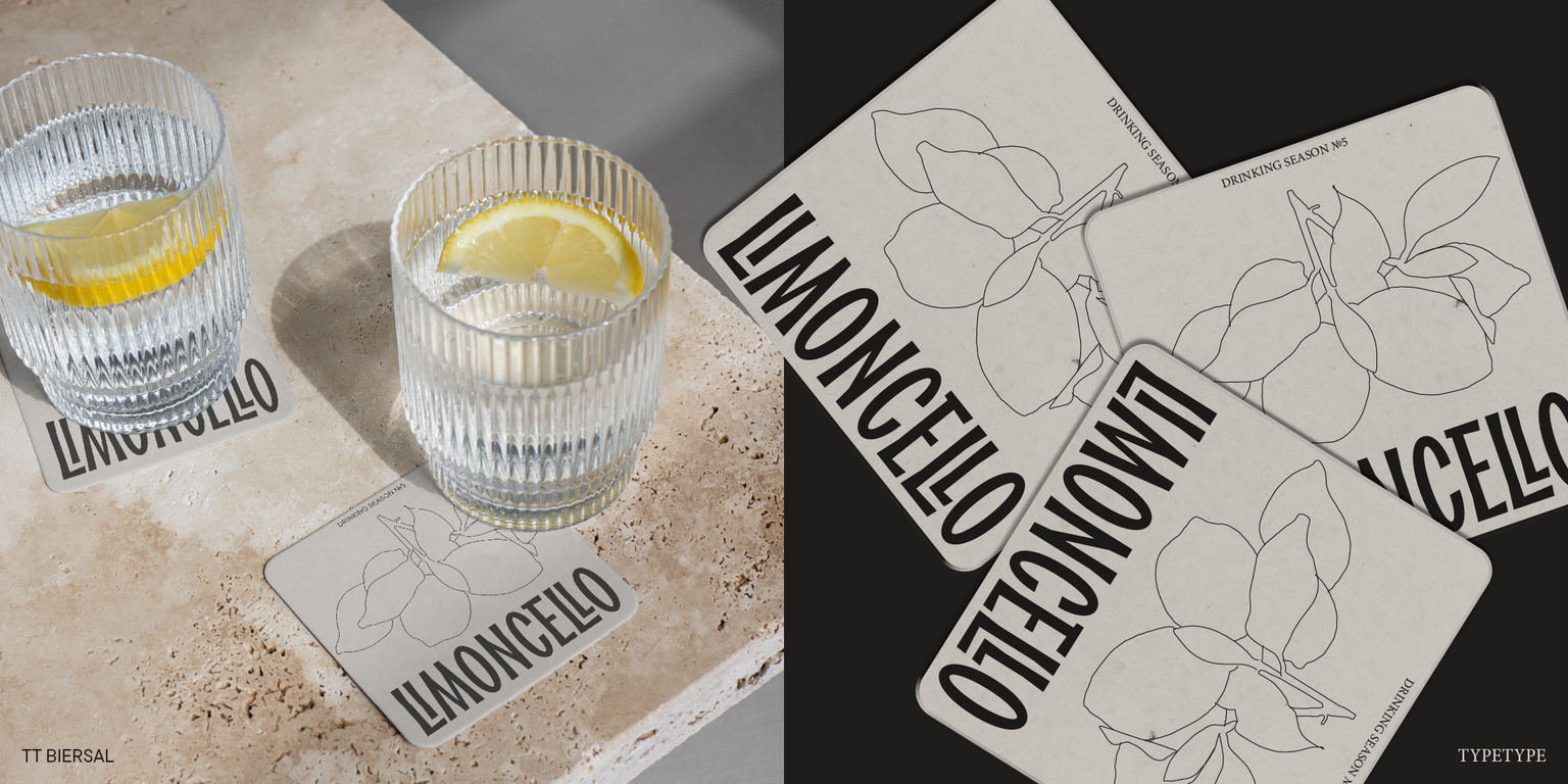
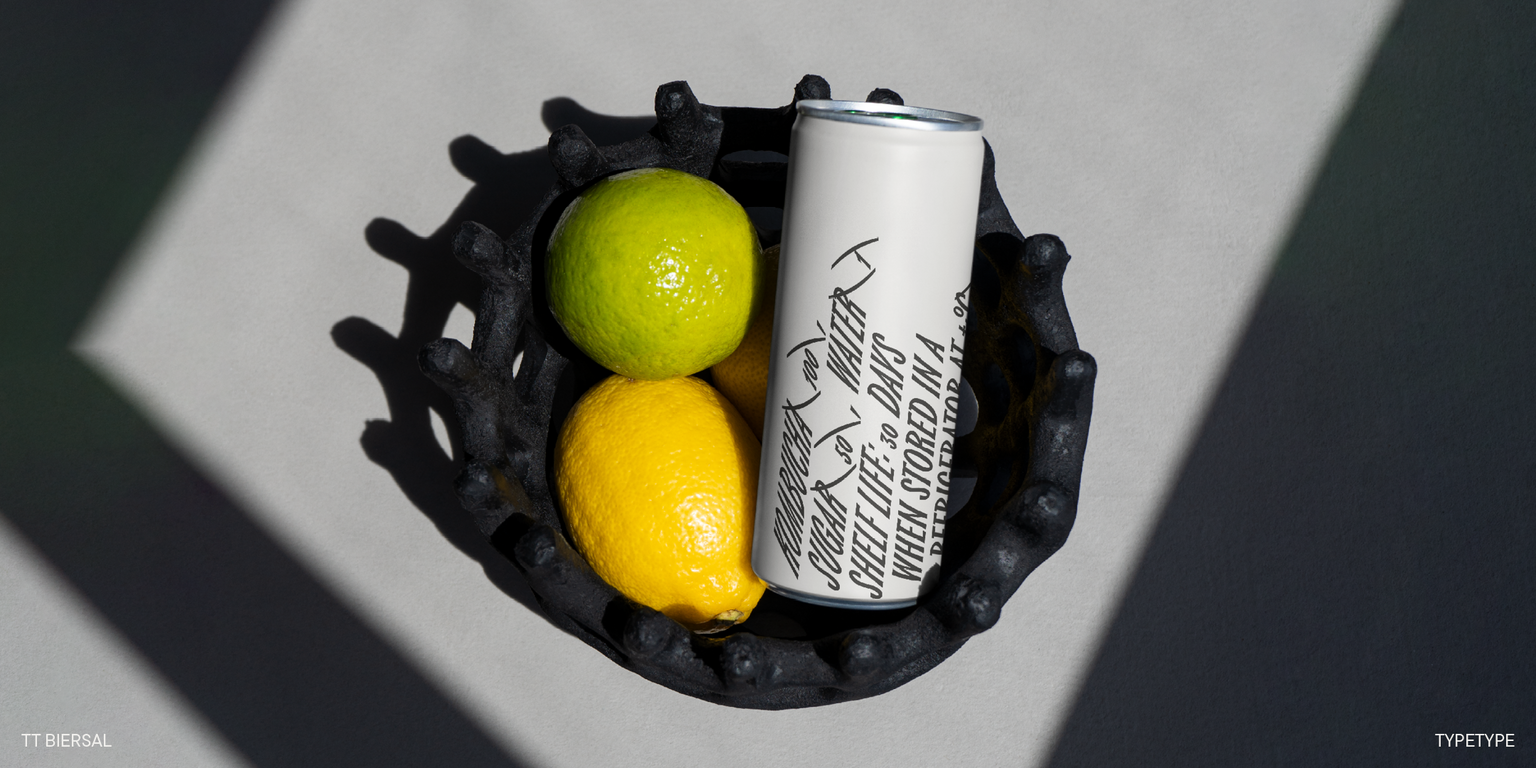
TT Biersal is a perfect match for music festivals, exhibitions, or movie posters. The font’s energetic character will infuse any design with a daring touch. Apart from that, the font’s handwritten origin makes it well-suited for crafting the visual identity of brands focused on handmade products.

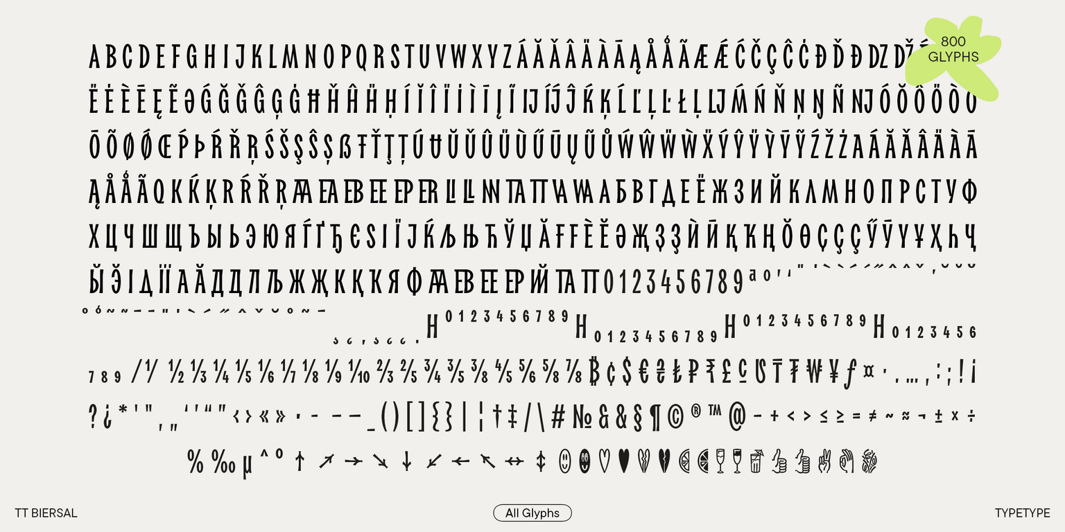
TT Biersal includes:

  • 6 font styles: 1 roman, 2 italic, 2 retalic, and one variable font with a slant variation axis;
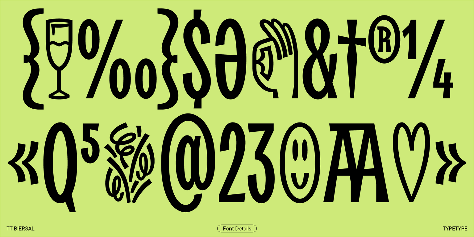
  • 799 characters in each font style;
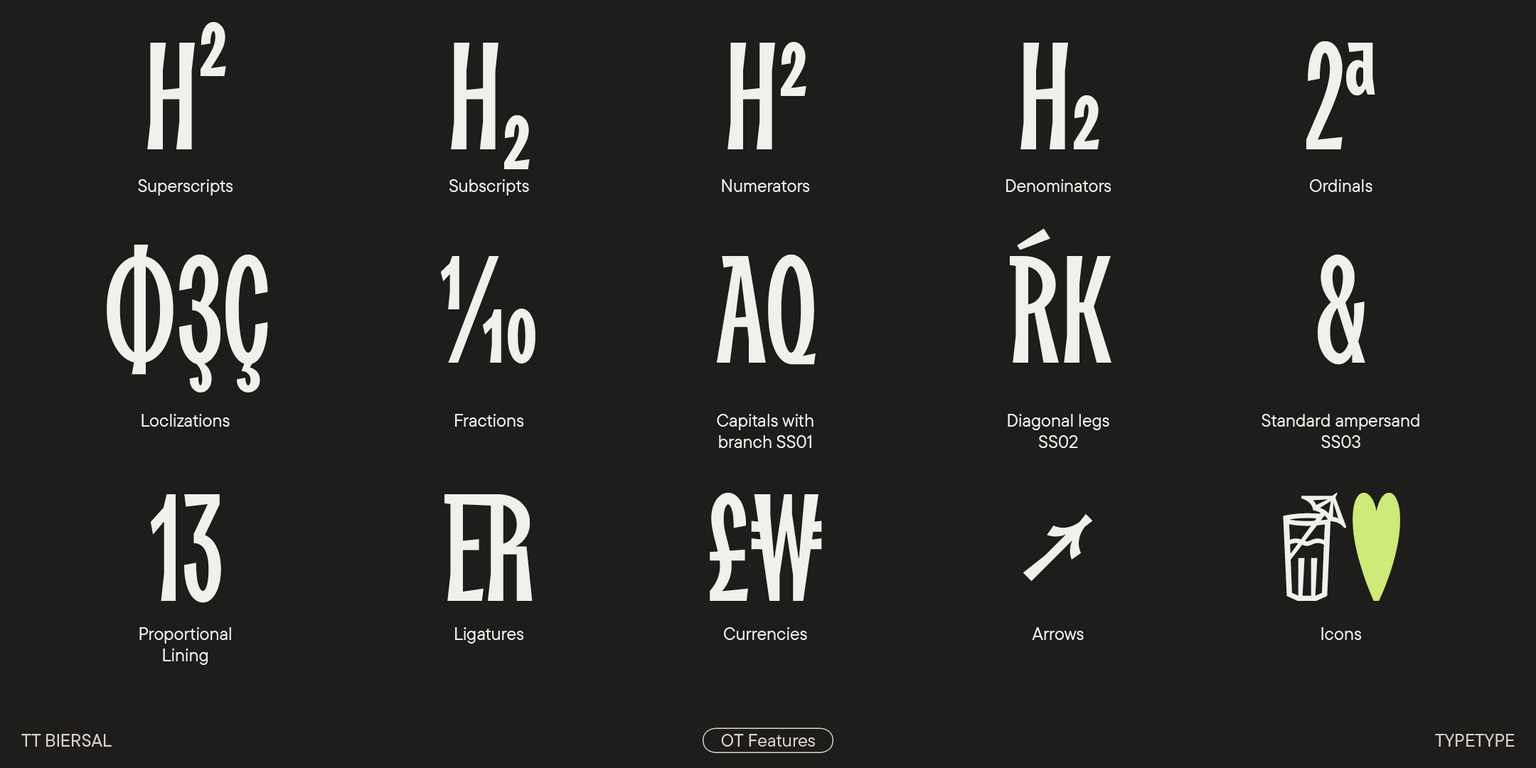
  • 22 OpenType features;
  • 230+ supported languages.

TT Biersal — the life of the font parties!

Release date

1 October, 2024

Additionally

Specimen

Download font specimen (pdf)

Poster Images

Graphic presentation at Behance

Custom version

Looking for a custom version of this font?

+ extended writing system Show all

Character Set

Basic Latin Basic Cyrillic Figures Punctuation Extended Latin Extended Cyrillic Math symbols Currencies Arrows Icons
A B C D E F G H I J K L M N O P Q R S T U V W X Y Z a b c d e f g h i j k l m n o p q r s t u v w x y z
А Б В Г Д Е Ё Ж З И Й К Л М Н О П Р С Т У Ф Х Ц Ч Ш Щ Ъ Ы Ь Э Ю Я Ѓ Ґ Ќ Є Ї Љ Њ Ћ Ђ Ў Џ а б в г д е ё ж з и й к л м н о п р с т у ф х ц ч ш щ ъ ы ь э ю я ѓ ґ ќ є ї љ њ ћ ђ ў џ
0 1 2 3 4 5 6 7 8 9 0 1 2 3 4 5 6 7 8 9
· . . . . , : ; ! ¡ ? ¿ * ' " « » - _ ( ) [ ] { } | ¦ / \ # & § © ® @ ^ °
Á Ă Ǎ Â Ä À Ā Ą Å Ǻ Ã Æ Ǽ Ć Č Ç Ĉ Ċ Ð Ď Đ DZ Dž É Ĕ Ě Ê Ë Ė È Ē Ę Ə Ǵ Ğ Ǧ Ĝ Ģ Ġ Ħ Ȟ Ĥ Í Ĭ Î Ï İ Ì Ĩ Ī Į IJ í j Ĵ Ķ Ĺ Ľ Ļ Ŀ Ł Lj Ń Ň Ņ Ŋ Ñ Nj Ó Ŏ Ô Ö Ò Ő Ō Õ Ø Ǿ Œ Þ Ŕ Ř Ŗ Ś Š Ş Ŝ Ș Ŧ Ť Ţ Ț Ú Ʉ Ŭ Ǔ Û Ü Ù Ű Ũ Ū Ų Ů Ŵ Ý Ŷ Ÿ Ȳ Ź Ž Ż
Ӑ Ғ Ғ Ѐ Ӗ Ә Җ Ҙ Ҙ Ѝ Ӣ Қ Ҡ Ң Ө Ҫ Ҫ Ҫ Ӳ Ӯ Ү Ұ Ҳ Һ Ҷ Ӏ
+ < > = ~ ¬ ± × ÷ % μ a o 1⁄
¢ $ £ ¥ ƒ ¤

OpenType features

dlig | Discretionary Ligatures

EB

EB

frac | Fractions

1/2 4/5

1/2 4/5

ss01 | Capitals with Branch

ÁĂǍ

ÁĂǍ

ss02 | Diagonal Legs

KḰĶ

KḰĶ

ss03 | Standard Ampersand

&

&

ss04 | Romanian Comma Accent

ŞŢ

ŞŢ

Show all

Ideal font pairs with TT Biersal

What is a font pair, and what does it serve for?

A font pair is a combination of two fonts within one text block. Most often, one of the fonts in a pair is a more expressive headline font, and the other one serves to communicate information. Such fonts complement each other and help designers solve various tasks, like highlighting key elements, adding emotional expressiveness to the project, or separating semantic blocks.

How to choose fonts for a project: Several general recommendations

To begin with, establish the project’s tone. Choose the fonts that stylistically match the main idea. After that, you need to determine the functions of each font in the project and their hierarchy: which font will complement the design and which one will serve to attract attention as the main element. You need to assess the difference between the fonts and decide what kind of information each of them should convey. First, we recommend choosing the base font you will use most, and then you can find a suitable pair for it.

Core principles of font pairing and recommendations from designers

The main rule you should follow when matching two fonts is that both similarities and differences must be visible between them. You can highlight the coherence of fonts by the following characteristics: contrast, proportions, width, openness of characters, individual letter shapes, and overall tone. Feel free to experiment with different combinations. We also recommend analyzing the projects you like: this way, you can enhance your visual skills, elevate your knowledge base, and gain confidence in dealing with typography.

Similar fonts

5 font styles
19 font styles
6 font styles
Buy font