The font design studio TypeType and branding company Pinot Agency combined fonts and wine to create “font wine” — a project that originated in conversations over sparkling wine and grew to cosmic proportions. What is it and how should you enjoy it? We’ll tell you in this article!
Summer, Fonts, Wine
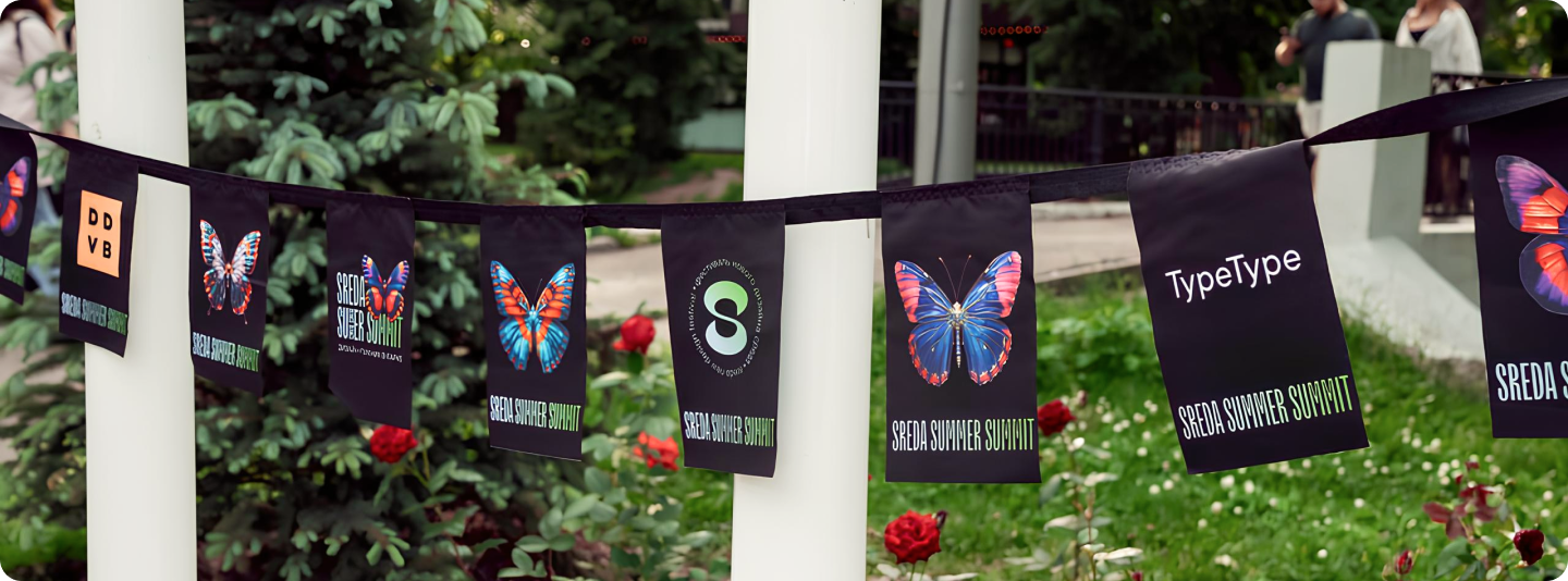
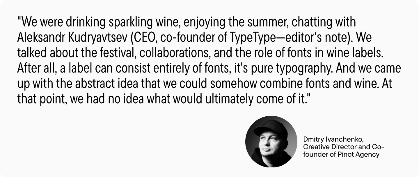
It all began in the summer of 2024. TypeType Studio became a partner of the Sreda Summer Summit festival, and there we met with colleagues from Pinot Agency.
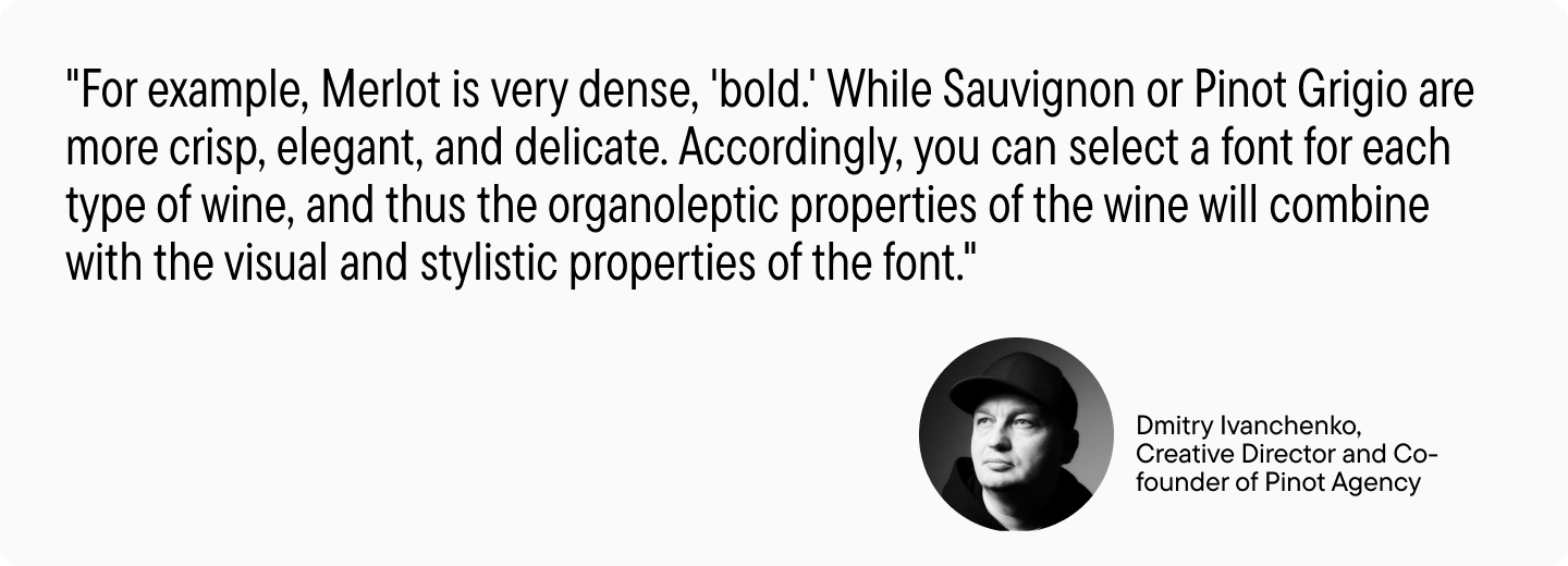
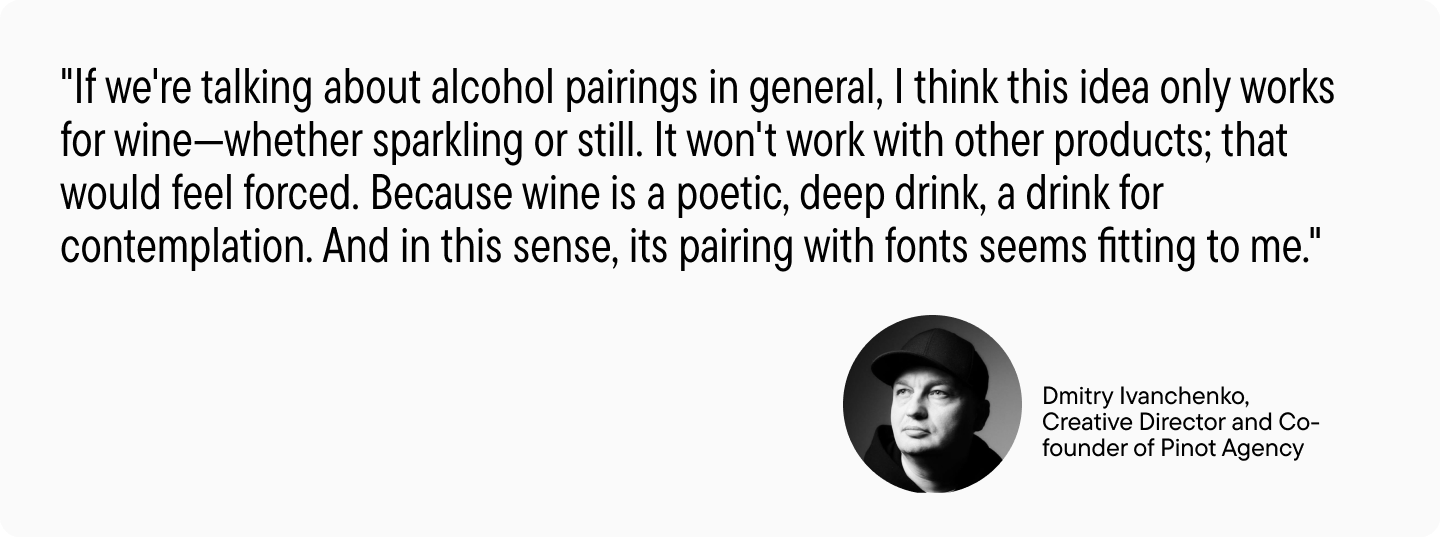
Initially, the team from the agency proposed creating a wine-font pairing. The idea was that each font, like each wine variety, has its own unique character. And, when united, they can highlight each other’s distinctive features, mood, and spirit.
We decided to try implementing this concept: take several wine samples and match them with suitable fonts from the TypeType collection.
So, the project received the working title “font wine,” and we moved on to the most interesting part — selecting wine-font pairs through tasting.

Wine-Font Pairing
The tasting took place at the TypeType office. Font designers and other studio employees participated, as well as representatives from Pinot Agency. We obtained nine wine samples from our partners, Ladoga company: three reds, three whites, and three sparkling wines. Based on the tasting results, we needed to select three samples (one from each group) and three fonts that matched them.
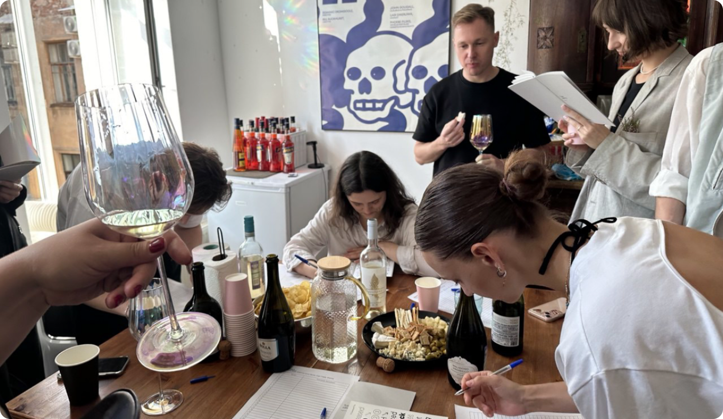
Each tasting participant could vote for one wine from each category that they liked the most and write down which font they associated with the chosen variety and why.
The top three pairs were:
- Red wine Stigelmar Zweigelt Pur Burgenland and TT Ricks font. According to participants, the wine is mineral, prickly, like the spikes of TT Ricks. It has a bold, mysterious character, just like the font.
- White wine Torotoro Marlborough Sauvignon Blanc and TT Neoris font. The wine has a fresh, well-balanced taste, much like the font design. At first, it seems simple, but upon careful examination, it reveals interesting details.
- Sparkling wine Glera Spumante Fonte Extra Dry and TT Ricordi Allegria font. They share elegance, refinement, lightness, grace, and Italian origins.
The sparkling wine received the most votes (it has long held a special place in our office refrigerator and in our hearts). So we decided to start with it.
A Metaphor of Cosmic Proportions
We realized that the pilot version should be more general and comprehensive, going beyond the original idea.
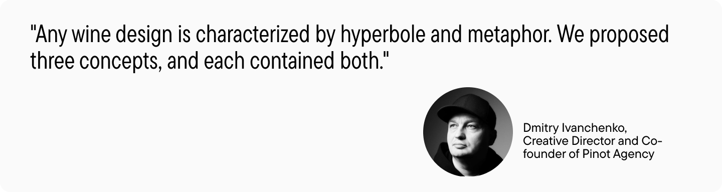
In the first concept, Pinot Agency emphasized that there are always people behind the fonts who create them. This resulted in a collective image of a “font god,” around whom different fonts revolve in orbit.
However, we wanted to make the metaphor deeper, more powerful, and extensive. Therefore, in the second concept, we compared the process of creating a font to how a tree grows.
But even this idea didn’t seem global enough. So a third concept emerged, which became the foundation for further work.
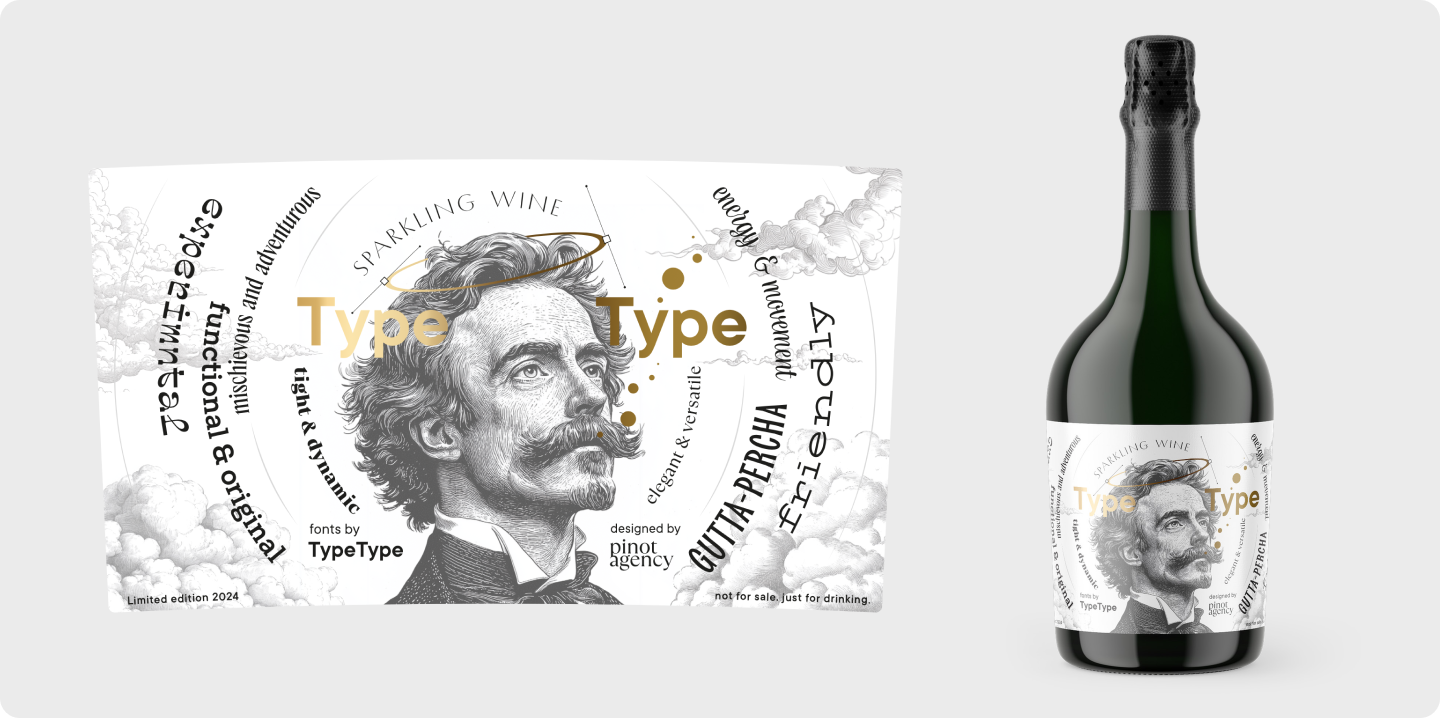
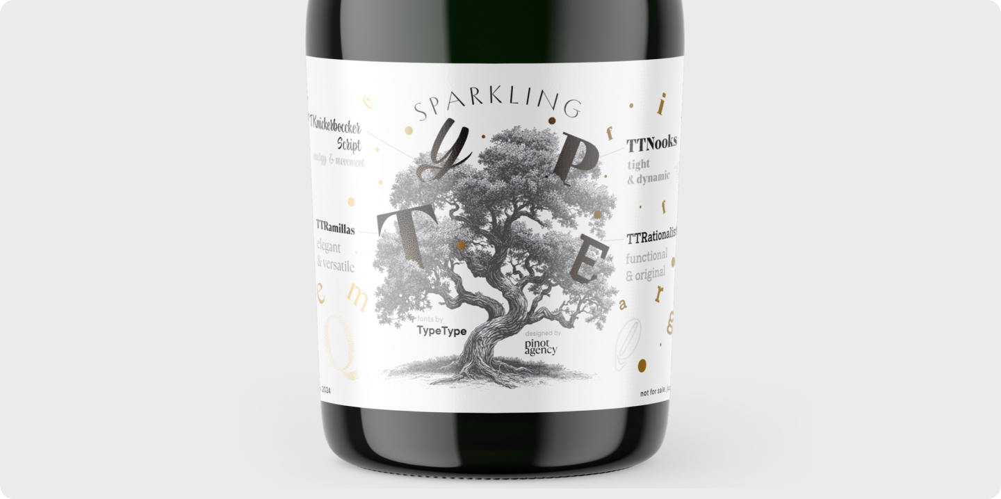
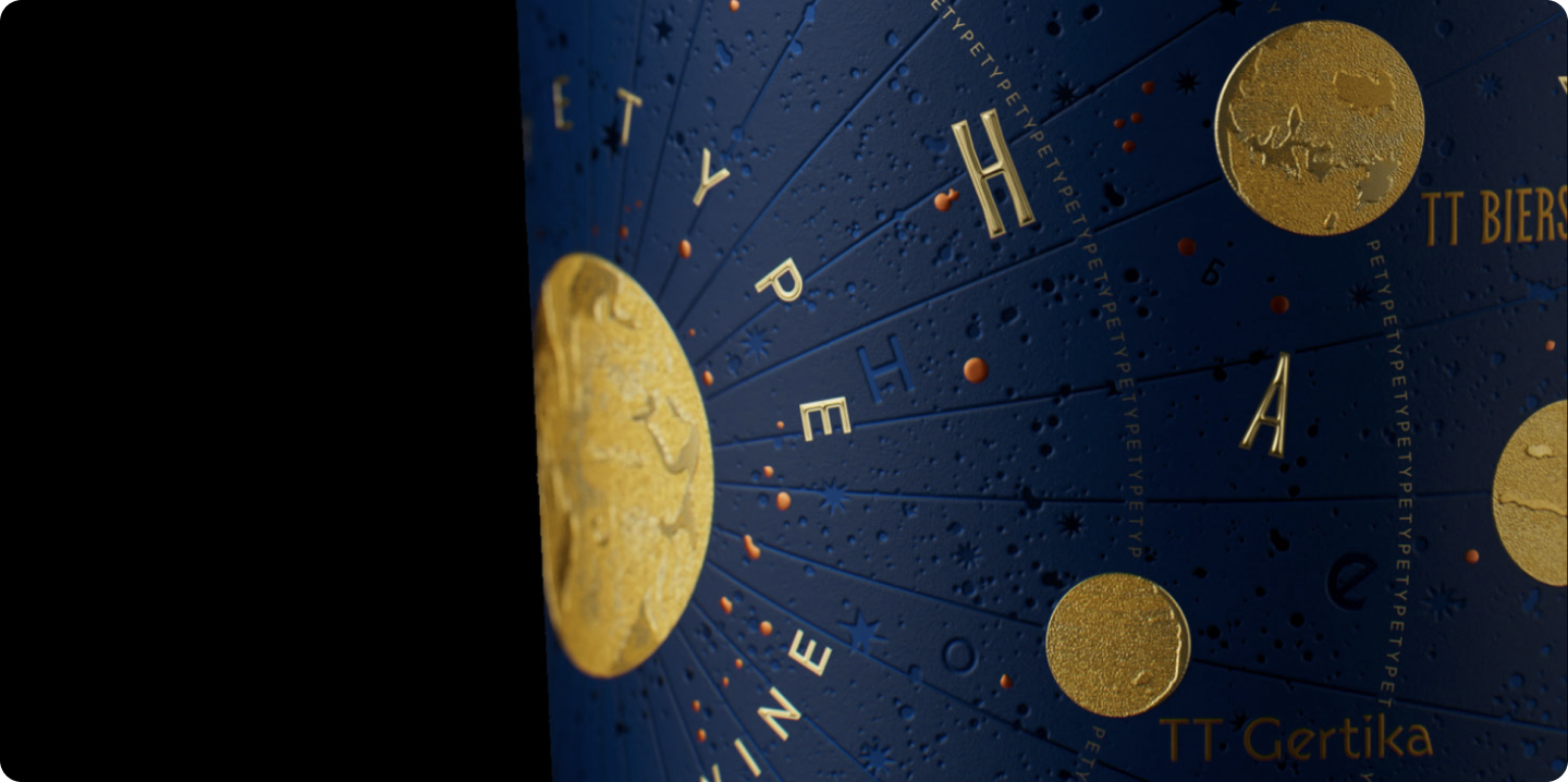
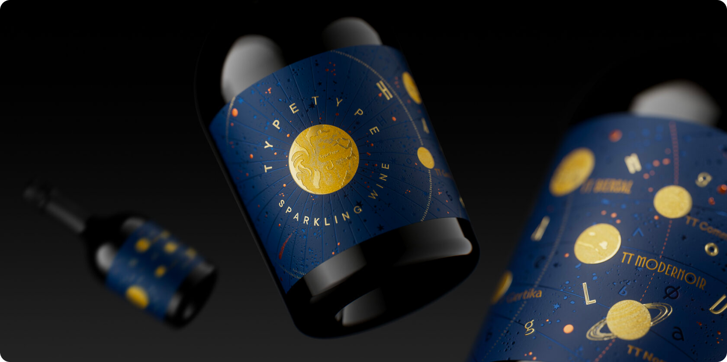
Map of the Font Universe
To bring this idea to life, Pinot Agency went to great lengths in terms of technology. Financial Papers Plus, a typography company from Moldova that became a partner in the project, played a major role in implementing the concept. They specialize exclusively in wine labels with in-depth detailing of various printing effects.
The textured Fasson Watermark paper became the foundation, helping to create depth and add texture and tactility to the label.
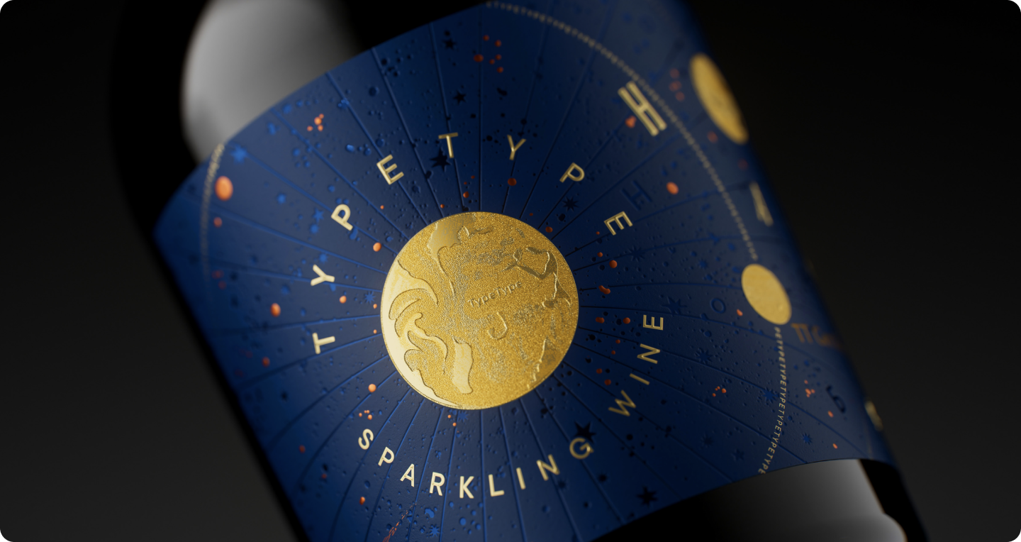
The mysterious twinkling of the stars was achieved with copper gel, and the planets were designed with embossing, adding a matte texture. On the sun, symbolizing TypeType, you can see the company name executed in micro-embossing.
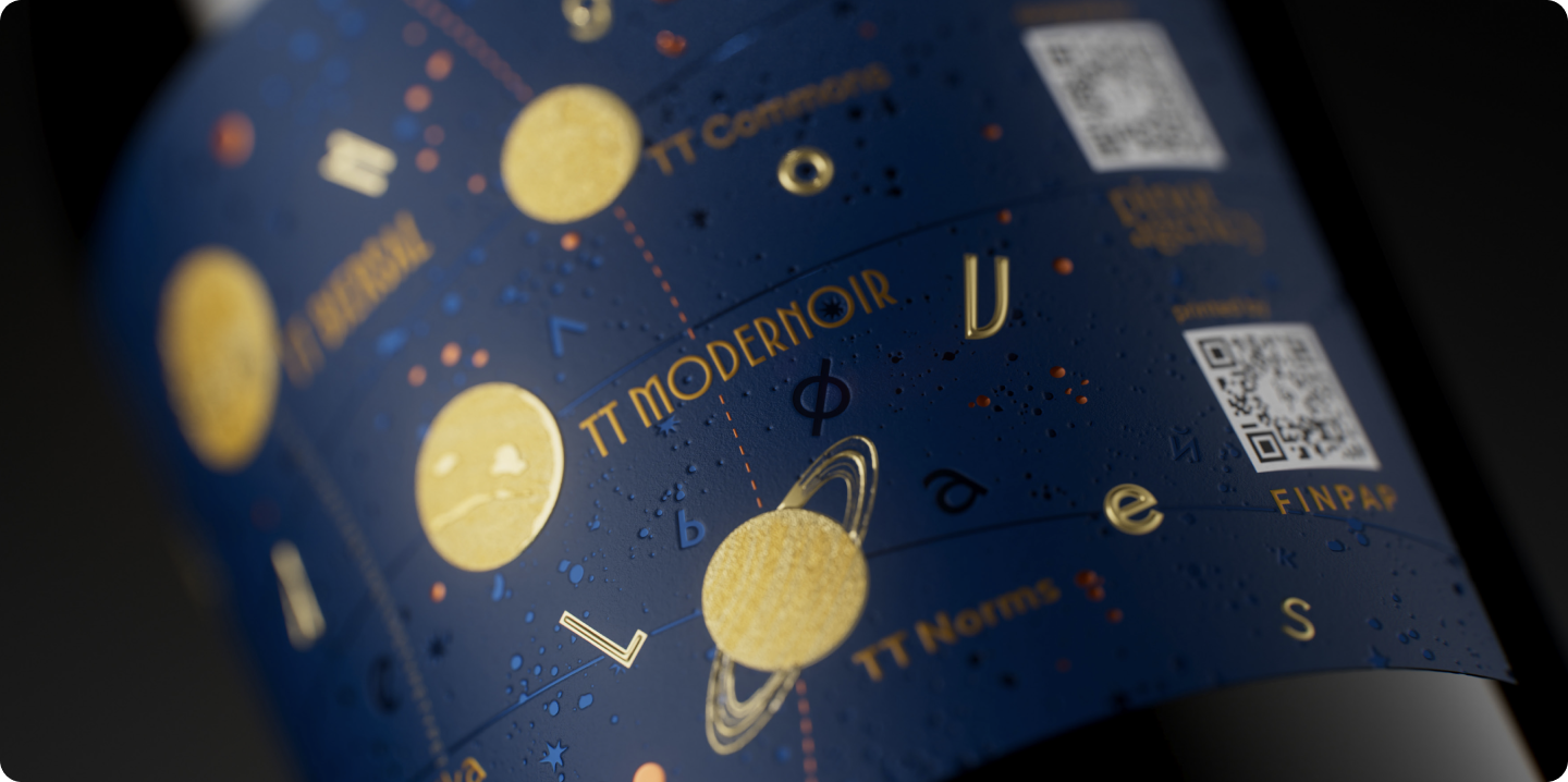
The letters “flying” across the label appear here for a reason — they’re an Easter egg of sorts. These letters spell out the word “handgloves,” which font designers use as a reference when creating a font. It doesn’t have a special meaning but consists of characteristic characters that help determine if the font works. These characters are always drawn first.
Another interesting detail is the orbit of our “font sun.” If you look closely, it consists of repeated words “typetype,” set in small letters.
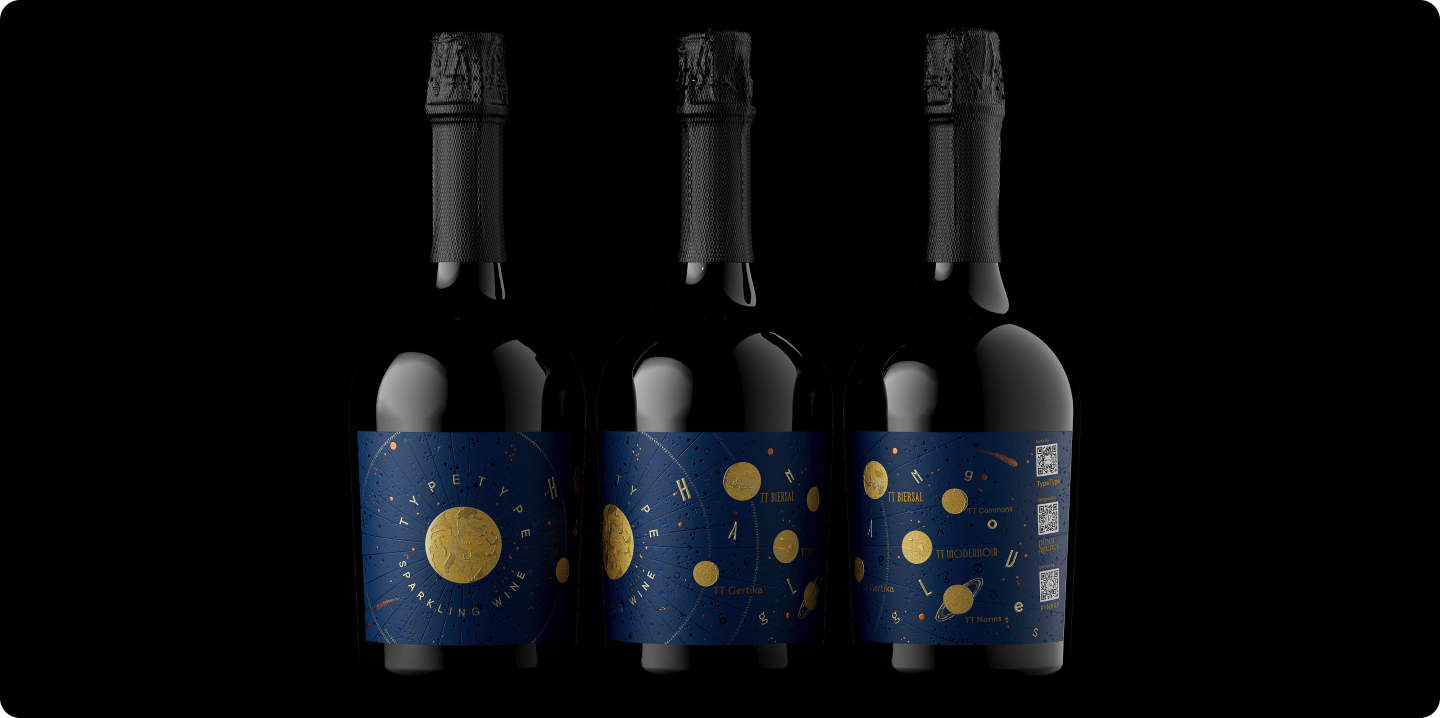
As a result, we released a series of branded bottles, with labels that became a kind of map of the Font Universe. By rotating the bottle in your hands, you can explore it, discovering new facets of the drink and nuances of the design.
Three, Two, One… Launch!
The project was officially named “Type&Wine. Font Universe.”
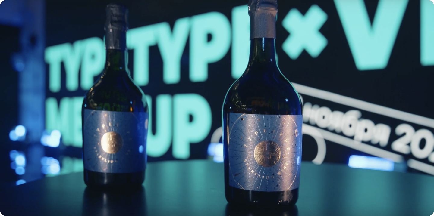
We deeply cherish this project and gift branded bottles to our friends and partners. And, of course, we plan to develop the idea further — stay tuned for updates!