
Text without structure quickly loses the reader. Even if the thought is strong and the arguments are precise, a solid wall of text is tiring, making it hard to read the main points and systematically absorb information. That is why tools that help to organise information are so important in articles, presentations, interfaces, instructions, educational materials, and other documents. One of the simplest and most helpful among them is bullet points.
In this article, we will break down what are bullet points, when to use bullet points effectively, how to format them correctly, and how to quickly insert bullet points using a shortcut key in Microsoft Word, Google Docs, Excel, PowerPoint, and Adobe InDesign. At the same time, we will show bullet points examples and explain why a list with bullet points is a fully-fledged tool for working with text.
What Are Bullet Points?

Bullet Points Meaning in Writing
A bullet, bullet point, or bullets is a list marker, meaning it is a special symbol or glyph placed before each item in a list. Most often, it is a round dot, but in practice, the marker can be a square, dash, diamond, arrow, or any other symbol.

The main purpose of bullet points is to show that the reader is not looking at an ordinary paragraph, but a list of separate yet related items. This way, the text becomes much easy to read.
So, a bullet point in writing acts as a visual anchor. It helps to instantly understand where a new point begins, how many items are in the block, and how they relate to one another.
Bullet Points vs Numbered Lists
A bulleted list is used when the order of the items is not critical. For example, if you are listing product features, service advantages, or elements of a corporate style, it is more convenient to use bullet points.
A numbered list is needed in a different situation — when there is a sequence between the items. These could be steps in a guide, project stages, a course of action, hierarchy, and so on.
Remembering the difference is easy:
- If the items can swap places without losing meaning, a bulleted list is suitable;
- If the order is important, it is better to use numbers.
The Purpose of Bullet Points
Bullet points in writing are necessary to:
- organise information;
- make reading easy;
- highlight important items;
- break down long enumerations within a paragraph;
- make the material looking neater visually.
This is exactly why bullet points are so commonly found in articles, presentations, a resume, commercial offers, interfaces, and educational materials. They save the reader’s attention and help them get to the point faster.
When to Use Bullet Points
Organizing Information
The first and most obvious scenario is when you want to gather several theses, properties, or features in one place. In a regular paragraph, such an enumeration quickly begins to fall apart. In a list, conversely, each point gets its own place.
For example, if you are explaining what to look at when choosing a font for an interface, it is more logical to format it like this:
- readability at a small point size;
- distinguishability of similar characters;
- support for the required languages;
- behaviour in tables and forms.
Such a list looks sharper and is read faster than a long sentence with many clarifications.
Making Text Easier to Read
People rarely read digital text strictly top to bottom without looking away. More often, they scan the page, looking for keywords, brief phrasings, highlighted blocks, and clear entry points. A list with bullet points creates exactly these entry points.
Using bullet points works especially well where it is vital to quickly convey the meaning:
- in instructions;
- on landing pages;
- in email newsletters;
- in articles with practical advice;
- in presentations;
- in product and service cards.
If a paragraph has too much homogeneous information, a list helps to declutter the text, break it into semantic blocks, and make it visually simpler to perceive.
Highlighting Important Points
A list marker works well as an accent tool. When you want to bring key takeaways, recommendations, requirements, or errors to the surface, markers help to show: this particular block is especially important.
For example:
Before approving a font for a brand, it is worth checking:
- how well the numbers are read;
- what the punctuation marks look like;
- whether there are enough styles for different tasks;
- if there is the necessary language support;
- whether the font’s character matches the brand’s tone.
Such a format converts an abstract explanation into a clear checklist that can realistically be used in work.
Using Bullet Points in Professional Writing (emails, resumes, presentations)
A bulleted list has long become the standard for business and professional communication. It is used in instructions, commercial offers, presentations, a resume, reports, training materials, product cards, emails, and internal documents. Wherever it is crucial to quickly convey the essence, bullet points help organise information and make it easy to digest.
For example, it is convenient to use bullet points to:
- list project tasks;
- record requirements;
- show preparation stages;
- highlight main conclusions;
- gather recommendations in one block.
Such a format makes professional writing clearer, more structured, and more practical.
Bullet Points Examples
Below are a few concrete examples of how a bulleted list might look in different text formats.
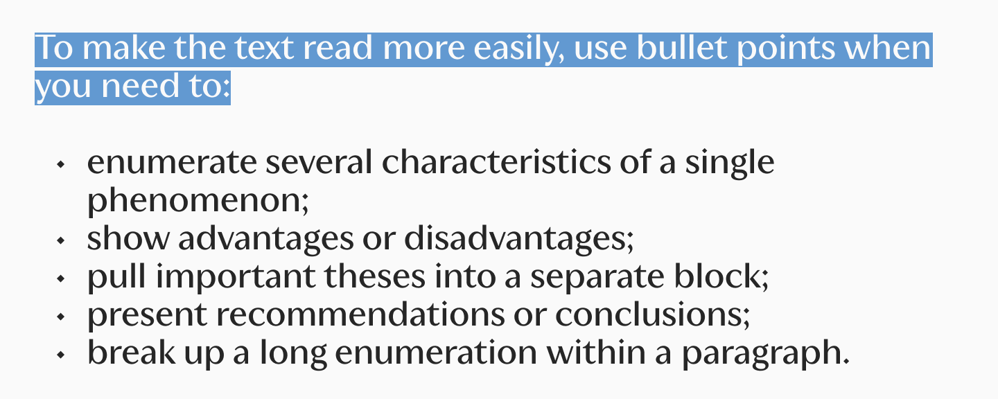
Example 1. List in an Article
Such a bulleted list is suitable for an explanatory or educational text where you need to briefly list the main thoughts:
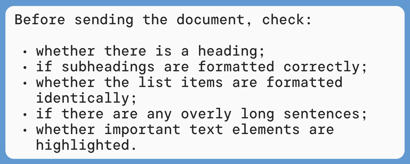
Example 2. List in an Instruction
If it is important for the reader to quickly understand what to do, a bulleted list helps show steps or requirements in a visual form:
Example 3. List in a business e-mail
In work correspondence, a bulleted list helps quickly gather key information in one place:

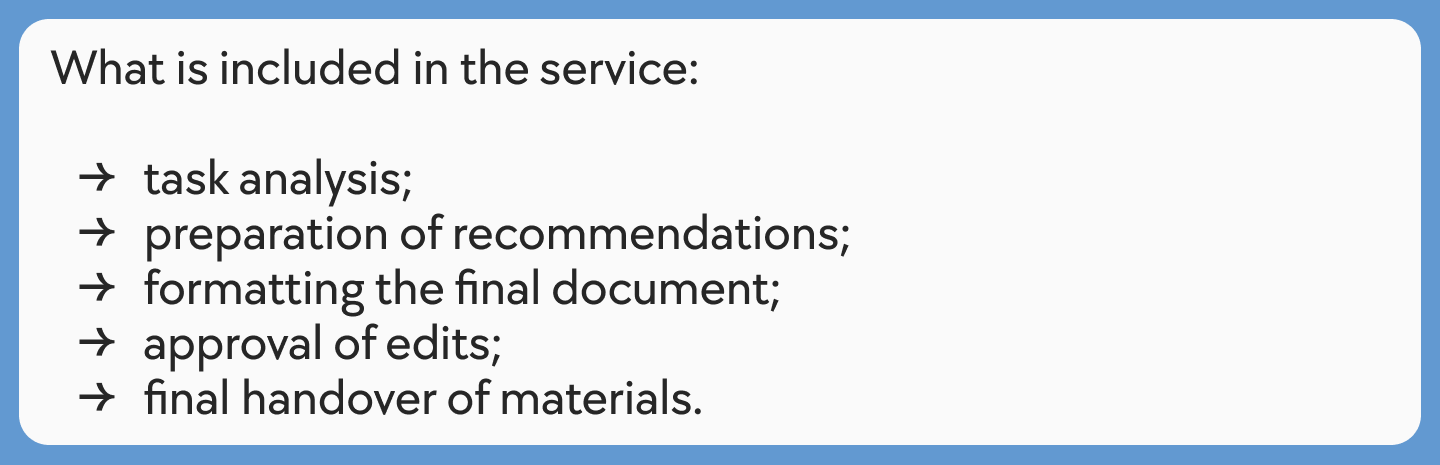
Example 4. List on a Website or Service Card
In commercial writing, bullets are often used to briefly show what the client gets:
Example 5. List in a Resume
In a resume, bullet points help quickly show responsibilities, skills, or achievements:

Example 6. List with Recommendations
This format works well in articles and guides when you need to give the reader short, practical tips:
Example 7. List with Errors
Bullet points are also convenient for listing typical mistakes:
Such examples of bullet points shows that bullets can be used in a wide variety of texts — from an article and instruction to a letter, resume, or commercial offer. The main thing is that the list helps the reader grasp the information faster, and doesn’t just inexplicably fragment the text for the sake of formatting.
How to Use Bullet Points Correctly
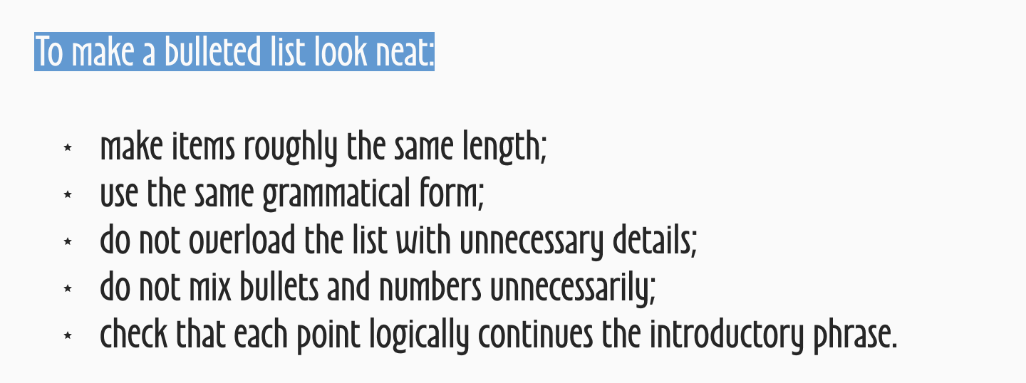
Basic Rules for Using Bullet Points
A good list is not just a set of lines with icons. For it to look professional and genuinely help text comprehension, it is important to follow a few basic rules.
First, the list must logically continue the introductory phrase. If a colon is introduced after it, each point must be grammatically read as a continuation of that sentence.
Second, within a single list, it is better to maintain the same form. If the first point starts with a verb, the rest should also be built the same way. If the first point is a short noun, you shouldn’t suddenly turn the next one into a detailed complex sentence.
Third, you need to monitor punctuation consistency. When one point ends with a full stop, the second with nothing, and the third with a semicolon, the list looks sloppy.
Formatting Bullet Points in Text
Formatting affects perception no less than the phrasing itself. Even a list that is good in meaning can be ruined if the markers are placed chaotically, the lines are too long, and there is no air between the items.
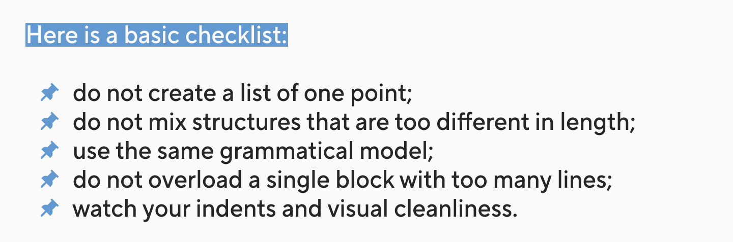
Check:
- whether the indent is the same for all elements;
- if there is a stable space between the marker and the text;
- whether the items are too long;
- if nested levels (sub-lists) are needed;
- whether the chosen symbol suits the overall style of the material.
How to Type Bullet Points on a Keyboard
Keyboard Shortcut for Bullet Points (Windows)
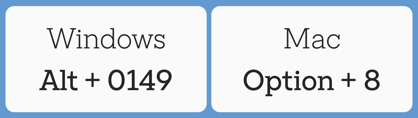
If you need a single symbol (a bullet), Windows users often use an Alt code. One of the most well-known options is to hold Alt and type 0149 on the numeric keypad (numpad). After that, the • symbol appears in the text.
But it is important to understand the difference between two tasks:
- inserting a single symbol;
- creating a fully-fledged bulleted list.
If you specifically need a list, it is almost always better to use the program’s built-in tool. You can find it on the top toolbar panel.
Bullet Points Shortcut on Mac
On a Mac, to insert bullet points, the keyboard shortcut Option + 8 is usually used. This is a fast way to get a bullet dot in the text.
But, just like in Windows, for documents, presentations, and layouts, it is safer to use the bulleted list function. This way, you instantly get the correct indents, nesting, and a uniform formatting style.
How to Type Bullet Points Without a Numpad
If there is no numeric block, you can use other methods:
- copy the • symbol and paste it;
- select the icon via the “Insert → Symbol” menu;
- turn on the bulleted list through the toolbar panel;
- in Word, type * and a space to automatically convert the line;
- in Google Docs, click the bulleted list button.
For everyday work, this is usually faster and more convenient than looking for an individual symbol manually.
How to Insert Bullet Points in Popular Programs
Insert Bullet Points in Microsoft Word
How do you make bullet points in Word? It is very easy. Simply place the cursor in the desired spot and click the “Bullets” button on the “Home” tab. After that, you can enter the items one by one, pressing Enter for a new element.
There is also a second fast way: start the line with the * symbol, press space — and Word will automatically convert the line into a list with bullet points.
If you need to change the look of the bullet, Word allows you to select a different icon or define your own symbol manually.
How to Add Bullet Points in Google Docs
In Google Docs, a bulleted list is turned on via the toolbar panel. Just click on the bulleted list icon and start typing.
Adding Bullet Points in Excel
In Excel, bulleted lists are used a bit differently because the program is primarily designed for tables, not for continuous text. Most often, a bulleted list is inserted directly within a cell.
This is convenient if you need to format in a table:
- short characteristics;
- a set of options;
- a list of functions;
- several theses within one cell.
If there are multiple elements, you can use a line break inside the cell and repeat the marker for each new point.
Bullet Points in PowerPoint
In PowerPoint, bullets are especially helpful because they help prevent turning a slide into a heavy paragraph. Instead of dense text, it is better to use short bulleted lists, each of which supports the speaker’s main thought.
These rules work well for slides:
- one point — one short thought;
- without long sentences;
- minimal nesting;
- only genuinely important theses.
Creating Bullet Points in Adobe InDesign
In Adobe InDesign, bullets are already part of professional text setup. Here it is important not just to insert an icon, but to embed the list into the system of paragraph styles.
This is particularly helpful if you are typesetting:
- an article;
- a catalogue;
- a brand guide;
- a presentation document;
- a multi-page PDF.
If bullets are tied to styles, they are easier to edit, align, and maintain uniformly throughout the layout. For any editor or designer, this is much more convenient than manually editing each point.
Tips for Using Bullet Points in Professional Documents
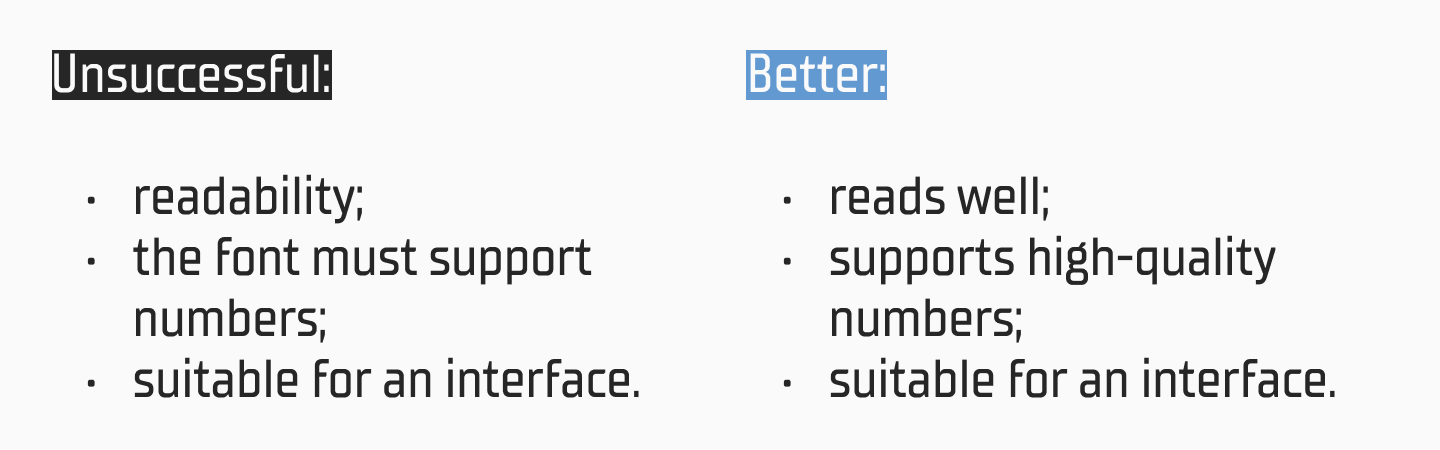
Keep Bullet Points Short
One of the main principles is not to turn a list item into a small paragraph. If a line occupies several long phrases, the list loses its main advantage: reading speed.
Better like this:

The shorter and more precise the phrasing, the stronger the list works.
Maintain Parallel Structure
When items are built on the same model, the list looks cleaner and more professional. It is a minor detail, but it is precisely these minor details that shape the impression of the text.
Avoid Too Many Bullets
Bullet points are helpful, but not universal. If the entire article consists only of lists, it starts to sound dry and looks like an instruction, not a lively text.
A list works stronger when it appears for a reason. If every block on the page is converted into a list, the accent gets blurred.
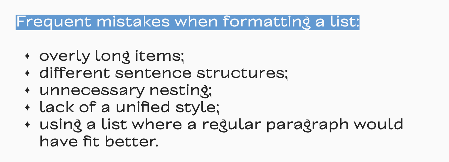
Common Mistakes When Using Bullet Points
The most frequent mistake is using bullet points where there is actually no list. If a thought is better developed through a coherent paragraph, you shouldn’t artificially fragment it.
Other common mistakes:
- a list of one point;
- overly long wordings;
- different grammatical structures within one block;
- chaotic punctuation;
- too many nesting levels;
- manual insertion of symbols instead of using the built-in list tool;
- absence of an introductory phrase before the enumeration.
Another important mistake is treating markers as a purely decorative element. In reality, a list is a part of the text’s structure. And if it is assembled carelessly, it reflects on the entire material: it begins to look less convincing, less neat, and is simply harder to read.
Conclusion
Bullet points in writing are a simple tool that solves several tasks at once: it helps organise information, makes the text easier to read, highlights important items, and adds visual rhythm to the page. That is why bulleted lists are so actively used in articles, interfaces, presentations, documents, and brand communication. But bullet points truly work well only when they are integrated into the overall logic of the text.
FAQ
What are bullet points in writing?
Bullet points in writing are list markers, meaning they are icons placed before the items in an enumeration. They help separate elements from each other and make the text more structured.
What is the purpose of bullet points?
Bulleted lists are used to simplify reading, highlight what is important, gather several theses in one block, and make the material visually clearer.
When should you use bullet points?
When the order of elements does not matter. If you are listing properties, features, advantages, functions, or examples, it is better to use bullet points. If the sequence is important, a numbered list will do.
How do you type bullet points on a keyboard?
On Windows, users often use Alt codes with the numeric keypad. On Mac — the keyboard shortcut Option + 8. But if you need not a single symbol, but a full list, it is better to turn it on via the editor’s functions.
What is the keyboard shortcut for bullet points?
Different combinations are used for the bullet symbol itself depending on the system. In Word, you can also start a line with a * and a space to automatically get a bulleted list.
How do you insert bullet points in Microsoft Word?
Place the cursor in the right spot, click the “Bullets” button on the “Home” tab, and type the first point. For the next point, press Enter.
How do you add bullet points in Google Docs?
Click the bulleted list icon on the toolbar panel and start typing. For a nested point (sub-list), use Tab.
What is the difference between bullet points and numbered lists?
A bulleted list is suitable for items without a strict order. A numbered list is for steps and sequences where it matters what comes first, second, and so on.
How to correctly format list items?
It is better to make them short, uniform in structure, with the same punctuation style and neat indents. You shouldn’t overload the list with long phrases and overly complex nesting.