A font family is one of the base concepts of modern typography, constantly encountered in the work of a designer, marketer, developer, and branding team. Often, there is confusion in terminology: what is considered a font, what is a typeface, and what is a family? Why are Arial, Helvetica, or TT Norms® Pro called a font, a typeface, and a family all at once? What types of families exist and how do you understand which ones suit specific tasks?
In this article, we will break down the font family definition, explore what types of font families exist, explain how a family differs from a font and a typeface, detail what is included in a font family, and guide you on how to make the best choice for a website, UI interface, and brand.
What is a Font Family?
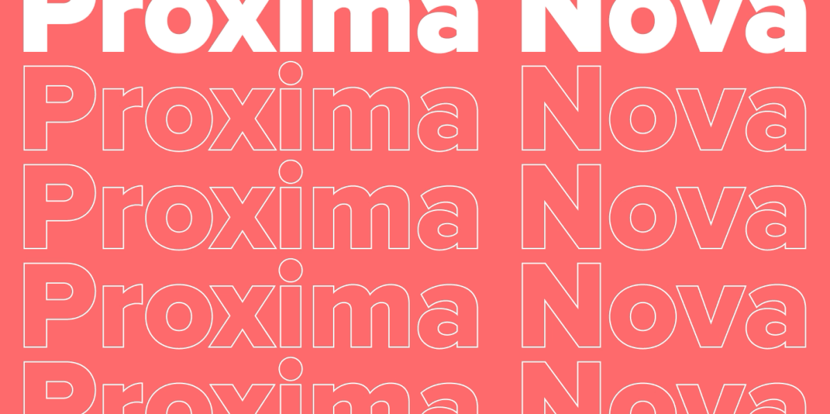
A font family (or type family) is a group of related fonts united by a common name, a shared visual idea, and related graphic features. Simply put, it is not just one font, but an entire system of variations that complement each other and can be used in different tasks within a single project.
For example, a family might include regular, medium, bold, black, italic, condensed, and other font family styles. They differ in weight, width, slant, or purpose, but look like parts of one cohesive design concept. This is exactly why a font family is so convenient for work: it helps build visual hierarchy and add variety to the design while preserving a single style throughout the project.

Font vs Font Family vs Typeface: What is the Difference?
This is one of the most frequently asked questions when it comes to typographic terminology. We have already covered this in detail in our article about the difference between a font and a typeface, and here we will briefly capture the main points.
A font is a complete set of characters (letters, numbers, and symbols) for typesetting text, united by a specific style. Within a typeface or a typeface family (or type family), there can be several fonts. However, in practice, the term “font” is often used to refer to the typeface itself and a specific style.
A font family (or type family) is a collection of related fonts combined into one system.
A typeface is a closely related concept often used as a synonym for a font family. In some interpretations, the typeface also refers to the visual principle itself, based on which different fonts and styles are created.

Why is it important to understand the font family vs typeface distinction? Imagine a technical brief says: “Use such-and-such font.” But it doesn’t specify what it means—an entire family or a specific style. As a result, the designer might choose one option, and the client might imagine a completely different font family. If it is immediately clear that we are talking about a family, and within it, specific styles are selected separately for headings, body text, and accents, misunderstandings are greatly reduced.
That is exactly why terminology in typography is not just a mere formality, but a working tool.
Types of Font Family Classifications
Font families can be categorized in different ways: by historical origin, by form, by purpose, by character. There is no single classification system, and that is normal. Families can include different fonts of one type (grotesque, serif, script) or combine different types. Below we will look at font family examples that include a specific type of font.
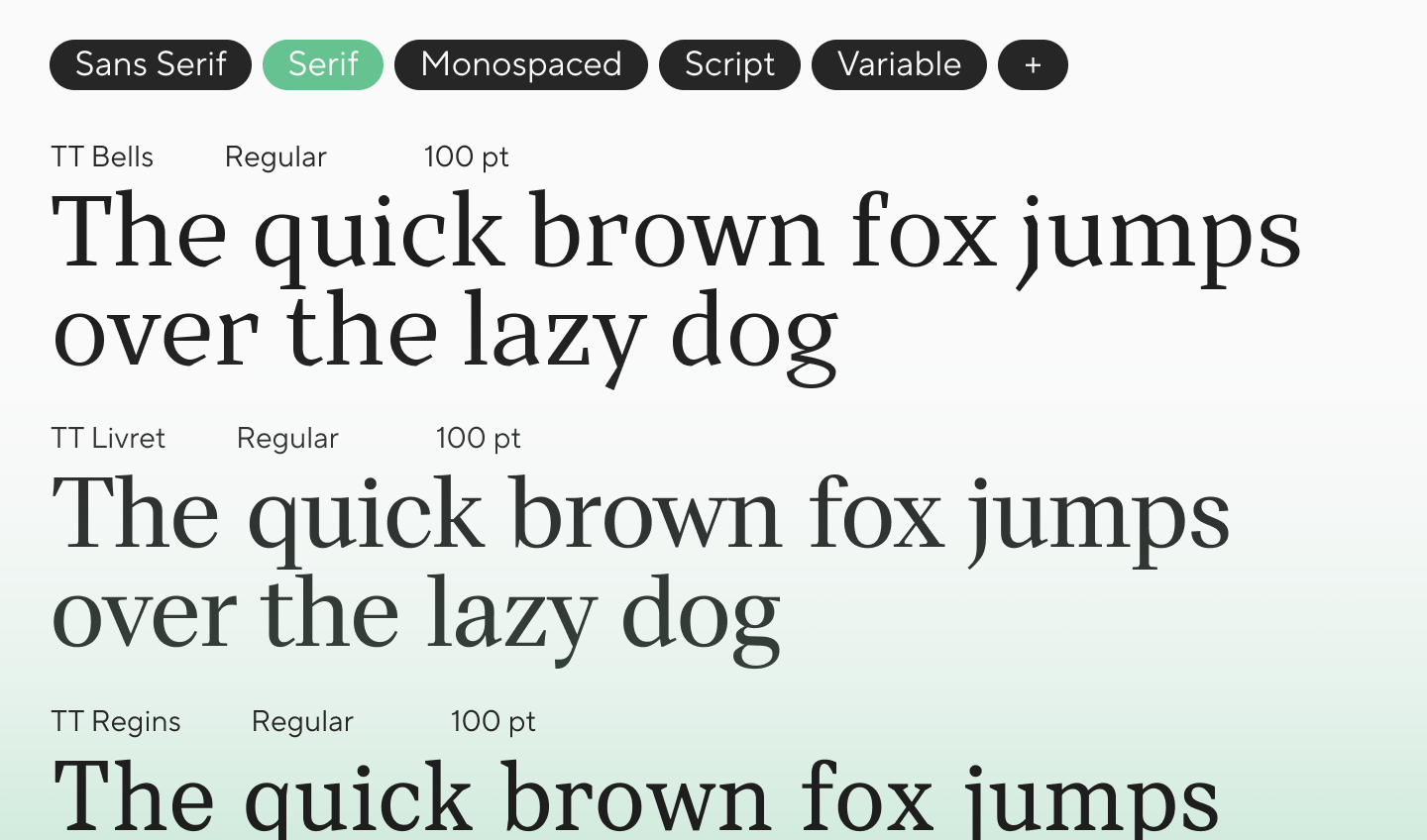
Serif Font Family
A serif font family is a group of fonts in which characters have small extra strokes at the ends of the main elements. Such fonts are classified as serifs. Usually, they are perceived as more classic, literary, elegant, or authoritative.
Serif families work well in editorial design, books, magazine layouts, branding, packaging, and projects where you need to add depth and cultural context to the image. But this does not mean all serif fonts look “traditional.” Among modern serifs, there are very relevant, lively, and highly functional solutions.
If you want to dive deeper into the contrast between serif and sans, we have already discussed this in our material about the differences between serif and sans serif fonts.
Sans Serif Font Family
A sans serif font family (or grotesque font family) is one of the most popular categories in modern design. They are frequently chosen for interfaces, websites, applications, navigation, branding, and corporate communication.
The reason for this popularity is simple: a sans serif font family usually looks clean, versatile, and modern. But within the category, the range is huge. Some grotesque font families are strict and neutral, others are friendly and soft (humanist), some are minimalist and geometric, and others have an almost engineering character.

Monospace Font Family
In a font family monospace, each character occupies the exact same horizontal space. In proportional fonts, letterforms have different widths, but in monospaced fonts, they are aligned to a single em square.
Historically, such font families are associated with typewriters and programming. But today they are used much more broadly: in web design, identity, packaging, editorial layouts, tech interfaces, and even fashion.
A monospace font family is extremely useful where numbers, tabular data, code (HTML/CSS), technical character, or a special visual intonation are important. We have already explored this topic in detail in our material about monospaced fonts in design and programming.
Script Font Family
A script font family imitates handwriting. Such fonts can be intentionally careless, decorative, or romantic. Their strength lies in emotion and character.
But precisely because of this, script fonts must be used carefully. They are rarely suitable for running text. Their area of strength is accents, logos, packaging, posters, menus, greeting cards, advertising messages, and any situation where a more personal, warm, or expressive voice is needed.

Font Family Styles and Options
One of the main advantages of a good typeface family is the presence of a well-thought-out internal system. The better it is organized, the easier it is to use the font in different scenarios without losing visual integrity.
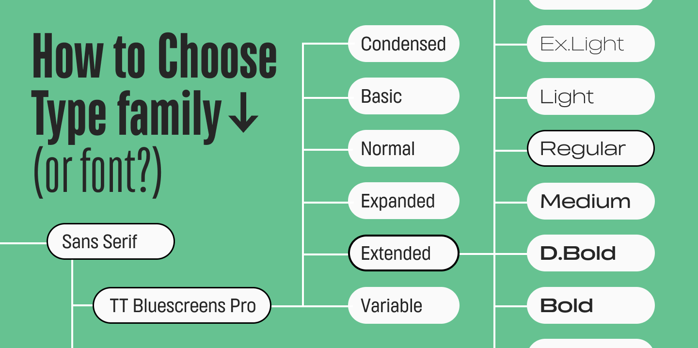
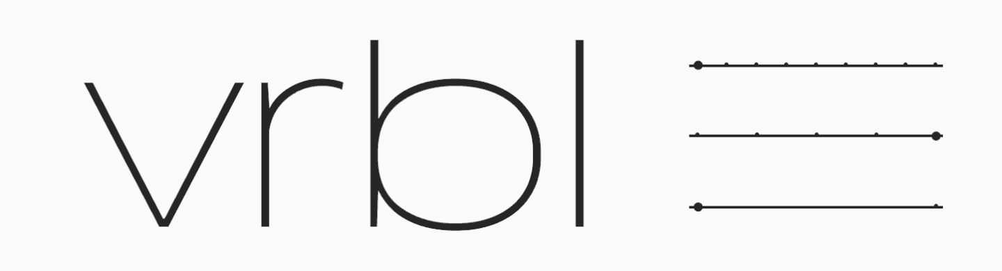
Slant, Weight, and Width Options
Usually, within a family, fonts differ by three main properties:
- by weight — from Thin and Light to Bold, ExtraBold, and Black;
- by slant — upright, slanted, and italic versions;
- by width — Normal, Condensed, Extended, and intermediate options.
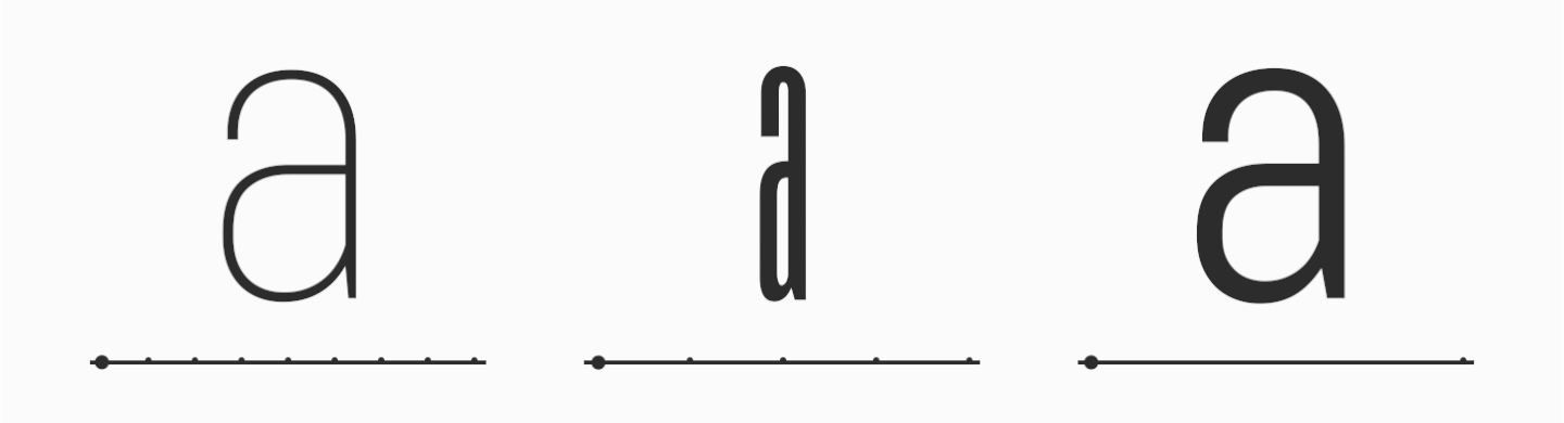
Heavier, bolder weights are suitable for accents, italics help highlight a text fragment, condensed styles save space in dense layouts or add style, and wide styles can enhance the expressiveness of a headline or create an unusual effect in packaging design.
A good font family is always a manageable set of variations, a logical system where every style has its place and purpose.
Variable Fonts
A separate topic is variable fonts. This is a format in which a single file combines several font parameters at once: weight, width, slant. Instead of a set of separate files, the designer gets a range of values and can more precisely adjust the font for the task.
For the web, this is especially interesting. A variable font allows you to work more flexibly with responsiveness, more accurately match the weight or width of the text to the display, and experiment with design. We have already detailed what variable fonts are and how to use them.
Usage Options in Design
A good font family gives you the ability to assemble almost the entire project within a single system. For example:
- for body text, use Regular or Book styles;
- for subheadings — Medium;
- for accent headlines — Bold or Black;
- for quotes and accents in text — Italic;
- for unusual design — stencil, outline, and other non-standard styles.
This approach is especially valuable in complex projects: branding, multi-page websites, UI interfaces, presentations, and design systems. When you have not just one font but an entire family at your disposal, working becomes easier and more convenient (this perfectly illustrates the font vs font family concept).
Font Family Examples
Now let’s move on to practice. Using examples, it is easier to understand how families work in a real environment and why some solutions are better suited for the web, while others are better for print, interfaces, or branding.
Popular Font Families
Among the most famous font families, we can list font family names like Helvetica, Arial, Times New Roman, Georgia, Futura, Calibri, Verdana, and Inter. These are popular names found in Windows, Mac OS, and PC systems, in browsers, text editors, interfaces, and office documents.
The popularity of such families is understandable: they have long become part of the everyday visual language, are familiar to the user, and are generally quite versatile. But this versatility has a flip side. If a project needs a bright character, expressive typography, or a unique voice, a standard solution is often not enough.
Options for Website and UI
For a website or interface, it matters not only how beautiful the font is on its own, but how it behaves in real usage. Is the text readable on the screen? Are letters and numbers easily distinguishable? Are there the necessary weights? How does the font render in a small size? Is there a license with suitable conditions?
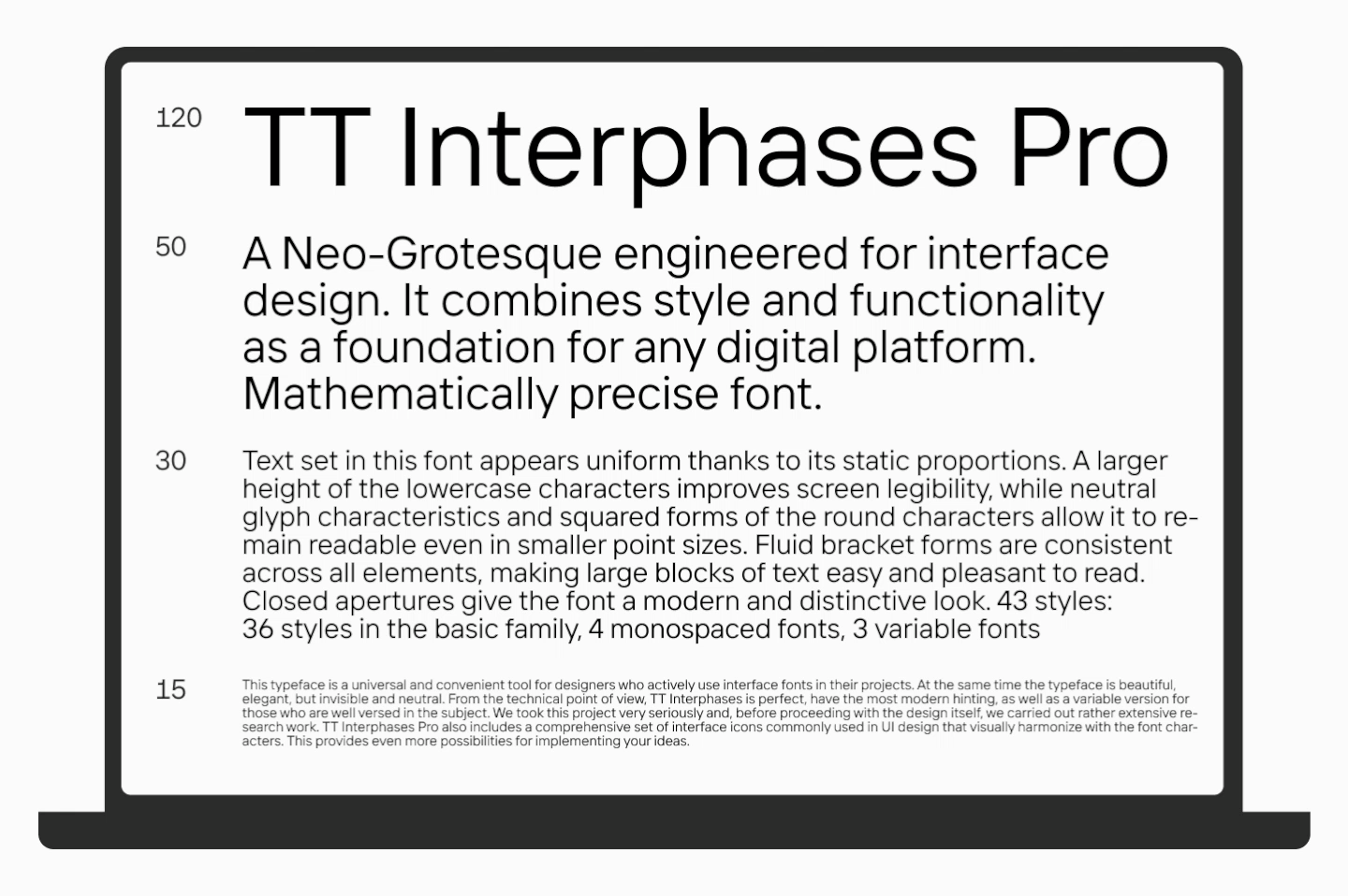
For websites and interfaces, a modern sans serif font family is in especially high demand. They provide a clean rhythm, are easily assembled into a system, and are highly readable. For instance, some of the most popular font families from the TypeType foundry for interfaces TT Norms® Pro, TT Commons™ Pro, TT Interphases Pro, and others.
If you are specifically interested in web typography, we have already discussed in detail how to choose and use fonts on a website.
Free Font Family Options
A free font family is not necessarily a weak solution. Today, you can find very worthy free options, especially in libraries like Google Fonts. They are suitable for tests, educational tasks, pilot launches, and some commercial projects.
But a free status does not negate quality checks. Before using, you should check:
- how many styles are in the family;
- how the font looks in small text;
- whether it has the required languages and features;
- if the license fits your usage scenario.
TypeType also has a collection of free fonts available to download.
Safe Font Families for Websites
A web safe font family refers to a group of fonts that have a high probability of rendering correctly for most users. Most often, this refers to system or widely distributed typefaces already present on users’ devices.
They are also called standard. But the word “safe” here does not mean an absolute guarantee. Completely safe fonts for all browsers, platforms, and device versions do not exist. It is more about the most predictable options.
We covered more about web safe fonts in this article.
Why is font safety important? The fact is that a website always exists in a real environment, not just in a designer’s mockup. It will be viewed on different screens, in different browsers, on old and new devices. And if the font loads incorrectly, the user will not see the content you intended.
As a result, readability, brand perception, and UI quality all suffer. Therefore, when choosing a web font family, you need to think not only about style but also about technical reliability.
The best font family for websites is a solution perfectly tailored to your project. When making a choice, you should evaluate several parameters:
- readability in text and interface;
- a sufficient number of styles;
- the availability of a web license;
- stylistic alignment with your positioning;
- the font’s behavior in the browser and on different devices.
In our selection, you will find an all font family list of ready-made options that are perfect for websites and interfaces.
Where to Find High Quality Font Families
One of the most convenient ways is to browse fonts in professional libraries and foundry catalogs. There, you can usually study not only the appearance of the typeface but also its structure. And on the TypeType website, you can use the online tester or download a trial version to see how the font works in layouts.
In our font catalog, you can search for families by style and purpose: grotesques, serifs, monospaced, display, text, fonts for interfaces, and branding. This is more convenient than relying solely on the name. Sometimes it is much more useful to first understand exactly what type of family you need, and only then choose a specific option.
Always check the language character set and the quality of adaptation for different alphabets. For example, not all popular typefaces have high-quality Cyrillic. At TypeType, we pay special attention to language support and work with native speakers of different languages.
Conclusion
A font family is the base of a typographic system. It is a connected structure in which different variations help solve different tasks: building hierarchy, making text readable, and maintaining style.
That is exactly why, when choosing a font for a website, brand, or interface, it is better to think not in terms of a single file, but the entire system. The more serious the project, the more important it is that this system is well-thought-out, flexible, and of premium quality.
FAQ
What is a font family?
A type family definition states it is a group of related fonts united by a common name, style, and visual logic. Within a family, there are usually several styles: from thin to bold, from upright to italic.
What is the difference between font family and typeface family?
A font is a complete set of characters for typesetting, united by a style. A font family (or type family) is a set of conceptually related fonts combined into one system. A typeface is a closely related term often used as a synonym for a family (explaining the typeface vs font family distinction).
What are the most common types of font family?
The most common types are serif, sans-serif, monospaced, and script families. They can also be divided by purpose: text, display, interface, and decorative.
What is a serif font family?
It is a family of serifs—fonts in which letters have small extra strokes at the ends of the main elements. Such fonts are often used in editorial design, branding, and projects with a more classic character.
What is a sans serif font family?
This is a grotesque font family (or sans serif font family)—fonts without serifs. Such fonts are especially popular on the web, in interfaces, and in modern branding due to their clean and versatile appearance.
What is a monospace font family used for?
They are suitable for programming, tables, data interfaces, technical tasks, and projects where a systemic or technological character is needed.
What are web safe font families?
They are considered the most predictable in the digital environment and have a high probability of rendering correctly for the vast majority of users on desktop and mobile devices.
What is the best font family for a website?
Focus on readability, brand character, the presence of necessary languages, the number of styles, file quality, web formats, and the license. The font must always be tested in a real environment.
Are free font families good for commercial use?
Yes, if the license allows your usage scenario and the font itself is well-designed. Free families are suitable for many tasks, but they also need to be checked carefully.
How many font styles can a font family include?
There is no strict limit. One family can have 3-5 styles, or it can have dozens of font family styles. For example, the bestseller TT Norms® Pro includes 104 font styles.