top_banner_ttchocolates0826
TT Quaris
14 styles
Type foundryFonts & StylesDisplayTT Quaris

TT Quaris

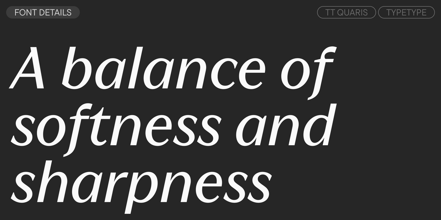
TT Quaris is an exquisite, modern high-contrast sans whose design balances between soft and sharp. The glyph shapes in the font are fluid and tend towards roundness, yet there are also sharp elements.
Single style: from $47.99
Full family: from $249 14 styles
TT Quaris
TT Quaris
TT Quaris
TT Quaris
TT Quaris
TT Quaris
TT Quaris
TT Quaris
TT Quaris
TT Quaris
TT Quaris
TT Quaris
TT Quaris
TT Quaris
TT Quaris

Buying Options

To purchase a font, first select the styles you need, then choose your licenses and proceed to checkout. To test the font in your project, download the free trial version.

Select at least one style before choosing licenses

To purchase a font, first select the styles you need, then choose your licenses and proceed to checkout. To test the font in your project, download the free trial version.
Package offer:
per style $17.79
from  $249
14 styles
from  $249
from $47.99
from $47.99
from $47.99
from $47.99
from $47.99
from $47.99
from $47.99
from $47.99
from $47.99
from $47.99
from $47.99
from $47.99
from $129
from $129
Package offer:
per style $19.08
from  $229
12 styles
from  $229
from $47.99
from $47.99
from $47.99
from $47.99
from $47.99
from $47.99
from $47.99
from $47.99
from $47.99
from $47.99
from $47.99
from $47.99
Package offer:
per style $114.50
from  $229
2 styles
from  $229
from $129
from $129
On request
Perpetual
On request
On request
Perpetual
On request
On request
On request
On request
On request
On request
On request
On request
Perpetual
On request
On request
Perpetual
On request
On request
Perpetual
On request
On request
Perpetual
On request
On request
On request
On request
On request
Your order:
Nothing selected yet

Select styles first, then licenses.

Questions about the font or licensing?

Testers

TT Quaris
Size
Features
Turn on all

TT Quaris—an exquisite and modern high-contrast sans

TT Quaris
Size
Features
Turn on all

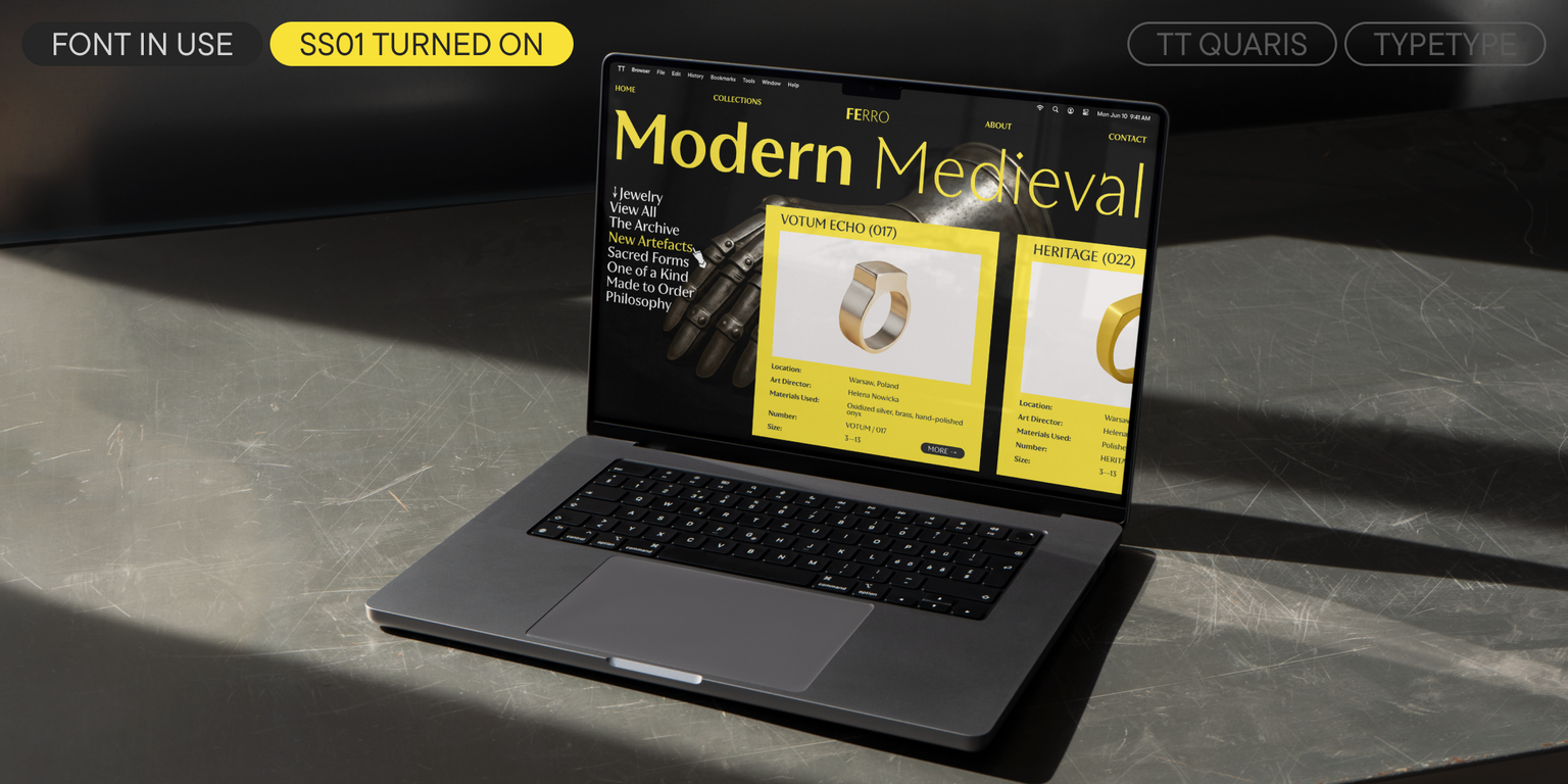
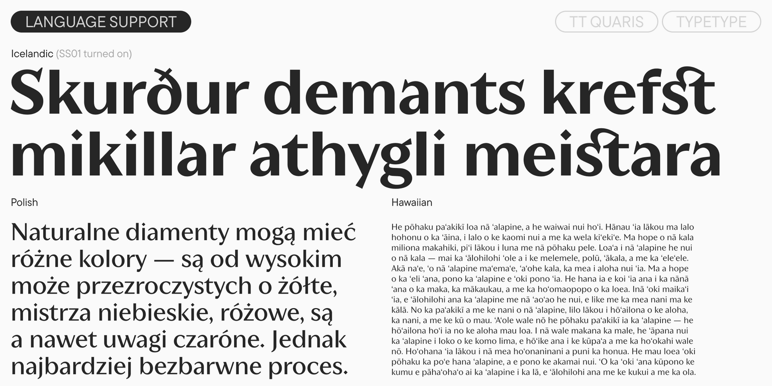
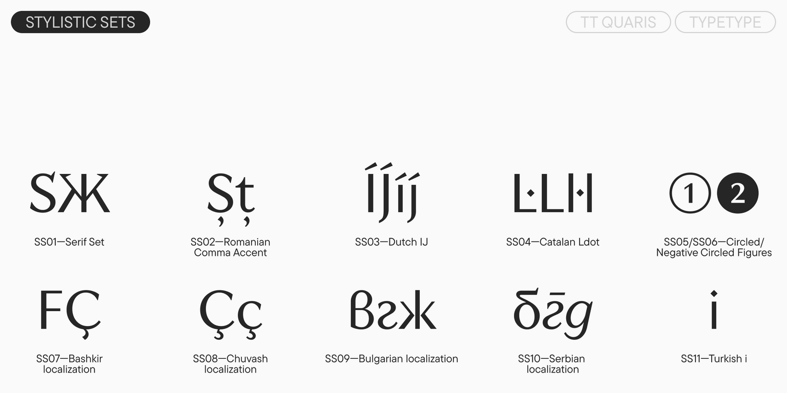
Before creating the TT Quaris, we conducted in-depth research into the archetypes of high-contrast sans typefaces to understand their variations and define the direction for our work. Based on this research, the key parameters and stylistic features of the future typeface were formulated, after which we began its development. The creation of this typeface took over two years and 2500 hours of painstaking work. The result is a modern, elegant display font. A key feature of TT Quaris is the "spiky stylistic set," SS01 (Serif Set), available via the OpenType menu in most graphics software. This set radically changes the font’s character: from refined and noble, it transforms the font into something daring and provocative, thanks to the appearance of sharp spurs and spikes on the letters. High-contrast sans typefaces are traditionally used in design fields such as branding for jewelry, cosmetics, and perfumes; art exhibitions in museums; glossy publications; and for various cultural institutions and gastronomic establishments.

TT Quaris
Size
Features
Turn on all

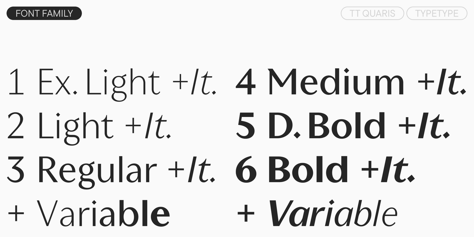
TT Quaris includes 14 styles: 6 uprights, 6 italics, and 2 variable fonts

TT Quaris
Size
Features
Turn on all

Luxury is the outer expression of magnificence

TT Quaris
Size
Features
Turn on all
Axes
Weight

"Elegance is refusal" — Coco Chanel

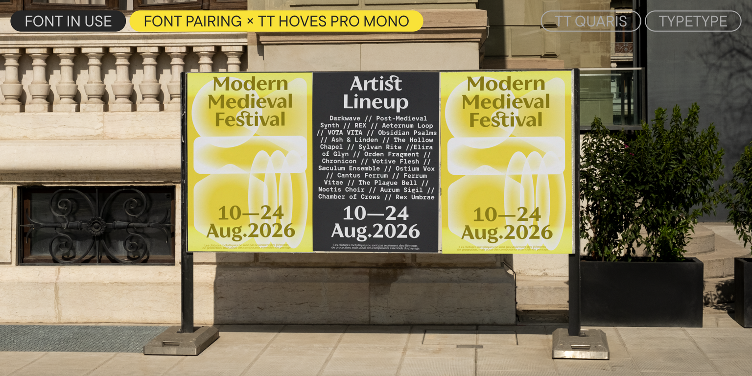
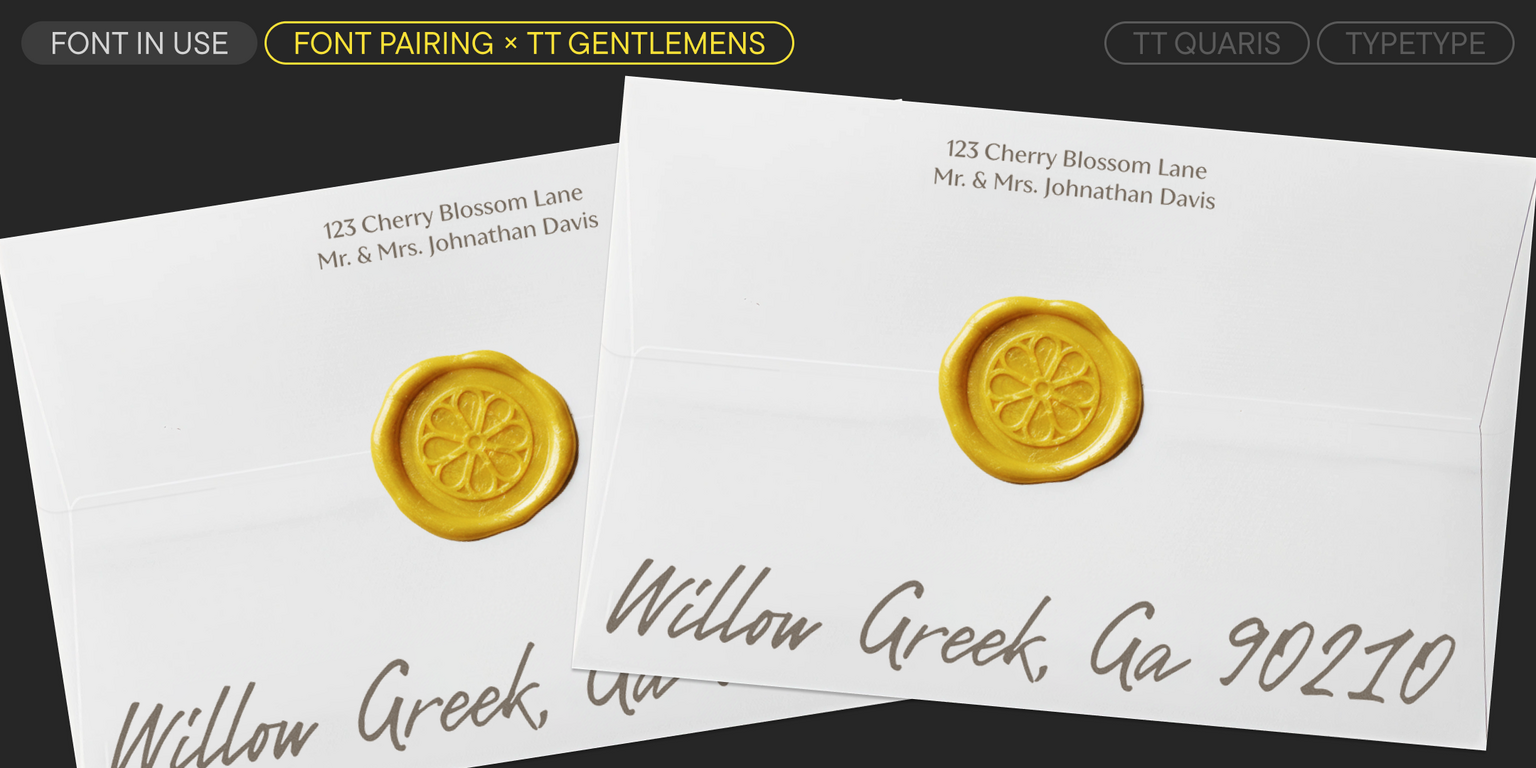
Ideal font pairs with TT Quaris

Creating Contrast Without Breaking Visual Harmony

Contrast helps two typefaces take on different roles, but the strongest combinations are rarely built on difference alone. Successful font combinations often share proportions, rhythm, stroke character, or overall mood while differing enough in weight, construction, or style to create hierarchy. This balance makes headlines, supporting text, and secondary information easier to distinguish. The goal is to create clear visual separation without making the composition feel fragmented, accidental, or inconsistent with the wider design system.

Pairing Serif and Sans Serif Typefaces

Combining serif and sans serif designs is a reliable way to create contrast across branding, editorial, and digital projects. Good typeface pairing still depends on more than category. Compare x-height, proportions, weight, spacing, and visual tone to make sure the two designs feel connected. The strongest combinations clearly separate headlines from supporting text while maintaining a coherent overall character. This approach also gives designers flexibility when building hierarchy across websites, publications, presentations, packaging, and other communication formats.

How Type Scale Strengthens a Typeface Pairing

Contrast does not have to come entirely from different letterforms. Scale, weight, spacing, and line height can significantly change how two typefaces interact. A large display treatment may carry the main message, while a calmer style supports body copy or secondary information. Before rejecting a combination, test several hierarchy settings—the same two designs can feel much more compatible once their roles are clearly established. Adjusting scale can also help preserve consistency when the project needs both expressive headlines and highly functional supporting text

Description

About font family TT Quaris
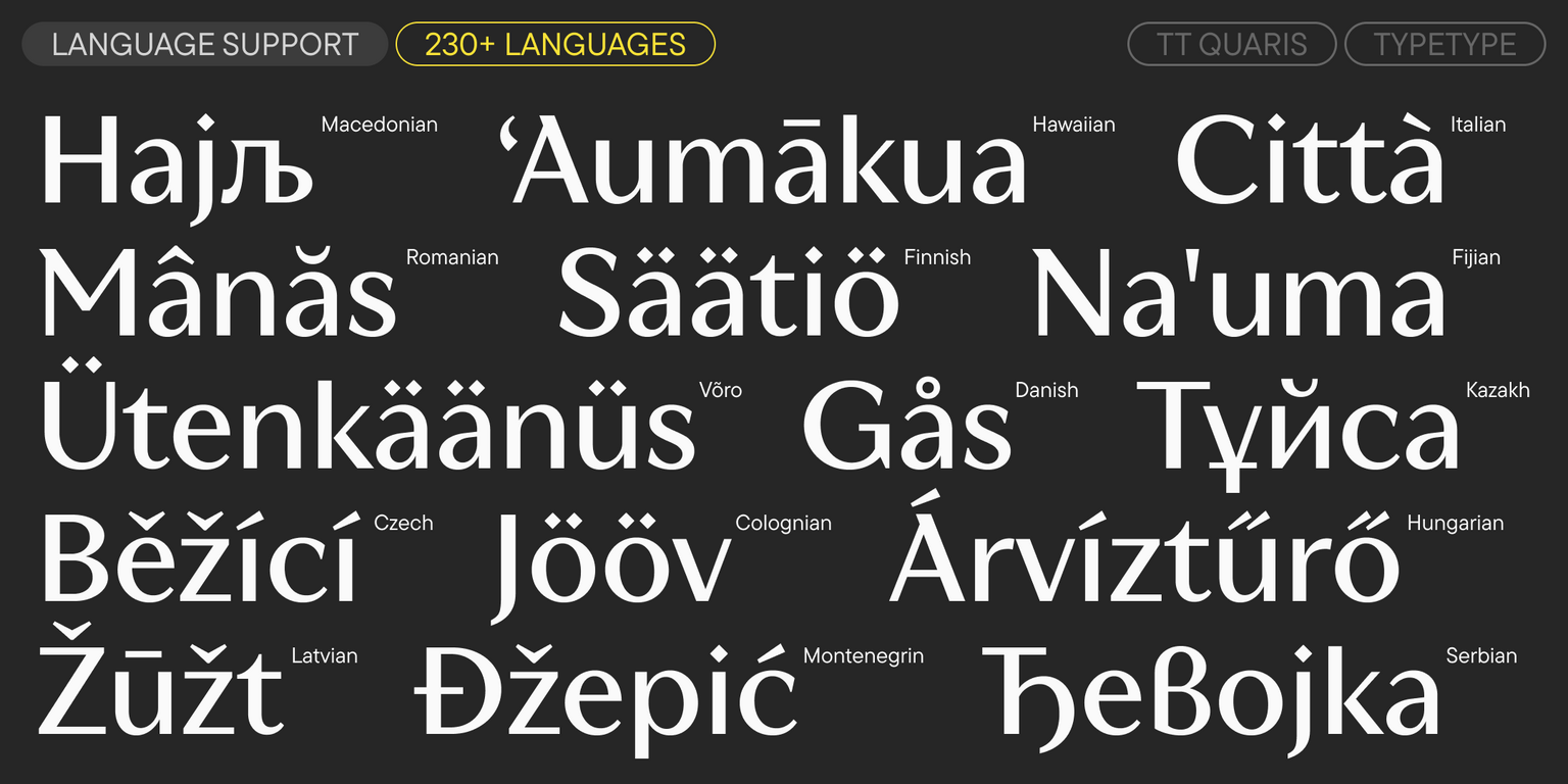
230+ Language support

Meet the new font in the TypeType collection—the luxurious TT Quaris, where elegance, mystery, and audacity converge.

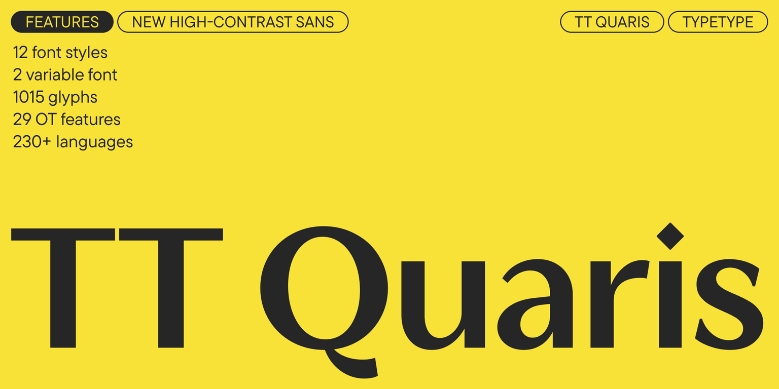
TT Quaris is an exquisite and modern high-contrast sans. Before developing this typeface, we carried out an in-depth study of high-contrast sans archetypes. Based on our findings, we formulated the key parameters and stylistic features of the future font, after which we began its development. The creation of the family took over two years and 2,500 hours of painstaking work. The result is a graceful, yet fresh and unconventional typeface. Its design features modern elements: a lack of stem flaring, high contrast, and a static structure.

TT Quaris is a balance of soft and sharp. The name alludes to smooth precious stones that can be given sharp edges when cut. For instance, the character shapes are fluid and tend towards roundness, yet there are sharp elements—the apex of the “t”, geometric details, and diamond-shaped punctuation marks. The typeface’s key feature is a “spiky” stylistic set with sharp spurs and spikes on the letters. With its help, you can radically change the font’s character, transforming it from refined and noble to daring and provocative.

We paid special attention to the italics, adding true italic forms, which are particularly prominent in the Cyrillic set. The italic font styles are slightly lighter and noticeably narrower than the uprights: this approach is a nod to classic italics, however, in TT Quaris, they look current and modern.

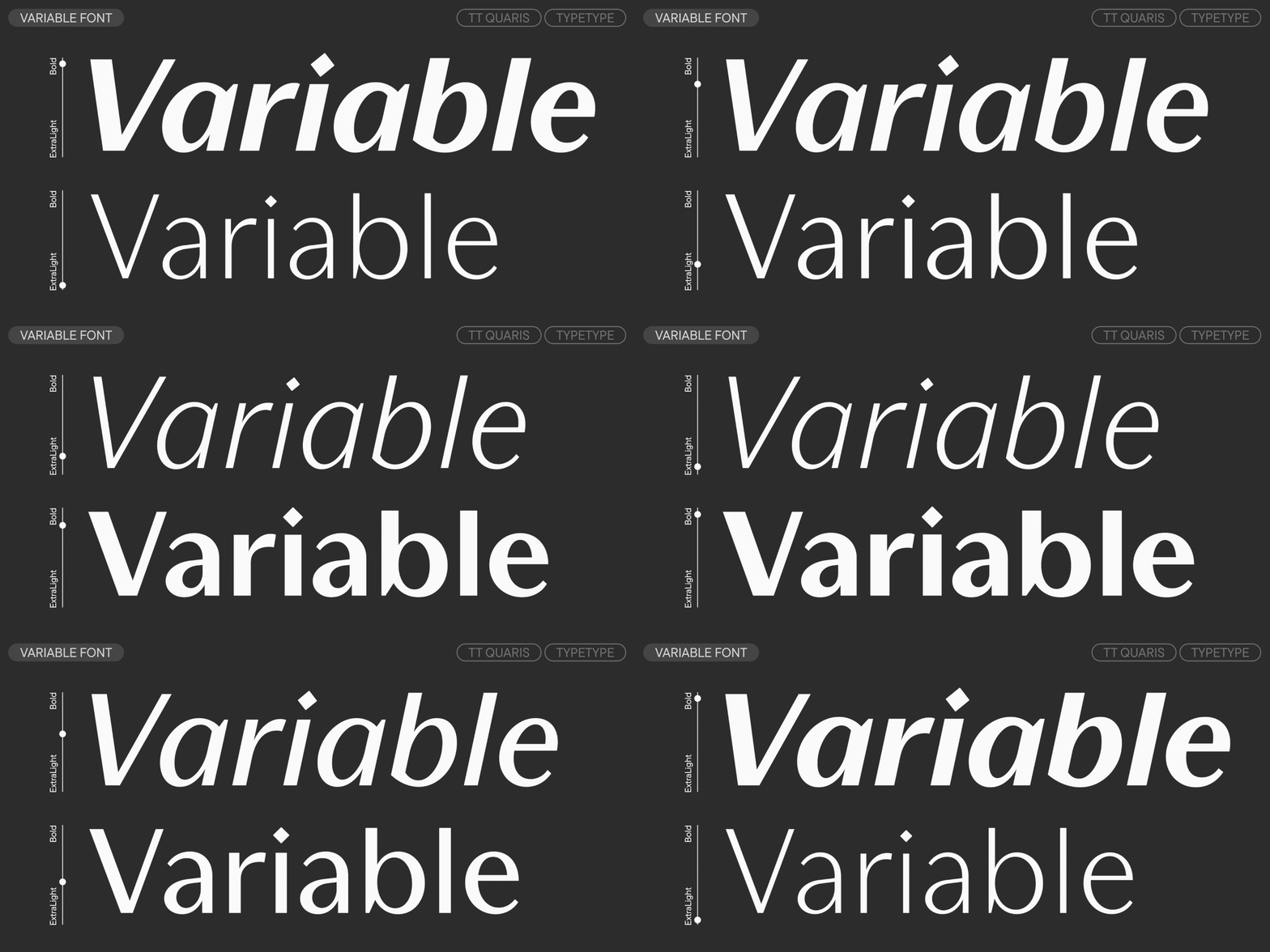
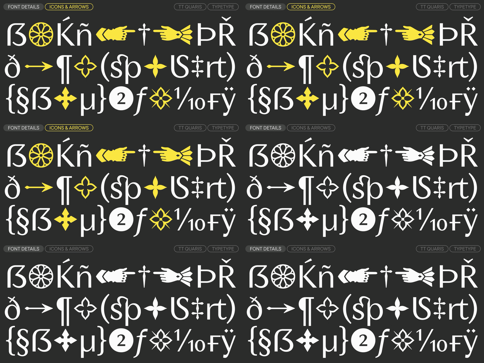
The typeface’s capabilities are expanded by two variable fonts (upright and italic), which change along the weight axis. Additionally, your designs can be enhanced with a set of icons related to the medieval themes of knighthood and romanticism: among them, you will find ornamental patterns and stained glass windows from Gothic cathedrals.

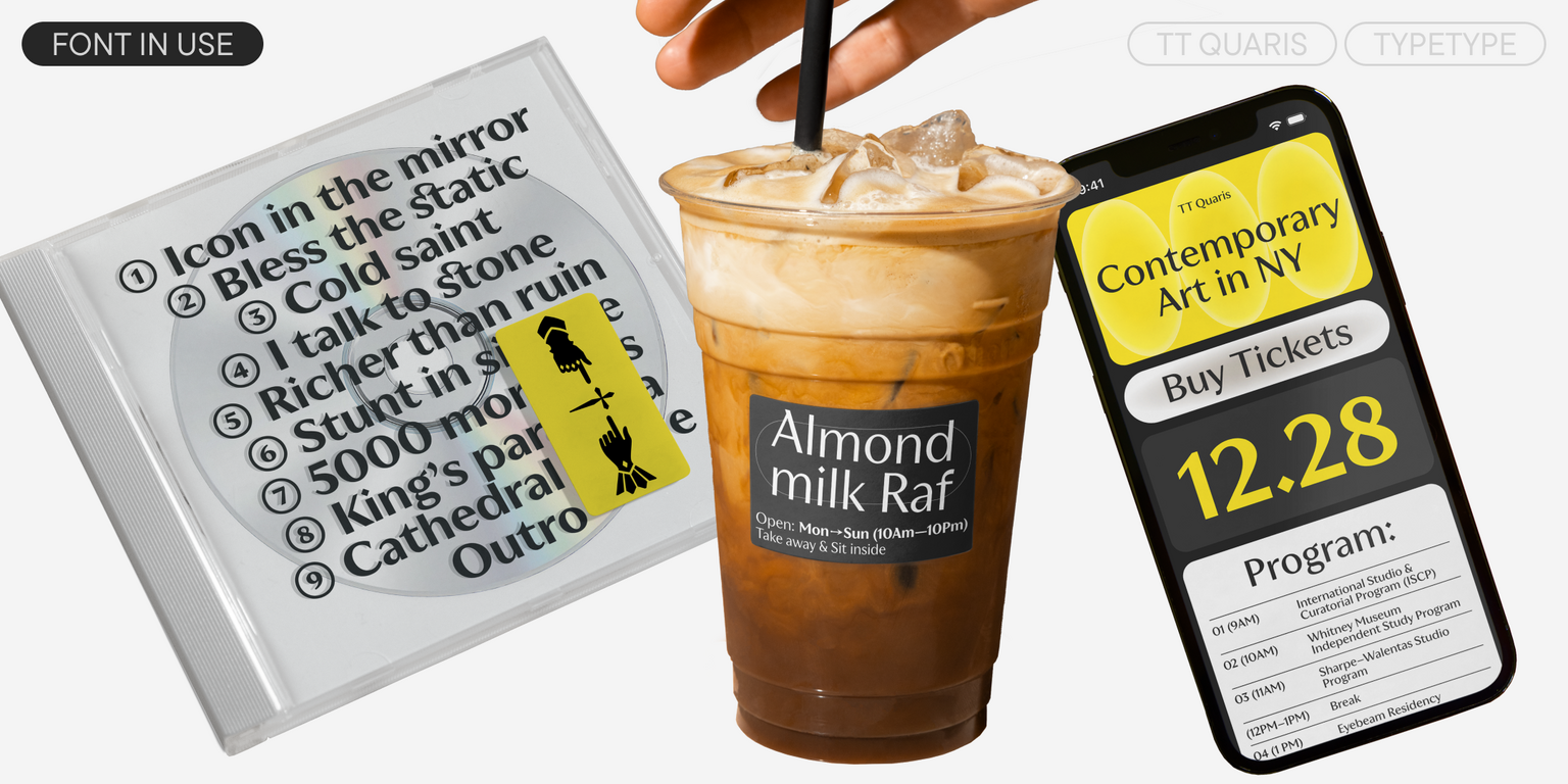
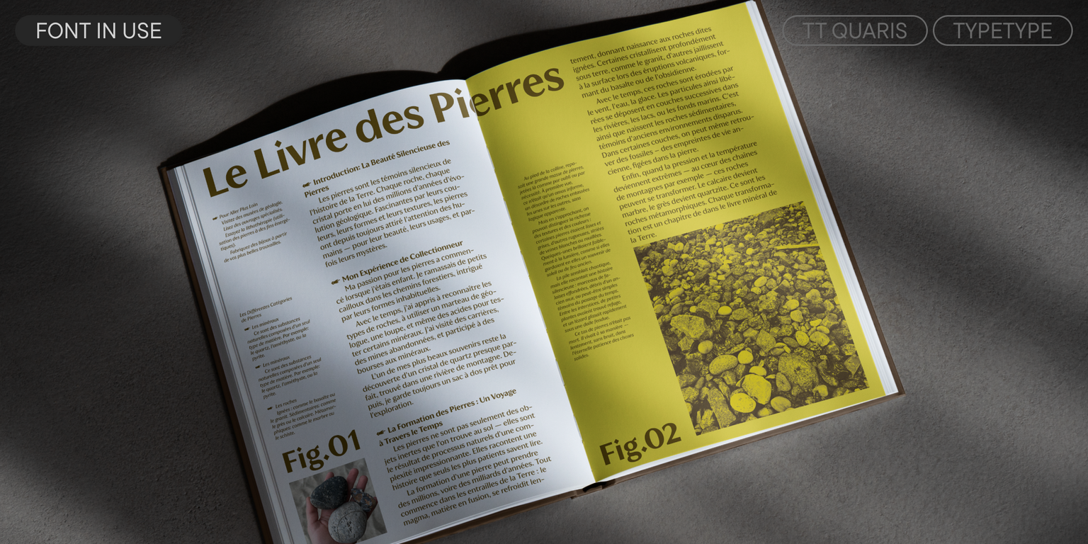
TT Quaris fits perfectly into the identity of a jewelry brand, can be used on cosmetics and perfume packaging, will look harmonious in the design of exhibitions and museum navigation, on the covers of glossy publications, and in the menus of bars and restaurants.

TT Quaris includes:

  • 14 styles: 6 uprights, 6 italics, and 2 variable fonts
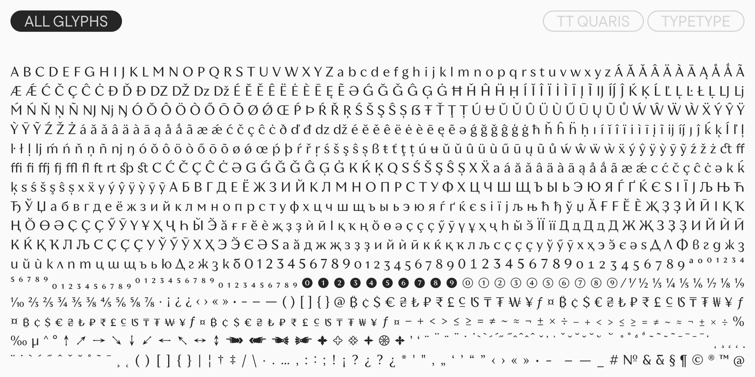
  • 1,015 glyphs in the upright styles and 1,003 glyphs in the italics
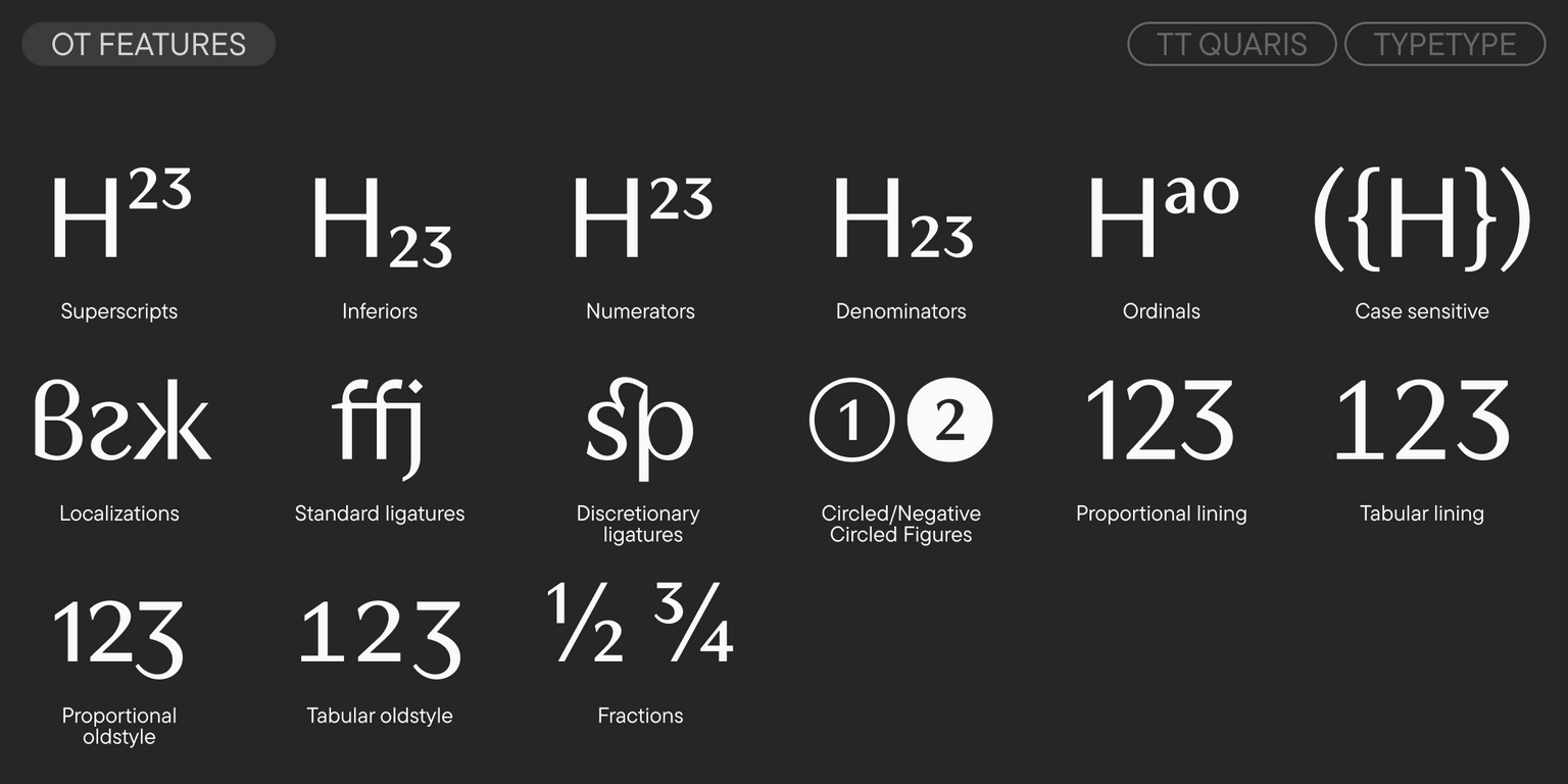
  • 29 OpenType features
  • Support for over 230 languages

TT Quaris — a true diamond in the world of type!
Team

Antonina Zhulkova
Anna Kondrashova
Lada Sobchenko
Roman Avdushkin
+ TypeType Team

Release date

14 October, 2025

Additionally

Specimen

Download font specimen (pdf)

Poster Images

Graphic presentation at Behance

Custom version

Looking for a custom version of this font?

Character Set

Basic Latin Basic Cyrillic Extended Latin Extended Cyrillic Fractions Proportional Lining Figures and Currencies Other Figures Punctuation and Symbols Math Symbols Arrows
A B C D E F G H I J K L M N O P Q R S T U V W X Y Z a b c d e f g h i j k l m n o p q r s t u v w x y z

OpenType features

ss01 | Serif Set

SX ac

SX ac

liga | Standard Ligatures

ffi ff

ffi ff

dlig | Discretionary Ligatures

st 1/2

st 1/2

onum | Oldstyle Figures

1 2 3

1 2 3

numr | Numerator

1 2 3

1 2 3

dnom | Denominator

1 2 3

1 2 3

Show all

Similar fonts

37 font styles
6 font styles
28 font styles
Select licenses
Contact us!