Today, social media platforms are full-fledged media channels where visual style determines whether a user will stop at a post or scroll past it. According to digital design research, a person spends an average of less than two seconds on the initial perception of content in their feed. In that time, color, composition, and, of course, the font do all the work.
A font on social media is not just a carrier of text. It shapes the character of the brand, influences trust, readability, and engagement. The same text set for social media in different fonts can be perceived as expert, friendly, edgy, or, conversely, outdated. Finding that perfect typeface means halfway ensuring the success of a post. That is exactly why popular social media fonts become a part of the identity on par with the logo and color palette.
In this article, we will break down how to choose fonts for social media for various formats and platforms, which typographic techniques work best, and offer a selection of the best 10 fonts for social media post creation from the TypeType studio for posts, stories, videos, and graphics. The TypeType studio has been creating fonts for branding, media, and digital products for over 12 years, and many of these solutions are already working successfully online.
Why Fonts Are Crucial for Social Media Success
Typography is directly linked to the psychology of perception. Studies show that the visual form of text affects trust in information no less than its content. A neat, highly readable font is associated with reliability and professionalism, while a random or cluttered one suggests low-quality content.
Great social media fonts perform several functions at once. First, they help you stand out in the feed among uniform visuals. Second, they ensure comfortable reading from a smartphone screen, where small details and weak contrast are quickly lost. Third, the font builds recognition: even without a logo, a user can identify a brand by its characteristic typography.
Many large companies use their own proprietary fonts specifically for digital communications. This allows them to maintain a unified style across all touchpoints: from the website to social media posts and cover art for videos. This task is typical for TypeType designers, who develop fonts taking into account screen display and various usage scenarios. Finding the best fonts to use for social media helps maintain this consistency.

Choosing the Right Fonts for Different Social Media Formats
Every social network has its own requirements for typography. There is no universal solution, but there are general principles.
Facebook users spend time in the feed and Reels, so typography should be versatile. In the feed, modern sans serif typefaces with medium contrast work well—they don’t steal attention but look neat, making them good fonts for social media posts. For community headers and advertising creatives, it’s better to choose bold styles: the text won’t get lost in the desktop version or on a small smartphone screen.Instagram has long ceased to be just about posts—Reels rule here. In short videos, typography acts as a voice: large, bold, and high-contrast lettering helps stop the eye, making them the best fonts for social media videos. Script fonts and text boxes placed directly over the frame are particularly eye-catching.
On LinkedIn, the visual style of graphics works to create a professional image. Modern sans serif fonts are well-suited for channel headers and article covers—they look clean, neutral, and inspire trust. In cards and carousels, you can use display fonts for accents: large headlines help structure information and draw attention to key thoughts, acting as the best fonts for social media design.
Tips for Using Fonts Effectively on Social Media
Font Pairings
One of the most reliable techniques is pairing a serif font with a sans serif. For example, an expressive serif for headlines and a neutral sans for the main text. Such contrast helps structure information and makes the design more professional. You can read more about font pairs this article.
Sizes and Readability
For social media, it is important to test the font at small sizes. What looks good in a mockup might become unreadable on a smartphone screen. Use a sufficient point size, adequate line spacing, and avoid overly thin styles for small text, especially when looking for the best fonts for social media captions.
Color and Contrast
Even a great font won’t work without the right contrast. Light text on a light background or overly bright combinations reduce perception. The font should enhance the visual art, not compete with it. This is key for creating the best fonts for social media images.
Tools to Work With
Online services like Canva or Adobe Express allow you to quickly create graphics for social media and work with fonts without installing them on your computer. Many of these sites have a built-in library with free fonts, where you can find global hits like Montserrat, Roboto, or Helvetica, as well as local typefaces. However, it’s important to consider licenses: commercial use in posts, stories, and videos requires an appropriate font license (read more here).
Checklist: Check Your Typography Before Publishing a Post
- The font is readable from a smartphone: test the layout at its real size—what looks okay on a «pretty» preview might become unreadable in the feed.
- Font weight and line spacing: do not use overly thin styles for small text; add «air» between lines.
- Contrast is in order: light text on a light background and «acidic» combinations worsen perception—the font should help the visual, not argue with it, which is crucial for good fonts for social media graphics.
- Clear hierarchy: headline, accent, and body text are noticeably different (in size, style, contrast) but remain within the same system.
- Logical pairing: if using a pair, maintain the principle of contrast (e.g., serif + sans serif) and assign roles (headlines and text).
- Unified style maintained: the same brand voice in posts, stories, and covers—without chaotic changes of typefaces. Using different fonts for social media randomly can hurt your brand.
- Licenses accounted for: if the font is used commercially, make sure you have the appropriate license.
Common Font Mistakes on Social Media — and How to Quickly Fix Them
Mistake 1. Text is too small.
How to fix: test the layout on a smartphone; increase the point size, add line spacing, and avoid thin styles at small sizes.
Mistake 2. Poor contrast (text "drowns").
How to fix: rebuild the combination of text and background. Make the background or text darker, remove overly bright pairs. Remember: the font enhances the visual, it doesn’t fight it.
Mistake 3. No unified style.
How to fix: lock in 1–2 base typefaces and rules: where to put headlines, where the text goes, what weights and sizes you use. This strengthens recognition and ensures you use the best social media fonts consistently.
Mistake 4. Random font pairing.
How to fix: assemble pairs by contrast and role: for example, an expressive serif for headlines + a neutral sans serif for the main text.
Mistake 5. Ignoring licenses.
How to fix: if the font is used in commercial content (posts/stories/videos), check the terms in advance—especially when working in online services and templates.
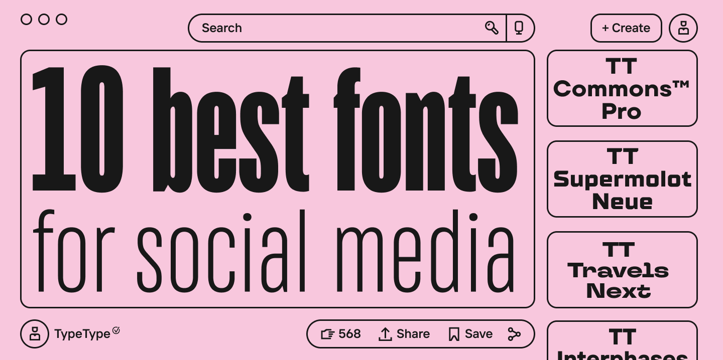
Top 10 Fonts for Social Media Use
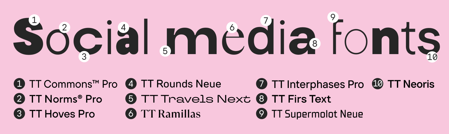
- TT Commons™ Pro
A versatile geometric sans serif. Suitable for posts, stories, covers, and videos. Excellent readability and wide language support. - TT Norms® Pro
A modern neutral font for social media and branding. Perfect for running text and graphics. - TT Hoves Pro
A crisp and concise sans serif. Works well in minimalist visuals. - TT Rounds Neue
A soft and friendly font with rounded forms. A great option for social media with a broad audience. - TT Travels Next
A display font with character. Suitable for headlines, video covers, and vibrant posts. - TT Ramillas
A modern serif with expressive graphics. Good for covers, quotes, and media content. - TT Interphases Pro
A technological sans serif, highly readable on screens. Suitable for digital projects and social media. - TT Firs Text
A text font ideal for running text and articles on social media. - TT Supermolot Neue
A brutal and expressive sans serif for accent lettering and videos. - TT Neoris
A modern neo-grotesque (an evolution of the classic sans serif with more refined plasticity and readability), developed with current digital requirements in mind.
Social Media Icon Fonts: What They Are and How to Use Them
Social media icon fonts are fonts where icons are used instead of letters. They are used for buttons, navigation, badges, and graphic elements in social media. This format is convenient because the icons scale without losing quality and are easily stylized to match the corporate style.
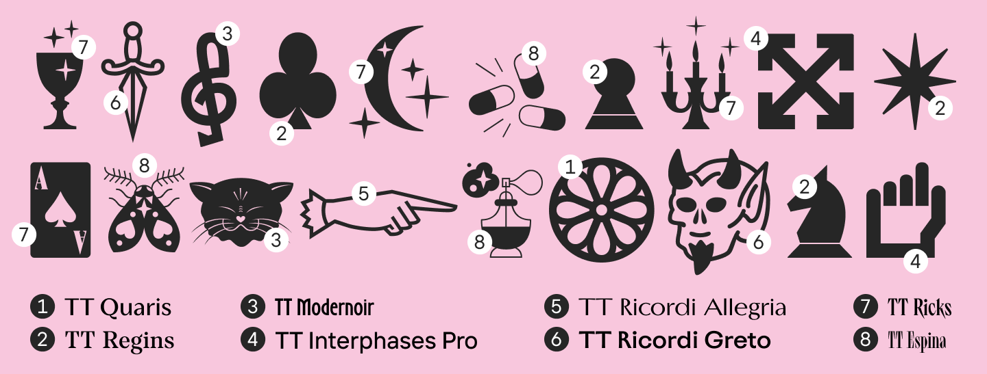
In social networks, icons are often used in stories, cards, and video graphics. A recommendation from TypeType is to use icons as a supplement to the text, not a replacement, to preserve readability and meaning. The TypeType collection includes fonts with icons and illustrations drawn for a specific typeface.
Such fonts include: TT Ricks, TT Espina, TT Interphases Pro, etc.
Conclusion
Fonts for social media posts are a powerful tool for shaping a visual style. A properly selected typeface helps you stand out, increase trust, and make your content recognizable. The TypeType studio has created many fonts that are already successfully used in digital media, branding, and social media. By choosing a high-quality font and applying it competently in your design, you are investing in the long-term visual image of your brand.
FAQ
What are the most popular social media fonts right now?
Modern sans serif typefaces like TT Commons™ Pro, TT Norms® Pro, and TT Hoves Pro.
How to choose a good font for social media?
Focus on readability, the character of the brand, and the content format. A good font is one that serves its purpose.
Where can I use fonts for social media online without installing them?
In online editors like Canva or Adobe Express, provided you comply with the license.
What are the best fonts for social media posts and stories?
For posts—text sans serifs; for stories and covers—display and accent fonts.
Can I use one font for all social media?
Yes, if it is versatile and highly readable across different formats.
How do I pair fonts for social media?
Use contrast: serif + sans serif, or display + text.
Do social networks support decorative fonts?
Yes, if they are used in graphics or images. In system texts, only those available in the platform’s library.
What are the most common mistakes when choosing fonts?
Point size that is too small, poor contrast, and the lack of a unified style.