A research team from the Center for Language and Brain at HSE University in St. Petersburg used eye-tracking to compare TypeType’s TT Interphases Pro with the standard Android and macOS system fonts. The specialists found no significant differences in eye movement metrics.
Research into the readability and functionality of various interfaces is one of the actively developing areas of focus for the Center for Language and Brain at HSE University. In collaboration with various companies, the Center’s team conducts experiments to build an evidence base that helps improve interface efficiency. In such studies, special attention is paid to how different font characteristics—serifs, spacing, size, and letter design—affect reading quality. These characteristics must be taken into account when developing new typefaces, particularly those based on the Cyrillic script.

Existing eye-tracking studies provide limited insight into how the typographic features of Cyrillic fonts impact their readability. Researchers at the Center for Language and Brain at HSE University in St. Petersburg conducted their own study using a video eye-tracker. They compared the Cyrillic typeface TT Interphases Pro with the world-renowned Roboto and San Francisco Pro—the standard user interface fonts for Android and macOS.
As a reminder, during the development of the TT Interphases Pro typeface, we analysed the main features of the most accessible and widely used interface fonts. Our goal was to create a stylish and aesthetic, yet sufficiently neutral typeface that would work flawlessly in digital interfaces.
The study by our colleagues at the Center for Language and Brain at HSE University involved 48 participants. The respondents silently read three texts about Easter Island, taken from the international PISA study on reading literacy. During the reading process, their eye movements were recorded using an EyeLink 1000+ eye-tracker. At the word level, the following metrics were analysed: first fixation duration, gaze duration upon first encountering a word, total viewing time, and the number of regressions. Reading speed (words per minute) was also analysed.
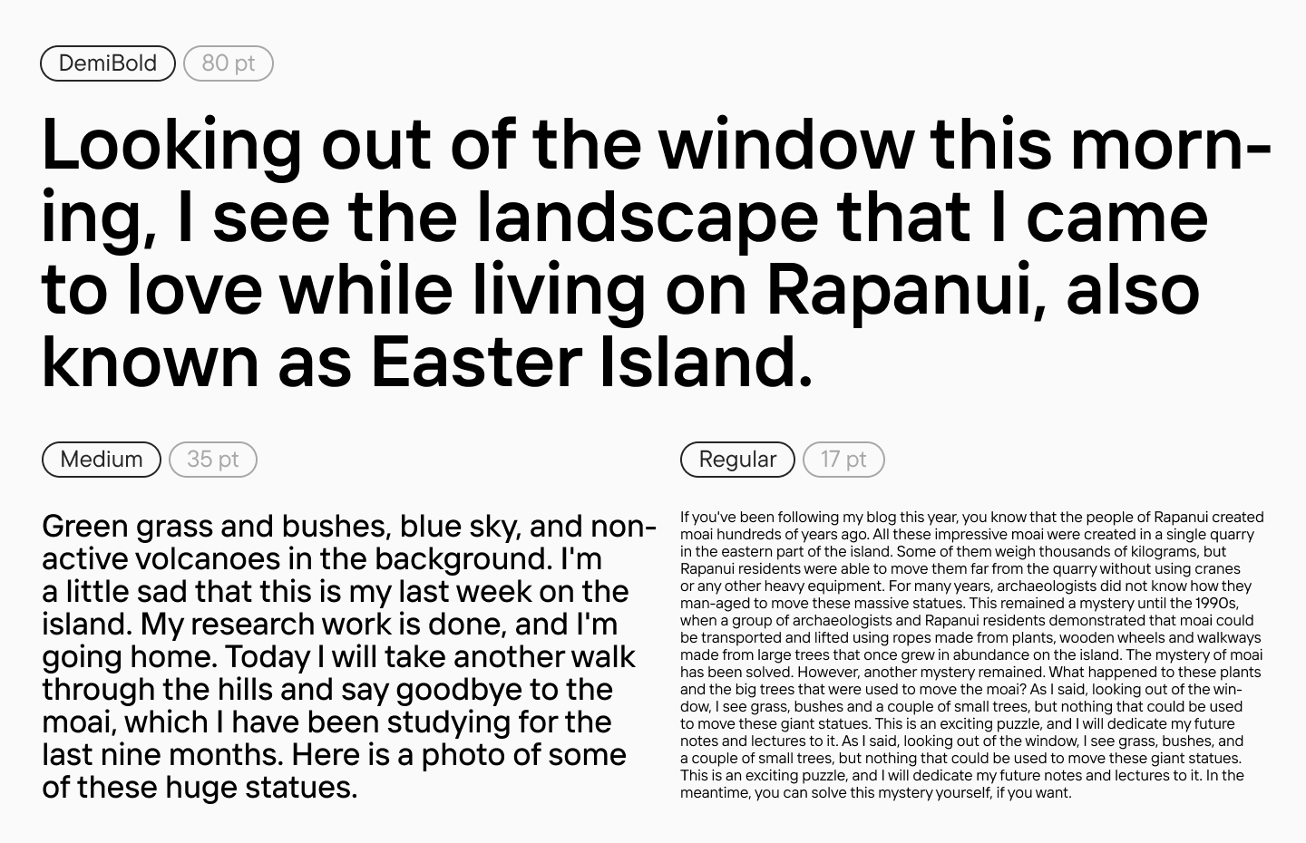
The analysis showed that TT Interphases Pro does not differ significantly across any of the metrics from the standard Roboto and San Francisco Pro fonts. The absence of differences in text processing confirms that the font’s legibility is on par with global analogues, demonstrating TT Interphases Pro’s suitability for use on digital screens.
“The results obtained have shown that TT Interphases Pro is capable not only of technically replacing the highly frequent Roboto, SF Pro, and other alternatives, but also of bringing additional design value to brands, increasing their uniqueness in a market oversaturated with free solutions. Thanks to this experiment, we have gained applied scientific conclusions that will allow us to improve and enhance the readability of all our fonts, especially in areas where it is critically important.“
— Sergei Kuzmin, Head of Project Management Office at TypeType
“I am very glad that we were able to conduct this pilot study on font readability in partnership with the TypeType type foundry. Experimental research on Cyrillic fonts and other typographic characteristics is extremely limited, and studies using eye-tracking to evaluate silent reading speed are exceedingly rare. Nevertheless, the demand for highly readable typefaces is significant. This is particularly important for digital resources designed for vulnerable populations, such as people with dyslexia. For some of these individuals, the visual presentation of text can be crucially important.“
— Svetlana Alekseeva, PhD in Philology, Director of the Center for Language and Brain at HSE University — St. Petersburg