
Last year, TypeType celebrated its first decade. Over those ten years, we’ve grown from a tiny basement studio into a large, serious company with nearly one hundred employees.
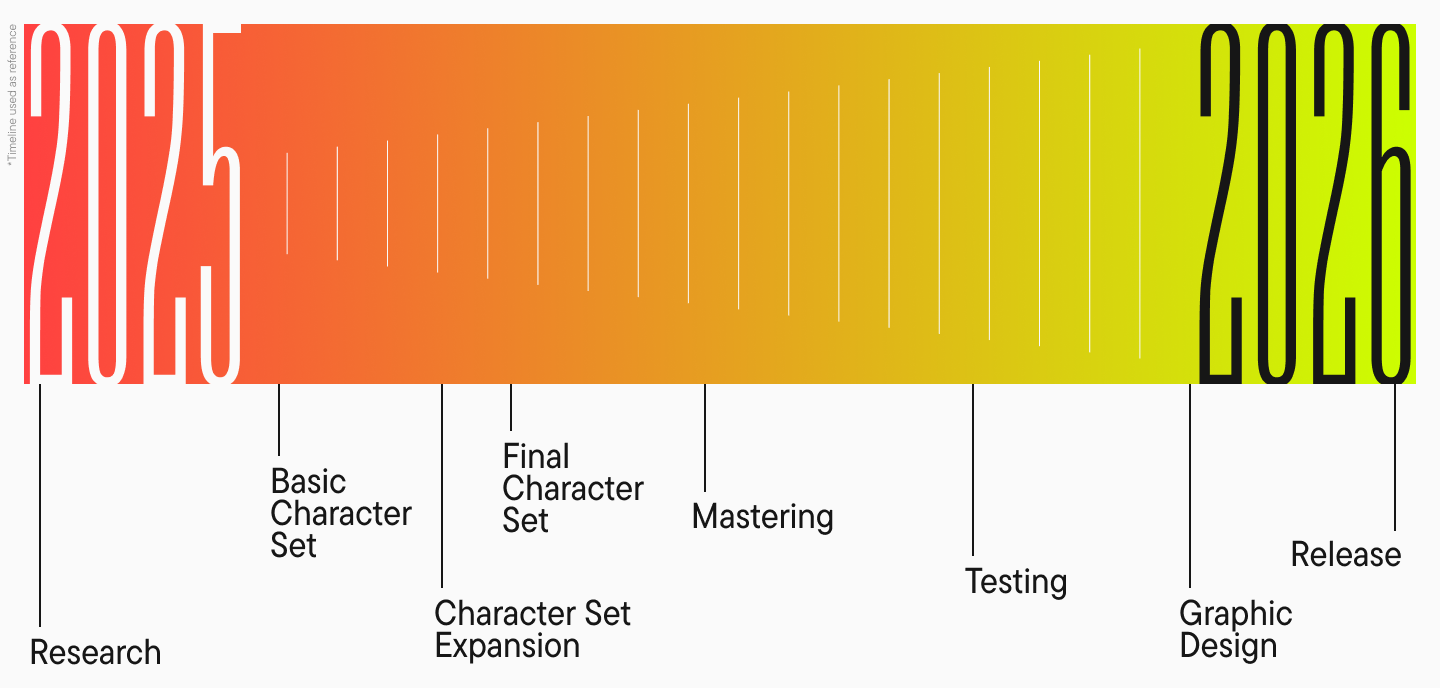
This kind of growth offers a great deal of creative freedom, but it also creates frameworks and obligations. For example, we work according to a strict plan: every project is broken down into stages and calculated by the hour. Thanks to this approach, it’s now mid-2025, and nearly all of our projects for 2026 are already designed. It took us a long time to achieve such a well-coordinated workflow, structure, and systematic approach. It’s a result we can be proud of.
But some things are difficult to fit into such a machine: spontaneity, ease, and play. Of course, we have projects codenamed “small creative ones.” But even those are incorporated into our plan, with several months allocated for their development. This turns a quick and light project into a large-scale, substantial one that a single type designer can struggle to handle alone. And since more resources are invested, we have to think about the market demand for the proposed font. This forces us to abandon overly wild ideas in favor of greater practicality. Moreover, this approach doesn’t allow us to offer a creative project to every type designer.
That’s why we spent a lot of time thinking about how to find a place for creative freedom within this system, how to set aside time for small passion projects, how to step outside our usual boundaries, and how to give spontaneity a chance. And we realized that the perfect moment will never come unless you take the first step.
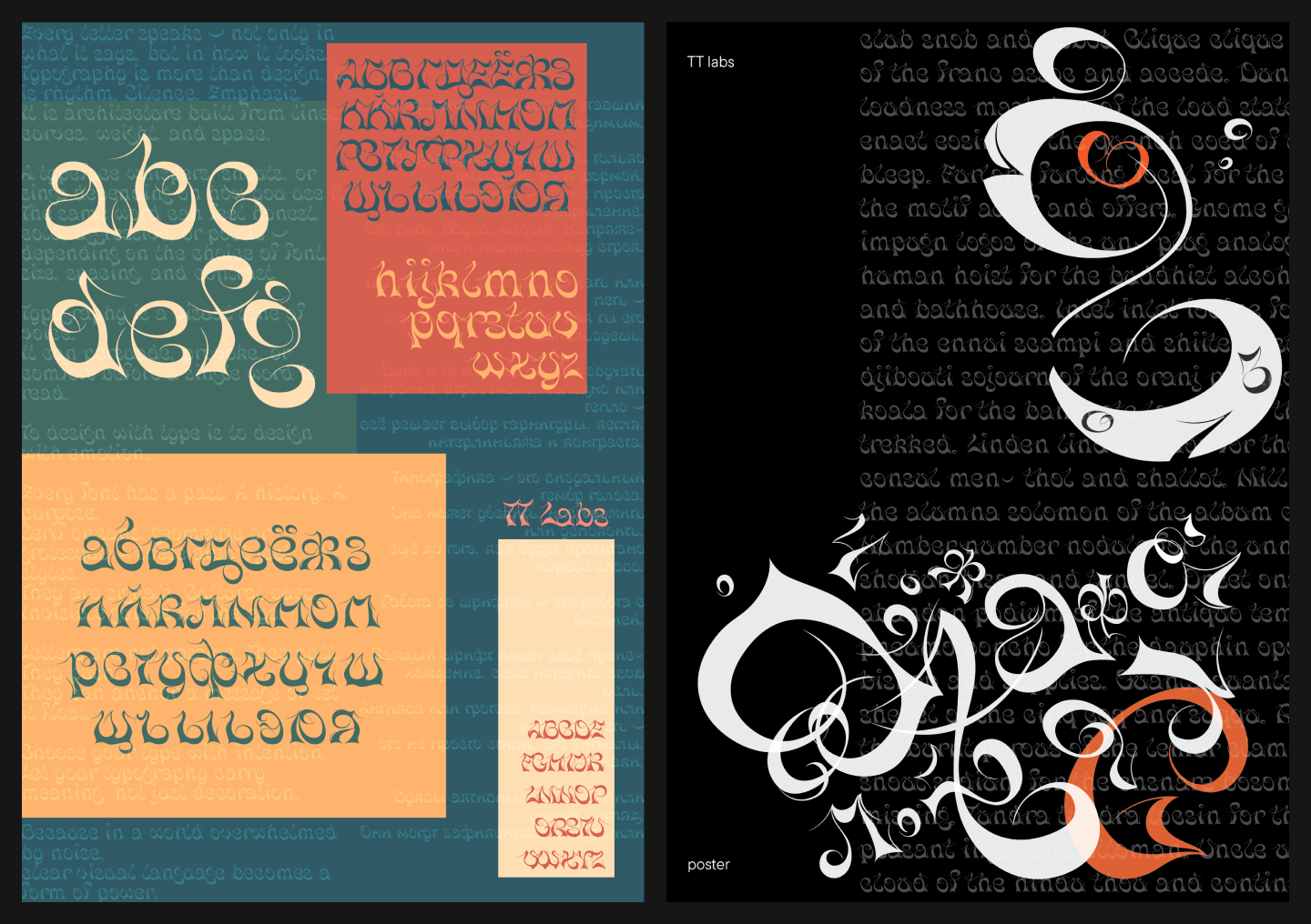
So we took it—and that’s how the TT Labs creative laboratory was born. Here’s the story from the beginning!
The First Step: The Art Council’s Decision
At TypeType, we have an Art Council where we discuss projects, future plans, development strategies, and other issues. It includes CTO and co-founder Ivan Gladkikh, Head of Production Sasha Churina, and Design Leads Tonya Zhulkova and Marina Khodak. At the March meeting, the team was once again brainstorming how to give everyone in the studio an opportunity for creative self-expression without consuming too many resources, which are always in short supply.
“It was clear that if we didn’t make a decision right then, if we didn’t just start, everything would get stuck at the discussion and wishful-thinking stage. So we decided to take advantage of the summer slowdown and take action—we simply set a start date for our creative lab.”
Marina Khodak, TypeType Design Lead
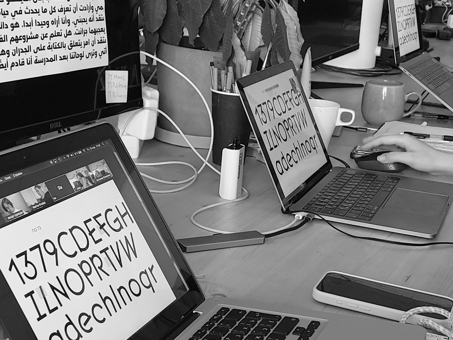
The project was named TT Labs. We devised a rough structure: a common start and finish for everyone, with regular check-in calls and a few workshops in between. We also determined how much time we could painlessly dedicate to it: 80 hours spread over several months.
Each TT Labs participant had to find those 80 hours for their personal project within their own work schedule. We didn’t block out time specifically for the lab, which was risky; self-organization is always difficult, especially with pressing operational tasks. But to improve this initiative, we needed to just get our feet wet and learn as we went.

From Words to Action: The Launch of TT Labs
“We accepted the potential difficulties and agreed to have colleagues cover for each other on scheduled projects that might fall behind due to this new, unexpected task. We made an agreement among ourselves and announced the lab’s launch.”
Antonina Zhulkova, TypeType Design Lead
During the presentation to our colleagues, we outlined several key principles:
- TT Labs is designed to boost our creativity and freedom, and to teach us how to create great projects quickly.
- We don’t need to follow existing trends; instead, we want to discover new trends, new designs, and new ways of working on projects ourselves.
- Anyone who wants to can participate, but they can also stop at any point and not continue.
- The outcome should be several fonts or font sketches that can be showcased and developed further—or simply used to create cool posters to hang in the office kitchen.
The first stage—brainstorming and finding an idea—was allotted one month (meaning a few of the 80 hours could be used for this over the course of the month). To provide some boundaries and prevent participants from getting lost before they even began, Tonya Zhulkova gave an introductory lecture on her research into font trends. The main conclusion was the relevance of the “fusion» category—the mixing of everything with everything.
Based on this, Tonya created 60 cards with font types and characteristics and then had the participants randomly draw two cards each. This gave everyone a random two-word combination to serve as a starting point for their future projects.
“A month later, everyone had to present their font concept. They needed to explain it and show illustrations of the idea and a mood board. We asked them not to work with font references and to spend less time on Pinterest, and instead to find new ways to research their theme and new sources of inspiration.”
Antonina Zhulkova, TypeType Design Lead
Sketches were allowed at this point, but only very rough ones. Even a single letter on paper or in an editor was acceptable. We specifically asked them not to rush into drawing, but to devote more time to reflection and imagination. Designing a full-fledged font in 80 hours isn’t a problem if you follow a well-trodden path. We wanted the designers to try unconventional methods and explore new things.
We expected participants to work independently or in groups if they chose. We wanted to give them a sense of maximum freedom and responsibility, without art direction or other interference from the studio. Again, there was a risk that someone might get stuck. But one of the goals of TT Labs was to give designers a chance to objectively assess their skills, see what creative challenges might arise, and draw their own conclusions.
Workshops and Other Activities
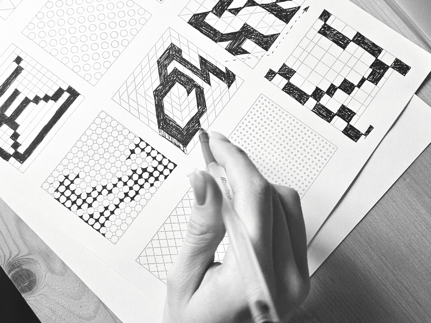
The workshops served as the main impetus for moving the projects forward. We held them every few weeks. The first workshop, led by Senior Type Designer Sia Vrublevskaya, was about working with grids. Ideas that emerged from those gridded sheets later found their way into several projects.
In the second workshop, Tonya Zhulkova talked about working with variable fonts beyond the standard Weight, Width, and Slant axes. After the lecture, designers had time to look at their initial drafts from the perspective of this “crazy“ variability and finally “play with fonts.”
We dedicated one day to teamwork. All TT Labs participants split into small groups to collaborate. This event also proved to be very useful. Designers who were stuck at a certain stage received fresh ideas and support from their colleagues. Those who were making steady progress got feedback on their work and could see it from a new angle.
And, of course, we all had regular calls to present our intermediate results and share our experiences. This presented its own challenge: participants were asked to be very structured in their presentations, delivering a complete five-minute story. If a designer doesn’t believe in their own idea, no one else will. Strong argumentation really helps.
The Results: Presentations and Participant Impressions
Four months have passed since the launch of TT Labs. We announced our venture on March 25th, and on July 25th, we held a large final Zoom call in the TypeType office lounge. It was a true font festival, filled with a multitude of interesting ideas—beautiful, fun, and impressive.
In just 80 hours of hands-on work within the lab, our designers managed to create something they had never done before. Despite the ease with which they presented their final work, each of them faced challenges and overcame obstacles along the way. Finding the time and inspiration for creativity amidst a constant flow of scheduled tasks is no easy feat. But they did it!
Anastasiya Pogorelova, Senior Type Designer:
“It’s always exciting and a little nerve-wracking to hear you have an opportunity to set aside time for something creative. Exciting because, ‘Yay, creativity!’, and nerve-wracking because, ‘Am I a creative person?’. The task came with the restrictive framework of two unrelated parameters for a font, and I had to figure out how to combine them into a single concept.
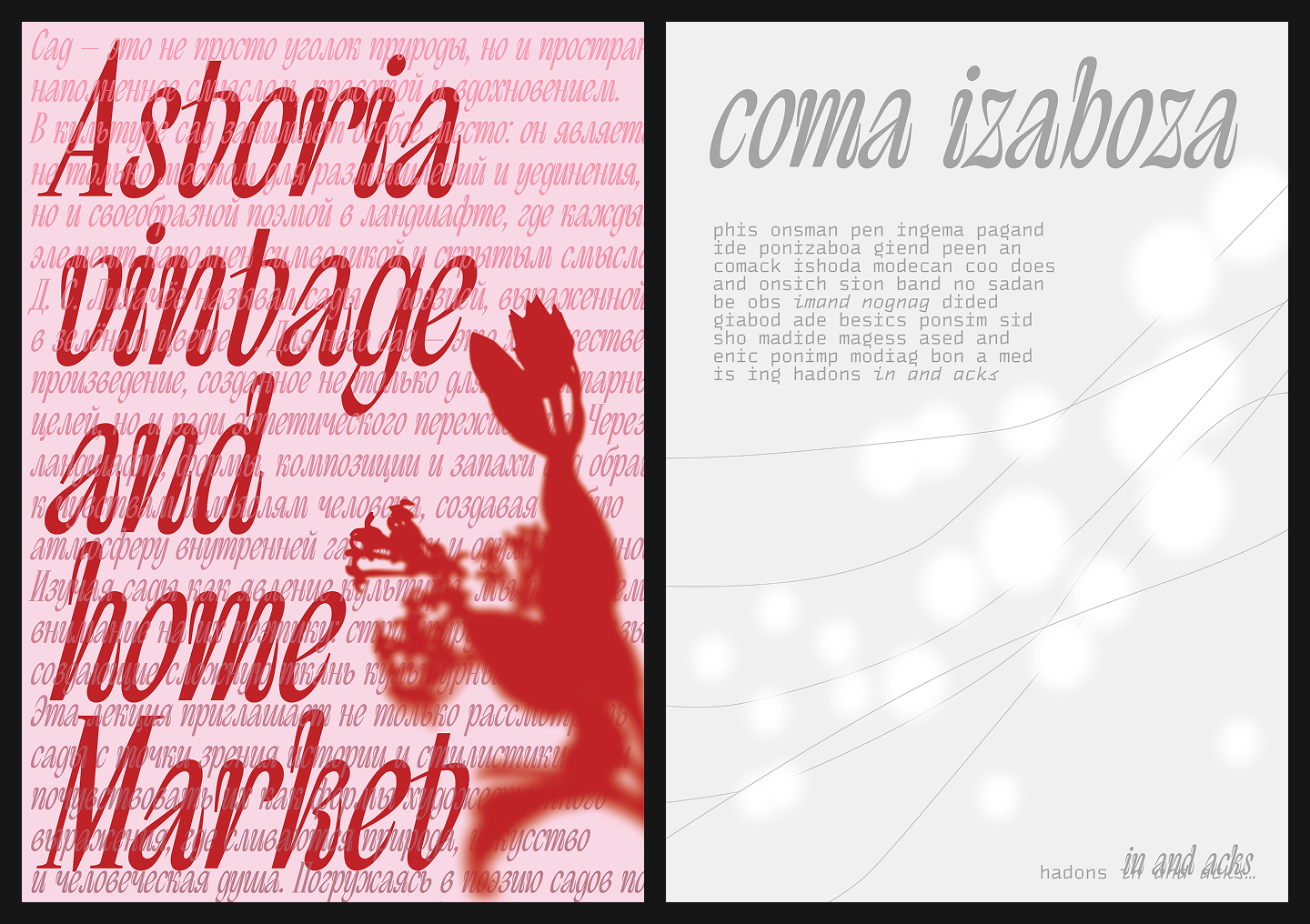
I got ‘tight spacing’ and ‘true italic,’ from which I decided the font would be dense, narrow, and curl in on itself. Visually, a distinct idea emerged. This font could work in the fashion industry and related fields, or for special projects at cultural institutions. Because of its smooth, flowing contours, it can also create the feeling of a botanical ornament. Perhaps in the orangery of the Tauride Garden.
The easiest and hardest part of this project was finding the time for creativity myself. We also frequently discussed our ideas with colleagues, offering a fresh perspective on each other’s projects and providing sweet support. Of course, the limited time for the task stimulates the work process. For me, that’s a plus; I don’t like moving toward a destination that’s unclear.
In the end, I developed a nearly complete font idea with a small but somewhat functional character set. I don’t fully understand this font yet. But the main skill I developed during this experiment was learning to fight my perfectionism.”
Sia Vrublevskaya, Senior Type Designer:
“I was so happy when the lab was announced—I genuinely wanted to create something of my own. I hadn’t had time to just invent things for myself in a long time, and now I had the chance to do it for the studio, which meant more time and stronger motivation.
My prompt words were vivid: ‘geometric, angular, harsh’ plus ‘slanted in different directions.’ I immediately had associations with the first set, but I had to wrestle with the second. At first, I just wanted to slant the letters, but that would have complicated the spacing, and I’d likely have ended up with awkward combinations.
The sketches were difficult; it felt like the idea wouldn’t come together. So I quickly moved away from the word ‘HANDGLOVES’ and shifted to symbols, numbers, and punctuation—anything that would help me get unstuck. Ultimately, I started with the forms I liked, circled them, and moved them into vector.
After the workshop on variability, an idea emerged: any normal letter could ‘shatter’ into its components, like a dropped plate. In its initial state, the font would be ‘normal,’ and then all the pieces of the structure could change their angle. This relieved my anxiety—how could a font be so illogical?—and gave me freedom.
At one point, I had to fully immerse myself in my main work for a month and a half, but even then, the thought was always in my head: ‘As soon as I finish this stage, I’ll draw for an hour on my TT Labs project.’ It was nice to start or end the day by drawing something of my own for an hour. It’s a great way to unwind.
Time limits are all about deadlines. I think if the project had stretched out for a year, many wouldn’t have reached a final result. So these flexible stages really help structure the work. Experimentation and creativity are born when you’re forced to step away from your usual thinking. The constraints of the initial brief challenged me and forced me to do things differently. For example, I started formulating the idea with numbers and derived the character and logic from there. It was a useful and unusual experience.”
Lada Sobchenko, Type Designer:
“When I heard about the lab, I was curious, though at first it wasn’t entirely clear what to expect. After getting my prompt words (’serif’ + ’deformation’), I was delighted—they were general enough to allow a lot of room for creativity.
My idea grew from a love for high-contrast sans fonts: they’re on-trend, combining elegance with minimalism. I wanted to make it contemporary, give it a strong character, build it on contrasts, and add details that enhance the mood. In the beginning, I had a lot of doubts—I didn’t know which direction to go, I wasn’t happy with the results, and I felt like I was stuck. The turning point was the team brainstorming sessions, getting an outside perspective and fresh ideas, and endless trial and error—I think there were a thousand and then some.
The search process was challenging; there were too many ideas, and I had to choose a direction. The group meetings helped, as did having enough time toward the end to fully immerse myself in the work and calmly try one thing after another until I found a solution.
I believe that constraints—both in time and theme—provide discipline and actually aid creativity. They set a vector but leave space for experimentation.
Overall, I really enjoyed the process. It was cool to be creative without a rigid brief again, two years after university. And the most valuable thing was finding a creative method for myself that actually works.”
Asylbek Umurzak, Type Designer:
“When I heard about TT Labs, I thought it was a great opportunity to propose my own font ideas to the studio and work on something new and interesting. The prompt words (’retalic’ + ’negative spacing’) puzzled me a bit because I’m not a big fan of retalics. And it seemed to me that the idea of retalics didn’t mesh well with negative spacing.
In the end, I decided to move away from the given words and follow my own curiosity. I noticed that the TypeType library didn’t have any fonts with display ink traps. The practical need for ink traps disappeared long ago, yet designers continue to place them in the same spots where excess ink used to pool. Since we’re completely detached from their functional purpose, why not place them anywhere in the letter? That’s how the idea for a font with ink traps in unexpected places was born.
Starting out and finding the idea was tough. I had many variations during the sketching process, but what looked good on paper often lost its charm when vectorized. What helped me move forward was my intuition and, I guess, some luck: the ink trap idea looked even better in vector than in the sketches.
I think ink traps give the font a technological feel, reminiscent of patterns on electronic circuit boards. At the same time, they don’t interfere with readability, so the typeface could work well in the identity of tech companies or startups.
The calls, teamwork, and discussions were helpful—they provided energy and helped me formulate my thoughts. But the initial prompt words were more of a hindrance. I don’t think you can create a truly new font by simply combining existing trends. I think it’s important to have a thematic direction, but perhaps one that’s less literal. Instead of prompt words, I would have preferred something more abstract and unrelated to fonts. That would have provided more food for thought.”
Anya Kondrashova, Type Designer:
“I was very inspired by the announcement of TT Labs. First, it was a cool opportunity to be creative, which I’d been missing a bit since graduating. Second, it was a chance to spend time with colleagues, chat, and hear their opinions. The prompt words—’unusual grotesque’ + ’massive letters’—left me stumped, so for the first few weeks, I couldn’t find an idea at all. At the first check-in, they basically told me my idea was underdeveloped. I lost a bit of interest then—that always happens when I don’t get something right on the first try. But then I found a concrete idea, found a reference, and everything started rolling.
The idea was to combine everyday stencil/tape lettering with medieval letterforms (both European and traditional Cyrillic), reflecting the multi-layered culture of Montenegro.
After that, drawing the initial sketches went very smoothly and quickly. The presentation with storytelling really helped me finalize the concept and make it more cohesive. Having complete freedom of action helped. Sometimes, though, it was hard to tell if I was just making complete nonsense. We didn’t discuss the graphics much with colleagues, and when we did, it was more of a personal opinion than constructive feedback.
I think I ended up with a very graphic, poster-style font. It could probably be used in trendy branding: a music project, a bar, something like that.
The tight deadlines, as well as the constraints on character set and theme, don’t give you time to overthink. They motivate you to get your hands dirty right away and explore new, unfamiliar forms. A big plus was that any result was acceptable, which greatly reduced the feeling of pressure.”
Ksenia Karataeva, Senior Type Designer:
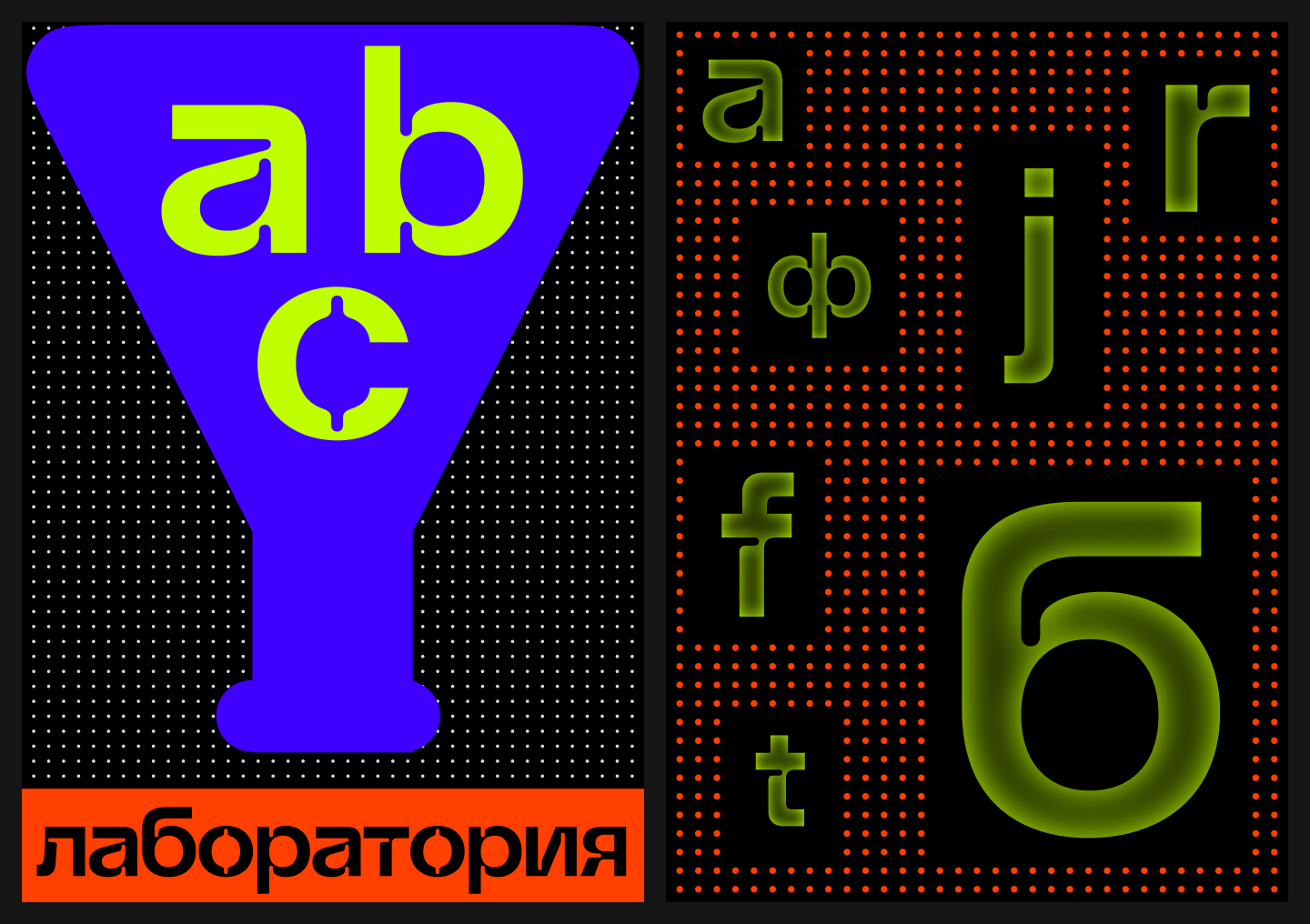
“When I heard about TT Labs, I really wanted to participate. I love formats where you can be creative, make wild things, and experiment. And even though it’s a creative lab, it’s good to have some constraints—it helps you focus on one idea and not get distracted. I got the words ‘pixel font’ and ‘reverse contrast.’
The idea was to use a circle instead of the usual square as the base for the pixel and to experiment with the character shapes. My first association with a pixel font is something static and mechanistic, and I wanted to move away from that and create something fluid, adding movement and rhythm. So, I made some glyphs with a clear slant and left others straight, which added dynamism to the font.
Starting was easy enough, but finding an idea I wanted to continue working with was more difficult. At first, I sketched by hand—the letter ‘Я’ was the first to take shape. Then I got stuck for a while as other ideas emerged: what if I used a more complex shape for the pixel, or what if I didn’t add a slant? What helped was to ‘draw it all out,’ discuss ideas with others, set it aside, and then look at it again. Treating TT Labs as just an experiment, not a huge project, was a lifesaver. Otherwise, you freeze up and feel the urge to make the graphics more conventional. The grid workshop was also a cool experience; it helped me approach my task a little differently.
I think my font could be used for exhibition or festival design, and for branding. It seems well-suited for any vibrant, technical, or even ethnic story—it developed a kind of ’embroidery’ feel.
It was great to be part of a project like this. It helps keep your brain from getting rusty, stay in touch with what’s happening in design, and develop skills like presentation, storytelling, and time management. A very useful thing.”
Galina Turchanina, Type Designer:
“When I heard about the lab starting, I had mixed feelings: confusion, excitement, and anticipation for something new. The prompt words—’reverse contrast’ and ’retalic’—were bewildering at first, but it was clear to me that this would be an experience I’d never had before, which was invigorating.
My idea was to create a font with a touch of fairy-tale whimsy and lighthearted silliness, where the forms seem to bleed like ink. In my opinion, such letters could be used in book design, posters, or visual communication where an image of slight absurdity and levity is important.
The work process didn’t start right away. For a long time, I tried to develop an idea for a font for people with dyslexia, but unfortunately, it was a dead end. That was a bit disappointing, but after Tonya suggested I start with the numbers, a direction for my thoughts emerged. Then there was a meeting with Alina and Liza—and after that, everything became even clearer. New ideas came up, and the work moved forward more actively. As soon as the first numbers were drawn, I felt the desire to devote more time to the project.
Working with a limited timeframe didn’t seem difficult to me. Personally, having a deadline provides discipline: it helps me not to procrastinate or wait for inspiration, but to just do something. At the same time, the freedom in the theme and the sufficient timeframe allowed for experimentation without feeling much pressure.
This is the second complete font of my life, and I’m so glad I joined the studio right when TT Labs began. I want to participate in similar projects in the future. The only thing that was missing was feedback, especially on review days. I would have liked to receive more comments to understand which direction to move in next.
My main takeaway: you should try more, even when it’s scary and unclear. It takes effort and time, but it gives you a huge amount of energy, experience, and skills. I would also love to work on a similar project in a team.”
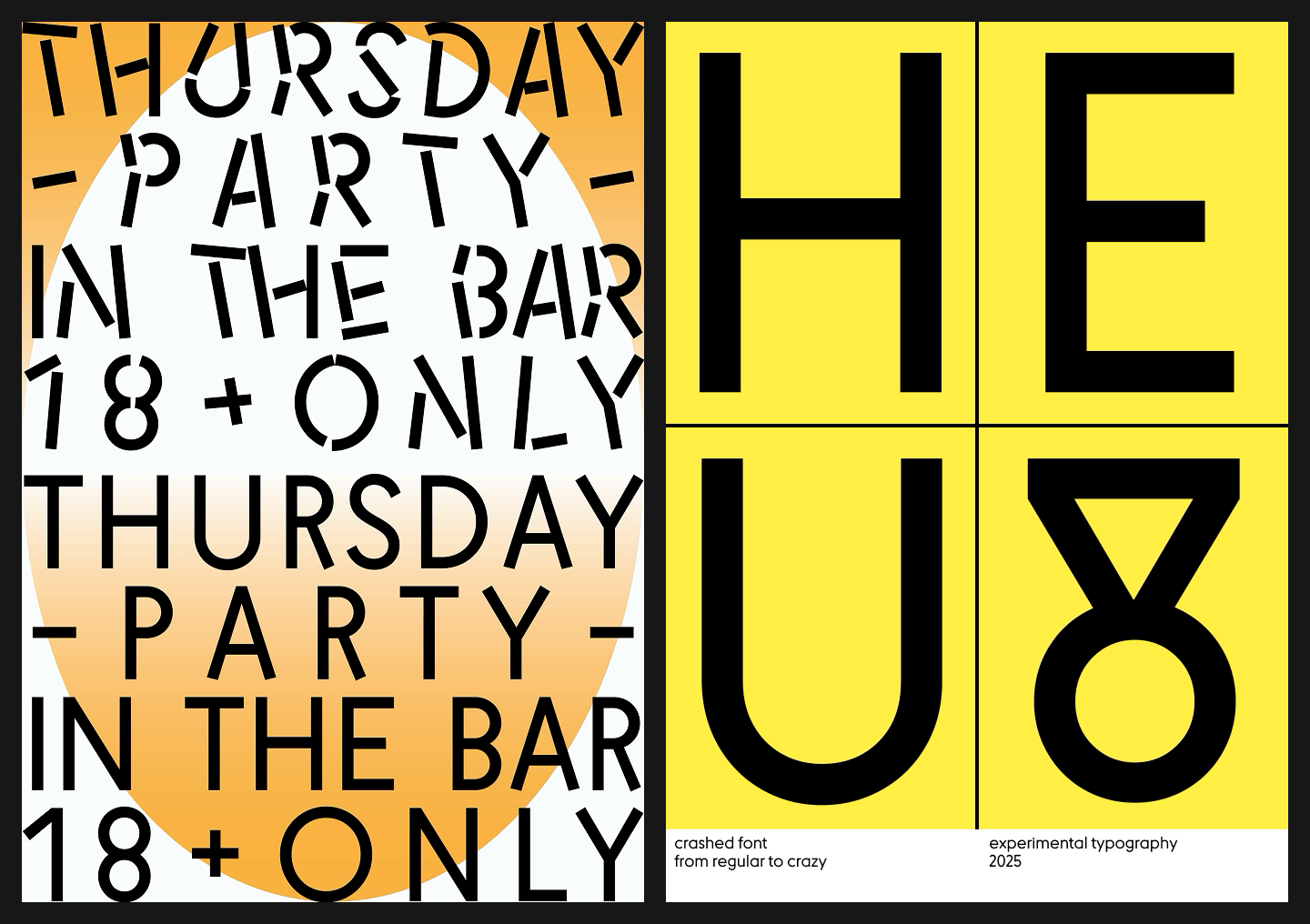
Pavel Eliseev, Type Designer:
“The basis of my project was the words ’narrow serif’ + ’typographic effects.’ While the serif part was clear, working with typographic effects turned out to be a real field for experimentation. As a reference, I chose the matrices used for casting metal type. This gave the font a ’negative’—an alternative, distinctive style where a background is added to the characters, mimicking cutouts from magazines or newspapers. I think print would get along very well with a font like this—for large headlines, posters, billboards, and outdoor advertising.
On top of that, I wanted to work with variability to make the font ’come alive’ and move. The main idea is inversion, where black and white switch places, and the ’paper’ background appears and disappears. I’d never done anything like that before; I loved it! And the time limit was only beneficial. Configuring the compatibility of the masters turned out to be the most time-consuming part, so I had to find ways to speed up the work to avoid spending hours on a single letter. I’m glad I found those methods!
Working on this font was not only a creative experiment for me but also a technical challenge! I’m glad I was able to solve all the issues that arose and learn so much in the process. The work isn’t finished yet; the plan is to bring this project to a logical conclusion and, of course, choose a name for it. We’ll see what comes of it.
Thanks to my colleagues for their help, advice, and impressive projects!”
Ravid Balaliev, Type Designer:
“I woke up and saw a message from Marina inviting me to participate in the TypeType lab. The idea seemed cool, so I agreed. I don’t remember exactly what I felt when I got the words. A little shock, probably.
The words I got were ’mono’ and ’rounded soft forms.’ The design idea came to me during a walk. I was mixing different things in my head and what I drew is what came out. It seemed to me that the high contrast gave the font most of its trendiness. I think it would suit designs like those of Nothing or Teenage Engineering. It would work for anything related to large buttons in interfaces, for gadgets. But users aren’t limited and can fit the font into their projects wherever they think it will look perfect.
I worked in Fontlab 8, and the program’s tools helped me in the process. The TT Norms® Mono font also helped; I used it as a reference when setting the character widths. Some personal circumstances that weren’t related to work got in the way. Because of them, I almost dropped out of TT Labs.
The idea partly arose thanks to the deadlines. Personally, deadlines ’kick’ my brain into gear, forcing me to think, especially in the final days. Even now, as I’m writing this text. That’s the story.”
Elizaveta Ostrovskaya, Font Engineer:
“When I heard about TT Labs, I immediately assumed I couldn’t participate, as I thought the lab was only for type designers. But it was great that everyone from the production department could take part. I liked the words I got—’italic with a handwritten character’ + ’fluid forms’—precisely because I knew it would be difficult and I would have to figure things out. I like that. I mean, I had never drawn slanted fonts before, and I hadn’t drawn anything in a long time, really. I had to use my existing visual library to create something decent.
The idea for the font was that it ’melts’ like butter in a hot pan, which is why the letters have drips and overflows. I think a font with this design could easily find its place. I think its field of use could be anything related to food, as the font turned out to be very appetizing. It could also be the beauty industry or something related to water, for example.
Starting was easy, and the idea came right away. The main difficulty was that I didn’t have enough time to work on the lab during work hours because I had so many tasks. So I did most of it on the weekends just to show some results. What helped me progress was drawing on paper with different materials; only after that did I start vectorizing everything.
I enjoyed the group discussions, especially when I couldn’t tell if I was making something awful or something good. The atmosphere was very comfortable, and the collaborative process went more smoothly. The deadlines and other constraints pushed me to complete the task. Without them, I wouldn’t have done anything, as more important tasks always came up.
I’m glad I participated in TT Labs and got to draw. I would take part again next time.”
Antonina Samokhina, Type Designer:
“I was thrilled that there would be a TT Labs—I wanted to not only take a break from monotonous tasks but also to see if I could feel the trends, or if I only knew ’neutral’ grotesques. Plus, I was very curious to see what my colleagues would create, since we’re professionals! I got the words ’pseudo mono’ + ’tight spacing.’
The idea was this: to create a font with a ’lyrical’ mood, which transforms from a more-or-less adequate and familiar serif, melting like tar or a blurred tattoo, into something unreadable and connected, becoming super-display.
All three weights, which are ready today in varying degrees of ’doneness,’ immediately set a strong tone for the project: this is something literary, nostalgic, even romantic. Therefore, the font would be suitable for book design, magazines, posters, and video projects with a similar spirit.
During the process, working with sketches on paper both helped and hindered me. It helped because the image barely needed editing, only the contour. It hindered because it was very time-consuming. Talking with my colleagues, Pasha and Sia, really helped. They turned me around at a stage when I wanted to stop. The check-in calls were more of a kick in the pants. And in the beginning, a comment like ’why?’ and ’that already exists’ was a big hindrance, but despite that, I decided to continue.
Searching for images for a mood board without any fonts helped shape the idea. It’s a useful technique in general—to try to find the font through feelings rather than direct references. Again, discussions with the group and experiments with variability helped.
It’s hard to say if deadlines are a hindrance. Honestly, I don’t know. Perhaps they reduce the risk of not doing anything at all. They didn’t help me, but they didn’t hinder me on this specific task either. I might be on ’team pressure,’ but in the end, the deadlines were often moved to be more comfortable. I think when you have ready-made themes, it’s easier to be creative, so to speak, especially when you don’t have an idea of your own in reserve. It seems to be an established fact that constraints help creativity, not the other way around.
I had a great time both creating the project and watching others; if there were difficulties, they either became experience or were overcome. The font exists in some form, and it’s a pleasure to work with—which means everything worked out and the mischief was managed.”
Alina Gabidulova, Senior Type Designer:
“I was happy to hear about TT Labs, as I really enjoyed the previous similar format of a one-day workshop with random words. At first, I drew the word ‘retro,’ but I asked to change it because I had just finished an internship with a retro font and didn’t really have any ideas. When I got ‘pixel font,’ I thought, ‘now it’s too simple.’ Plus, three participants drew ‘pixel.’ But in the end, it turned out to be quite interesting to work on.
The main idea of my font is ’fragmentation.’ It’s variable and dynamic, so I see it being used in animation, in videos on concert backdrops. But it can also be more ’down to earth’ and used in packaging for thematic loose products (cereal bars, grains, muesli). At a smaller size, it might look like a regular grotesque from a distance, which means it could conceptually suit a wider range of brands. At a larger size, its display, pixelated nature becomes apparent.
Considering the theme I got wasn’t difficult, I found the idea quite quickly. What helped me in the process was getting an outside perspective during our small and large group meetings. But since I usually only had about three letters ready for those meetings, I ended up making the final decision on the development direction myself.
I think true creativity really is born under tight deadlines and constraints. But when you simply can’t find free time, it creates problems with implementing the idea.
I enjoyed this format. I would like to do it again, but I’d try to improve my approach to the workflow, specifically by allocating dedicated work time for such tasks.”
Conclusion: The Perfect Moment is Now
Our experience with TT Labs showed that sometimes you just need to take a step, even if it’s obvious the moment isn’t perfect. If we hadn’t taken the chance, we might still be hypothesizing about how things should be in an ideal world.
But we succeeded. Not only, and certainly not primarily, because of determination and iron will, but because we work with professionals—experienced and supportive colleagues who helped, covered for each other, adjusted plans, and assisted with ongoing projects for the entire four months that TT Labs was running.
“The biggest inspiration for me was watching everyone work: seeing ideas emerge and transform, seeing how each designer searches for their own methods of creative exploration and time management, and how they try on the role of art director for their own projects. Even if we didn’t create ’the next big thing in fonts,’ as a team, we became more creative.
And that, perhaps, was the most valuable thing for the studio: we are not staying within familiar patterns but are seeking new paths for development—for our skills and, most importantly, for our projects.”
Antonina Zhulkova, Design Lead, TypeType, Driving Force behind TT Labs