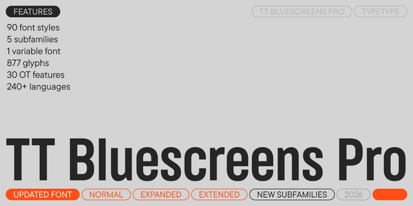
Introducing TT Bluescreens Pro 4.000 — now featuring wide proportions!
We added new subfamilies and enhanced the font’s functionality.
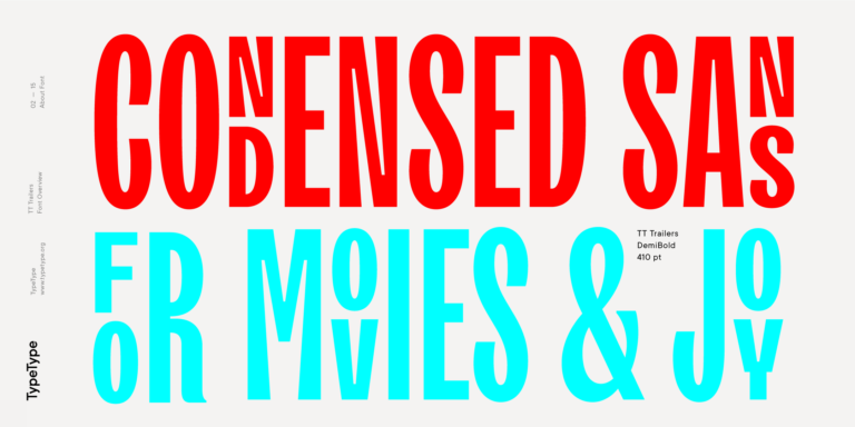
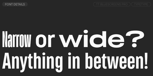
TT Bluescreens Pro is a modular sans serif with a distinctive character. In 2015, we created this typeface specifically for movie posters and credits, and its narrow proportions were its distinguishing trait. However, over time, TT Bluescreens changed, becoming more multifaceted and functional. In 2023, we released the third version of the font, supplementing it with an even narrower subfamily and extended Cyrillic. However, we didn’t stop there.
In 2025, we had an idea that seemed crazy at first but turned out to be quite rational: what if we made TT Bluescreens as wide as possible? We dared to undertake this experiment—and the result genuinely surprised us. Presenting TT Bluescreens Pro—the fourth version of our legendary typeface!
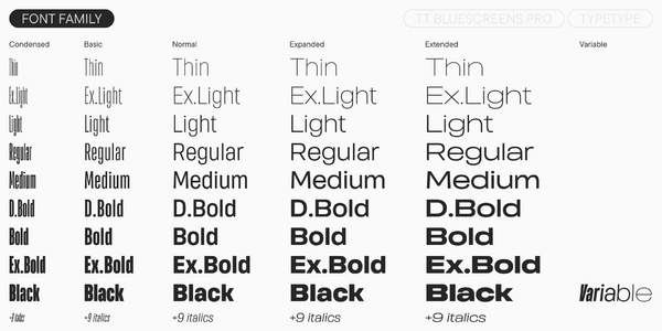
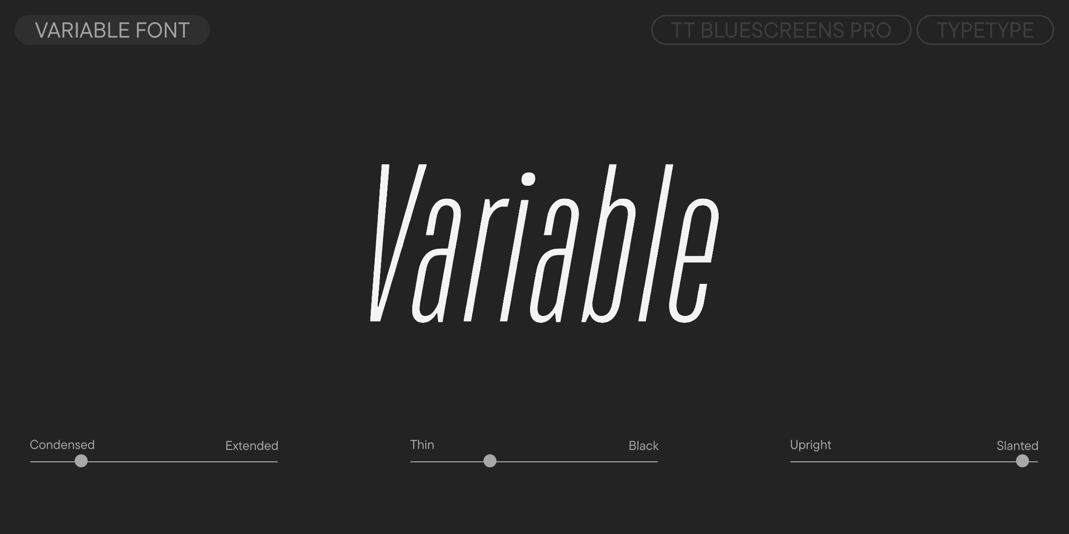
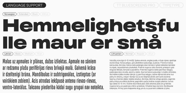
It now features three new subfamilies: Normal, Expanded, and Extended. This range of widths offers virtually unlimited possibilities for design. We also updated the variable font, which now unites all five widths into a single variable system.
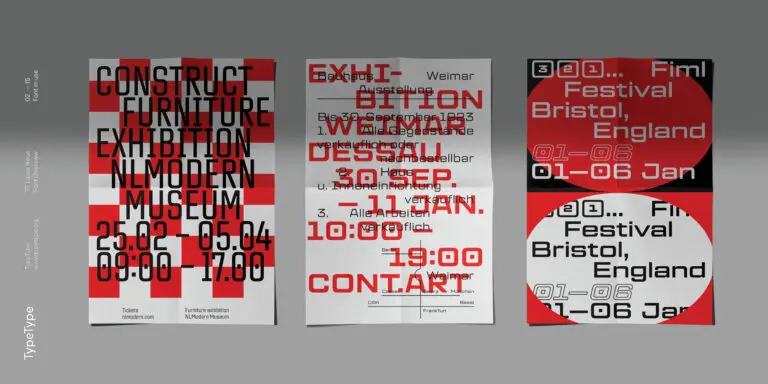
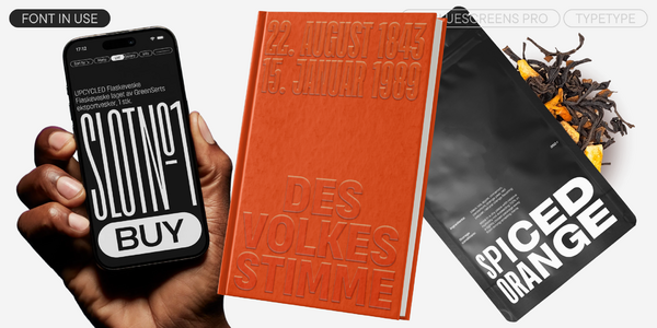
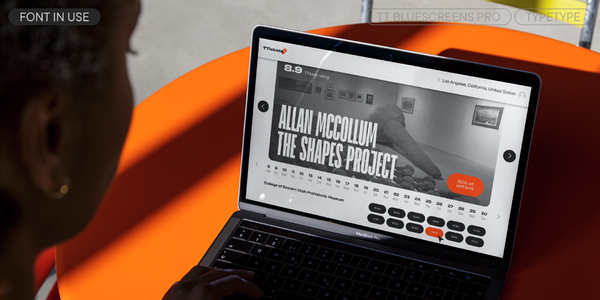
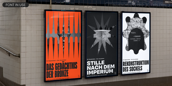
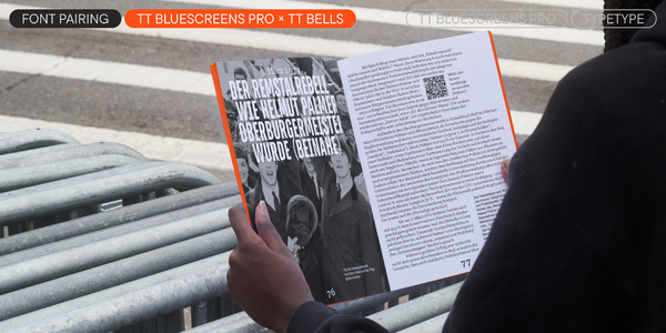
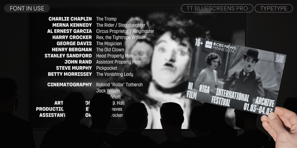
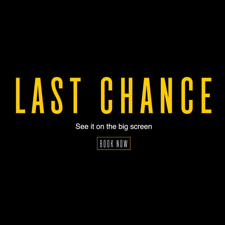
Thanks to its visual features and functional richness, TT Bluescreens Pro can be used in completely different projects. This font is suitable for branding, packaging design, cover design, posters, and event announcements, and it will look aesthetically pleasing in film credits and disclaimers.
TT Bluescreens Pro 4.000 includes:
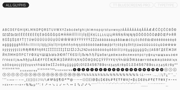
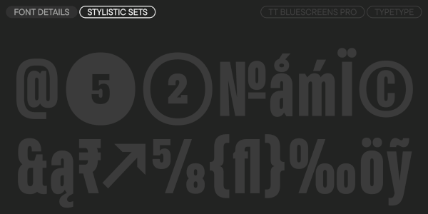
- 91 styles: 45 uprights, 45 italics, and 1 variable font
- 5 subfamilies: Condensed, Normal, Expanded, Extended, and the base TT Bluescreens Pro
- 877 glyphs per style
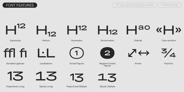
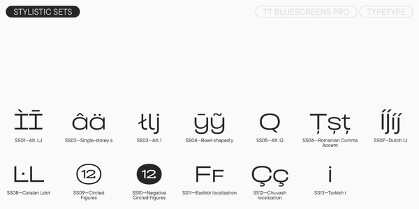
- 30 OpenType features, including ligatures, stylistic sets, and localization features
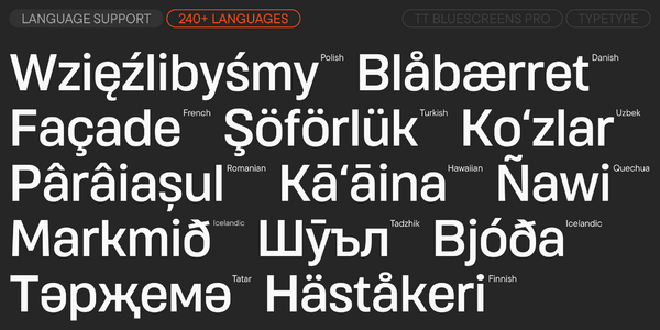
- Support for over 240 languages