top_banner_ttcommonspro0526
Type foundry Blog UniversiTTy

UniversiTTy

UniversiTTy: Lesson 10. Designing Basic Lowercase Characters
UniversiTTy

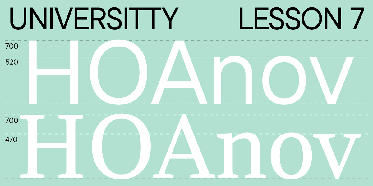
Welcome to the tenth lesson of our “UniversiTTy”! In this series of articles, we guide you through the process of font design step by step. Last time, we focused on the detailed development of uppercase characters. Now, it’s time to concentrate on basic lowercase ones.

UniversiTTy: Lesson 9. Uppercase Characters. Detailed Contour Refinement
UniversiTTy

Welcome to the ninth lesson of our «UniversiTTy»! In this series, we guide you through the process of font design step by step. The font is a cohesive visual system. This can be seen on all levels: global (font type, weight, proportions, contrast, general forms) and at lower scales that encompass all graphic choices in individual characters. Let’s find out together how visual details influence the overall perception of fonts.

UniversiTTy: Lesson 8. Designing Basic Latin Characters. Uppercase characters
UniversiTTy Work with fonts

Welcome to lesson number 8 of our “UniversiTTy” series! Last time, we covered optical compensation, uppercase and lowercase character heights, and the concept of contrast. In this article, we will finally focus on glyph design specifically.

UniversiTTy: Lesson 7. Designing Basic Latin Characters. Glyph Height, Contrast, Optical Sizes
UniversiTTy

Welcome to the seventh lesson of our «UniversiTTy»! This article continues our fascinating explorations of the font creation process. Today, we will continue discussing optical compensations, find out how to determine the heights of uppercase and lowercase characters, and learn more about the essence of contrast.

UniversiTTy: Lesson 6. Designing Basic Latin Characters. Introduction
UniversiTTy

It’s time to continue our fascinating journey into the multi-dimensional topic of font design! The following article is dedicated to the first stage of designing basic Latin characters: glyph construction and determining the graphic features, proportions, and consistency.

UniversiTTy: Lesson 5. Choosing and Mixing Typefaces: Theory and Practice
UniversiTTy

Designing a font is a complex and meticulous process that requires a lot of experience. However, dealing with a fully crafted font can also take much work. Our clients often ask us how to use a specific typeface better and what other fonts they can match it with. We help choose a suitable type solution for the project, whether it’s an existing typeface from our collection or an entirely new font we design from scratch. In this article, we will share our experience with you.

UniversiTTy: Lesson 4. Planning a Font Family
UniversiTTy

Expanding our exploration of sketches, the focus in this article will shift to more pragmatic sketches — those of a font family. You’ll find out why it’s essential to determine the contents of your typeface during the first stages of your project.

UniversiTTy: Lesson 2. How Not to Get Lost When Working on a Font. The Art of Task Outlining
UniversiTTy

Before you begin designing letters and forming the font, it is essential to carry out initial preparation to get a clear idea about the project’s outcome. In this article, we will focus on the essence of this preliminary stage and the importance of this work, describing and analyzing the process of task outlining.

UniversiTTy: Lesson 1. Typeface Categories
UniversiTTy

This article is not an ordinary one. If you have not heard about it yet, we have launched a new project for everyone who is in love with fonts. As part of this initiative, we will release articles on typography regularly. Each article of the series will explore one useful subject. The main thing is that you will not only immerse yourself in the industry but also meet our wonderful TypeType team of typography experts as they share their knowledge and experience.