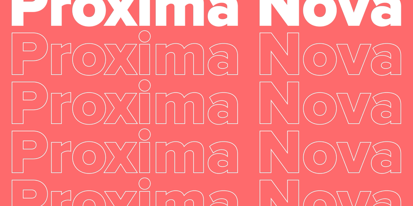
Proxima Nova is one of the most recognizable sans-serif fonts in modern design. You can find it in branding, logos, on websites, and in mobile apps. This typeface has become a versatile tool for designers and developers thanks to its neutral character, balanced proportions, and excellent readability.
In this article, we’ll explore the history of the Proxima Nova font family, its graphic characteristics and composition, figure out what fonts go with Proxima Nova, what its best alternatives are, and what license you need to use it.
What is Proxima Nova? An Overview of the Typeface

History of Proxima Nova
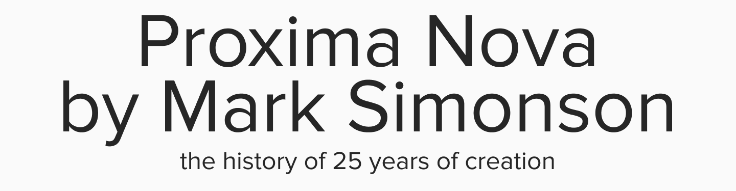
The creator of this font is American designer Mark Simonson. He worked on the typeface for a whole 25 years: its history began back in the 1980s with the first prototype. In 1994, the first version of the font, called Proxima Sans, was released. It wasn’t until 2005 that the Proxima Nova we know today was released. Since 2010, it has become the most popular commercial font on the internet.
Composition of the Proxima Nova Typeface

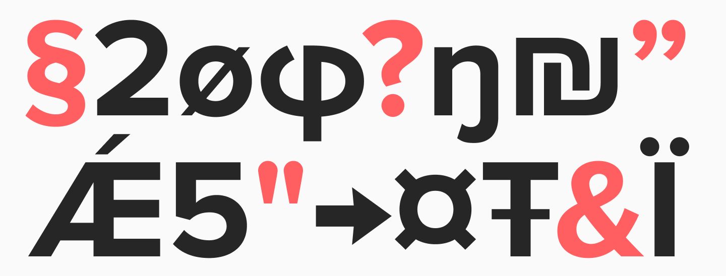
The extensive Proxima Nova family consists of 5 subfamilies (each with 16 styles), totaling 80 different font styles (including Thin, Light, Regular, Medium, Semi Bold, Bold, Extra Bold, and Black, with their corresponding italic versions). It also boasts broad language support (over 110 languages), including Arabic, Thai, Devanagari, Hangul, Hebrew, and Tamil. Proxima Nova Cyrillic support is also included.
The Idea
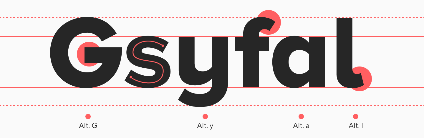
The name Proxima Nova translates from Latin and Portuguese as “next new thing.” The main idea behind this font was to combine the geometric style of Futura with the humanist character of Akzidenz-Grotesk. Mark Simonson aimed to create a neutral and versatile typeface that would look fresh and modern.
Proxima Nova Price
The price for the superfamily (80 font styles) on various platforms starts from $2000 (excluding discounts), and for individual families, from $500.
Price Comparison on Aggregators and Official Distributors
| Platform | Purchase Model | Price for Complete Family (Desktop) | Features |
| Fonts.com (Monotype) | One-time payment / Subscription | For large companies, subscriptions start at $2,500/year. For small companies, from $199/year | Official distributor from the creator (Mark Simonson Studio). Prices often match MyFonts. |
| Adobe Fonts | Subscription only | Included in subscription (from ~$20/month and up) | Cannot be purchased outright. Access to the entire family (and thousands of other fonts) with a monthly Adobe Creative Cloud subscription. Ideal for Adobe subscribers. |
| YouWorkForThem | One-time payment | (48 font styles) $1,836 Complete Family (48 fonts) | Another popular aggregator. Often has its own discounts and alternative packages. |
| Mark Simonson Studio | One-time payment | $877.99 (superfamily) | Personal website-portfolio and blog of the creator of Proxima Nova. |
Proxima Nova Font Characteristics
Proxima Nova has a neutral character, strict proportions, and clean, simple lines. It blends the characteristics of geometric and humanist sans-serif fonts. Thanks to its minimalist design and lack of flashy details, this font can be used in almost any design.
Usage: Where Proxima Nova Works Best
Proxima Nova is a versatile font suitable for a multitude of applications:
- Web design and digital interfaces (webfont, CSS, web-safe)
- Branding and logos
- Editorial projects and publishing
- Mobile apps and UI/UX design
- Advertising and social media

Proxima Nova is often used by tech companies, media outlets and magazines, and social platforms and apps. Over the years, it has been used by brands like Spotify, BuzzFeed, Airbnb, Twitter, Wired, and Mashable. In the 2010s, the typeface was among the top 5 most popular web fonts. However, today many designers are opting for more modern solutions.
Fonts Similar to Proxima Nova (Alternatives)
Below, we’ve selected fonts similar to Proxima Nova from the TypeType collection that can easily serve as a replacement. We’ve also compared their graphic and technical characteristics.
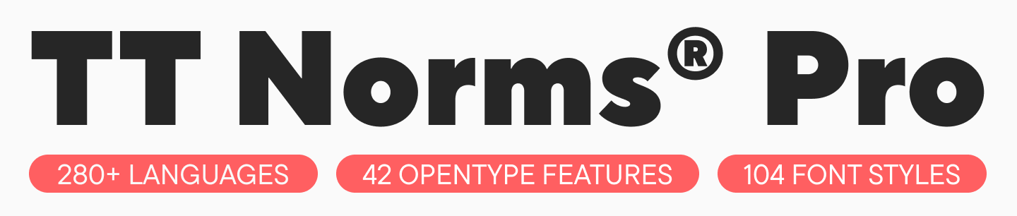
TT Norms® Pro

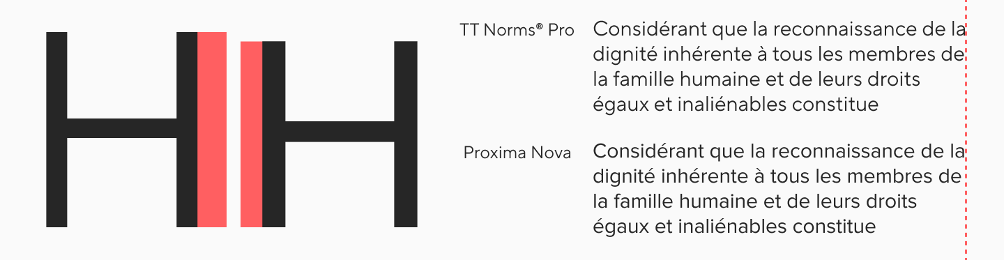
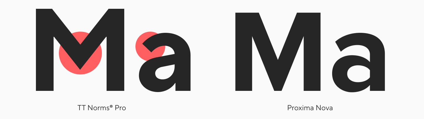
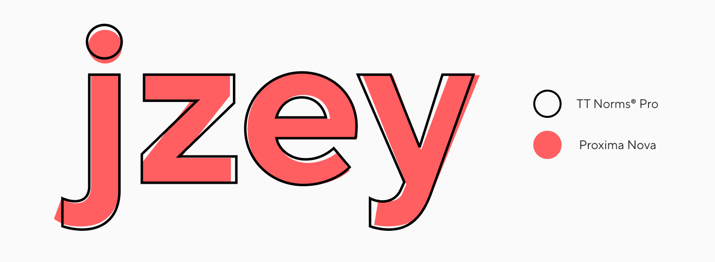
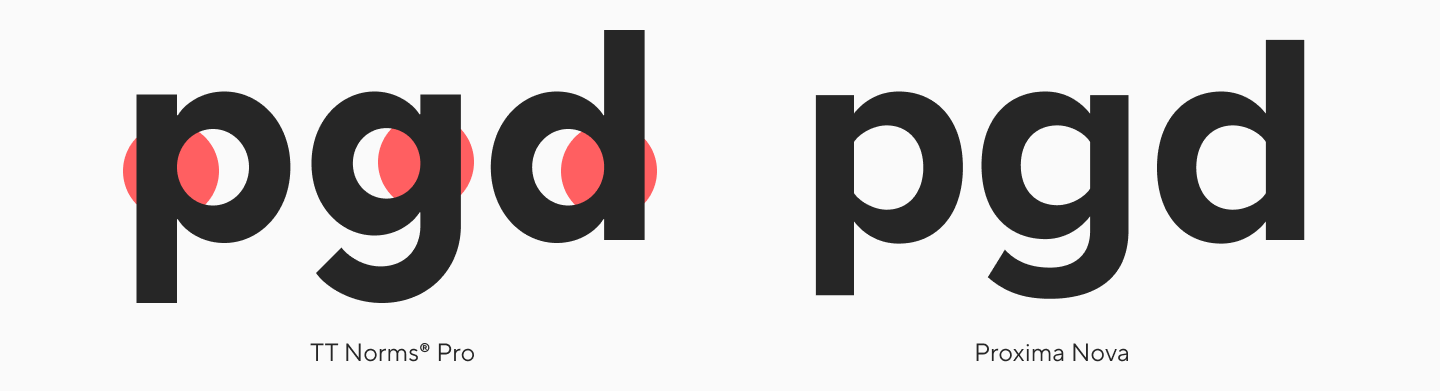
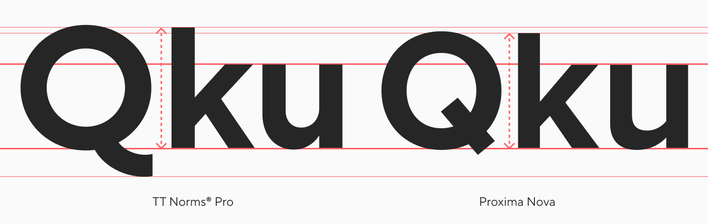
TT Norms® Pro is a concise and versatile geometric sans-serif, a bestseller from our studio. It is what font is closest to Proxima Nova: they have almost identical graphics, very similar character structures and proportions, letter skeletons, and spacing. Both fonts also share high readability, slightly open apertures, and a tendency toward uniform proportions. The characters of these fonts are equally neutral, making them suitable for almost any situation.
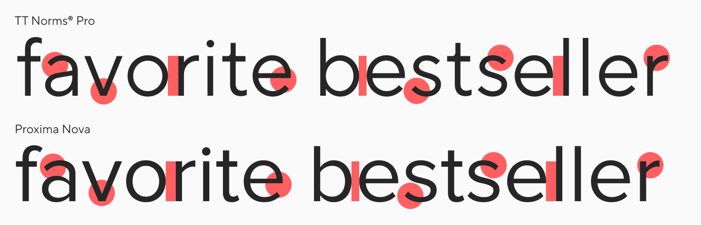
The spacing in TT Norms® Pro is slightly looser, taking up a bit more space, but this contributes to its readability in small sizes.
Although both fonts are neutral, TT Norms® Pro exhibits the geometric quality characteristic of Neo-Grotesques.
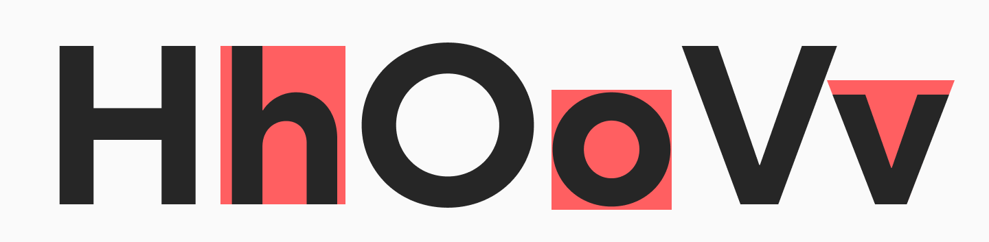
TT Norms® Pro also features sharper elements, such as in the letter “m,” and a charismatic letter “a.”
Compared to Proxima Nova, the contrast in TT Norms® Pro is less pronounced.
The two fonts have different bowl joins.
The lowercase characters in TT Norms® Pro are slightly shorter.
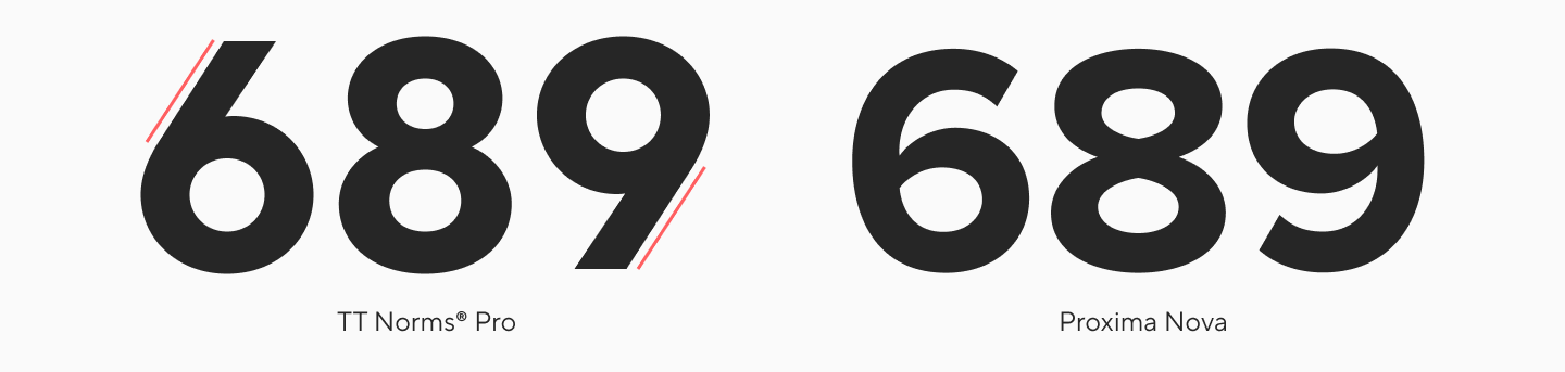
The structures of the numbers 6, 8, and 9 are different.
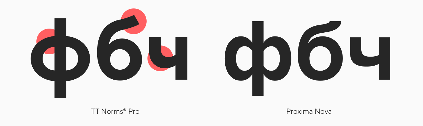
The Cyrillic in TT Norms® Pro is designed a bit more precisely (this is especially noticeable in “ф” and “б”).
Furthermore, TT Norms® Pro is highly functional and diverse. The family includes a huge palette of styles from condensed to wide—a total of 104 font styles (including Compact, Condensed, Expanded, and Mono subfamilies, plus 2 variable fonts).

Their feature sets are nearly identical (TT Norms® Pro supports 42 OpenType features), but the language support in TT Norms® Pro is much broader, covering over 280 languages.
TT Norms® Pro works flawlessly in text, looks minimalist in headlines, and fits into any context thanks to its neutral character. So, it can easily replace Proxima Nova from both a visual and functional standpoint.
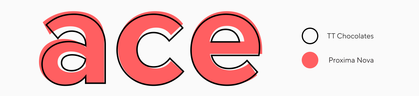
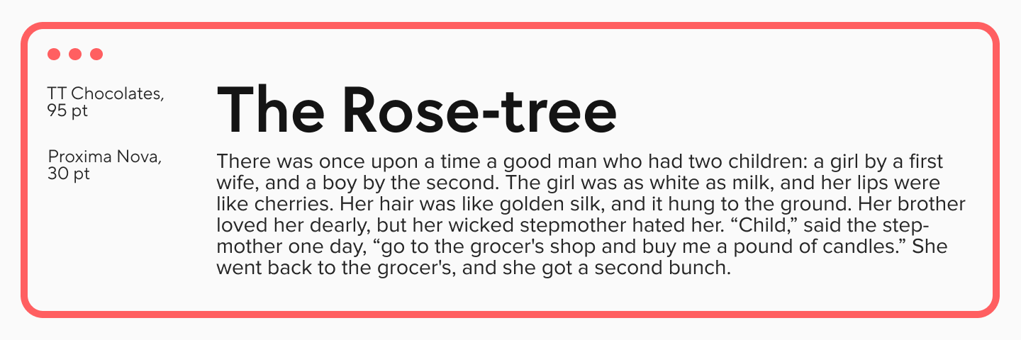
TT Chocolates
TT Chocolates is an elegant humanist sans-serif with tight typesetting and balanced, classic proportions. It’s not as literally similar to Proxima Nova, but it’s a great alternative for cases where you need a replacement with a bit more character.
Proxima Nova and TT Chocolates have a very similar letter “a,” and both fonts have open apertures.
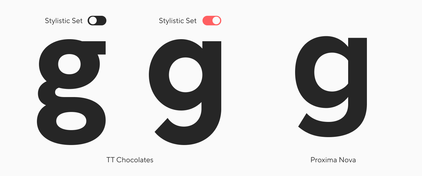
The letter “g” is different, but TT Chocolates includes a stylistic set with the same single-story glyph.
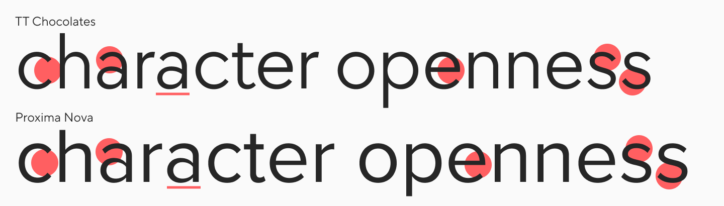
Unlike Proxima Nova, TT Chocolates has varied proportions, which means it takes up slightly less space in body text.
It’s also worth noting that TT Chocolates has pointed terminals on its diagonal strokes (noticeable in “Vv,” “Ww,” “Nn”), which gives the font a more dynamic character.
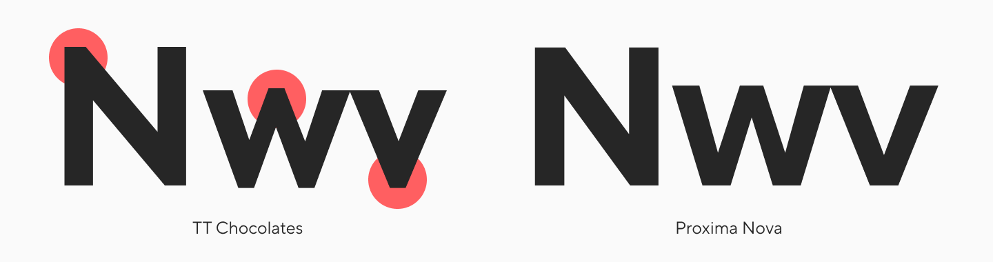
TT Chocolates includes 29 font styles, supports 230+ languages, and 32 OpenType features. It reads well in body text and looks stylish in large and medium sizes.
TT Drugs
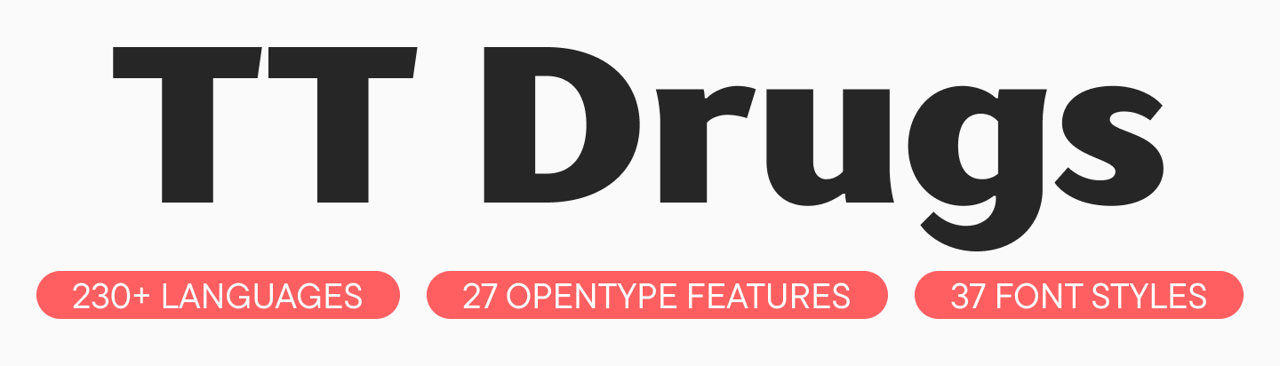
Another font like Proxima Nova from our collection is TT Drugs. It’s a refined yet serious high-contrast sans that is versatile in its application.
TT Drugs is similar to Proxima Nova in terms of its structures. They have nearly identical proportions, though TT Drugs is slightly wider. In body text, they create a similar feel, as both typefaces are considered more humanist than geometric.
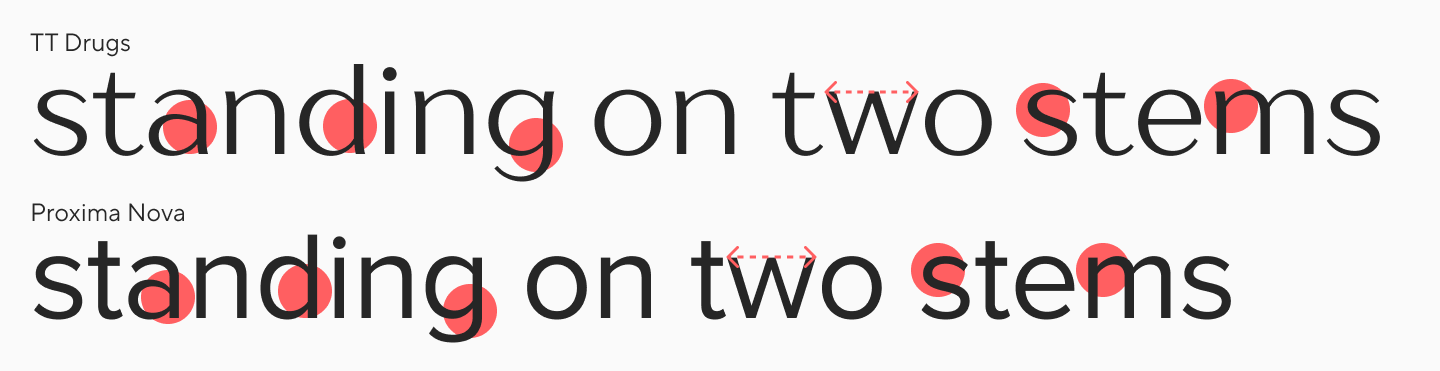
These fonts have the same oval joins and similar graphics in the characters “a,” “g,” and “s.”
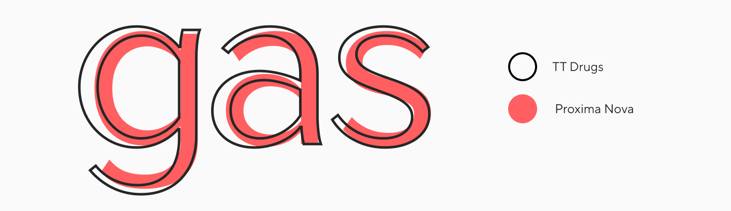
A major difference is that TT Drugs has much higher contrast than Proxima Nova, and this difference becomes more obvious as the weight increases. Overall, the character of TT Drugs feels cleaner, more delicate, and stylish.
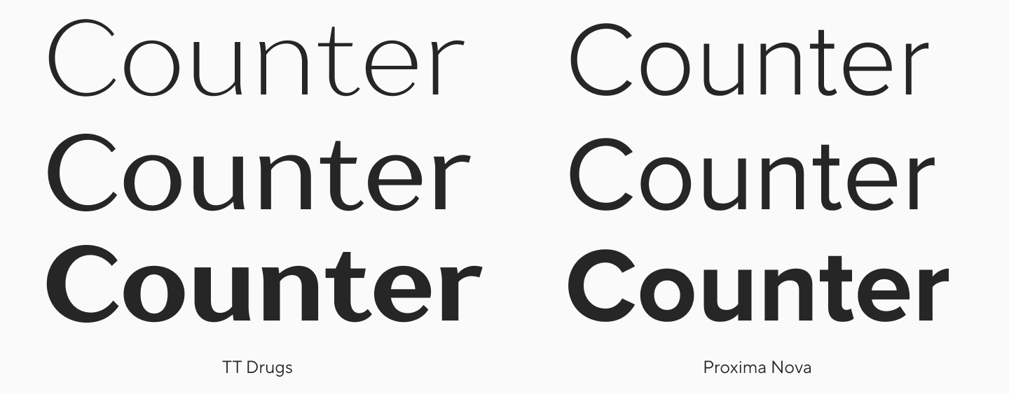
By the way, they can also work in combination: TT Drugs would look great in large and medium sizes, while Proxima Nova can be used for body text.
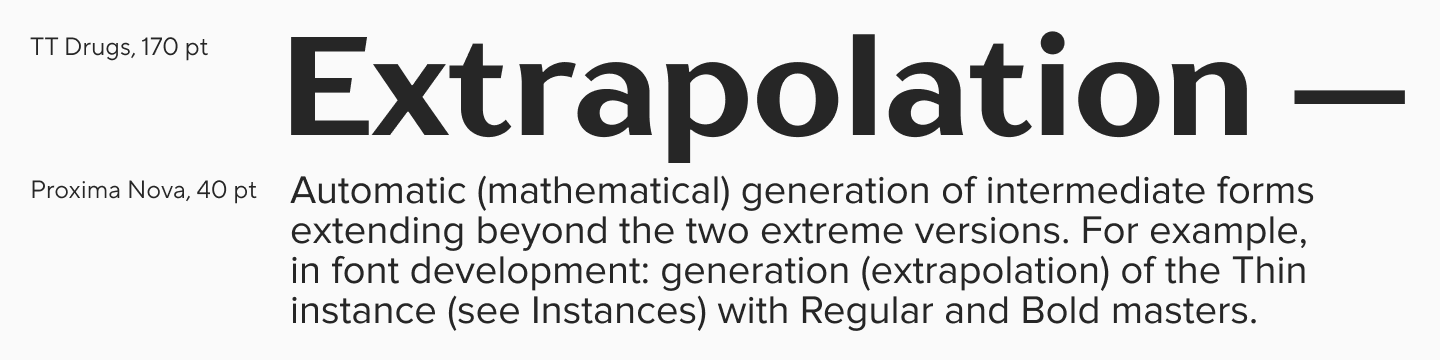
TT Drugs includes 37 font styles, support for over 230 languages, and 27 OpenType features. The font fits harmoniously into projects with diverse themes, looks interesting in large sizes, and reads well in text blocks.
Alternatives from Other Foundries
Proxima Nova Alternatives from Google Fonts:
Montserrat: A geometric sans-serif with open forms and a friendly character, visually similar to Proxima Nova. It’s a great choice for those looking for a more open, energetic, and popular font that is available for free. It’s a good, versatile option for headlines and branding.
Manrope: This is the Proxima Nova alternative for interfaces and digital products. While Proxima Nova combines elegance and functionality, Manrope focuses solely on functionality. It’s more restrained and legible in small sizes. If you need a font for comfortable reading, this is a good alternative.
Noto Sans: The most neutral alternative. Like Proxima Nova, it inherits features from classic sans-serifs (like Helvetica) but without any stylistic accent. The font is suitable for multi-purpose projects where support for a large number of languages is important and where the expressiveness of Proxima Nova might be too much.
Microsoft Fonts Similar to Proxima Nova:
Calibri: Calibri can replace Proxima Nova where the priority is not expressiveness but accessibility and neutrality in a corporate or document environment. Like Proxima Nova, Calibri is a humanist sans-serif with soft, rounded forms but lacks its elegant contrast and dynamism. It’s an everyday choice for standard tasks (e.g., office documents).
Ebrima: As a font with extensive Unicode support (including many African scripts), Ebrima serves as an alternative in a very narrow but important niche: global compatibility. If a project needs to display rare or complex characters correctly, and you need a modern sans-serif, Ebrima can be a utilitarian replacement. It’s a choice that prioritizes functionality.
Verdana: This is an alternative for cases where high readability is the priority. Designed for low-resolution screens, Verdana—with its tall characters, wide proportions, and large letter spacing—has little in common with the elegance of Proxima Nova. However, if you need a font for small text or for interfaces for people with visual impairments, Verdana is a pragmatic replacement.
Proxima Nova Font Pairing Guide
Since we’ve touched on font combinations with the TT Drugs example, let’s find a few more successful Proxima Nova font pairings.
Proxima Nova + TT Chocolates
Yes, our TT Chocolates can serve not only as an alternative but also as a font pairing with Proxima Nova. They work well together if you assign TT Chocolates the role of the headline font and leave Proxima Nova for the running text.
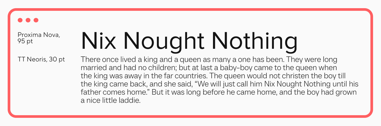
Proxima Nova + TT Neoris
TT Neoris is a concise and modern Neo-Grotesque. This font, in contrast, will look better in running text if Proxima Nova is used for the headlines.
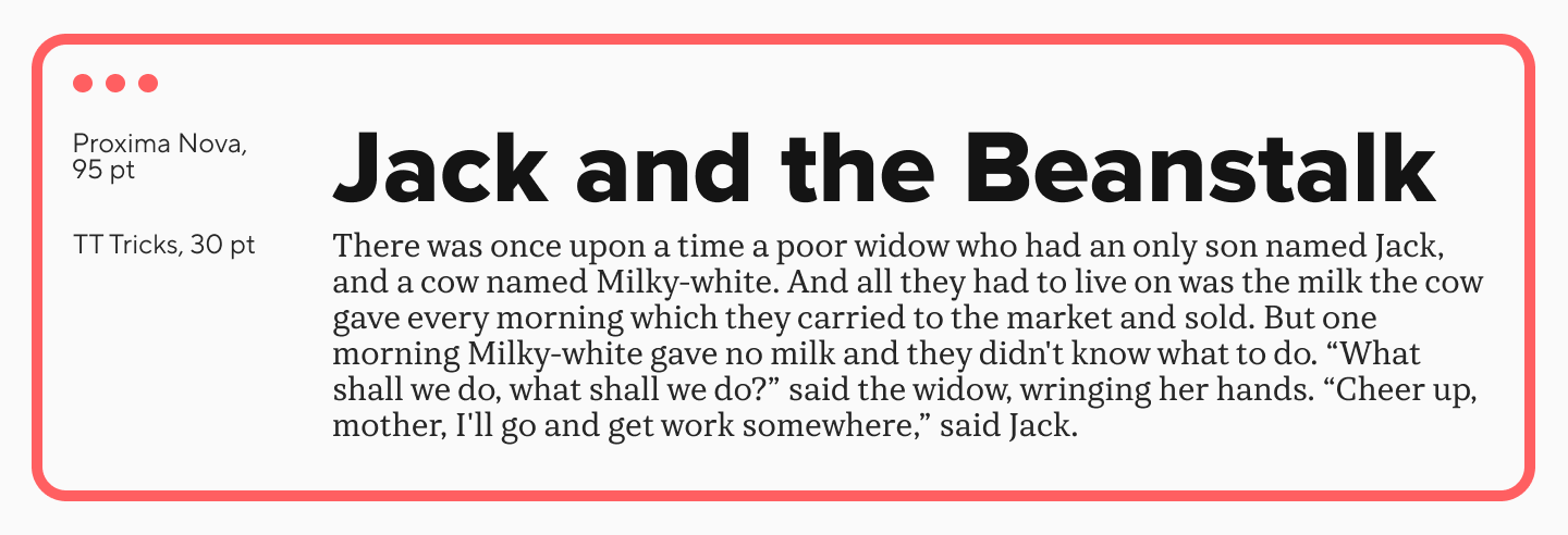
Proxima Nova + TT Tricks
TT Tricks is a modern text serif with a calm, elegant, and moderately strict character and a distinctly professional mood. It can also serve as the text base in combination with Proxima Nova in headlines.
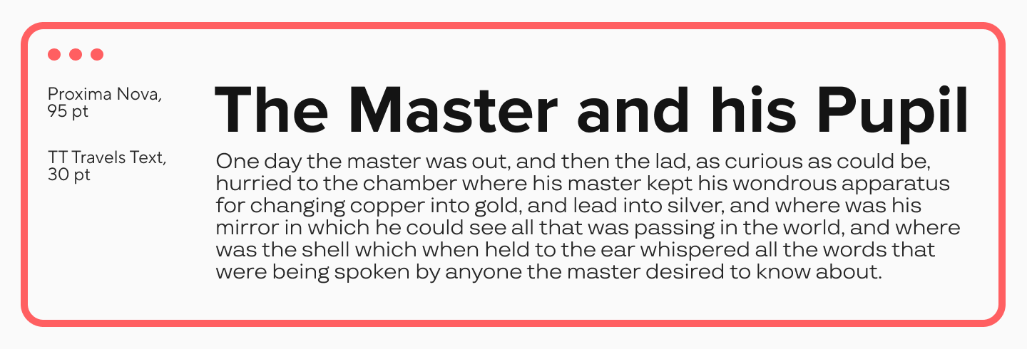
Proxima Nova + TT Travels Text
And one more font from TypeType that will look good as running text alongside Proxima Nova in headlines is TT Travels Text. It’s a geometric text sans-serif with wide proportions.
How to Link Proxima Nova in CSS?
You can use @font-face to link the font. This method allows you to load fonts from a server or locally. In the code, you need to specify:
font-family: The name of the font that will be used in the CSS.
src: The path to the font files. It’s best to specify multiple formats for cross-browser support.
font-weight: The weight of the font. Different weights are available.
font-style: The style of the font (normal, italic, oblique).
Example of linking a local font:
@font-face {
font-family: 'Proxima Nova';
src: url('/fonts/ProximaNova.ttf')
format('truetype');
font-weight: normal;
font-style: normal;
}
Only then can you include this font in a CSS rule:
body {
font-family: 'Proxima Nova',
Fallback, sans-serif;
}
Note that @font-face should be added before any other CSS rules.
FAQ
Where can I download Proxima Nova officially?
You can download Proxima Nova from the official website of Mark Simonson Studio, the font’s creator. A full list of subfamilies and font styles is available there.
You can also buy Proxima Nova on Type Network, Fontspring, and other platforms.
Is Proxima Nova free to use?
No, Proxima Nova is not a free font. To use it, you must purchase a paid license.
What is the closest Google font to Proxima Nova?
Noto Sans, Manrope, and Montserrat are the closest Google Fonts to Proxima Nova.
Does Proxima Nova have Cyrillic support?
Yes, the Proxima Nova font includes Cyrillic support.
Proxima Nova TTF, OTF, Webfont availability
Like all modern fonts, Proxima Nova is available in these formats.
Proxima Nova CSS usage
The Proxima Nova web font can be used in CSS, but it’s important to link it correctly and apply it to your elements.