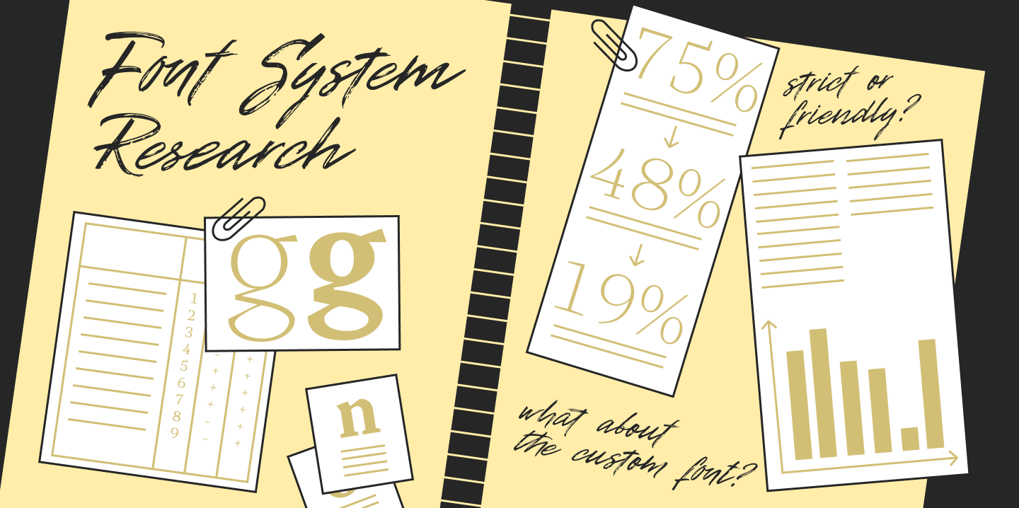
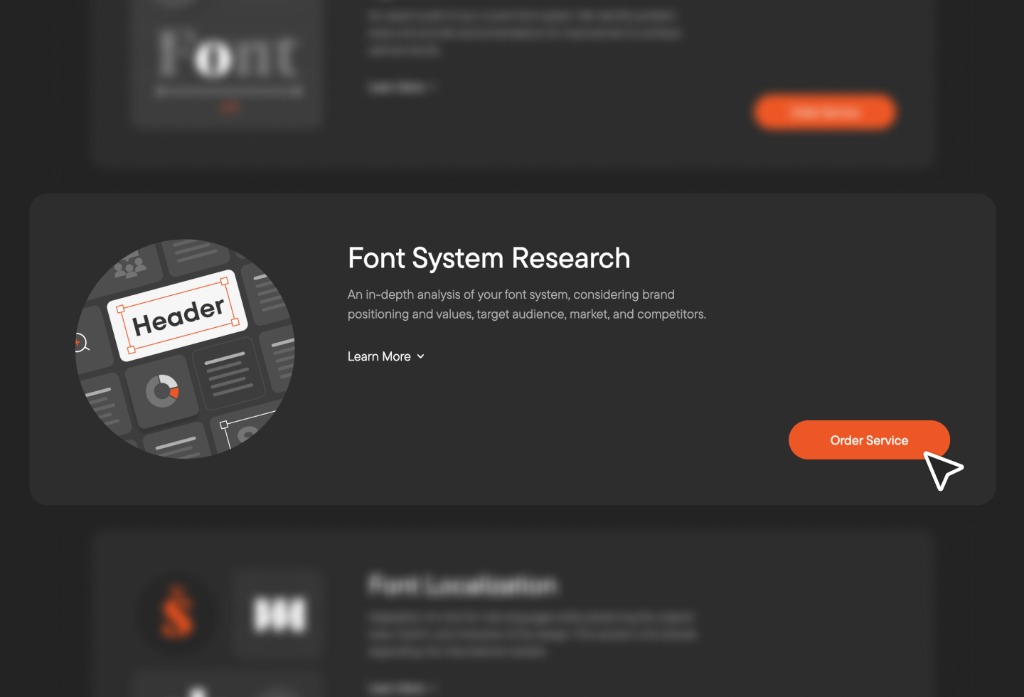
Among TypeType Studio’s services, we offer typeface system research—a service where we conduct a deep typeface analysis of a client’s font system, taking into account brand positioning, values, target audience, the market landscape, and competitors.
Why do brands need such research, and how does it help them develop? How is it conducted? What does the research include, and how are the results interpreted? We answer these questions and show how it works in practice using the financial segment as an example.
What is typeface research?
Typeface system research is a form of expert approach to font solutions, serving as a vital part of typographic consulting and the strategic development of a client’s brand. It is a powerful tool that not only helps understand market realities and trends within a specific segment but also allows a brand to see its current position among competitors and understand how it can grow.
As part of the research, we compare the typography of market players, identify segment tendencies, general typography trends, and global typography trends. We gather data into tables and charts, formulate applied recommendations, and—crucially—propose specific font solutions for the business. Our ultimate goal is strategic brand development through fonts.
At TypeType, such research is conducted in two formats: independent brand analytics carried out by the studio’s project office, and research within ongoing (client) font projects, for which font experts from the production department are responsible.

Why brands need font research
A brand might go years without updating its typography: a font was chosen long ago, and it performs its basic functions. However, the brand may get lost among competitors, recognition doesn’t grow, and a redesign feels risky. This is the moment when the main question arises: what exactly needs to be changed—and does anything need to change at all?
Research helps the brand team formulate a request for typography: what the brand’s «voice» should be in different channels, and which criteria are truly important (readability and neutrality vs. bright character, friendliness vs. strictness, classic elegance vs. bold modernity, etc.).
Typeface research helps move away from subjective «like/dislike» judgments to conscious, data-driven decisions. Usually, clients come to us when they need to:
- Answer a specific question: «Is it time for us to update?», «How do we strengthen recognition?», «Why do our communications lack consistency?»;
- Compare themselves with competitors, see weak points, and understand how to highlight strong ones;
- Make the brand identity design more thoughtful and harmonious through corporate typography;
- Improve communication—ensure text is read faster and works better across different media and devices;
- Understand segment trends and decide whether to follow them or set their own vector.
Important: Even at an early stage, we can show draft directions for updates by testing suitable fonts in the client’s layouts. This helps to quickly feel the difference.
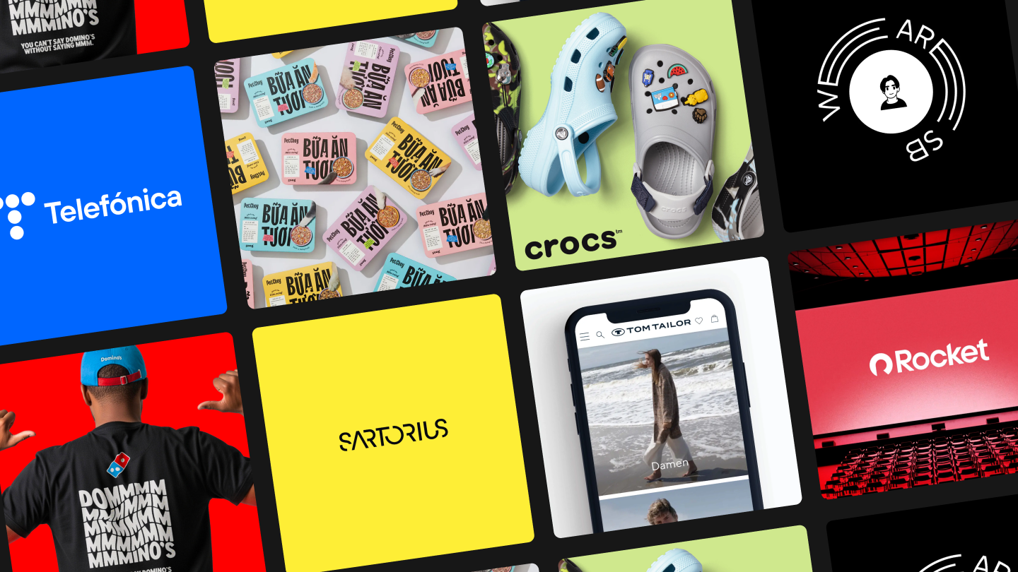
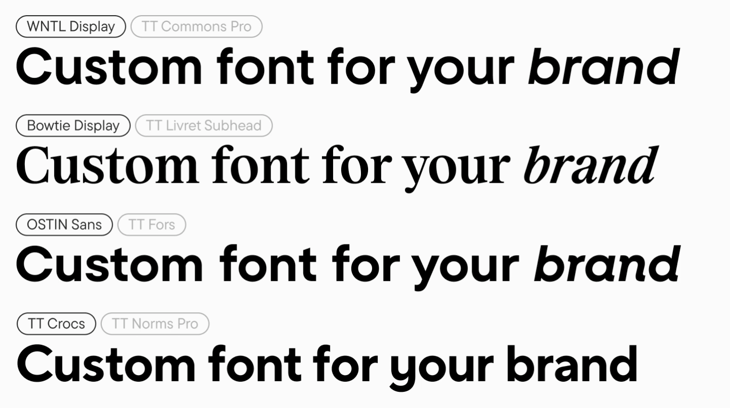
Among the major brands for which we have already conducted research and developed a unique corporate typography system based on the results are Rocket, Crocs, and others.
What typography research includes
Typeface analysis is built on a deep expert evaluation of the brand’s typography linked to positioning, values, audience, and market context. It consists of several stages:
Market and Leading Brand Analysis
At this step, we:
- Analyze which fonts, in which styles, and for what purposes the main market players use;
- Evaluate how competitors position themselves, what they emphasize, and how they stand out in their typography;
- Formulate conclusions for the segment—these will become the basis for further recommendations.
Client Typeface Analysis (Typography Audit)
Next, we conduct a corporate font audit:
- Check the consistency of typographic solutions;
- Compare how the brand wants to sound vs. how it currently sounds in different channels;
- Record strong points and problem zones, relying on TypeType’s years of expertise.
Consolidated Statistics and Market Overview
Here we gather data that helps make decisions more confidently:
- Which solutions prevail: do brands use their own font, buy retail fonts, or use free typefaces;
- How popular brands with a corporate font are;
- Is there professional community interest in the segment’s typography (discussability, «virality» of solutions).
Assessment and Selection Criteria
This stage is needed to define clear criteria for choosing a brand font:
- Which parameters are truly important to the brand (neutrality/character, strictness/friendliness, etc.);
- What the «ideal picture» of communications and visuals should look like;
- How well the current typography corresponds to the desired image.
Interpretation of Results and Recommendations
We filter the research results through the prism of the initially set goal:
- Check for the presence of pronounced trends;
- Highlight the key positions of leaders;
- Create an individual roadmap for typography development.
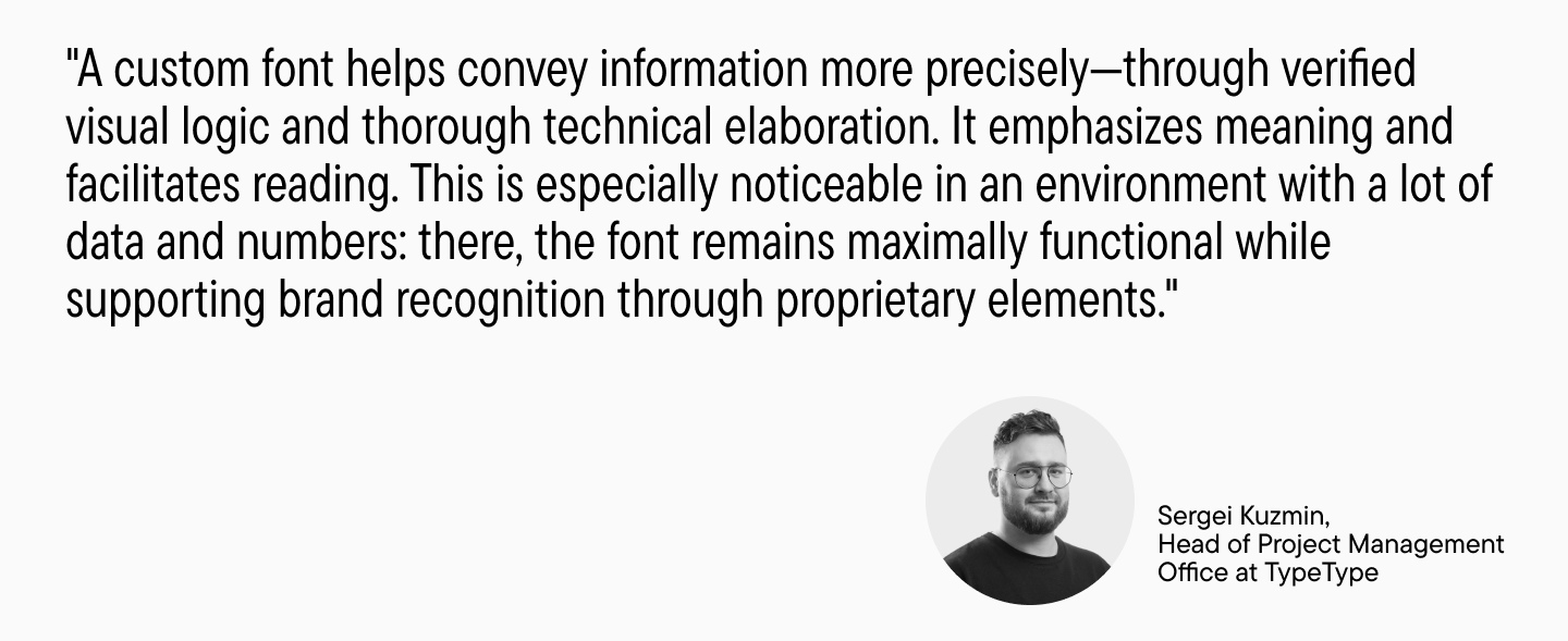
Typography in the financial sector: Features and Trends
The financial segment is one of the most illustrative for typographic research: it has a strong presence both online and offline, and the cost of error is high.
Banking typography is a key tool in financial branding, influencing client trust and the perception of the institution’s authority. Independent studies show: correct typography increases trust in a financial organization by up to 40% and improves user engagement.
Competent use of typography helps financial institutions create a professional image and strengthen a reputation for reliability, and in some cases—modernity and technological advancement. So, in this case, the thoughtful choice of a font for the brand is especially important.
Key Characteristics of Financial Typography
Clarity of Numbers
Financial data does not forgive ambiguity. It is important that similar symbols are easily distinguishable (for example, «1», «I», «l»), and numbers and numerals in typography are convenient for tables and reports (a huge advantage is the presence of monospaced figures in the font).
Legibility and Readability
There should be no excessive display features or hard-to-read forms. The font must allow for setting clear inscriptions that are legible even in small point sizes (for example, legal warnings and regulatory texts).
Cross-Platform Adaptation
Fonts for banks must display equally well on all devices and media. Many financial brands prefer families that cover a wide range of scenarios.
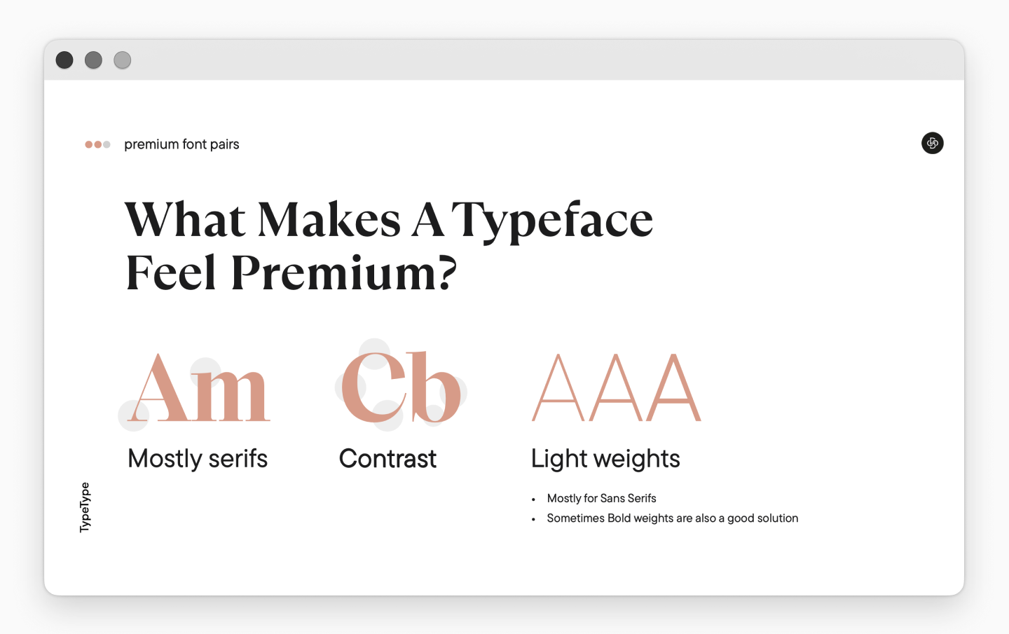
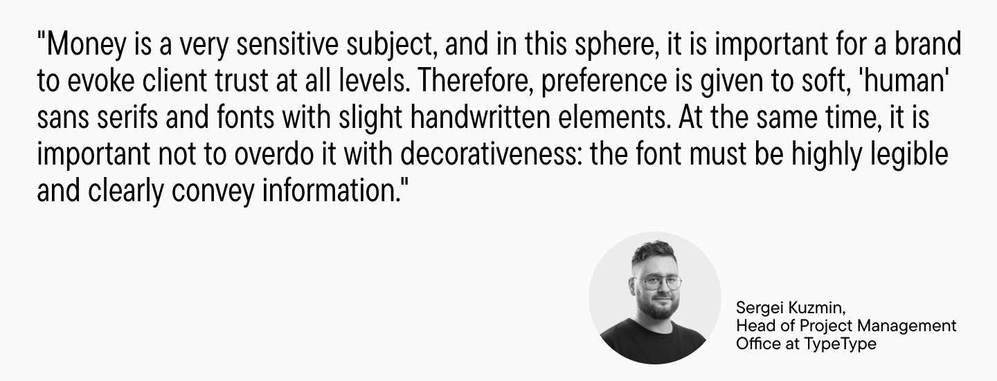
Focus on Trust, Security, and Reliability
The market is dominated by soft sans serifs with welcoming, friendly forms, sometimes with the addition of handwritten elements, without excessive coldness or strict geometry.

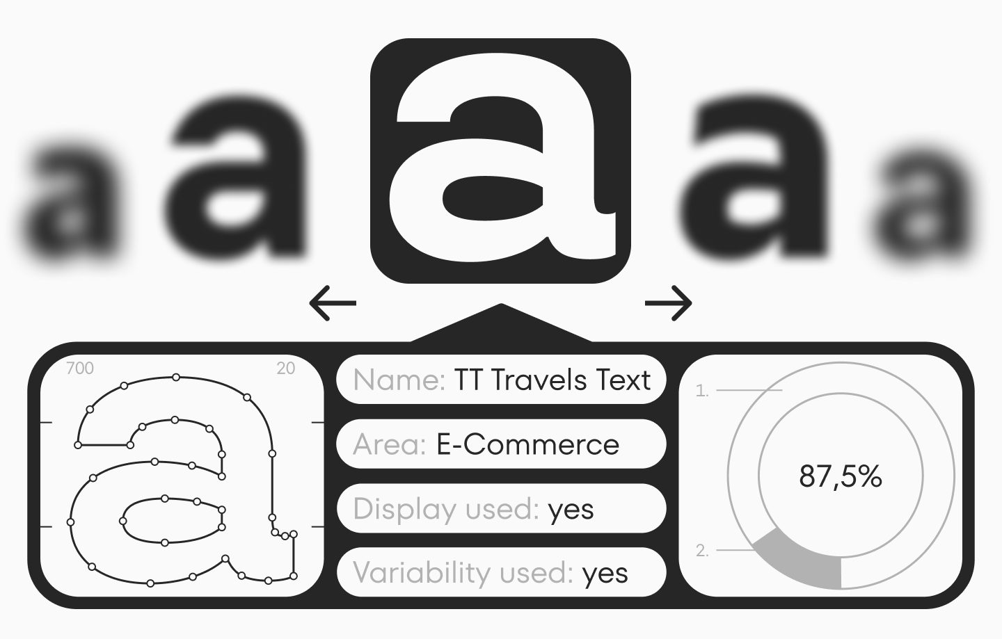
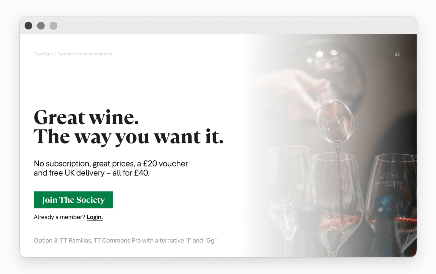
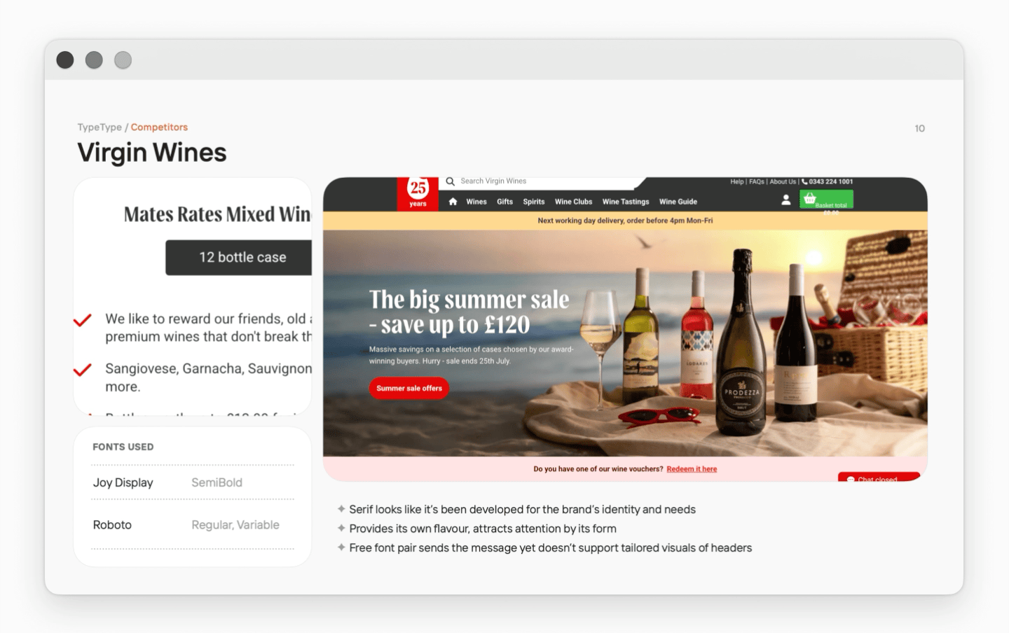
See real examples of TypeType fonts used in the financial segment on this page.
Features of Display Fonts
A separate challenge for financial companies is the selection of display fonts. These create the first impression: in headlines, advertising campaigns, promos, and brand communications. Here, it is important to combine visual communication appeal with the conservative expectations of the audience and readability requirements.
Modern market research shows impressive statistics: globally, 76% of the largest financial institutions today use custom or semi-custom display fonts as key elements of their branding. The leaders of this trend are advanced fintech companies, which have set a new bar in the use of typography.
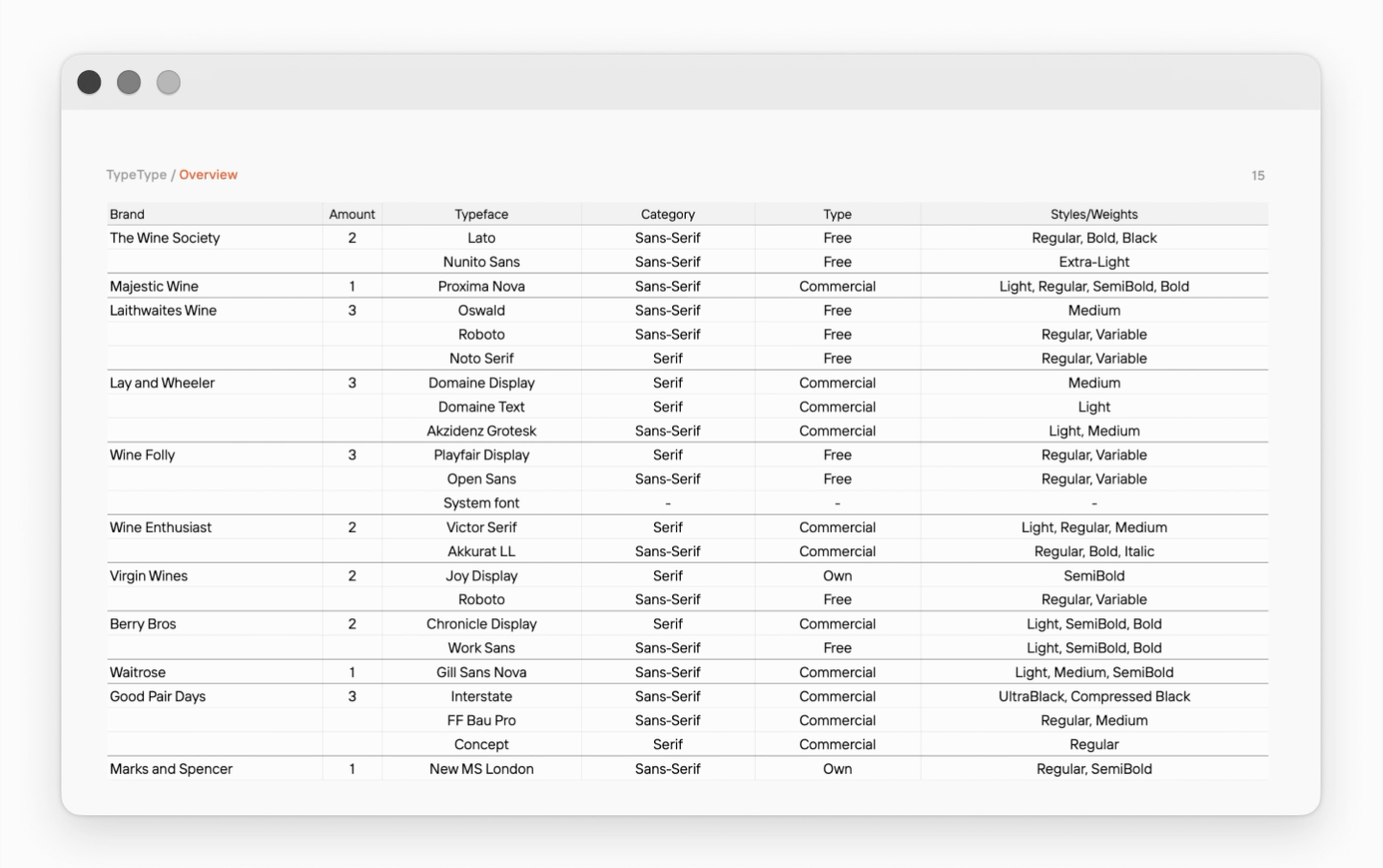
Other important conclusions we drew based on font research in the financial segment:
- The market sees an even distribution between proprietary and free fonts
- The typography of brands that have a corporate font system evokes direct visual associations among the audience between communications, brand interfaces, and the brand itself;
- Corporate fonts can be divided into two main categories: those created for the brand from scratch/customized for the brand, and retail fonts;
- Fonts created or customized specifically for the brand allow for solving more tasks and meeting brand requests more precisely.
Find a selection of retail fonts for financial companies from our collection here, and below we will tell you when custom fonts for companies become the best choice.
Why companies choose custom brand fonts
Interest in unique typefaces is growing: we see a trend towards personalization and a demand for more flexible typography that can be tuned “for oneself«—both visually and technically.
What tasks a custom font solves:
1. Preserves visual integrity during growth: When a company merges with others, expands its product line, or launches new directions.
2. Anchors the updated image during rebranding: Helping to distance from the previous visual style.
3. PR Opportunity: Sometimes a new typeface becomes an independent news hook and part of PR communication.
4. Emphasizes identity character: Through the font, you can convey the mood and «gimmick» of the brand to target your audience more precisely.
Benefits of custom fonts:
1. Recognition: A proprietary typeface visually distinguishes the brand and eventually becomes part of its ecosystem.
2. Uniqueness: Font uniqueness reflects the brand’s character and helps form associations more accurately.
3. Precise Tuning: A custom font is optimized for a specific product.
4. Conversion Growth: Due to increased readability, page loading speed, and correct display.
5. Legal Protection: In the case of a fully custom solution, the rights to the font are secured by the company.

Regional typography differences
Even within a single segment, typography can differ noticeably by region: in some places, brands choose stricter and more official solutions, in others—more friendly and technological ones. Perception is influenced by cultural context, reading habits, visual competition, and even which interface patterns dominate the region. Therefore, in our research, we separately look at regional typography differences and identify international font trends if this is important for the brand’s tasks (for example, for international expansion or launching a product in a new market).
Conclusions
Font research helps a brand see the market from the inside and make a decision based on clear criteria and data.
The brand receives:
- A clear answer to the initial question;
- Understanding of typography trends and the competitive field;
- Applied recommendations and brand type solutions;
- A roadmap for typography development.
TypeType conducts research not only for the banking and fintech sectors. We work with various segments and use this tool as part of brand font strategy.
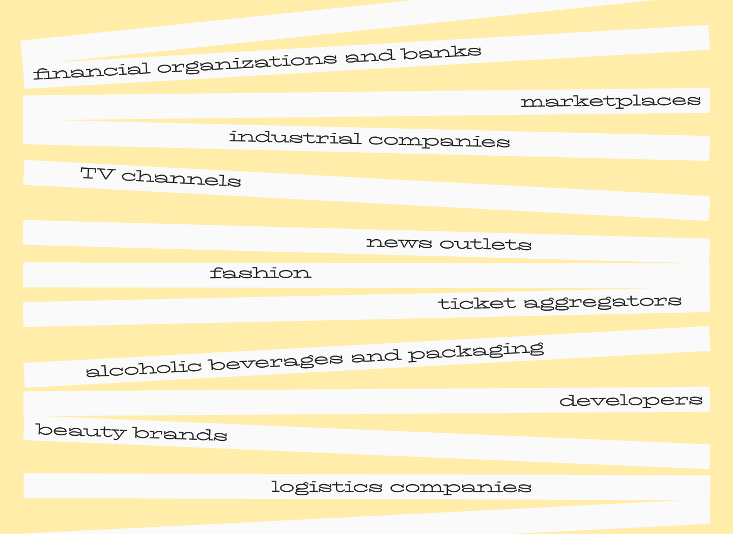
Analyzed segments include:
Financial organizations and banks, fonts for marketplaces, industrial companies, TV channels, fonts for media brands, fonts for fashion brands (retail online and offline), ticket aggregators, alcoholic beverages and packaging, developers (real estate), beauty brands, and logistics companies.
Custom Typography Research for Brands
We conduct both general research by segment and individual research—for a specific brand and a specific question. As a result, you get ready-made recommendations and font solutions that can be tested in your environment.
To learn details and order research, leave a request—we will contact you, clarify the task, and propose a work format.
FAQ
How is typeface research different from font selection?
Standard font selection often relies on a specific, isolated task and doesn’t account for the broader brand strategy. Typeface research is an expert, strategic approach: we analyze the typography of the brand and its competitors, identify segment tendencies and global typography trends, gather data into charts, and based on this, formulate applied recommendations and specific font solutions for the business.
What data is used in typography analysis?
The research considers brand positioning and values, the target audience, competitor solutions in the market segment, and generally accepted tendencies. Then, the “technical specs” of the segment are gathered: what fonts players use, in which styles and for what purposes, how typical the solutions are, and whether brands use corporate fonts or rely on free/retail ones. Data is consolidated into statistics, tables, and graphs.
Why are numbers analyzed separately in financial typography?
Because in sectors like banking typography, the cost of error is high, and data “does not forgive ambiguity.” It is crucial that similar symbols are easily distinguishable (e.g., “1”, “I”, “l”) and that figures are convenient for tables and reports. We specifically check for the presence of monospaced figures and the quality of typesetting in small point sizes for legal and regulatory blocks.
Can research results be used without creating a custom font?
Yes. Research does not necessarily lead to a custom font; its goal is to help the brand make a conscious choice and understand exactly what to change and if change is needed at all. At an early stage, we can show “draft directions” by testing suitable retail fonts in client layouts. In the end, you receive recommendations, solution options, and a roadmap.
How do you distinguish a short-term trend from a lasting solution?
In research, trends are verified with data: we compare the typography of market players, look for pronounced tendencies in the segment, and check them against general and typography trends. A sustainable solution is one that supports the brand’s strategic goal and meets clear criteria (e.g., character/neutrality, strictness/friendliness), rather than simply copying a competitor’s fashionable trick.
What mistakes do brands make when adapting fonts globally?
A common mistake is transferring typography “as is” without considering the regional context. Even within one segment, solutions differ noticeably by region due to cultural background, reading habits, visual competition, and dominant interface patterns. Therefore, research separately examines countries and regions to identify international trends if the brand is expanding globally.
How do you know when brand typography needs an audit?
A signal is when the font performs basic functions, but the brand gets lost among competitors, recognition isn’t growing, and a redesign seems risky. At this moment, it is important to answer: what exactly needs to change—and is it necessary? Research helps formulate the request for the brand’s “voice” in different channels, identify weak and strong points, and evaluate how well current typography matches the desired image.
What risks come from choosing fonts without research?
The main risk is remaining in the zone of subjectivity and not seeing your place in the market. Without research, a brand may look like competitors, lose communication integrity, and fail to build recognition because criteria for the “right” solution aren’t defined. In segments with a high cost of error (like finance), the wrong choice worsens information readability and can hit audience trust.
How long does typography research take?
On average—from 1–2 weeks (quick audit and recommendations) to 4–8 weeks (deep diagnosis with visual tests on media and pilot implementation). Depth is determined by: the number of analyzed brands, complexity of the product ecosystem (site + app + platform), volume of content and data, legal restrictions, and whether a font prototype/pairing setup is needed.
Where should a brand start before ordering research?
Start by formulating a specific question: “Is it time to update?”, “How to strengthen recognition?”, “Why is there no consistency?”, “Do we really look the way we think?”. Then fix what the typographic “voice” should be in different channels and which parameters are important specifically to you. Leave a request: the TypeType team will clarify the task and propose a work format, resulting in recommendations, solution options, and a roadmap.