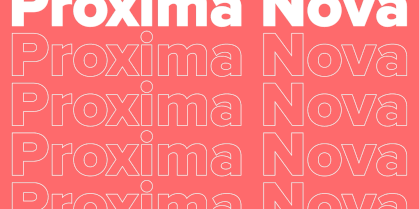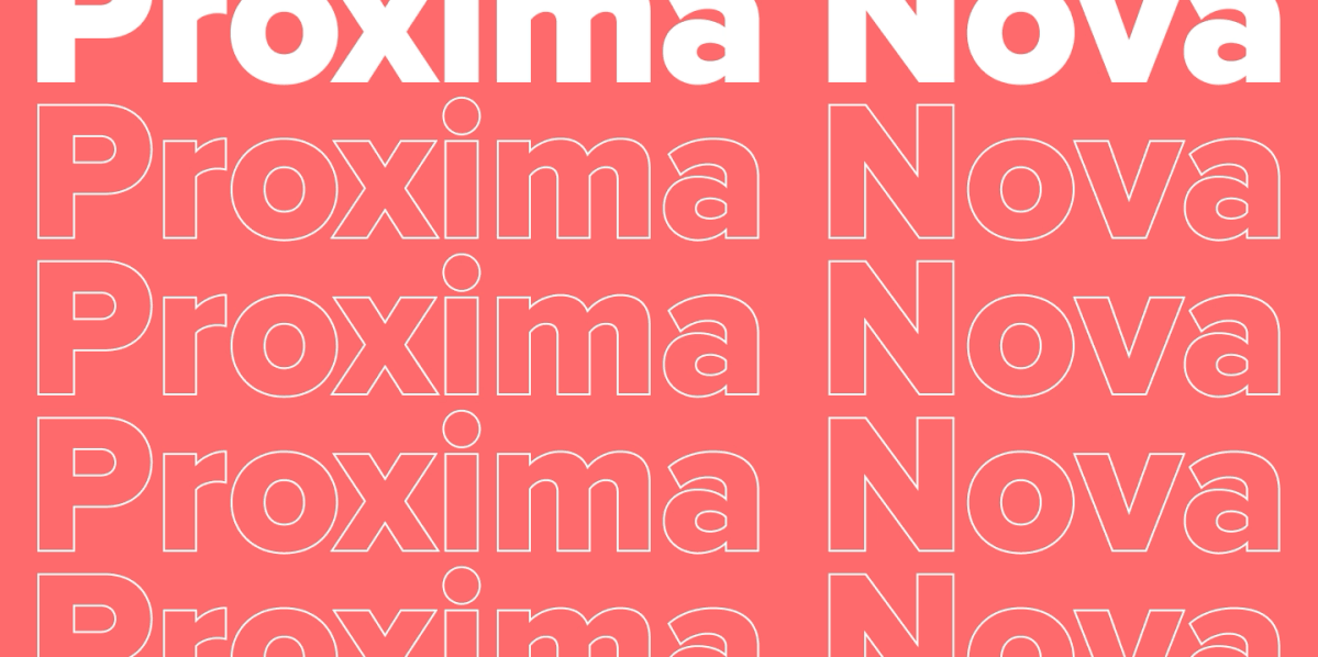
Font design (or typeface design) is the process of designing letters, numbers, and symbols as a unified system. A font created specifically for a project helps make the style recognizable: you control the character, rhythm, readability, and how the brand “sounds.”
The popularity of custom fonts is growing alongside competition in branding and digital communications: on screens, details and the quality of display in various conditions decide everything. That is why more and more teams want to design a font from scratch or customize an existing typeface to fit their brand’s needs.
TypeType is an international font design studio: our team handles the development of typefaces, customization, Cyrillic extension, all types of technical font tuning, and conducts font research, typography analysis, and font selection for brands.
What Is Font Design? A Simple Explanation
The concepts of “font” and “typeface” are often confused. To put it simply: a typeface is a font family (a unified idea and visual system), while a font is the specific implementation in a file/style that you use to set text.
Font design is the process of generating font design ideas and developing a full typeface from scratch. Customization is the modification of an already finished font for specific tasks (changing letterforms, introducing new symbols, adding necessary features, etc.).
Why do brands need customization or a custom font design? Because they solve several tasks at once:
- Makes communication recognizable without unnecessary decorative tricks;
- Is developed specifically for your media (app, web site, packaging);
- Covers technical requirements (languages, characters, OpenType options, formats).

Font Style & Typeface Structure Basics
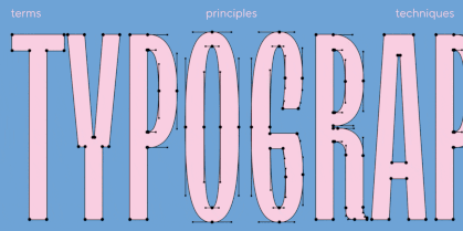
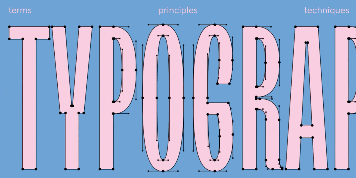
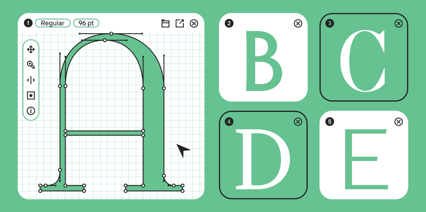
Before you start drawing, you need to understand the “skeleton” of the font—otherwise, you will be making edits endlessly and without a system.
Anatomy of a font:
- Baseline — the line on which the characters “sit”;
- x-height — the height of lowercase letters excluding ascenders and descenders (the lowercase “x” is the reference);
- Ascenders and descenders — the parts of letters that extend above the x-height or below the baseline (for example, in the Latin “b” and “p”).
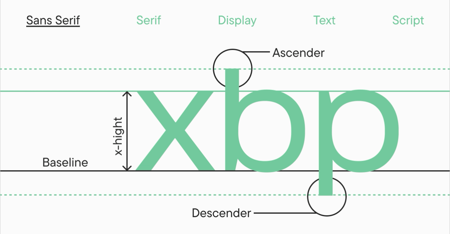
These parameters directly affect readability: a large x-height makes the text denser and more noticeable on screen, while ascenders and descenders provide “air” and a recognizable silhouette.
Types of fonts by purpose and character:
- Serif — often great for a “traditional” feel and print;
- Sans serif — associated with a more modern and minimalist look, making it more versatile;
- Display font — decorative, “loud,” fancy designs for large sizes and headlines;
- Text font — a clean font without superfluous elements, comfortable for reading, perfect for setting large blocks of text;
- Script font (or Handwritten font) — imitates handwriting, mostly used selectively (logos, packaging, invitations, greeting cards).
How to Design a Font: Step-by-Step Process
Below is a working roadmap: from the initial idea and sketches to the technical side, metrics, and testing.
1) Analysis and Finding Font Design Ideas
Don’t start with letters; start with context: where will the font be used (screens/print), what tone is needed (strict/friendly/premium), and what category will it belong to? At this stage, it’s helpful to gather similar examples and record observations—not just “beautiful/ugly,” but why it works.
2) Defining the Goal and Purpose
Setting the task is the foundation: it sets the boundaries and helps you make reasoned decisions. A clear plan and task structure at the beginning will save weeks of corrections later.
3) Choosing Font Design Software
Decide right away where you will draw and assemble the font: entirely in one editor or using a workflow like “sketches → vector software → font editor.” It is important to find a tool that is comfortable for you.
4) Sketches and Initial Forms
Start with hand sketches: it is faster to find the character and proportions this way. It’s best to draw many test words, print them out, and keep them visible—so you can evaluate the project as a whole, not just one letter at a time.
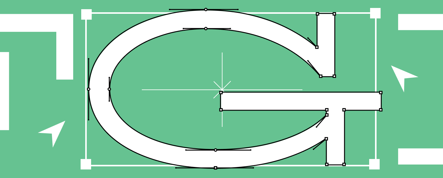
5) Creating Base Characters (The Core)
In typography font design, it’s important to choose reference letters. Start with the basic lowercase and uppercase Latin characters, which set the proportions and thicknesses for the rest of the set.
6) Building the Full Character Set
When the core is ready, expand the character set: numbers, punctuation, currencies, diacritics, symbols. Keep the system consistent: identical solutions should be repeated in similar elements (terminals, serifs, stroke endings). This is one of the main quality accelerators.
7) Generating and Testing the Font
Test real scenarios, not just the alphabet: UI screens, websites, packaging, long articles. It is crucial to evaluate how the font looks in live use across different sizes and combinations. We discussed all stages of font creation in detail in our UniversiTTy article series.
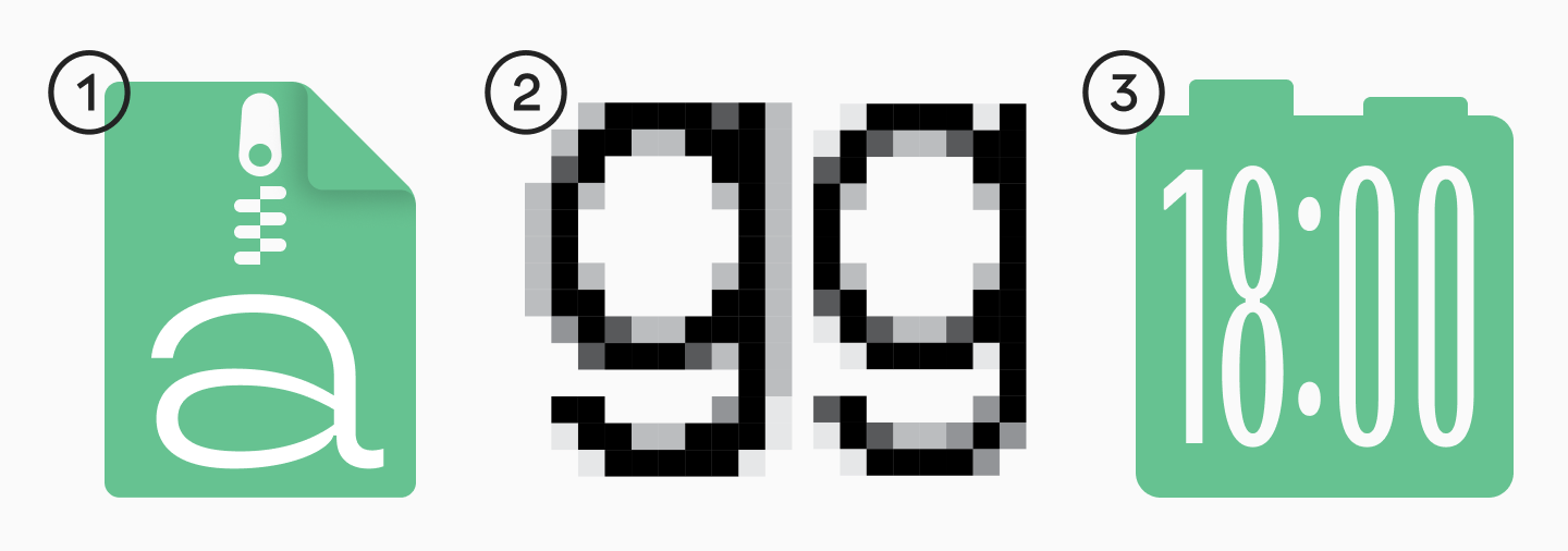
8) Preparation for Use: Formats and Licensing
Different tasks require different formats: for desktop, usually OTF/TTF; for the web, WOFF/WOFF2, and sometimes EOT for legacy systems. Formats in which files are usually delivered: OTF, TTF, WOFF, WOFF2, EOT.
If you are downloading or purchasing an existing font from a library, understand the license in advance to acquire the necessary rights and use the font correctly in your product and communications.
You can read more about font licensing here.
Best Font Design Software
Below are popular software options for font design and typographic creation.
Glyphs
Pros: A fast, professional tool, convenient for building families, supports modern export formats; a popular standard among many designers.
Cons: macOS only; price is higher than amateur solutions.
Who it’s for: Beginners willing to learn seriously, and pros who value speed.
FontLab
Pros: A powerful powerhouse for design and font engineering, cross-platform compatibility; great for complex projects and production.
Cons: The functionality requires time to master; noticeable cost.
Who it’s for: Those planning to make large, complex families.
RoboFont
Pros: Flexibility, scripts, and extensions; a strong platform for those who love automation. RoboFont emphasizes full access to objects and the interface, focusing on extensibility.
Cons: The barrier to entry can be higher, especially without an understanding of font production; macOS only.
Who it’s for: Advanced designers and those who want to build their own custom tool.
FontForge
Pros: Free, open-source, cross-platform compatible; good for understanding the basic logic of editing and exporting.
Cons: The interface and stability may lag behind commercial editors; harder to establish a fast production workflow.
Who it’s for: Students, enthusiasts, for trial tasks and educational projects.
Procreate (for sketches)
Pros: Quick sketching on an iPad, convenient for exploring stroke character; “pay once, no subscription” model.
Cons: It is not a font editor—you will need to trace it into vectors and transfer it to a font editor.
Who it’s for: Those who want to sketch digitally rather than just on paper.
Figma (for sketches)
Pros: Collaboration, quick prototypes, easy to discuss shapes and options, has free usage tiers.
Cons: Not designed for assembling font files.
Who it’s for: Teams and those who want to quickly approve visual concepts.
Mini-guide by complexity/price:
- Easiest to start: Figma / Procreate → FontForge
- Medium threshold (but fast growth): Glyphs
- Expert level: FontLab / RoboFont
Logo Font Design: How It Differs From Typefaces
Why brands need logo fonts:
- To avoid depending on a “recognizable someone else’s font”;
- To maintain identity even without a graphic symbol;
- To create a unified corporate style: logo → headlines → interface.
When a logo requires a completely new font:
- The brand has a non-standard character (e.g., “technological but human”) and existing solutions look either too neutral or too decorative;
- A unique set of characters is needed (e.g., special symbols or icons);
- You need to lay the foundation for a future system: a logo today, a full corporate typeface tomorrow.
A practical compromise: start by customizing an existing typeface (change key letters, add alternates, embed logo elements)—this can significantly reduce timelines.
Font Design Tips From Professionals
Below are 10 tips that help you navigate the path from an idea to a fully functional font without falling into common traps.
- Start with hand sketches
Hand sketches reveal the character of the font faster. The goal is not beauty, but the logic of forms and strokes. - Formulate the task in one paragraph
What is this font, where does it live, what are the constraints? This prevents scope creep. - Define proportions before details
First—widths, heights, contrast, and overall plasticity. Decor without solid proportions almost always looks “random.” - Start with the most frequent letters
Base characters are the foundation for the whole system: they set the rules. - Watch the rhythm, not just individual letters
Rhythm is born from repeating verticals, negative space, and intervals. It is also part of the font. - Maintain consistency of forms
If you make a decision for one element—for example, the shape of a serif, stroke ending, or how an arch connects to a vertical—repeat it in all similar letters. Consistency makes a font cohesive and professional. - Account for optical compensations
Rounded letters and numbers often require optical overshoot so they don’t visually appear smaller than straight characters. Therefore, their outline is drawn slightly above the cap height and/or below the baseline—this makes all symbols look equal in height. - Test in real text and on real media
User interface (UI), long reads, packaging, presentations—these are all different environments. - Do not overcomplicate the form unnecessarily
The more complex the outline, the harder it is to maintain stability at different sizes, and the higher the risk of “muddy” rendering on screen or in print. - Gather feedback and edit based on data
Ask colleagues to read the text, find places where the rhythm “stumbles,” and note exactly what breaks the perception. This is faster than an endless cycle of “I think it looks better now.”
Common Mistakes in Typeface Design
Incorrect proportions
For example, a very narrow “n” paired with a wide “o” breaks the rhythm. Solution: return to the base reference letters and build a width system.
Uneven thickness
Contrast must be controlled. If the thickness fluctuates randomly, the font looks unprofessional.
Problems with leading and heights
If ascenders and descenders are too aggressive, the text “collides” or requires excessively large line spacing.
Lack of testing
A font might look beautiful in a single word but fall apart in a paragraph. You should constantly return to practical testing and follow a step-by-step development logic.
Font Design Tools & Online Generators
Using a font design generator online is a good start for simple tasks (an experiment, an educational project), but it rarely replaces a full-fledged font editor because its capabilities are limited.
A few examples of font design online tools and makers that are frequently used:
- FontStruct — a free online builder for modular grid-based fonts; exports TrueType.
- Calligraphr — turns a handwritten alphabet into a font; has a free version and paid subscription options.
- Metaflop — a web tool for parametric “modulation” of fonts based on Metafont.
If you are making a font for a commercial product, interface, or brand, an online maker or generator should usually be viewed as a “sketching phase,” not final production.
When to Hire a Professional Font Design Studio
There are reasons when self-creating a font turns into an overly expensive experiment if you lack experience:
- You need a full-fledged corporate font (many languages, many platforms, strict requirements for readability and adaptability);
- Technical precision is vital: kerning, hinting, mastering, correct formats, stable export;
- You need to save time: establishing the process, controlling quality, and testing the font.
TypeType handles both font customization (changing characters, alternates, embedding a logo) and creating fonts from scratch—depending on the task and scale. You can find out the cost of font development and customization here.
Conclusion
To create a font means not just drawing an alphabet, but building an entire system: from the task and concept development to base letters, expanding the character set, and technical engineering. If you properly structure the workflow and check your decisions on real text, you will get a great result much faster.
FAQ
What is the first step in font design?
Formulating the task: purpose, media, character, languages, and constraints. This sets boundaries and saves time on redos mid-project.
What software do you need to create your own font?
At minimum: a sketching tool (paper/Procreate/Figma) and a font editor (Glyphs, FontLab, RoboFont, or FontForge). The choice depends on budget and experience.
How long does it take to create a custom typeface?
It depends on the character set size, the number of styles, and requirements. A full family takes months or even years of work; customizing an existing typeface is usually faster.
Can you design a font online?
Yes, but online generators are better suited for basic tasks and experiments. For a serious project, you generally still need a full editor, professional skills, and thorough testing.
Do you need drawing skills to make your own font?
They are helpful, but understanding proportions, rhythm, and systematic thinking is more important. Your skill grows through sketching, analyzing examples, and testing iterations.
What makes a font professional?
High-quality outlines, technical features, well-thought-out forms and proportions, correct formats, and technical preparation.
When does it make sense to hire a font design studio?
When you need a corporate font, a large character set, multiple languages, high technical precision, and a predictable result. It saves time and reduces the risk of errors.