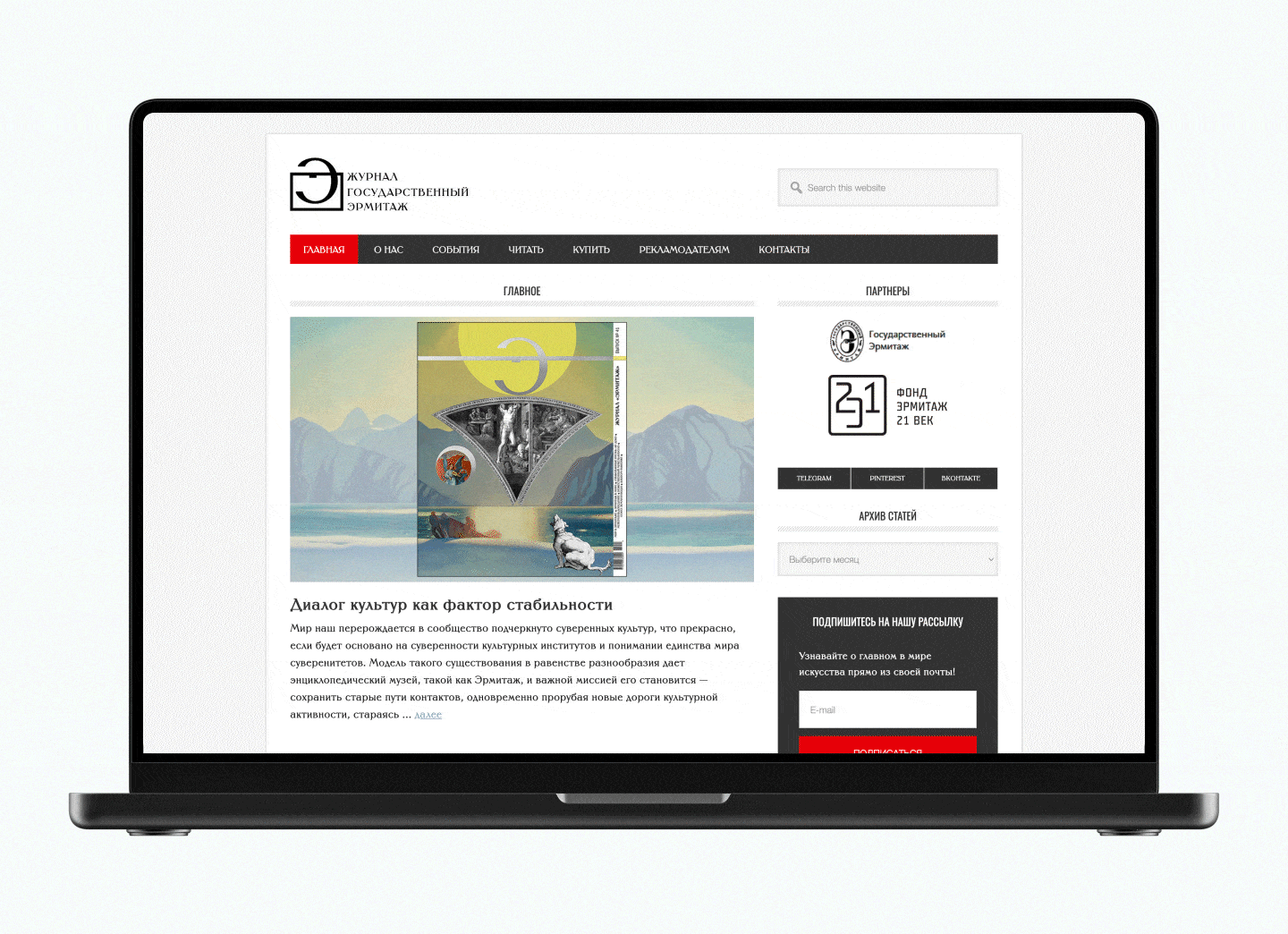
The TypeType team, with the support of the Mantera Group, has created a new font family for the State Hermitage Museum—the Hermitage Type Family. The typeface will be used across all of the Hermitage’s digital content; you can already see it on the website and the updated launch page of the mobile version. And this is just the beginning of a major overhaul of the museum’s digital identity, in which the new font will play a pivotal role.
In this article, we discuss our goals, the search for the right style, the development process, and how to reflect historical context in a modern typeface without being tied to a specific era!
Exploring the Hermitage’s Typographic History
We were faced with an interesting and highly responsible task: to develop a typeface for the State Hermitage Museum. To understand exactly how it should look, we went on quite a journey.
We knew that the Hermitage has its own incredibly rich typographic history, and the choice of modern fonts for the museum depends on it in one way or another. For example, the Old Style serif Cormorant was actively used. The museum also had a project to create its own Cyrillic version of the Ingeborg typeface. However, even together, these two fonts didn’t cover all the necessary tasks. Furthermore, both possess a strong historical background—both graphically and emotionally. Consequently, they could not be called neutral.
“On the one hand, neutrality is good for a font because it makes it multifunctional. You can use such a font to format documents, in apps, and on websites. But at the same time, neutral fonts can be somewhat faceless. The Hermitage, of course, wanted its own font—one that would reflect its values and its centuries-old history.”
Marina Khodak, Design Lead at TypeType
Therefore, we needed to create a font that combined historical references with universality. It was crucial that it be suitable for various tasks—from designing exhibition materials linked to different eras to general communications.
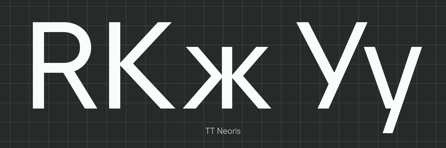
One of the most important (and most recognizable) embodiments of the Hermitage’s image in typography is the museum’s logo. We turned to it as our source of inspiration. It is based on a neoclassical serif with narrow proportions and distinctive forms. The recognizable details of the logo include the “flame-like” tongue of the letter «Э», long vertical serifs, and the curved legs of the «Ж». The descriptor is set in Times.
Armed with this knowledge, we moved on to selecting fonts from the TypeType collection for customization.

Selecting Fonts for Customization
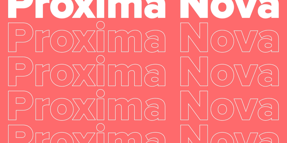
To begin, we tried to find a font that matched the logo—specifically to replace Times. We selected five options: TT Livret, TT Fellows, TT Ricordi Marmo, TT Wellingtons, and TT Knickerbockers. These fonts were chosen based on different logic and potential for development. For instance, TT Knickerbockers matched the logo’s rhythm perfectly—one could imagine it as a row of columns in one of the museum halls. TT Ricordi Marmo combines elements of grotesque and antiqua. It seemed to us like a good allegory for an all-encompassing font. Together with the Hermitage team, we reviewed how each font looked in layouts and discussed which was best suited for customization. In the end, we settled on TT Livret—a functional neoclassical serif that includes both display and text font styles.
We proceeded with this typeface. The logo became our fulcrum. We aimed to support the existing graphics and create a visual connection between the logo and the font—not by literally copying elements, but by creating a soft interaction that would be intuitively understood. It is important to understand that this is a more global task than it might initially seem.
“For example, the letter ‘Э’ in the logo has a characteristic curved tongue and a sharp upper serif. However, in TT Livret, these elements are completely different. This means we need to redraw this letter, and that will affect other letters as well. If we change the serifs in ‘Э’, they change in all similar characters. We can’t just redraw three letters; we have to redraw almost every character that has similar elements. Moreover, as soon as we start changing specific details, the letters stop interacting harmoniously with one another—which means we need to do additional work on the proportions and rebalance the font.”
Marina Khodak, Design Lead at TypeType
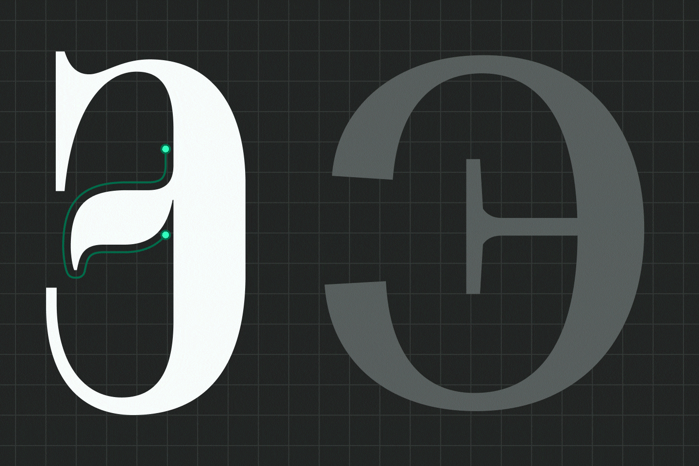
Thus, we added several details from the logo to TT Livret: the «Ээ» with the flame-like tongue, the «А» with a high waist, and the «Жж» with curved legs. To pair with it, we selected the neo-grotesque TT Neoris, which we also began customizing. These two typefaces already worked excellently as a pair and looked balanced thanks to similar vertical proportions. We took them as our base, and after all approvals were met, we moved on to the most interesting part—finding the individual “Hermitage style.”
Creating the “Hermitage Style”
Our task was to create a harmonious and functional font pair consisting of a display font and a text font. A display serif (based on TT Livret) for instances where the museum needs to show its voice and character, and a functional sans serif (based on TT Neoris)—more neutral and readable in blocks of text—for solving practical tasks.
The first thing we needed to adjust in TT Livret was the contrast. We needed to increase contrast to give the font a more solemn, ceremonial tone and add a “display” quality.
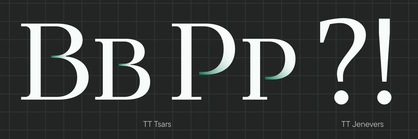
In total, TT Livret has three subfamilies: Text, Subhead, and Display. We, of course, wanted to work with all of them. But due to limited resources, we had to proceed in the direction of “Display Serif + Functional Sans.” We pushed TT Livret to the level of contrast the client liked. The Hermitage team had tested the TT Tsars font, among others, and asked us to create a serif with exactly that ratio of thin to thick strokes. This decision was definitive in understanding that we were creating a headline or title font, not a body text font.
At the start of our communication, it was important to agree on the general direction so we could take the first step. Therefore, we outlined several points that seemed logical for the start:
- Change the shape of the letter «а», as it is very frequent: if you change it, the entire font acquires a new shade.
- Create an interaction with the logo in the letters «Ээ», «Кк», «Жж».
- Change the forms of commas, exclamation marks, and question marks.
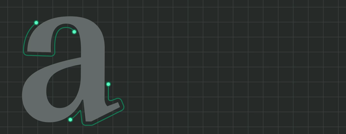
Our colleagues from the Hermitage studied our font collection and arrived prepared with their own ideas. For example, they really liked the concept of detached bowls in certain letters («Вв», «Рр», «Ьь» and others) in the TT Tsars font. These details look ornate and refer to 18th-century Cyrillic title fonts. They also liked the shapes of the exclamation and question marks in TT Jenevers. As a result, we adapted these graphemes for the new Hermitage font.
“The font contains many different references—due to its proportions, strict restrained rhythm, and high contrast, it belongs to modern serifs, but certain details hint at historicism. However, these references create a link to a specific time only when the font is placed in a specific context. If used in a neutral context, it simply looks like a beautiful, solemn serif. Branded and recognizable—yes, but without reference to specific eras. But if you use the font, for example, in the design of an exhibition or catalog, those details that need a specific background to shine begin to reveal themselves.”
Marina Khodak, Design Lead at TypeType
In the Latin characters, there are sharp serifs, fairly abrupt cold forms, and static elements, which is especially noticeable in the uppercase letters. But in the lowercase letters and certain other details—in the legs, the terminals, the letter “Q”—more emotional, soft elements appear. Because of this, the font becomes very functional from the perspective of emotional expression. It turns out it can solve a variety of tasks depending on the context.
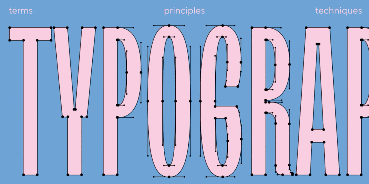
If you compare the customized version and the original font, it becomes obvious that they are quite different. We didn’t just make spot changes; we altered the rhythm, character, and idea of the font. Into every character, we poured the graphics we had been searching for together with the Hermitage team over the last few months.
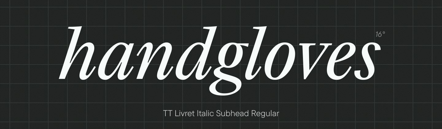
A separate interesting task was working with the italics (True Italic). The italic for TT Livret has narrow proportions, a very rapid rhythm, and a strong slant—about 16°. But the font in this variation proved too narrow for the Hermitage’s needs.
“The main function of italics is to highlight semantic blocks in the text or add emphasis. And italics don’t need to be as easily readable as a standard upright font. There are different ways to deform it: slant, narrowing, lightening, or darkening. The point is that when looking at a block of text, the reader quickly catches the change in the text’s rhythm. But there is another function of italics—to simply be a font. Both of these concepts have a right to exist. And we decided to think about what we could do with this.”
Marina Khodak, Design Lead at TypeType
We slightly reduced the angle of the slant—from 16 to 12 degrees; we made certain forms easier to read and understand, specifically «к» and «ж»; and we simplified the serifs, which introduced more “air” into the text. The characters became wider, and the spacing increased. The font transformed into a pleasant, rounded serif in its italic variation. Due to the slant angle and slightly narrower proportions, it still catches the eye very well in typesetting—it looks lighter than the main text. Thanks to this solution, the Hermitage’s typographic palette gained another functional typeface instead of more decorative and rarely used ones.
It is interesting that during the development of TT Neoris, graphics were already embedded that have found their maximum application now, in creating a pair for the Hermitage serif. When working with this neo-grotesque initially, we only needed to add alternative characters with curved legs to the main character set. However, we later refined some other elements: specifically, we changed the letters «Уу» and the shape of the number 1, making them smoother to better rhyme with the serif font.
The font is very readable at small point sizes, but at the same time, it is designed so that as the size increases, the graphics become more interesting, revealing details.
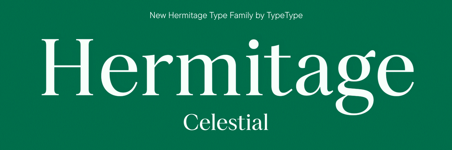
The Result: Hermitage Type Family
The result is a functional typeface family that unites two subfamilies: Hermitage Celestial and Hermitage Grotesque. Each includes six font styles: Regular, Medium, Bold, and their corresponding Italics.
Hermitage Celestial is a display serif for work in large point sizes. Its main task is to reflect the traditions of the Hermitage, to be recognizable, and to attract attention. It is here that TypeType’s font designers invested the maximum amount of characteristic elements and individual plasticity, combining modernity with careful references to the heritage of the past. The font does not belong to a specific era, but its details unfold and resonate differently depending on the context. The combination of soft elements and colder, more restrained solutions creates great emotional and graphic variability for the font’s application.
The italic styles add more softness to the character of the typeface. They can be used not only for semantic and contextual emphasis in the text but also as a standalone font in small text blocks that require a special tone.
Hermitage Grotesque is a functional sans serif belonging to the category of interface fonts. Its graphics are designed so that, on the one hand, it reads very well at small sizes, while on the other, it reveals more detail and acquires individuality as the point size increases. The character of the graphics can be significantly changed using the stylistic sets embedded in the original font.
Hermitage Celestial and Hermitage Grotesque work well as a pair because their proportions are similar, and their characters combine softness and strictness. The fonts complement each other both graphically and functionally, allowing for the solution of diverse tasks.
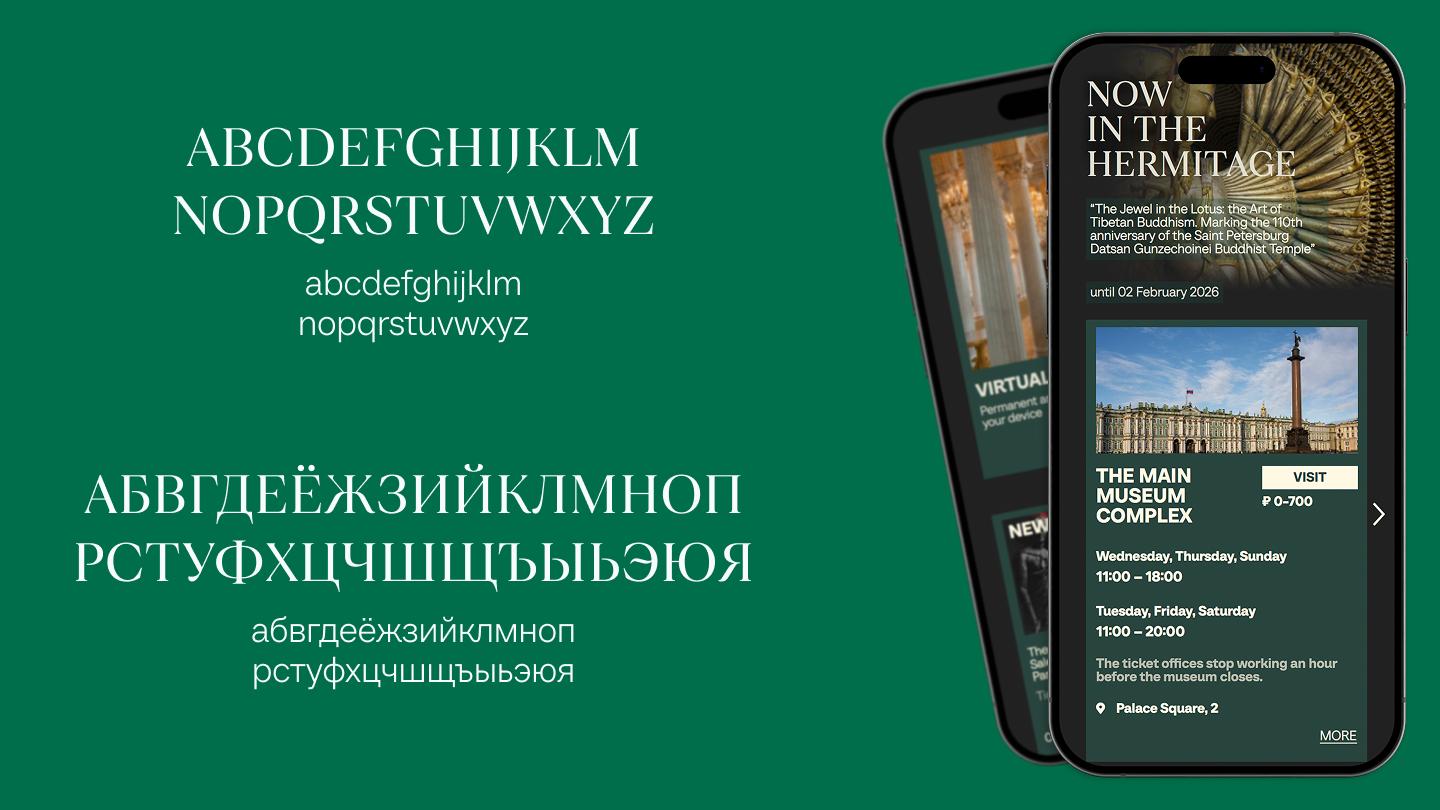
The fonts will be used in all digital projects of the Hermitage, reflecting the history and values of the museum and setting the tone of communication.
“We have had several Hermitage fonts. Once, in the 1920s, a significant number of the Hermitage’s research staff knew how to typeset fonts—Joseph Abgarovich Orbeli included. One such typeset text, dedicated to a meeting in memory of Alisher Navoi, lies in the Archive. This collection was typeset during the war. So, this is an important Hermitage tradition—where the font becomes part of the memory of the Hermitage.”
Mikhail Piotrovsky, General Director of the State Hermitage Museum