top_banner_ttneorispro0426
TT Modernoir
6 styles
Type foundryFonts & StylesSans SerifTT Modernoir

TT Modernoir

TT Modernoir is a display sans serif featuring dynamic proportions. It merges the flowing curves of Art Nouveau with the rhythmic freedom of jazz.
Single style: from $43.99
Full family: from $139 6 styles

Buying Options

Choose the fonts and licenses you want. Then, press the "Add to Cart" button

Any questions about the font or licences? Write us.

Choose the fonts you want

Package offer:
per style $23.17
from  $139
6 styles
from  $139
from $43.99
from $43.99
from $43.99
from $43.99
from $43.99
from $129
Package offer:
per style $25.80
from  $129
5 styles
from  $129
from $43.99
from $43.99
from $43.99
from $43.99
from $43.99
from $129
1 style
from $129
from $129

Any questions about the font or licences? Write us.

Select font licenses

You must specify a font package or style before selecting a licence

Choose the licenses you want

On request
On request
On request
On request
On request
On request
On request
On request
On request
On request
No selected items
Total
$0

Testers

TT Modernoir
Size
Features
Turn on all

TT Modernoir is inspired by the French typography of the XXth century

TT Modernoir
Size
Features
Turn on all

Fluid lines and delicate Art Nouveau forms in this typeface blend seamlessly with the rhythmic flow and improvisational freedom of jazz. TT Modernoir stands out for its high contrast between upright and rounded characters, curved legs, and dynamic swirls, infusing the font’s design with a feeling of musical rhythm and movement. The typeface doesn’t feature lowercase characters, but we incorporated small capitals. To allow for modifying the typesetting appearance, we added a narrow-proportioned set for rounded characters. Also, if you need a higher level of expressiveness, you can choose the set with underlined glyphs. The typeface includes a small collection of icons to enrich and spice up your design.

TT Modernoir
Size
Features
Turn on all

The font family consists of 6 font styles: 5 roman and one variable font

TT Modernoir
Size
Features
Turn on all

TT Modernoir shines best in large point sizes and is an ideal choice for event posters

TT Modernoir
Size
Features
Turn on all
Variable axes
Weight

VALSE POUR PIANO 34

TT Modernoir in design

Description

About font family TT Modernoir
230+ Language support

Introducing TT Modernoir version 2.000!

We’ve updated this experimental font, adding new glyphs, features, and alternates.

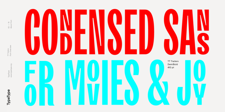
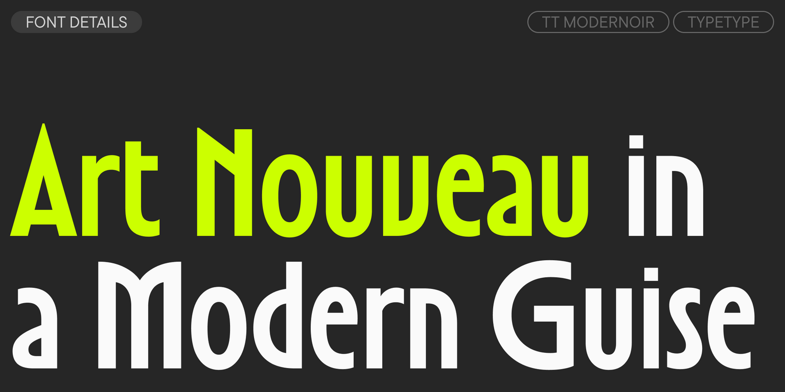
TT Modernoir is a display sans serif with dynamic proportions. In this font, the fluid lines and elegant forms of Art Nouveau are combined with the rhythm and improvisational freedom of jazz. During its creation, we were inspired by 20th-century French typography, as well as the aesthetic of film noir, which is reflected in the typeface’s name.

The defining features of TT Modernoir are the significant difference in proportions between square and oval characters: the square characters are very narrow, while the oval ones, in contrast, are very wide. Curved legs lend the font a sense of refinement, while dynamic swirls create a sense of musical rhythm and movement.

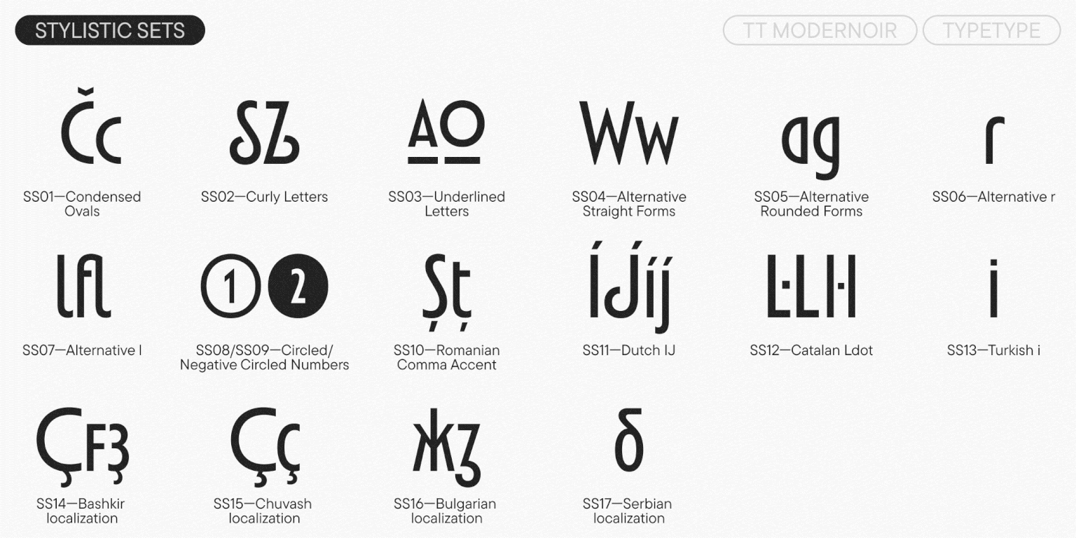
A stylistic set with narrow proportions for square and oval characters allows for a more even texture in typesetting. In contrast, a set with underlined characters will increase the display quality where needed. The typeface also includes a so-called “curly set” with swirls in the ‘S’ and ‘Z’ characters and curved legs on characters like ‘R’ and ‘Я’.

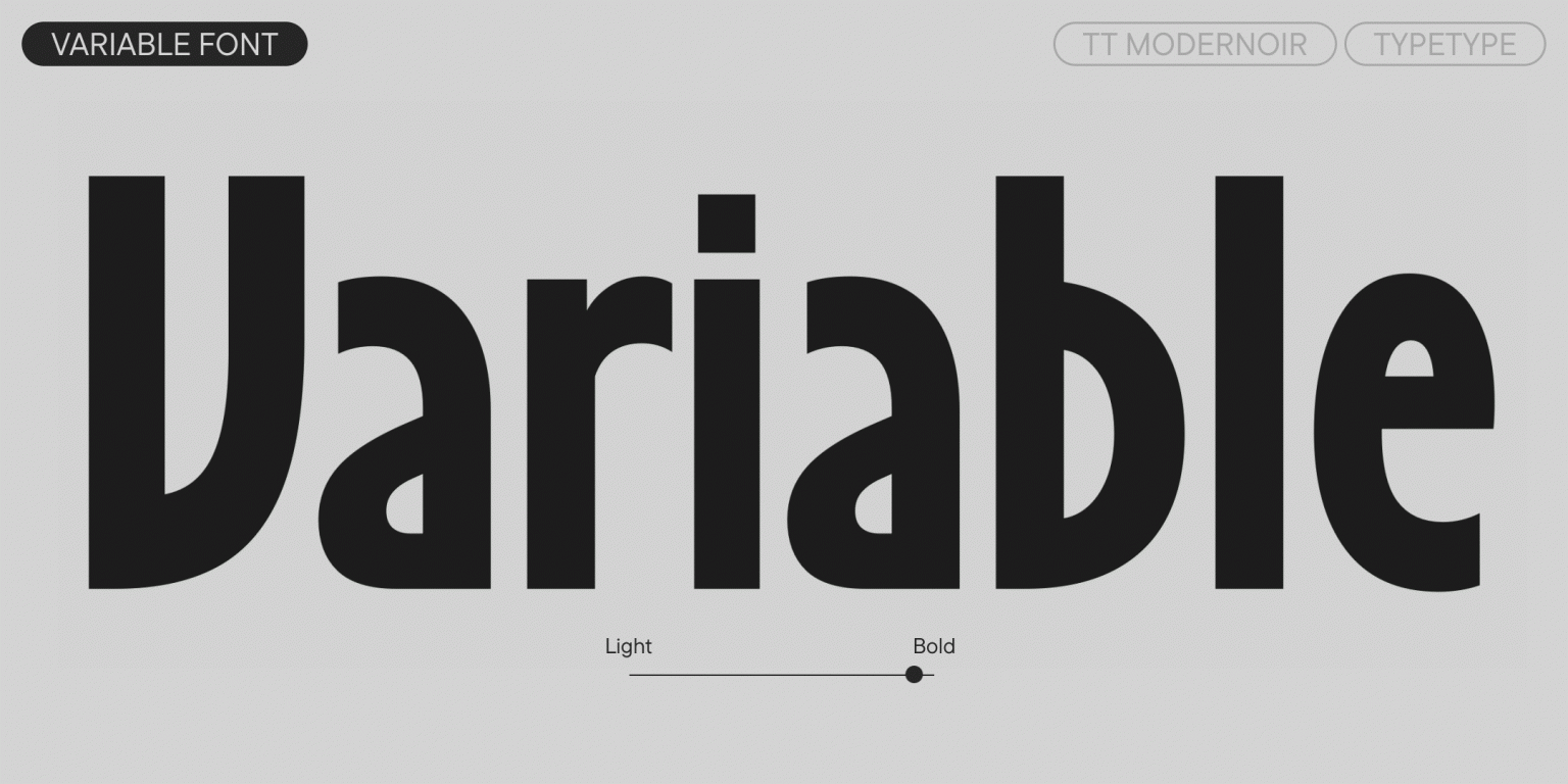
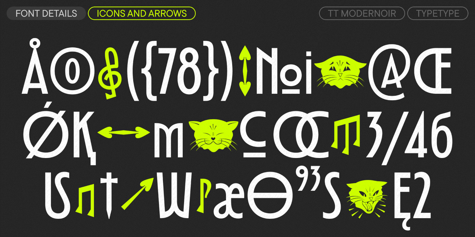
A small set of icons is included to diversify your designs, featuring distinctive black cats, arrows with heart-shaped tips, and musical notes. Useful features and a variable font, which changes along the weight axis, provide the flexibility to tailor the typeface for various tasks.

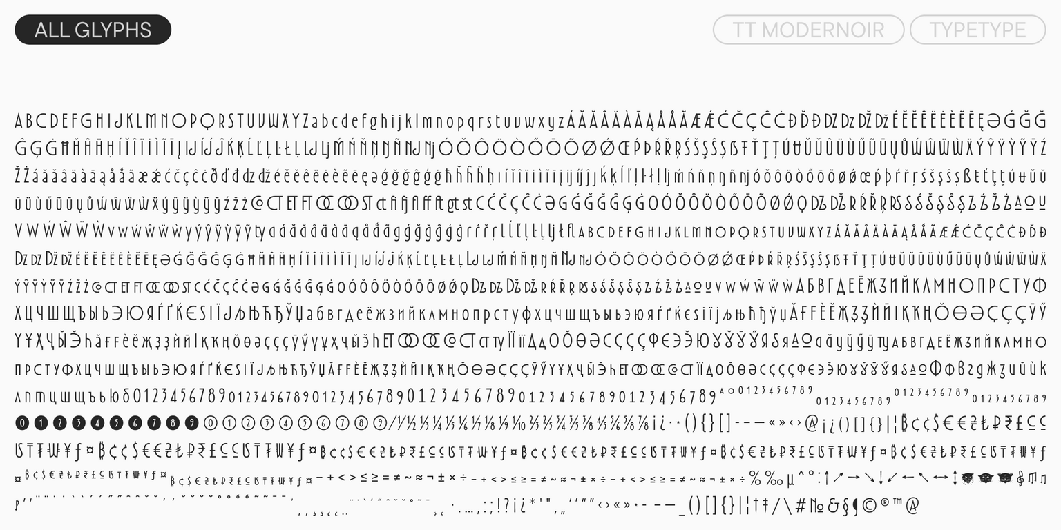
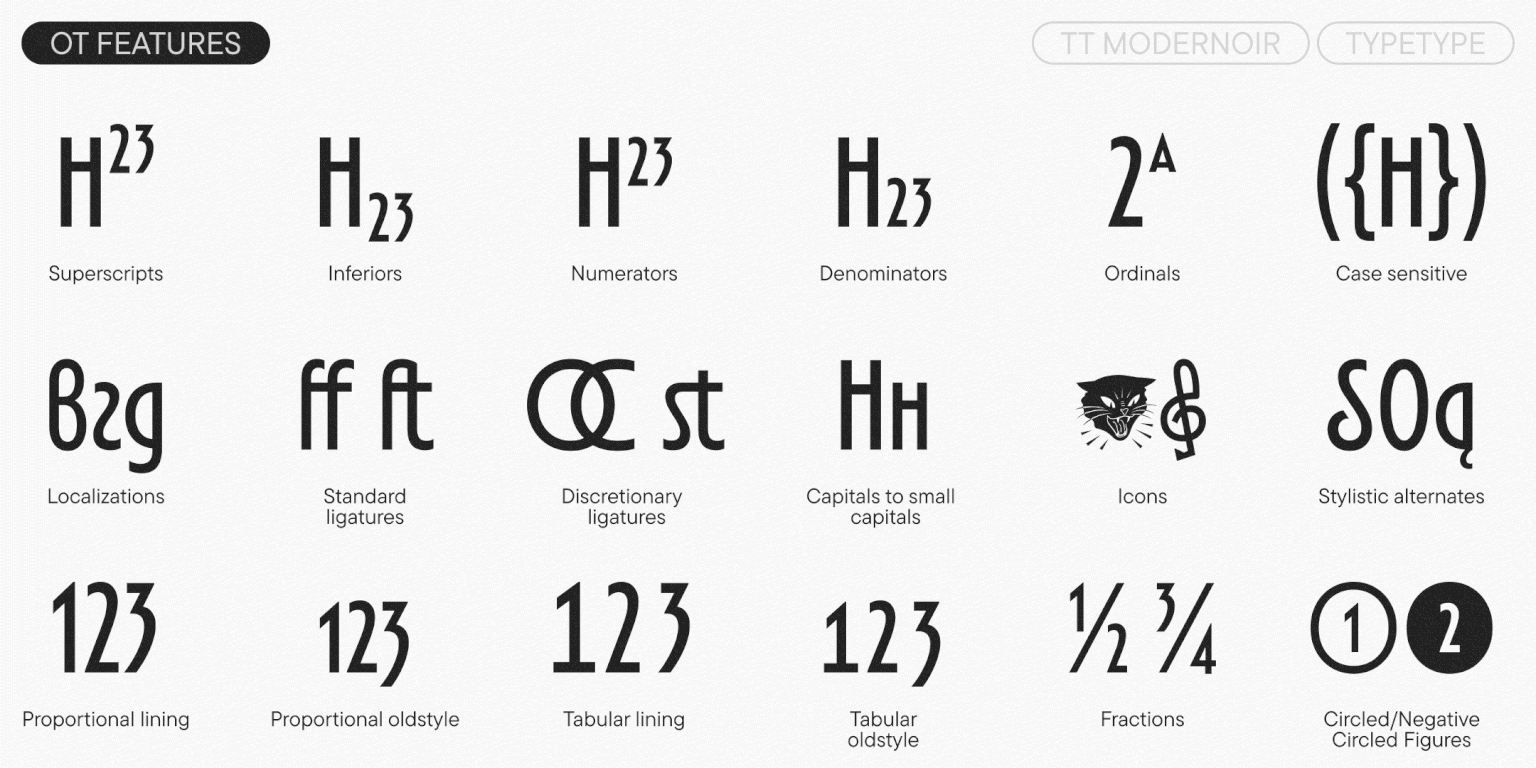
In the updated version, we have significantly expanded the character set. Most importantly, we’ve added a full lowercase set (the small capital letterforms from the previous version can now be found in a small capital set). This greatly expands the typeface’s functionality: whereas TT Modernoir was previously a title font with only uppercase forms, it now features a complete lowercase set. We also drew numerals and currency symbols for the minuscule and minuscule tabular figures. Additionally, we’ve added new OpenType features and stylistic sets. Specifically, more conventional alternate forms for triangular characters (Vv, Ww, y) and more decorative forms for ‘a’ and ‘g’. These allow you to vary the font’s level of decorative complexity and display character.

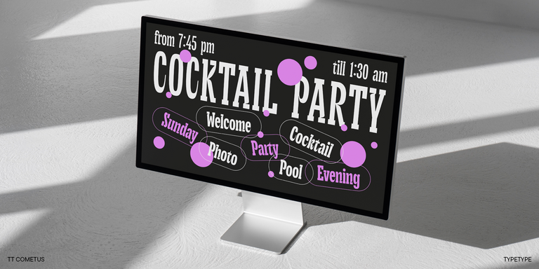
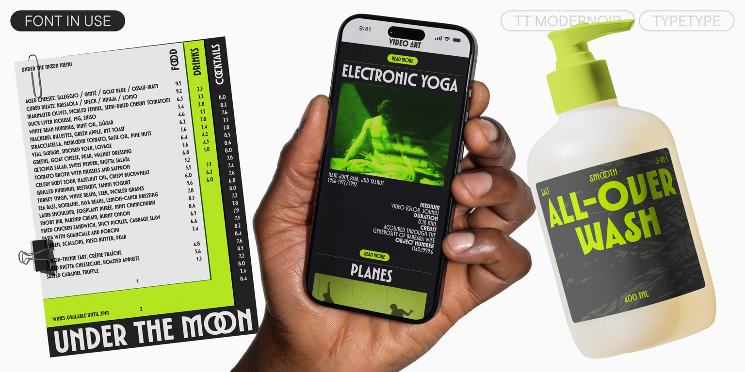
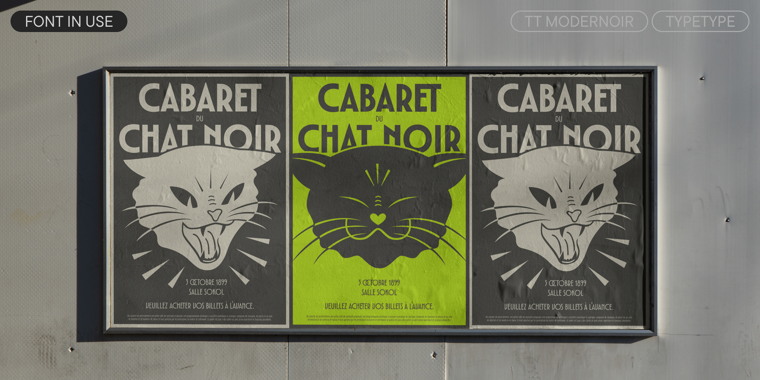
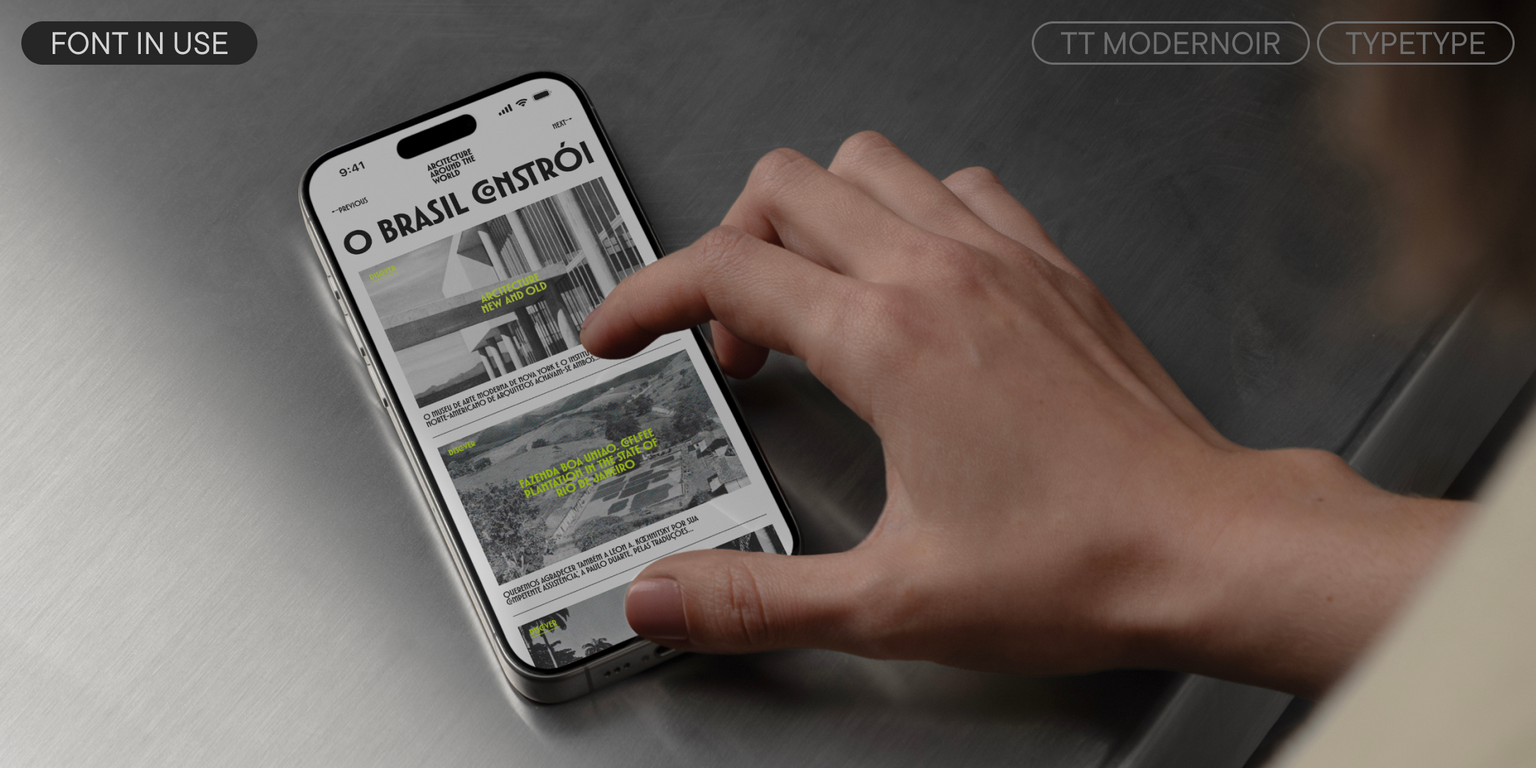
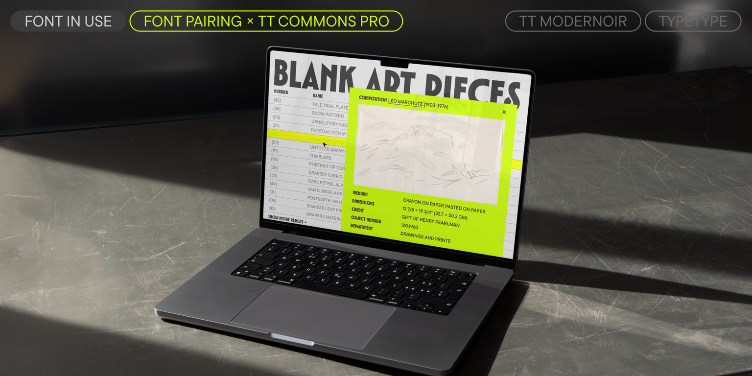
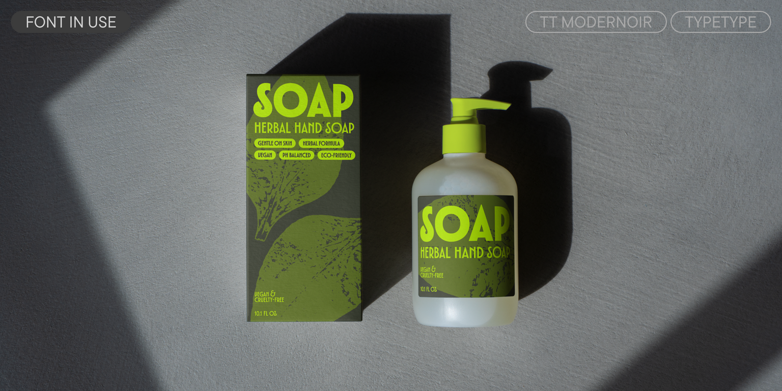
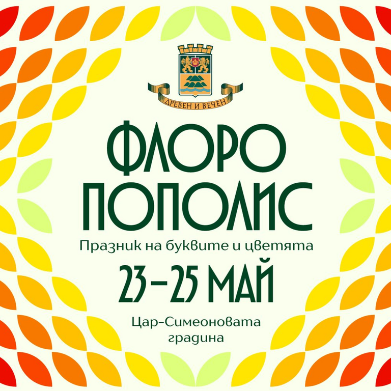
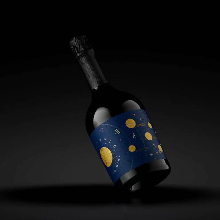
TT Modernoir works best at large point sizes. It is perfectly suited for event posters, signage, packaging design, magazine and book covers, as well as for branding and logos.

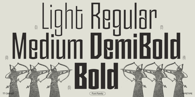
TT Modernoir features:

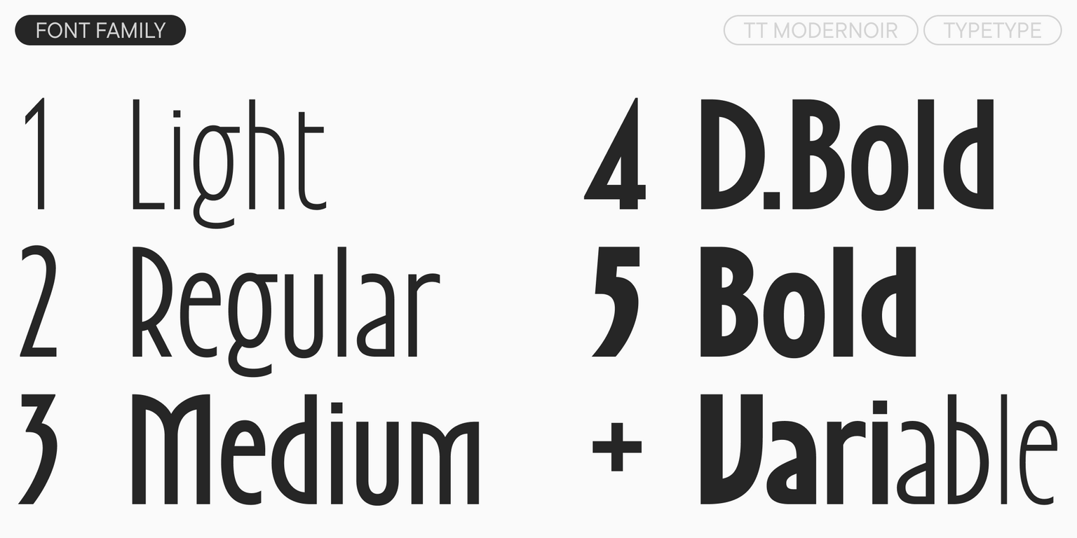
  • 6 styles: 5 uprights and 1 variable font
  • 1,445 glyphs per style
  • 38 OpenType features
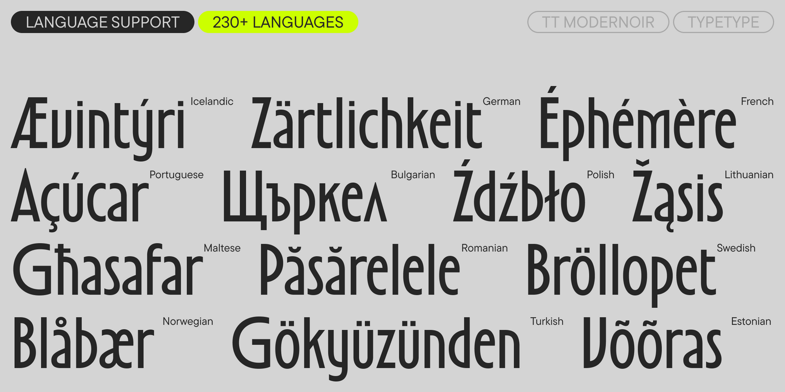
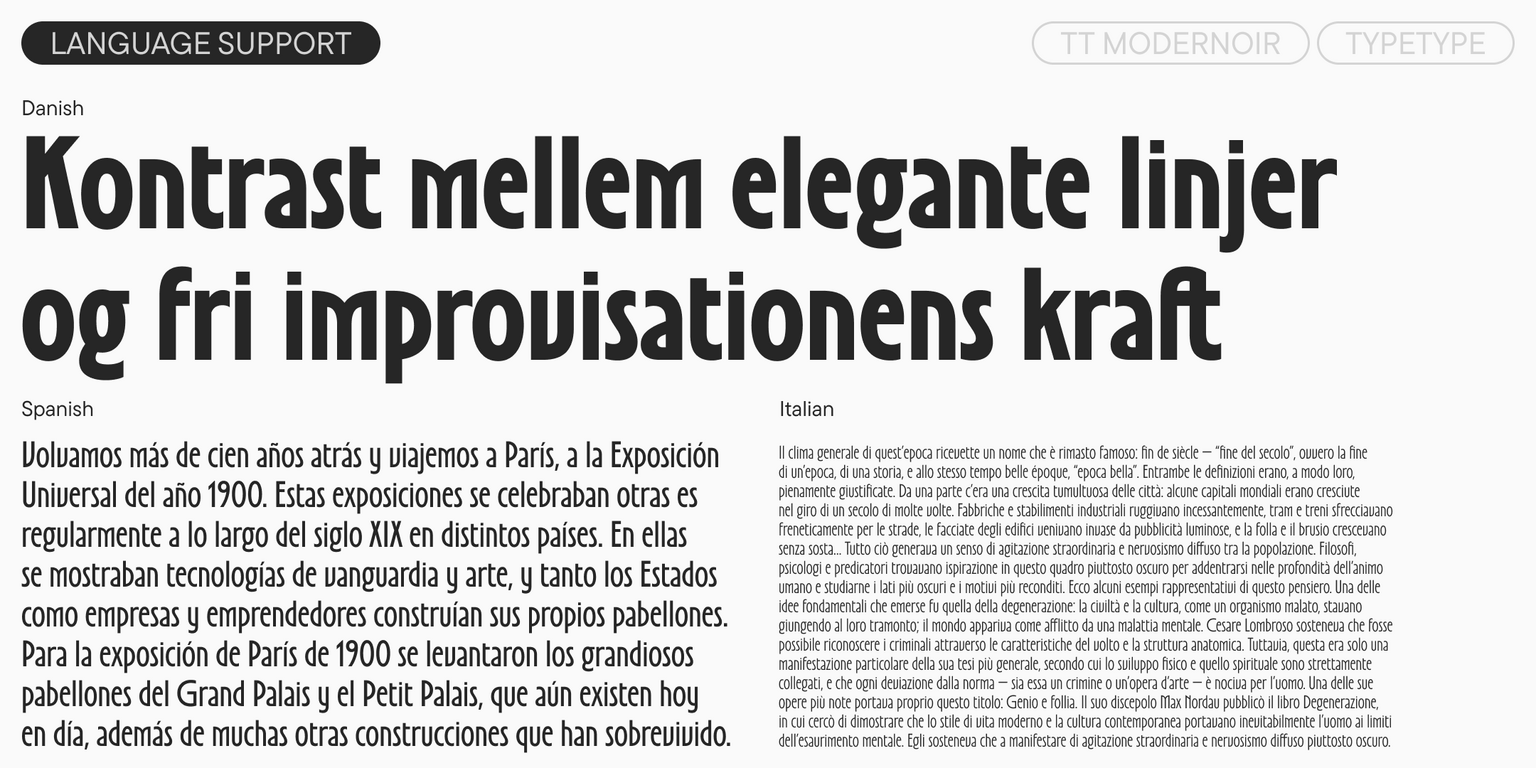
  • Support for over 230 languages

Add sophistication and romance to your design with TT Modernoir!

Release and update date

Release: 3 September, 2024

Last update: 15 July, 2025

What's changed in the font:
  • A full lowercase set has been added (the small capital letterforms from the previous version can now be found in a small capital set)
  • Numerals (0-9) and currency symbols have been added for minuscule and minuscule tabular figures
  • The total glyph count per style has increased from 1,341 to 1,445
  • New stylistic sets have been added: SS04—Alternative Straight Forms, SS05—Alternative Rounded Forms, SS06—Alternative r, SS07—Alternative l, SS17—Serbian localization.
  • New OpenType features have been added, increasing the count from 31 to 38

Additionally

Specimen

Download font specimen (pdf)

Poster Images

Graphic presentation at Behance

Custom version

Looking for a custom version of this font?

+ extended writing system Show all

Character Set

Basic Latin Basic Cyrillic Extended Latin Extended Cyrillic Fractions Proportional Lining Figures and Currencies Other Figures Punctuation and Symbols Math Symbols Arrows Icons
A B C D E F G H I J K L M N O P Q R S T U V W X Y Z a b c d e f g h i j k l m n o p q r s t u v w x y z
А Б В Г Д Е Ё Ж З И Й К Л М Н О П Р С Т У Ф Х Ц Ч Ш Щ Ъ Ы Ь Э Ю Я Ѓ Ґ Ќ Є Ї Љ Њ Ћ Ђ Ў Џ а б в г д е ё ж з и й к л м н о п р с т у ф х ц ч ш щ ъ ы ь э ю я ѓ ґ ќ є ї љ њ ћ ђ ў џ
Á Ă Ǎ Â Ä À Ā Ą Å Ǻ Ã Æ Ǽ Ć Č Ç Ĉ Ċ Ð Ď Đ DZ Dz DŽ Dž É Ĕ Ě Ê Ë Ė È Ē Ę Ə Ǵ Ğ Ǧ Ĝ Ģ Ġ Ħ Ȟ Ĥ Í Ĭ Î Ï İ Ì Ĩ Ī Į IJ Ĵ Ķ Ĺ Ľ Ļ Ŀ Ł LJ Lj Ń Ň Ņ Ŋ Ñ NJ Nj Ó Ŏ Ô Ö Ò Ő Ō Õ Ø Ǿ Œ Þ Ŕ Ř Ŗ Ś Š Ş Ŝ Ș Ŧ Ť Ţ Ț Ú Ʉ Ŭ Ǔ Û Ü Ù Ű Ũ Ū Ų Ů Ŵ Ý Ŷ Ÿ Ȳ Ź Ž Żá ă ǎ â ä à ā ą å ǻ ã æ ǽ ć č ç ĉ ċ ð ď đ dz dž é ĕ ě ê ë ė è ē ę ə ǵ ğ ǧ ĝ ģ ġ ħ ȟ ĥ ı í ĭ î ï i ì ĩ ī į ij ĵ ȷ ķ ĺ ľ ļ ŀ ł lj ḿ ń ň ņ ŋ ñ nj ó ŏ ô ö ò ő ō õ ø ǿ œ þ ŕ ř ŗ ś š ş ŝ ș ß ŧ ť ţ ț ú ʉ ŭ ǔ û ü ù ű ũ ū ų ů ŵ ý ŷ ÿ ȳ ź ž ż
Ӑ Ғ Ѐ Ӗ Җ Ҙ Ѝ Ӣ Ӏ Қ Ҡ Ң Ө Ә Ҫ Ӯ Ӳ Ү Ұ Ҳ Ҷ Һ ӑ ғ ѐ ӗ җ ҙ ѝ ӣ ӏ қ ҡ ң ө ә ҫ ӯ ӳ ү ұ ҳ ҷ һ
½ ¼ ¾
0 1 2 3 4 5 6 7 8 9 ¢ $ £ ¥ ƒ ¤
0 1 2 3 4 5 6 7 8 9
· . ... , : ; ! ¡ ? ¿ * ' " « » - _ ( ) [ ] { } | ¦ / \ # & § © ® @ ° ^
+ < > = ~ ¬ ± × ÷

OpenType features

smcp | Small Caps

a b c

a b c

dlig | Discretionary Ligatures

1/2 1/4

1/2 1/4

ss01 | Condensed Ovals

C Ǵ Ó

C Ǵ Ó

ss02 | Curly Letters

Ŕ Ś Z

Ŕ Ś Z

ss03 | Underlined Letters

A O U

A O U

ss08 | Circled Figures

1 2 3

1 2 3

Show all

Ideal font pairs with TT Modernoir

What is a font pair, and what does it serve for?

A font pair is a combination of two fonts within one text block. Most often, one of the fonts in a pair is a more expressive headline font, and the other one serves to communicate information. Such fonts complement each other and help designers solve various tasks, like highlighting key elements, adding emotional expressiveness to the project, or separating semantic blocks.

How to choose fonts for a project: Several general recommendations

To begin with, establish the project’s tone. Choose the fonts that stylistically match the main idea. After that, you need to determine the functions of each font in the project and their hierarchy: which font will complement the design and which one will serve to attract attention as the main element. You need to assess the difference between the fonts and decide what kind of information each of them should convey. First, we recommend choosing the base font you will use most, and then you can find a suitable pair for it.

Core principles of font pairing and recommendations from designers

The main rule you should follow when matching two fonts is that both similarities and differences must be visible between them. You can highlight the coherence of fonts by the following characteristics: contrast, proportions, width, openness of characters, individual letter shapes, and overall tone. Feel free to experiment with different combinations. We also recommend analyzing the projects you like: this way, you can enhance your visual skills, elevate your knowledge base, and gain confidence in dealing with typography.

Similar fonts

6 font styles
5 font styles
19 font styles
Buy font