top_banner_ttnormspro0426
TT Turns
19 styles
Type foundryFonts & StylesSans SerifTT Turns

TT Turns

TT Turns is a striking geometric sans serif with expressive elements. This versatile font works exceptionally well for running text, while at large point sizes, it takes on a distinct display character.
Single style: from $47.99
Full family: from $329 19 styles

Buying Options

Choose the fonts and licenses you want. Then, press the "Add to Cart" button

Any questions about the font or licences? Write us.

Choose the fonts you want

Package offer:
per style $17.32
from  $329
19 styles
from  $329
from $47.99
from $47.99
from $47.99
from $47.99
from $47.99
from $47.99
from $47.99
from $47.99
from $47.99
from $47.99
from $47.99
from $47.99
from $47.99
from $47.99
from $47.99
from $47.99
from $47.99
from $47.99
from $279
Package offer:
per style $15.50
from  $279
18 styles
from  $279
from $47.99
from $47.99
from $47.99
from $47.99
from $47.99
from $47.99
from $47.99
from $47.99
from $47.99
from $47.99
from $47.99
from $47.99
from $47.99
from $47.99
from $47.99
from $47.99
from $47.99
from $47.99
from $279
1 style
from $279
from $279

Any questions about the font or licences? Write us.

Select font licenses

You must specify a font package or style before selecting a licence

Choose the licenses you want

On request
On request
On request
On request
On request
On request
On request
On request
On request
On request
No selected items
Total
$0

Testers

TT Turns
Size
Features
Turn on all

A Fresh Take on the Symbiosis of Geometric and Humanist Styles

TT Turns
Size
Features
Turn on all

The main idea behind the TT Turns font family was to create a new, universal typeface that could be used with equal effectiveness in virtually any field. The font is meticulously calibrated and built on a foundation of strictly balanced proportions, making it a worthy alternative to classic grotesques. The font’s character remains neutral while still feeling contemporary. During the design process, unique elements were added to the font: special terminals in the letters ’a’ and ’g’, as well as specific forms characteristic of a broad-nib pen in the Cyrillic ’Дд’ and ’Лл’. These details give the typeface a slight display quality—about 5%—which becomes its key feature and helps it stand out from other fonts. We have also included numerous OpenType features in the font, significantly expanding its capabilities. Six stylistic sets are available that replace individual characters with alternate forms: the first set changes the ’a’ to a single-storey form, the second gives the ’G’ a more geometric form, the third replaces the ’g’ with a two-storey variant, the fourth adjusts the junction of the diagonals in ’Kk’, the fifth changes the tail of the ’Q’, and the sixth makes the tail of the ’y’ straight.

TT Turns
Size
Features
Turn on all

The typeface includes 19 styles: 9 upright, 9 italics, and 1 variable font

TT Turns
Size
Features
Turn on all

We’ve added a 5% touch of friendliness and uniqueness

TT Turns
Size
Features
Turn on all
Variable axes
Weight
Slant

Quake is a legendary sci-fi shooter

Ideal font pairs with TT Turns

What is a font pair, and what does it serve for?

A font pair is a combination of two fonts within one text block. Most often, one of the fonts in a pair is a more expressive headline font, and the other one serves to communicate information. Such fonts complement each other and help designers solve various tasks, like highlighting key elements, adding emotional expressiveness to the project, or separating semantic blocks.

How to choose fonts for a project: Several general recommendations

To begin with, establish the project’s tone. Choose the fonts that stylistically match the main idea. After that, you need to determine the functions of each font in the project and their hierarchy: which font will complement the design and which one will serve to attract attention as the main element. You need to assess the difference between the fonts and decide what kind of information each of them should convey. First, we recommend choosing the base font you will use most, and then you can find a suitable pair for it.

Core principles of font pairing and recommendations from designers

The main rule you should follow when matching two fonts is that both similarities and differences must be visible between them. You can highlight the coherence of fonts by the following characteristics: contrast, proportions, width, openness of characters, individual letter shapes, and overall tone. Feel free to experiment with different combinations. We also recommend analyzing the projects you like: this way, you can enhance your visual skills, elevate your knowledge base, and gain confidence in dealing with typography.

Description

About font family TT Turns
230+ Language support

Introducing the new TT Turns — foundational and striking all at once!

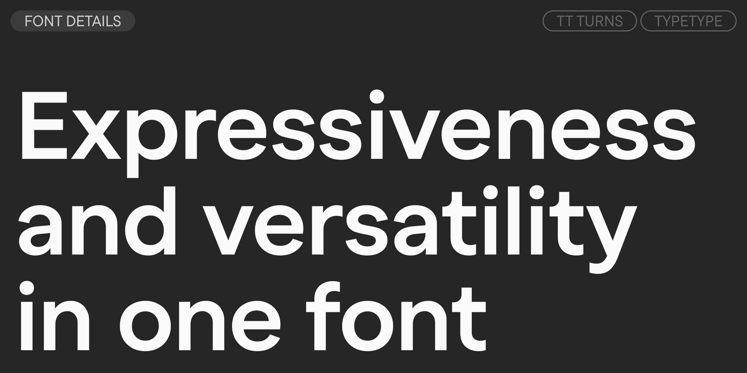
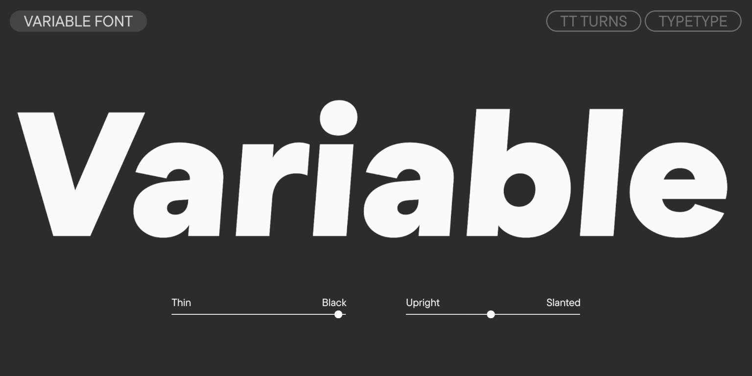
TT Turns is a geometric sans serif with distinctive rounded glyphs and expressive overhanging elements. This versatile font has a concise appearance and is highly readable at small sizes, while at large point sizes, it becomes a display font and reveals its character to the fullest. It’s energetic, strong, and dynamic—a quality that is especially evident in the italic font styles.

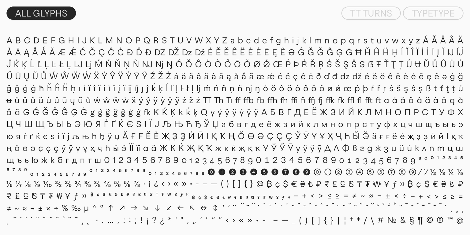
In ‘Kk’ and ‘Жж’, the diagonals meet the stem at a steep angle, creating a striking triangle of white space. This adds a sharp quality to the design. Other characteristic details include the sharp terminals on ‘Ss’, ‘Cc’, ‘a’, ‘Ээ’, and ‘Зз’, an expressive leg on the ‘R’, and pronounced protruding strokes on the left parts of ‘Лл’ and ‘Дд’.

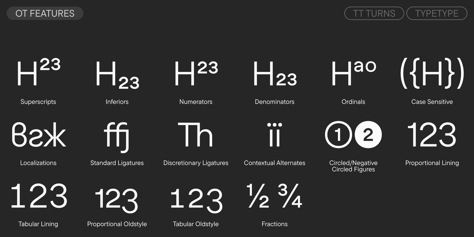
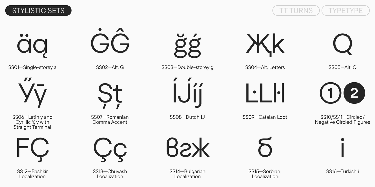
You can add even more display character to the font using its striking stylistic sets. For instance, the ‘a’ can be changed from a double-storey to a single-storey form, the ‘g’ from a single-storey to a double-storey, the shape of the ‘G’ can be made rounded, the glyphs for ‘Жж’ and ‘Kk’ can be changed, and the shape of the ‘Q’s tail can be transformed. And if, on the contrary, you wish to calm the typesetting, a set with more restrained tail forms for the Cyrillic ‘Уу’ and Latin ‘y’ is available. The font also includes ligatures, numerous OpenType features that significantly expand its capabilities, and a variable style that changes along the weight and slant axes.

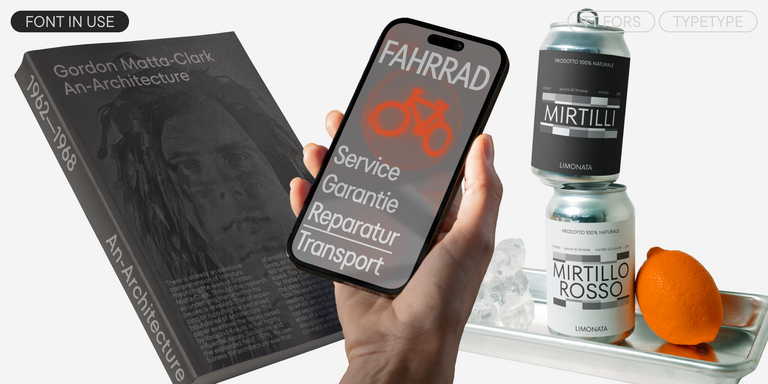
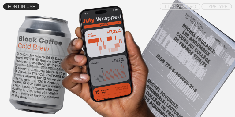
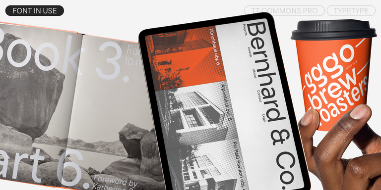
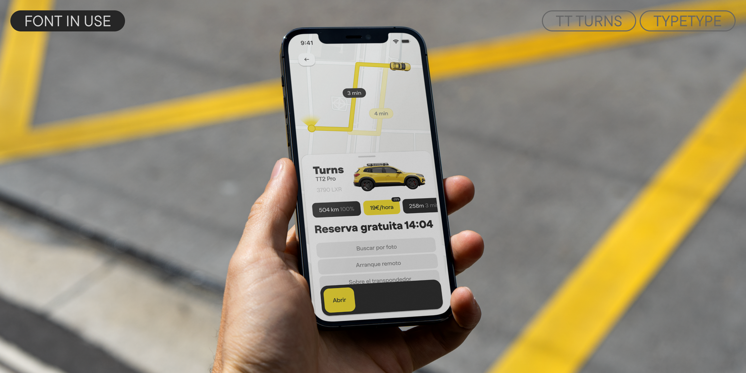
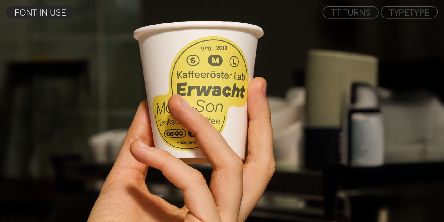
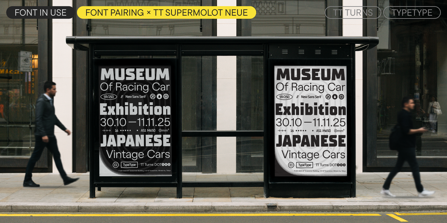
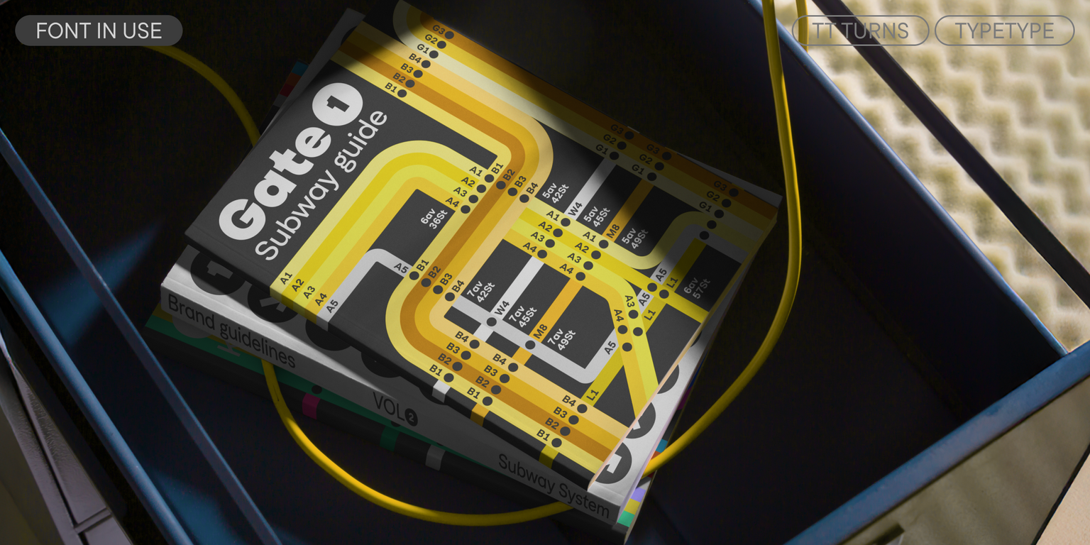
TT Turns is suitable for a multitude of different tasks: from use in running text, on the web, and in applications to branding and packaging design. It can be used with equal effectiveness in virtually any field.
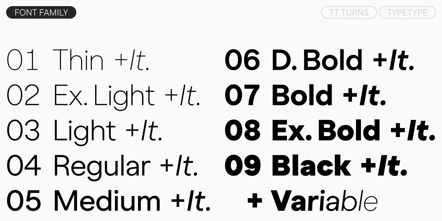
TT Turns includes:

  • 19 styles: 9 uprights, 9 italics, and 1 variable font
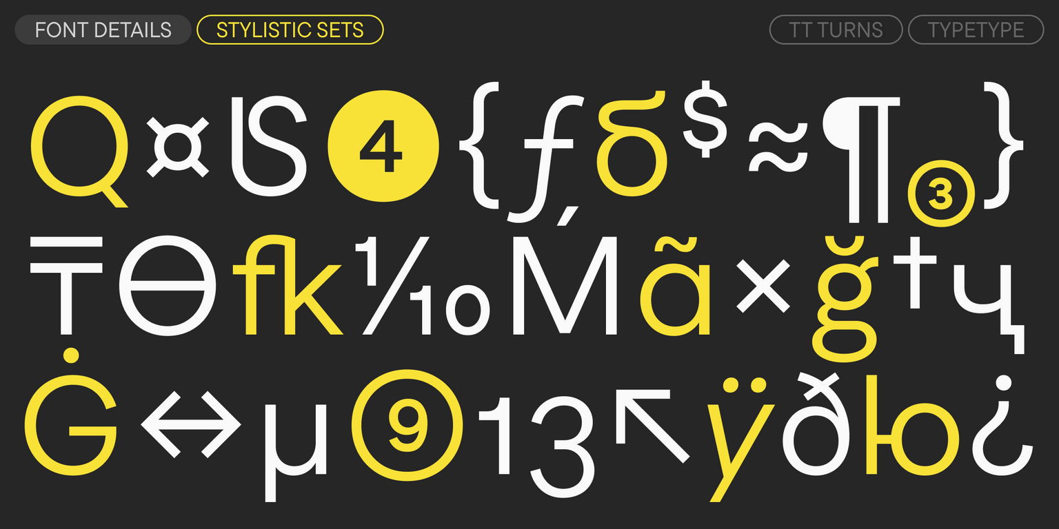
  • 931 glyphs per style
  • 34 OpenType features
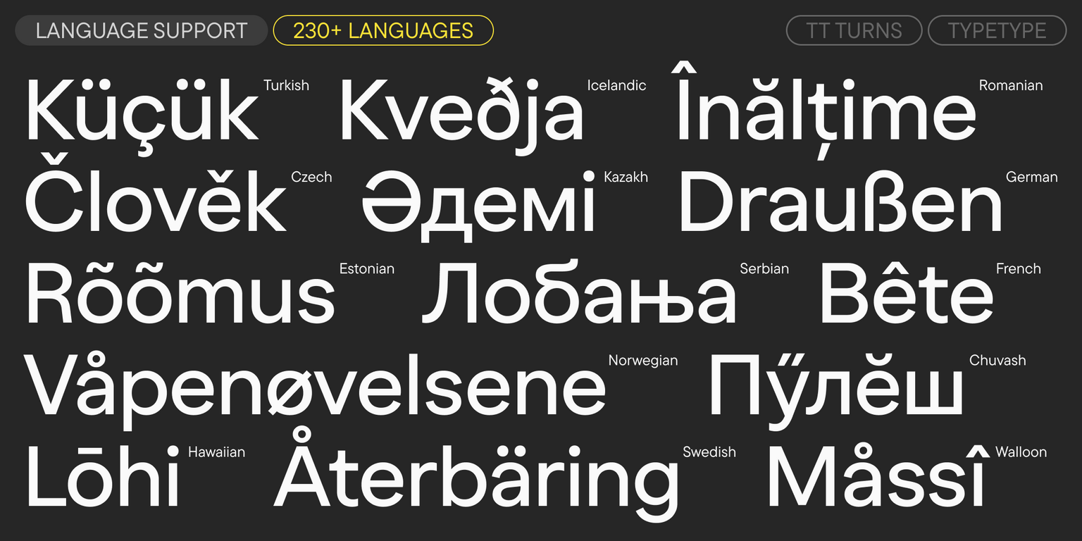
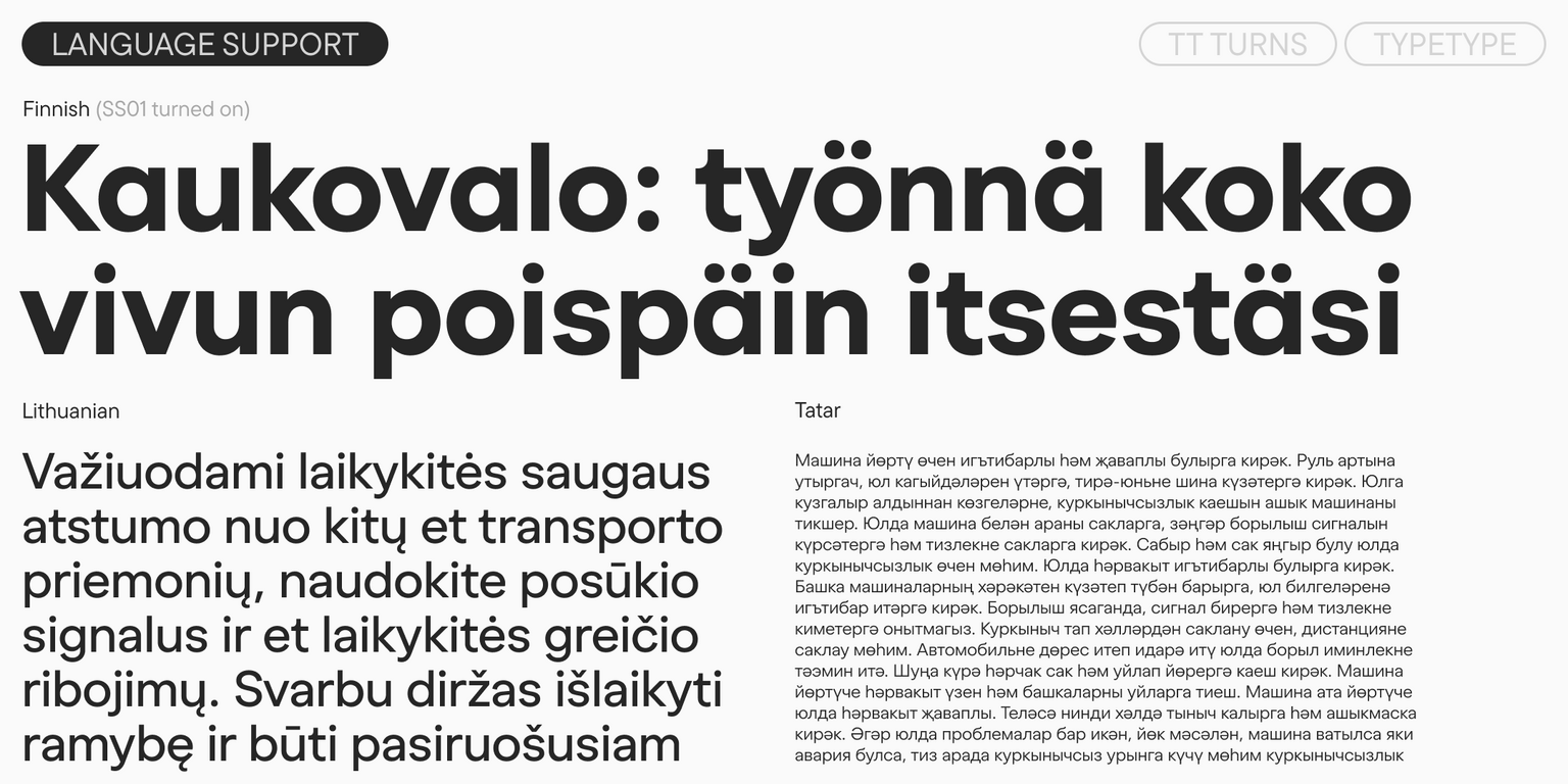
  • Support for over 230 languages

Release date

25 November, 2025

Additionally

Specimen

Download font specimen (pdf)

Poster Images

Graphic presentation at Behance

Custom version

Looking for a custom version of this font?

+ extended writing system Show all

Character Set

Basic Latin Basic Cyrillic Extended Latin Extended Cyrillic Fractions Proportional Lining Figures and Currencies Other Figures Punctuation and Symbols Math Symbols Arrows
A B C D E F G H I J K L M N O P Q R S T U V W X Y Z a b c d e f g h i j k l m n o p q r s t u v w x y z
А Б В Г Д Е Ё Ж З И Й К Л М Н О П Р С Т У Ф Х Ц Ч Ш Щ Ъ Ы Ь Э Ю Я Ѓ Ґ Ќ Є Ї Љ Њ Ћ Ђ Ў Џ а б в г д е ё ж з и й к л м н о п р с т у ф х ц ч ш щ ъ ы ь э ю я ѓ ґ ќ є ї љ њ ћ ђ ў џ
Á Ă Ǎ Â Ä À Ā Ą Å Ǻ Ã Æ Ǽ Ć Č Ç Ĉ Ċ Ð Ď Đ DZ DŽ Dz Dž É Ĕ Ě Ê Ë Ė È Ē Ę Ə Ǵ Ğ Ǧ Ĝ Ģ Ġ Ħ Ȟ Ĥ Í Ĭ Î Ï İ Ì Ī Į Ĩ IJ Ĵ Ķ Ĺ Ľ Ļ Ŀ Ł LJ Lj Ń Ň Ņ Ñ NJ Nj Ŋ Ó Ŏ Ô Ö Ò Ő Ō Õ Ø Ǿ Œ Þ Ŕ Ř Ŗ Ś Š Ş Ŝ Ș Ŧ Ť Ţ Ț Ú Ʉ Ŭ Ǔ Û Ü Ù Ű Ū Ų Ů Ũ Ŵ Ý Ŷ Ÿ Ȳ Ź Ž Ż á ă ǎ â ä à ā ą å ǻ ã æ ǽ ć č ç ĉ ċ ð ď đ dz dž é ĕ ě ê ë ė è ē ę ə ǵ ğ ǧ ĝ ģ ġ ħ ȟ ĥ ı í ĭ î ï i ì ī į ĩ ij ȷ ĵ ķ ĺ ľ ļ ŀ ł lj ḿ ń ň ņ ñ nj ŋ ó ŏ ô ö ò ő ō õ ø ǿ œ þ ŕ ř ŗ ś š ş ŝ ș ß ŧ ť ţ ț ú ʉ ŭ ǔ û ü ù ű ū ų ů ũ ŵ ý ŷ ÿ ȳ ź ž ż
Ӑ Ғ Ӗ Ѐ Җ Ҙ Ѝ Ӣ Ӏ Қ Ҡ Ң Ө Ә Ҫ Ӳ Ӯ Ү Ұ Ҳ Ҷ Һ ӑ ғ ӗ ѐ җ ҙ ѝ ӣ ӏ қ ҡ ң ө ә ҫ ӳ ӯ ү ұ ҳ ҷ һ
½ ¼ ¾
0 1 2 3 4 5 6 7 8 9 ¢ $ £ ¥ ƒ ¤
¹ ² ³
· . ... , : ; ! ¡ ? ¿ * ' " « » - _ ( ) [ ] { } | ¦ / \ # & § © ® @ ª º
+ < > = ~ ¬ ± × ÷ % µ ° ^

OpenType features

ss01 | Single-storey a

ă â ä ą

ă â ä ą

ss02 | Alternative G

Ǵ Ğ Ĝ Ģ

Ǵ Ğ Ĝ Ģ

ss03 | Double-storey g

ǵ ğ ǧ ĝ

ǵ ğ ǧ ĝ

ss04 | Alternative Letters

Қ Ҡ ḱ ķ

Қ Ҡ ḱ ķ

ss05 | Alternative Q

Q

Q

ss06 | Latin y and Cyrillic Y, y with straight terminal

Ў Ӳ ŷ ÿ

Ў Ӳ ŷ ÿ

Show all

Similar fonts

50 font styles
96 font styles
104 font styles
Buy font