
top_banner_granshan0926
TT Hazelnuts
18 styles
Type foundryFonts & StylesSans SerifTT Hazelnuts

TT Hazelnuts

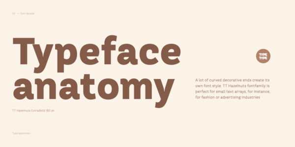
TT Hazelnuts is a display sans serif featuring smooth, decorative elements with flowing curves.
Single style: from $43.99
Full family: from $239 18 styles

Buying Options

To purchase a font, first select the styles you need, then choose your licenses and proceed to checkout. To test the font in your project, download the free trial version.

Select at least one style before choosing licenses

To purchase a font, first select the styles you need, then choose your licenses and proceed to checkout. To test the font in your project, download the free trial version.
Package offer:
per style $13.28
from  $239
18 styles
from  $239
from $43.99
from $43.99
from $43.99
from $43.99
from $43.99
from $43.99
from $43.99
from $43.99
from $43.99
from $43.99
from $43.99
from $43.99
from $43.99
from $43.99
from $43.99
from $43.99
from $43.99
from $43.99
On request
Perpetual
On request
On request
Perpetual
On request
On request
On request
On request
On request
On request
On request
On request
Perpetual
On request
On request
Perpetual
On request
On request
Perpetual
On request
On request
Perpetual
On request
On request
On request
On request
On request
Your order:
Nothing selected yet

Select styles first, then licenses.

Questions about the font or licensing?

Testers

TT Hazelnuts
Size
Features
Turn on all

A display sans serif fontfamily

TT Hazelnuts
Size
Features
Turn on all

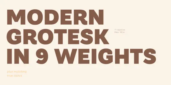
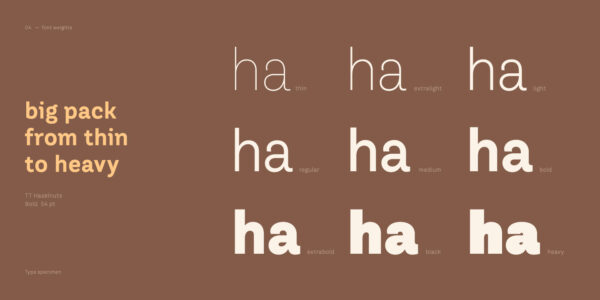
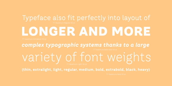
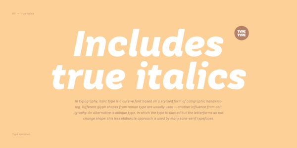
TT Hazelnuts is a display sans serif fontfamily containing a set of elegant and delicate decorative elements. Initially the family was designed for highly specialized areas, but we’ve decided to extend the number of typefaces and to make the family more universal. It will fit perfectly into layout thanks to a large variety of font weights (Thin, ExtraLight, Light, Regular, Medium, Bold, ExtraBold, Black, Heavy) and its real italics.

TT Hazelnuts
Size
Features
Turn on all

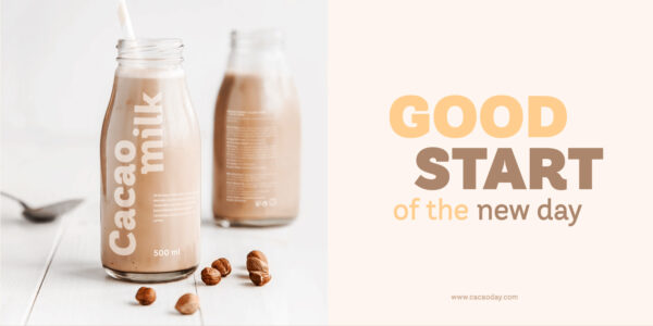
TT Hazelnuts fontfamily is perfect for small text arrays, for instance, for fashion or advertising industries

TT Hazelnuts
Size
Features
Turn on all

TT Hazelnuts reflects a touch of human hand

TT Hazelnuts
Size
Features
Turn on all

3/4 cup (18 cm3)

TT Hazelnuts in design

Description

About font family TT Hazelnuts
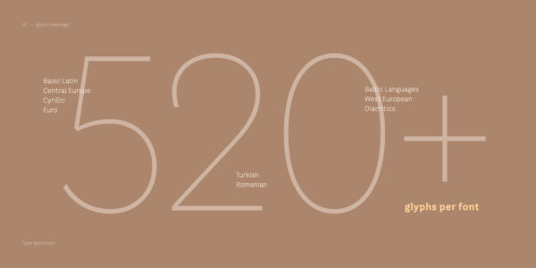
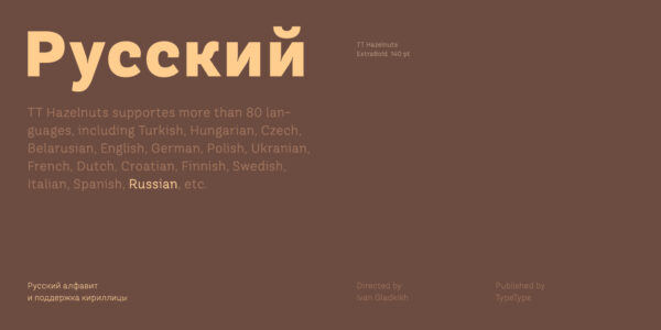
160+ Language support

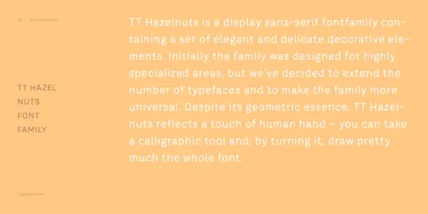
TT Hazelnuts is a display sans-serif fontfamily containing a set of elegant and delicate decorative elements. Initially the family was designed for highly specialized areas, but we’ve decided to extend the number of typefaces and to make the family more universal. Despite its geometric essence, TT Hazelnuts reflects a touch of human hand — you can take a calligraphic tool and, by turning it, draw pretty much the whole font.

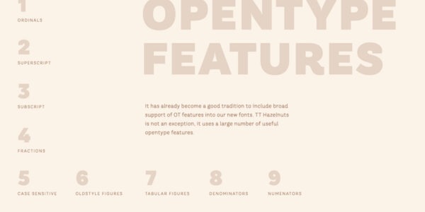
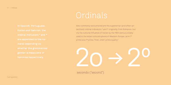
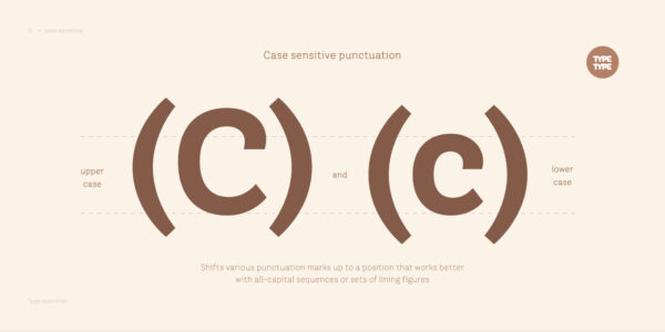
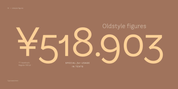
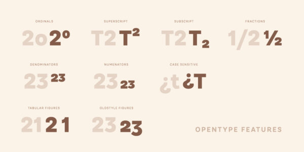
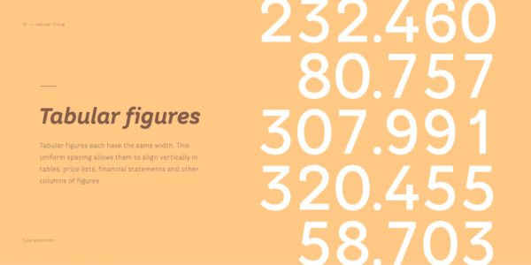
TT Hazelnuts fontfamily is perfect for small text arrays, for instance, for fashion or advertising industries, and will also fit perfectly into layout of longer and more complex typographic systems thanks to a large variety of font weights (Thin, ExtraLight, Light, Regular, Medium, Bold, ExtraBold, Black, Heavy) and its real italics. It has already become a good tradition to include broad support of OT features into our new fonts. TT Hazelnuts is not an exception, it uses a large number of useful features: ordn, sinf, sups, numr, dnom, tnum, onum, frac, case.
Team

Ivan Gladkikh
+ TypeType Team

Release date

10 January, 2017

Additionally

Specimen

Download font specimen (pdf)

Poster Images

Graphic presentation at Behance

Custom version

Looking for a custom version of this font?

Character Set

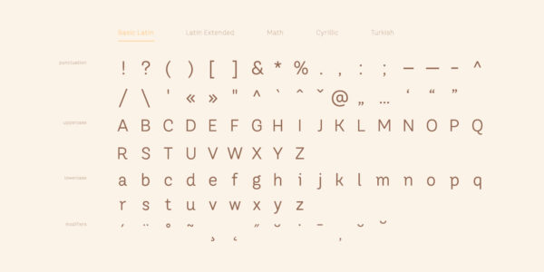
Basic Latin Basic Cyrillic Extended Latin Lining Figures, Currencies Old-style Figures|onum Punctuation, Symbols, Mathematical Symbols, Arrows
A B C D E F G H I J K L M N O P Q R S T U V W X Y Z a b c d e f g h i j k l m n o p q r s t u v w x y z

OpenType features

onum | Oldstyle Figures

1638

1638

case | Case Sensitive Forms

{([H])}

{([H])}

frac | Fractions

1/2 3/4

1/2 3/4

numr | Numerators

H123

H123

Ideal font pairs with TT Hazelnuts

Building Typography Hierarchy in Design Systems

In design work, font pairing is rarely just about matching two visually compatible typefaces. It is about shaping a clear hierarchy that works across different levels of communication. Headings, subheadings, body copy, captions, and interface elements all require different degrees of clarity, rhythm, and emphasis. Successful heading and body font combinations support hierarchy without creating visual conflict. The typefaces work together to define priority, showing the reader what matters most, what comes next, and what can be scanned quickly.

How Context Affects Font Compatibility

Context changes how typography works. One and the same combination can perform very differently in a product interface, a print layout, or a broad brand system. For interface design, clarity and speed of recognition usually outweigh expressive contrast. Editorial design demands readability across long passages. In branding, however, emotional tone and competitive distinction matter most. That is why selecting compatible typefaces begins with understanding the context of use before any final choice is made. Only then can designers see how fonts work with content density, color, and hierarchy.

Consistency Through Typographic Systems

Typography is best seen as a system that carries consistency across formats and platforms. A combination of fonts frequently becomes the first step in building that structure. Within this system, each typeface usually has a clear role: one defines the identity through headlines or display use, while the other provides stability in longer text and functional UI elements. Together, they form a structure that scales across websites, apps, marketing assets, and product screens. This systemic approach reduces design fragmentation and helps teams maintain a unified visual language over time.

Similar fonts

19 font styles
57 font styles
6 font styles
Select licenses
Contact us!