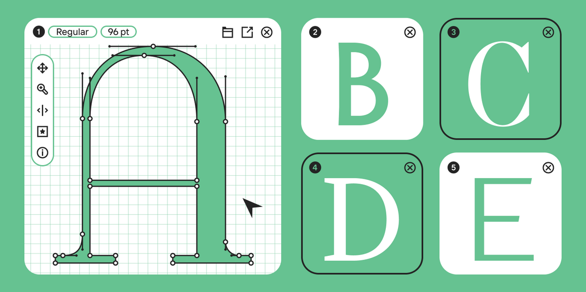
Figma typography is more than just selecting a font from a dropdown menu. In interface design, text works as a fully-fledged element of the product: it explains, directs, warns, and helps users compare data and make decisions. Therefore, in Figma, it is important not just to tweak individual elements, but to build a powerful system.
The larger the project, the more noticeable the price of chaos. On a simple landing page, you can manually fix a couple of headings. In an app with hundreds of screens, multiple platforms, different modes (like light/dark themes), and localizations, this approach quickly breaks down. One designer changes the size of a caption, another creates a local style, a third manually tweaks the line height—and within a month, the team no longer understands which values are actually systemic. A systematic approach to typography in Figma is crucial: it helps not only to craft an amazing layout but also to make the design solid and sustainable in real production.
In this article, we explore the capabilities of working with typography in Figma, break down the core concepts, and provide practical examples.
What Is Typography in Figma?
Typography figma functionality involves working with text inside a design mockup: creating text layers, selecting a font family and typeface styles, setting the size, and so on. At a basic level, a designer controls a single layer. On a systemic level, they create rules that can be applied across the entire file and passed on to development.
In UI/UX design, text almost never exists in isolation. That is why typography in Figma must answer not only “how the text looks” but also “what role it plays in the interface.”
Why typography is important in UI/UX design
Good typography makes an interface clearer. The user quickly understands what is a heading, what is body text, where the action is, what is a tooltip, and what is a warning. A properly configured typographic system helps to build a visual hierarchy without unnecessary noise.
If typography is assembled randomly, the interface can look messy even with a solid grid and high-quality components. For example, two similar captions with a 1 px difference create a sense of instability. The user doesn’t always realize exactly what is wrong, but they subconsciously read the product as less reliable.
In UI/UX, typography is directly linked to user convenience. The easier the text is to read, the lower the cognitive load. The more consistent the roles, the faster the user navigates. Therefore, a Figma typography design system is not a decorative add-on, but a core part of the product’s logic.
Core text capabilities in Figma
In Figma, you can create a text layer, select a font family, and modify the weight, size, line height, letter spacing, paragraph spacing, paragraph indent, and other properties. Figma also supports text styles, which allow you to save a set of typographic parameters and apply them repeatedly.
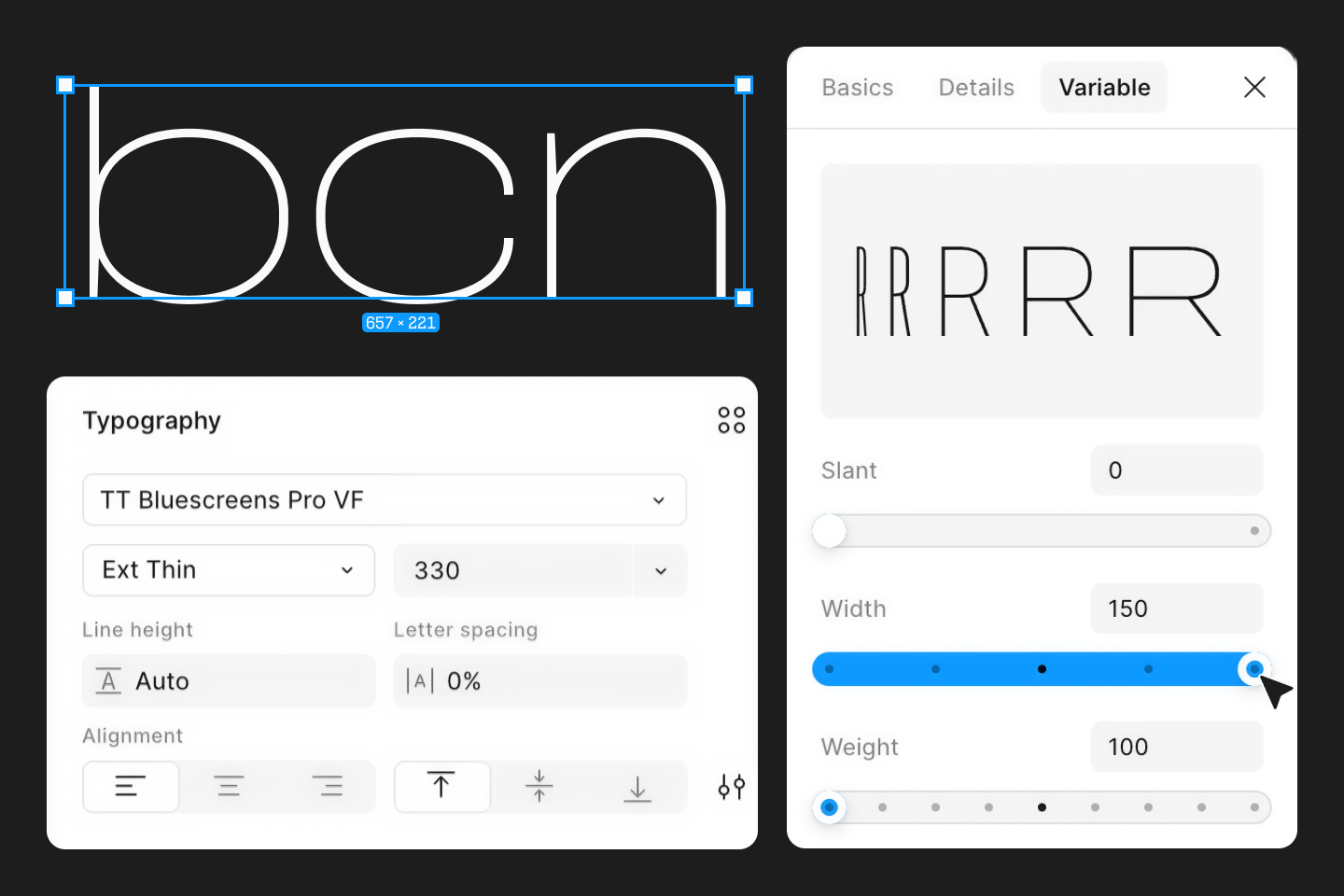
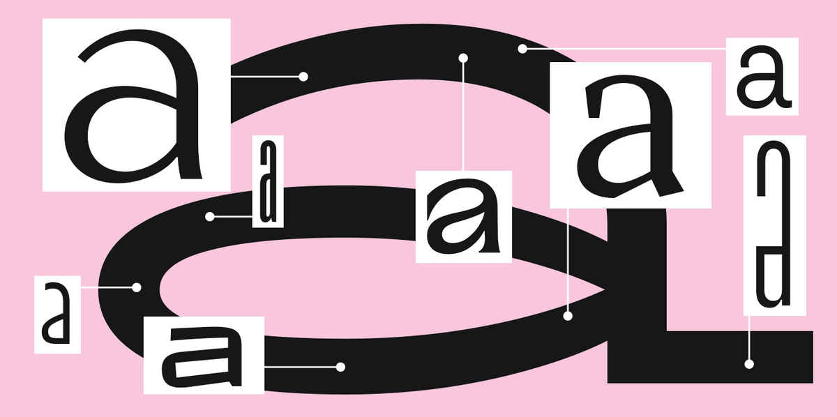
Another important feature is working with variable fonts. Unlike static fonts, where a designer chooses fixed weights like Regular or Bold, variable fonts offer an open range of adjustments along axes for width, weight, slant, and other parameters, provided they are built into the font file.
The role of fonts in interfaces
The font in an interface sets the voice of the product. A neutral sans-serif in the body text helps make the system calm, functional, and versatile. A more distinct typeface in the accents adds brand recognition. A variable font can provide flexibility when you need to manage parameters across different contexts.
For interfaces, it is important to choose not just a “beautiful font,” but a family that withstands real-world scenarios. You need to check small sizes, numbers, currency symbols, punctuation, language support, and behavior in tables, buttons, and long texts. In our blog, we have already discussed the difference between a font and a typeface and why understanding the logic of a font family is so important.
If a project is built around UI, look for families with excellent screen readability, predictable weights, and a sufficient range of styles. In the TypeType catalog, you can search for fonts by category and purpose: for example, sans serifs, text typefaces, fonts for interfaces, the web, branding, and applications.
Getting Started with Figma Typography
Let’s break down the main stages of working with text.
Creating a text layer
A text layer is created using the Text tool. A designer can click on the canvas and start typing, or drag a box to set the width of the block. The first method is best for quick captions and short headings. The second is more convenient for paragraphs, cards, descriptions, and any elements where line wrapping is important.
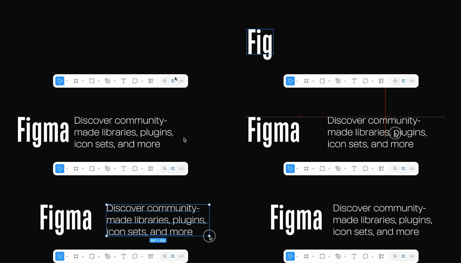
After creating the layer, you should immediately determine its function. Is it a heading, body text, a warning, a button label, a link, or an error message? This approach keeps you from generating chaotic layers. If a designer manually selects parameters every time, the file will quickly fill up with similar but subtly different solutions.
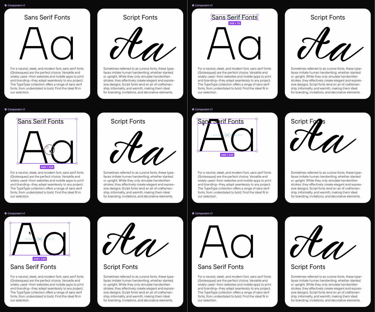
In interfaces, a text layer often becomes part of a component or Auto Layout. For example, button copy must react to the label length, helper text must live inside input fields, and a card’s title must wrap correctly when the width changes. Thus, typography in Figma is deeply interconnected not only with the font but also with the layout.
Selecting fonts, typefaces, and font families
Figma allows you to choose both locally installed fonts and web fonts. In the interface, the designer selects the font family and the required style within it.
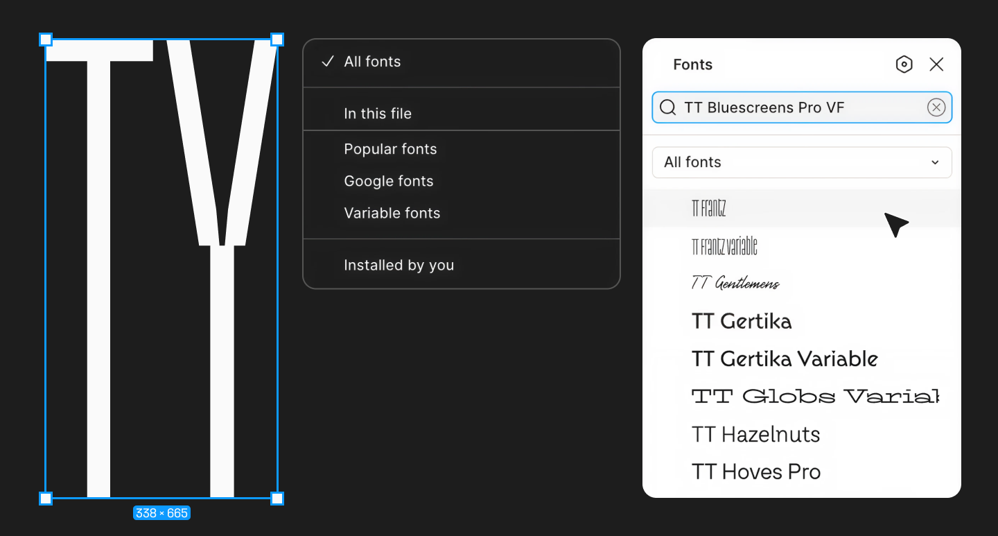
For product design, it is generally best to rely on families with excellent screen readability, multiple weights, and predictable behavior in small and large sizes. As a project grows, it is crucial to start with a well-thought-out family offering a clear logic of weights and styles, rather than a random font.
Setting size, weight, line height, and tracking
Basic typography configuration in Figma revolves around four parameters: font size, font weight, line height, and tracking (letter spacing). Size dictates visual hierarchy; weight handles accent and contrast; line height ensures readability; and tracking defines the density and character of the text.
You can read more about tracking and line spacing here.
In UI design, it is especially important not to overdo tracking: at small sizes, excessively loose or tight text impairs readability. For long texts, it is better to start with neutral values and adjust them only when actually necessary.
It is also helpful to remember advanced settings: paragraph spacing, paragraph indent, OpenType features, and vertical trim. These go beyond the “first layer” of typography, but these details are exactly what make an interface look refined and professional. For example, paragraph spacing helps control the rhythm of long content, while OpenType features let you enable tabular figures, stylistic sets, ligatures, or alternative character forms if the font supports them.
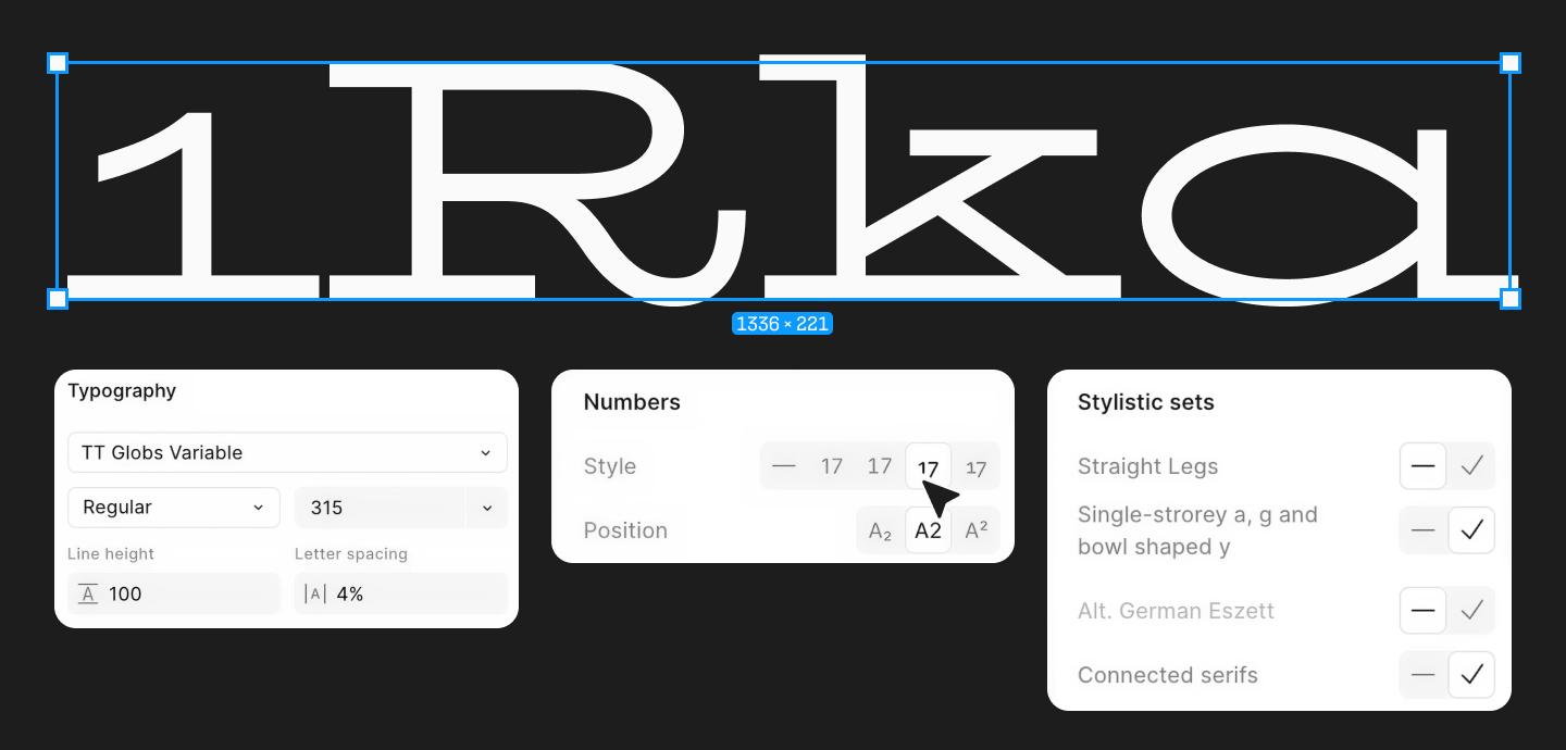
Figma Typography Styles and Scale
When a project has more than a few screens, manual text adjustment stops being efficient. Text styles and a typographic scale help lock in the system: defining what levels of text exist, what parameters each level has, and where they are used.
Building a typographic scale
A typographic scale (or typescale) is a pre-planned system of sizes and intervals for different levels of text: for example, Display, H1, H2, H3, Body L, Body M, Caption. In Figma, text styles are used specifically to lock in this scale and use it consistently across all designs.
In practice, a good scale shouldn’t be too fragmented. If a file contains 15 nearly identical text sizes, it is a sign of chaos, not flexibility. For most interface systems, a compact set of roles is sufficient: 1–2 display levels, 2–3 headings, 1–2 body text sizes, and 1–2 supporting styles. The clearer the scale, the easier it is for the team to maintain. This is less about aesthetics and more about interface manageability. The foundation for this in Figma relies on text styles and the unified set of properties they store.
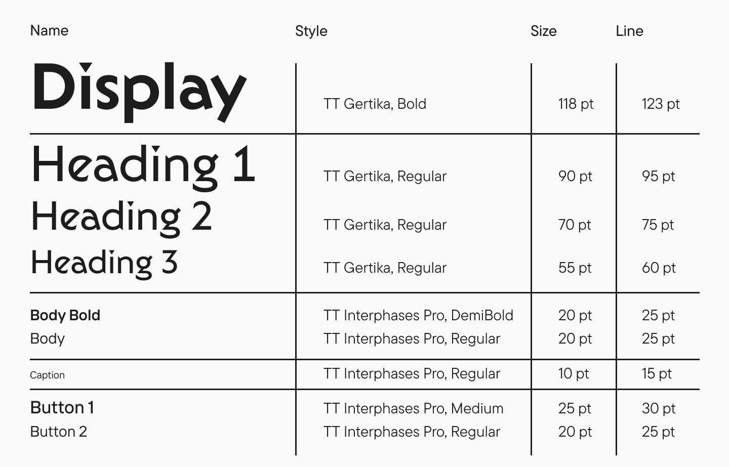
Example of a basic scale for an interface:
- Display / L — large promo headings and hero blocks;
- Heading / H1 — main screen heading;
- Heading / H2 — section heading;
- Heading / H3 — card or subsection heading;
- Body / L — important body text;
- Body / M — base interface text;
- Caption / M — labels, metadata, tooltips;
- Button / M — buttons.
This structure helps build visual hierarchy while maintaining control. If every level has a clear role, designers are less likely to create random values.
Using text styles
Text styles in Figma save a set of typographic properties and allow you to reapply them across different designs and files. This is convenient for various roles: body text, headings, buttons, and more. When a style is updated, the changes are automatically applied to all linked layers.
A text style saves the core typographic parameters (font, size, line height, spacing, and some advanced settings), but not all text properties are locked into it as a strict preset. Alignment, color, and resizing behavior are not included in a text style, meaning they must be controlled separately. This separation is a key part of Figma’s architecture: typography is separated from visual styling.
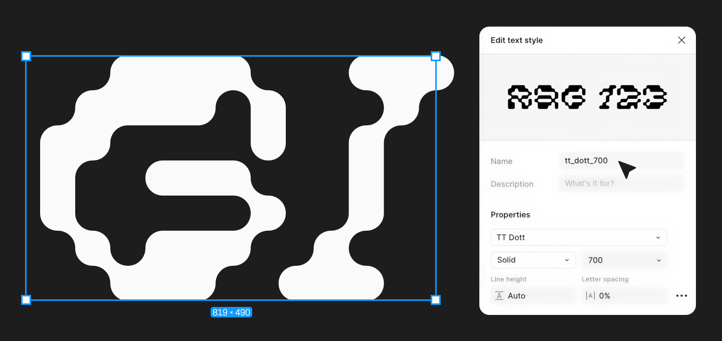
This is a crucial point: many beginner designers mistakenly think that a text style covers “everything about the text.” In reality, it is strictly a typographic style, not a universal preset for all layer properties. Therefore, mature systems often use a combination: a text style handles the typography, a color style or color variable handles the color, while layout and alignment are configured at the component or block level.
Establishing visual hierarchy
Visual hierarchy shows what is primary and what is secondary in an interface. It is built not just with size. In Figma, it is usually crafted from a combination of point size, weight, line height, contrast, and the rhythm of spacing. A solid hierarchy allows the user to understand at a glance where the heading is, where the body text sits, where the tooltip lives, and where a secondary caption belongs. This is why it is better to design a set of roles with specific functions rather than designing isolated, beautiful text blocks.
For interfaces, it is especially important that the hierarchy remains consistent across all screens. If a product card on one screen uses one type of body text, and on another screen it uses something almost identical but with a slightly different size and line height, the interface begins to visually fall apart. Text styles in Figma solve this issue by acting as a “single source of truth” for typography.
Figma Typography Variables
In Figma, variables are reusable values that can be applied to various design properties. For typography, this is incredibly powerful because variables can be bound to font properties and used as the foundation for adaptive and scalable systems. Figma supports number variables for size, numeric weight (if the font supports it, or via style name), line height, letter spacing, paragraph indent, and paragraph spacing. It also supports string variables for font families and style/weight names (these variables require the necessary fonts to be available to all project participants).
In other words, figma typography variables are not a separate, magical feature, but simply the application of standard variables to text properties. For example, you can create the variables font/size/body/md, font/line-height/body/md, and font/family/base, and then use them in your styles and components. This approach is incredibly efficient when the same system needs to work across multiple themes, products, languages, or breakpoints.
Examples of variables:
- font/size/body/m = 16;
- font/line-height/body/m = 24;
- font/size/heading/h1 = 40;
- font/family/base = TT Norms Pro;
- font/weight/medium = 500;
- font/paragraph-spacing/article = 16.
These values can be used as the foundation for text styles and components. If the team decides to change the body text from 16/24 to 17/26, they don’t need to manually go through dozens of layers. They simply update the systemic value and verify how the change propagated through linked instances.
How to create and manage variables
Variables in Figma are organized via collections, groups, and modes. A collection is a set of variables and modes; groups help maintain order inside the collection; modes allow you to store different values of the same variable for different contexts.
For typography, it is highly beneficial to agree on a naming convention early on. Naming logic like category/role/size/state works well (e.g., font/size/heading/h1, font/line-height/body/m, font/family/brand). The sooner a designer sets a strict naming system, the easier it will be for the team to read, search, and reuse variables without confusion. Figma additionally allows you to group and reorder variables within collections, which simplifies the management of large systems.
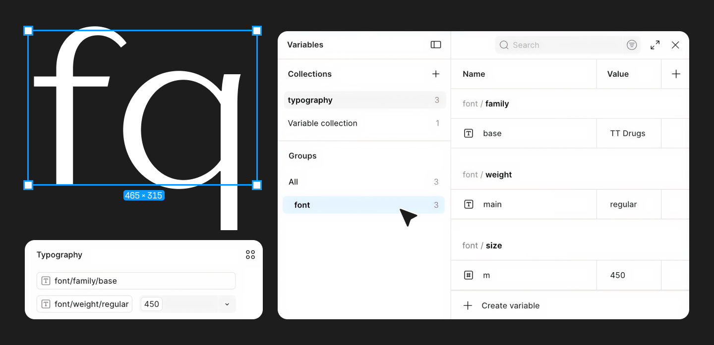
Figma lets you apply variables to different layer properties, as well as to styles. You can bind variables to properties in the right-hand panel, to text styles, and to color styles. You can use variables from the current file or from published team libraries.
In typography, this helps connect text styles with base values. For example, the Body / M style can use the font/size/body/m variable for its size and font/line-height/body/m for its line height. If the value changes, the style updates via the variable.
This is especially convenient when switching to a new font. Imagine the team is replacing an old typeface with a new one that has a slightly different x-height, a different feel in its weights, and a different rhythm. With variables, it is much easier to control the changes: designers adjust the base values, and the linked styles update systemically.
Benefits for scalable systems
The main advantage of typography variables figma offers is scalability. As a design system grows, manually managing sizes and intervals becomes too expensive in terms of time and too risky in terms of errors. Variables allow you to centralize values, use modes for different contexts, and reuse them efficiently in styles.
This is absolutely vital in large products: mobile and desktop interfaces, light and dark themes, different languages, and different brands within a single platform. In such cases, variables act as the “skeleton” of the system, while styles serve as a more user-friendly wrapper for designers.
Typography Tokens in Figma
Typography tokens figma users refer to are named design values that describe the typography system at the level of rules, rather than individual layouts. In the Figma ecosystem, tokens are most often implemented via variables and aliasing (when one variable links to another).
It is important not to confuse tokens with the styles themselves. A token is a logical unit of the system, the source of a value. A style is a convenient, composite set of properties that a designer applies to text on the canvas. In a mature system, tokens live “under the hood,” while text styles become a friendlier interface for the team’s daily workflow.
Difference between tokens and variables
Variables are a native Figma tool. Tokens are a methodology. A variable stores a value. A token explains what role that value plays in the system. When a variable is given a systemic name, a place in the hierarchy, and connections to other values, it begins to function as a token.
For example:
- 16 — just a number;
- font/size/16 — a base variable;
- text/body/default/size — a semantic token;
- Body / M — a text style that might use this token.
Primitive (base) and semantic tokens
In typography, it is highly effective to divide tokens into base (primitive) and semantic. Primitive tokens describe the “raw materials”: specific sizes, line height, font family, font weight. For example, font/size/16, font/line-height/24, font/weight/700. Semantic tokens link these values to a role in the interface: text/body/default, text/heading/h2, text/button/label. Figma allows you to build this logic using variables of the same type that alias one another.
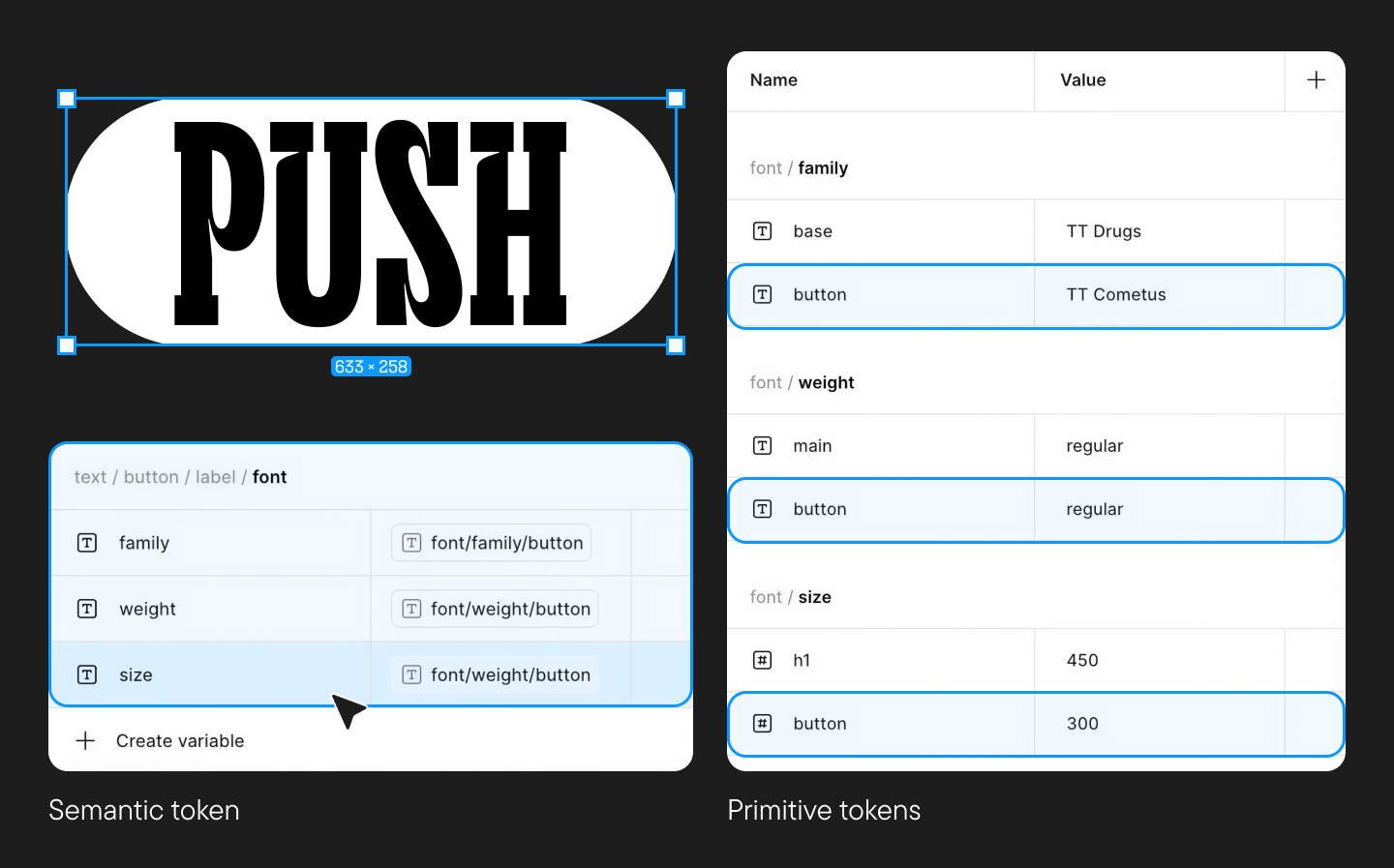
It is this semantic layer that makes the system actually usable in real work. If tomorrow the body text size changes, the designer and developer do not need to manually hunt down every instance of “16 px”. They simply update the linked primitive value or reassign the semantic token.
Tokens help synchronize design decisions across layouts, components, and the developer handoff process. The larger the product, the higher the value of managed dependencies over manual tweaks. In conjunction with libraries, styles, and variables, tokens allow you to maintain consistency without constantly checking every single screen by hand.
Building a Typography Design System in Figma
A robust figma typography design system is built in layers. First, the team selects a typeface and defines the base parameters: sizes, line heights, weights, and roles. Then, variables and tokens are created. After that, text styles are assembled. On top of these, components are designed: buttons, input fields, cards, tables, and modals.
The minimum framework for a system:
- Font family and fallback font;
- Scale of sizes;
- Rules for line height;
- Permitted weights;
- Text styles for primary roles;
- Tokens and variables for key values;
- Rules for links, buttons, fields, and captions;
- Examples of application in components;
- Guidelines for accessibility and readability.
This approach separates the foundation from the applied layer. If the foundation needs to be changed, the team does not reinvent every component; they simply update the linked values.
The true power of typography reveals itself in components. When text styles and variables are embedded into a button, an input field, a card, or a table, the component already contains the correct typographic behavior. The designer doesn’t manually pick the size but works with a ready-made role.
For instance, in a button component, you can lock in the Button / M style; in an input field — Input / Value and Input / Helper; in a card — Card / Title and Card / Description. If the team later changes the font or adjusts the line height, the components update alongside the system.
For team collaboration, it is vital to publish styles and variables to libraries. Then, typography ceases to be a local solution in a single file and becomes a global standard. The team can use the same foundation across multiple products and distribute updates centrally.
Scalability and unified rules
Scalable typography is a system that can be modified without breaking layouts. For example, a team can adapt the scale for mobile screens, swap out the font, add a new language, introduce a large-text mode for accessibility, or refresh the brand.
This requires not just styles, but variables, modes, tokens, components, and a clear style guide. Ideally, a designer looks at the system and sees not a random collection of layers, but a map: what roles exist, where they are applied, what can be customized, and what constitutes breaking the rules.
Using Figma Typography Templates
A figma typography template helps you start a project not from scratch, but with an existing structure. This could be a dedicated page in a design system file, a UI kit, a starter file, or a library where roles, styles, variables, and usage examples are already gathered.
A typography template is a pre-prepared set of text roles and rules. A good template shows not only the names of the styles but also real-world application scenarios.
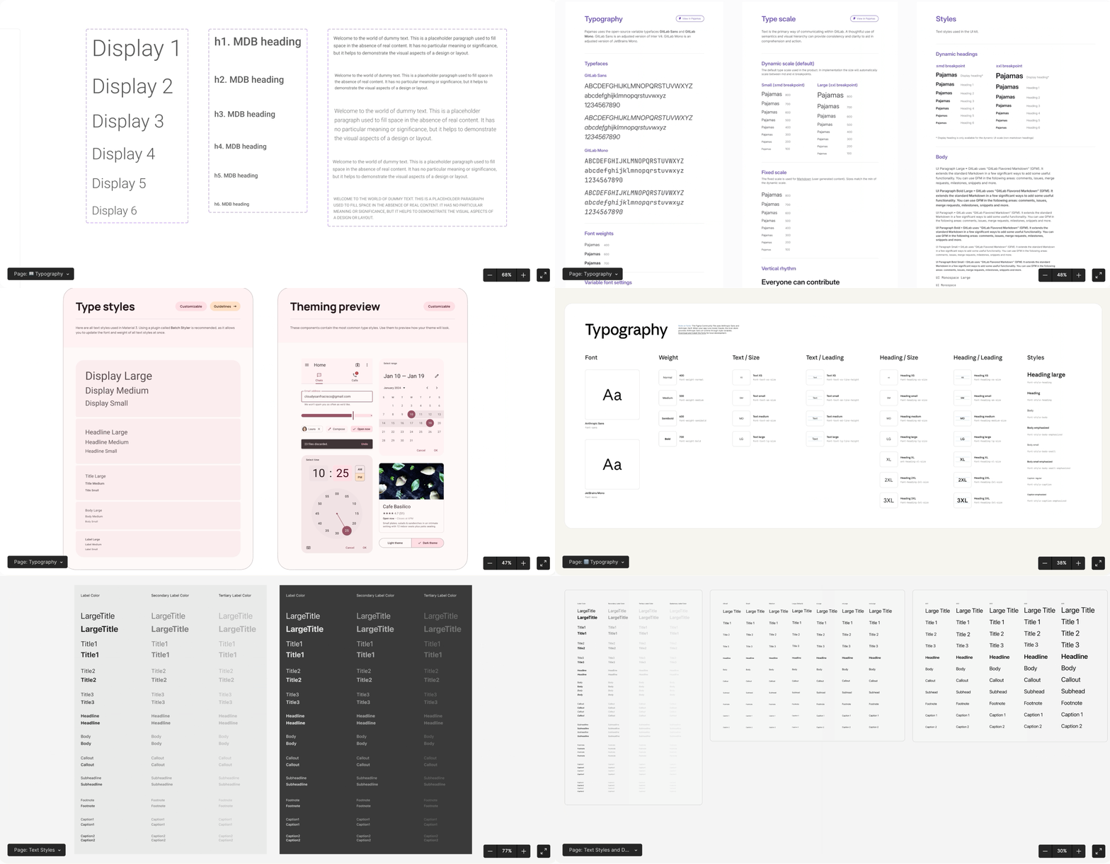
For example, a Typography page might include a size chart, a set of text styles, examples of paragraphs, cards, buttons, forms, tables, and states. This helps the team quickly grasp how the system operates in the interface, rather than just reading an abstract specification.
The primary advantage of a template is speed. A designer doesn’t have to recreate the scale and styles from scratch every time. The team launches the project faster, onboarding newcomers is easier, and discussions become more specific. Instead of saying “make the text a bit smaller,” you can say: “use Body / M instead of Body / L”.
A template also reduces the number of random decisions. If ready-made roles and styles are already in the file, designers rarely create local copies. This is particularly important in teams where multiple people are simultaneously working on a product.
However, a ready-made template cannot simply be copied and considered final. It must be customized for the specific project or brand: selecting the font family, configuring the weights, verifying the sizes, and so on. It is also crucial to test how the font behaves inside real components.
Best Figma Typography Plugins
Today, Figma natively handles most basic typographic tasks. Therefore, a figma typography plugin is not meant to replace systems thinking, but to speed up routine tasks, audits, imports, exports, and bulk changes.
Plugins are incredibly useful when you need to quickly scan a file, find text layers without styles, swap a font, rename styles, export tokens, synchronize values, or populate placeholders with real content. They save time in areas where the rules have already been defined.
But a plugin does not make design decisions for the team. If there is no logic in the system, automation will simply accelerate chaos. First, you must build the scale, styles, variables, and tokens. Then, you can hook up extensions that help maintain order.
Overview of popular solutions
Tokens Studio is one of the most well-known tools for working with tokens in Figma. It allows you to manage tokens, work with JSON, aliasing, themes, and sync with GitHub. This is especially beneficial for large teams where tokens must live not only in the design but also in development code.
Design Lint helps locate violations in your designs: missing styles, non-systemic values, and local deviations. For typography, it is great because it scans and highlights text layers that are not bound to text styles or that break away from the system.
Batch Styler helps bulk-edit styles. For example, if you need to swap the font family across a huge number of text styles or update parameters after a rebranding, this plugin saves hours of manual work.
Uwarp Font Replacer is a quick replacer for rapidly swapping fonts in a mockup. You can use it when testing a new typeface, migrating a project to a different family, or validating several font hypotheses.
Editorial typographic plugins help fix quotes, dashes, spaces, widows, orphans, and other editorial minutiae. They don’t build the design system, but they elevate the quality of the text in your mockup.
Automation works best where there are established rules: style names, sizes, text roles, tokens, modes, and library dependencies. Therefore, you should always establish the logic of your typographic system inside Figma first, and only then supercharge it with plugins. Otherwise, the plugin will just automate a mess.
Best Practices for Typography in Figma
Powerful typography in Figma is built on a combination of design experience and systemic rules. It is important to constantly verify readability, font pairings, consistency, real data, and the technical handoff to developers.
Readability and accessibility
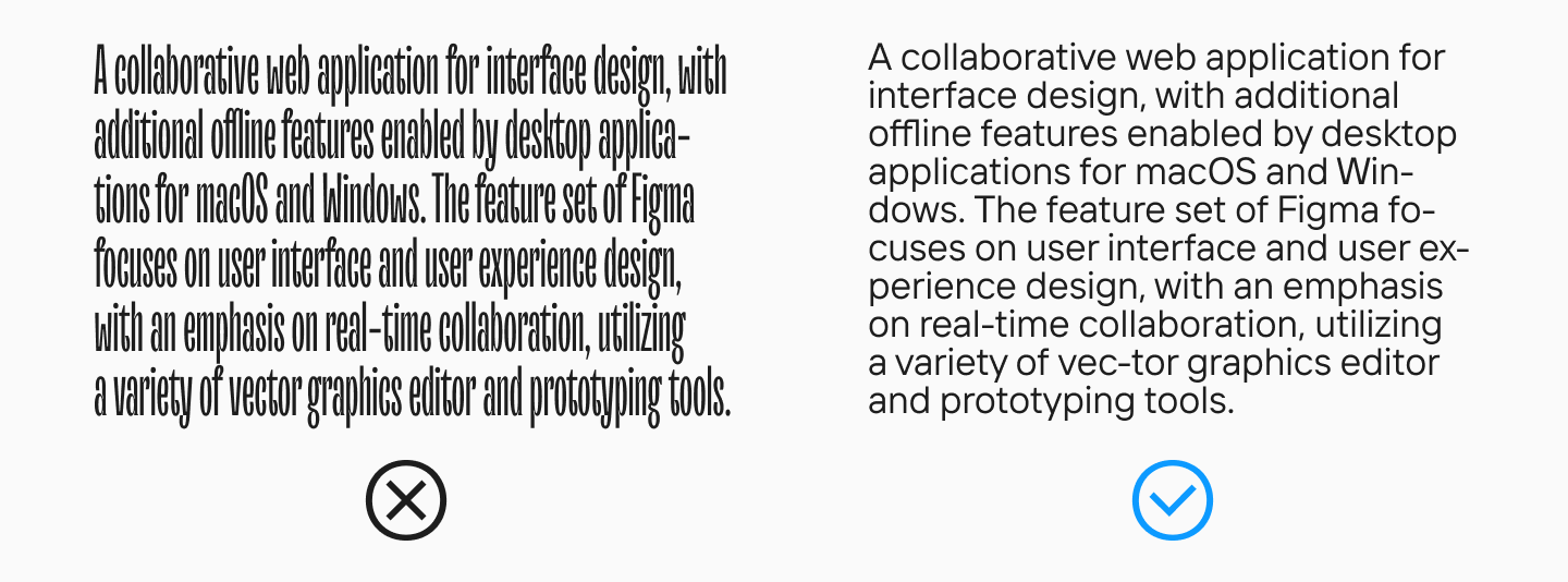
Readability depends on a range of parameters (we discussed this in detail in this article). One font might look amazing in a large headline but fail miserably in body text. Therefore, you must test real-world scenarios. For body text, it is always better to select neutral and minimalist fonts in basic weights.
If the text is hard to read, the user will not be able to interact efficiently with the product. Thus, a font must be evaluated not in isolation, but in conjunction with other UI elements.
Font pairings
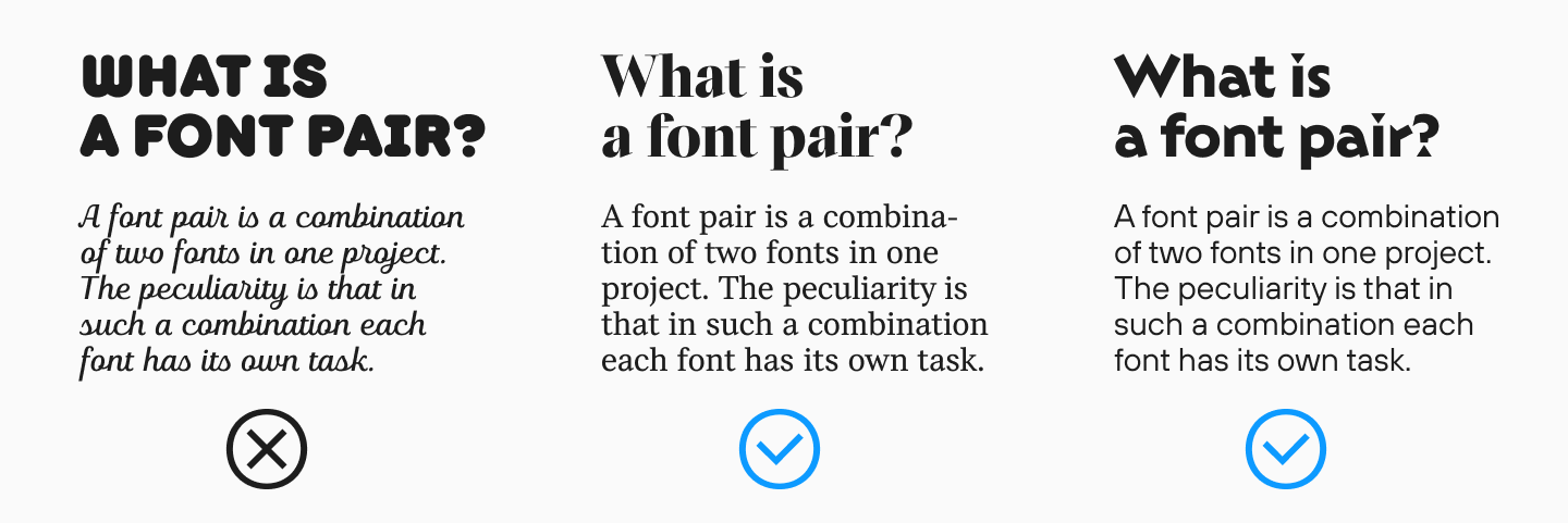
Font pairings must solve a specific problem. In an interface, one solid family with multiple weights is often enough. This approach is easier to maintain, reduces visual noise, and makes the system resilient. If two typefaces are used, their roles must be strictly divided.
For example, an expressive typeface might handle the accents, while a neutral one manages the body text. But if both typefaces compete for attention, the interface loses clarity. Our blog features dedicated articles on choosing fonts and creating pairings—you can use them as an additional guide when building your system.
Consistency in UI systems
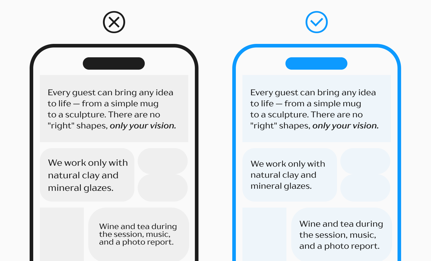
Consistency means that identical roles look and behave identically. If a field’s label is 12/16 in one place and 13/18 in another, the user experiences unnecessary visual friction.
To maintain consistency, use text styles, variables, tokens, components, and libraries. But that alone is not enough. You must regularly audit the file: search for local styles, delete duplicates, check for outdated values, and ensure the team isn’t bypassing the system manually.
Common mistakes and how to avoid them
The first mistake is having too many similar styles. If your system includes Body 15, Body 16, Text Regular, Paragraph, Main text, and Copy, designers will get confused. It is better to have fewer roles, but with distinct, clear tasks.
The second mistake is mixing system levels. A text style should not be responsible for everything at once. Typography, colors, layout, and components should remain distinct. Otherwise, any minor change becomes complex and risky.
The third mistake is failing to test real data. In a perfect mockup, all headings are short, numbers are round, and buttons are neat. In the actual product, you will encounter long strings of copy, different languages, and unexpected line breaks. The typographic system must be built to withstand these dynamic scenarios.
Conclusion
Typography in Figma is not a random collection of text settings, but a complete, powerful system. The earlier your typography becomes systemic, the easier it is to maintain the product. A systematic approach doesn’t make design boring; it frees up your attention for important creative decisions. When the base rules function reliably, a designer can experiment purposefully, rather than spending hours fixing chaos manually.
FAQ
What is typography in Figma?
Typography in Figma is the process of working with text in a mockup: selecting the font, size, weight, line height, letter spacing, and other parameters. In UI design, it is not just about decorating text, but a system of rules that helps build visual hierarchy and make the product user-friendly.
How do you create typography styles in Figma?
First, determine your text roles: headings, body text, captions, buttons, supporting elements. Then, for each role, configure the font parameters—family, size, weight, line height, tracking—and save them as text styles. After that, these styles can be reused and updated centrally.
What are Figma typography variables?
Figma typography variables are reusable values for text properties: size, line height, tracking, weight, font family, and other parameters. They help you manage typography systematically: change a value in one place, and the linked styles or components update automatically.
What is the difference between typography tokens and variables in Figma?
Variables are a native Figma tool that stores specific values. Tokens are a methodology: they describe the role of a value in a design system. For example, 16 is just a number, font/size/16 is a variable, and text/body/default/size is a meaningful semantic typographic token.
How do typography tokens work in a design system?
Tokens define systemic values for typography and bind them to interface roles. For instance, a token for body text might control the size, line height, and font weight. If the value changes, the entire linked system updates: styles, components, and layouts.
Which typography plugins are best for Figma?
For typography, tools like Tokens Studio, Design Lint, Batch Styler, Uwarp Font Replacer, and editorial text correction plugins are highly useful. They help you manage tokens, locate non-systemic values, bulk-edit styles, swap fonts, and elevate the quality of the copy in your designs.
How do you build a typography design system in Figma?
You need to select a font family, define a typographic scale, create variables and tokens, configure text styles, and embed them into components. It is also important to document the rules of application: which styles to use for headings, body text, buttons, labels, forms, and other elements.
What is a typography template in Figma?
A figma typography template is a ready-made structure for working with text: a collection of roles, styles, variables, examples, and rules. It helps you launch a project faster, maintain a unified approach within the team, and reduce the number of random decisions in your layouts.
How do you improve readability in Figma typography?
You must test the font in real scenarios: at small sizes, in long paragraphs, buttons, tables, and across different languages. It is also crucial to properly set the size, line height, tracking, and contrast, and to avoid overloading the interface with too many different font choices.
Can Figma automate typography workflows?
Yes, parts of the workflow can be automated using variables, tokens, text styles, libraries, and plugins. However, automation works efficiently only when the system already has clear rules. Without a well-thought-out structure, plugins will only accelerate chaos, not order.