Many of our readers are undoubtedly familiar with the term “italic” as we frequently discuss these slanted and cursive fonts in our articles. However, the term “retalic” might be unfamiliar even to those well-versed in typography. Let’s explore this unique font style and its applications in modern design.
What is a Retalic?
Let’s start by refreshing our understanding of italics with a look at our font dictionary.
Italics (or true italics) traditionally referred specifically to cursive fonts where lowercase characters transformed into cursive forms (true italic). This style is particularly common in typefaces with serifs. Today, the term has broadened to include both true italics and slanted fonts (slant, oblique).
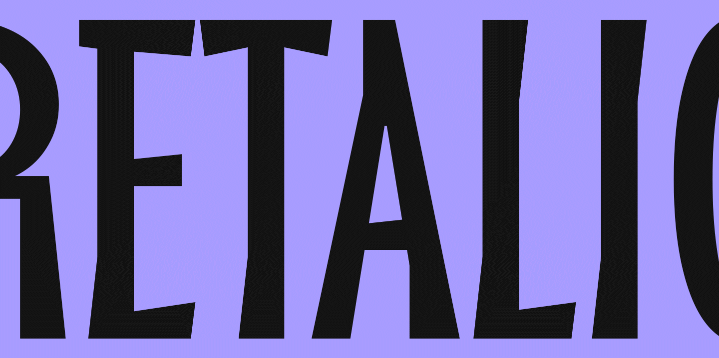
A retalic is essentially italic’s mirror image—a reversed italic font that leans left instead of right. It’s literally a reversed italic (reitalic).
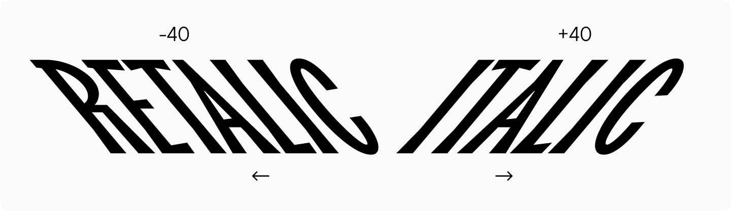
Without italics, retalics wouldn’t exist. While italics serve to emphasize text, backslanted italics create even stronger emphasis through their unexpected left lean. These contra italics are highly expressive but rarely used, as their unusual appearance can be quite striking to readers.

Applications and Uses
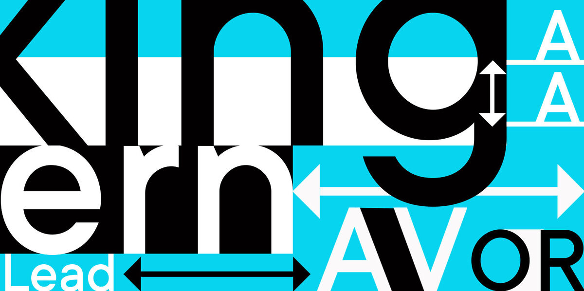
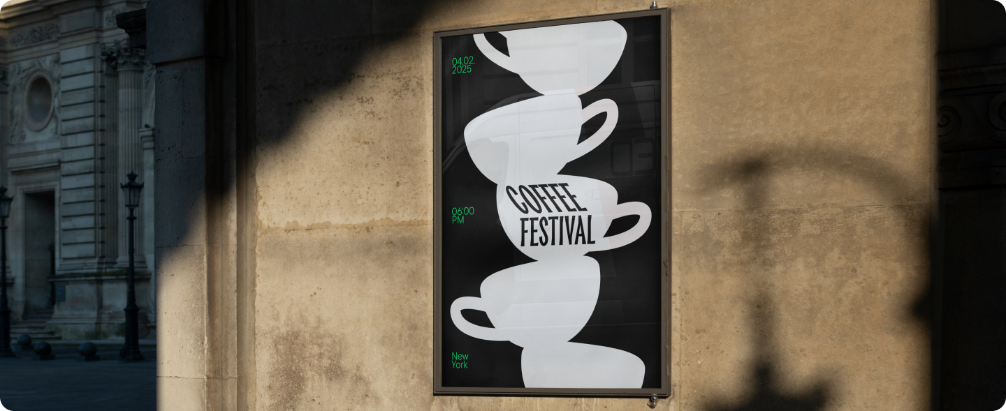
Thanks to their distinctive character, retalics excel at creating emphasis and drawing attention. They work particularly well in designs that need to convey movement, such as sports brand identities or delivery service logos, circus posters or album covers, book and magazine titles / fast-food restaurant menus.
Beyond these common applications, retalics have some surprising uses that we’ll explore later.
Different Names for the Same Concept
Reversed italics, contra italics, slanted font—you’ll encounter various terms for retalics. Typography terminology is still evolving, so different interpretations exist across the field.
At TypeType, we use “retalic” because we refer to slanted styles as italics and cursive forms as true italics. To maintain consistency, we chose “Retalic” (full name: reversed italic) for our left-leaning style.
Here are the common terms for this style:
- Contra italics;
- Backslanted;
- Left italic;
- Reverse oblique
- Reversed italic;
- Reclining;
- Reclined italics;
- Left italics;
- Linkskursiv;
- Left-leaning italics.
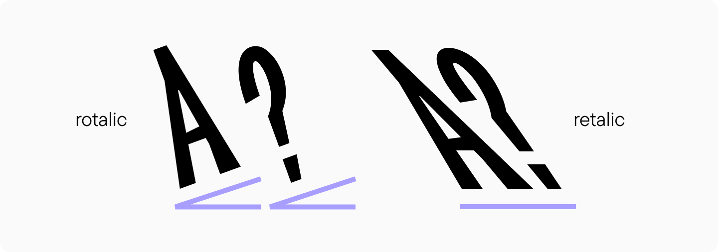
Don’t Confuse Retalic with Rotalic!
There’s another fascinating and rare typographic phenomenon called rotalic. Unlike italic and retalic fonts where characters slant left or right, rotalic characters appear to rotate clockwise or counterclockwise around their axis.
Calligraphic Origins of Retalics
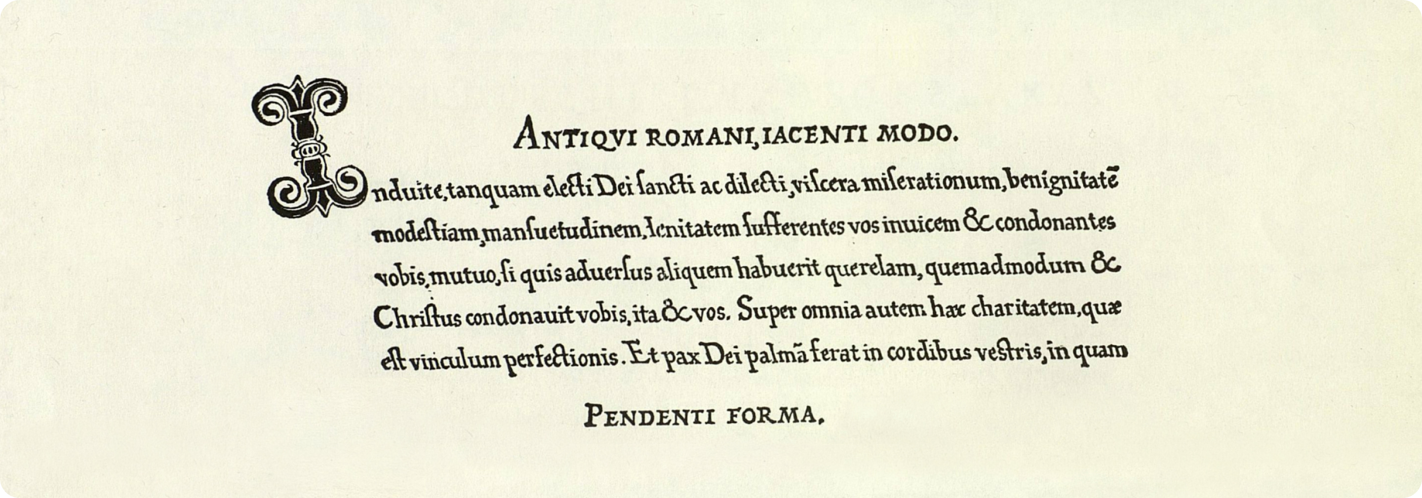
The first cursive fonts naturally evolved from handwriting. Since most people are right-handed, right-leaning scripts became the norm. However, rare historical examples of left-leaning writing styles do exist.
Unexpected Applications
While left-leaning fonts are relatively uncommon, they’ve found their way into some surprising areas of use.
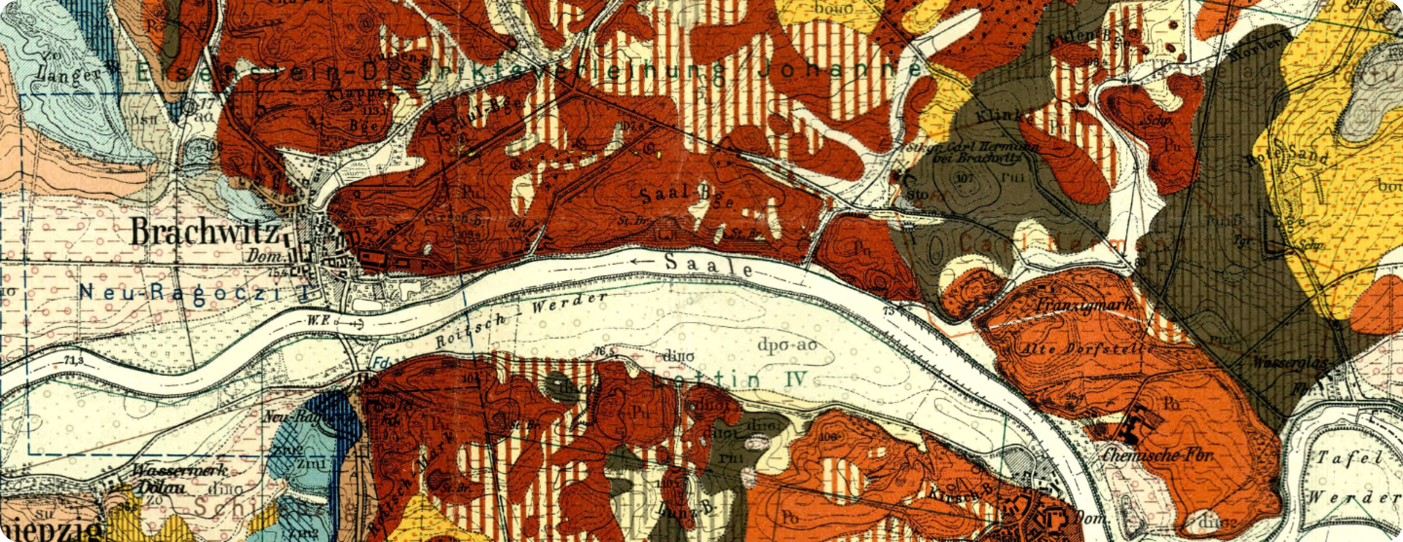
Retalics in Maps and Cartography
German cartographers particularly favored retalics, using them primarily for river labels.
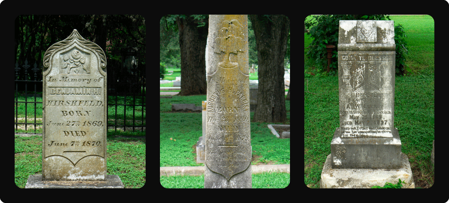
Retalics in Tombstone Inscriptions
You might spot reversed italics lettering on 19th-century gravestones.
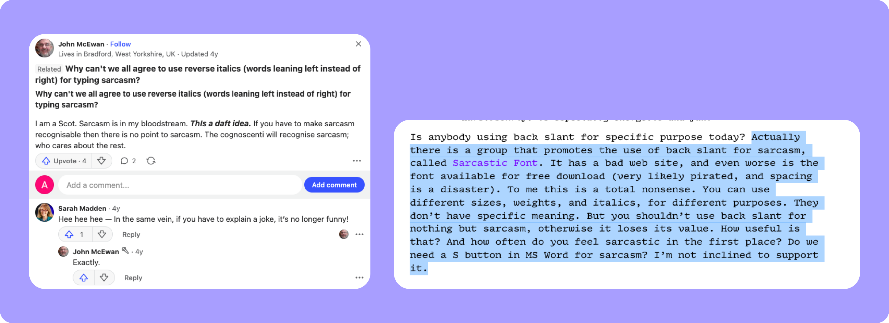
Indicating Sarcasm
Some have suggested using retalics to denote sarcasm in text. However, we (and many others) find this idea impractical. After all, if sarcasm needs explanation, it loses its punch.
Industrial Revolution, Display Fonts for Advertising, and Wood Type
The Second Industrial Revolution (late 19th—early 20th century) transformed font design. This era saw an explosion of display fonts used primarily in advertising and posters. Retalics proved particularly effective at catching attention, as their unusual slant naturally drew the eye.
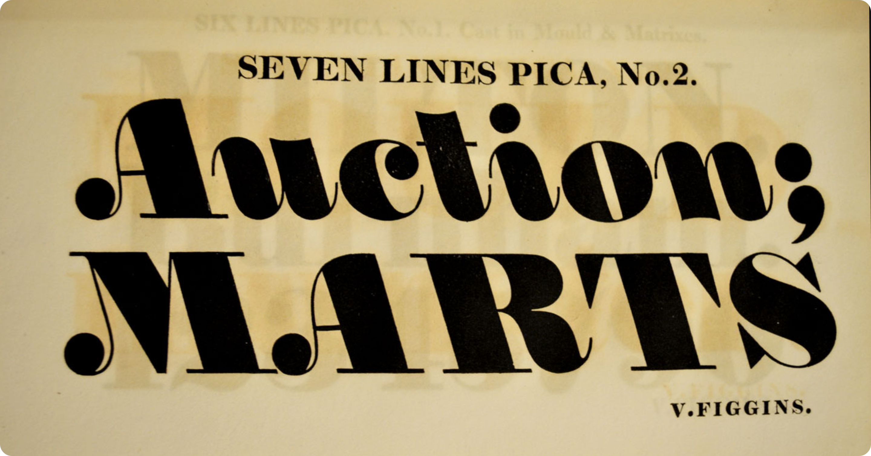
Seven Lines Pica No 2 (1815) likely holds the distinction of being the first typographic font featuring a reversed slant.
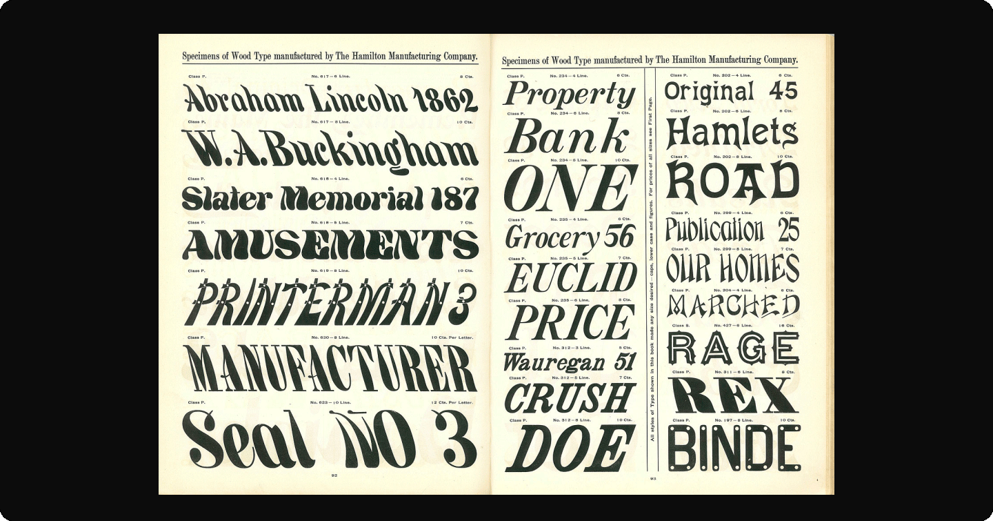
The Hamilton Wood Type foundry created particularly interesting examples of wooden retalic fonts.
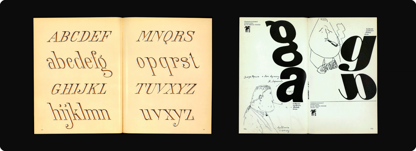
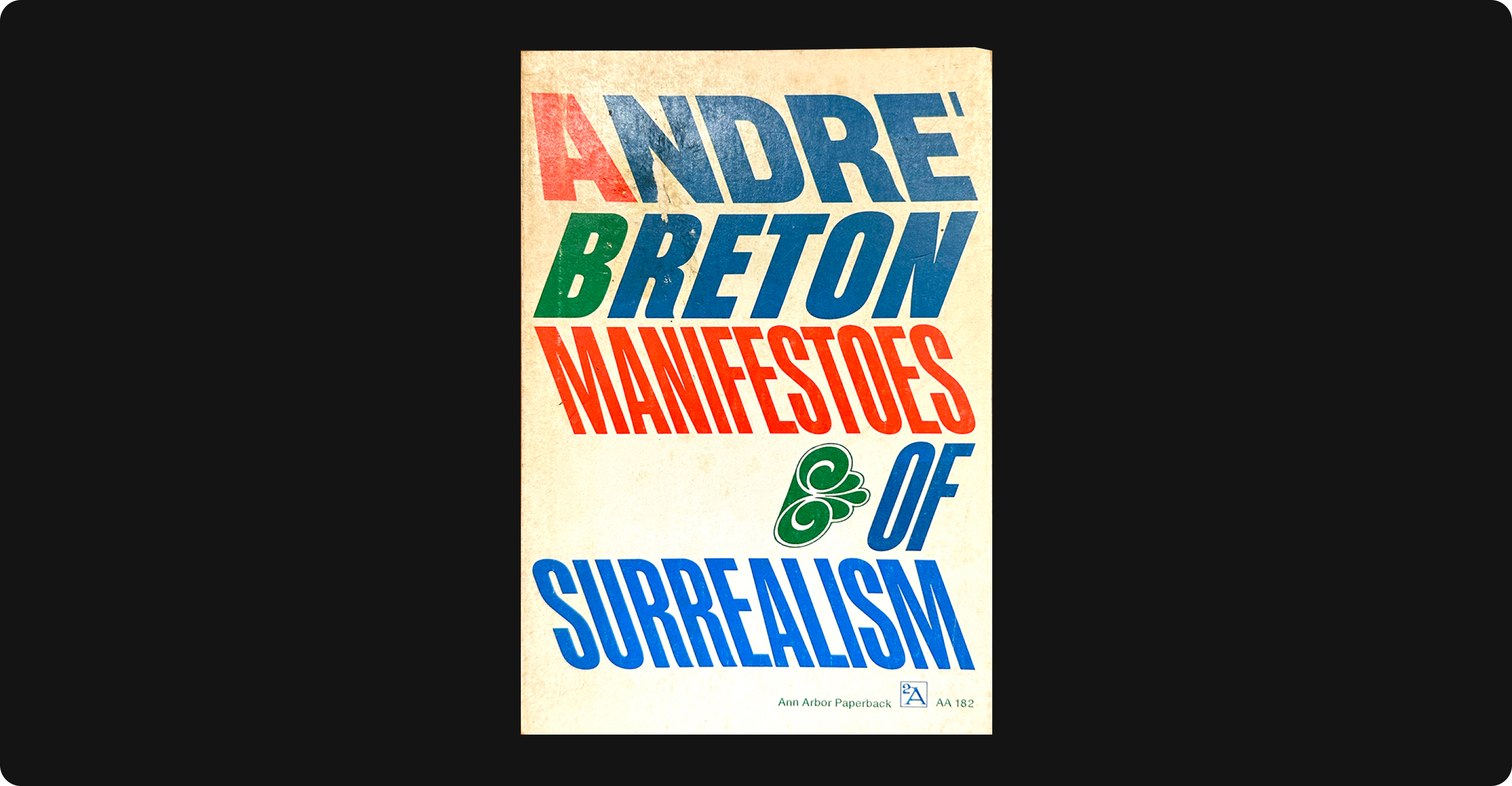
Retalics made a notable appearance in the 1972 cover design of André Breton’s “Manifesto of Surrealism“.
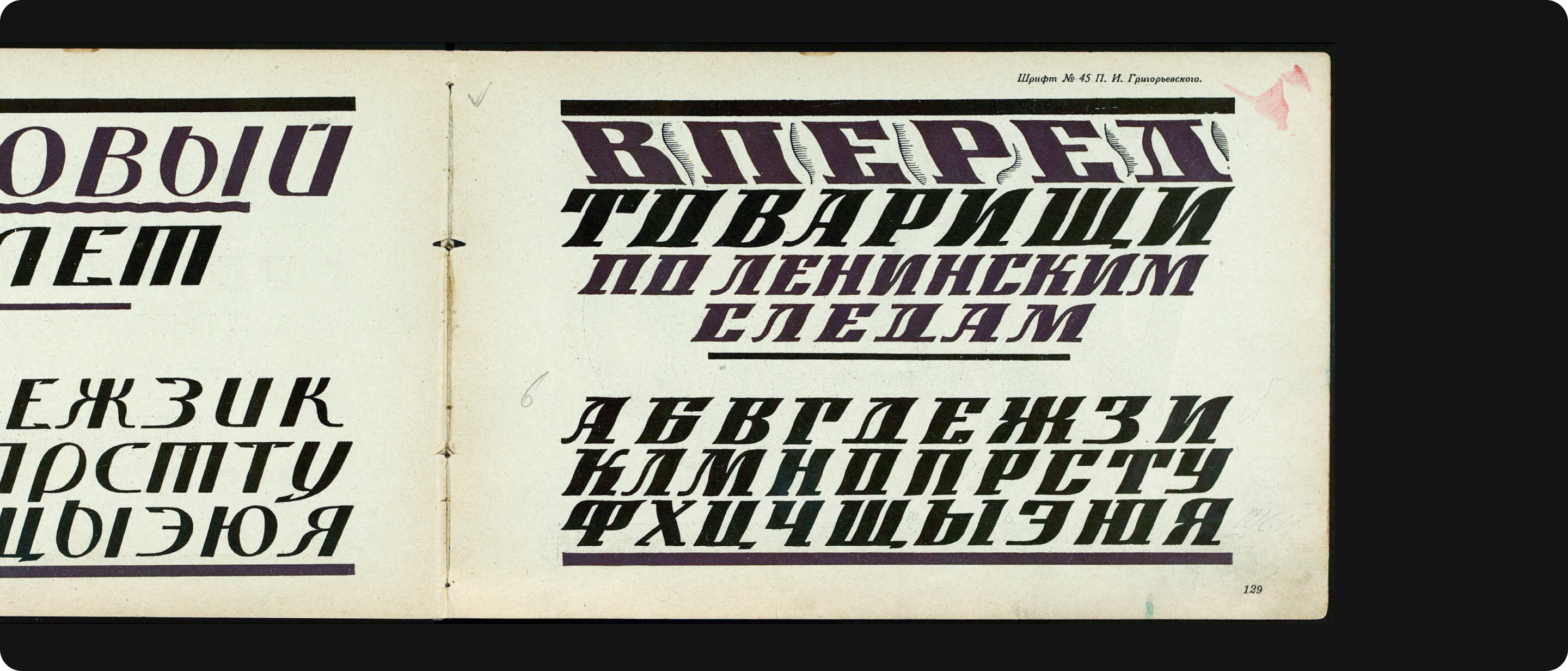
We’ve also uncovered fascinating examples of retalic use in Soviet-era display typefaces.
Our Approach to Drawing Retalics
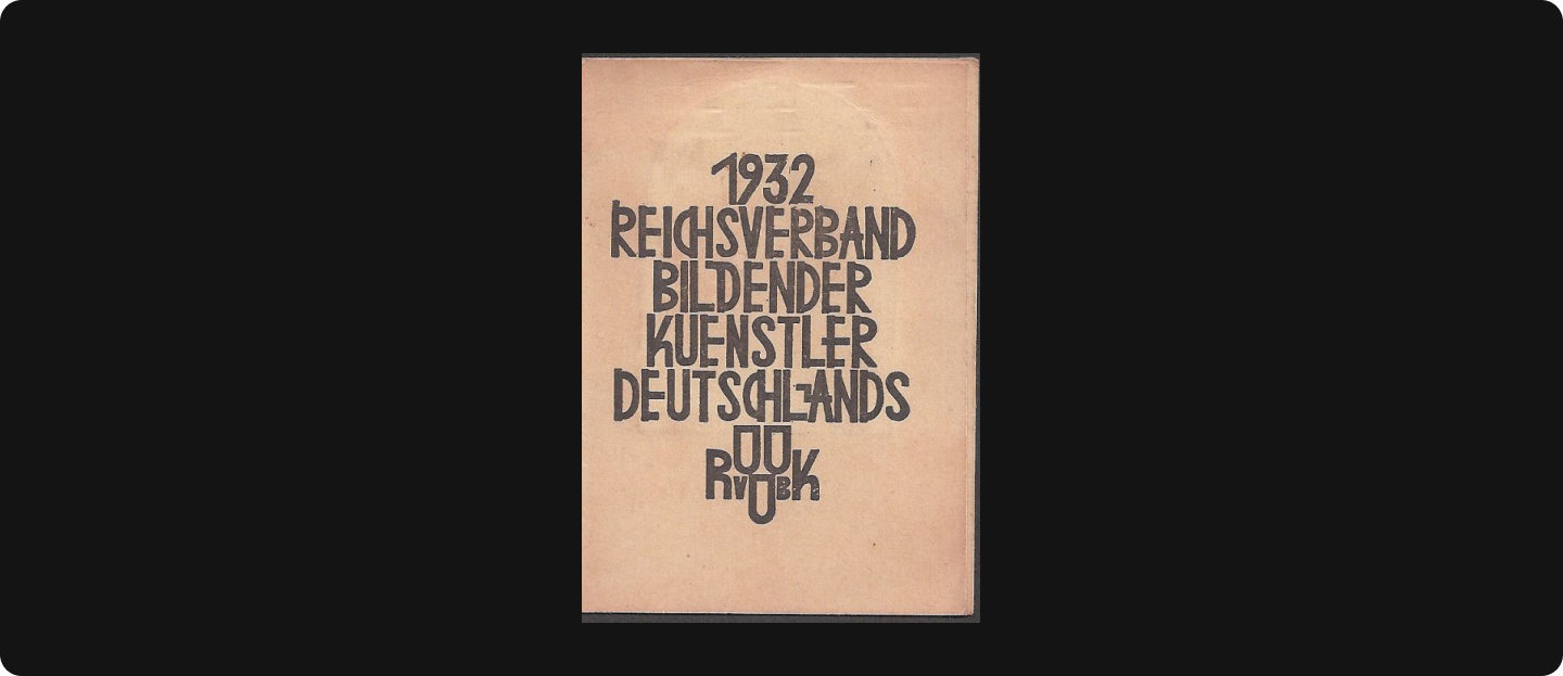
Recently, we introduced our first retalic as part of TT Biersal, a display font inspired by early 20th-century typography. Our design process began with lettering from a German poster from the early 1930s.
We developed the retalic following italic principles, using our proprietary methodology. Characters were “slanted” in traditional groups: square, rounded, and triangular.
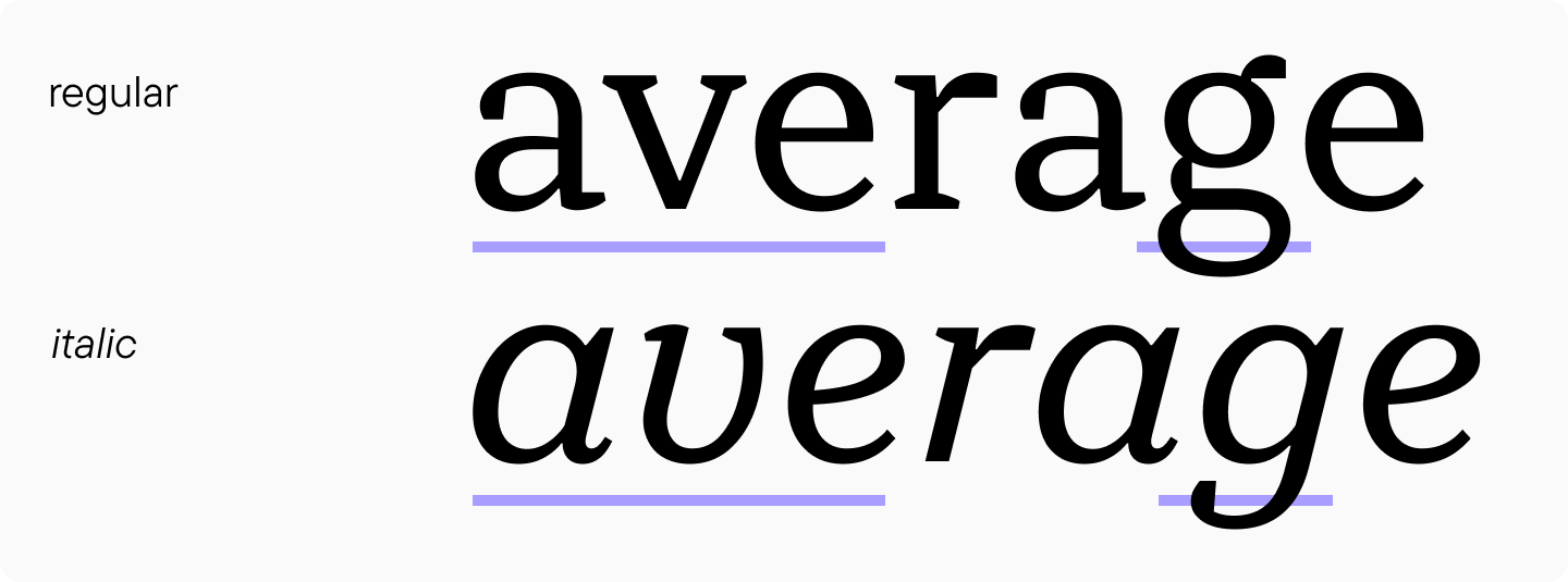
“I created the retalic after completing the italic—this approach worked better for me, though it’s possible to design them independently. The extreme slant significantly distorted stem weight, requiring visual compensation. While our other fonts typically use an 11-12 degree slant with minimal weight distortion, TT Biersal’s 40-degree slant demanded significant optical adjustments.”Alina Gabidulova, idea creator and Senior Type Designer at TypeType
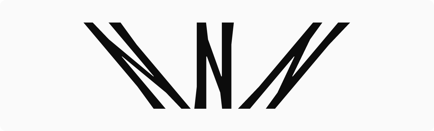
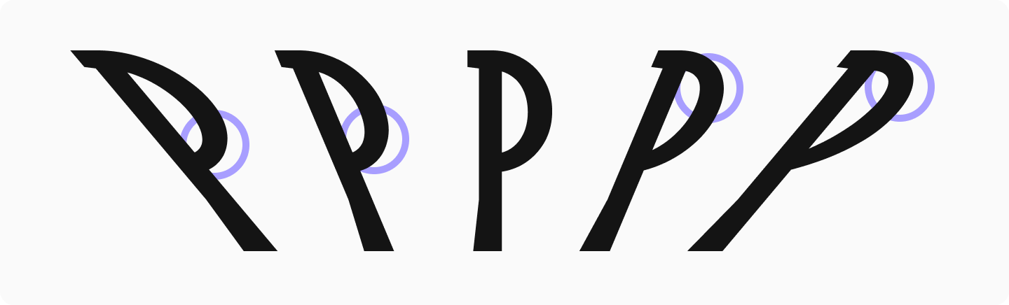
Had we maintained the identical weight value between upright and slanted styles in TT Biersal, the stems would appear too bold. Therefore, the weight values in the slanted version are slightly lower than in the upright version, but visually the stems appear identical. The letter “N” demonstrates how the slant appears without such compensation.
Left-leaning creates notably thinner diagonals, requiring increased weight in downstrokes after optical adjustment. Italics present the opposite challenge—descending diagonals naturally appear bolder and need thinning. This is typical for traditionally right-slanted fonts. Therefore, during optical adjustment, we make them thinner.
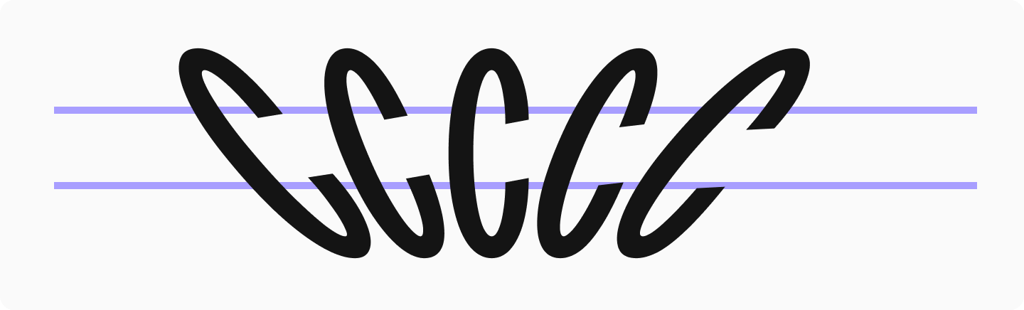
The letter “C” reveals interesting terminal dynamics: in retalic, the upper terminal looks shorter than the lower, while italics show the reverse effect.
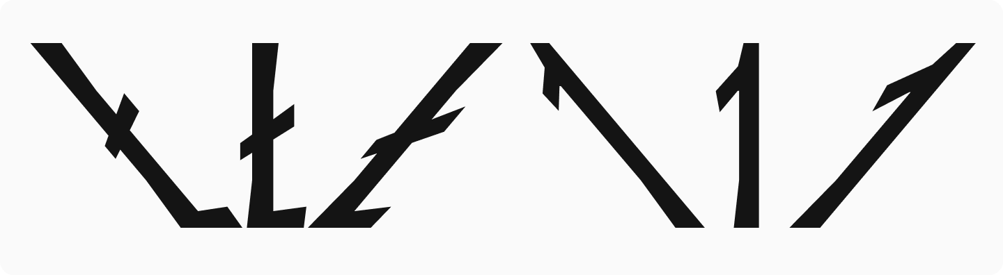
Diagonal elements display unexpected size effects. For example, in the extended Latin character Lslash and numeral 1, retalics shorten the diagonal while italics lengthen it.
Oval characters position their stresses differently between slanted styles.
“Ovals presented the greatest challenge. Starting with the italic slant, we normally use a half-rotation and half-slant technique for ovals. However, extreme slants require additional visual refinement. Like square and triangular characters, rounded forms undergo significant distortion.”Alina Gabidulova, idea creator and Senior Type Designer at TypeType
Stresses (the boldest areas) follow a bottom-left to top-right diagonal arrangement. Retalics mirror this pattern. These stresses are required to prevent characters from appearing flat or mechanically slanted.
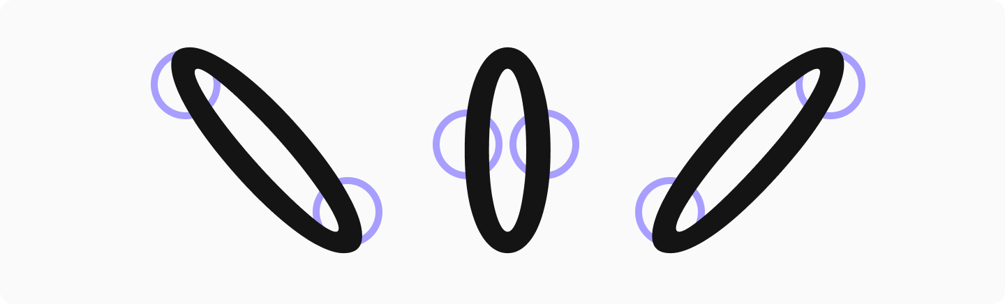
“To maintain oval consistency, I mirrored the ’O’ from italic and used it as a base for other rounded characters—’C’, ’G’, ’D’, ’Q’, and their Cyrillic counterparts. Interestingly, this mirroring technique didn’t work for other letters. For the ’C’ in retalic, I took the retalic ’O’, removed its right section to create terminals, then narrowed it—following our standard upright design process. The italic followed similar principles. Traditional italic methods—slanting each rounded character from upright through half-rotation-half-slant with visual corrections—would have compromised the unified logic of rounded characters, creating slight variations across circles. This necessitated our alternative approach.”Alina Gabidulova, idea creator and Senior Type Designer at TypeType
This process resulted in TypeType’s first retalic, combining dynamic energy with adventurous spirit. The font creates striking, original designs either standalone or paired with TT Biersal’s upright and slanted styles to suggest movement or shadow effects.
Conclusion
Retalics boast a fascinating history, yet they still feel fresh to modern eyes. While these fonts have existed for generations, their unconventional nature continues to surprise and engage viewers. This enduring ability to catch attention and appear innovative remains their greatest strength. We hope our exploration inspires your own typographic experiments!
FAQ
Is reversed italic suitable for body text, or should it be limited to display use?
Reversed italic is very attention-grabbing, so in long body copy it can quickly feel tiring and pull focus away from the content. It works best as a selective accent: short highlights, headings, and dynamic elements where the effect matters.
How does left-leaning typography affect readability compared to traditional italic?
A left slant is less familiar to the eye, so reading may slow down and lines can feel less even. In return, it creates a stronger emphasis than a traditional italic, especially in headlines and poster-style typography.
Can reversed italic fonts be used in web design and responsive interfaces?
Yes—if the font is technically solid and renders consistently across screens. Test sizes, letter spacing, and line breaks in advance, because reversed italic is usually set larger and used more sparingly than regular italic.
Are reversed italics accessible for users with dyslexia or visual impairments?
Reversed italic can make reading harder: the unusual slant reduces predictability of shapes and slows word recognition. If accessibility is critical, use it only as an occasional accent and always test with real content and sufficient contrast.
Do major font foundries include reversed italic styles in commercial type families?
This style is rare and usually appears in experimental or display-oriented families. TypeType includes reversed italic, for example in the display typeface TT Biersal.
How can designers technically create a reversed italic style if it’s not included in a font?
A simple software slant is only a mechanical effect and often damages letterforms and spacing. A proper solution is to draw a dedicated style in a font editor, following italic logic, then rework kerning and hinting.
Does reversed italic work well in multilingual typography (e.g., Cyrillic, Greek, Arabic scripts)?
It can work well, but the complexity is higher because scripts have different habitual slants and letter dynamics. Choose families where reversed italic was designed by the type author for the required scripts; otherwise it may look accidental in Cyrillic or, for example, Arabic.
When should a brand choose reversed italic instead of a traditional italic for visual identity?
Choose reversed italic when you need speed, motion, and a bold, slightly rebellious tone and a standard italic feels too familiar. It fits sports, delivery services, posters, music events—anywhere the emphasis should be direct and noticeable.
Are there performance or rendering issues when using reversed italic fonts in digital products?
Reversed italic is usually no heavier than other styles, but small sizes on weaker screens can lose crispness. The fix is straightforward: test on target devices, adjust size and weight, and limit reversed italic to larger sizes if needed.
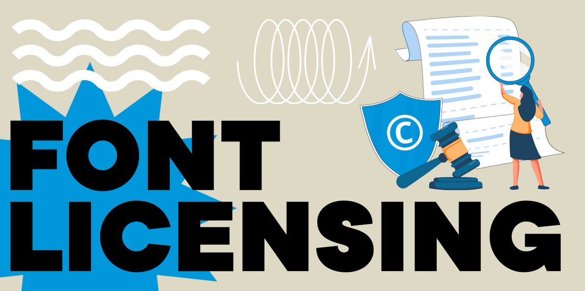
What are the legal and licensing considerations when modifying a font to create a reversed italic style?
Creating reversed italic by modifying a font file is often prohibited by the license or requires separate approval. A safer route is to buy a family that already includes the style, or discuss a legal customization via the Licensing section.