top_banner_ttnormspro0426
TT Paplane
3 styles
Type foundryFonts & StylesSans SerifTT Paplane

TT Paplane

TT Paplane is a squared-looking sans serif with nostalgic undertones. The letters appear constructed from folded paper ribbons, creating a distinctive silhouette.
Single style: from $43.99
Full family: from $89 3 styles
TT Paplane
TT Paplane
TT Paplane
TT Paplane
TT Paplane
TT Paplane
TT Paplane
TT Paplane
TT Paplane
TT Paplane
TT Paplane
TT Paplane
TT Paplane
TT Paplane
TT Paplane
TT Paplane
TT Paplane

Buying Options

To purchase a font, first select the styles you need, then choose your licenses and proceed to checkout. To test the font in your project, download the free trial version.

Select at least one style before choosing licenses

To purchase a font, first select the styles you need, then choose your licenses and proceed to checkout. To test the font in your project, download the free trial version.
Package offer:
per style $29.67
from  $89
3 styles
from  $89
from $43.99
from $43.99
from $79
Package offer:
per style $39.50
from  $79
2 styles
from  $79
from $43.99
from $43.99
from $79
1 style
from $79
from $79
On request
Perpetual
On request
On request
Perpetual
On request
On request
On request
On request
On request
On request
On request
On request
Perpetual
On request
On request
Perpetual
On request
On request
Perpetual
On request
On request
Perpetual
On request
On request
On request
On request
On request
Your order:
Nothing selected yet

Select styles first, then licenses.

Questions about the font or licensing?

Testers

TT Paplane
Size
Features
Turn on all

TT Paplane is an expressive sans serif carried by the winds of childhood.

TT Paplane
Size
Features
Turn on all
Axes
Weight

This font is inspired by our childhood memories. Remember how you used to fold paper planes? We, in our turn, folded an entire typeface from the image of a paper plane. While being visually modular and «machinelike», the font is completely handmade and asymmetrical, which makes it look lively and playful. The second font style features a strong reverse contrast, different in logic and nature for uppercase and lowercase glyphs. This trait makes the font style unique and recognizable. The significant difference between the two font styles enhances the versatility of the typeface.

Ideal font pairs with TT Paplane

Creating Contrast Without Breaking Visual Harmony

Contrast helps two typefaces take on different roles, but the strongest combinations are rarely built on difference alone. Successful font combinations often share proportions, rhythm, stroke character, or overall mood while differing enough in weight, construction, or style to create hierarchy. This balance makes headlines, supporting text, and secondary information easier to distinguish. The goal is to create clear visual separation without making the composition feel fragmented, accidental, or inconsistent with the wider design system.

Pairing Serif and Sans Serif Typefaces

Combining serif and sans serif designs is a reliable way to create contrast across branding, editorial, and digital projects. Good typeface pairing still depends on more than category. Compare x-height, proportions, weight, spacing, and visual tone to make sure the two designs feel connected. The strongest combinations clearly separate headlines from supporting text while maintaining a coherent overall character. This approach also gives designers flexibility when building hierarchy across websites, publications, presentations, packaging, and other communication formats.

How Type Scale Strengthens a Typeface Pairing

Contrast does not have to come entirely from different letterforms. Scale, weight, spacing, and line height can significantly change how two typefaces interact. A large display treatment may carry the main message, while a calmer style supports body copy or secondary information. Before rejecting a combination, test several hierarchy settings—the same two designs can feel much more compatible once their roles are clearly established. Adjusting scale can also help preserve consistency when the project needs both expressive headlines and highly functional supporting text

Description

About font family TT Paplane
230+ Language support

Introducing TypeType’s new display font — an airy TT Paplane that “flew” to us straight from childhood! 

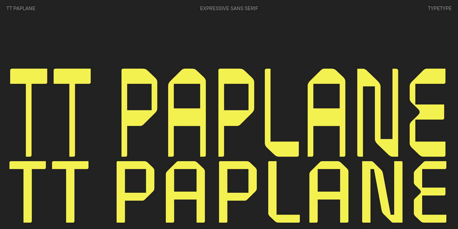
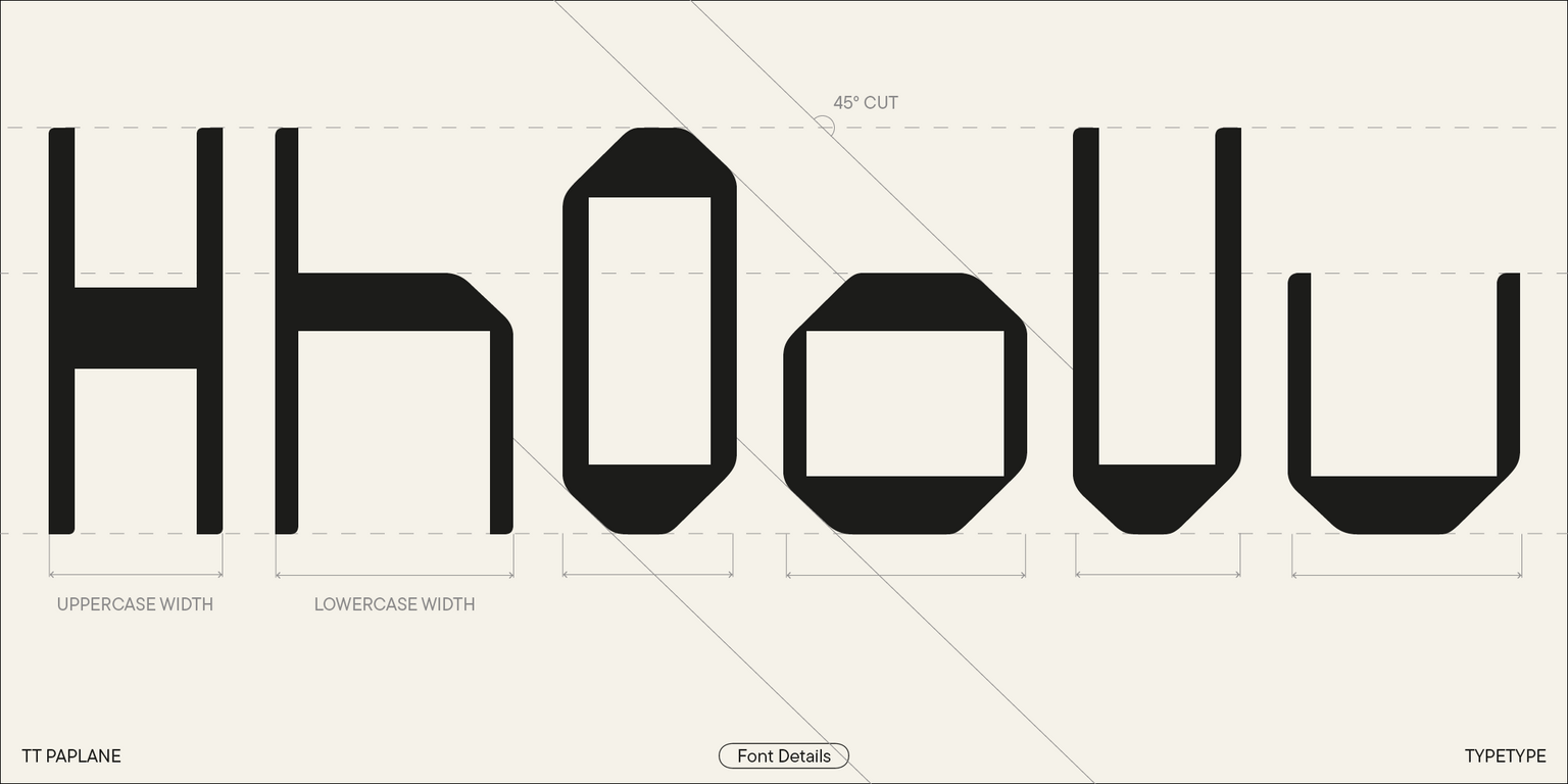
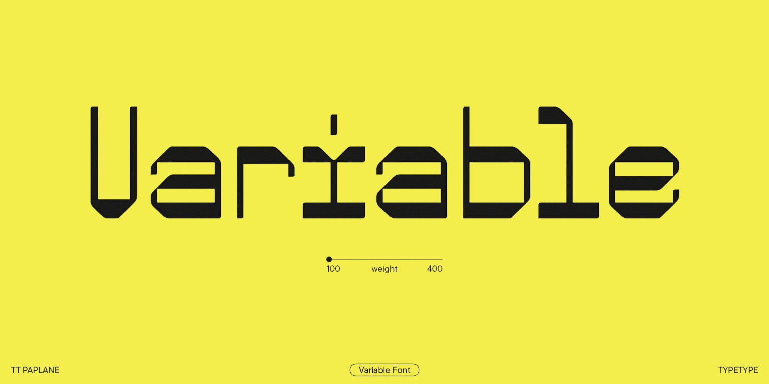
TT Paplane is a squared-looking display sans serif. Its name, Paplane, comes from the phrase “paper plane.” This embodies the core idea of our font: the logic of letters is built in a way that makes them look like they are folded from a paper strip.

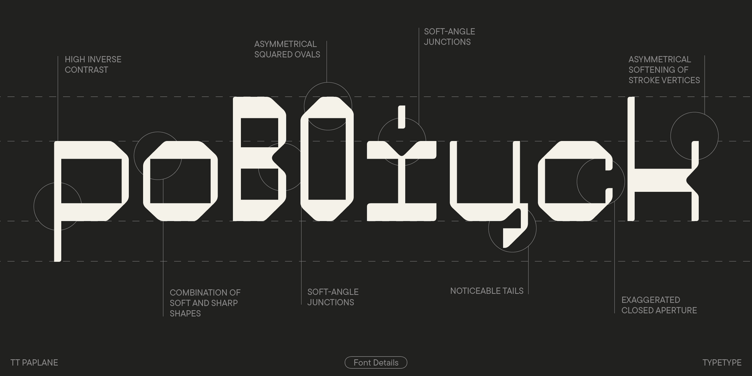
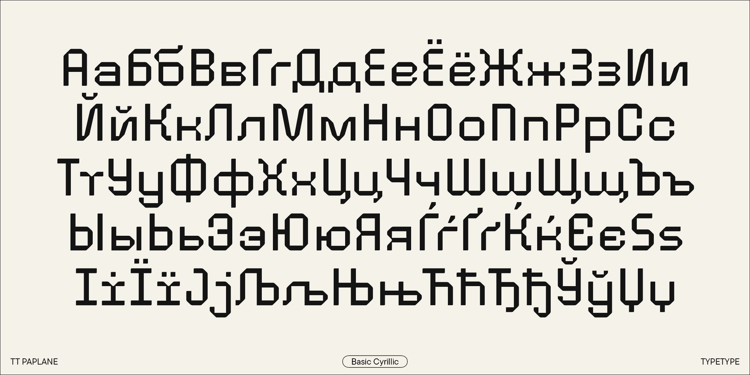
So, this sans serif stands out for its squared forms, 45-degree cuts, flowing outer contours, and asymmetrical smoothing of stroke ends. A playful feel of the font is achieved by varying proportions of lowercase and uppercase characters. Other captivating details include the drops in the Cyrillic alphabet, the forms of the letter “i” and the Cyrillic letter “т,” the tails of “ц” and “щ,” and the serifs of the letters “i” and “l.”

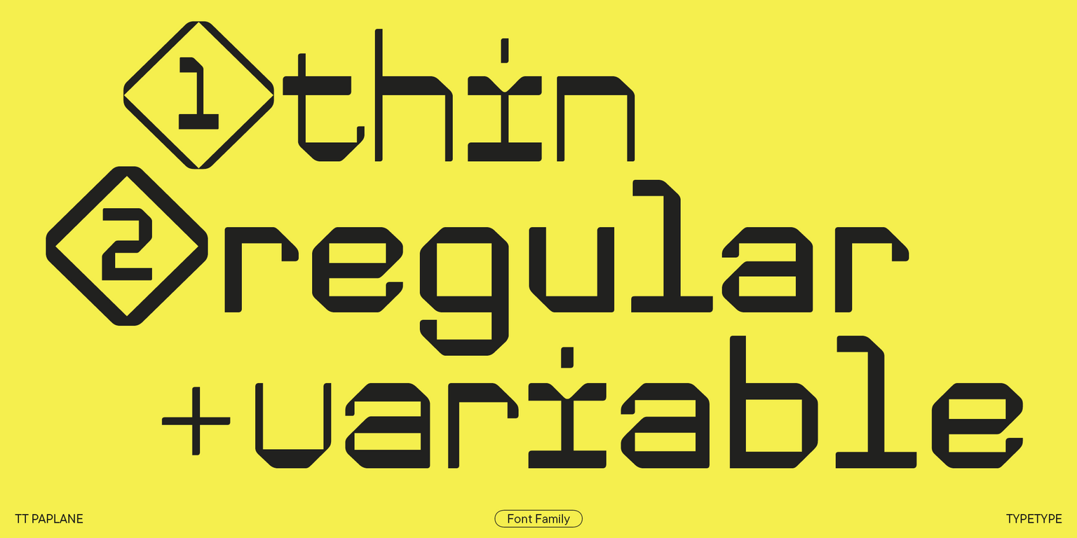
TT Paplane includes two font styles with different aesthetics: Regular and Thin. The Regular style is low-contrast and more paper-looking. The Thin style, in turn, features reverse contrast while having the same glyph forms, making the font’s design look like a barcode in use. Uppercase characters in both font styles are noticeably narrower than lowercase, and the letter proportions are closer to monospaced. In addition, the typeface includes a variable font with a weight variation axis.

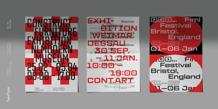
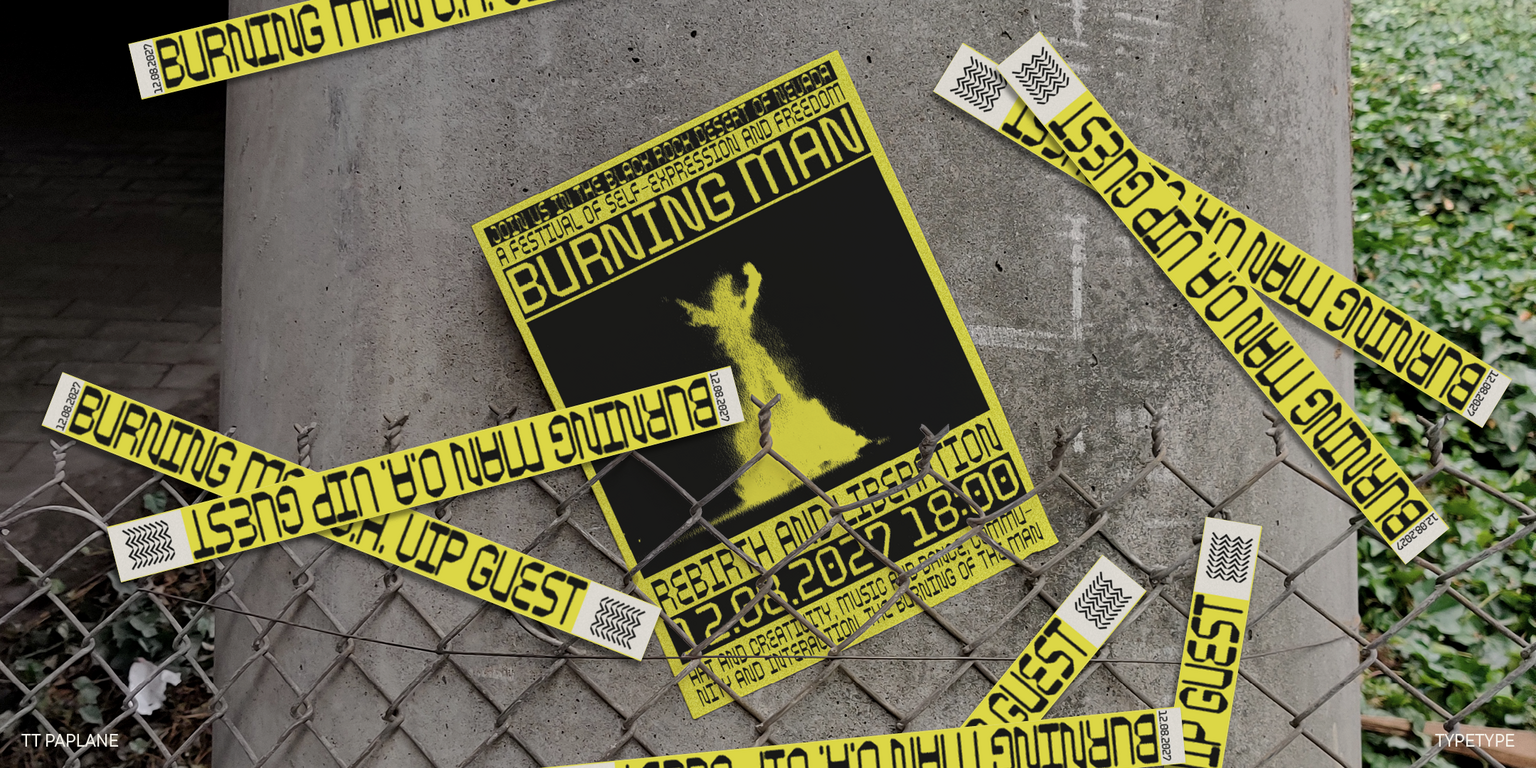
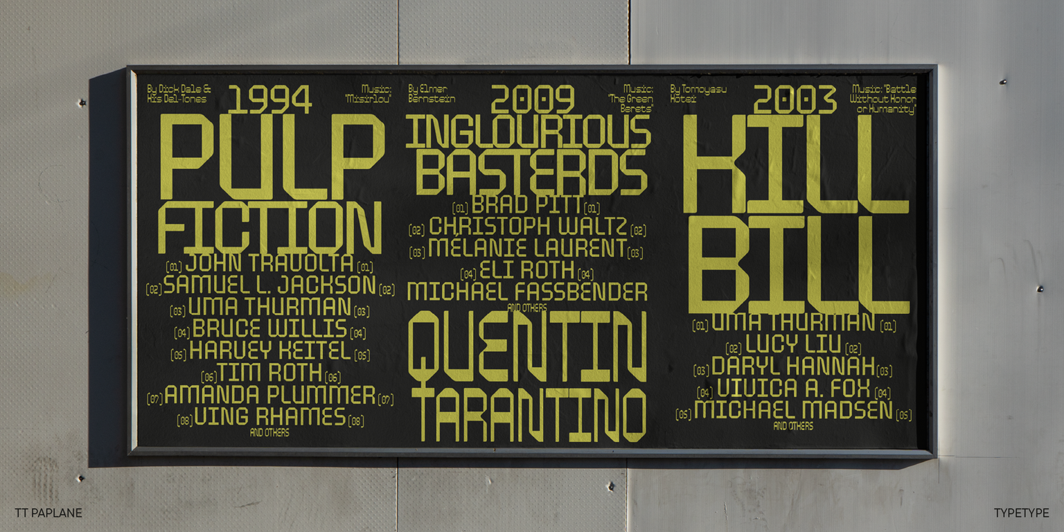
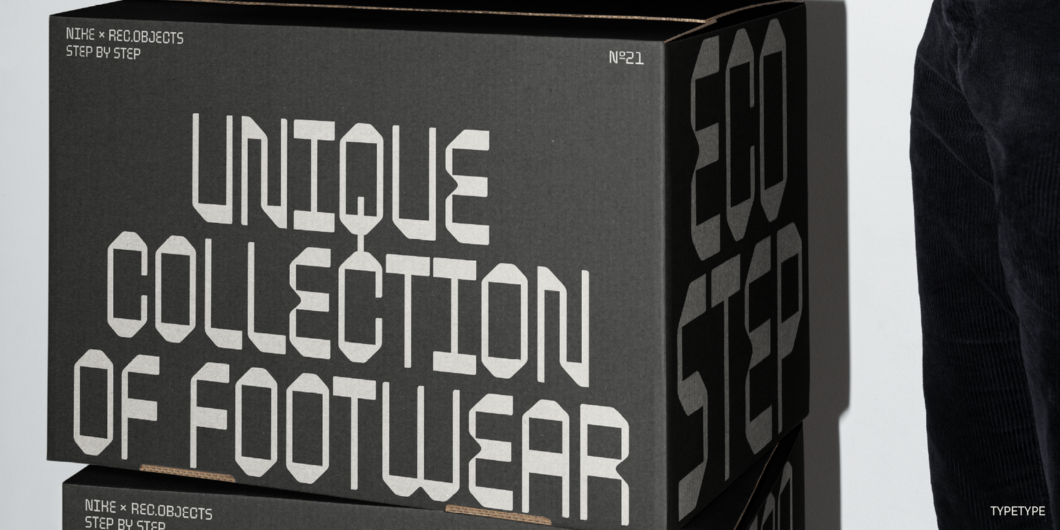
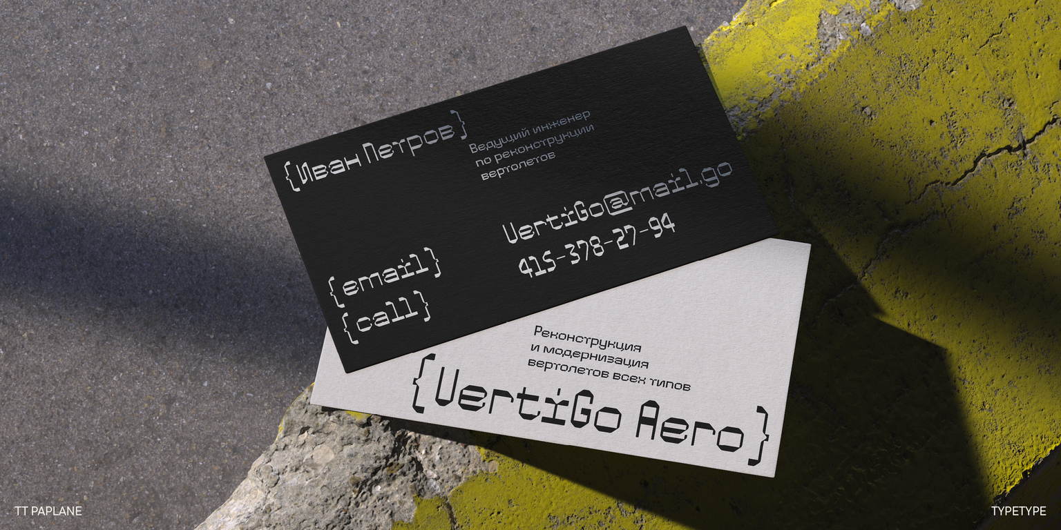
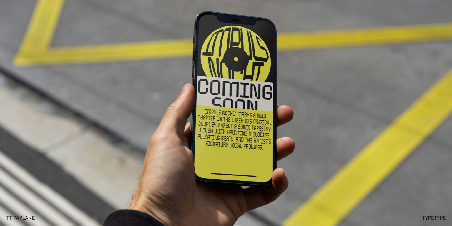
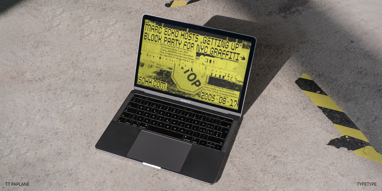
The unusual features of TT Paplane will shine best on posters and packaging, implemented into branding, and as an eye-catching element on websites and apps. This font can help you infuse your design with an informal mood, adjust it to reflect the atmosphere of the 80s or 90s, and add uniqueness to your project, stepping outside the familiar confines.

TT Paplane includes:

  • 3 font styles: 2 roman and one variable font;
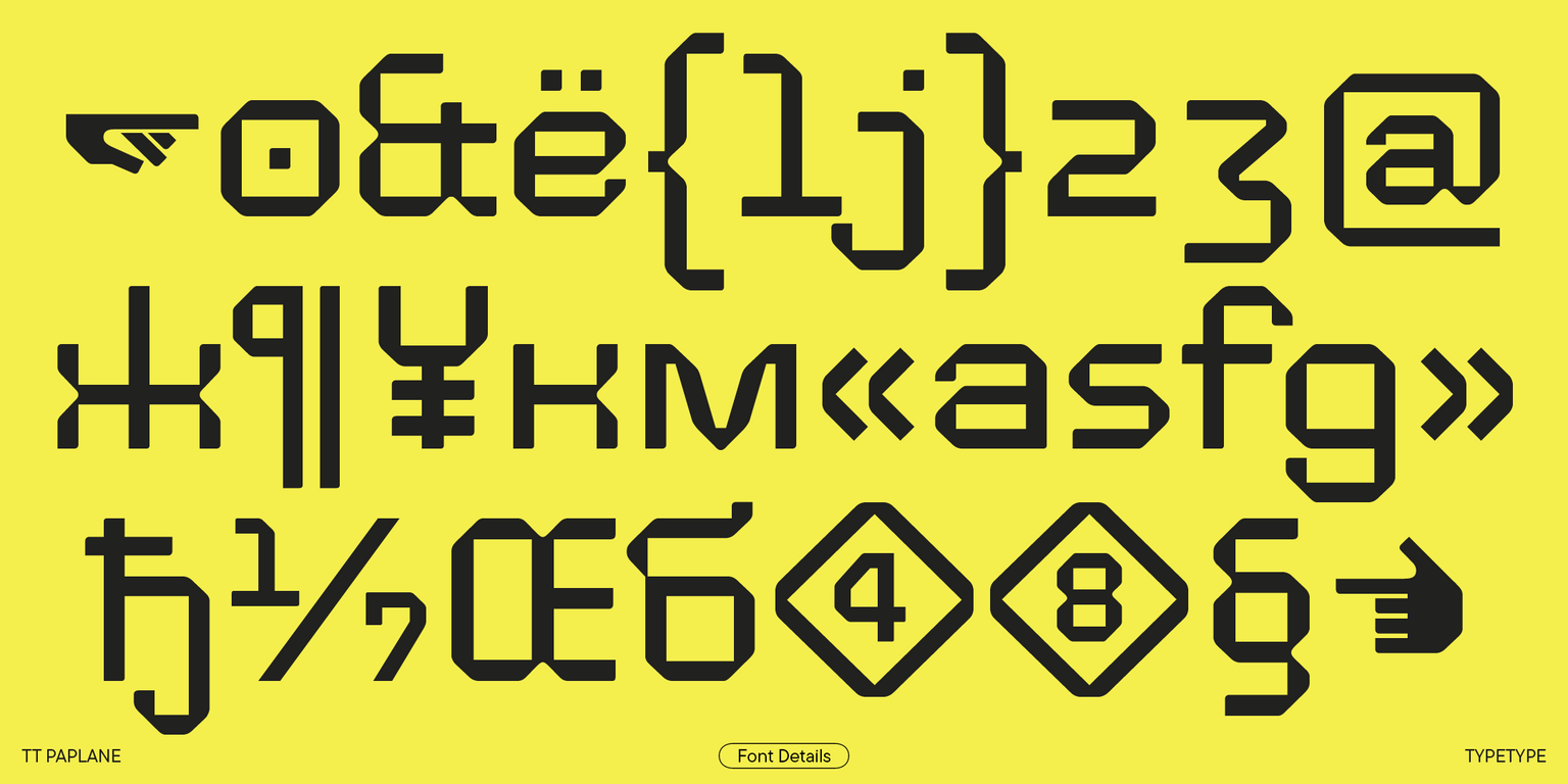
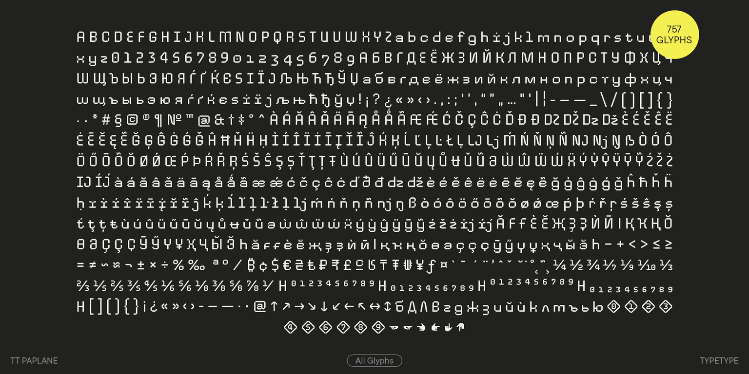
  • 757 characters in each font style;
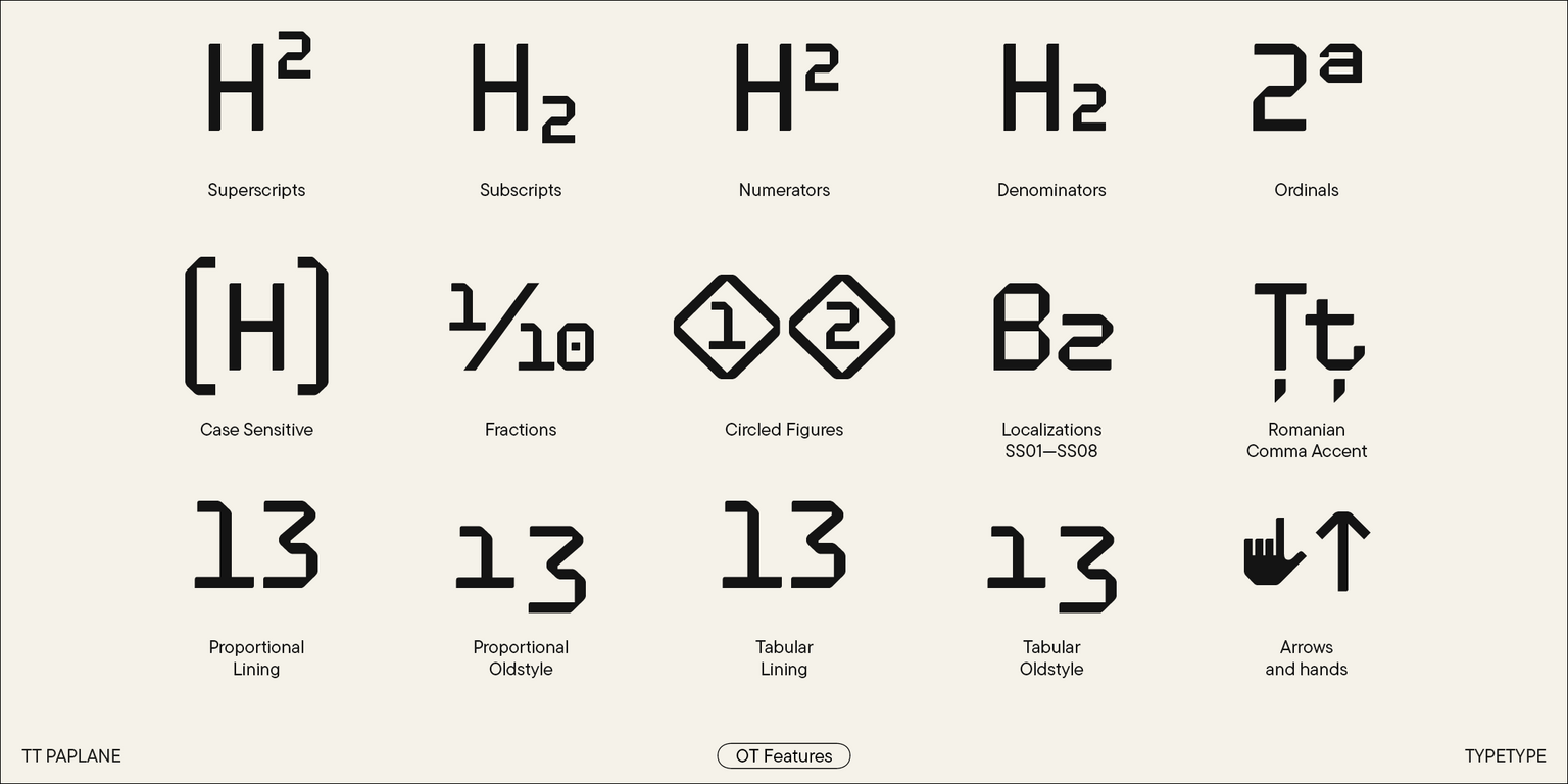
  • 24 OpenType features;
  • 230+ languages support.

Let your ideas fly free with TT Paplane!
Team

Marina Khodak
Antonina Samokhina
Yuriy Nakonechny
Elizabeth Ostrovskaya
+ TypeType Team

Release date

6 August, 2024

Additionally

Specimen

Download font specimen (pdf)

Poster Images

Graphic presentation at Behance

Custom version

Looking for a custom version of this font?

Character Set

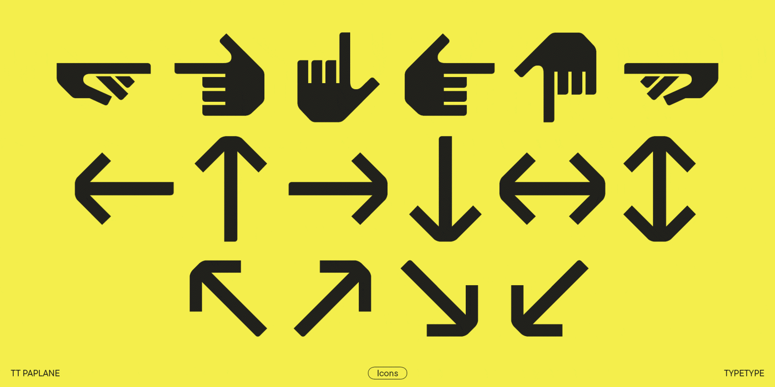
Basic Latin Basic Cyrillic Figures Extended latin Extended cyrillic Punctuation Math Symbols Currency Figures in circles|ss01 Arrows Index
A B C D E F G H I J K L M N O P Q R S T U V W X Y Z a b c d e f g h i j k l m n o p q r s t u v w x y z

OpenType features

ss01 | Circled Figures

123

123

ss06 | Bashkir localization

Ғғ Ҙҙ

Ғғ Ҙҙ

ss08 | Bulgarian localization

ДЛ вг

ДЛ вг

dlig | Discretionary Ligatures

1/2 1/4

1/2 1/4

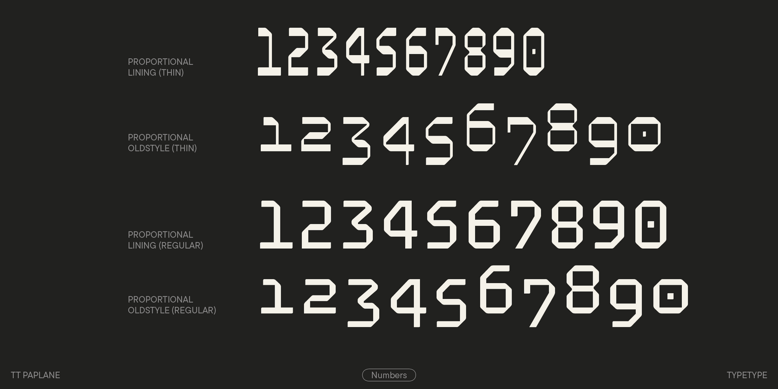
onum | Oldstyle Figures

789

789

ss09 | Serbian localization

б

б

Show all

Similar fonts

73 font styles
91 font styles
Select licenses
Contact us!