top_banner_ttneorispro0426
TT Travels Next
21 styles
Type foundryFonts & StylesSans SerifTT Travels Next

TT Travels Next

TT Travels Next is an ultra-contemporary wide sans serif with attitude. This display typeface harmoniously balances smooth curves and sharp angles.
Single style: from $47.99
Full family: from $389 21 styles

Buying Options

Choose the fonts and licenses you want. Then, press the "Add to Cart" button

Any questions about the font or licences? Write us.

Choose the fonts you want

Package offer:
per style $18.52
from  $389
21 styles
from  $389
from $47.99
from $47.99
from $47.99
from $47.99
from $47.99
from $47.99
from $47.99
from $47.99
from $47.99
from $47.99
from $47.99
from $47.99
from $47.99
from $47.99
from $47.99
from $47.99
from $47.99
from $47.99
from $47.99
from $47.99
from $279
from $279
1 style
from $279
from $279
Package offer:
per style $15.50
from  $279
18 styles
from  $279
from $47.99
from $47.99
from $47.99
from $47.99
from $47.99
from $47.99
from $47.99
from $47.99
from $47.99
from $47.99
from $47.99
from $47.99
from $47.99
from $47.99
from $47.99
from $47.99
from $47.99
from $47.99
Package offer:
per style $39.50
from  $79
2 styles
from  $79
from $47.99
from $47.99

Any questions about the font or licences? Write us.

Select font licenses

You must specify a font package or style before selecting a licence

Choose the licenses you want

On request
On request
On request
On request
On request
On request
On request
On request
On request
On request
No selected items
Total
$0

Testers

TT Travels Next
Size
Features
Turn on all

Trendy and modern wide display sans serif

TT Travels Next
Size
Features
Turn on all

The idea to create an alternative version of the TT Travels font family emerged at the «Mail.ru Design Conf x Dribbble Meetup» that took place in August 2020 in Moscow. The typeface has very wide proportions and characters that almost do not get narrower as you move from the bold styles to a light one. TT Travels Next has an exaggerated closed aperture, low contrast, noticeable visual compensators, and a harmonic combination of soft and sharp shapes.

TT Travels Next
Size
Features
Turn on all

In addition, the TT Travels Next typeface has two great outline styles

TT Travels Next
Size
Features
Turn on all

In inclined styles, we have purposefully increased the slant up to 14 degrees

TT Travels Next
Size
Features
Turn on all

ladyfinger 1/2 cup = 4 fl.oz

Show more

TT Travels Next in design

Description

About font family TT Travels Next
200+ Language support

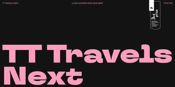
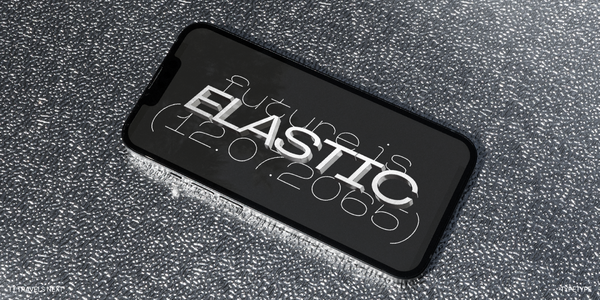
Introducing TT Travels Next—an experimental display typeface based on the original TT Travels! 

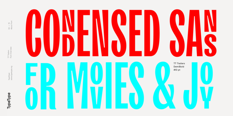
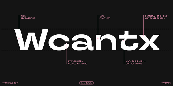
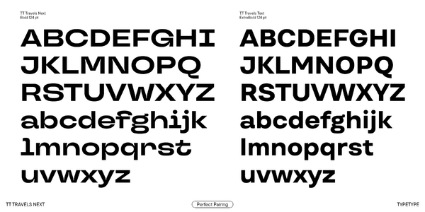
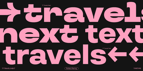
TT Travels Next is an ultra-modern, wide sans serif. Wide proportions are one of the typeface’s distinctive features: there is almost no glyph narrowing when transitioning from bold to thin font styles. Besides, the font stands out for its extra closed aperture, low contrast, and noticeable ink traps. Interestingly, TT Travels Next does an exceptional job blending smooth and sharp forms, which makes it highly versatile, unusual, and attractive. We also increased the slant angle of the Italic font styles to 14 degrees so you can create a crisp and dynamic text look. 

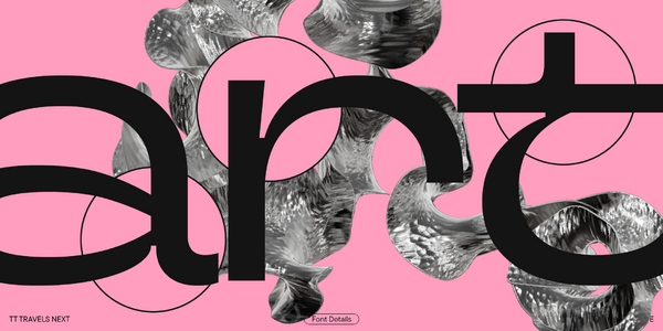
When designing TT Travels Next, we aimed to explore what the original TT Travels would look like if it were transformed into a rebellious and straightforward punk, rejecting its conformity and compromise. So, we infused the new typeface with a radical personality and put its expressive elements in the spotlight.  

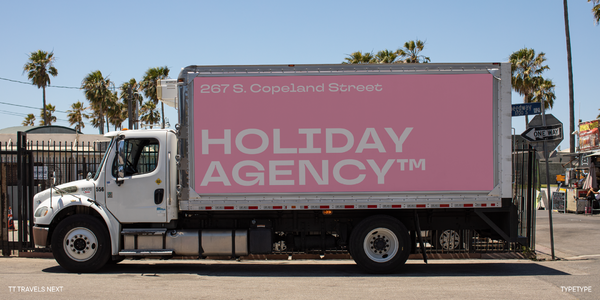
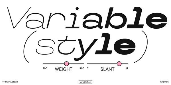
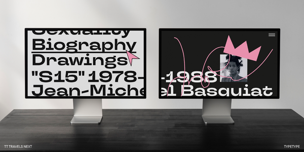
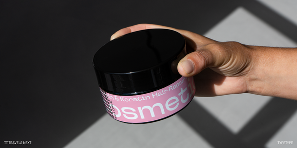
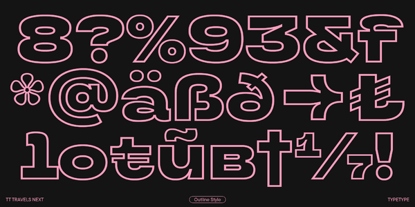
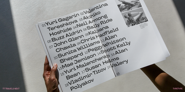
This stylish and ultra-modern typeface is a perfect match for working with layouts, be it printing or web formats. TT Travels Next has two outline font styles that complement the roman ones perfectly and can also serve as accent fonts. In addition, we implemented a variable font with weight and slant variation axes, allowing designers to adjust the font to fit their needs or requirements. 

TT Travels Next includes: 

  • 21 font styles: 9 roman, 9 italic, 2 outline styles, and one variable font; 
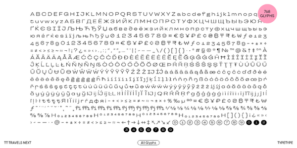
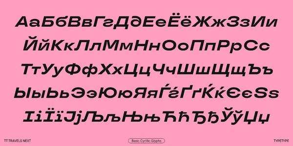
  • 757 characters in each font style;
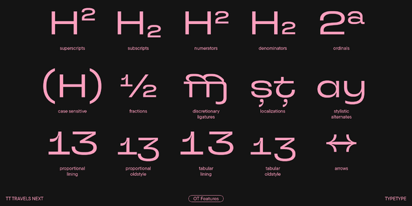
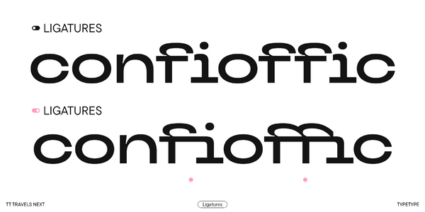
  • 26 OpenType features, counting in stylistic alternates, ligatures, arrows, and circled figures;
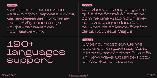
  • 190+ languages support.

Team

Yulia Gonina
Ksenia Karataeva
Yuriy Nakonechny
Ivan Gladkikh
+ TypeType Team

Release date

15 July, 2021

Additionally

Specimen

Download font specimen (pdf)

Poster Images

Graphic presentation at Behance

Custom version

Looking for a custom version of this font?

+ extended writing system Show all

Character Set

Basic Latin Basic Cyrillic Extended Latin Stylistic Alternates, Standard and Discretionary Ligatures|salt,liga,dlig Lining Figures, Currencies Old-style Figures|onum Punctuation, Symbols, Mathematical Symbols, Arrows Stylistic Set 1 (Cyrillic and Latin) |ss01 Figures in circles
A B C D E F G H I J K L M N O P Q R S T U V W X Y Z a b c d e f g h i j k l m n o p q r s t u v w x y z
А Б В Г Д Е Ё Ж З И Й К Л М Н О П Р С Т У Ф Х Ц Ч Ш Щ Ъ Ы Ь Э Ю Я Ѓ Ґ Ќ Є Ї Љ Њ Ћ Ђ Ў Џ а б в г д е ё ж з и й к л м н о п р с т у ф х ц ч ш щ ъ ы ь э ю я ѓ ґ ќ є ї љ њ ћ ђ ў џ
À Á Ă Â Ä Ā Ą Å Ã Æ Ć Č Ç Ĉ Ċ Ď Đ Đ È É Ě Ê Ë Ė Ē Ĕ Ę Ğ Ģ Ĝ Ġ Ǵ Ĥ Ħ Ì Í Î Ï İ Ī Į Ĭ Ĩ Ĵ Ķ Ĺ Ľ Ļ Ŀ Ł Ń Ň Ņ Ñ Ŋ Ò Ó Ô Ö Ő Ō Õ Ŏ Ø Œ Þ Ŕ Ř Ŗ Ś Š Ŝ Ş Ș Ť Ţ Ț Ŧ Ù Ú Û Ü Ű Ū Ŭ Ų Ů Ʉ Ũ Ə Ŵ Ý Ŷ Ÿ Ȳ Ź Ž Ż I J à á ă â ä ā ą å ã æ ć č ç ĉ ċ ď đ ð è é ě ê ë ė ē ĕ ę ğ ģ ĝ ġ ǵ ĥ ħ ì í î ï i ı ī į ĭ ĩ ȷ ĵ ķ ĺ ľ ļ ŀ ł ń ň ņ ñ ŋ ß ò ó ô ö ő ō õ ŏ ø œ þ ŕ ř ŗ ś š ŝ ş ș ť ţ ț ŧ ù ú û ü ű ū ŭ ų ů ʉ ũ ə ŵ ý ŷ ÿ ȳ ź ž ż i j
I Ì Í Î Ï I Ī Į a à á ă â ä ā ą å ǻ ã l ĺ ľ ļ ŀl ł y ý ŷ ÿ ȳ I Ì Í Î Ï İ Ī Į І Ї а ӓ у ў І Ї ӑ ӳ fi fj ffi ffj 1⁄2 1⁄3 1⁄4 1⁄5 1⁄6 1⁄8 2⁄3 2⁄5 3⁄4 3⁄5 3⁄8 4⁄5 5⁄6 5⁄8 7⁄8
0 1 2 3 4 5 6 7 8 9 $ ¥ £ ¢ ƒ ¤
0 1 2 3 4 5 6 7 8 9
! ¡ ? ¿ « » . , : ; ... " ' | ¦ - _ / ( ) [ ] { } · * # § © ® @ & ° ^ - + < > = ~ ¬ ± × ÷ %
Ì Í Î Ï İ Ī Į Ĭ Ĩ I J R Ŕ Ř Ŗ a à á ă â ä ā ą å ã g ğ ģ ĝ ġ ǵ i ì í î ï i ı ī į ĭ ĩ i j j ȷ ĵ l ĺ ľ ļ ł y ý ŷ ÿ ȳ Я І Ї а і ї ј г ѓ д у ў ф я

OpenType features

ss01 | Ordinary Set

Qg

Qg

ss06 | Circled Figures

135

135

frac | Fractions

3/4

3/4

liga | Standard Ligatures

ffi

ffi

onum | Oldstyle Figures

1703

1703

case | Case Sensitive Forms

({[H]})

({[H]})

Show all

Ideal font pairs with TT Travels Next

What is a font pair, and what does it serve for?

A font pair is a combination of two fonts within one text block. Most often, one of the fonts in a pair is a more expressive headline font, and the other one serves to communicate information. Such fonts complement each other and help designers solve various tasks, like highlighting key elements, adding emotional expressiveness to the project, or separating semantic blocks.

How to choose fonts for a project: Several general recommendations

To begin with, establish the project's tone. Choose the fonts that stylistically match the main idea. After that, you need to determine the functions of each font in the project and their hierarchy: which font will complement the design and which one will serve to attract attention as the main element. You need to assess the difference between the fonts and decide what kind of information each of them should convey. First, we recommend choosing the base font you will use most, and then you can find a suitable pair for it.

Core principles of font pairing and recommendations from designers

The main rule you should follow when matching two fonts is that both similarities and differences must be visible between them. You can highlight the coherence of fonts by the following characteristics: contrast, proportions, width, openness of characters, individual letter shapes, and overall tone. Feel free to experiment with different combinations. We also recommend analyzing the projects you like: this way, you can enhance your visual skills, elevate your knowledge base, and gain confidence in dealing with typography.

Similar fonts

19 font styles
19 font styles
4 font styles
Buy font