


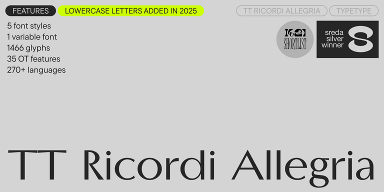

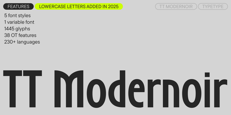
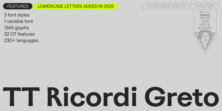
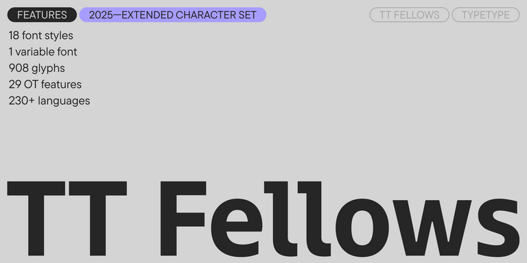
- A full lowercase set has been added (the lowercase characters from the previous version can now be found in a small caps set).
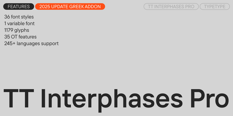
- The number of glyphs per style has nearly doubled, increasing from 750 to 1,466.
- Specifically, we have: expanded the extended Cyrillic and Latin sets; expanded the basic currency set (Bitcoin, Lira, Rupee, Som, Sum, Tenge, Tugrik, Won for all cases); drawn fractions and double ligatures, as well as alternate and small cap forms for ligatures; drawn all figures for numerators and denominators; drawn service characters for the lowercase set; drawn numerals and currency symbols for minuscule and minuscule tabular figures.
- The number of OpenType features has increased from 19 to 35.
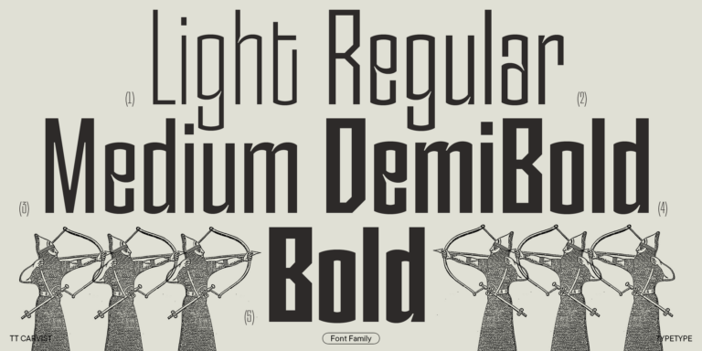
- The number of font styles has increased from 3 to 6: the bolder Medium and Demibold have been added, which significantly expand the typeface’s range of use.
- New stylistic sets have been added: SS09—Circled Figures, SS10—Negative Circled Figures, SS11—Bashkir localization, SS12—Chuvash localization, SS13—Bulgarian localization, SS14—Serbian localization.
- The number of supported languages has increased from over 200 to over 230.
Sans Serif Fonts
For a neutral, sleek, and modern font, sans serif fonts (Grotesques) are the perfect choice. Versatile and widely used—from websites and mobile apps to print and branding—they adapt seamlessly to any project. The TypeType collection offers a range of sans serif fonts, from understated to bold. Find the ideal fit in our selection.
Today, sans serifs are the most modern and popular fonts. Most often, fonts of this particular style become interface fonts for famous brands and popular websites and are frequently used on posters, billboards, and in-store windows.
Simple at first glance, neat, and versatile, they have taken over the world and become the new rule of good manners. Using sans serifs in your projects means understanding current trends and inviting users to a dialogue.
Not surprisingly, in the extensive collection of TypeType fonts, sans serifs have won the hearts of millions. TT Norms® Pro and TT Commons™ Pro, our bestsellers, equally popular TT Hoves Pro, TT Firs Neue and TT Fors—these typefaces are our best and most popular sans serifs.
In addition to geometric typefaces, there are the Old Style, Humanist, and Neo-Grotesque fonts. Common characteristics of all these groups are no serifs, a wide range of applications, and versatility.
Old Style sans serifs are the typefaces that originated in the Victorian era. Although they did not have serifs, such fonts had a rather extravagant appearance compared to the later sans serifs.
Neo-Grotesques appeared later than the Old Style ones. They looked much sleeker and stricter than their predecessors. These fonts are more functional and highly adaptable. Neo-Grotesques are usually low-contrast and monospaced.
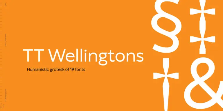
Humanist sans serifs move away from austerity towards humanism, as you might guess from the name. They have calligraphic influence and feature references to serifs and dynamics. As a rule, these are mixed-width fonts with high contrast of strokes. They have true italic styles, where the characters are not only slanted but also change their shape. In the TypeType collection, the Humanist sans serifs are TT Wellingtons and TT Corals.
Geometric sans-serifs are functional and versatile workhorses of the font world. They do not have a solid visual character, so they can be suitable for almost any task. They look aesthetically pleasing in print, ideal on the web, and are suitable as an interface font.
The versatility of Geometric sans serifs is derived from the shape of the characters based on simple geometric shapes. Most often, these are low-contrast mixed-width fonts. This type of font is suitable for both headings and running text.
The TypeType collection features numerous Geometric sans serifs. This category includes the legendary TT Norms® Pro and TT Commons™ Pro, as well as the highly popular TT Lakes, TT Hoves Pro, and TT Fors.
Each of the sans serifs in the TypeType collection has an original look and its own characteristics, yet they are all user-friendly and functional. Each of our sans-serif fonts has a large number of styles, so you can choose the most suitable one for your project or buy a license for several.
Moreover, some of them feature a variable font, for example, in TT Norms® and TT Commons™ Pro. This allows you to choose the perfect font variation.
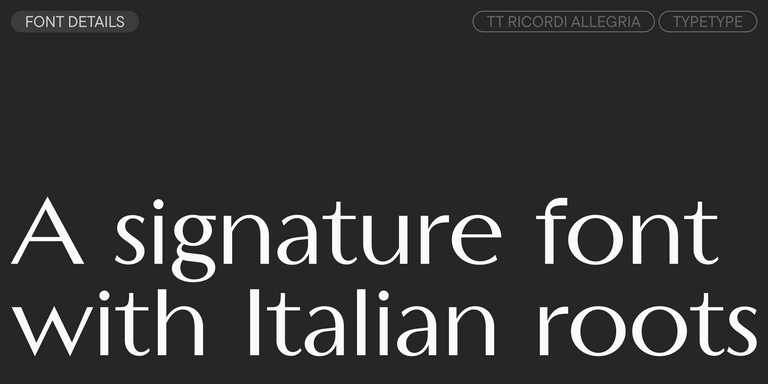
TT Ricordi Allegria is a sleek and intelligent contemporary Florentine grotesque.
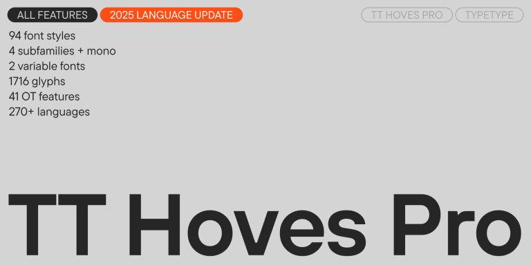
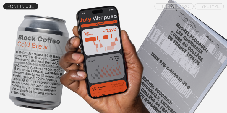
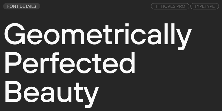
TT Hoves Pro is a versatile sans-serif with a recognizable geometry
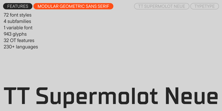
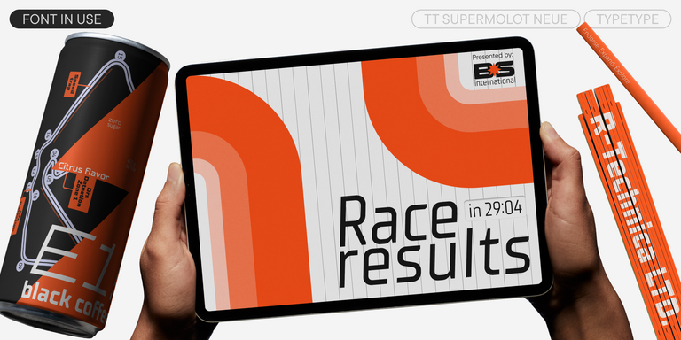
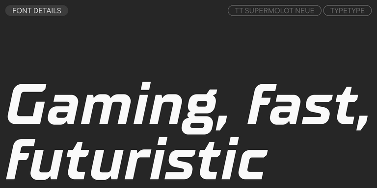
TT Supermolot Neue is a redesigned, extended, and greatly enhanced reincarnation of the popular font family
Discounted fonts
View all discounted fonts
Remaining time:
0
0
days
0
0
hours
0
0
minutes
0
0
seconds
TT Biersal
- from Original price was: $39 . 99 . $27 . 99Current price is: $27 . 99 .
- 30% off Special offer is valid until 17 Oct, 2025


TT Gertika
- from Original price was: $39 . 99 . $27 . 99Current price is: $27 . 99 .
- 30% off Special offer is valid until 24 Oct, 2025


TT Ricordi Marmo
- from Original price was: $29 . $20 . 30Current price is: $20 . 30 .
- 30% off Special offer is valid until 7 Nov, 2025
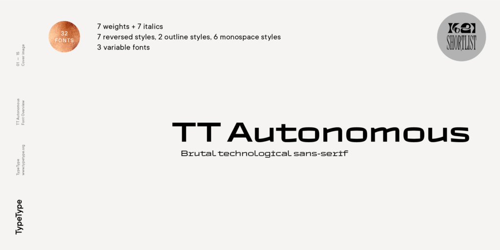
TT Autonomous
- from Original price was: $39 . 99 . $27 . 99Current price is: $27 . 99 .
- 30% off Special offer is valid until 14 Nov, 2025
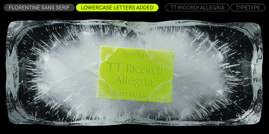
TT Ricordi Allegria
- from Original price was: $39 . 99 . $20Current price is: $20 .
- 50% off Special offer is valid until 14 Nov, 2025
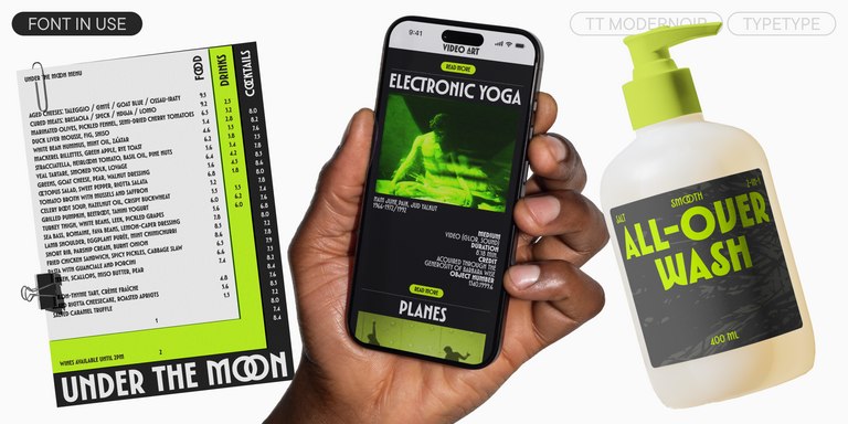
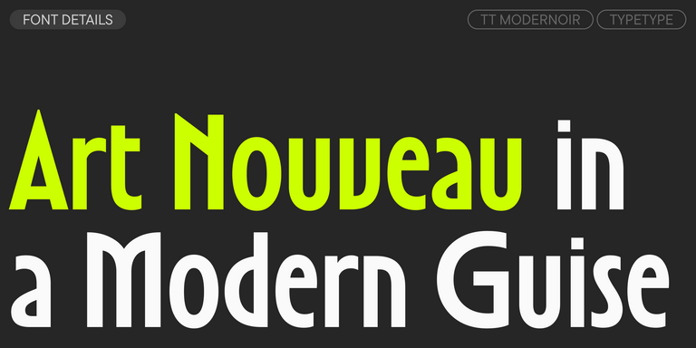
TT Modernoir is a display sans serif with dynamic proportions. Fluid lines and delicate Art Nouveau forms in this typeface blend seamlessly with the rhythmic flow and improvisational freedom of jazz.
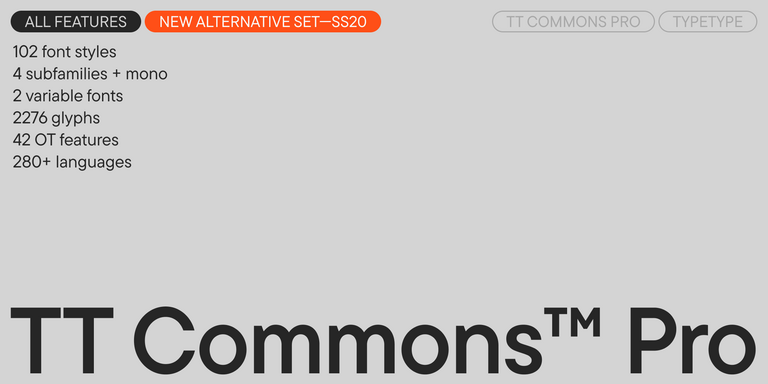
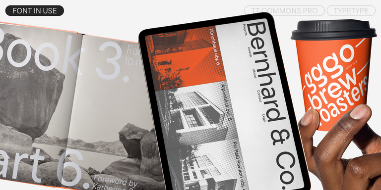
TT Commons™ Pro is a completely redesigned version of the well-established classic font family TT Commons.
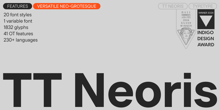
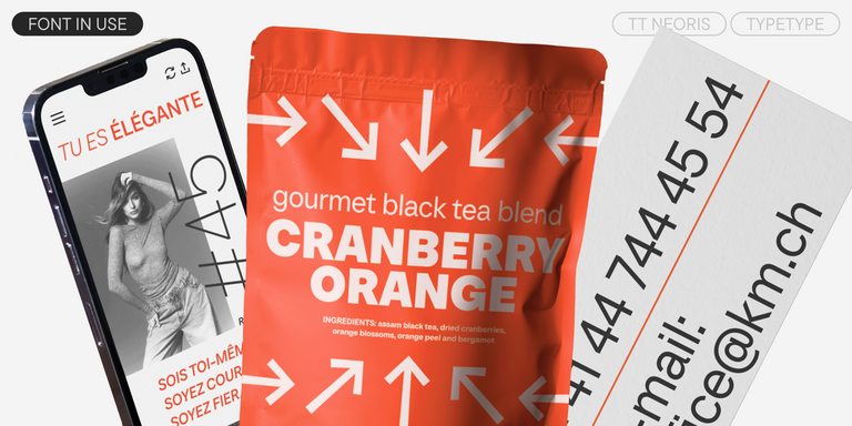
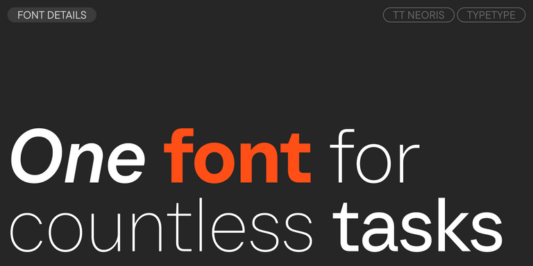
TT Neoris is an elegant Neo-Grotesque with unlimited potential and a font that encompasses all modern requirements and user desires.
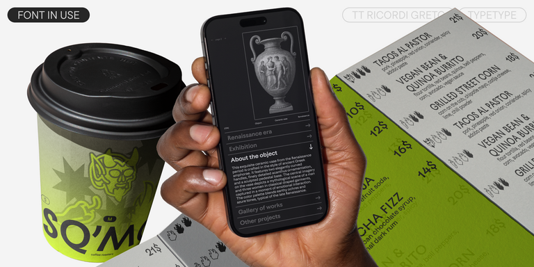
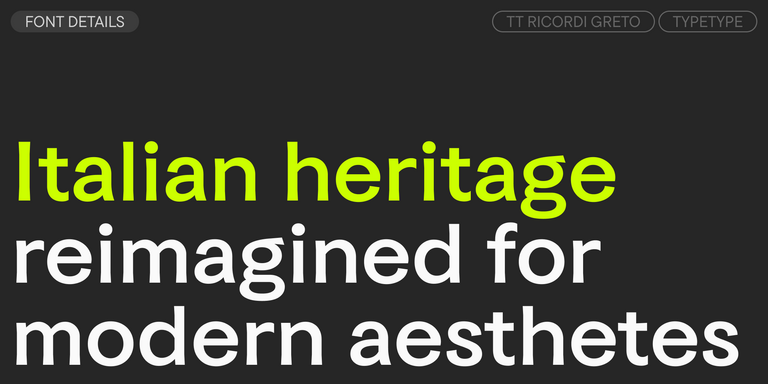
TT Ricordi Greto is an experimental project, inspired by a floor plaque dating from 1423 found in the Basilica di Santa Croce, Florence.
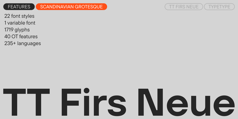
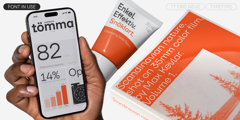
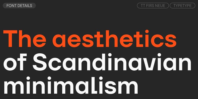
TT Firs Neue is a contemporary reincarnation of the good old TT Firs sans serif.
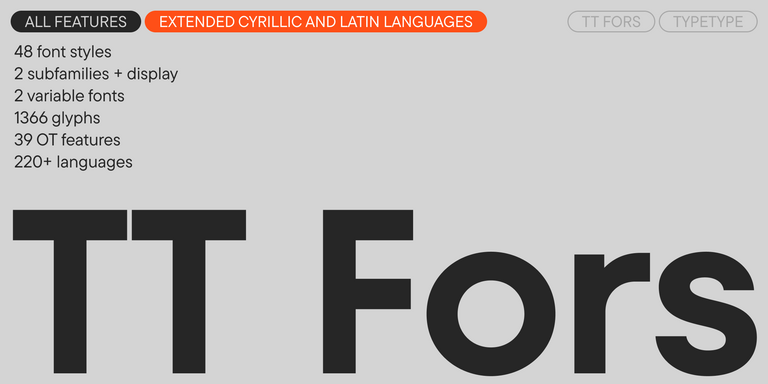
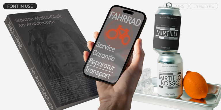
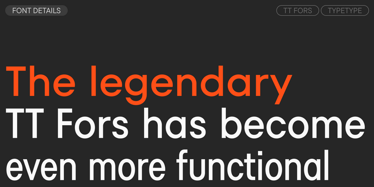
TT Fors is a modern geometric sans serif with characters and shapes contrasting in width.
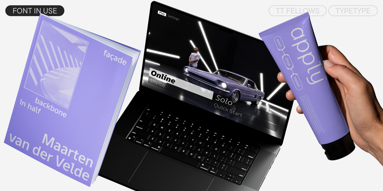
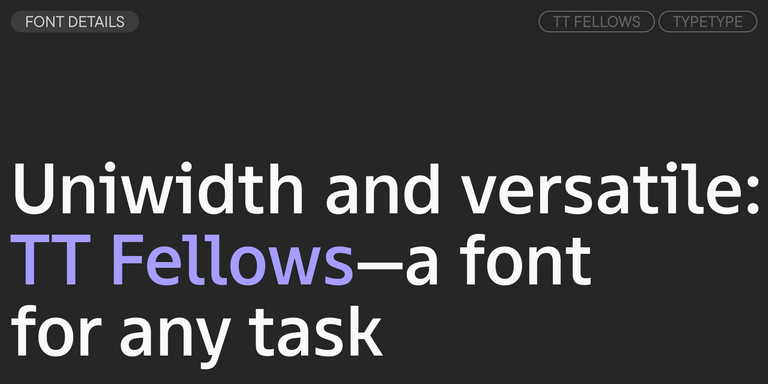
TT Fellows is a humanist sans serif with a mechanical touch.
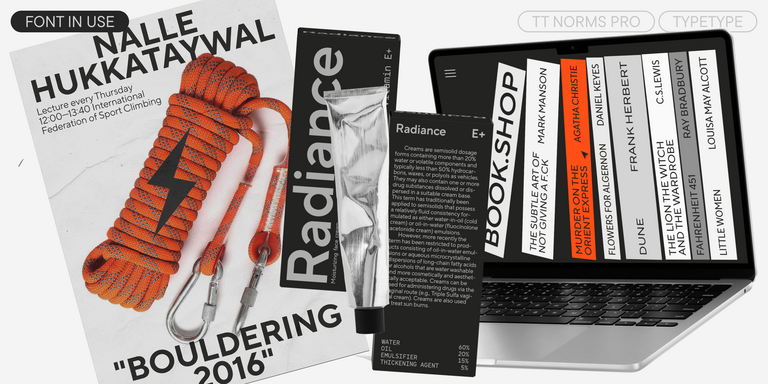
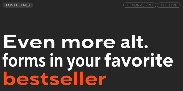
The bestseller TT Norms® Pro—a geometric sans serif, trouble-free workhorse
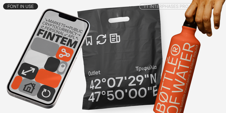
TT Interphases Pro is a neo-grotesque sans serif with equal-width proportions
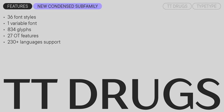
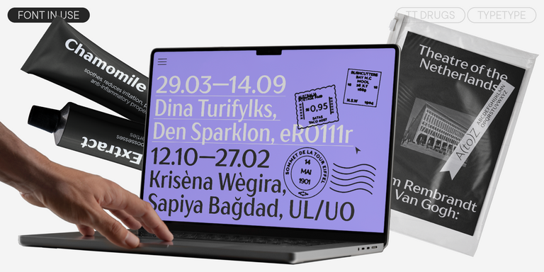
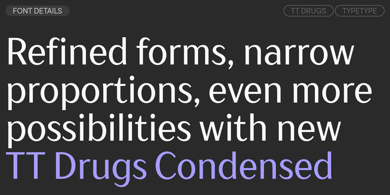
TT Drugs is a typeface that doesn’t feature serifs but stands out for its high contrast.
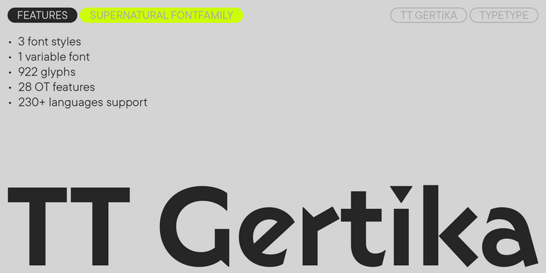
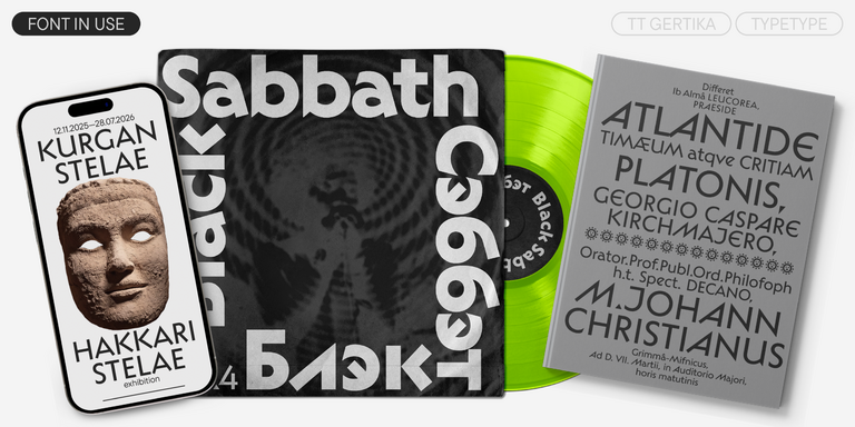
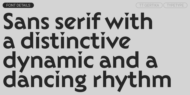
TT Gertika is a geometric sans serif with a dynamic character and a dancing rhythm. This font’s idea originates from the lettering featured on an American poster from the late 1930s.
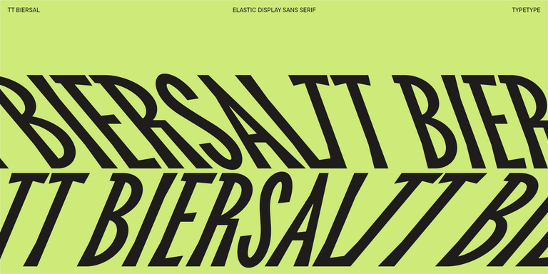
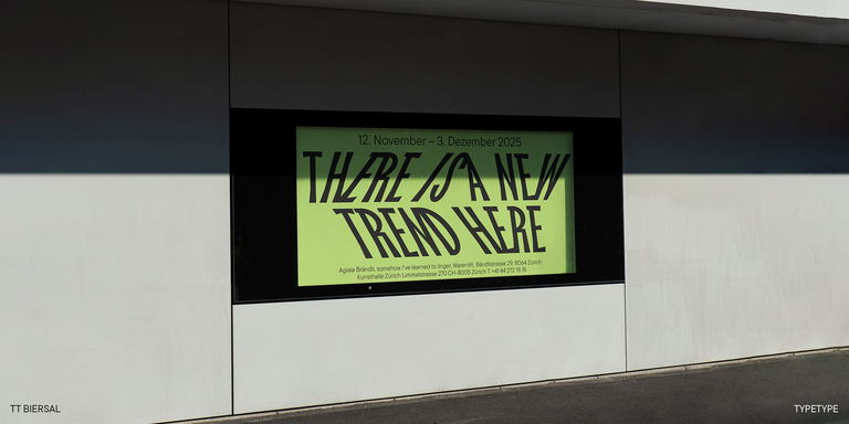
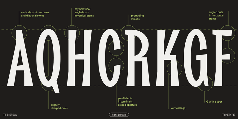
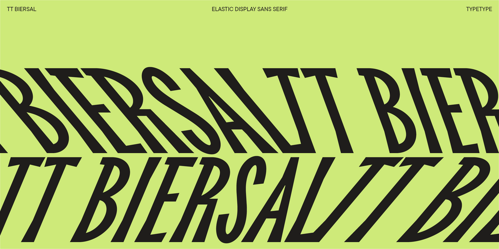
TT Biersal is a display sans serif with a free-spirited, playful, and adventurous nature. The concept of this font was sparked by a German poster from the early 1930s.
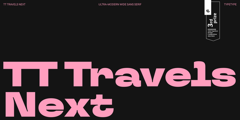
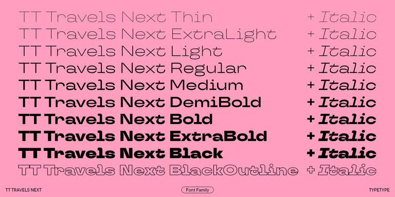
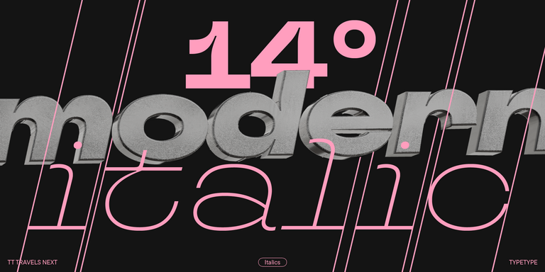
TT Travels Next is a very trendy and modern wide display sans serif for use in different sets, be they print or web.
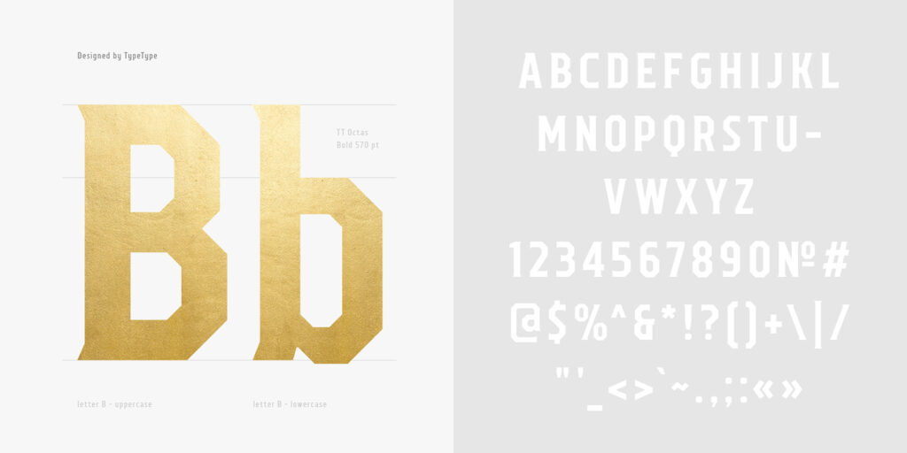
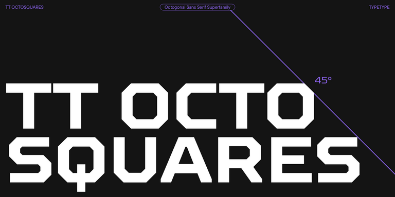
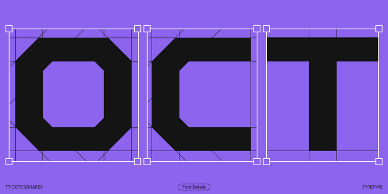
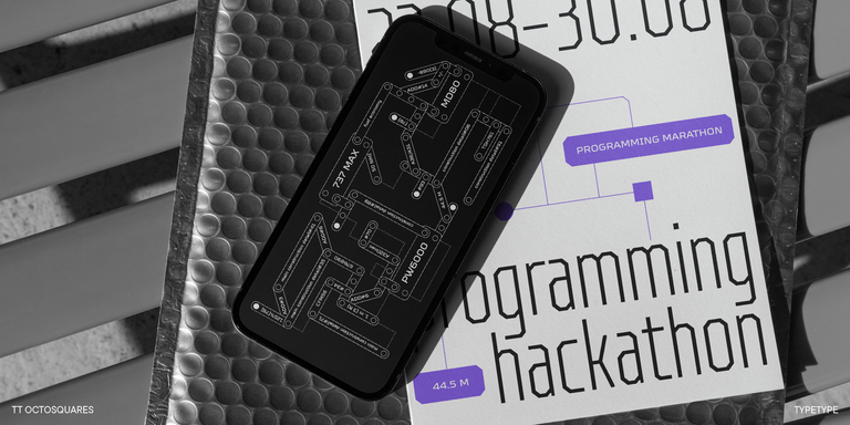
TT Octosquares is a fresh, revised, expanded, and significantly improved version of our first commercial font TT Squares & its narrow version.
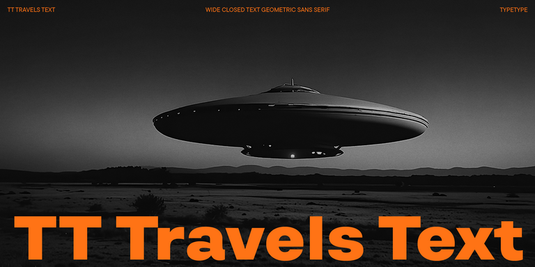
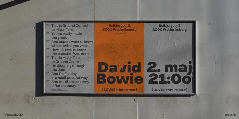
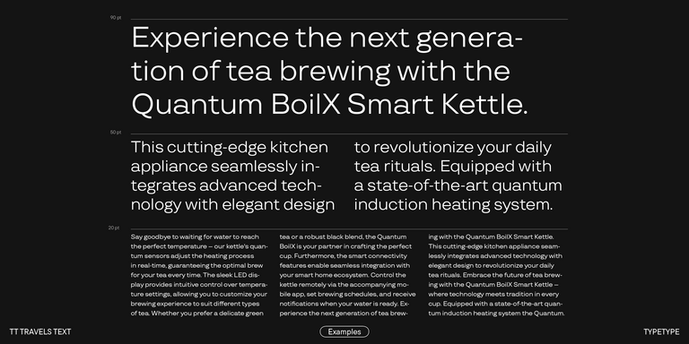
TT Travels Text is a geometric grotesque with wide proportions and specific shapes of circles and fillets, which includes two stylistic sets with completely different natures.
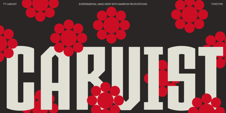
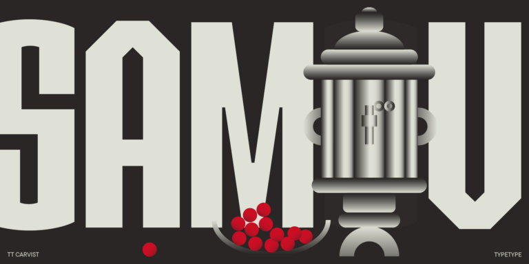
TT Carvist—peculiar, playful, and courageous—this font does an excellent job of grabbing attention!
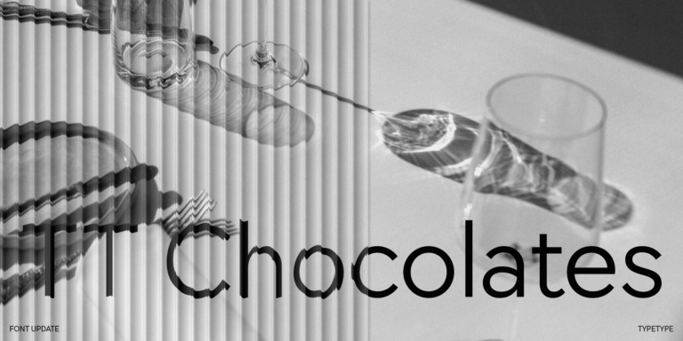
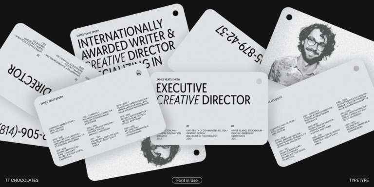
TT Chocolates typeface consists of 14 fonts: 7 weights and 7 obliques. Due to the extended language support and the introduction of useful features.

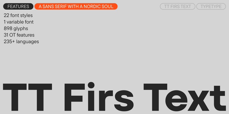
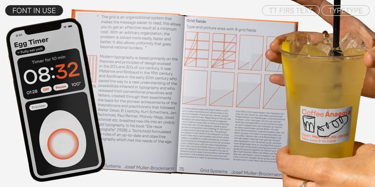
We have released a brand-new font. Meet TT Firs Text—a geometric sans serif with a Nordic character!
TT Wellingtons is an attempt to combine the style of English humanist sans serifs of the early 20th century with the requirements for modern geometric grotesques.
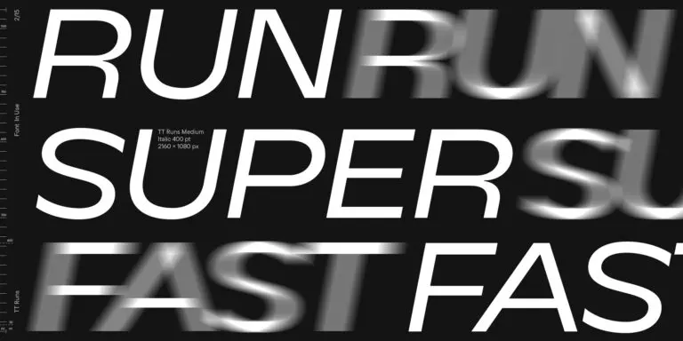
TT Runs is a very stylish and charismatic display sans serif with irregular proportions of some characters.