top_banner_bees0926
TT Firs Text
23 styles
Type foundryFonts & StylesSans SerifTT Firs Text

TT Firs Text

TT Firs Text is a clean geometric sans serif with Nordic sensibility. This text typeface offers both versatility and expressive character.
Single style: from $47.99
Full family: from $389 23 styles

Buying Options

To purchase a font, first select the styles you need, then choose your licenses and proceed to checkout. To test the font in your project, download the free trial version.

Select at least one style before choosing licenses

To purchase a font, first select the styles you need, then choose your licenses and proceed to checkout. To test the font in your project, download the free trial version.
Package offer:
per style $16.91
from  $389
23 styles
from  $389
from $47.99
from $47.99
from $47.99
from $47.99
from $47.99
from $47.99
from $47.99
from $47.99
from $47.99
from $47.99
from $47.99
from $47.99
from $47.99
from $47.99
from $47.99
from $47.99
from $47.99
from $47.99
from $47.99
from $47.99
from $47.99
from $47.99
from $329
Package offer:
per style $14.95
from  $329
22 styles
from  $329
from $47.99
from $47.99
from $47.99
from $47.99
from $47.99
from $47.99
from $47.99
from $47.99
from $47.99
from $47.99
from $47.99
from $47.99
from $47.99
from $47.99
from $47.99
from $47.99
from $47.99
from $47.99
from $47.99
from $47.99
from $47.99
from $47.99
from $329
1 style
from $329
from $329
On request
Perpetual
On request
On request
Perpetual
On request
On request
On request
On request
On request
On request
On request
On request
Perpetual
On request
On request
Perpetual
On request
On request
Perpetual
On request
On request
Perpetual
On request
On request
On request
On request
On request
Your order:
Nothing selected yet

Select styles first, then licenses.

Questions about the font or licensing?

Testers

TT Firs Text
Size
Features
Turn on all

TT Firs Text—scandinavian grotesque you'll love

TT Firs Text
Size
Features
Turn on all

As for the nature of the new font family, we tried to make it as neutral as possible. As the basis of the new font family, we took the new version of TT Firs Neue, which we released in 2023. We completely redrawn all the fancy and flashy elements of the font family and made them more traditional. TT Firs Text is great for all modern uses.

TT Firs Text
Size
Features
Turn on all

Geometric, textual, nordic

TT Firs Text
Size
Features
Turn on all

Lillebror och Karlsson på taket

TT Firs Text
Size
Features
Turn on all

Jysk & Ikea

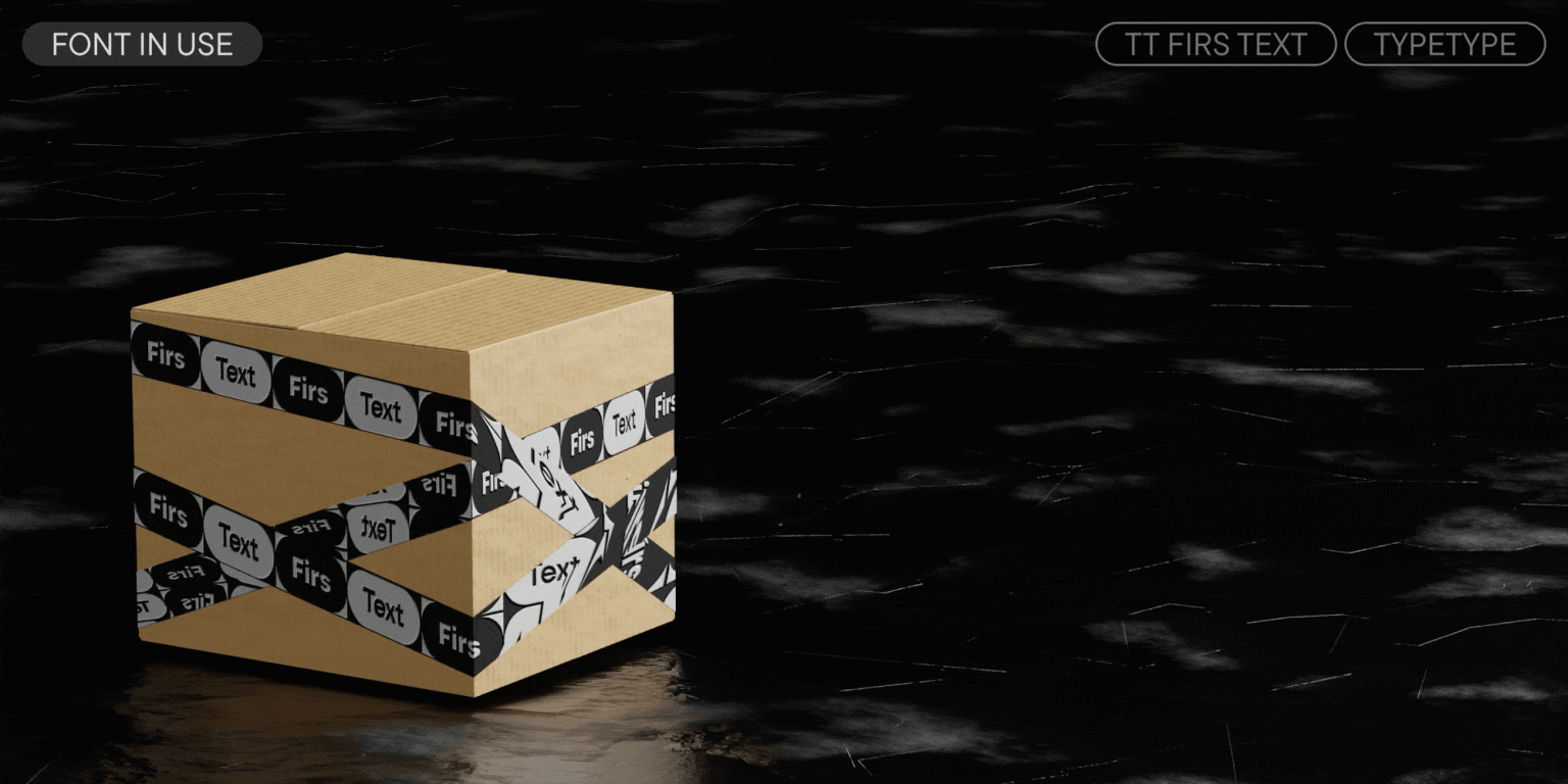
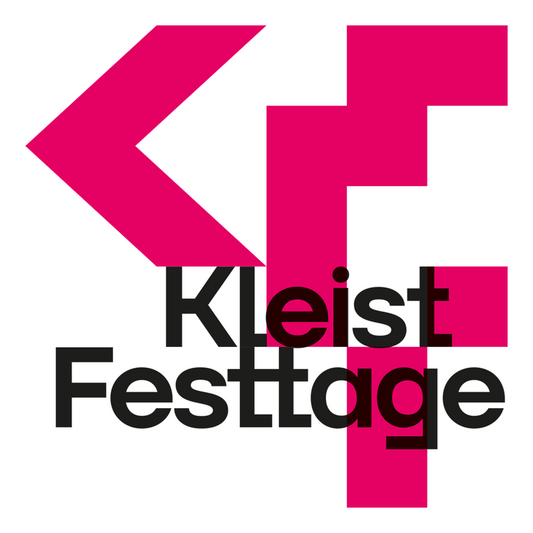
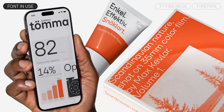
TT Firs Text in design

Description

About font family TT Firs Text
240+ Language support

Meet TT Firs Text—a well-balanced geometric sans serif with a Nordic character!

TT Firs Text is a text typeface created based on the TT Firs Neue typeface, which was updated in 2023. Our goal was to make it more neutral while still giving it its own unique style. You can read more about the typeface’s development process in our article.

TT Firs Text turned out to be simultaneously cool and elegant, stern and captivating, and most importantly, exceptionally versatile. We preserved the aesthetic of Scandinavian minimalism but completely redrew all the expressive elements, making them softer and more traditional. The texture of the set text has become more uniform, which ensures the font remains clear and legible even when setting large blocks of text in small point sizes.

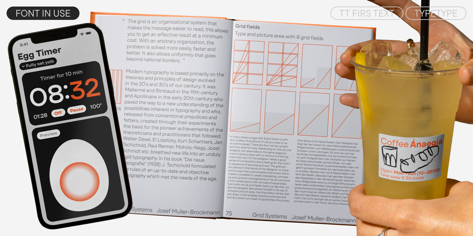
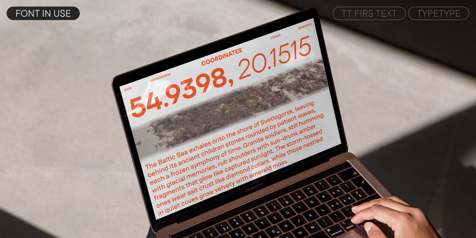
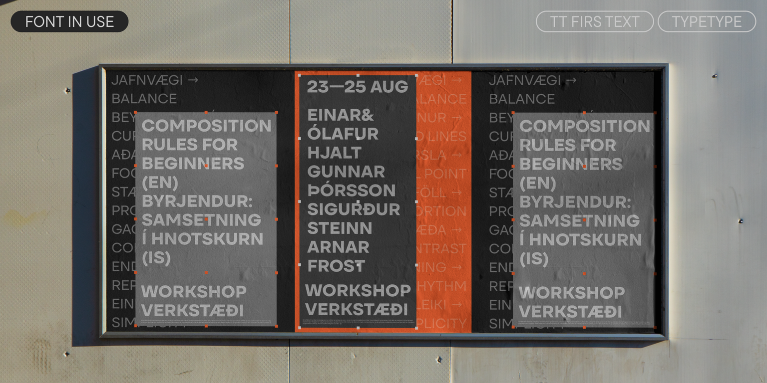
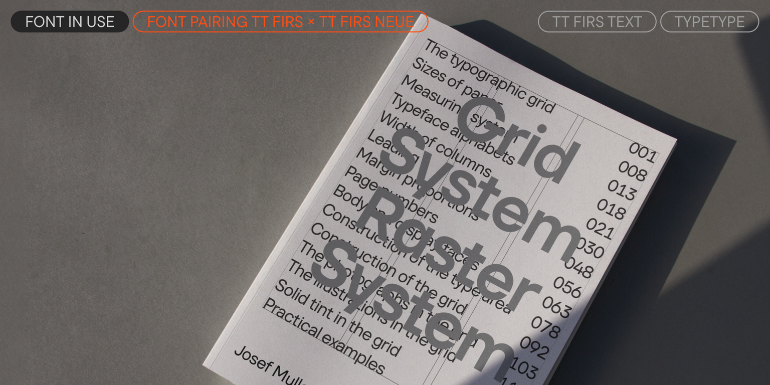
This typeface is equally well-suited for use on websites, for book typesetting, branding and packaging design, and for posters and announcements. Its range of application is practically limitless. TT Firs Text pairs perfectly with TT Firs Neue; however, thanks to its neutral character, it also combines easily with other typefaces.

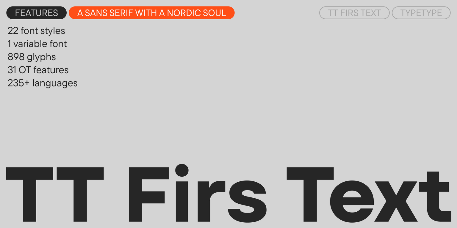
TT Firs Text includes:

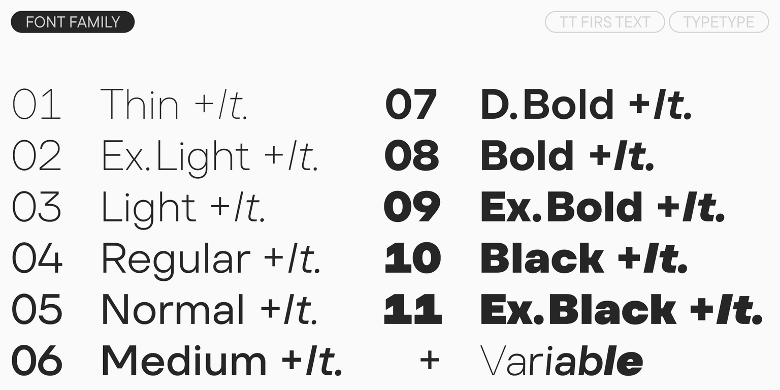
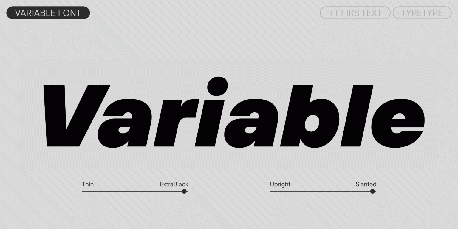
  • 23 styles: 11 uprights, 11 italics, and 1 variable font
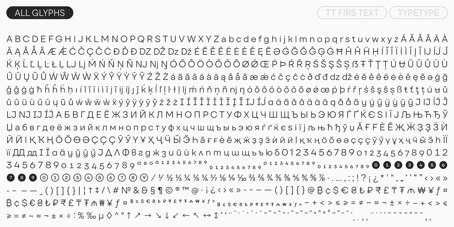
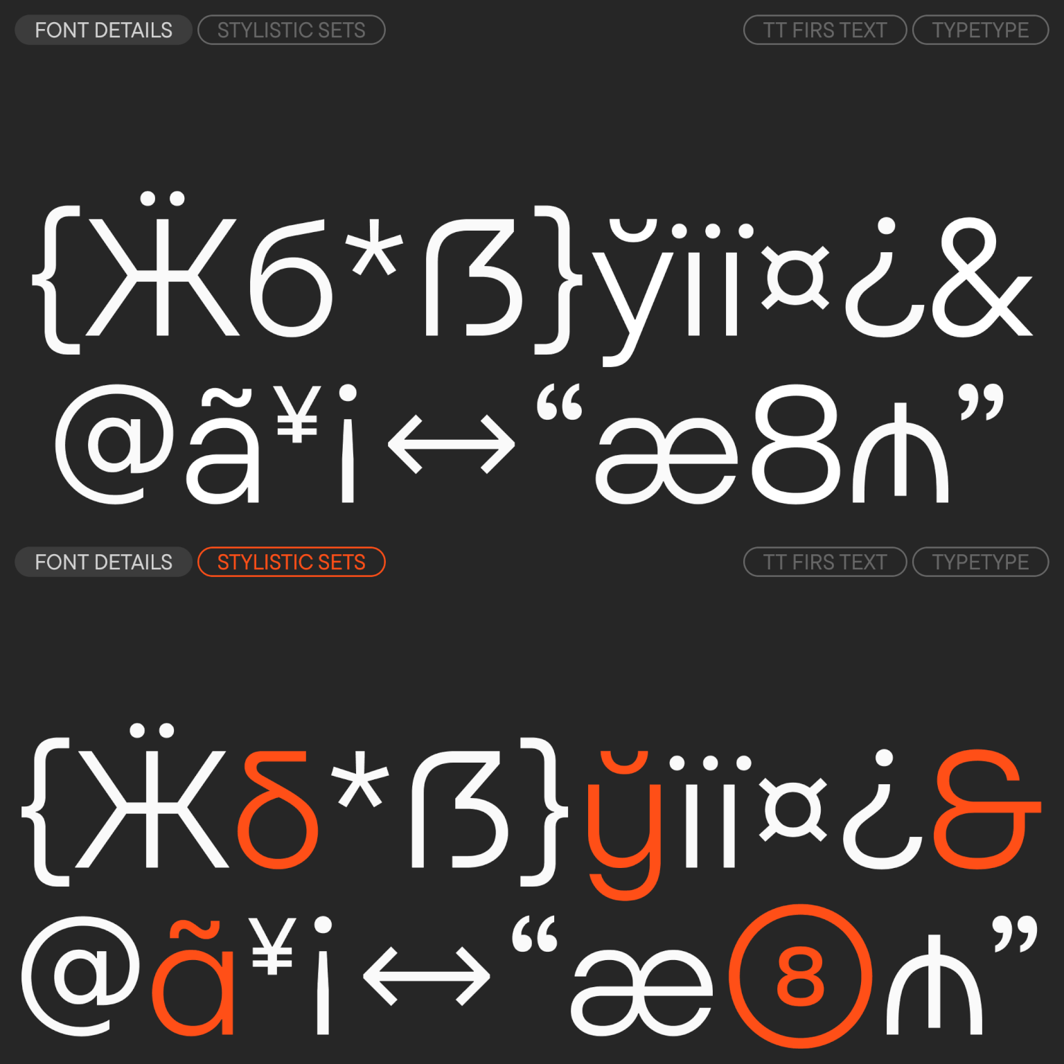
  • 898 glyphs in each style, including characters for extended Latin and Cyrillic
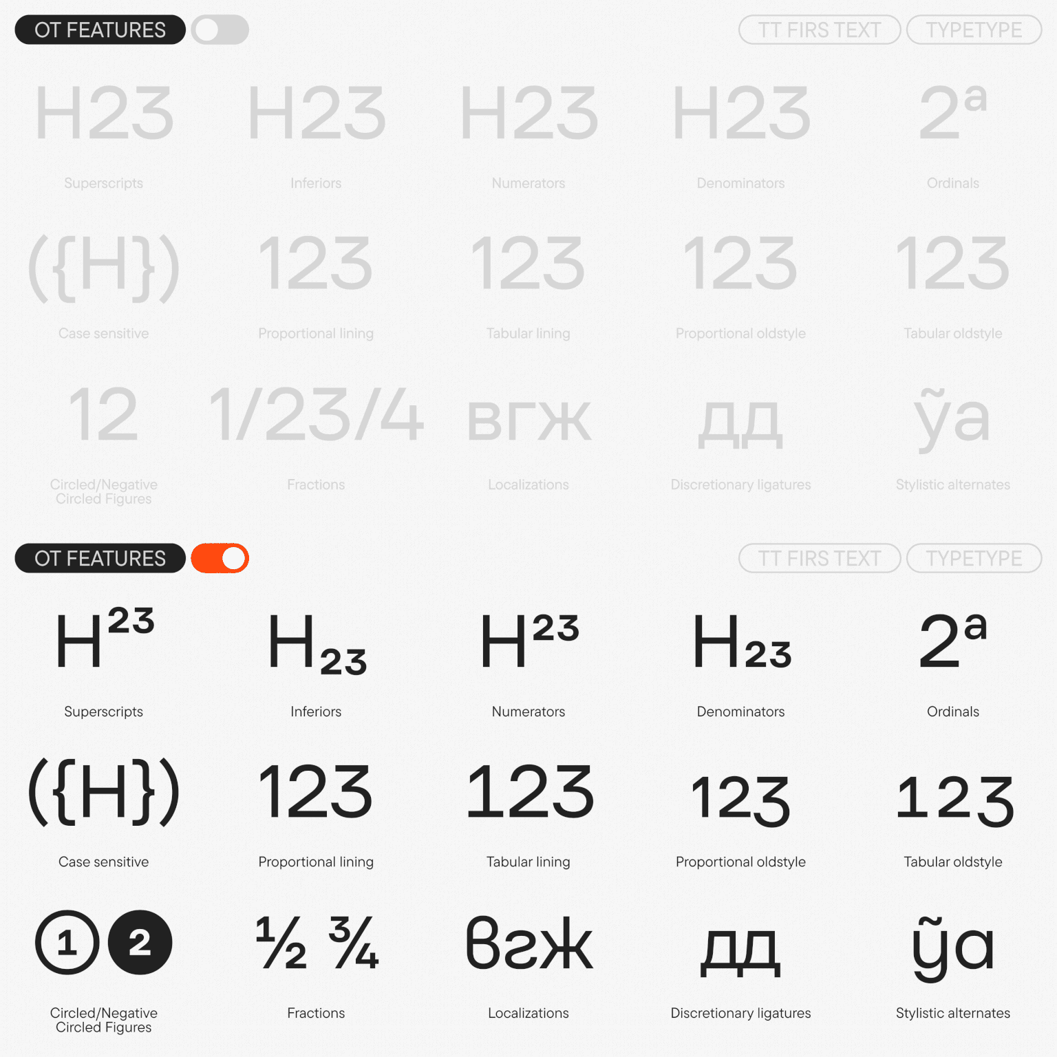
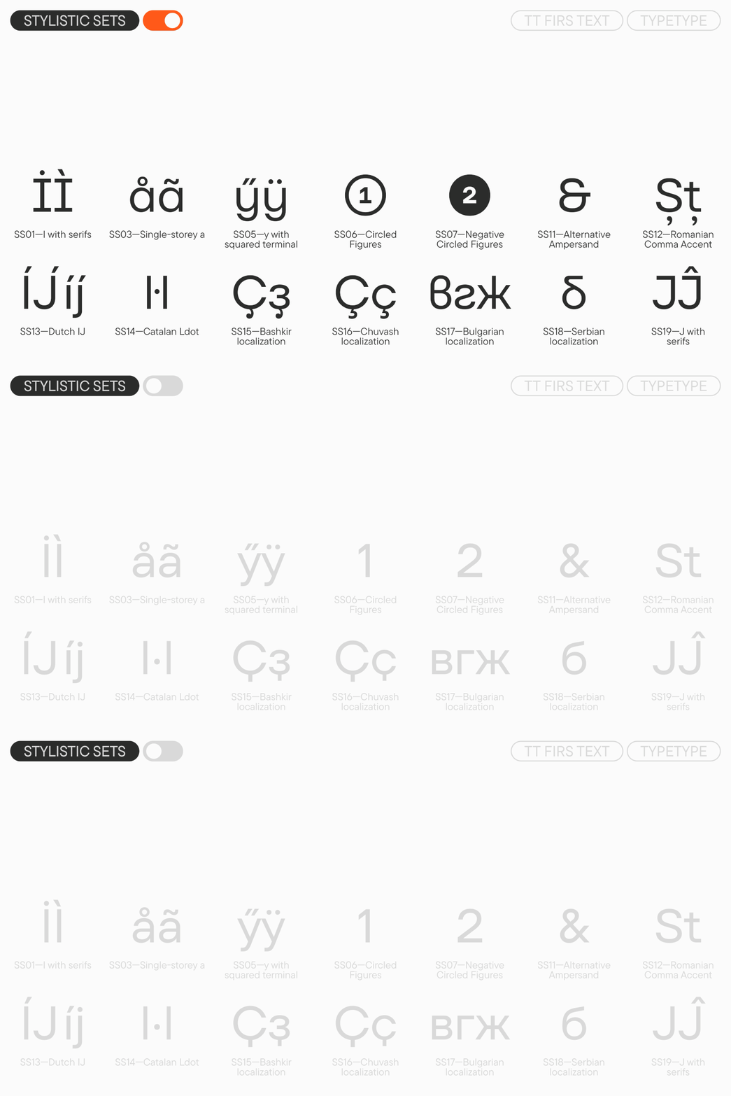
  • 31 OpenType features, including circled numerators and a stylistic alternate for the ampersand
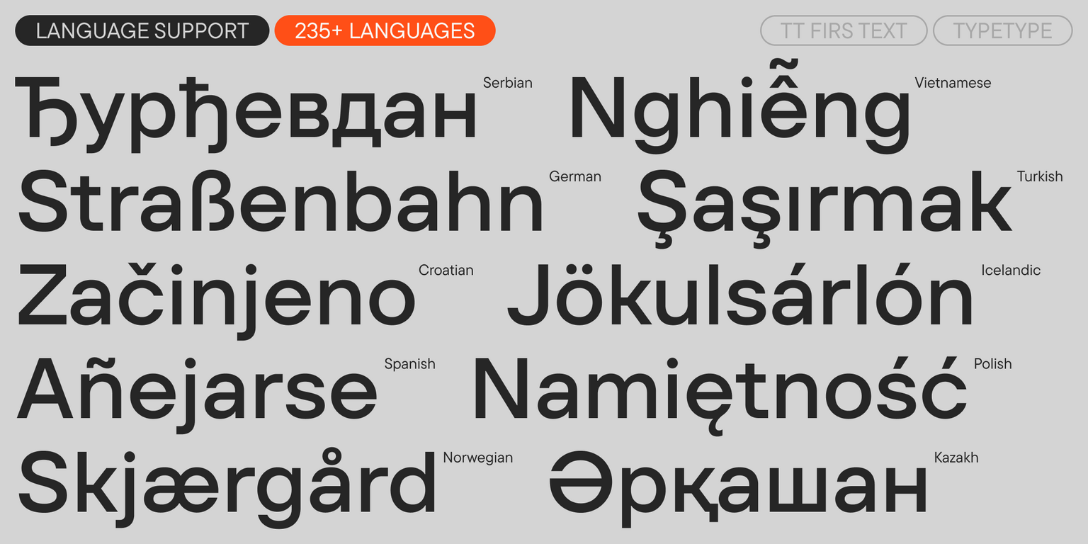
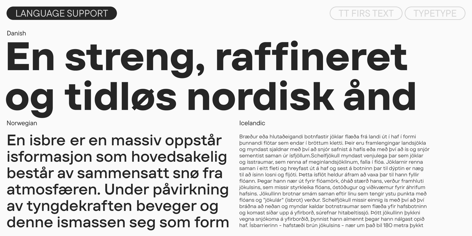
  • Support for over 240 languages

TT Firs Text—for texts with a Scandinavian touch!
Team

Marina Khodak
Antonina Zhulkova
Anastasia Pogorelova
Ivan Gladkikh
+ TypeType Team

Release date

22 August, 2023

Additionally

Specimen

Download font specimen (pdf)

Poster Images

Graphic presentation at Behance

Custom version

Looking for a custom version of this font?

Character Set

Basic Latin Basic Cyrillic Extended Latin Extended Cyrillic Punctuation, Symbols, Mathematical Symbols, Arrows Currency Figures in circles
A B C D E F G H I J K L M N O P Q R S T U V W X Y Z a b c d e f g h i j k l m n o p q r s t u v w x y z

OpenType features

ss01 | I with serifs

IJ

IJ

ss03 | Single-storey a

aáă

aáă

ss05 | y with squared terminal

yýŷ

yýŷ

ss06 | Circled Figures

123

123

ss11 | Alternative Ampersand

&

&

case | Case Sensitive Forms

(123)

(123)

Show all

Ideal font pairs with TT Firs Text

Building Typography Hierarchy in Design Systems

In design work, font pairing is rarely just about matching two visually compatible typefaces. It is about shaping a clear hierarchy that works across different levels of communication. Headings, subheadings, body copy, captions, and interface elements all require different degrees of clarity, rhythm, and emphasis. Successful heading and body font combinations support hierarchy without creating visual conflict. The typefaces work together to define priority, showing the reader what matters most, what comes next, and what can be scanned quickly.

How Context Affects Font Compatibility

Context changes how typography works. One and the same combination can perform very differently in a product interface, a print layout, or a broad brand system. For interface design, clarity and speed of recognition usually outweigh expressive contrast. Editorial design demands readability across long passages. In branding, however, emotional tone and competitive distinction matter most. That is why selecting compatible typefaces begins with understanding the context of use before any final choice is made. Only then can designers see how fonts work with content density, color, and hierarchy.

Consistency Through Typographic Systems

Typography is best seen as a system that carries consistency across formats and platforms. A combination of fonts frequently becomes the first step in building that structure. Within this system, each typeface usually has a clear role: one defines the identity through headlines or display use, while the other provides stability in longer text and functional UI elements. Together, they form a structure that scales across websites, apps, marketing assets, and product screens. This systemic approach reduces design fragmentation and helps teams maintain a unified visual language over time.

Similar fonts

23 font styles
43 font styles
96 font styles
Select licenses
Contact us!