top_banner_ttcommonspro0526
TT Wellingtons
19 styles
Type foundryFonts & StylesSans SerifTT Wellingtons

TT Wellingtons

TT Wellingtons is a humanist sans serif reflecting broad-nib pen strokes. It has a contemporary font with concise forms and memorable character.
Single style: from $47.99
Full family: from $329 19 styles

Buying Options

Choose the fonts and licenses you want. Then, press the "Add to Cart" button

Any questions about the font or licences? Write us.

Choose the fonts you want

Package offer:
per style $17.32
from  $329
19 styles
from  $329
from $47.99
from $47.99
from $47.99
from $47.99
from $47.99
from $47.99
from $47.99
from $47.99
from $47.99
from $47.99
from $47.99
from $47.99
from $47.99
from $47.99
from $47.99
from $47.99
from $47.99
from $47.99
from $279
Package offer:
per style $15.50
from  $279
18 styles
from  $279
from $47.99
from $47.99
from $47.99
from $47.99
from $47.99
from $47.99
from $47.99
from $47.99
from $47.99
from $47.99
from $47.99
from $47.99
from $47.99
from $47.99
from $47.99
from $47.99
from $47.99
from $47.99
from $279
1 style
from $279
from $279

Any questions about the font or licences? Write us.

Select font licenses

You must specify a font package or style before selecting a licence

Choose the licenses you want

On request
On request
On request
On request
On request
On request
On request
On request
On request
On request
No selected items
Total
$0

Testers

TT Wellingtons
Size
Features
Turn on all

Introducing the 2nd version of the humanistic sans serif font family TT Wellingtons

TT Wellingtons
Size
Features
Turn on all

Humanistic grotesques are firmly associated with early 20th century English culture. TT Wellingtons belongs to this category of fonts. Within the TT Wellingtons font family is the archetype of the broad-nib pen. It is as if one could take this writing instrument and write every character in the font. This fact makes this font family very lively and human. In the new edition of the font in 2023, we did a lot of work: we increased the character set, corrected the proportions of all glyphs, worked on the detail of the contours, and prepared the family to work in all types of interfaces. In fact, this is a com- pletely new font family created for all the needs of the modern graphic designer.

TT Wellingtons
Size
Features
Turn on all

Education never ends, Watson. It is a series of lessons, with the greatest for the last.

TT Wellingtons
Size
Features
Turn on all

English and humanistic

TT Wellingtons
Size
Features
Turn on all

MORE figural (45)

TT Wellingtons in design

Description

About font family TT Wellingtons
240+ Language support

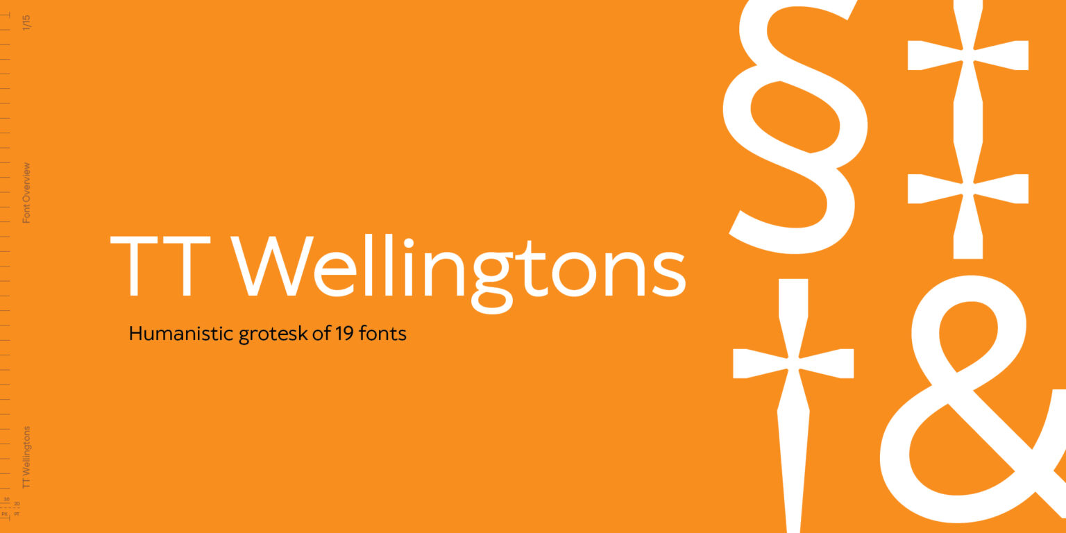
The New Look of TT Wellingtons!

We have changed everything about this font—from its character set to the technical expansion. We have redesigned each contour and perfected the shapes. The main feature stays the same—this is a modern font with an elegant and distinctive personality.

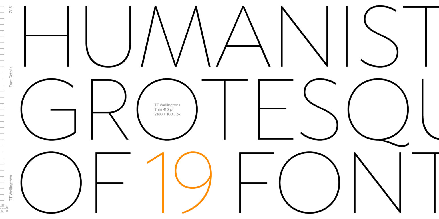
TT Wellingtons is a Humanist sans serif with forms closely connected to the movement of the broad nib. Soft letter lines of the updated typeface, a feature of English Humanist typefaces of the XX century, look relevant and lively in contemporary design projects.

The 2023 edition of TT Wellingtons is a font designed with new technical requirements in mind.

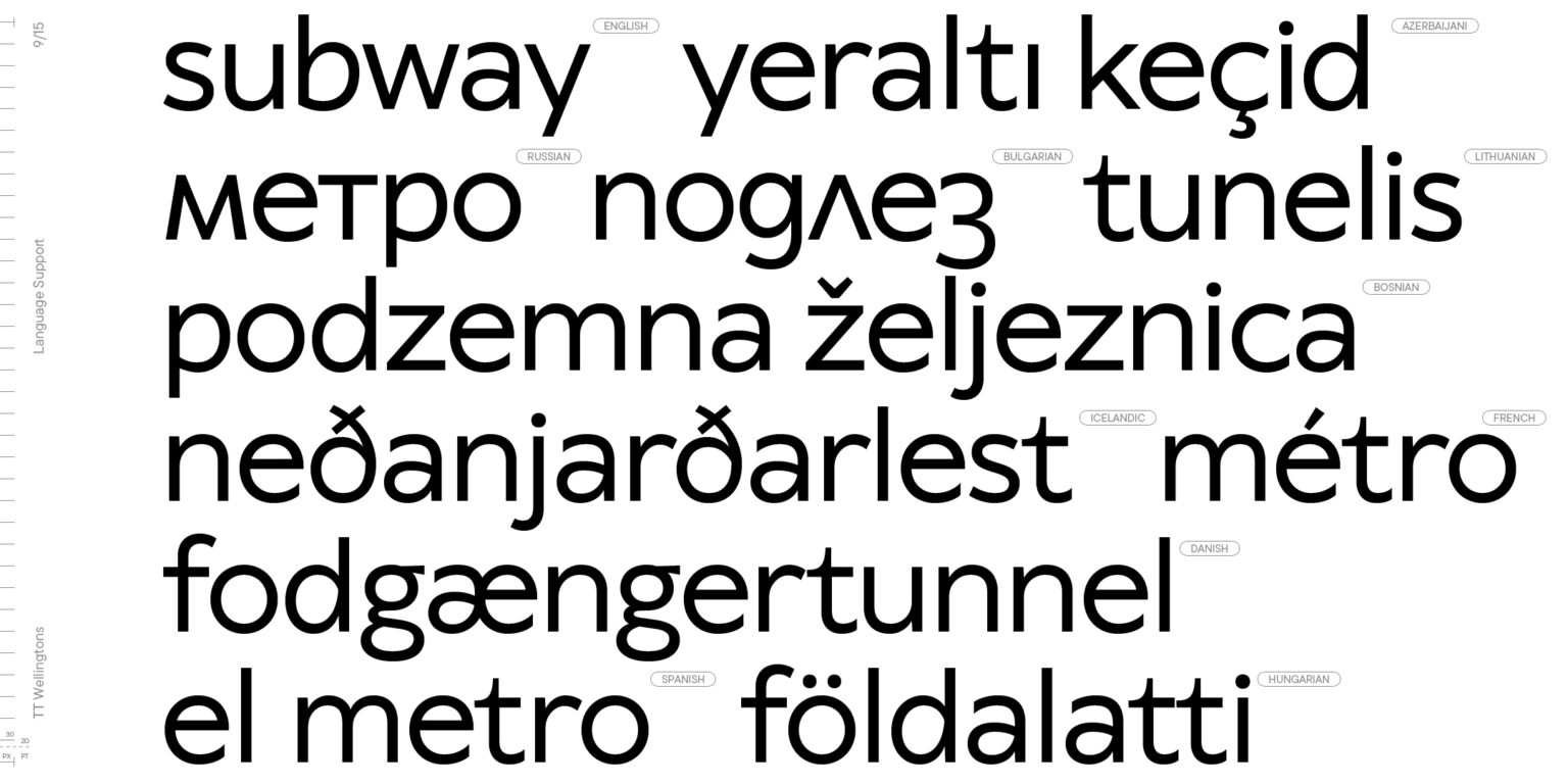
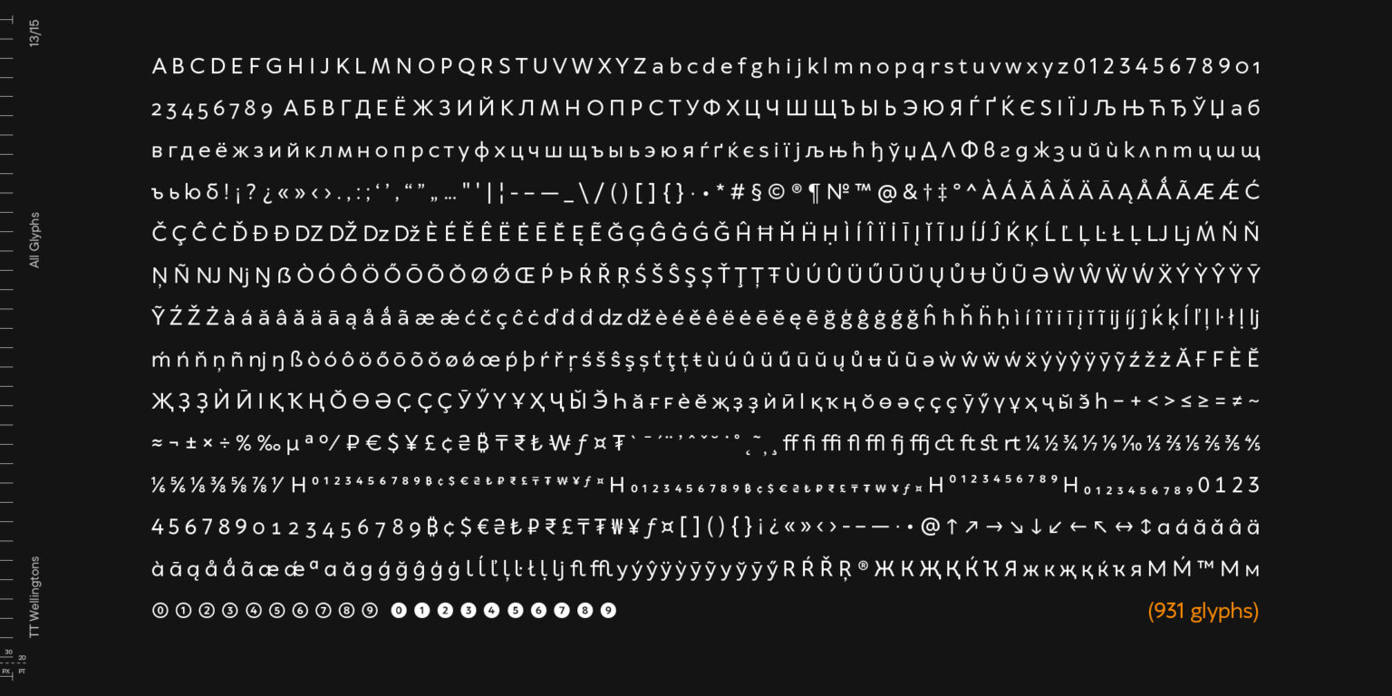
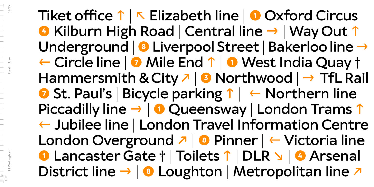
  • Expanded character set. We’ve added 358 new characters into each font style, increasing the number of characters to 913. The characters of the expanded Cyrillic and Latin writing systems, new currency symbols, characters with diacritical marks, and arrows have been added as well.
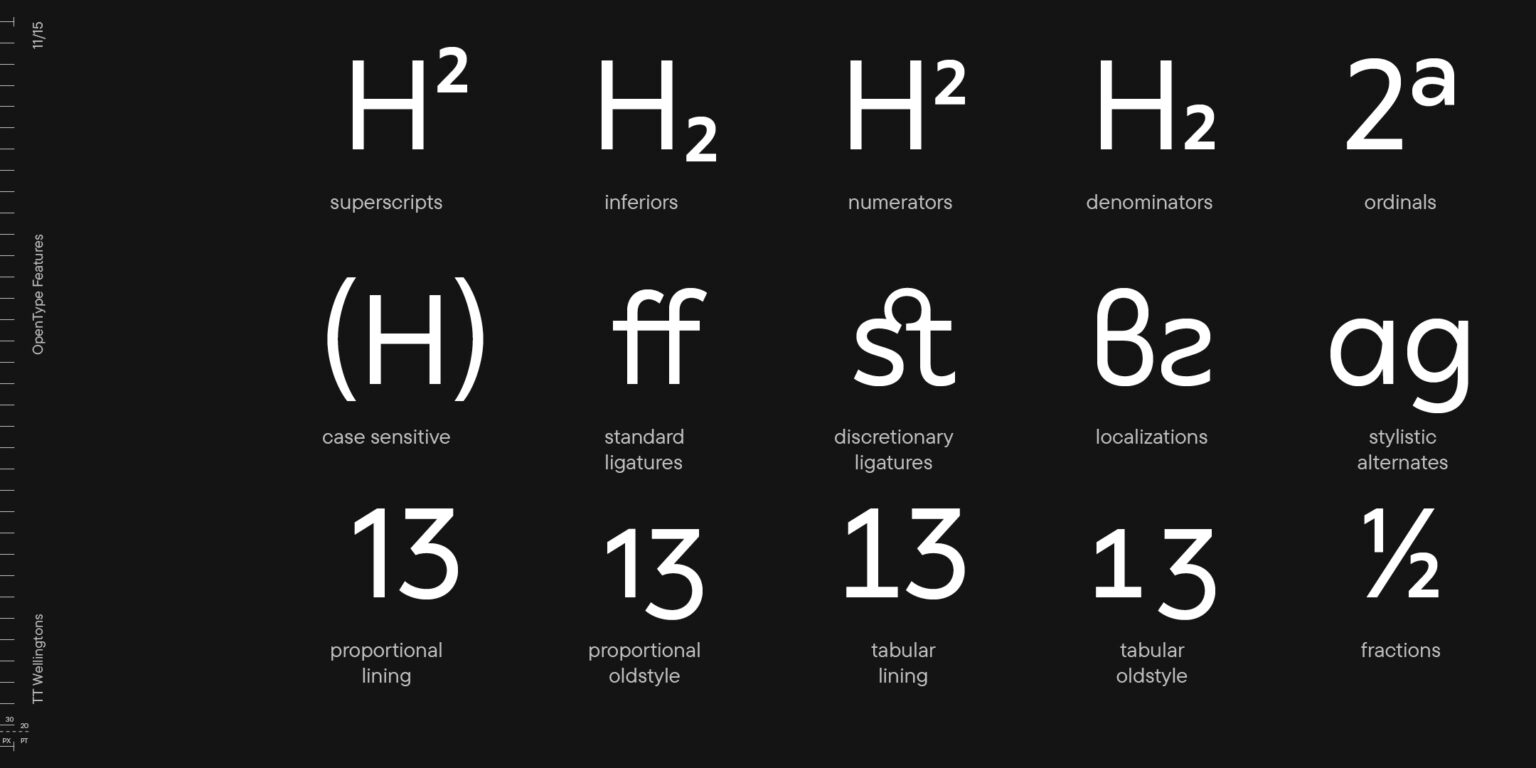
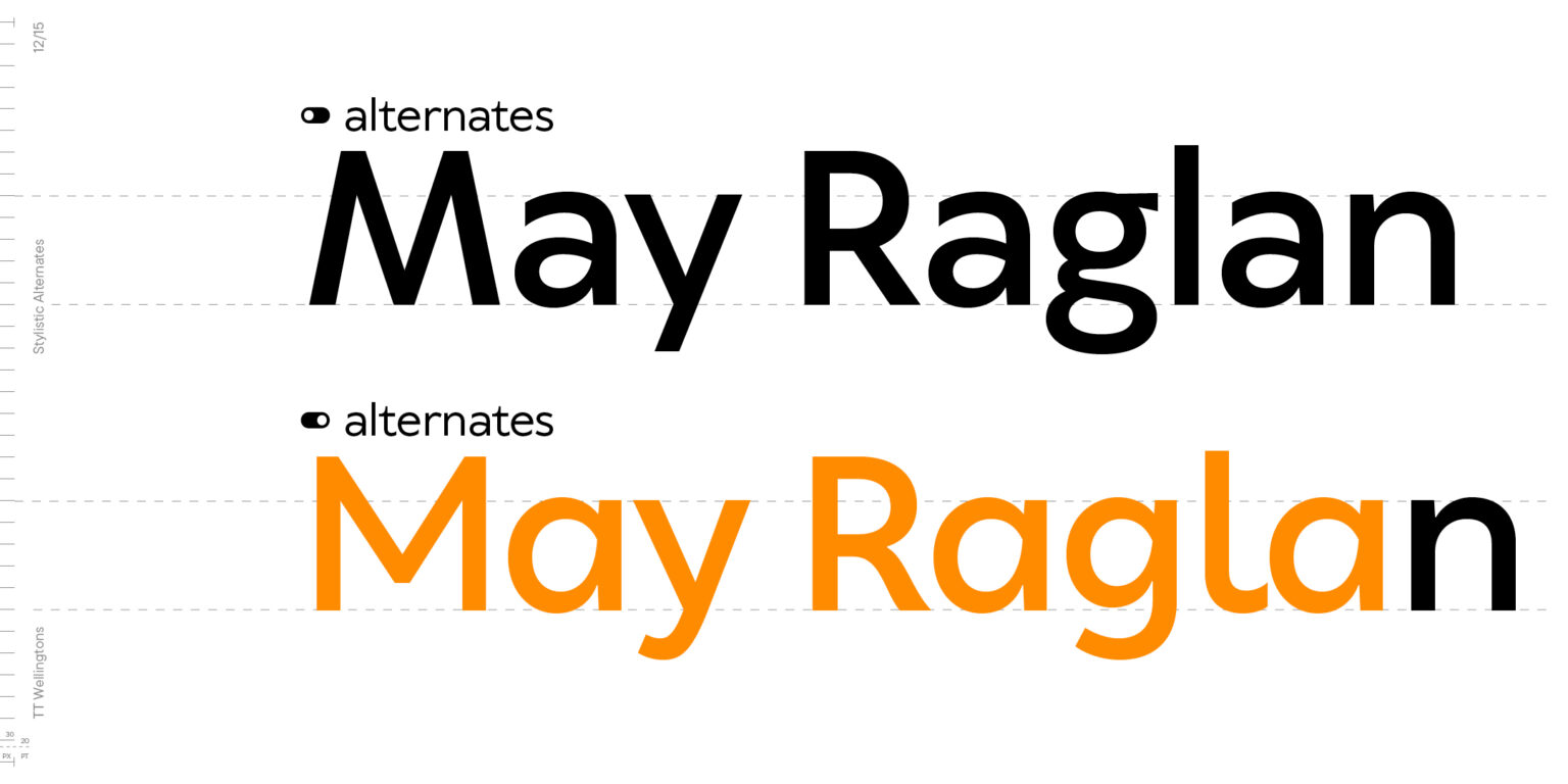
  • Updated set of OpenType features. The font now includes 35 functional and designer-friendly featured, including stylistic alternates and localization features.
  • More languages.
    The new version supports more than 230 languages.
  • Variable font.
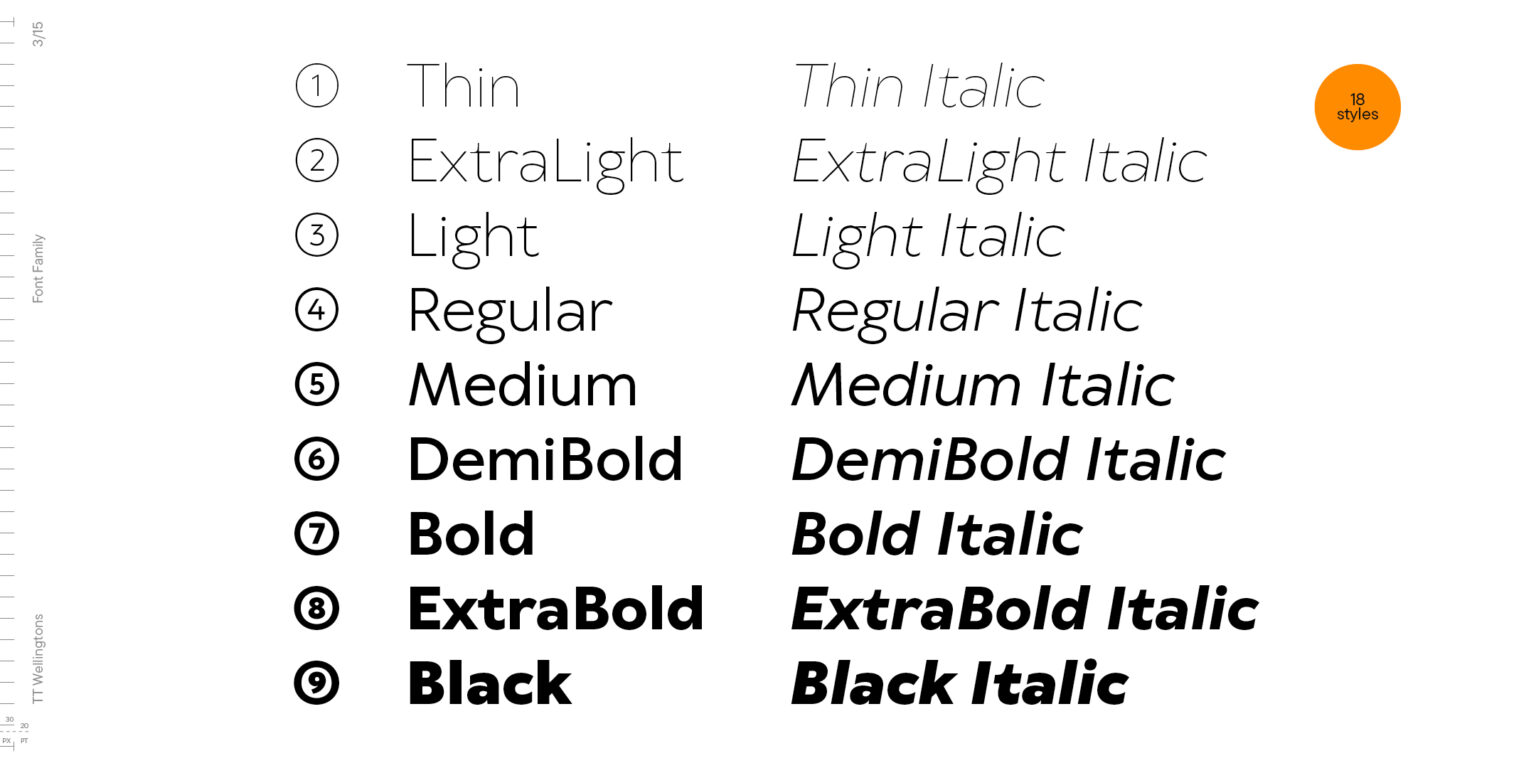
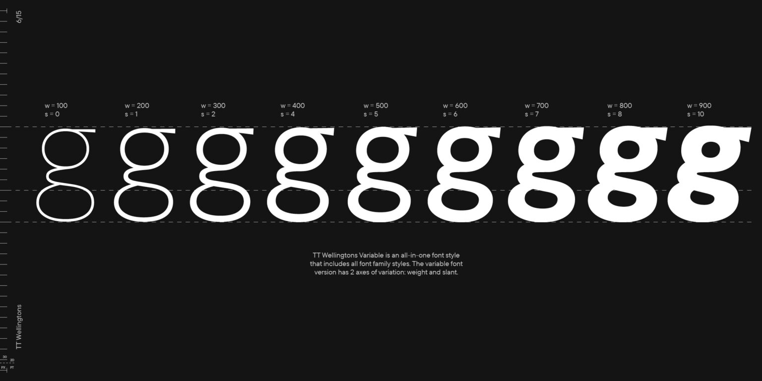
    It is now possible to create a unique style by altering the font on two axes of variation: weight and slant. The font family includes 19 styles: 9 roman, 9 italic, and the variable font.
  • New contours.
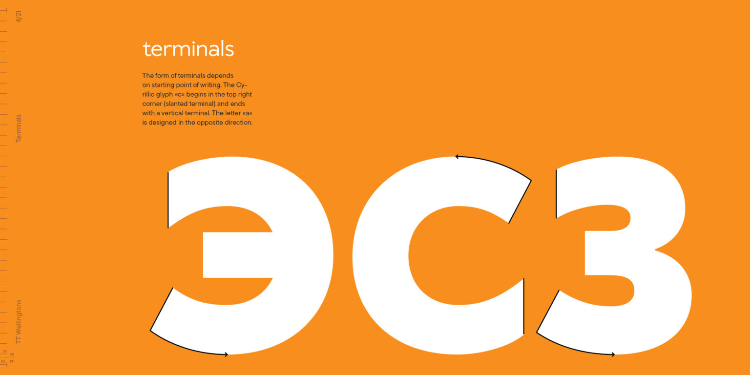
    We have carefully examined the letterforms in all font styles to enhance the overall balance of the font. In the new version, we have improved the shapes of the terminals and cuts, for example, in the characters a, c, g, j, y, and figure 2. Additionally, we have standardized the contrast of the characters in all font styles. And to some characters, like b, d, q, or p, we added Humanist features by working on ligatures.
  • New diacritic.
    The new characters with diacritical marks now have a more aesthetic look and have become more convenient to work with.
  • New forms.
    Some characters have been transformed entirely. For instance, the letters a and g now have the same logic in each font style, and the letter Q looks more elegant because of the new shape of its curved element.
  • Perfect italics.
    The glyphs in italic font styles have been almost completely redesigned. The new italics are flawless both from graphic and technical points of view.

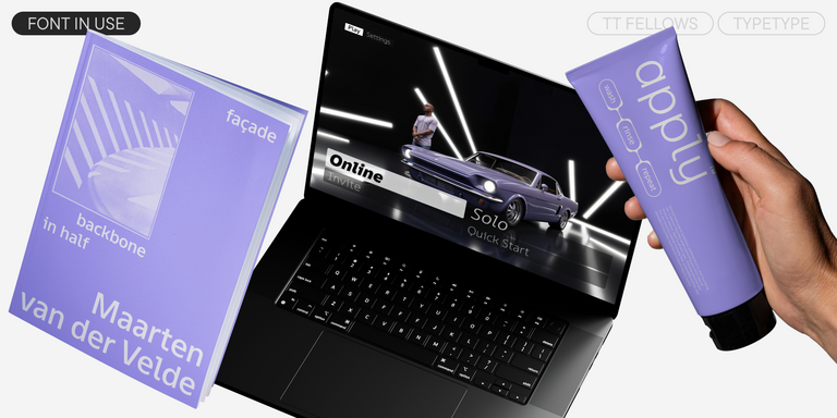
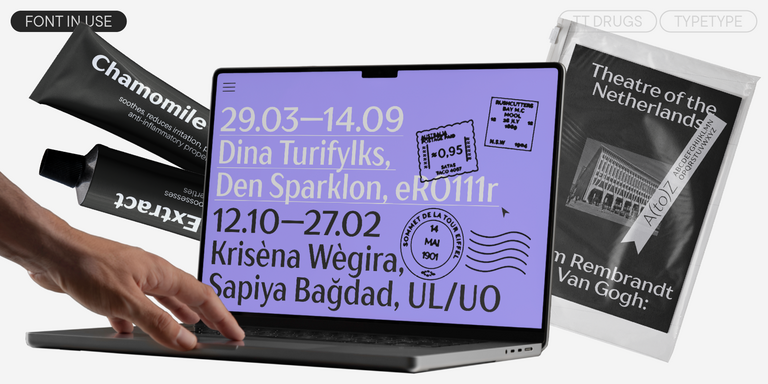
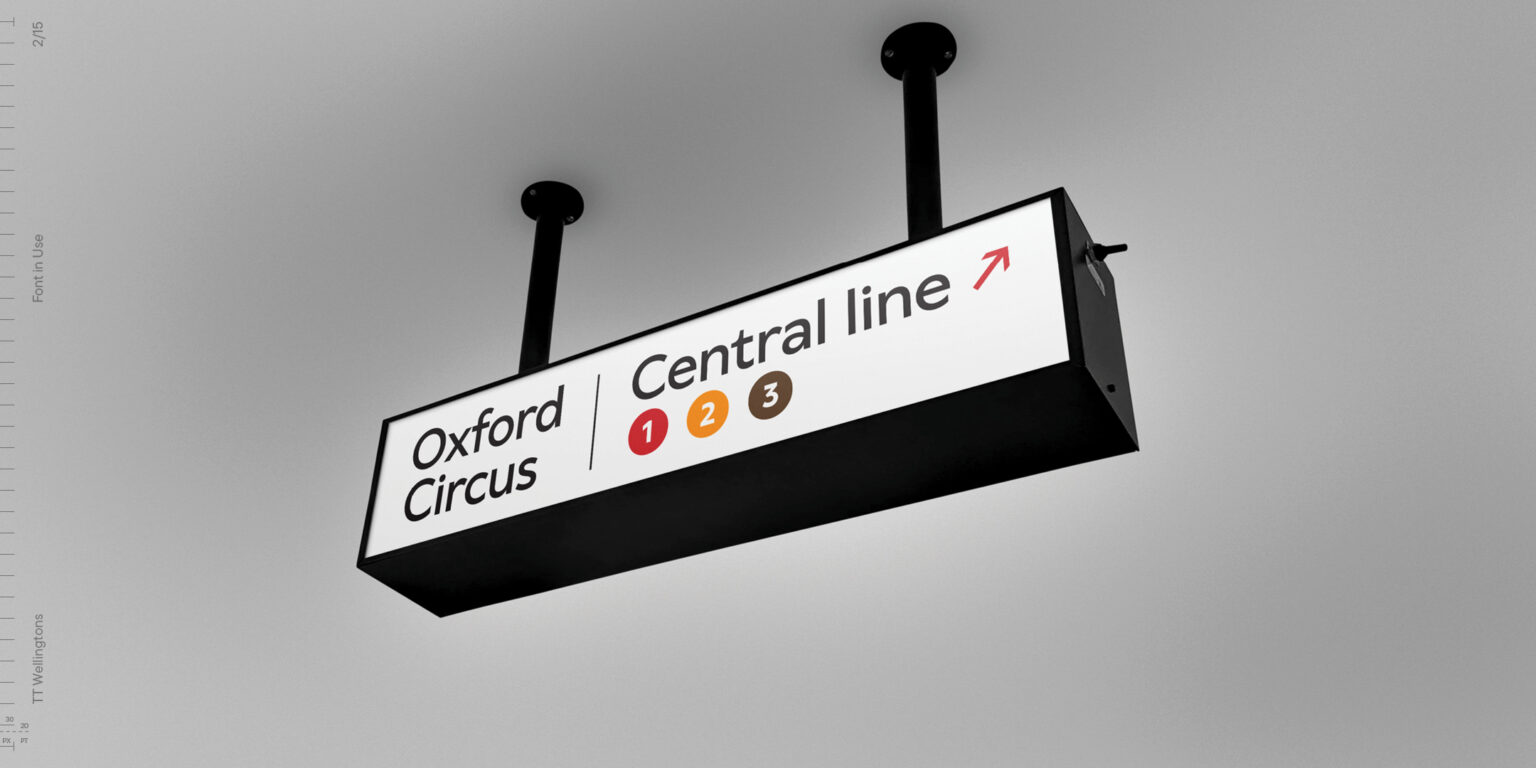
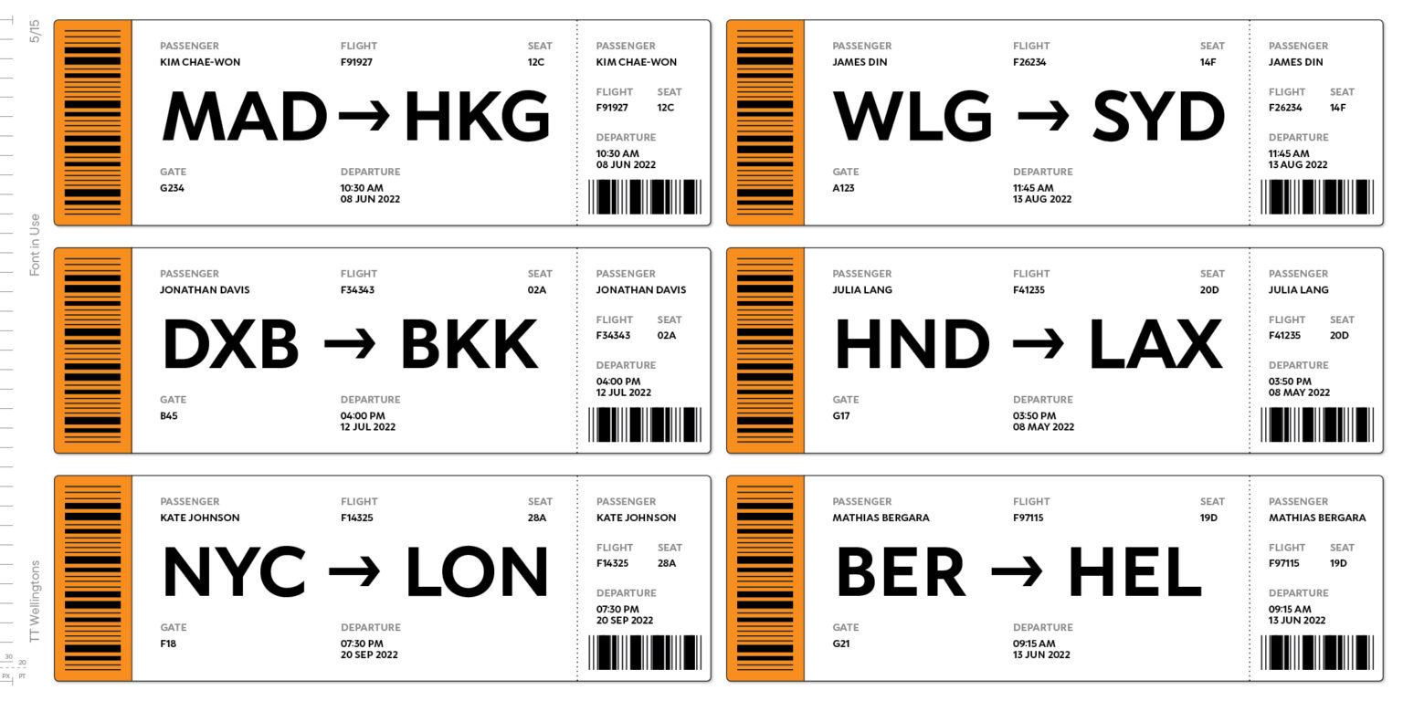
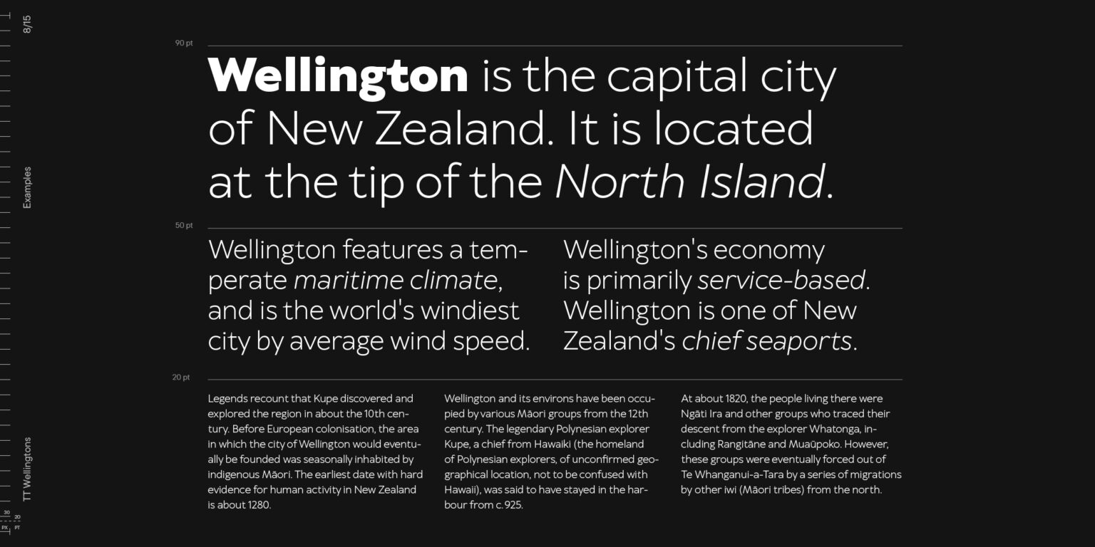
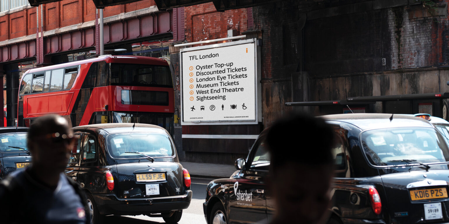
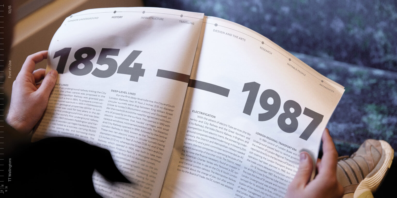
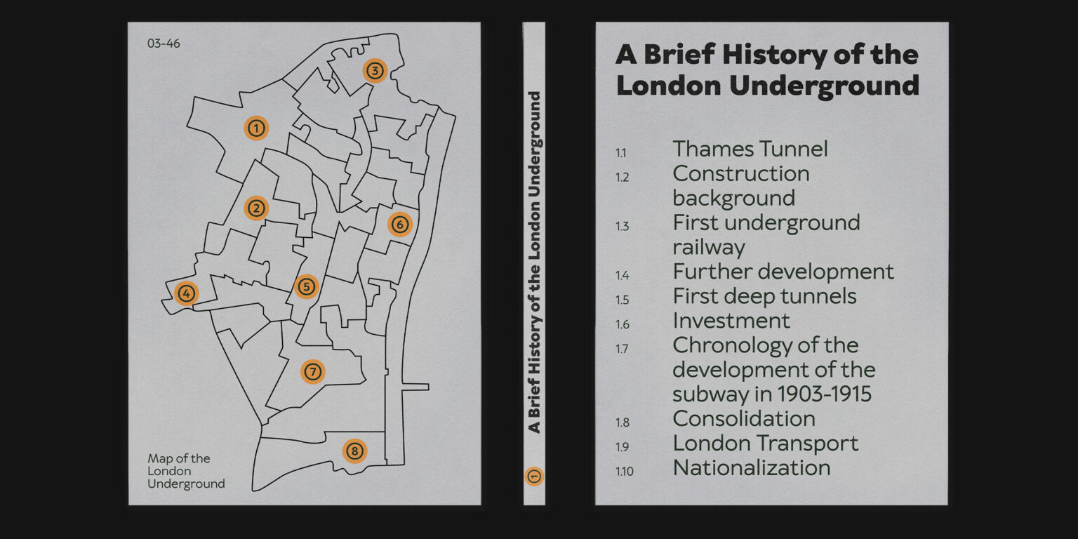
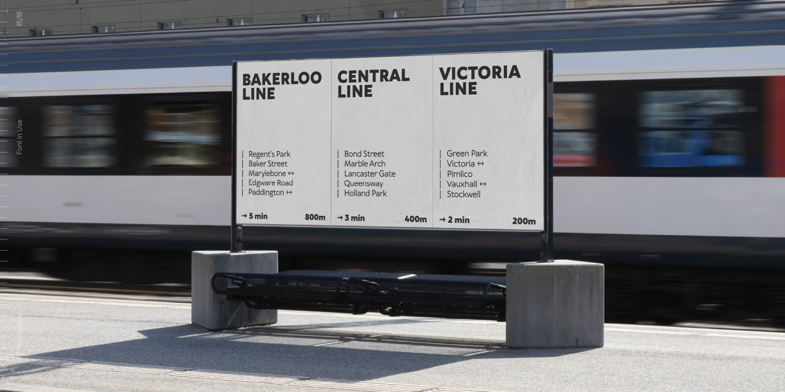
The new TT Wellingtons is convenient and looks fantastic everywhere you need the aesthetic feel: in headings and blocks of text, in the web industry and printing materials, in movies, videos, and signage.

Team

Marina Khodak
Anna Tikhonova
Anastasia Pogorelova
Anastasia Vrublevskaya
+ TypeType Team

Release and update date

Release: 9 January, 2018

Last update: 8 August, 2023

Additionally

Specimen

Download font specimen (pdf)

Poster Images

Graphic presentation at Behance

Custom version

Looking for a custom version of this font?

+ extended writing system Show all

Character Set

Basic Latin Basic Cyrillic Extended Latin Stylistic Alternates, Standard and Discretionary Ligatures|salt,liga,dlig Lining Figures, Currencies Old-style Figures|onum Punctuation, Symbols, Mathematical Symbols, Arrows
A B C D E F G H I J K L M N O P Q R S T U V W X Y Z a b c d e f g h i j k l m n o p q r s t u v w x y z
А Б В Г Д Е Ё Ж З И Й К Л М Н О П Р С Т У Ф Х Ц Ч Ш Щ Ъ Ы Ь Э Ю Я Ѓ Ґ Ќ Є Ї Љ Њ Ћ Ђ Ў Џ а б в г д е ё ж з и й к л м н о п р с т у ф х ц ч ш щ ъ ы ь э ю я ѓ ґ ќ є ї љ њ ћ ђ ў џ
À Á Ă Â Ä Ā Å Ã Ą Æ Ć Č Ĉ Ç Ď Đ È É Ě Ë Ė Ê Ē Ę Ğ Ģ Ķ Ĺ Ľ Ļ Ł Ì Í Î Ï İ Ī Į Ń Ň Ņ Ñ Ò Ó Ô Ö Ő Ō Õ Œ Ø Þ Ŕ Ř Ŗ Ś Š Ș Ş Ť Ţ Ý Ÿ Ù Ú Û Ü Ū Ű Ů Ų Ź Ž Ż à á ă â ä ā å ã ą æ ć č ĉ ç ď đ è é ě ë ė ê ē ę ğ ģ ķ ĺ ľ ļ ł ì í î ï i ī į ń ň ņ ñ ò ó ô ö ő ō õ œ ø þ ŕ ř ŗ ś š ș ş ť ţ ý ÿ ù ú û ü ū ű ů ų ź ž ż
a ą ă ā à á â ã ä å æ a а g ğ ģ l ĺ ļ ľ ł fl ffl y ý ÿ у ў fb ff fh fi fj fk fl ft ffb fff ffh ffi ffj ffk ffl ct ch ck st sh sk
0 1 2 3 4 5 6 7 8 9 $ ¢ ¤ ¥ £ ƒ
0 1 2 3 4 5 6 7 8 9
! ¡ ? ¿ « » . , : ; ... | ¦ - _ / ( ) [ ] { } · * # % § © ® @ & ° ^ - + < > = ~ ¬ ± × ÷

OpenType features

Curved legs

R Ŕ

R Ŕ

Alternative M

M Ḿ

M Ḿ

Circled Figures

1 2 3

1 2 3

Ligatures

fl ffb

fl ffb

Oldstyle Figures

H123

H123

case | Case Sensitive Forms

({[H]})

({[H]})

Ideal font pairs with TT Wellingtons

What is a font pair, and what does it serve for?

A font pair is a combination of two fonts within one text block. Most often, one of the fonts in a pair is a more expressive headline font, and the other one serves to communicate information. Such fonts complement each other and help designers solve various tasks, like highlighting key elements, adding emotional expressiveness to the project, or separating semantic blocks.

How to choose fonts for a project: Several general recommendations

To begin with, establish the project's tone. Choose the fonts that stylistically match the main idea. After that, you need to determine the functions of each font in the project and their hierarchy: which font will complement the design and which one will serve to attract attention as the main element. You need to assess the difference between the fonts and decide what kind of information each of them should convey. First, we recommend choosing the base font you will use most, and then you can find a suitable pair for it.

Core principles of font pairing and recommendations from designers

The main rule you should follow when matching two fonts is that both similarities and differences must be visible between them. You can highlight the coherence of fonts by the following characteristics: contrast, proportions, width, openness of characters, individual letter shapes, and overall tone. Feel free to experiment with different combinations. We also recommend analyzing the projects you like: this way, you can enhance your visual skills, elevate your knowledge base, and gain confidence in dealing with typography.

Similar fonts

29 font styles
19 font styles
37 font styles
Buy font