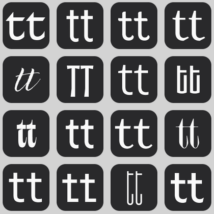
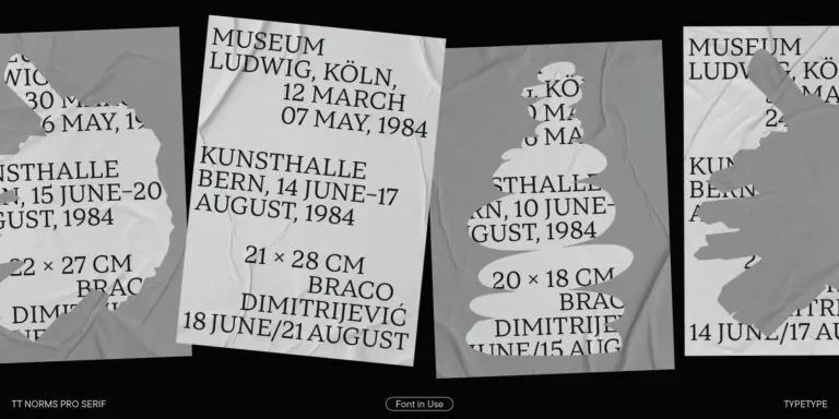
Working with a curated font library can make both selection and long-term project management more predictable. Instead of collecting typefaces from unrelated sources, designers and brand teams can explore families produced within one studio, compare them through the same tools, and work with a consistent licensing system.
This becomes especially useful when a project expands. An identity may begin with a website and packaging but later require presentations, advertising, interfaces, publications, or additional languages. Having one reliable source can reduce the time spent searching for compatible solutions.
Free repositories remain useful for experimentation, but character sets, technical quality, available styles, and licensing conditions can differ significantly between individual downloads. A professionally maintained collection gives teams a clearer foundation when typography needs to move from an early concept into commercial production.
What Sets a Professional Typeface Collection Apart
A professional collection is more than a large font database. Its value lies in the depth of individual families: carefully designed character sets, spacing and kerning, technical production, language coverage, and features intended for real design workflows.
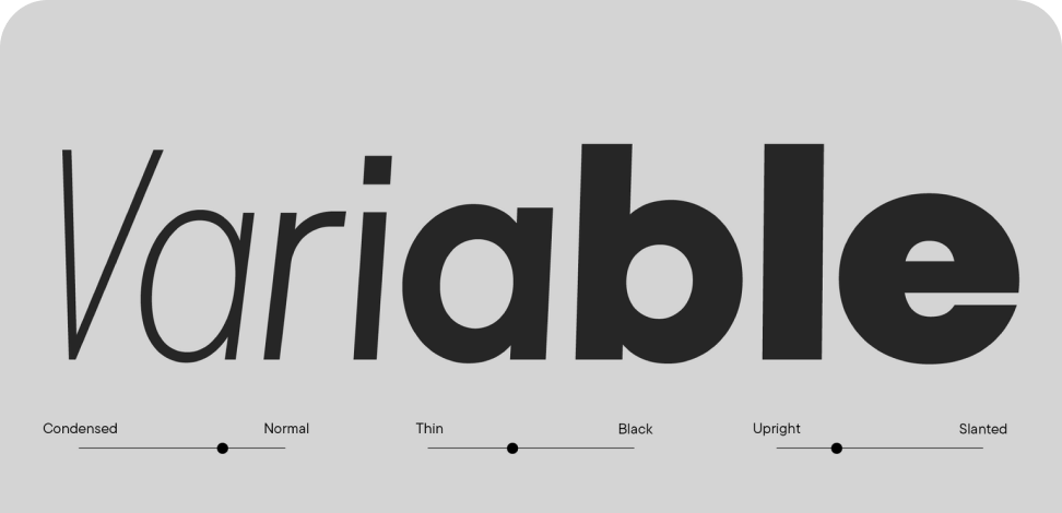
Depending on the family, this may include numerous weights and widths, variable versions, stylistic alternates, ligatures, different figure styles, fractions, small caps, and language-specific forms. The exact OpenType functionality varies between TypeType families.
Multilingual support is another important consideration. TypeType states that most of its collection includes extended Latin and Cyrillic alphabets and localization features, although the exact coverage differs by family.
These details become especially important once a project expands beyond a single layout. A well-developed type system should remain useful across different formats, languages, content types, and stages of production.
How to Choose the Right Typeface Style for Your Project
A large font catalogue is easier to navigate when you start with the project requirements rather than a visual category.
First, define the tone. A restrained sans serif can provide a flexible foundation for an interface or brand system, while a distinctive serif or display design may be more appropriate when typography needs to carry a stronger personality.
Then consider function. Interface text should remain clear at compact sizes; editorial typography has to work comfortably across longer passages; packaging and campaigns can allow more expressive forms. If one family will serve several roles, check its available weights, widths, italics, and variable options.
For multilingual work, verify the exact languages and scripts required. Licensing should also be considered before production because websites, applications, logos, print materials, video, and other uses may require different permissions.
Finally, test real headlines, paragraphs, UI labels, and brand names rather than relying only on specimen text.
Inside the TypeType Catalogue: All Families at a Glance
The current TypeType fonts catalogue contains 76 families across overlapping categories, including 49 sans serifs, 27 serifs, 6 slab serifs, 42 display families, 9 scripts, and 47 variable families.
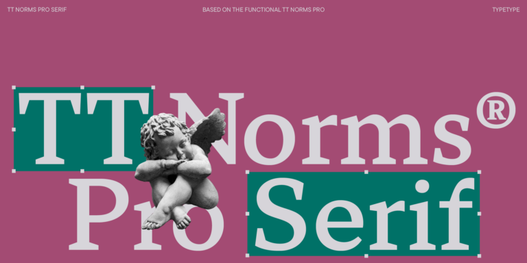
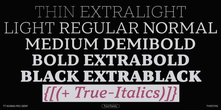
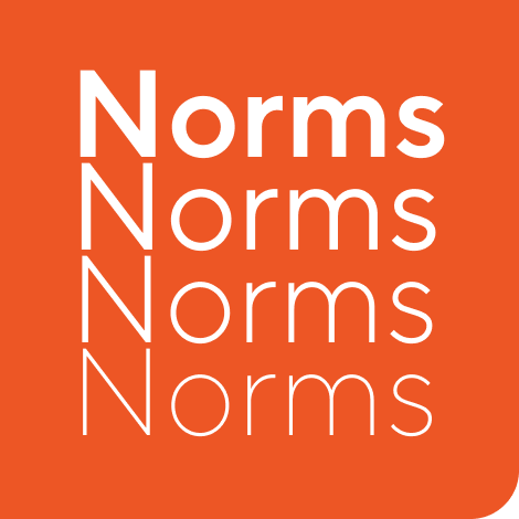
For broad identity systems, TT Norms® Pro and TT Commons™ Pro each offer 104 styles. TT Commons™ Pro currently includes five subfamilies—Normal, Condensed, Compact, Expanded, and Mono—plus variable styles, giving designers considerable flexibility within one system.
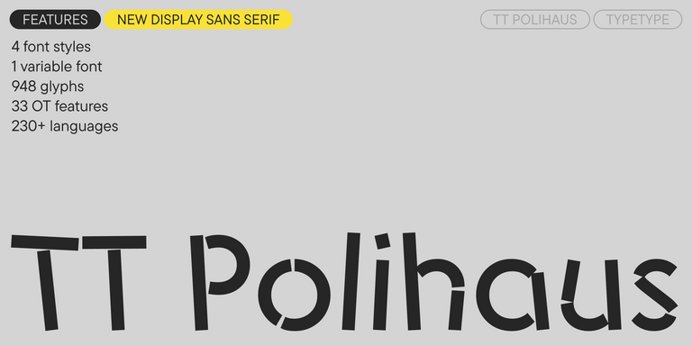
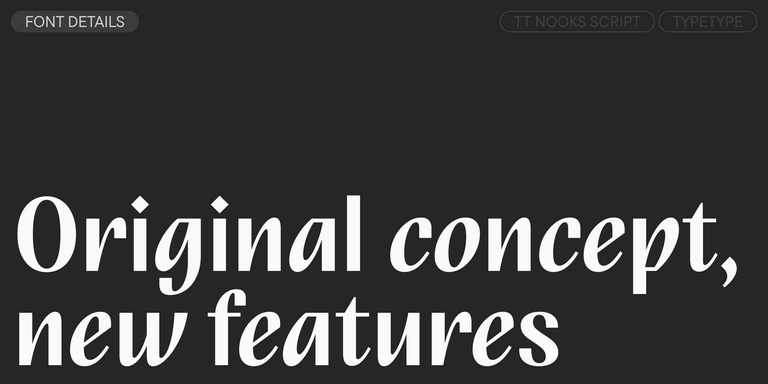
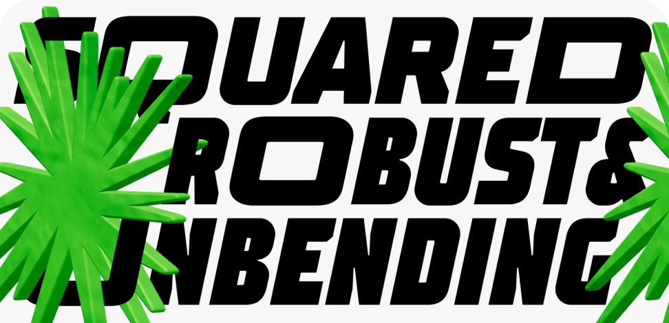
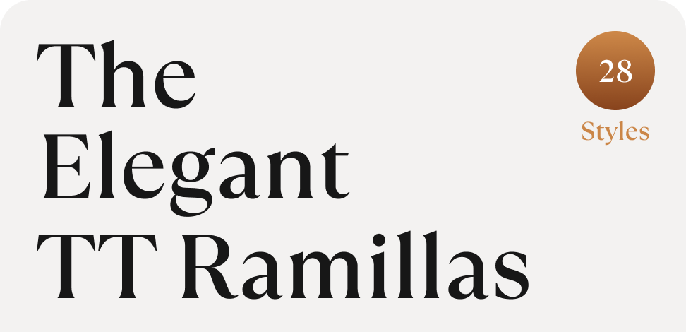
TT Interphases Pro is a more interface-oriented option and currently includes 43 styles and three variable versions. For editorial and expressive applications, TT Ramillas offers text, decorative, initials, and variable styles, while TT Trailers is an experimental display sans serif designed for high-impact typography.
The collection therefore ranges from functional workhorses to highly distinctive display designs rather than following a single visual direction.
Licensing TT Typefaces for Commercial and Digital Use
When you browse fonts for a commercial project, the required license depends on how the typeface will actually be used.
TypeType’s Desktop License covers installation on licensed computers and uses such as printed materials, stationery, merchandise, and static graphic images for websites and social media. A separate Logo License is required for using the typeface in a logo in public spaces.
The Webfont License covers headings and text displayed on websites and is priced according to monthly pageviews. The App License covers embedding in mobile applications, including mobile games. TypeType also offers separate licenses for eBooks, publishing, servers, digital advertising, video and broadcasting, videogames, and other scenarios.
For projects spanning several channels, it is useful to identify all planned uses before purchase and check the current licensing page for the appropriate combination.
Latin and Cyrillic Coverage Across the Collection
When comparing all fonts for an international project, language coverage deserves the same attention as visual style. TypeType states that most families in its collection include extended Latin and Cyrillic alphabets together with localization features. Coverage is not identical across every product, so it should always be checked on the individual family page.
Large systems can extend considerably further. TT Norms® Pro currently supports more than 290 languages, while the updated TT Commons™ Pro supports more than 295 languages and includes Arabic- and Georgian-based languages in addition to its broader character set.
For multilingual brands, the practical goal is not simply to find a required script. Teams should verify the specific languages, regional characters, localization features, and consistency needed for the markets where the type system will actually be used.
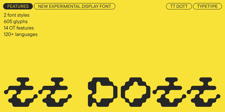
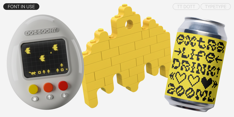
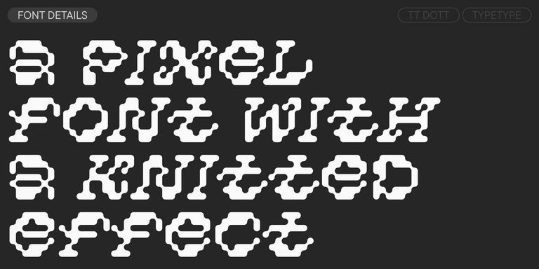
TT Dott is an experimental pixel grotesque where a circle is used as the base for the pixel. It is a fluid and unusual display font, evoking associations with embroidery and techno parties all at once.
TT Norms® Pro is a typographic legend embraced by world-renowned brands. Evolved through multiple iterations, it has conquered MyFonts and redefined typographic versatility. A design workhorse that transforms from a humble tool to an essential creative companion.
TT Commons™ Pro is the studio’s typographic powerhouse. A font so versatile it defies categorization, seamlessly bridging style and function. For designers seeking a universal foundation that elevates every project, this is the definitive choice.
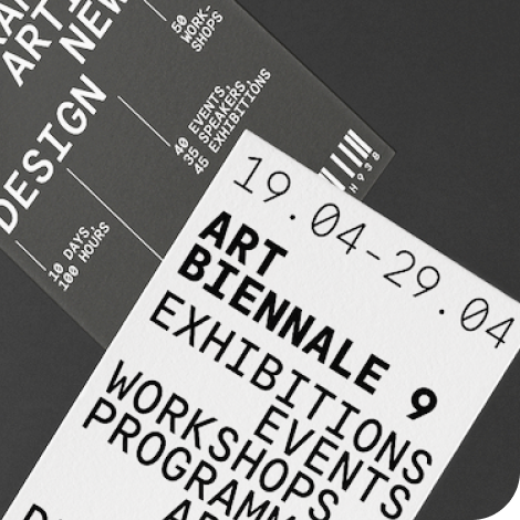
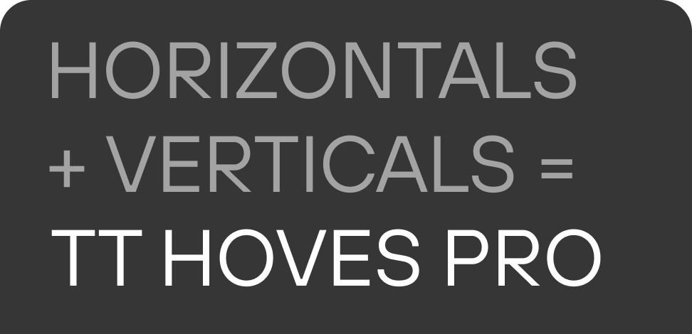
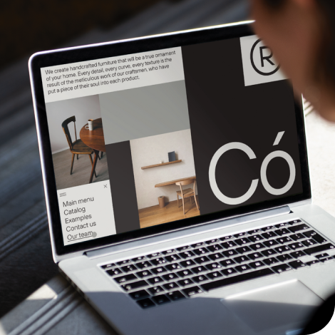
TT Hoves Pro is a Scandinavian sans serif that whispers minimalist elegance. Simultaneously understated and distinctive, it’s a designer’s secret weapon that transforms complex challenges into visual poetry with effortless precision.
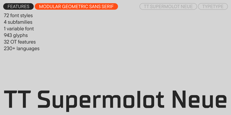
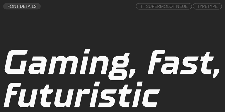
TT Supermolot Neue is a game-changer in visual communication! An advanced, modular sans serif that captures the pulse of technological innovation, bringing electrifying vision to everything from immersive game interfaces to bold visual narratives.
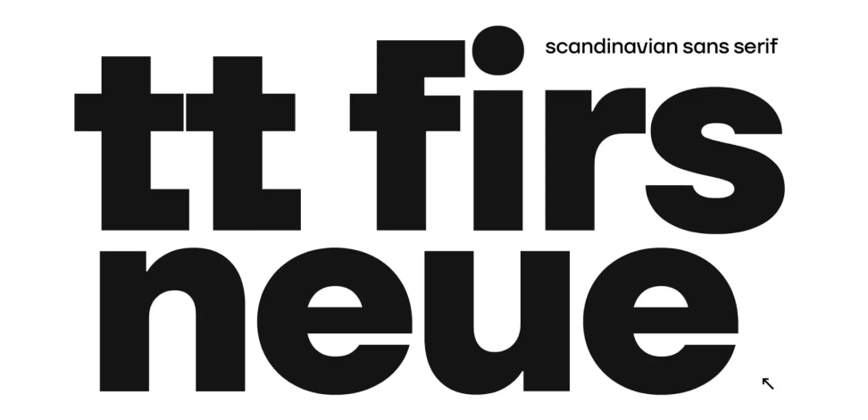
TT Firs Neue is a balanced sans serif infused with Scandinavian design philosophy. Elegant and versatile, polished through two deliberate revisions to achieve typographic perfection.
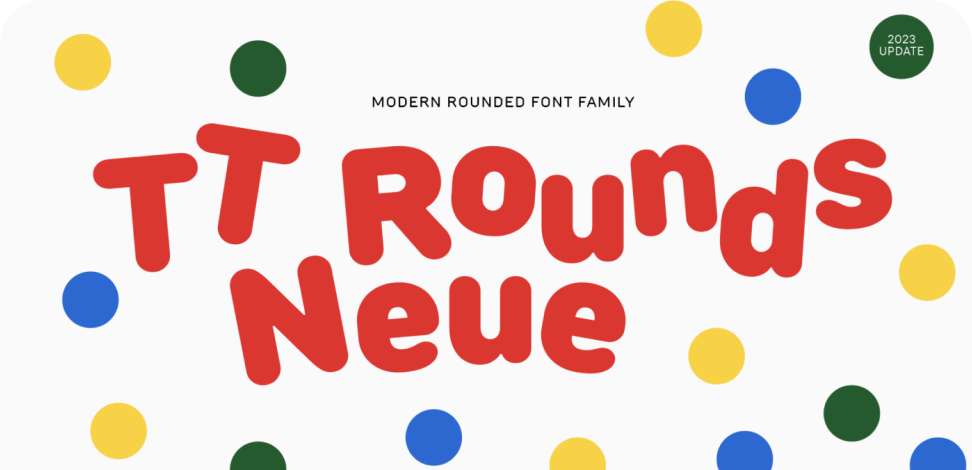
TT Rounds Neue is a soft and friendly font that knows how to be different. In lighter font styles it looks minimalist and neutral. The bold font styles make it puff up and achieve maximum roundness, exuding childlike charm.
TT Fors is a design Swiss Army knife of typography. This geometric sans serif delivers pure versatility through clean, refined proportions. It can be used for defining interfaces or crafting visual accents.
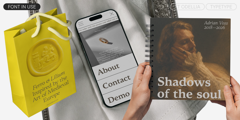
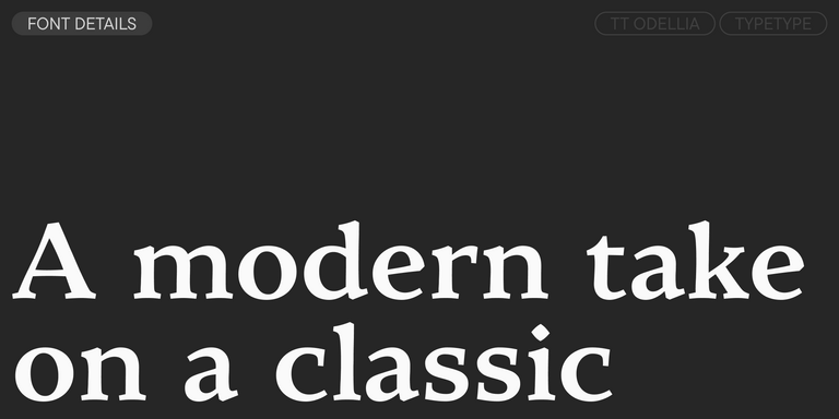
TT Ramillas is a stylish and contemporary serif that elevates design to an art form. Characterized by its unique decorative styles and initials with a floral ornament, it crafts visual experiences that are truly one-of-a-kind. Already adorning over 3000 websites globally, it’s a Modern Cyrillic award-winner that redefines typographic sophistication.
from $43.99Original price was: $43.99.$30.79Current price is: $30.79.
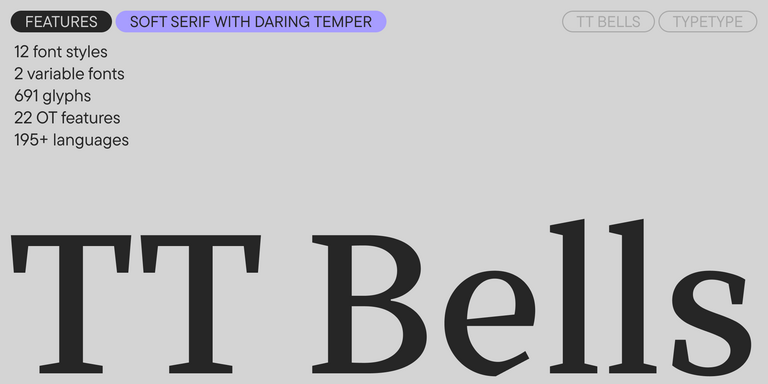
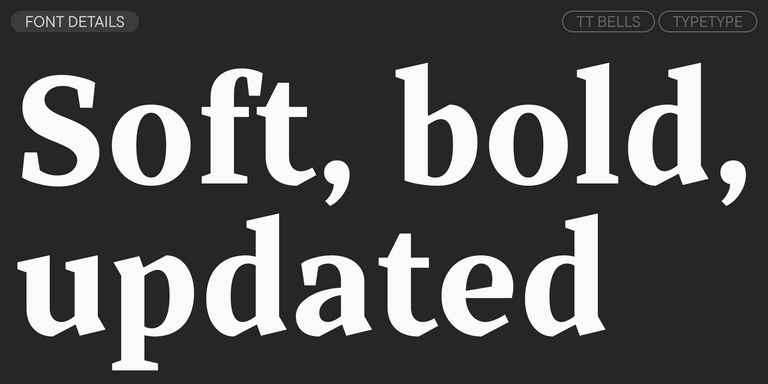
TT Bells combines the elegant softness of Antiqua with a complex and daring temper reflected in straight stroke terminals and arrowheaded serifs. The typeface is based on the broad nib, which creates these hallmark terminals and serifs.
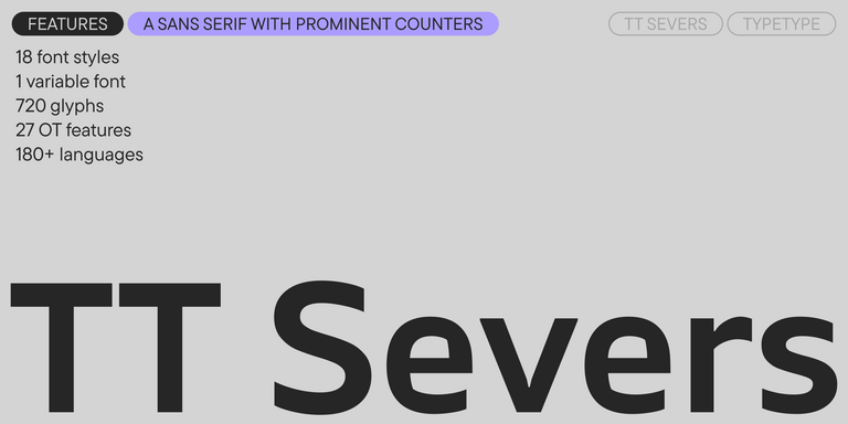
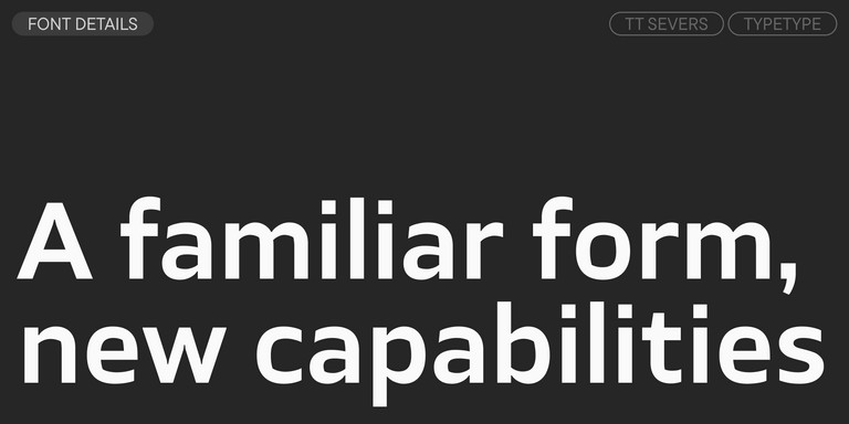
TT Severs is a geometric sans serif with emphasized elements of internal brackets. The main visual feature of TT Severs is the unusual form of internal ovals.
TT Turns is a striking geometric sans serif with expressive elements. This versatile font works exceptionally well for running text, while at large point sizes, it takes on a distinct display character.
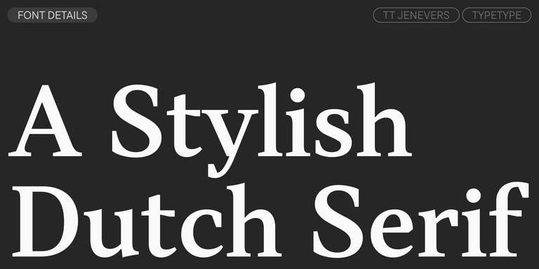
TT Jenevers is a modern serif with a Dutch flavor. The font family features the characteristic details peculiar to Dutch serifs—these are the asymmetrical shape of serifs and an irregular slant of ovals.
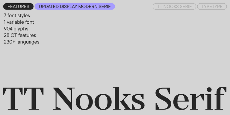
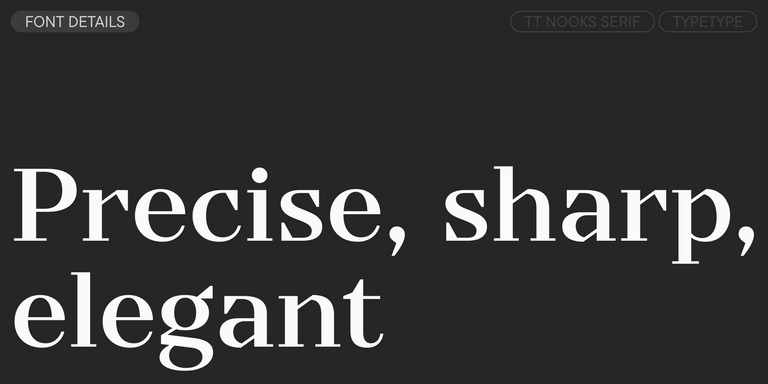
TT Regins is a Scottish modern serif. Striking contrast and sharp triangular serifs give this font a stern and commanding character, while refined forms, enlarged lowercase letters, and slightly condensed, static proportions add grace to its design.
TT FRANTZ IS AN EXPERIMENTAL VARIABLE FONT, DISTINGUISHED BY ITS SLIMNESS AND LIGHTNESS. THE VARIATION IN THE FONT AFFECTS THE CHANGE IN THE HEIGHT OF THE MEAN LINE—BY MOVING THE AXIS ADJUSTMENT SLIDER YOU CAN EASILY RAISE OR LOWER THE MEAN LINE OF THE FONT.
FAQ
What Makes a Professional Font Collection Stand Out?
A professional collection combines design quality with reliable production, useful character sets, language coverage, spacing, and clearly defined licensing. Every font has its own feature set, while larger families may include variable versions and extensive OpenType functionality. TypeType also states that most of its collection includes extended Latin and Cyrillic coverage with localization features.
Which TT Typefaces Are Closest to Popular System Fonts?
If you are comparing all text fonts rather than expressive display designs, versatile sans serifs such as TT Norms® Pro and TT Commons™ Pro occupy a similar functional space to familiar system families. They add their own proportions, extensive style systems, multilingual coverage, and OpenType functionality. There is no meaningful equivalent to every font ever, so comparison should focus on the requirements of the project.
Are TT Typefaces Suitable for Brand Identity Projects?
Yes. The TypeType font collection includes both restrained families for large visual systems and expressive designs for more distinctive communication. TT Norms® Pro and TT Commons™ Pro offer extensive style ranges, while families such as TT Trailers provide a much stronger display character. The appropriate choice depends on how typography needs to work across the complete identity.
Can I Use TypeType Typefaces in Commercial Projects?
TypeType offers TT fonts under licenses for different commercial applications. Desktop covers print, stationery, merchandise, and static graphics; Logo is a separate license for logo use; Webfont covers websites; and App covers mobile applications. Separate options are also available for eBooks, publishing, servers, digital ads, video and broadcasting, videogames, and other uses.
How Do I Browse and Test Typefaces Before Buying?
You can explore all typefaces in the TypeType tester, enter your own text, compare options, and adjust styles before choosing. Trial files can also be downloaded for use in test layouts. They contain the same character sets, language support, kerning, OpenType features, and hinting as commercial versions but cannot be used in completed projects. Use the test fonts online tool before licensing.
Do TypeType Typefaces Support Cyrillic and Multilingual Text?
Most of the current font set includes extended Latin and Cyrillic, but exact language coverage varies by family. Some large systems go considerably further: TT Norms® Pro supports more than 290 languages, and TT Commons™ Pro supports more than 295. For multilingual projects, always verify the required scripts, languages, and localization features on the individual product page.
Enter your email address and spin the sun to win up to 100% off or TypeType services
Giveaway rules:
Each user can only play once;
Each promo code is unique and can only be used once;
The promo code discount applies only to purchases up to $5,000 in the online store;
Please note that the "Font Renaming," "Your Logo in a Font," and "Basic Customization" services do not apply to previously purchased fonts and are only available for new orders;
If you win a service, our manager will contact you within three business days with the details.