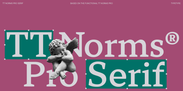
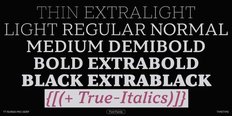
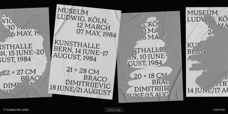
We continue to expand the line of the studio's main bestseller TT Norms® Pro!
Advertising Fonts
Advertising fonts shape the way audiences perceive a brand, product, or message. The right typeface creates immediate visual impact, supports recognition across touchpoints, and helps communication feel consistent and intentional. Explore TypeType’s collection of typefaces crafted for use in campaigns, branding, digital media, and print advertising.
- All fonts 76
- Sans Serif 49
- Serif 27
- Slab Serif 6
- Display 42
- Script 9
- Variable 47
- Font sale 15
What Makes a Typeface Effective in Advertising?
Advertising typography has to communicate quickly. Whether someone sees a billboard for several seconds or scrolls past a sponsored post on a phone, the message needs to be clear enough to understand and distinctive enough to remember. This makes readability, character, and visual hierarchy equally important.
When choosing fonts for advertising, designers often look at how well a typeface performs at different sizes, how clearly its characters can be distinguished, and whether its personality supports the brand. A strong headline style may create an immediate focal point, while a more restrained family can keep product details, prices, or calls to action easy to scan.
Typography also shapes first impressions. Rounded forms may feel approachable, precise geometry can suggest technology or efficiency, and expressive details can make a campaign feel more distinctive. The right solution supports the message rather than competing with it.
Advertising Fonts for Different Campaign Goals
The right typographic approach depends on what a campaign needs people to notice, feel, and do.
Sales-focused communication usually benefits from a strong hierarchy. Headlines, offers, prices, and calls to action should be easy to distinguish quickly. A product launch may require more distinctive lettering to establish a recognizable visual identity, while an image campaign can give typography a more expressive role in building mood and brand perception.
Social media creates another set of priorities. Text often appears for only a moment and on relatively small screens, so clarity matters even when the visual direction is bold.
This is why there is no single category of fonts for advertising that works for every campaign. Some projects require an attention-grabbing display face; others need a flexible family capable of handling headlines, captions, product information, and multiple formats while maintaining one consistent visual language.
Best Fonts for Ads: From Print to Digital
Different media create very different conditions for reading. The best fonts for ads are therefore the ones that fit both the creative idea and the environment in which the message will appear.
Outdoor advertising is viewed from a distance and often in motion, making strong proportions and immediate recognition especially important. Print materials allow more detail because readers can spend longer with the composition. Social posts and display banners require clear lettering at small sizes and layouts that remain effective across different screen dimensions.
Email campaigns need dependable hierarchy for headings, offers, and supporting copy, while video introduces movement, timing, and changing backgrounds. A title that works perfectly on a static poster may need different spacing, weight, or scale when animated.
Rather than evaluating a typeface only in a specimen, designers should test it in the actual format and at realistic viewing sizes.
How to Choose the Right Typeface for Your Campaign
Start with the audience and the communication goal. A campaign for a financial service, fashion label, technology product, or children’s brand may require completely different levels of neutrality, authority, energy, or expression.
The best fonts for advertising also need enough flexibility for the campaign system. Check the available weights and styles if typography will appear across headlines, supporting copy, promotional graphics, banners, and social content. For international campaigns, confirm that all required languages are supported.
Readability should be evaluated at the smallest and largest expected sizes, particularly when one campaign has to adapt from mobile screens to outdoor media. Licensing is another practical consideration: the usage rights need to cover the formats in which the campaign will run.
Finally, test real copy in actual layouts. A design that looks compelling in isolation may behave very differently next to photography, product imagery, buttons, or motion graphics.
TypeType Collection — Typefaces Built for Advertising
TypeType’s collection includes advertising fonts with different levels of personality and versatility, allowing designers to choose according to the campaign rather than relying on one visual formula.
TT Norms® Pro is a practical option for systems that need a clean, adaptable typographic foundation across multiple materials. TT Hoves Pro combines versatility with a recognizable contemporary character, making it useful when a campaign needs both functional text and stronger headlines.
TT Fors offers a more distinctive geometric direction for modern branding and communication, while TT Interphases Pro is particularly suited to projects where digital readability and interface use are important alongside promotional graphics.
When comparing these families, consider not only individual headlines but the entire campaign ecosystem: landing pages, social media, banners, presentations, video, and supporting materials. Available styles, language coverage, and appropriate commercial licensing can all become important when one visual concept has to scale across channels and markets.
- The quick brown fox jumps over a lazy dog.
- Pack my box with five dozen liquor jugs.
- Sphinx of black quartz, judge my vow
- 0123456789 !?.,:;—–()[]{}<> “quotes” ‘apostrophe’ @#%&*_+=/\| № $ € £ ₽ +−×÷=≠≤≥ … % © ® ™
- Aa Bb Cc Dd Ee Ff Gg Hh Ii Jj Kk Ll Mm Nn Oo Pp Qq Rr Ss Tt Uu Vv Ww Xx Yy Zz
TT Livret is an elegant, modern and functional serif
TT Neoris is an elegant Neo-Grotesque with unlimited potential and a font that encompasses all modern requirements and user desires.
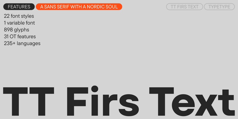
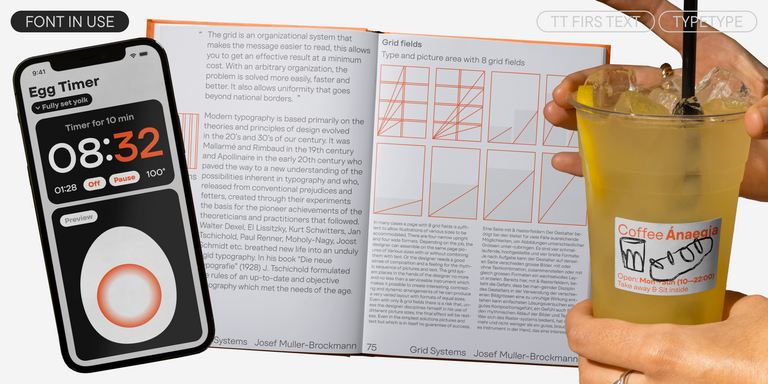
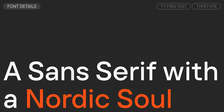
We have released a brand-new font. Meet TT Firs Text—a geometric sans serif with a Nordic character!
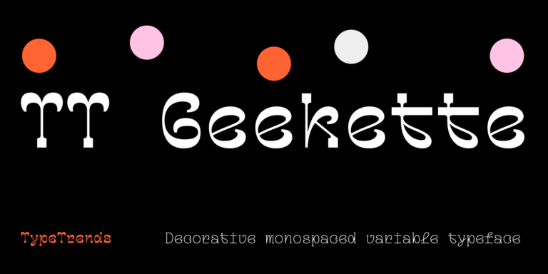
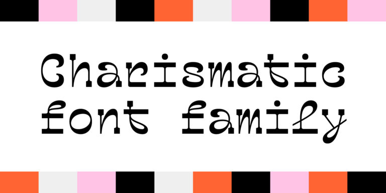
TT Geekette is an experimental variable serif with friendly and flexible character of shapes.
FAQ
What Are the Best Advertising Fonts for Brand Campaigns?
The best advertising fonts depend on the brand and the message. Geometric and neo-grotesque sans serifs can create a clean, contemporary impression, while contemporary serifs may feel more editorial or distinctive. Look for a balance of personality, readability, and flexibility across headlines, supporting text, digital formats, and larger campaign materials.
Which Typefaces Work Best for Digital Ads?
The best fonts for ads on screens remain clear at small sizes and across different devices. Good spacing, readable character shapes, appropriate web formats, and reliable screen rendering are especially important for banners, social media, and mobile placements. A visually expressive design can work well, but it should not make short messages or calls to action harder to understand.
What Makes a Typeface Suitable for Promotional Campaigns?
Fonts for advertising should attract attention while keeping the message easy to process. Useful qualities include clear hierarchy, distinctive but readable forms, multiple weights, and the ability to work alongside photography and brand graphics. The strongest choice supports the campaign’s visual tone without becoming so decorative that it overwhelms the information being communicated.
How Do I Pick the Right Font for a Specific Ad Format?
The best fonts for ads depend partly on viewing conditions. Billboards and posters can support large, expressive lettering, while banners and mobile placements usually require greater clarity at compact sizes. Video adds movement and changing backgrounds to the equation. Test the chosen typeface at its real dimensions and in the actual composition before finalizing the campaign.
Are These Typefaces Suitable for Brand Identity and Logo Design?
Many advertising fonts can also work effectively in identity systems, especially when they offer distinctive forms and a broad range of styles. For logo design, consider recognition and personality; for the wider identity, check whether the same family can remain consistent across packaging, websites, campaigns, presentations, and other brand touchpoints.
Can I Use These Typefaces in Commercial Advertising Projects?
TypeType families can be licensed for commercial projects, but the required license depends on how the typography is used. Desktop, Web, App, and Video & Broadcasting applications cover different scenarios. Before launching a campaign, identify every planned medium and choose the appropriate permissions rather than assuming one license automatically covers all advertising fonts usage.
What Is the Difference Between Fonts for Print and Digital Advertising?
Fonts for ads in print can take advantage of high resolution and, in some cases, finer details. Digital environments introduce changing screen sizes, pixel rendering, and responsive layouts, making clarity and screen performance especially important. The same family may work in both, but designers should test weight, size, spacing, and contrast separately for each medium.