top_banner_ttnormspro0426
TT Nooks Script
8 styles
Type foundryFonts & StylesScriptTT Nooks Script

TT Nooks Script

TT Nooks Script is an upright italic with references to the calligraphic tradition, built according to all the principles of broad-nib calligraphy. It has narrow proportions, high contrast, and an expressive character.

Valid until 18 Sept, 2026

Single style: from  Original price was: $43.99.Current price is: $30.79.
Full family: from  Original price was: $169.Current price is: $118.30. 8 styles

Buying Options

To purchase a font, first select the styles you need, then choose your licenses and proceed to checkout. To test the font in your project, download the free trial version.

Select at least one style before choosing licenses

To purchase a font, first select the styles you need, then choose your licenses and proceed to checkout. To test the font in your project, download the free trial version.

Valid until 18 Sept, 2026

Package offer:
per style $14.79
from  $118.30
8 styles
from  $118.30
from  $30.79
from  $30.79
from  $30.79
from  $30.79
from  $30.79
from  $30.79
from  $30.79
from  $111.30
Package offer:
per style $15.90
from  $111.30
7 styles
from  $111.30
from  $30.79
from  $30.79
from  $30.79
from  $30.79
from  $30.79
from  $30.79
from  $30.79
On request
Perpetual
On request
On request
Perpetual
On request
On request
On request
On request
On request
On request
On request
On request
Perpetual
On request
On request
Perpetual
On request
On request
Perpetual
On request
On request
Perpetual
On request
On request
On request
On request
On request

Valid until 18 Sept, 2026

Your order:
Nothing selected yet

Select styles first, then licenses.

Questions about the font or licensing?

Testers

TT Nooks Script
Size
Features
Turn on all

TT Nooks Script—an upright italic drawn with a broad nib

TT Nooks Script
Size
Features
Turn on all

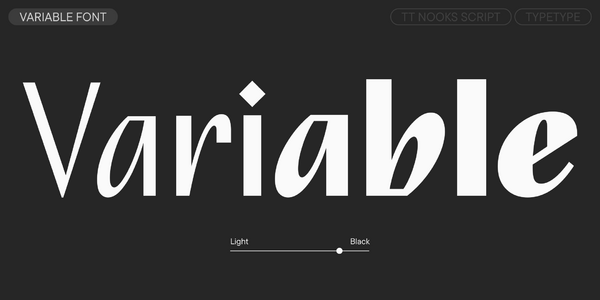
If TT Nooks Script were a person, it could be described as an elegant lady with an independent and firm character—refined, but with an inner core. The typeface is unique and has no direct analogs: it is an upright italic built according to all the classic principles of broad-nib calligraphy. The letterforms are based on natural calligraphic techniques: smooth transitions from thick to thin strokes, characteristic connections, and a unique line rhythm. The typeface originally came out in 2018 and included only 4 font styles. 8 years later, we have significantly transformed it: reimagined the letterforms and revised the propor- tions. For ease of use, we recalculated the thickness of all styles and added three new styles. At the same time, the overall impression and image of the font remained the same: TT Nooks Script is still authentic, noble, and easily recognizable. The typeface also received a variable version that allows you to smoothly adjust the stroke thickness across a wide range, as well as a completely new technical foundation.

TT Nooks Script
Size
Features
Turn on all

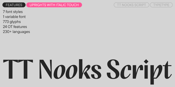
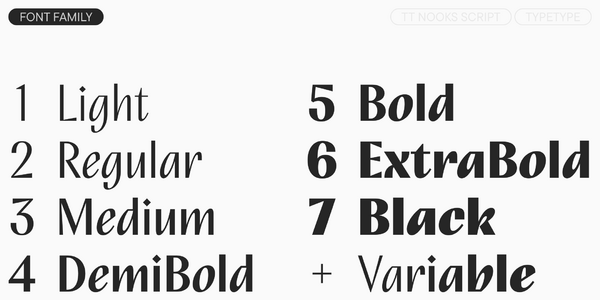
TT Nooks Script features 8 font styles, including a variable version.

TT Nooks Script
Size
Features
Turn on all

«Fashion fades, only style remains the same.» — Coco Chanel

TT Nooks Script
Size
Features
Turn on all
Variable axes
Weight

(OKAY) 15 backflips

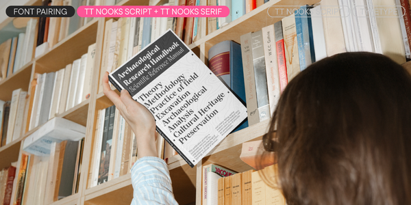
Ideal font pairs with TT Nooks Script

What is a font pair, and what does it serve for?

A font pair is a combination of two fonts within one text block. Most often, one of the fonts in a pair is a more expressive headline font, and the other one serves to communicate information. Such fonts complement each other and help designers solve various tasks, like highlighting key elements, adding emotional expressiveness to the project, or separating semantic blocks.

How to choose fonts for a project: Several general recommendations

To begin with, establish the project's tone. Choose the fonts that stylistically match the main idea. After that, you need to determine the functions of each font in the project and their hierarchy: which font will complement the design and which one will serve to attract attention as the main element. You need to assess the difference between the fonts and decide what kind of information each of them should convey. First, we recommend choosing the base font you will use most, and then you can find a suitable pair for it.

Core principles of font pairing and recommendations from designers

The main rule you should follow when matching two fonts is that both similarities and differences must be visible between them. You can highlight the coherence of fonts by the following characteristics: contrast, proportions, width, openness of characters, individual letter shapes, and overall tone. Feel free to experiment with different combinations. We also recommend analyzing the projects you like: this way, you can enhance your visual skills, elevate your knowledge base, and gain confidence in dealing with typography.

Description

About font family TT Nooks Script
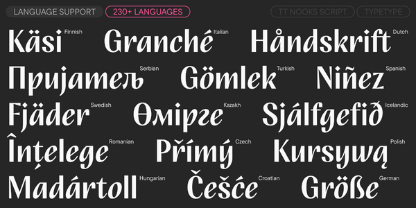
230+ Language support

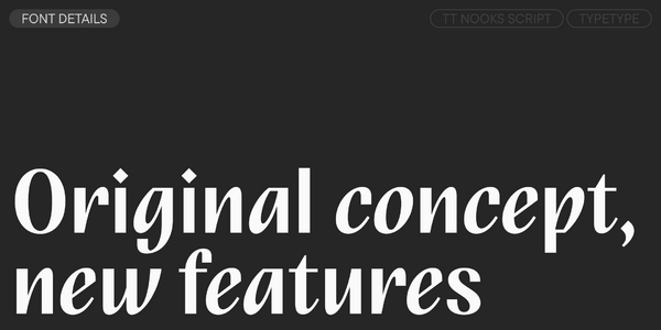
Meet TT Nooks Script version 2.000! We have significantly updated the font: reworked the letter graphics while keeping the original idea, expanded the character set, and added new features, alternate glyphs, and languages.

TT Nooks Script features a unique design that has no direct analogs. It is an upright italic with references to the calligraphic tradition, built according to all the principles of broad-nib calligraphy. It has narrow proportions, high contrast, and an expressive character.

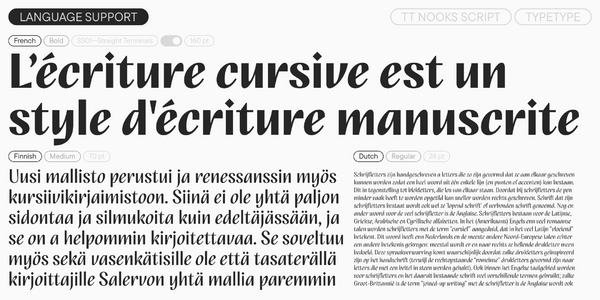
The uppercase characters look more static; they have a sharp character thanks to their pointed details. The lowercase forms are closer to a „classic“ italic: they look dynamic, yet soft and rounded. The text also looks different in Cyrillic and Latin: Cyrillic has more interesting details, while the Latin looks calmer. The mood also changes across the font styles: the thin styles reveal humanist traits and artifacts characteristic of the continuous movement of a broad nib. In the bold styles, the text becomes very dense, and the rhythm becomes dynamic.

Among the font’s distinguishing features are the unusual forms of its bowls and arcs. The terminals of several characters are very rounded and large. There are calligraphic forms. The diagonal strokes and crossbars are slightly „flared,“ which is especially noticeable in the uppercase characters. The punctuation and diacritics are large and diamond-shaped. All these details emphasize the unique design of TT Nooks Script, where calligraphic principles blend with design techniques.

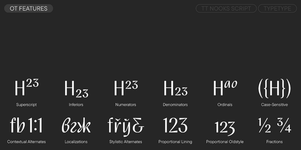
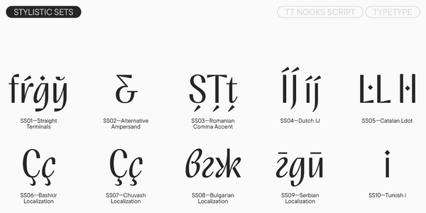
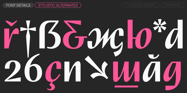
In the updated version, we added four new font styles, including a variable font, and seriously expanded the character set: we supplemented the extended Cyrillic and Latin, expanded the main set of currencies (added the bitcoin, lira, rupee, som, sum, tenge, tugrik, and won), and added fractions and service symbols. The typeface also received new OpenType features, languages, and stylistic sets (for example, one with straight terminals, which truly shine in the bold styles).

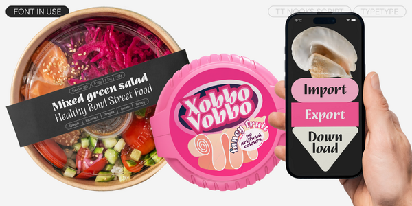
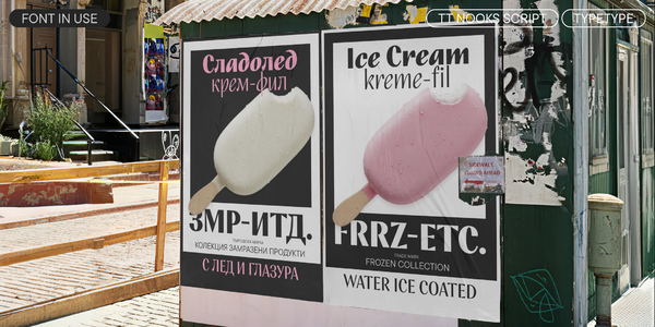
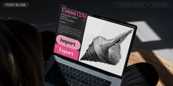
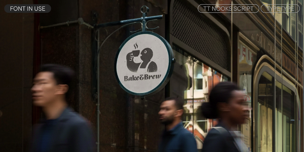
TT Nooks Script is a display font that reveals itself most vividly in large and medium sizes. It is suitable for various tasks: packaging design, book and magazine covers, posters and playbills, branding, and web use.

TT Nooks Script 2.000 includes:

  • 8 font styles: 7 upright ones and 1 variable font
  • 773 glyphs in each style
  • 24 OpenType features
  • 10 stylistic sets
  • Support for over 230 languages

Team

Anna Kondrashova
Antonina Samokhina
Vika Usmanova
Ivan Gladkikh
+ TypeType team

Release and update date

Release: 4 August, 2026

Last update: 4 August, 2026

What's changed in the font:
  • The number of font styles increased from 4 to 8, including a new variable font
  • The number of glyphs increased from 677 to 773: in particular, we supplemented the extended Cyrillic and Latin, expanded the main set of currencies (bitcoin, lira, rupee, som, sum, tenge, tugrik, won), and added fractions and service symbols
  • New stylistic sets were added—including ss01 with straight terminals, which truly shine in the bold styles
  • The number of OpenType features increased from 18 to 24
  • The number of languages increased from 155 to over 230

Additionally

Specimen

Download font specimen (pdf)

Custom version

Looking for a custom version of this font?

+ extended writing system Show all

Character Set

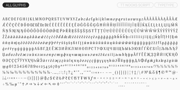
Basic Latin Basic Cyrillic Extended Latin Extended Cyrillic Fractions Proportional Lining Figures and Currencies Other Figures Punctuation and Symbols Math Symbols Arrows
A B C D E F G H I J K L M N O P Q R S T U V W X Y Z a b c d e f g h i j k l m n o p q r s t u v w x y z
А Б В Г Д Е Ё Ж З И Й К Л М Н О П Р С Т У Ф Х Ц Ч Ш Щ Ъ Ы Ь Э Ю Я Ѓ Ґ Ќ Є Ї Љ Њ Ћ Ђ Ў Џ а б в г д е ё ж з и й к л м н о п р с т у ф х ц ч ш щ ъ ы ь э ю я ѓ ґ ќ є ї љ њ ћ ђ ў џ
Á Ă Ǎ Â Ä À Ā Ą Å Ǻ Ã Æ Ǽ Ć Č Ç Ĉ Ċ Ð Ď Đ DZ Dz DŽ Dž É Ĕ Ě Ê Ë Ė È Ē Ę Ə Ǵ Ğ Ǧ Ĝ Ģ Ġ Ħ Ȟ Ĥ Í Ĭ Î Ï İ Ì Ī Ĩ Į IJ Ĵ Ķ Ĺ Ľ Ļ Ŀ Ł LJ Lj Ń Ň Ņ Ñ NJ Nj Ŋ Ó Ŏ Ô Ö Ò Ő Ō Õ Ø Ǿ Œ Þ Ŕ Ř Ŗ Ś Š Ş Ŝ Ș Ŧ Ť Ţ Ț Ú Ʉ Ŭ Ǔ Û Ü Ù Ű Ū Ų Ũ Ů Ŵ Ý Ŷ Ÿ Ȳ Ź Ž Ż á ă ǎ â ä à ā ą å ǻ ã æ ǽ ć č ç ĉ ċ ð ď đ dz dž é ĕ ě ê ë ė è ē ę ə ǵ ğ ǧ ĝ ģ ġ ħ ȟ ĥ ı í ĭ î ï i ì ī į ĩ ij ȷ ĵ ķ ĺ ľ ļ ŀ ł lj ḿ ń ň ņ ñ nj ŋ ó ŏ ô ö ò ő ō õ ø ǿ œ þ ŕ ř ŗ ś š ş ŝ ș ß ŧ ť ţ ț ú ʉ ŭ ǔ û ü ù ű ū ų ũ ů ŵ ý ŷ ÿ ȳ ź ž ż
Ӑ Ғ Ӗ Ѐ Җ Ҙ Ѝ Ӣ Ӏ Қ Ҡ Ң Ө Ә Ҫ Ӳ Ӯ Ү Ұ Ҳ Ҷ Һ ӑ ғ ѐ ӗ җ ҙ ѝ ӣ ӏ қ ҡ ң ө ә ҫ ӯ ӳ ү ұ ҳ ҷ һ
½ ¼ ¾
0 1 2 3 4 5 6 7 8 9 ¢ $ £ ¥ ƒ ¤
¹ ² ³
· . , : ; ! ¡ ? ¿ * ' " « » - _ ( ) [ ] { } | ¦ / \ # & § © ® @
+ < > = ~ ¬ ± × ÷ ^ ° % ª º

OpenType features

ss01 | Straight Terminals

f ġ ŗ ŷ

f ġ ŗ ŷ

ss02 | Alternative Ampersand

&

&

ss06 | Bashkir localization

Ғ ғ Ҙ ҙ Ҫ ҫ

Ғ ғ Ҙ ҙ Ҫ ҫ

ss07 | Chuvash localization

Ҫ ҫ

Ҫ ҫ

ss08 | Bulgarian localization

Д Л Ф ж з ю

Д Л Ф ж з ю

ss09 | Serbian localization

г д п т ш

г д п т ш

Show all

Similar fonts

8 font styles
8 font styles
2 font styles
Add licenses