Introducing the new TT Glips—a trendy typeface with a talent for misdirection!
TT Glips is an experimental typeface that came out of the TypeType Creative Lab. It began with two conditions the designer had to reconcile within the experiment: „mono“ and „rounded, soft forms“. The result is a monospaced sans serif with a handmade feel.
High contrast is one of the hallmarks of the design, a consequence of forms borrowed from italics. At small sizes, the monospaced proportions can make the typeface look mechanical and technological. That’s an illusion: as the size grows, rounded details and soft forms begin to come through, revealing the true Humanist nature of TT Glips.
Stylistic sets can transform the way the typeface looks—making it simpler and more geometric, or conversely more elegant; narrowing the space and the em-space of the punctuation marks, or enlarging those marks instead. We’ve also added old-style figures and some beautiful ligatures.
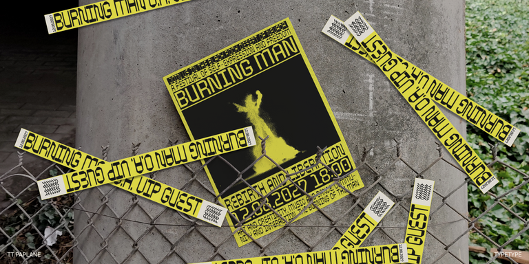
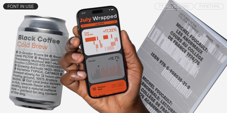
For all its unusual character, TT Glips is remarkably versatile. It works well in website and app interfaces, comes into its own on a poster for a rave, and would make an intriguing addition to the brand identity of an electronic instrument maker.
TT Glips includes:
- 1 font style
- 981 characters
- 28 OpenType features
- 230+ languages