top_banner_bees0926
TT Polihaus
5 styles
Type foundryFonts & StylesSans SerifTT Polihaus

TT Polihaus

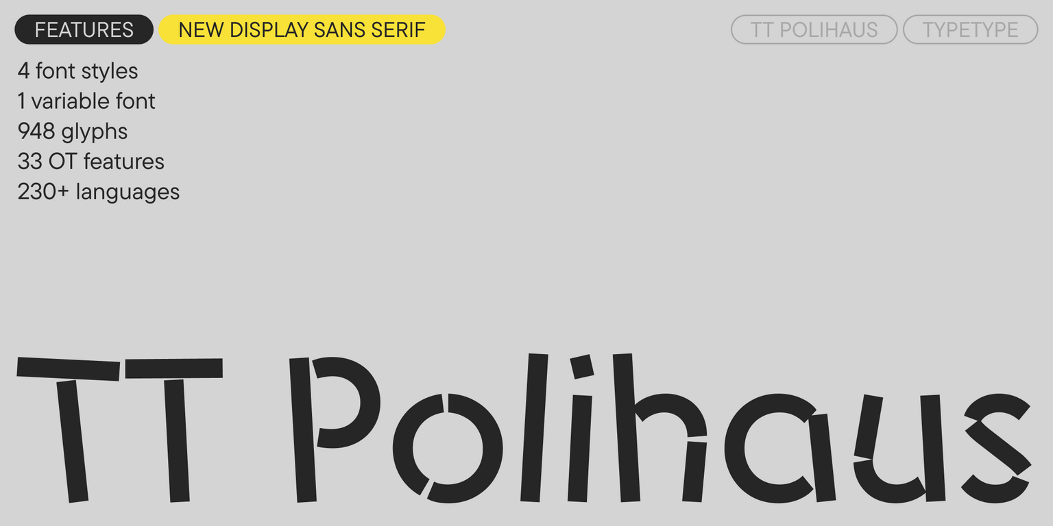
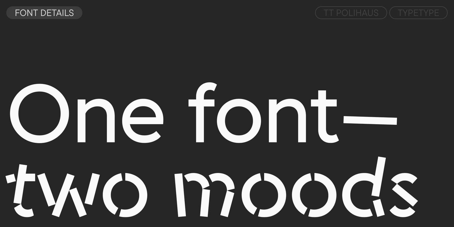
TT Polihaus is an experimental sans serif that, at first glance, looks ordinary, but then breaks apart, transforming into a stencil pattern.

Valid until 20 Nov, 2026

Single style: from  Original price was: $47.99.Current price is: $33.59.
Full family: from  Original price was: $129.Current price is: $90.30. 5 styles

Buying Options

To purchase a font, first select the styles you need, then choose your licenses and proceed to checkout. To test the font in your project, download the free trial version.

Select at least one style before choosing licenses

To purchase a font, first select the styles you need, then choose your licenses and proceed to checkout. To test the font in your project, download the free trial version.

Valid until 20 Nov, 2026

Package offer:
per style $18.06
from  $90.30
5 styles
from  $90.30
from  $33.59
from  $33.59
from  $33.59
from  $33.59
from  $83.30
Package offer:
per style $20.83
from  $83.30
4 styles
from  $83.30
from  $33.59
from  $33.59
from  $33.59
from  $33.59
On request
Perpetual
On request
On request
Perpetual
On request
On request
On request
On request
On request
On request
On request
On request
Perpetual
On request
On request
Perpetual
On request
On request
Perpetual
On request
On request
Perpetual
On request
On request
On request
On request
On request

Valid until 20 Nov, 2026

Your order:
Nothing selected yet

Select styles first, then licenses.

Questions about the font or licensing?

Testers

TT Polihaus
Size
Features
Turn on all

TT Polihaus—geometric, jittery, dual

TT Polihaus
Size
Features
Turn on all

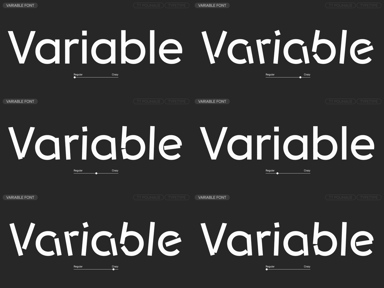
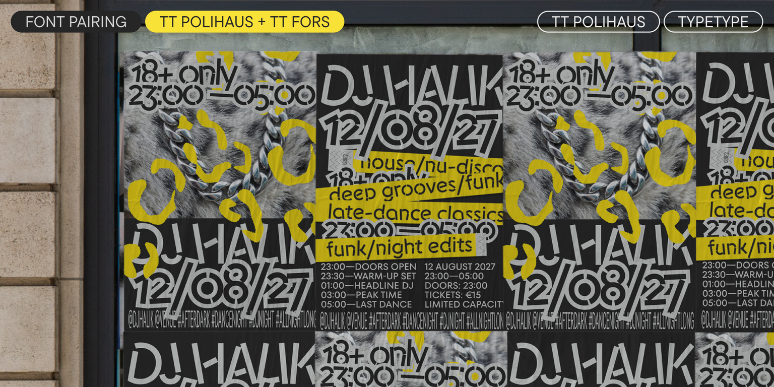
TT Polihaus emerged from TypeType's Creative Lab in 2026. During the draw, the designer was assigned "tilts in different directions" and "geometric"—a combination that threatened to create holes in the running text if inter- preted literally. The solution was not to turn the tilts into an italic, but to make them the core concept of the entire font. This is how a sans serif was born that, at first glance, looks ordinary, but then disassembles into rect- angles and semicircles, transforming into a stencil pattern. These two states—concentration and chaos—are connected by a slider that can be moved in either direction. It is ideal for rave parties, navigation in art spaces, energy drink packaging, and branding where duality is essential. The hardest part of the process was fitting the calm graphics of a sans serif and an almost unrecognizable, "crazy" display style into a single variable file so that the interpolation wouldn't break anywhere—especially on glyphs like ?, S, and 8. What saved the project was that both masters were developed in parallel from the very beginning. The result is a font with four font styles, from regular to crazy, and an alternate character set for words with repeating letters. This experiment boosted the designer's ability to find order within chaos—and vice versa.

TT Polihaus
Size
Features
Turn on all

In a closed system, entropy cannot decrease.

TT Polihaus
Size
Features
Turn on all
Variable axes
Display

Randomizer 67

Ideal font pairs with TT Polihaus

Creating Contrast Without Breaking Visual Harmony

Contrast helps two typefaces take on different roles, but the strongest combinations are rarely built on difference alone. Successful font combinations often share proportions, rhythm, stroke character, or overall mood while differing enough in weight, construction, or style to create hierarchy. This balance makes headlines, supporting text, and secondary information easier to distinguish. The goal is to create clear visual separation without making the composition feel fragmented, accidental, or inconsistent with the wider design system.

Pairing Serif and Sans Serif Typefaces

Combining serif and sans serif designs is a reliable way to create contrast across branding, editorial, and digital projects. Good typeface pairing still depends on more than category. Compare x-height, proportions, weight, spacing, and visual tone to make sure the two designs feel connected. The strongest combinations clearly separate headlines from supporting text while maintaining a coherent overall character. This approach also gives designers flexibility when building hierarchy across websites, publications, presentations, packaging, and other communication formats.

How Type Scale Strengthens a Typeface Pairing

Contrast does not have to come entirely from different letterforms. Scale, weight, spacing, and line height can significantly change how two typefaces interact. A large display treatment may carry the main message, while a calmer style supports body copy or secondary information. Before rejecting a combination, test several hierarchy settings—the same two designs can feel much more compatible once their roles are clearly established. Adjusting scale can also help preserve consistency when the project needs both expressive headlines and highly functional supporting text

Description

About font family TT Polihaus
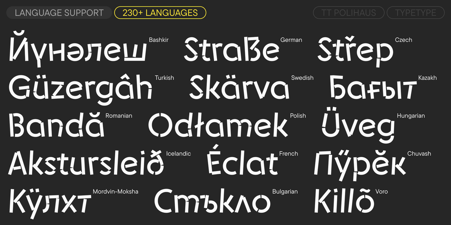
230+ Language support

Meet the new display font TT Polihaus—a geometric, chaotic, and slightly crazy font!

TT Polihaus is an experimental sans serif born in TypeType’s Creative Lab. „Geometric shapes“ and „multidirectional slants“ are the two principles the designer had to combine in one font for this experiment. As a result, the slant was not implemented as an italic, but became the core concept. This is how a sans serif was born that, at first glance, looks ordinary, but then „goes crazy“ and breaks apart, transforming into a stencil pattern.

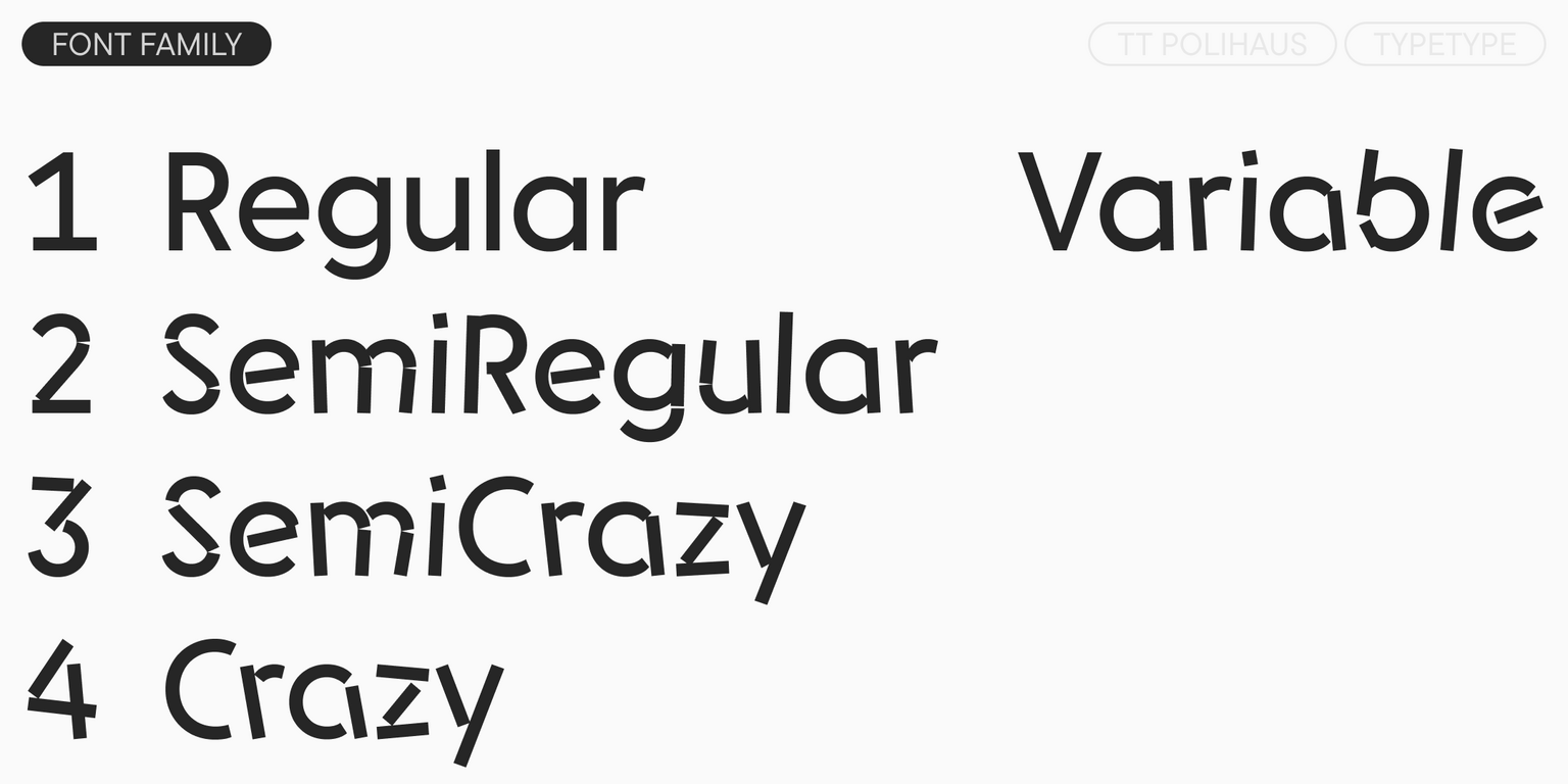
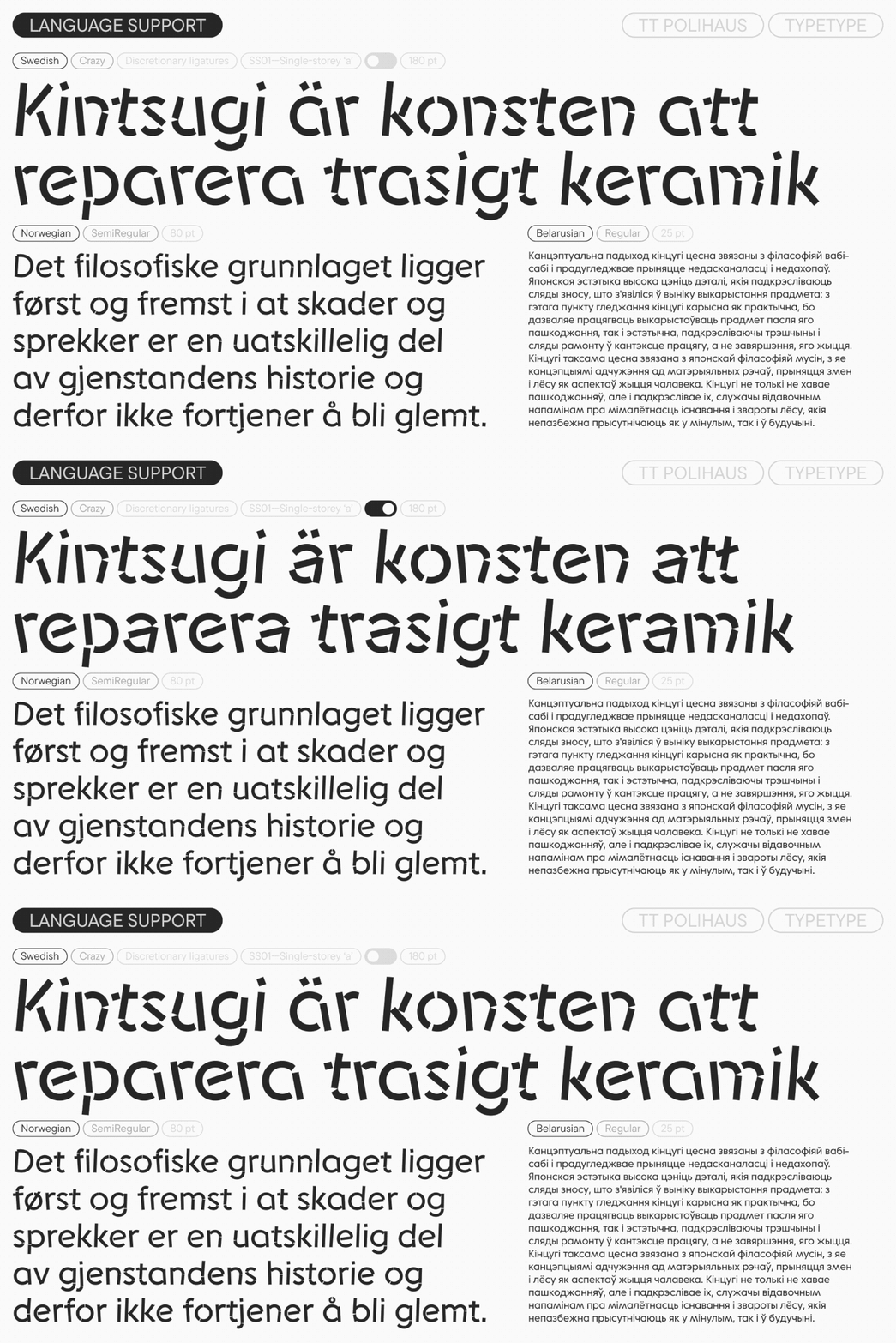
The typeface includes four styles reflecting all stages of the font’s madness: from a standard Regular, which perfectly handles small blocks of body text, to a wild Crazy, which grabs attention. These two states are connected by a variable font slider that can be moved in either direction. The extreme font styles work as an ideal font pair: a calm sans serif and a vibrant display font. In the intermediate SemiRegular, the level of display expression the font can reach is not yet noticeable, but a slight „jitter“ and outline distortion are already visible. And SemiCrazy allows you to add display characteristics while softening the degree of madness.

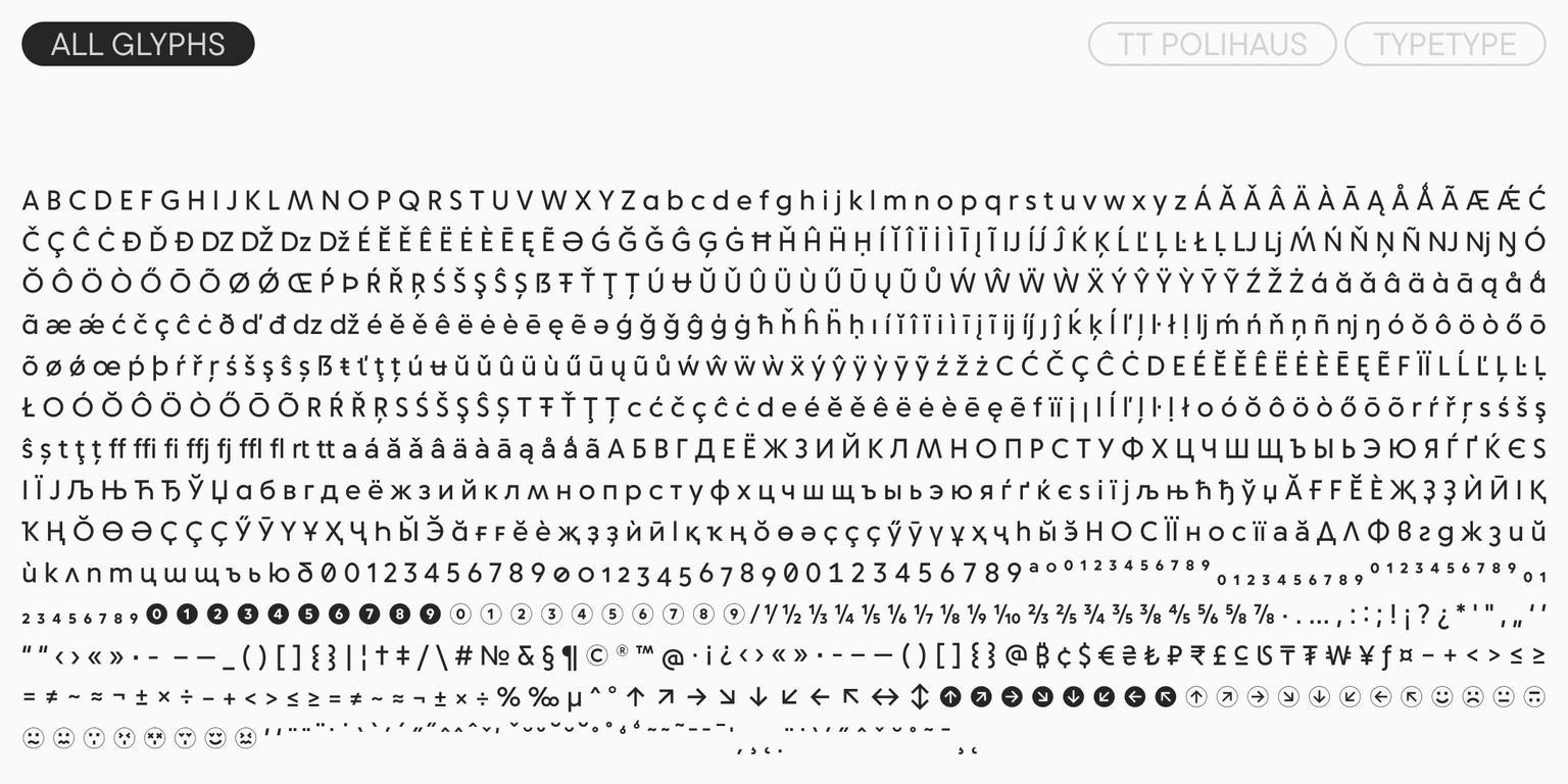
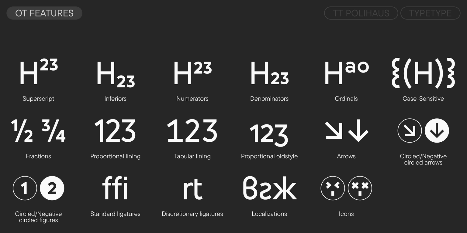
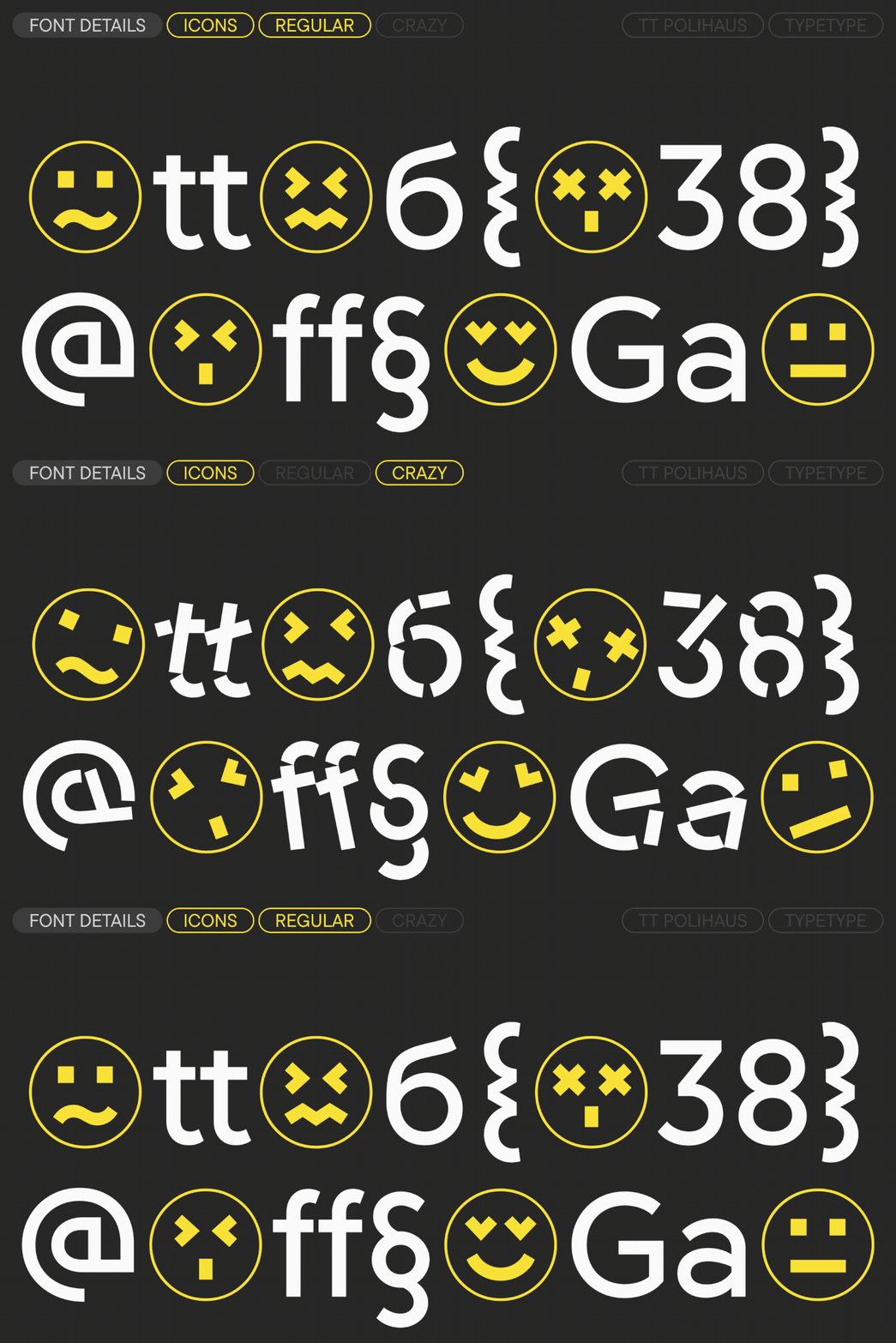
To make the typesetting look even more dynamic, we added a feature that changes the shapes of repeating letters to alternate ones: for example, in the word „DIFFERENT“, the two ‘F’s will look different. The typeface also includes a large set of emoji icons that change just like the letters and match the character of the font.

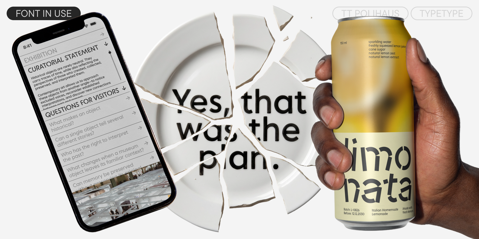
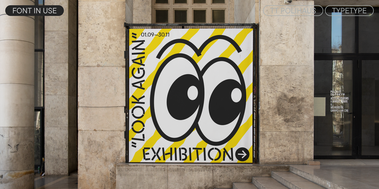
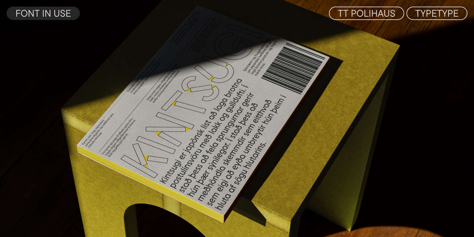
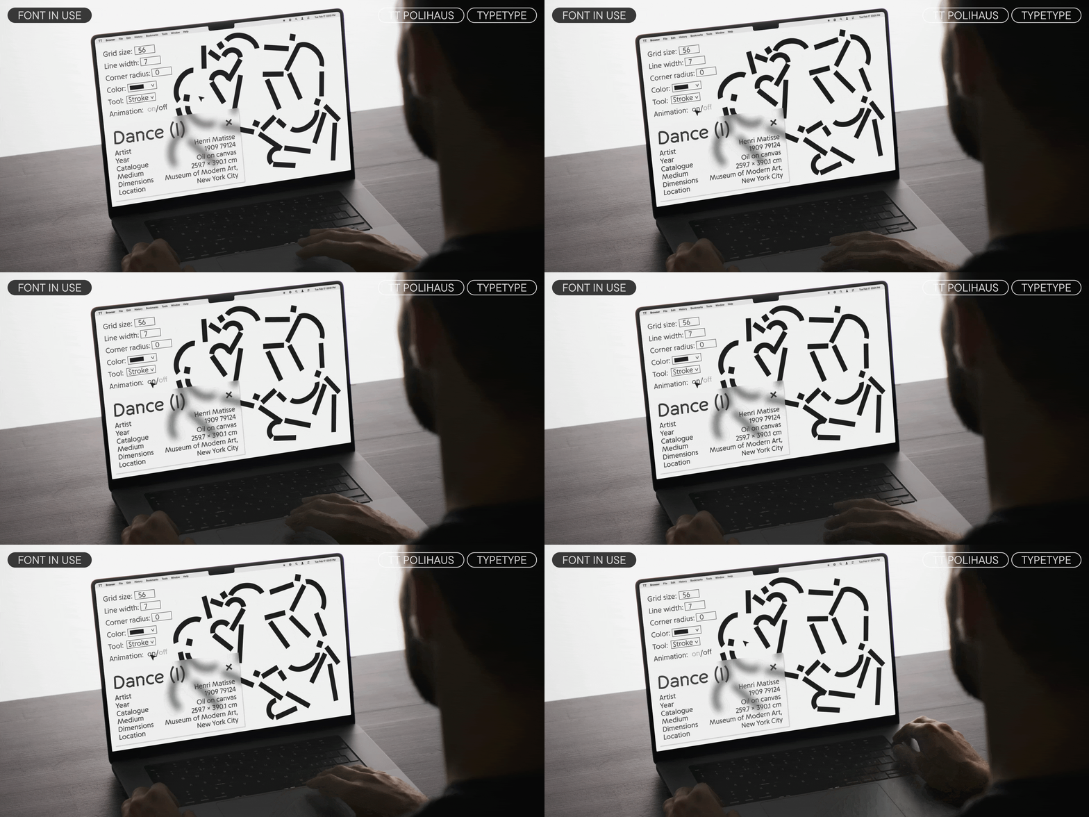
TT Polihaus will easily fit into the identity of a dance festival or a rave party. It will look great on energy drink packaging or customized LEGO, in navigation for a contemporary art exhibition or an art space, and in the branding of a creative architectural bureau. The variable font can emphasize the unconventional nature or duality of a brand, and become a cool tool for dynamic graphics, animation, and titles.

TT Polihaus includes:

  • 5 font styles: 4 uprights and 1 variable font
  • 948 glyphs in each font style
  • 33 OpenType features
  • Support for over 230 languages

Team

Anastasia Vrublevskaya
Marina Khodak
Yuriy Nakonechnyi
Elizabeth Ostrovskaya
+ TypeType team

Release date

6 October, 2026

Additionally

Specimen

Download font specimen (pdf)

Custom version

Looking for a custom version of this font?

Character Set

Basic Latin Basic Cyrillic Extended Latin Fractions Proportional Lining Figures and Currencies Punctuation and Symbols Math Symbols
A B C D E F G H I J K L M N O P Q R S T U V W X Y Z a b c d e f g h i j k l m n o p q r s t u v w x y z

OpenType features

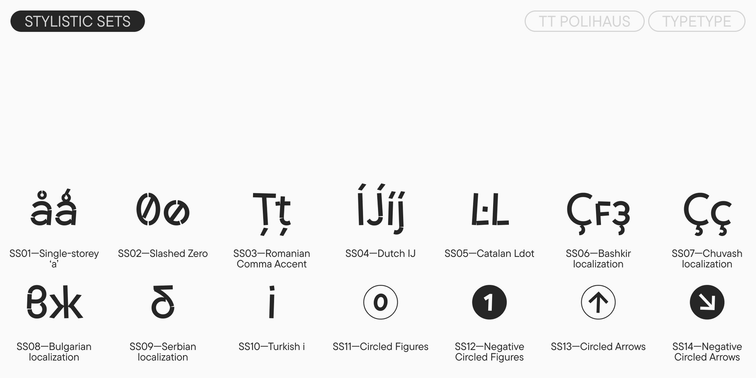
ss01 | Alternative a

á ă â

á ă â

ss11 | Circled Figures

1 2 3

1 2 3

liga | Standard Ligatures

ffl ffj

ffl ffj

onum | Oldstyle Figures

1 2 3

1 2 3

case | Case Sensitive Forms

({[H]})

({[H]})

ss02 | Slashed zero

0

0

Show all

Similar fonts

4 font styles
50 font styles
36 font styles
Select licenses
Contact us!