top_banner_bees0926
TT Dott
2 styles
Type foundryFonts & StylesSans SerifTT Dott

TT Dott

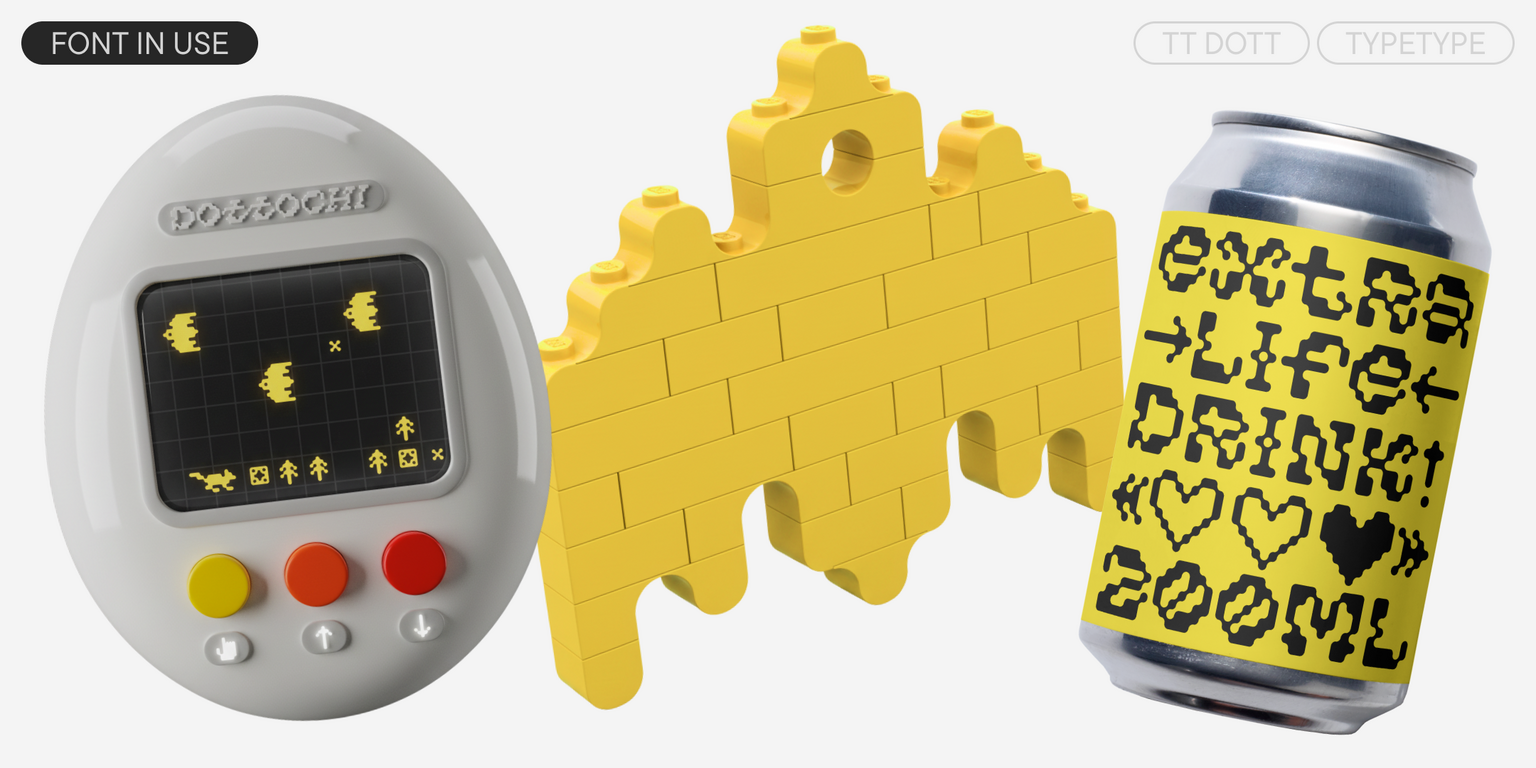
TT Dott is an experimental pixel grotesque where a circle is used as the base for the pixel. It is a fluid and unusual display font, evoking associations with embroidery and techno parties all at once.
Single style: from $43.99
Full family: from $79 2 styles

Buying Options

To purchase a font, first select the styles you need, then choose your licenses and proceed to checkout. To test the font in your project, download the free trial version.

Select at least one style before choosing licenses

To purchase a font, first select the styles you need, then choose your licenses and proceed to checkout. To test the font in your project, download the free trial version.
Package offer:
per style $39.50
from  $79
2 styles
from  $79
from $43.99
from $43.99
On request
Perpetual
On request
On request
Perpetual
On request
On request
On request
On request
On request
On request
On request
On request
Perpetual
On request
On request
Perpetual
On request
On request
Perpetual
On request
On request
Perpetual
On request
On request
On request
On request
On request
Your order:
Nothing selected yet

Select styles first, then licenses.

Questions about the font or licensing?

Testers

TT Dott
Size
Features
Turn on all

TT Dott — An experimental laboratory display font

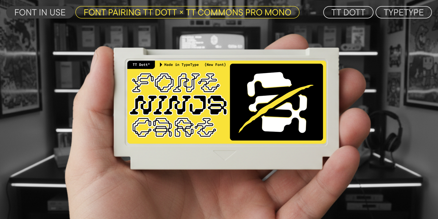
Ideal font pairs with TT Dott

Creating Contrast Without Breaking Visual Harmony

Contrast helps two typefaces take on different roles, but the strongest combinations are rarely built on difference alone. Successful font combinations often share proportions, rhythm, stroke character, or overall mood while differing enough in weight, construction, or style to create hierarchy. This balance makes headlines, supporting text, and secondary information easier to distinguish. The goal is to create clear visual separation without making the composition feel fragmented, accidental, or inconsistent with the wider design system.

Pairing Serif and Sans Serif Typefaces

Combining serif and sans serif designs is a reliable way to create contrast across branding, editorial, and digital projects. Good typeface pairing still depends on more than category. Compare x-height, proportions, weight, spacing, and visual tone to make sure the two designs feel connected. The strongest combinations clearly separate headlines from supporting text while maintaining a coherent overall character. This approach also gives designers flexibility when building hierarchy across websites, publications, presentations, packaging, and other communication formats.

How Type Scale Strengthens a Typeface Pairing

Contrast does not have to come entirely from different letterforms. Scale, weight, spacing, and line height can significantly change how two typefaces interact. A large display treatment may carry the main message, while a calmer style supports body copy or secondary information. Before rejecting a combination, test several hierarchy settings—the same two designs can feel much more compatible once their roles are clearly established. Adjusting scale can also help preserve consistency when the project needs both expressive headlines and highly functional supporting text

Description

About font family TT Dott
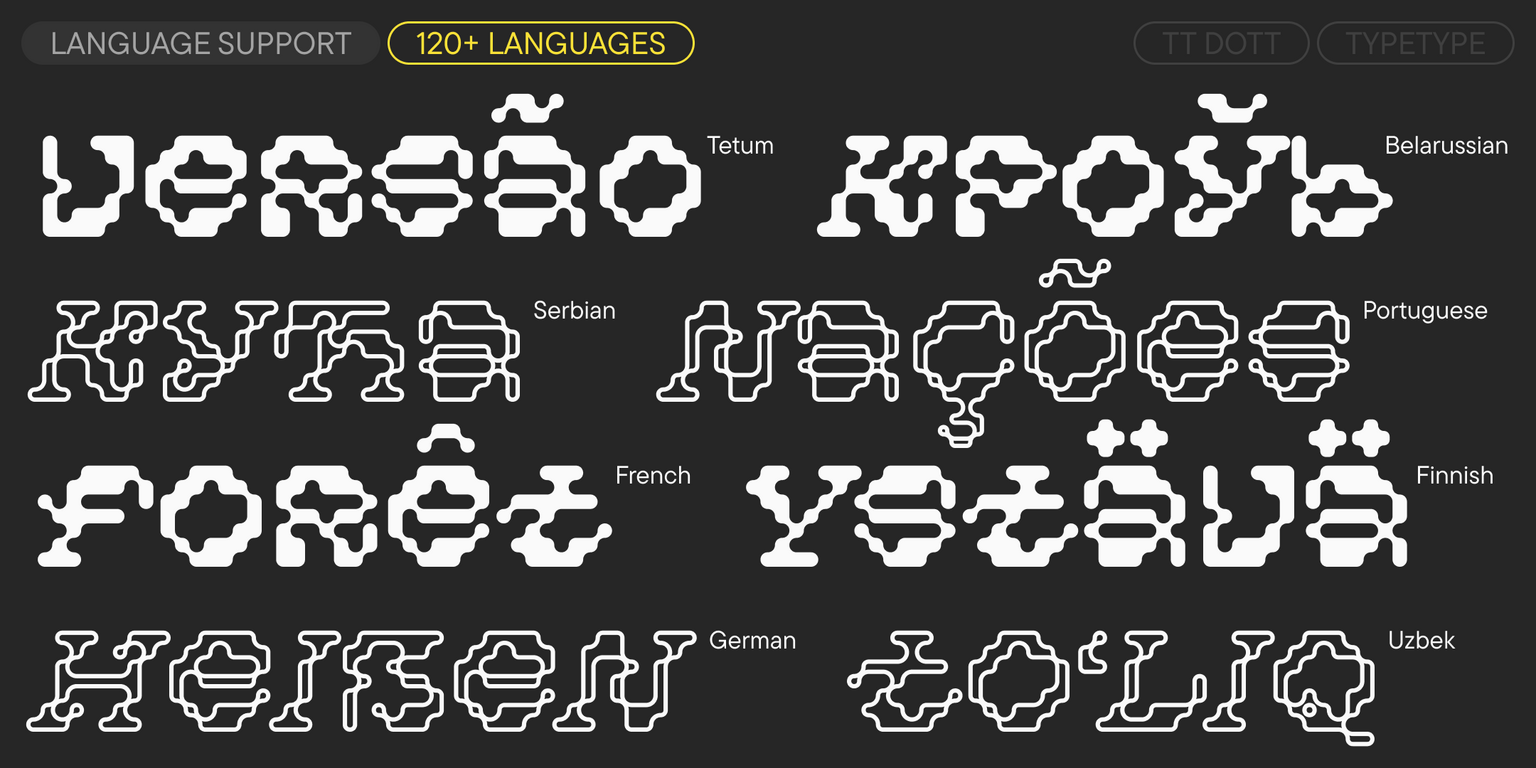
120+ Language support

Meet the new TT Dott—an unusual font that redefines pixel aesthetics!

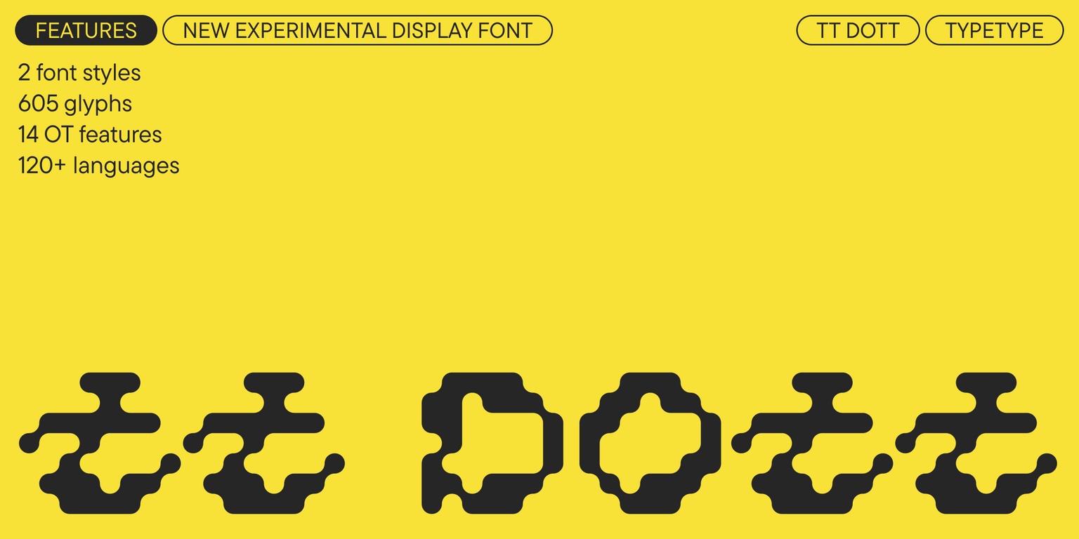
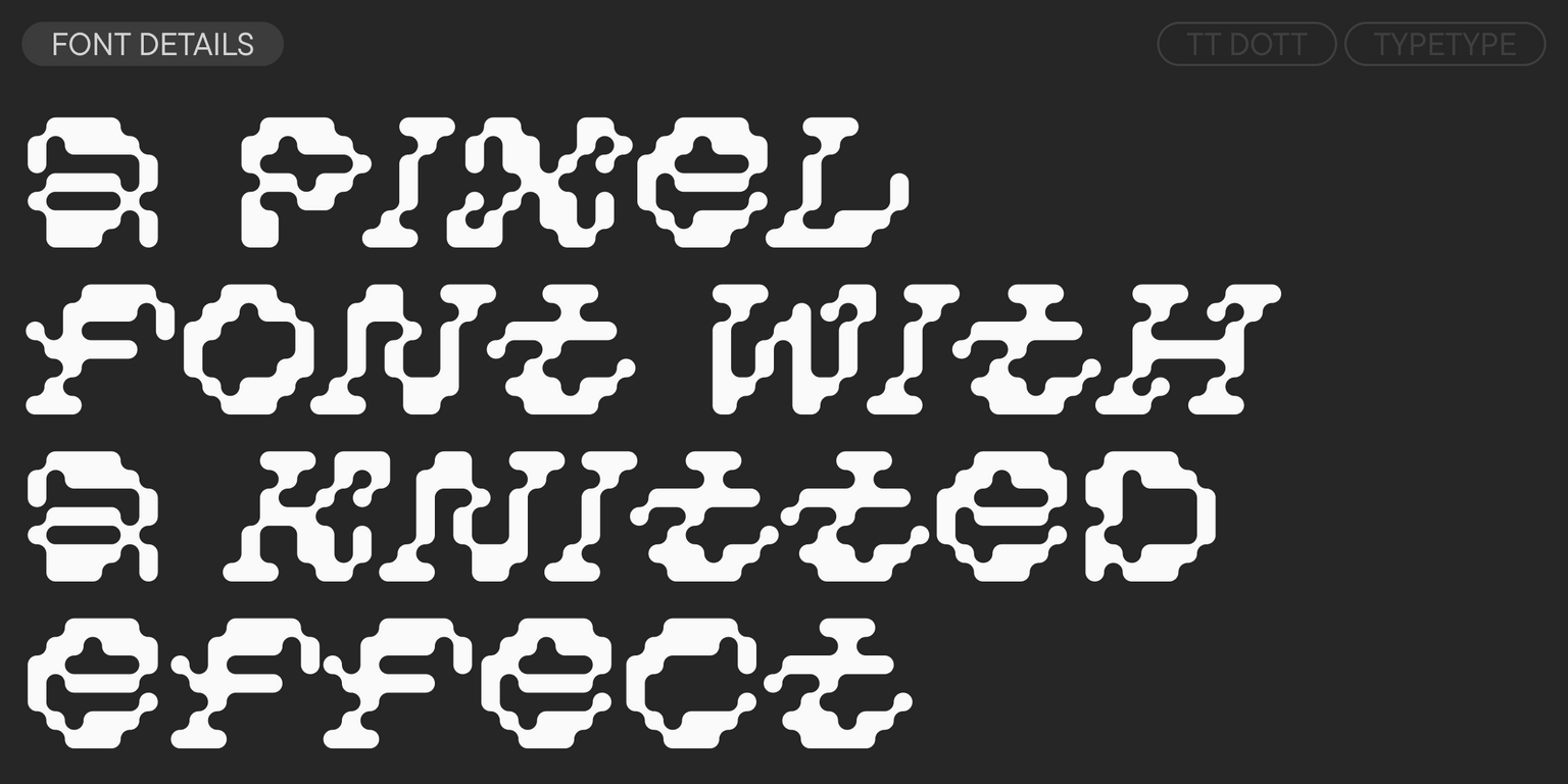
TT Dott is a display pixel grotesque. It is an experimental project created within our Creative Lab. The idea was to use a circle instead of a square as the base for the pixel, and to experiment with character shapes. We wanted to step away from the usual association with a pixel font—static and mechanistic—and create something completely different: fluid, alive, and rhythmic. Because of this, we made some glyphs slanted and others upright, adding dynamism and a sense of randomness to the font.

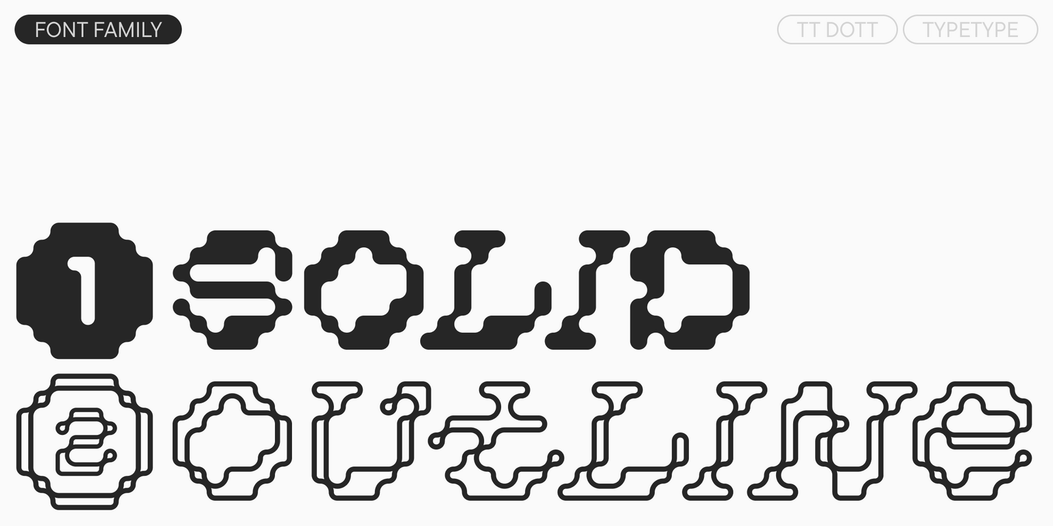
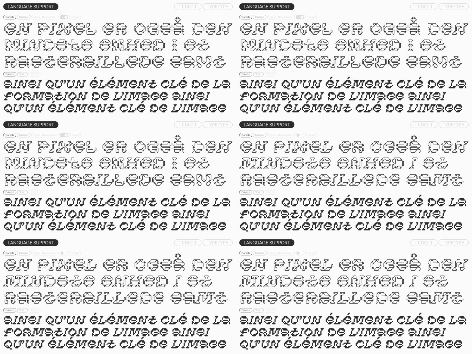
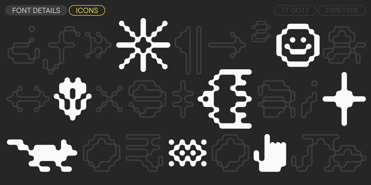
TT Dott turned out fluid and warm, evoking associations with embroidery, knitting, and techno parties all at once. The typeface includes two font styles: Solid and Outline, which work perfectly on their own and can beautifully complement each other. It also features two stylistic sets: the main one—with slants in certain characters that give it dynamism and quirkiness—and a Static one, which is calmer, with upright characters. An extensive set of thematic icons expands the design possibilities even further.

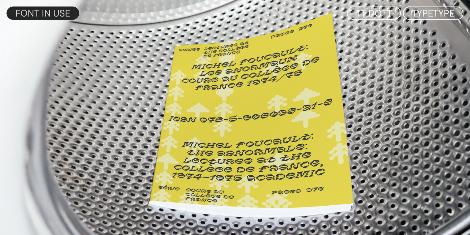
TT Dott is a font for accents that works best in large sizes. It is suitable for exhibition and festival design, branding, and packaging design. With its help, you can add vibrancy and originality to a project, and in some cases, it will harmoniously fit into an ethnic theme.

TT Dott includes:

  • 2 font styles: Solid and Outline
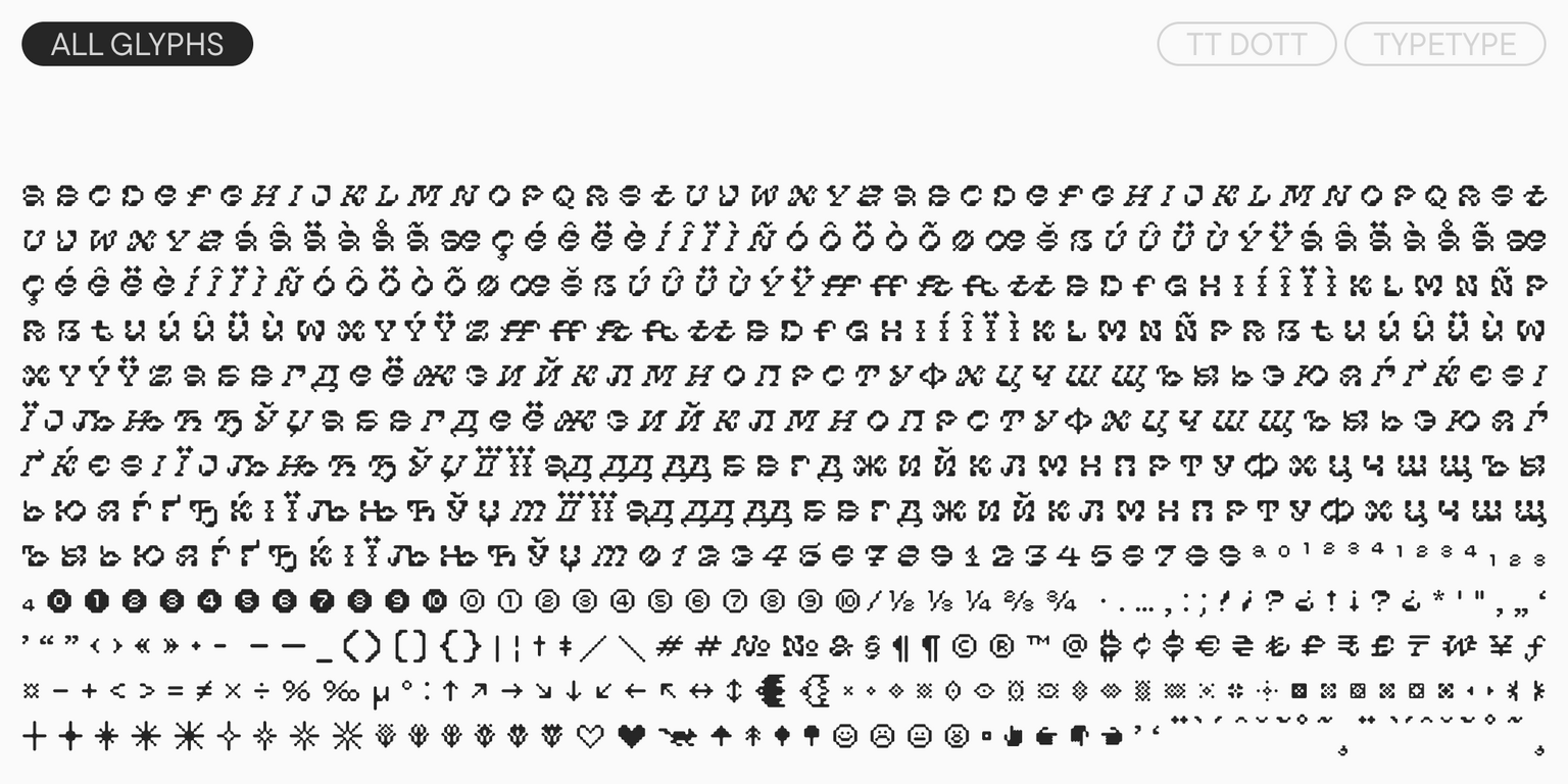
  • 605 glyphs per style
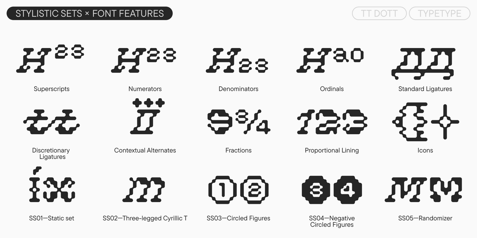
  • 14 OpenType features
  • Support for over 120 languages

Team

Kseniya Karataeva
Antonina Zhulkova
Ivan Gladkikh

Release date

5 May, 2026

Additionally

Specimen

Download font specimen (pdf)

Custom version

Looking for a custom version of this font?

Character Set

Basic Latin Basic Cyrillic Extended Latin Fractions Proportional Lining Figures and Currencies Other Figures Punctuation and Symbols Math Symbols Arrows Icons
A B C D E F G H I J K L M N O P Q R S T U V W X Y Z a b c d e f g h i j k l m n o p q r s t u v w x y z

OpenType features

ss01 | Static set

f t ! ?

f t ! ?

ss02 | Three-legged Cyrillic T

Т

Т

ss03 | Circled Figures

1 2 3

1 2 3

ss04 | Negative Circled Figures

1 2 3

1 2 3

liga | Standard Ligatures

ff

ff

dlig | Discretionary Ligatures

ft tt

ft tt

Show all

Similar fonts

3 font styles
3 font styles
4 font styles
Select licenses
Contact us!