Your logo has to do a lot of work. It communicates your company’s personality and values, and it’s what makes you recognizable in a competitive market.
Logos fall roughly into three large groups: brandmarks (emblems), wordmarks and combination marks. Brandmarks lean heavily on a symbol. In the other two, the typeface leads.

Context comes first, trends second. That’s really what choosing the best fonts for logo design comes down to. Below we compare TypeType releases and show how type shifts from expressive to neutral from one industry to the next. Readability and technical quality stay in focus the whole way.
How to choose the best fonts for logo design
Start by clarifying what the logo has to communicate and where it will appear. Tone, legibility and scalability are what matter here.
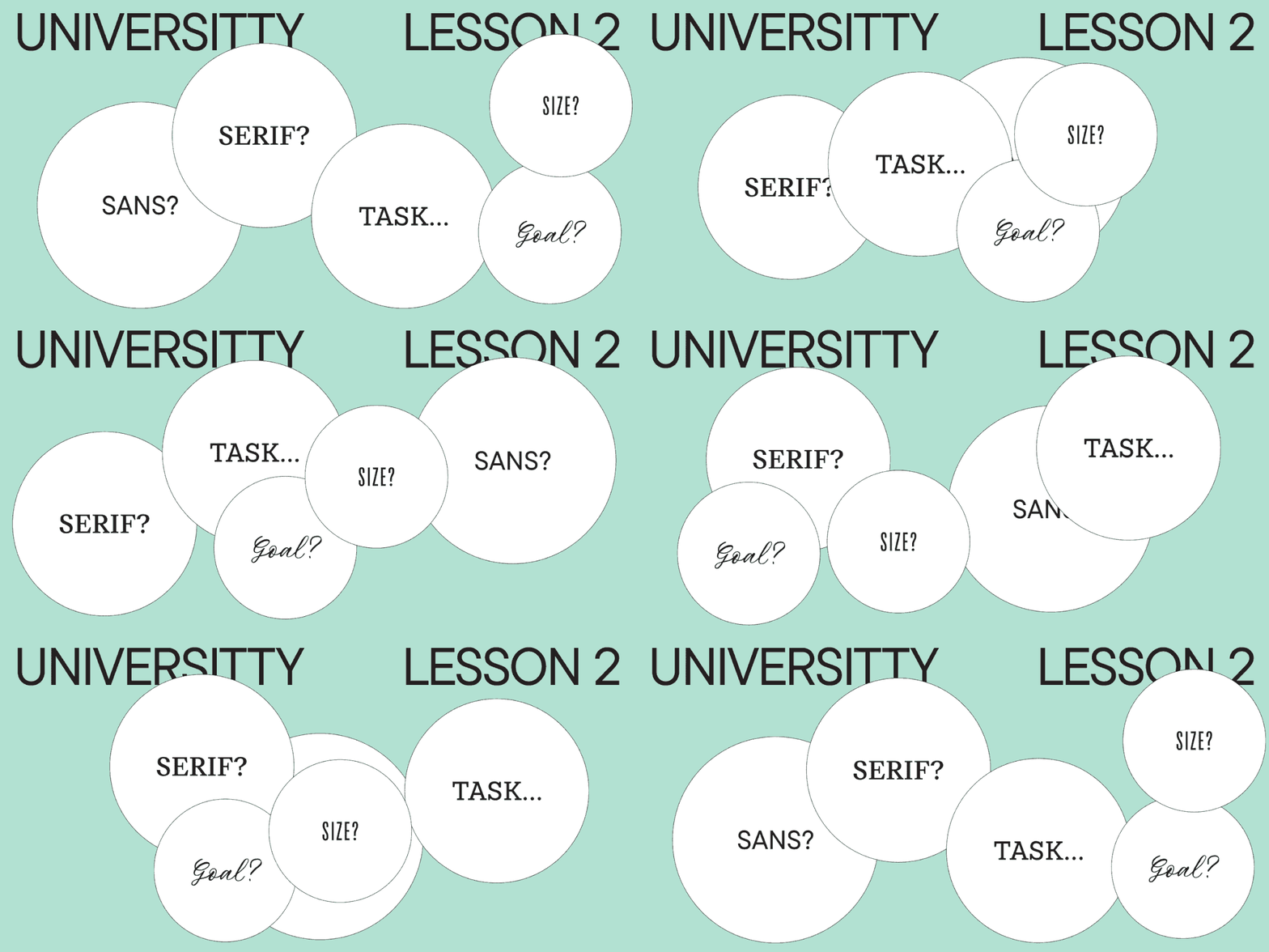
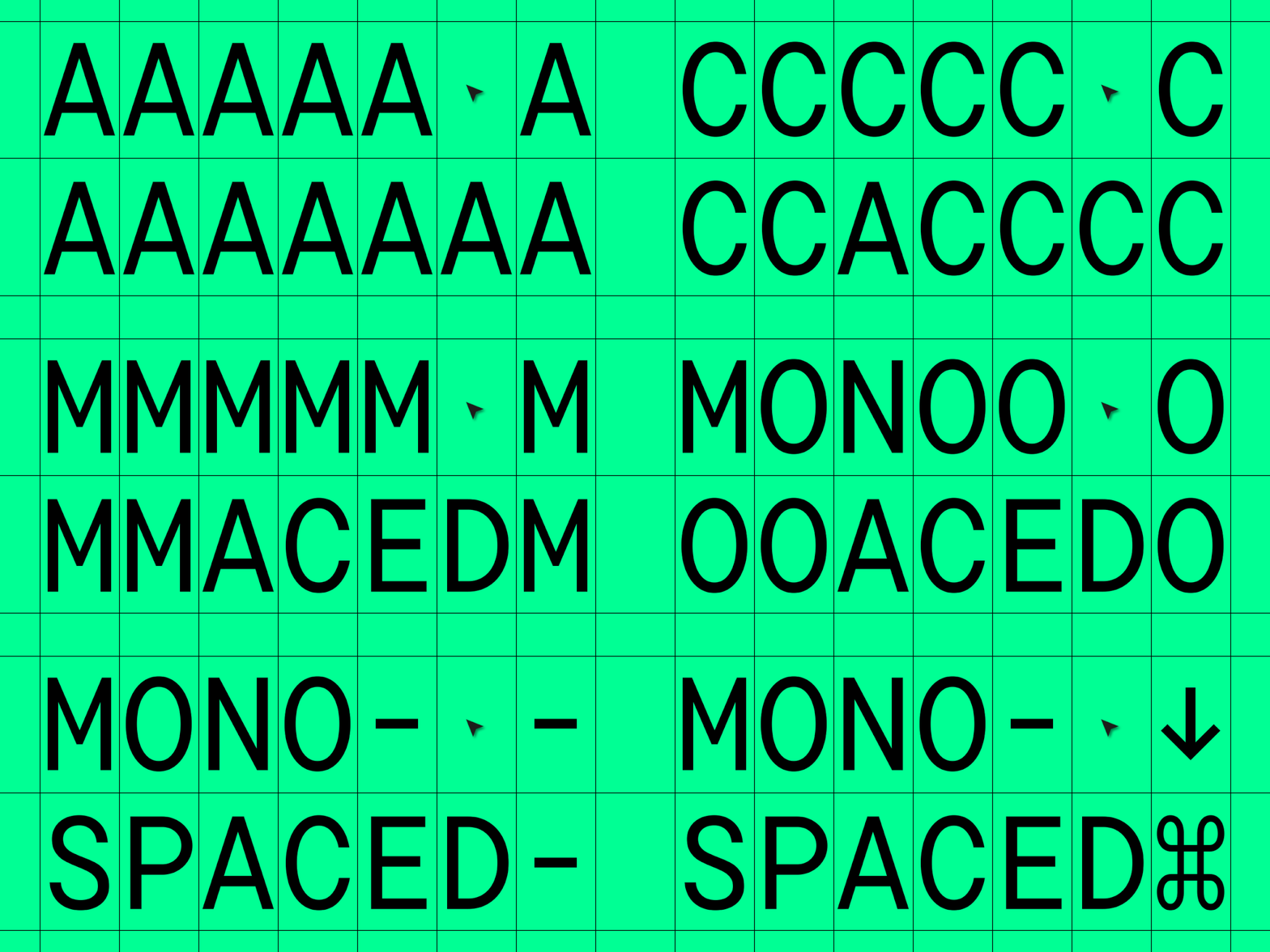
The typography has to convey the brand’s overall tone, and the typeface you pick for a wordmark should be unique and eye-catching. It also has to be legible, whether that’s a single letter, a word or a phrase, which often argues for something clean and simple. And it has to be technically sound, working well on every platform and scaling easily across devices.
No single font works for everything. Context, audience and medium determine whether the result feels credible.
Take a simple example. A kids’ clothing store using a free Gothic-style typeface called Demon Letter. What do you feel looking at a name set like this?
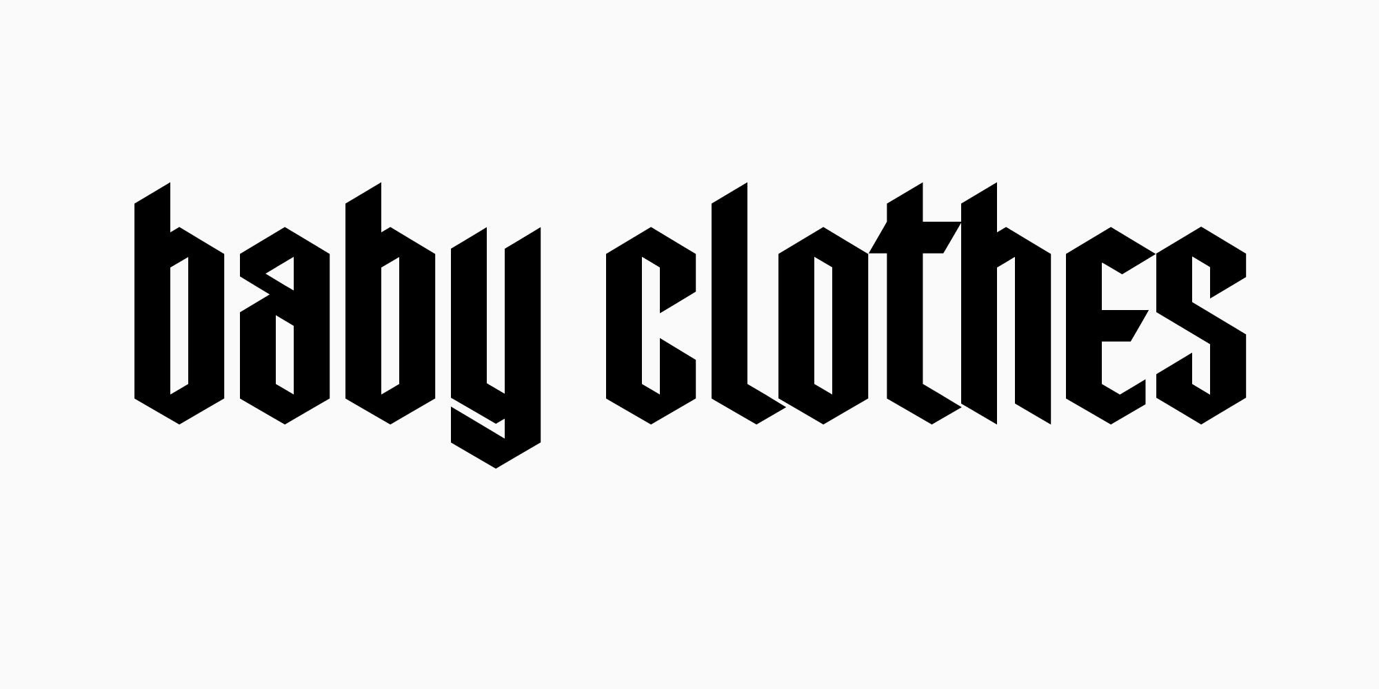
If it’s a specialized store aimed at goth or nonconformist parents, the typeface emphasizes exactly that and helps the brand stand out. If the brand makes casual kids’ clothing, the same typeface misleads potential customers, or won’t catch their eye at all.
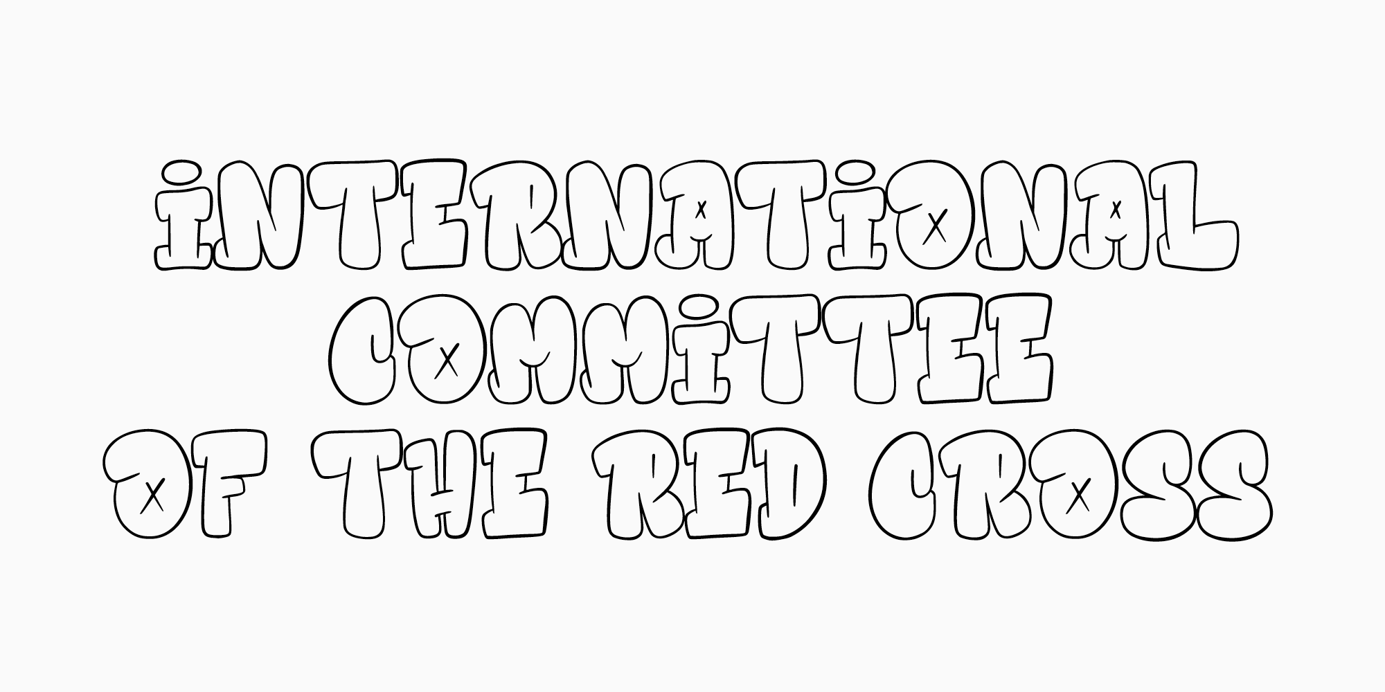
Another example: an unusual designer typeface used by an official organization. Say a free one called Hidebeast by Allouse Studio ended up in the identity of the International Committee of the Red Cross. You’d most likely think you got the website address wrong, and the portal would make you skeptical from the start.
Before you narrow the shortlist, test the actual wordmark at small and large sizes.
Distinctiveness often comes from small details, so set your exact company name rather than relying on sample text. A shortlist of top-rated fonts for creative logo design can be useful, but the one you keep is the one whose proportions, terminals and rhythm support the brand voice.
Tip: while choosing among visually similar typefaces, analyze the letters and characters your wordmark actually needs. Pay closer attention to how each of them looks separately, then arrange them in the desired order to see their effect in combination. Letterforms you liked at first sometimes won’t create the necessary impression in the finished wordmark.
Industry context should guide the shortlist too. For premium positioning, the best fonts for a luxury brand logo are a useful starting point. A tech startup or a digital product will more often want the best font for a minimalist logo, or something clean for the website. Either way, compare complete font families rather than isolated screenshots.
Good fonts for logo design have to remain legible across all sizes and mediums, and that holds whatever the industry. The best fonts for a photography logo depend on how much personality the studio’s name has to carry, while something more elegant might suit a high-end boutique. Expressive is fine. It still has to be readable on a business card, a website and a poster.
How many typefaces should you use in a logo?
When a single family can cover the full hierarchy, consistency is easier to maintain. So instead of chasing the best font for logo work as an abstract idea, test the settings you actually need against real names, taglines and sizes.
How to combine typefaces
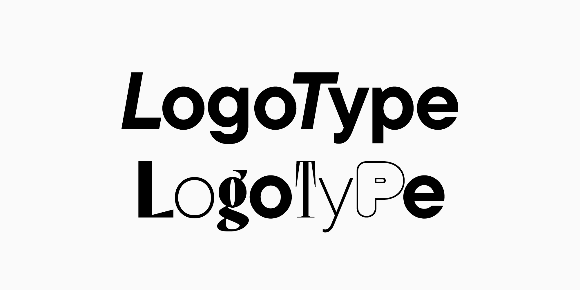
If you’ve decided to mix several typefaces in one logo, they have to complement each other.
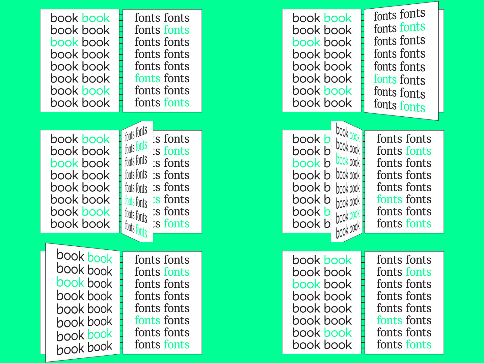
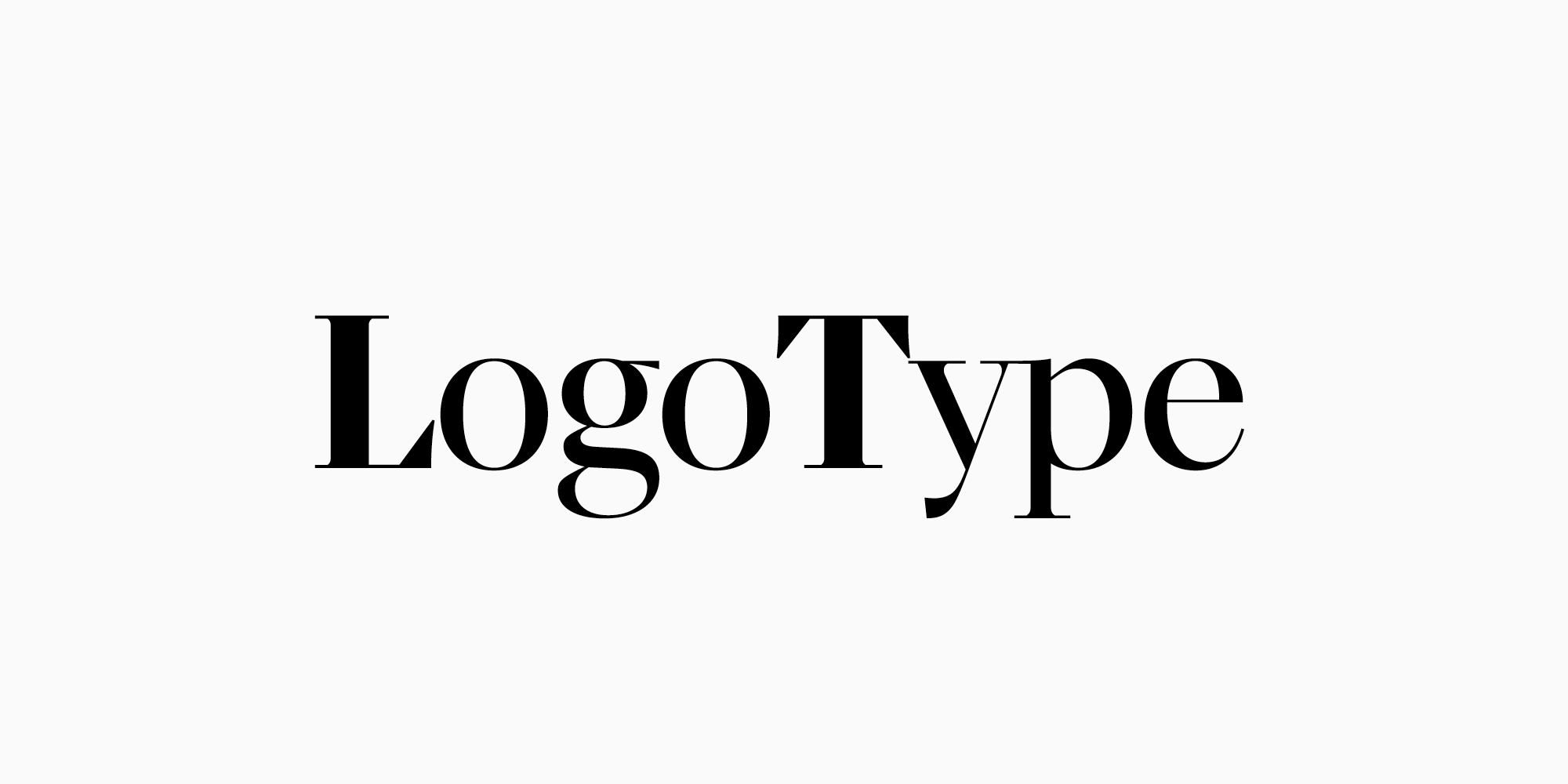
There are two options. The first is to combine different font styles of the same typeface, which makes stylistic integrity easier to keep.
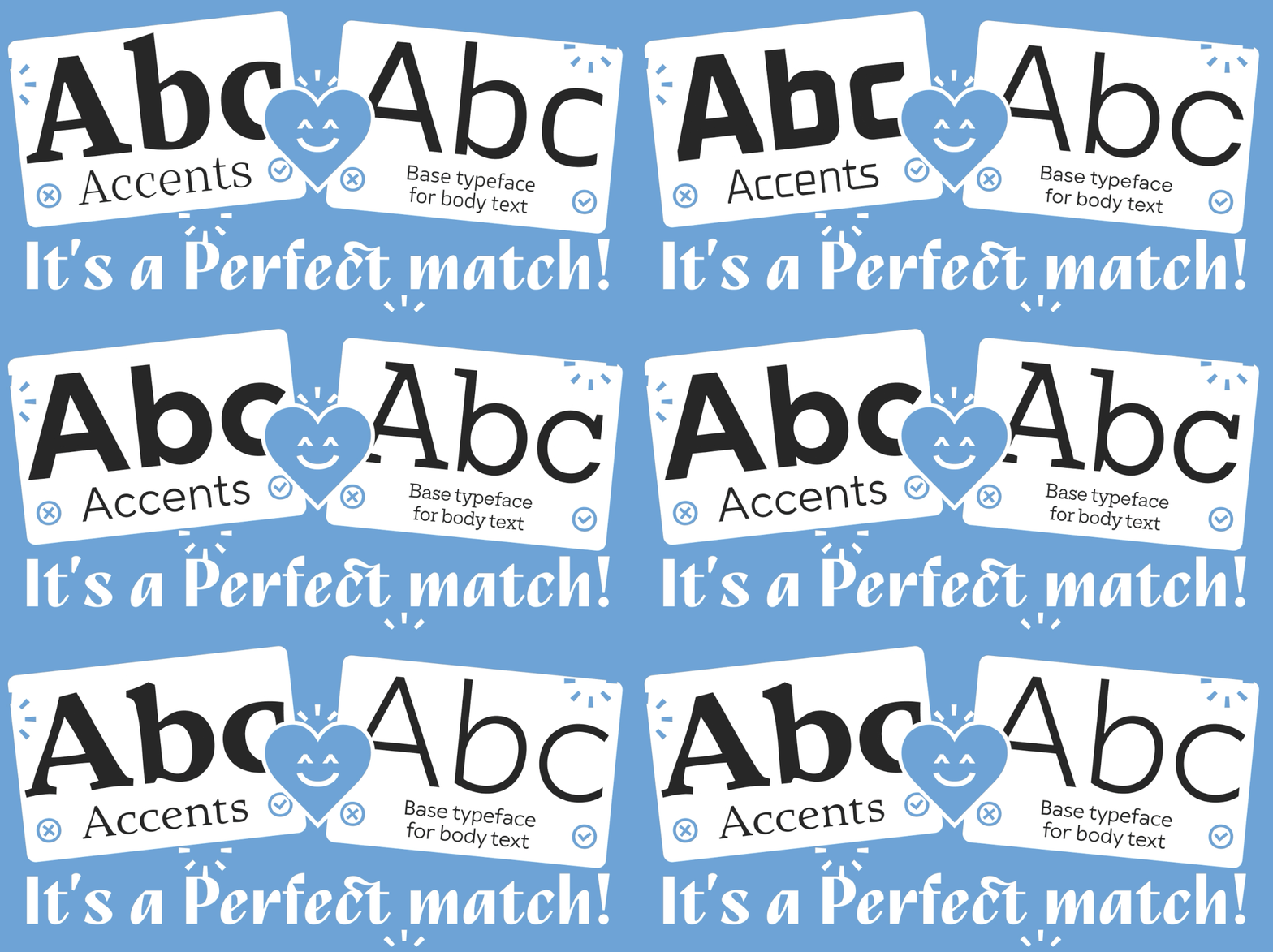
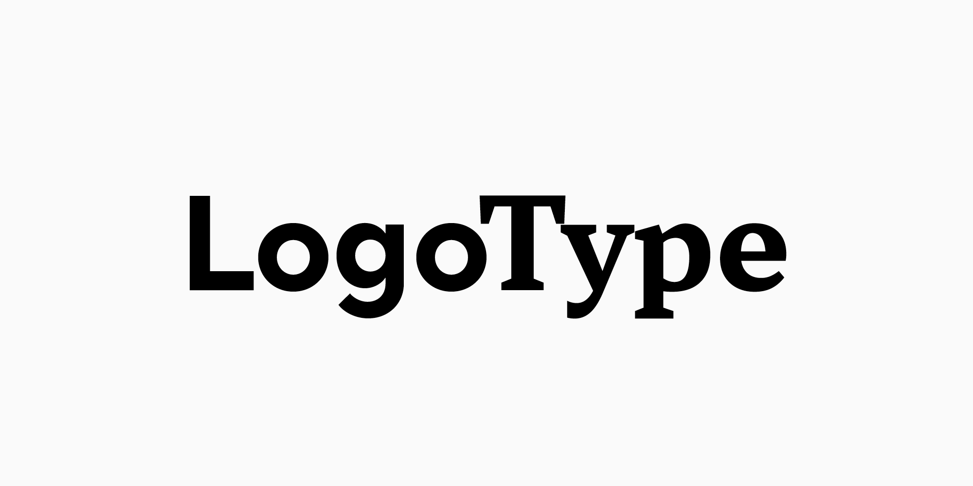
The second is to create a typeface pair. That one is harder, since there are no clearly defined rules on pairing, though you can start from pairs that already exist. One of ours is TT Norms® Pro with TT Norms® Pro Serif. There’s more on how this works in our article on typeface pairs.
Best fonts for logo design by category
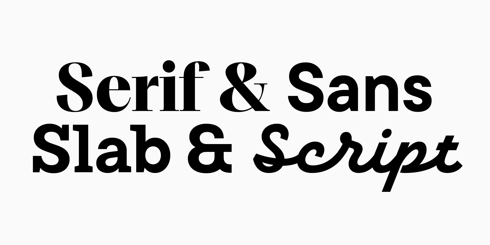
Style categories are a practical filter. The best cursive fonts for logo projects can signal energy or craft, serifs often feel editorial or refined, sans serifs appear cleaner and more neutral, and a script adds a handwritten voice.
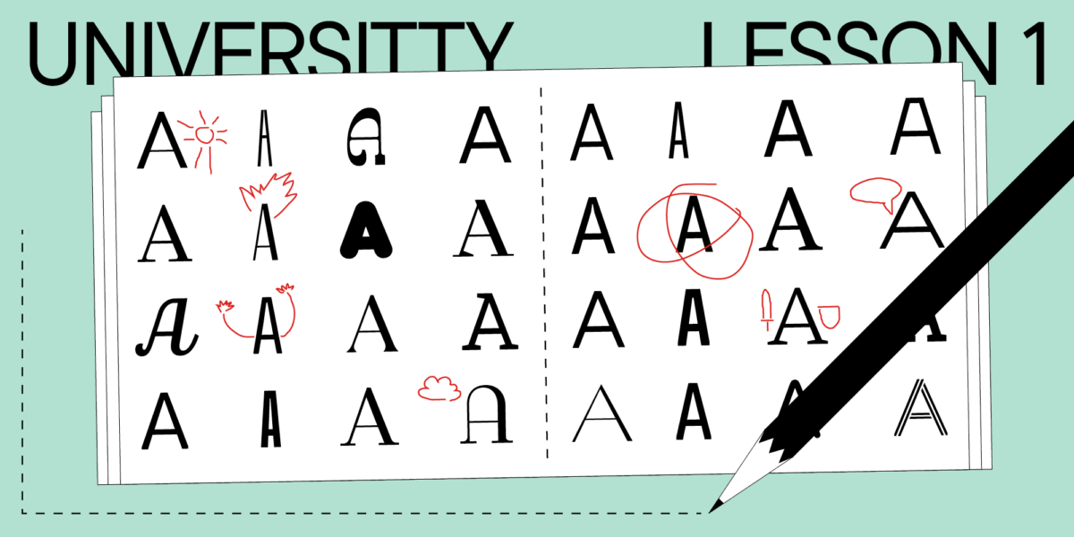
What kind of fonts can you use for a logo? Almost any of them. There aren’t strict limits here, but four categories tend to suit the job. Serif typefaces are characterized by the small strokes attached to the ends of their letters, and they’re usually subdivided into four groups: Old-Style, Transitional, Modern and Slab Serifs. Sans serif typefaces are the clean ones without those terminating strokes, subdivided in turn into Grotesque, Neo-Grotesque, Geometric and Humanist. Slab serifs are a subcategory of serifs with one distinctive feature: large, solid serifs. And script typefaces imitate handwriting.
For modern brands, bold fonts create impact, while good fonts for a logo keep the name easy to parse. It depends on the tone you want: cool fonts for business logo work, nice or elegant ones, and stronger or newer releases may all fit.
For more traditional or luxury brands, a serif with subtle serifs and elegant strokes adds a touch of sophistication and trustworthiness. These work best for businesses aiming for a classic, refined look: small law firms, boutique fashion lines.
A logo maker tool can simplify the design process. Such tools usually offer a variety of modern and decorative typefaces, from bold and futuristic to thin and handwritten, along with language support for international brands. They also let you experiment with all caps for a strong presence against mixed case for a friendlier, more approachable look.
Best modern serif fonts for logos
Serif typefaces are most often used to emphasize a brand’s prestige or elegance, and to create an atmosphere of rich history and respect for traditions. The use range of contemporary serifs isn’t limited to that case only.
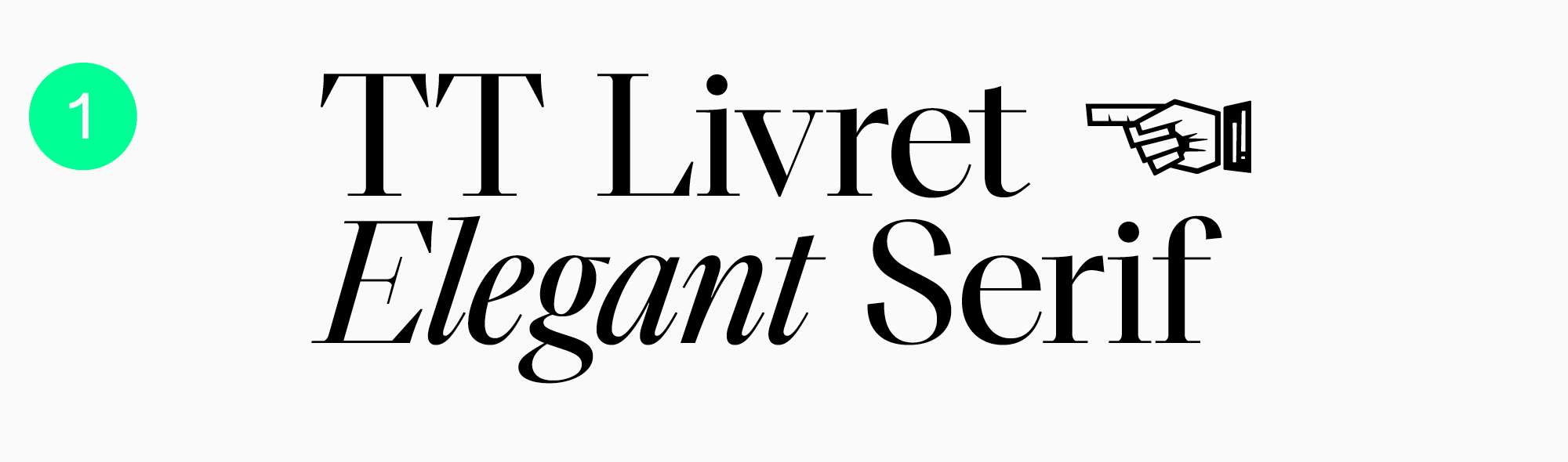
TT Livret, a modern serif without a vintage look
TT Livret is an excellent example of a modern and functional serif. Elegant and calm, which is what lets it complement all sorts of brands.
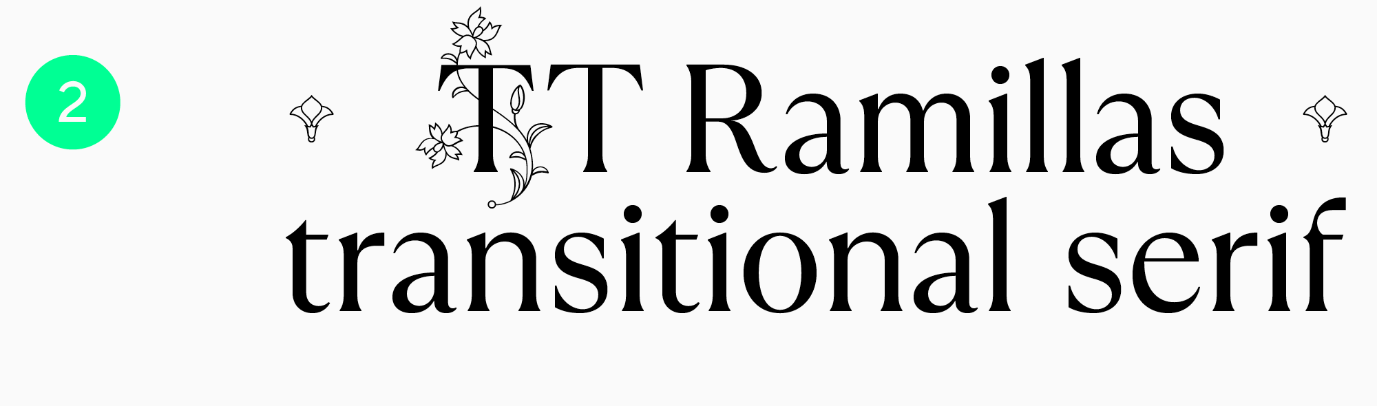
Modern and neat TT Ramillas
TT Ramillas has a narrower use range, but it’s well tailored to contemporary reality and its technical requirements. It works particularly well in wordmark graphic design, where it accentuates premium and luxury status. Clothing boutiques, perfumes, jewelry.
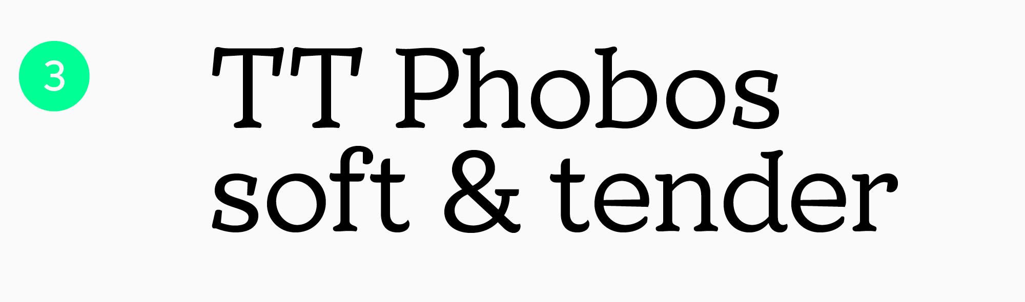
Soft and gentle TT Phobos
TT Phobos is fluid, expressive and mild-mannered, so it draws attention without being too visually demanding. The Stencil style is worth considering here. TT Phobos is also a particularly good idea for a pastry shop or a restaurant.
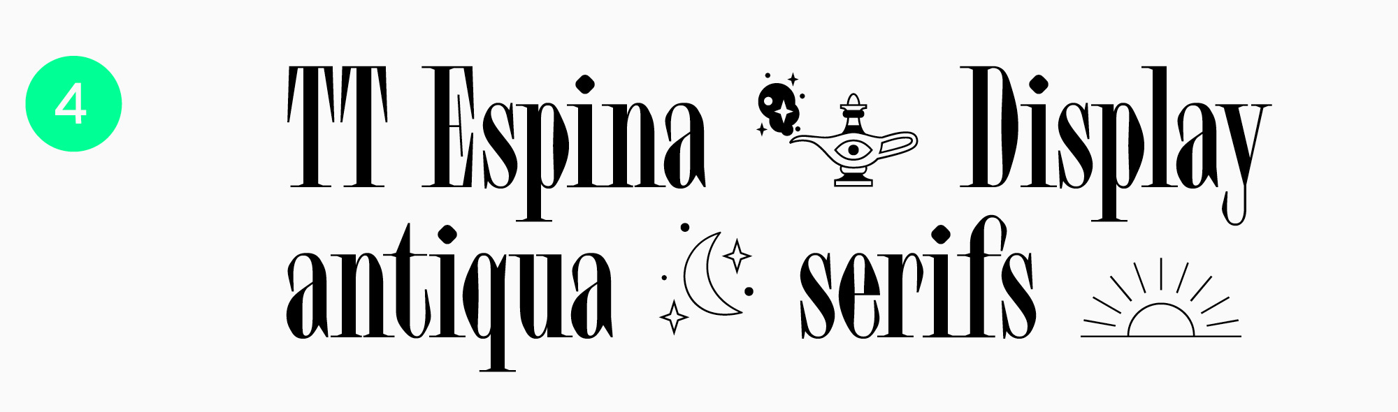
TT Espina, expressive and trendy
TT Espina is a display serif inspired by old times while still remaining modern. An unusual typeface with many peculiar details, the kind that makes you want to take a closer look at a wordmark. It works best in larger sizes.
Best sans serif fonts for logos
Typefaces without serifs, or sans serifs, are usually the most versatile. Simple and often neutral in nature, so they suit various domains: clothing brands, websites, video games. The number of options is almost infinite.
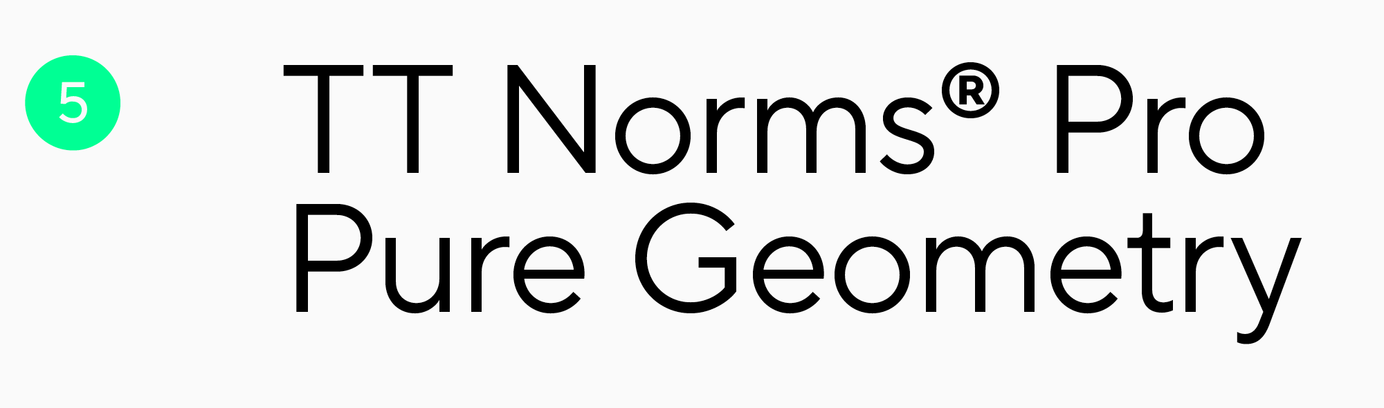
The bestseller TT Norms® Pro
TT Norms® Pro, a functional geometric sans serif, is one of the most popular typefaces made by our studio. Convenient on the technical side, highly versatile in terms of aesthetics. It suits almost any domain: mobile apps, clothing brands, mass media, educational projects.
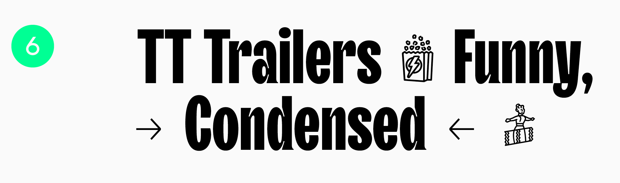
TT Trailers, a typeface for a vibrant brand identity
TT Trailers is an expressive display sans serif, and an interesting choice across various themes. The initial version was made with the cinema industry in mind. The updated TT Trailers will also shine in magazines, restaurants, food and beverages, apps and websites.
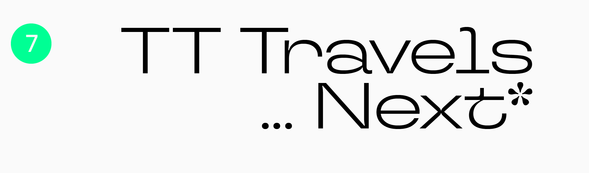
Trendy, stylish and youthful TT Travels Next
If you’re looking for a modern logo typeface, consider TT Travels Next. This is an expressive sans serif with remarkable details, and a perfect fit for a contemporary brand identity.
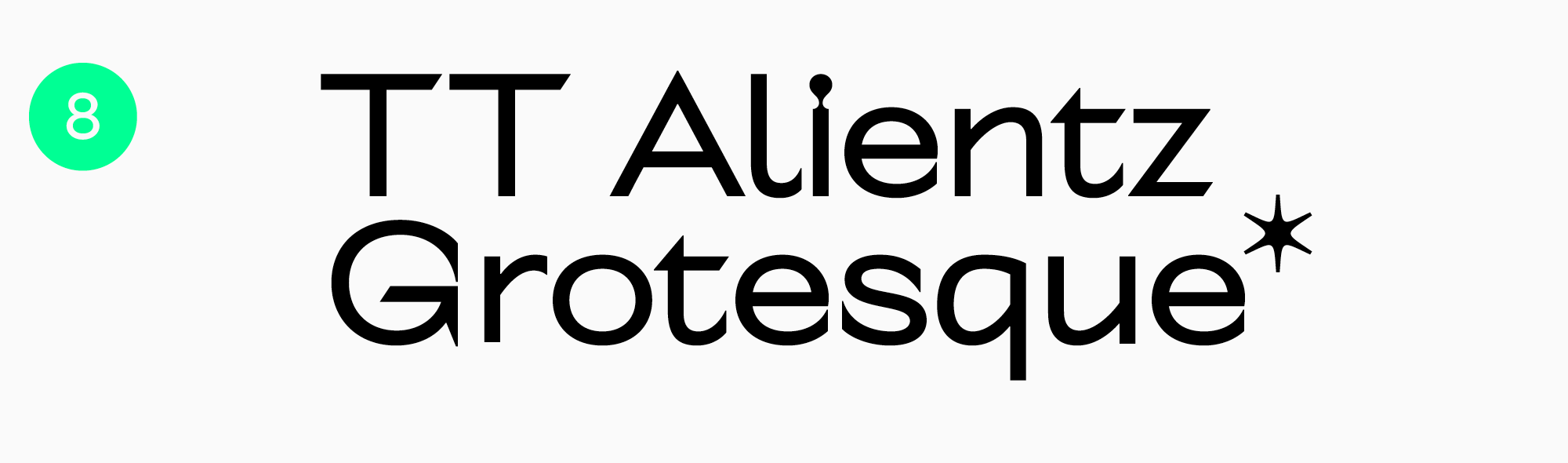
TT Alientz Grotesque, an out-of-this-world sans serif
Sans serifs are considered relatively neutral, and yet there are truly extraordinary options among them. TT Alientz Grotesque from the TT Alientz family is one of them. Super expressive, audacious and spiky. It fits easily into the identity of unconventional, provocative projects that want to make a statement, and it lends the brand a supernatural, experimental, nonconformist feeling.
Best slab serif fonts for logos
Slab serifs can go either way. Serious and solid, or bright and loud. The scope is quite broad and depends on the specific typeface.
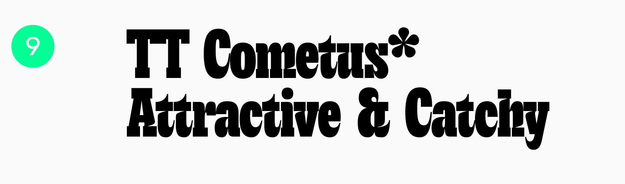
Catchy and dynamic TT Cometus
TT Cometus is a slab serif for a captivating, attention-grabbing wordmark. Solid but flexible and dynamic, so the result looks modern, vibrant and confident. Its fluid shapes also give it a friendly nature.
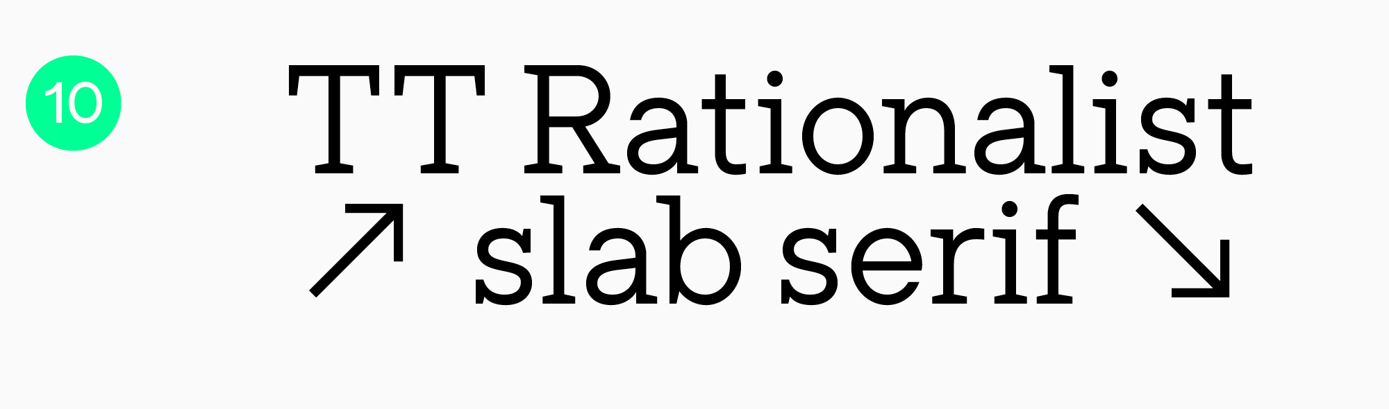
Sharp and precise TT Rationalist
If you want something versatile, recognizable and unique, TT Rationalist is worth a look. Its classic design can be applied across fields, and it keeps the result modern and distinctive.
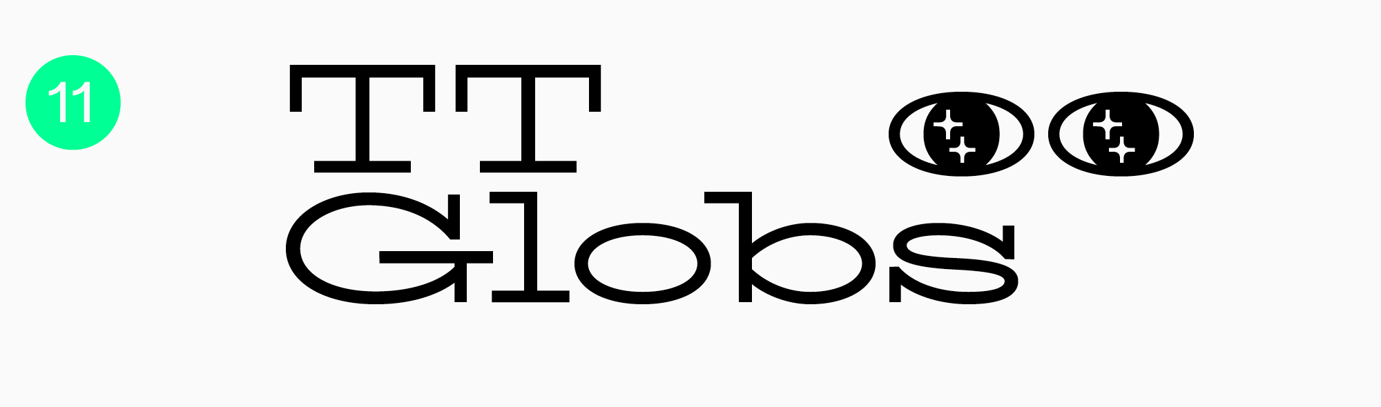
TT Globs, a contemporary foundation
TT Globs is a modern wide typeface, one of the core options in our collection. Its use range is extensive.
Best script fonts for logos
Script typefaces can be used with very different purposes in mind, since their nature varies from casual and playful to calm and elegant. What scripts are especially good at is conveying the feeling of something handmade and local, and showing off what makes a brand distinctive.
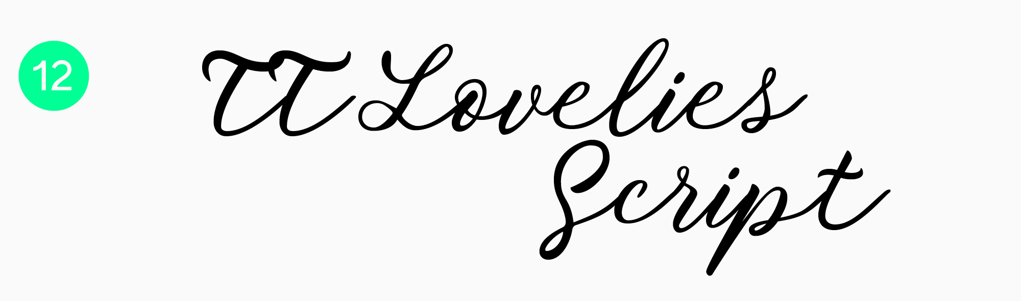
Romantic and playful TT Lovelies Script
TT Lovelies Script was designed based on original calligraphy, which left it unique, highly functional, technological and partially unpredictable all at once. Its unbroken ligatures are the main feature. A real gem if you need something beautiful, sophisticated and fun.
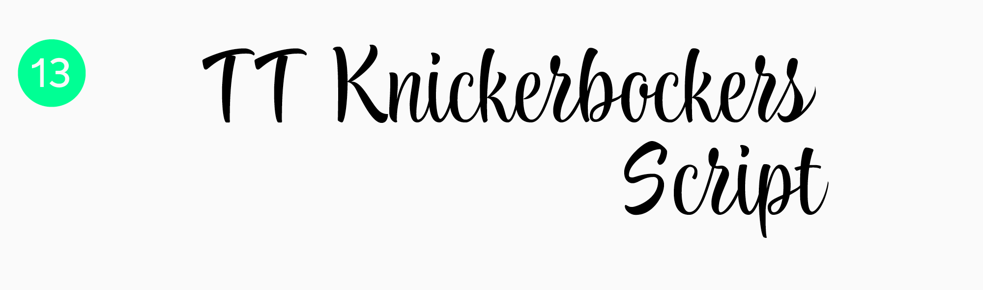
TT Knickerbockers Script
Opposite in nature, TT Knickerbockers Script is inspired by New York and its architecture. Monumental, dynamic, upright. Stricter than most scripts, though it still contributes to the feeling of handcrafted quality.
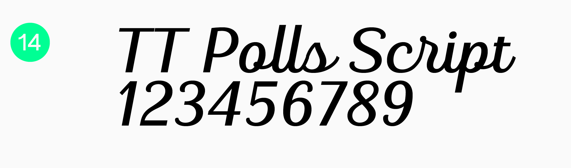
TT Polls Script, a retro-style American classic
TT Polls Script from the TT Polls family is familiar to the eye, since shapes like these are typical for script typefaces. It references the classic American style and creates a retro feel, and used wisely, those features work in your favor.
Which fonts do famous logos use?
Let’s look at what typefaces famous brands use. You’ll find more TypeType options that can match your project’s needs in our catalog.
Plenty of companies use their own corporate typefaces. Instagram employs its unique Instagram Sans, Uber opts for Uber Move, and Apple relies on the iconic San Francisco.

Just as often, famous brands build on custom lettering. Coca-Cola, Minecraft, Nickelodeon, Tesla, Google and M&M’s all went that way.
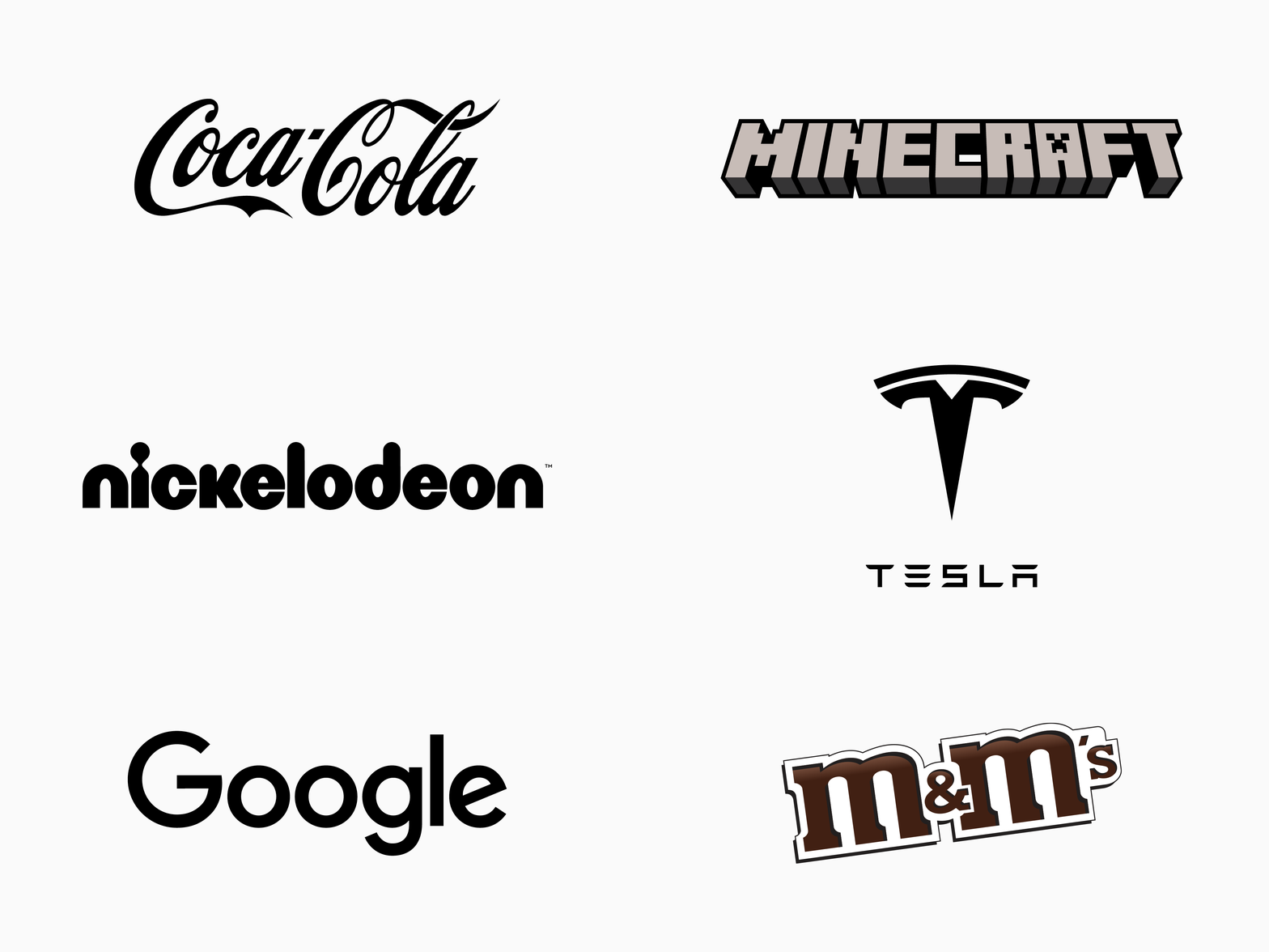
Elsewhere, companies use an existing typeface or have one designed for the project. Here are several wordmarks built on typefaces from our studio.
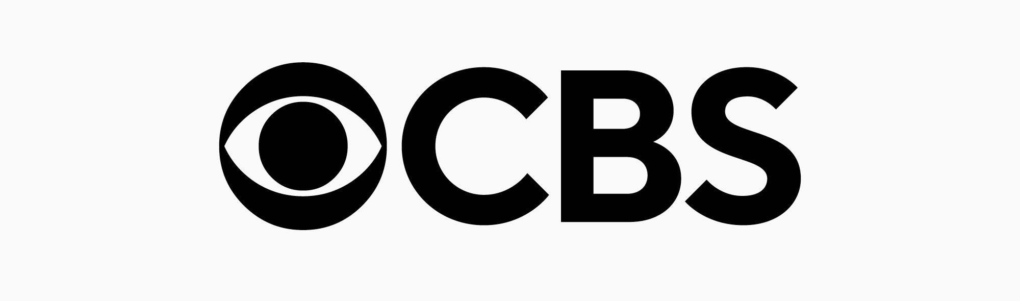
- The logo of the CBS News streaming video channel has TT Norms® Pro at its core, the typeface mentioned earlier.
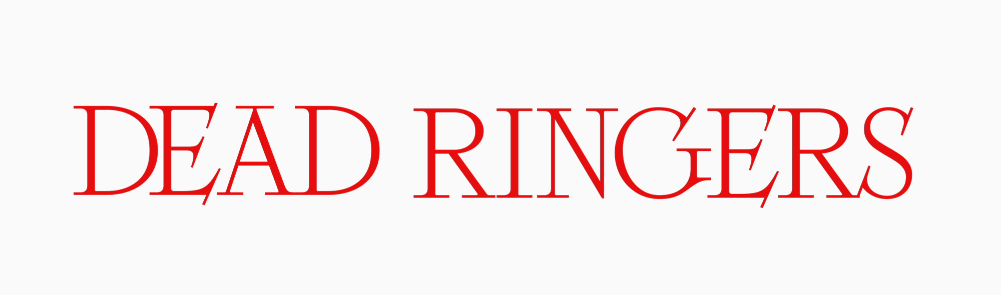
- TT Ricordi Fulmini, a fashionable serif with historical roots, is featured in the titles for the 2023 series Dead Ringers.
- TT Hoves Pro is another versatile sans serif. You can see a modified version in the logo and on the website of the major Spanish telecommunications company Telefónica, while the original form is used by the Lithuanian state agency Invest Lithuania.
As for other famous brands: M&M’s implemented the All Together typeface from Monotype in its 2022 rebrand, Sony is associated with Clarendon, PlayStation with Zrnic Regular, Samsung with DDT Condensed, and Adidas with ITC Avant Garde Gothic.
Conclusion
The best fonts for logo design in 2026 are the ones that support the brand identity, remain readable, and adapt to every touchpoint you need. Use this selection as a starting point, then test the actual name in context before committing to a final direction.
Rules are useful, but distinctive brand systems often appear where conventions loosen. Explore typefaces, develop your visual intuition, and keep experimenting.
FAQ
How do you choose a font for a brand logo design?
It takes a balance of aesthetics and functionality. Define the brand’s personality first, then test your shortlist by setting the exact name and checking that the letterforms stay balanced and legible at small and large sizes.
What is the best font for a logo?
There’s no universal answer. Versatile, legible sans serifs like TT Norms® Pro suit modern digital brands, while traditional and luxury brands more often do better with an elegant serif such as TT Livret.
Can I use any font for my logo?
Technically yes, as long as you hold the right commercial license. In practice, avoid anything so decorative that it stops being readable once it shrinks to a mobile screen or a business card.
Which font style is best for a business logo?
It depends on the industry. Tech and startup companies generally favor clean, modern sans serifs. Law firms, editorial brands and luxury fashion houses lean on serifs to convey authority, history and elegance.
How many fonts should one logo use?
Usually one is enough, especially when a single family covers the whole hierarchy. A second only makes sense when the name and a tagline need to read as clearly different.