top_banner_ttnormspro0426
TT Alientz
3 styles
Type foundryFonts & StylesVariableTT Alientz

TT Alientz

TT Alientz is a variable font spanning from minimal alien-like sans serif to spiky display serif. It offers extreme stylistic range within a single typeface.
Single style: from $43.99
Full family: from $89 3 styles

Buying Options

Choose the fonts and licenses you want. Then, press the "Add to Cart" button

Any questions about the font or licences? Write us.

Choose the fonts you want

Package offer:
per style $29.67
from  $89
3 styles
from  $89
from $43.99
from $43.99
from $79
from $79
1 style
from $79
from $79
Package offer:
per style $39.50
from  $79
2 styles
from  $79
from $43.99
from $43.99

Any questions about the font or licences? Write us.

Select font licenses

You must specify a font package or style before selecting a licence

Choose the licenses you want

On request
On request
On request
On request
On request
On request
On request
On request
On request
On request
No selected items
Total
$0

Testers

TT Alientz
Size
Features
Turn on all

A visual journey from a laconic extraterrestrial grotesque to a very prickly display serif

TT Alientz
Size
Features
Turn on all

The TT Alientz family consists of 3 fonts: grotesque, serif and variable font. Each font contains more than 470 glyphs. In addition to broad language support (including Cyrillic), the typeface has stylish ligatures, contextual alternates, and old-style figures. Variability in the typeface affects the changes in the overall style of the font—moving the slider to adjust the variable axis, you can go from a laconic grotesque to an extreme serif.

TT Alientz in design

Description

About font family TT Alientz
170+ Language support

TT Alientz is a variable* typeface that allows the user to make a visual journey from a laconic extraterrestrial grotesque to a very prickly display serif. As part of this project, we decided to investigate the influence of a foreign substance and the consequent transformation of the original forms, which ultimately leads to extreme visual changes.

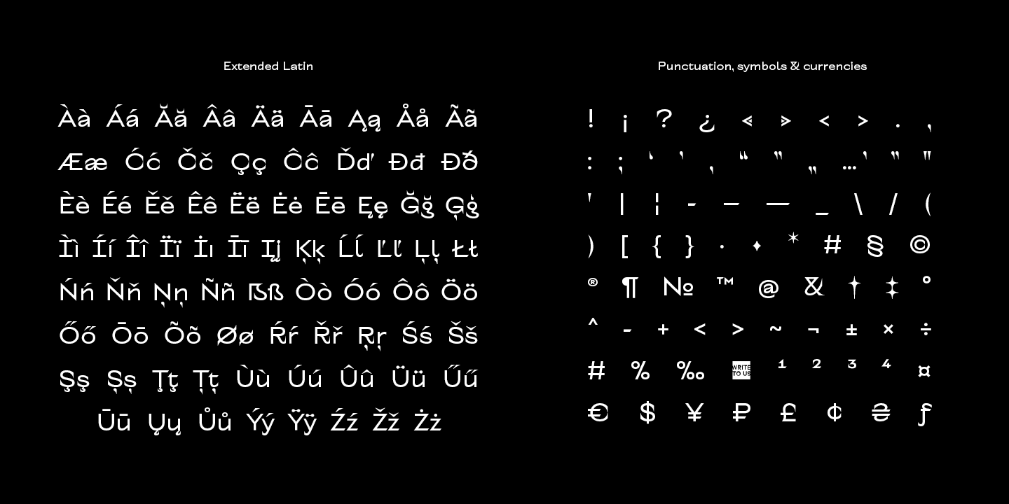
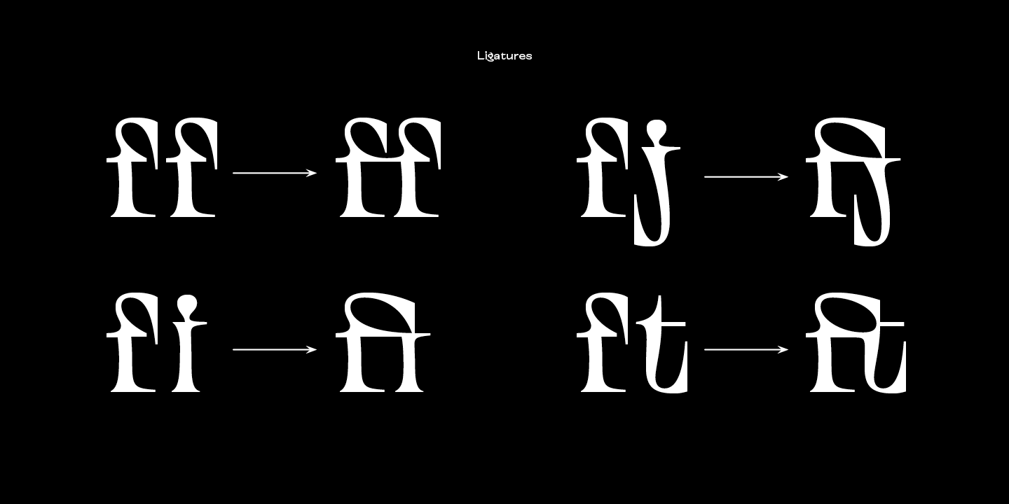
The TT Alientz family consists of 3 fonts: grotesque, serif and variable* font. Each font contains more than 470 glyphs. In addition to broad language support (including Cyrillic), the typeface has stylish ligatures, contextual alternates, and old-style figures. Variability in the typeface affects the changes in the overall style of the font—moving the slider to adjust the variable axis, you can go from a laconic grotesque to an extreme serif.

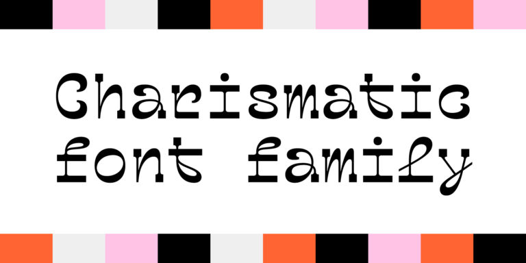
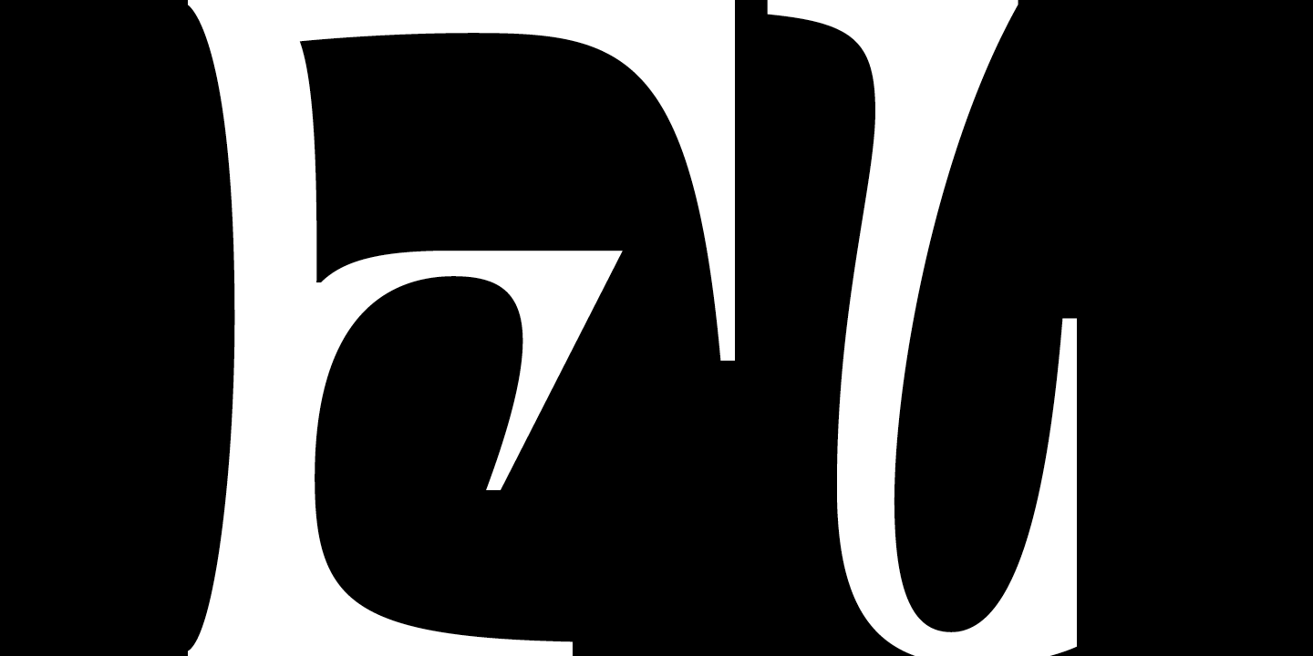
TT Alientz Grotesque is a fairly neat hipster grotesque, but with its own small features. In the design of some letters of the grotesque you can find small sharp elements that add uniqueness and character to the font when used in large inscriptions and headings. At the same time, when you use the font in small size of the size and in text blocks, sharp elements do not greatly affect its readability. The design of some letters of the grotesque is quite peculiar and is intended to emphasize the initial concept of slight ’alienness’.

TT Alientz Serif is an ’infected’ TT Alientz Grotesque and the result of changes to it. Unlike the grotesque, the serif is dynamic, viscous, ductile and very prickly. Serif has a lot of smooth lines and not quite standard strokes contrast. It can be noted that most serifs in the antiqua are pointed inward, not outward. Despite its extremeness, the serif will look good both in large and in small body sizes.

Team

Vika Usmanova
Ivan Gladkikh
+ TypeType Team

Release date

6 November, 2019

Additionally

Custom version

Looking for a custom version of this font?

Character Set

Basic Latin Basic Cyrillic Extended Latin Stylistic Alternates, Standard and Discretionary Ligatures|salt,liga,dlig Lining Figures, Currencies Old-style Figures|onum Punctuation, Symbols, Mathematical Symbols, Arrows
A B C D E F G H I J K L M N O P Q R S T U V W X Y Z a b c d e f g h i j k l m n o p q r s t u v w x y z
А Б В Г Д Е Ё Ж З И Й К Л М Н О П Р С Т У Ф Х Ц Ч Ш Щ Ъ Ы Ь Э Ю Я Ѓ Ґ Ќ Є Ї Љ Њ Ћ Ђ Ў Џ а б в г д е ё ж з и й к л м н о п р с т у ф х ц ч ш щ ъ ы ь э ю я ѓ ґ ќ є ї љ њ ћ ђ ў џ
À Á Ă Â Ä Ā Ą Å Ã Æ Ć Č Ç Ĉ Ď Đ Đ È É Ě Ê Ë Ė Ē Ę Ğ Ģ Ì Í Î Ï İ Ī Į Ķ Ĺ Ľ Ļ Ł Ń Ň Ņ Ñ Ò Ó Ô Ö Ő Ō Õ Ø Œ Þ Ŕ Ř Ŗ Ś Š Ş Ș Ť Ţ Ț Ù Ú Û Ü Ű Ū Ų Ů Ý Ÿ Ź Ž Ż à á ă â ä ā ą å ã æ ć č ç ĉ ď đ ð è é ě ê ë ė ē ę ğ ì í î ï ı ī į ķ ĺ ľ ļ ł ń ň ņ ñ ß ò ó ô ö ő ō õ ø œ þ ŕ ř ŗ ś š ş ș ť ţ ț ù ú û ü ű ū ų ů ý ÿ ź ž ż
ff fi fj ft ffi ffj fft
0 1 2 3 4 5 6 7 8 9 ¤ $ ¥ £ ¢ ƒ
0 1 2 3 4 5 6 7 8 9
! ¡ ? ¿ « » . , : ; ... " ' | ¦ - _ / ( ) [ ] { } · * # § © ® @ & ° ^ - + < > ~ ¬ ± × ÷ % 1 2 3 4

OpenType features

liga | Standard Ligatures

ff fi ffj

ff fi ffj

onum | Oldstyle Figures

1638

1638

case | Case Sensitive Forms

({[H]})

({[H]})

calt | Contextual Alternates

ft fi

ft fi

Ideal font pairs with TT Alientz

What is a font pair, and what does it serve for?

A font pair is a combination of two fonts within one text block. Most often, one of the fonts in a pair is a more expressive headline font, and the other one serves to communicate information. Such fonts complement each other and help designers solve various tasks, like highlighting key elements, adding emotional expressiveness to the project, or separating semantic blocks.

How to choose fonts for a project: Several general recommendations

To begin with, establish the project's tone. Choose the fonts that stylistically match the main idea. After that, you need to determine the functions of each font in the project and their hierarchy: which font will complement the design and which one will serve to attract attention as the main element. You need to assess the difference between the fonts and decide what kind of information each of them should convey. First, we recommend choosing the base font you will use most, and then you can find a suitable pair for it.

Core principles of font pairing and recommendations from designers

The main rule you should follow when matching two fonts is that both similarities and differences must be visible between them. You can highlight the coherence of fonts by the following characteristics: contrast, proportions, width, openness of characters, individual letter shapes, and overall tone. Feel free to experiment with different combinations. We also recommend analyzing the projects you like: this way, you can enhance your visual skills, elevate your knowledge base, and gain confidence in dealing with typography.

Similar fonts

3 font styles
4 font styles
4 font styles
Buy font