When expanding character sets of fonts, novice type designers often face difficulties in drawing the eszett character.
In this article, we will take a journey through the history of this character, learn about its origin and role in modern typography. But most importantly, we will talk about the methods and rules for drawing eszett when creating your own font. The first part will be devoted to theory, and the second will be a practical guide for everyone involved in type design.
Part one. Theory.
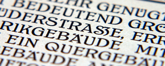
Eszett (or sharp s) is a character of German orthography. Formerly it was used in most of Europe but survived only in German.

Modern character names
In terms of design, an eszett is an orthographic ligature.
Technically, it consists of ſ (long s) and z, hence the German name “Eszett”.
Common name options are Eszett and Eszet. In the past, these designations were not used as a term, but rather conveyed the sound of two letters.
Eszett is often called “scharfes S”, that is, in literal translation, the sharp letter s. In his book Treasury of Alphabets and Lettering, Jan Tschichold explains that the conjunction ſz in this ligature is a misunderstood conjunction of a long s and a terminal round s. If you push the long s and the short one together, then only a part similar to the Gothic z will remain of the short one on the right. The further printers moved away from using the long s, the more the original meaning of this ligature was distorted.
The shape of the eszett character is somewhat similar to an unusual version of the letter B or to the Greek beta. To better understand why the form of the eszett became this way, let’s dive into history.
Origin of eszett
Consider the left side of the ligature, the long s.
The long s is an archaic form of the letter, long out of use. Among modern symbols, the closest in form is the mathematical sign of the integral. The long s is derived from the ancient Roman cursive letter s.
Most printed works before 1800 used two forms of lowercase s. One of them is a short or round s, familiar to everyone.
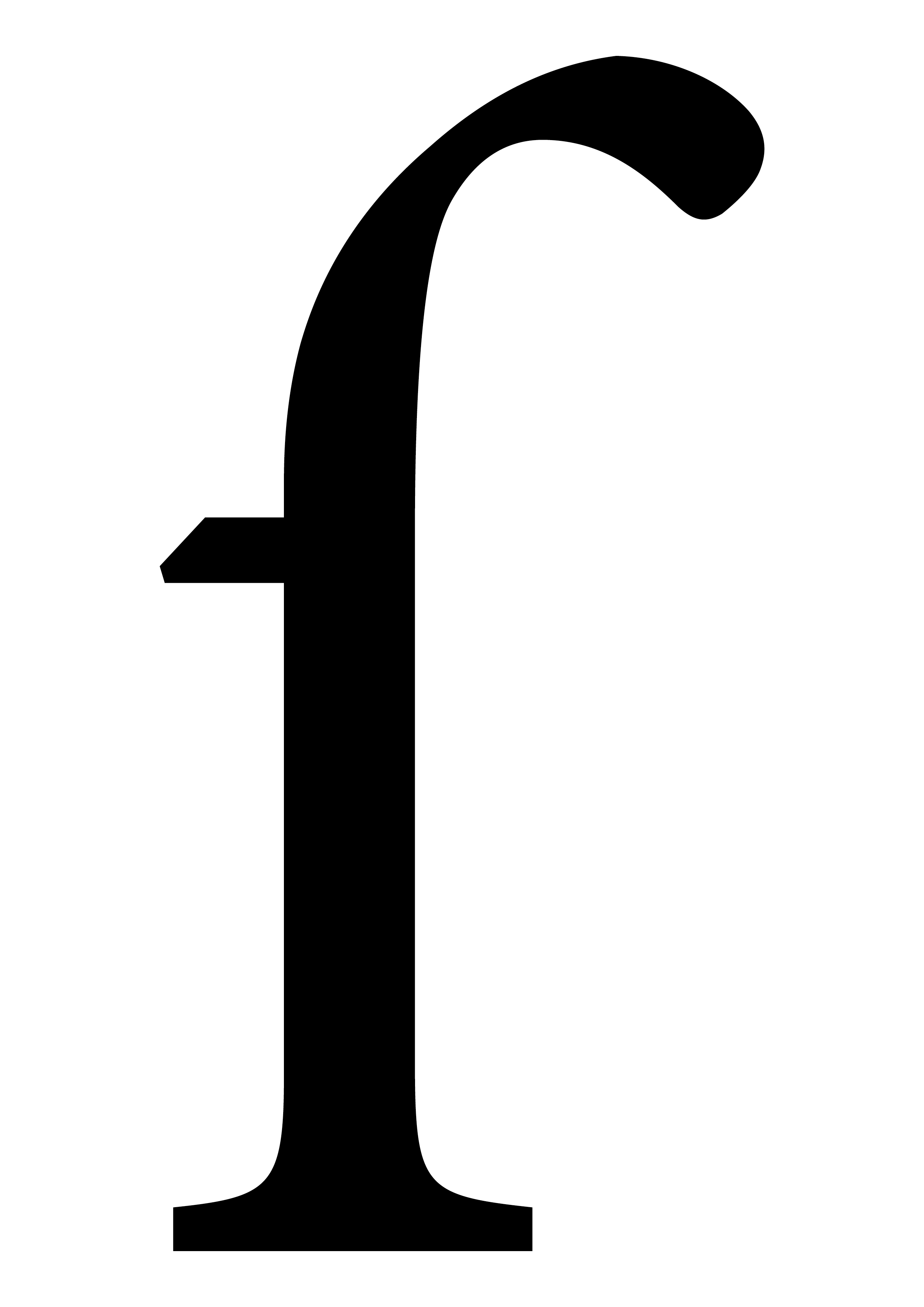
The second was a long s, visually similar to f without the right side of the crossbar. It retains the serif on the left, which is found in the design of the eszett in modern typography.
In italic form of the long s, the left serif is often missing.
The printers of the first Gothic-based typefaces followed the established rules of using initial and middle long s and final short s.
However, the first authors of humanist writing used only long letters. Some printers, inspired by the tendencies of humanist writing, began to replicate this trend but soon abandoned this idea. The “Gothic” use of initial and middle long and final short s became the rule of printing until the end of the 18th century.
The long s often overlapped adjacent characters; in such cases they could replace the long s with a short one. This technique was used before letters that a long s could collide with. Over time, special ligatures were created for such combinations: sb, sh, si, sk, sl, ss, st, ssi, ssl.
In calligraphy, the long s was rarely used in cursive forms of writing (clerical cursive and “Italian” cursive). Such loose principles differed from the printing rules of the day.
After the 16th century, the long s began to be gradually replaced. The trend towards such a solution was set by Giovanni Francesco Cresci, a Roman calligrapher-reformer and teacher. He rarely used the long s in his work, and this style was adopted by his students and followers.
The long s became less common, and this approach was transferred from calligraphy to print.
François-Ambroise Didot was the first to abandon the long s in his fonts, and other printers followed his example. The long s was abandoned due to the inconvenience of use and its shape.
The long s could be found in Gothic fonts, for example, in Fraktur and Schwabacher. These fonts have become more widespread in the press of German-speaking countries. Since most of the books there were set in Fraktur, there were no problems with the use of eszetts and long s.
However, the abandonment of the long s by printers also affected German printing, as Roman types were becoming popular. For example, in 1789, Johann Friedrich Unger anecdotally trimmed a long s for printing Goethe’s “Roman Carnival” in the style of Didot fonts. This way, he had the opportunity to type an eszett in the text.
Going forward, printers would either carve the German ſs in the style of Didot fonts, or use the combination ss.
The first appearance of the ß ligature was in the second edition of Jacob Grimm’s “German Grammar”. The book is set in French-style Roman font using ſ and ß. It is assumed that ß was cut specifically for Grimm. It was this form of eszett that decades later would be adopted as the official one following the German spelling reform of 1903.
Jacob Grimm proposed to finally abandon the use of Gothic fonts in scientific publications and use Roman ones. In order to avoid problems during printing that would be due to the lack of a long s and an eszett, he recommended replacing the eszett with a combination of sz. This proposal was taken into account, and although most books and newspapers in the 19th century were still set in Fraktur, for scientific and technical publications, most printers chose the Roman type.
Eszett’s official approval
In 1871, the German Empire was created with its capital in Berlin. German spelling was reformed and changed.
The first step was a conference in Berlin in 1876 where the introduction of ß into the Roman script was discussed. In 1879, the first versions of the character were published in the report of the Journal für Buchdruckerkunst.
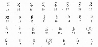
Some ligatures were based on ſz, others were formed from ſs. Variants 1 and 3 (bottom left row) received the greatest support from typographers. They were based on the ß that Grimm once used.
In 1903, the printing association of Germany, Austria and Switzerland decided to use the character ß in Roman script, consisting of the ligature ſ and s.
The symbol ß, which at the time was officially called the Sulzbacher form, was often criticized. It has received criticism for its appearance, which many found ugly, for its strong resemblance to the Roman capital B and the Greek beta. However, it was this form that became the model for ß, later used in many fonts.
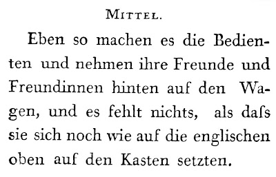
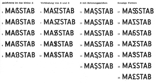
There was no consensus on the design of the capital eszett. In some editions, the combination SZ appeared, replacing the eszett. For example, one could come across both the spelling PREUSZEN and Preußen. Several times type designers attempted to find a form for the eszett character, but none of them were successful.
For example, below are eszett variants published in the German magazine Papier und Druck in the 1950s.
Until 1996, the capital eszett was not used in the mass printing, although it was sometimes used in local publications.

In 1996, a reform of the German spelling took place, affecting the eszett character. The new rules assigned the function ss to the eszett, specifying how to read a vowel before an s-like sound. Thus, the search for a unified design of the capital eszett became a necessity.
In 2008, the character appeared in the updated composition of Unicode, and in 2017, the Council for German Spelling approved the optional use of the capital eszett.
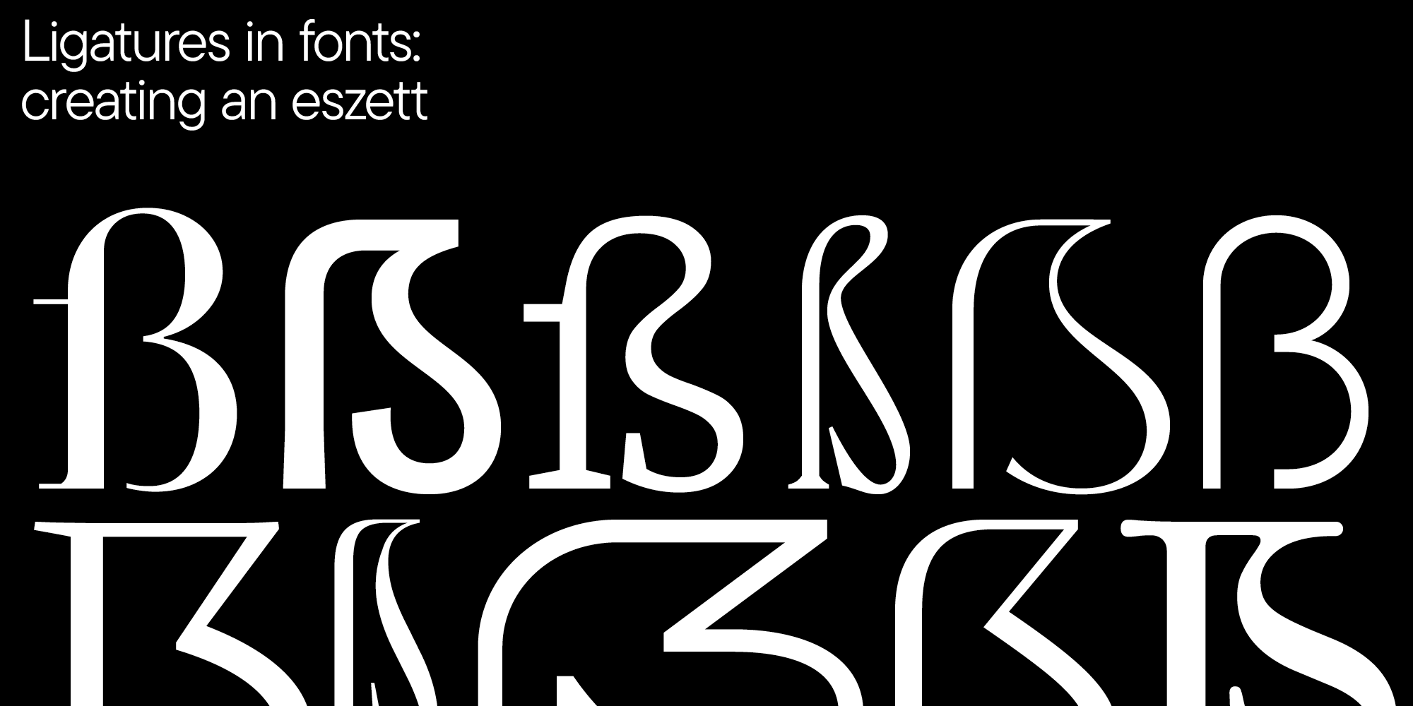
Type designers have created several types of eszett, the most popular you can see below in the image by Adam Twardoch.
Part two. Practice.
In this chapter, we unify recommendations from Ralph Herrmann, Karen Cheng and internal studio work.
Designing the uppercase eszett
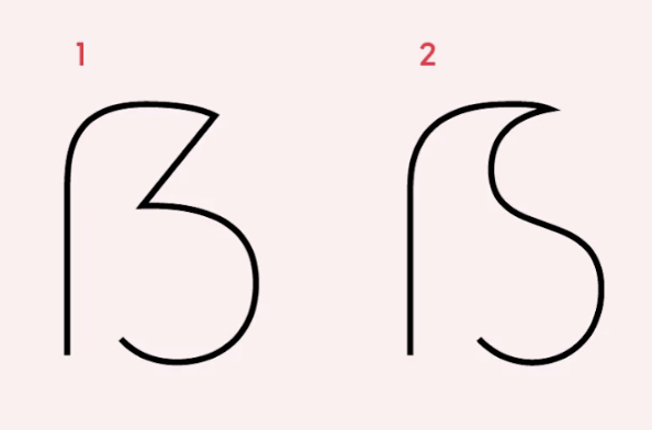
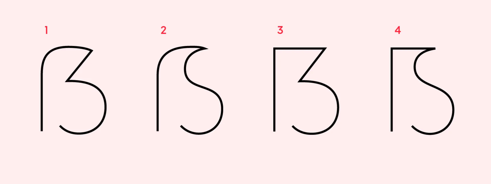
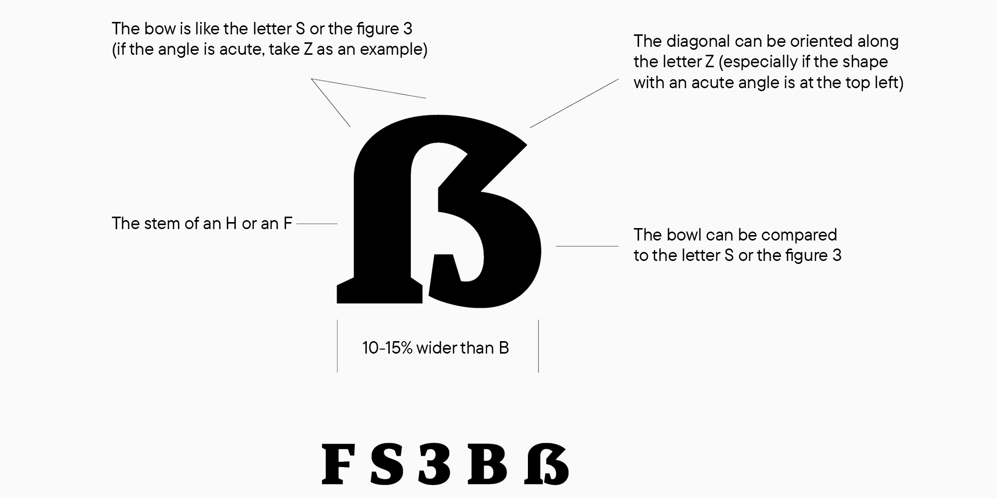
Ralph Herrmann mentioned that the number 1 capital form of eszett is the most common construction. Characteristic features are the aperture at the bottom and the diagonal in the upper right part. The bottom is often rounded, although you can find eszett forms where this part of the character is drawn as an angle or with a serif.
When a type designer sets out to create an extended language set, the basic set of characters and letters is usually already rendered.
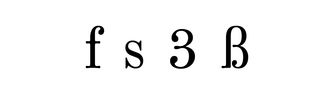
Therefore, graphically, when drawing an eszett, you can focus on the created forms of the signs F, S, Z, B and the number 3.
The proportions of the capital ß are wider than those of the letter B by about 10-15%. This is not a mandatory requirement, because it is more important to take into account the proportions of the created font and focus on them.
To test the result, you can print the text with an eszett and carefully look at the character in the total mass of characters. This way you can understand how the shape of the character fits into the overall look of the font in terms of width and shape.Karen Cheng in Designing Type suggests making cuts and serifs in terminals of S 3 and eszetts identical, but this is not a requirement when creating a typeface.
In sans serifs, for example, terminal cuts can be straight.

Unsuccessful examples of the eszett form are usually read as B.

In such cases, you can add a diagonal element.
Lowercase eszett design
When creating a lowercase eszett, two forms are possible.
- The classic connection of f on the left with the letter s. In f, there is no crossbar.
- Sulzbacher shape with two semi-ovals on the left, as in number 3.
In many typefaces, you can see the smooth continuous connection of the arch f with the letter s, although there are forms with a more noticeable separation of these characters.
Ralf Herrmann says that German-speaking readers that are not familiar with typography perceive eszett as a single letter. Because of this, it is preferable to create a variant with a smooth connection.

In TypeType fonts, the stem does not go below the baseline of upright styles. This helps to tell apart the eszett and the Greek letter beta. In italic forms, you don’t have to follow this rule, since historically the long s form in Italics always had a descender and was indeed long.
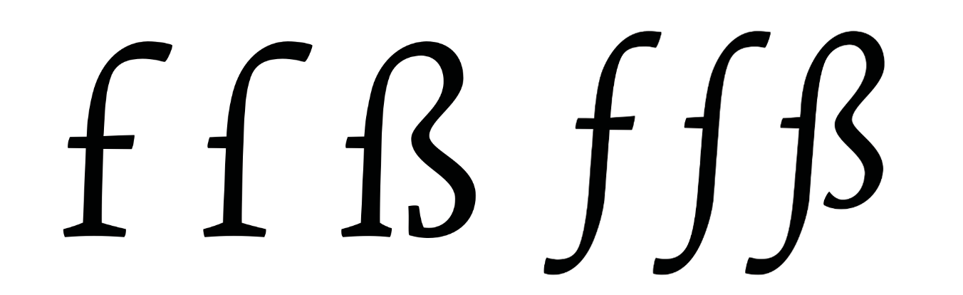
The left serif you see in the image above is found in many fonts. In modern typography, this is not a necessary element for an eszett. You can leave out the serif so that the eszett doesn’t look like an f.
However, if your font has a long s, be careful about adding serifs. If you draw a serif in a long s, it must also be added to the eszett. This rule also works the other way round: the absence of serifs must concern both characters.
It is important to avoid confusing long s and f, as in the example below: the longs_t ligature looks like f_t, but there is no serif in the eszett sign, as well as in the long s sign. A user unfamiliar with history can easily use this ligature for other purposes.
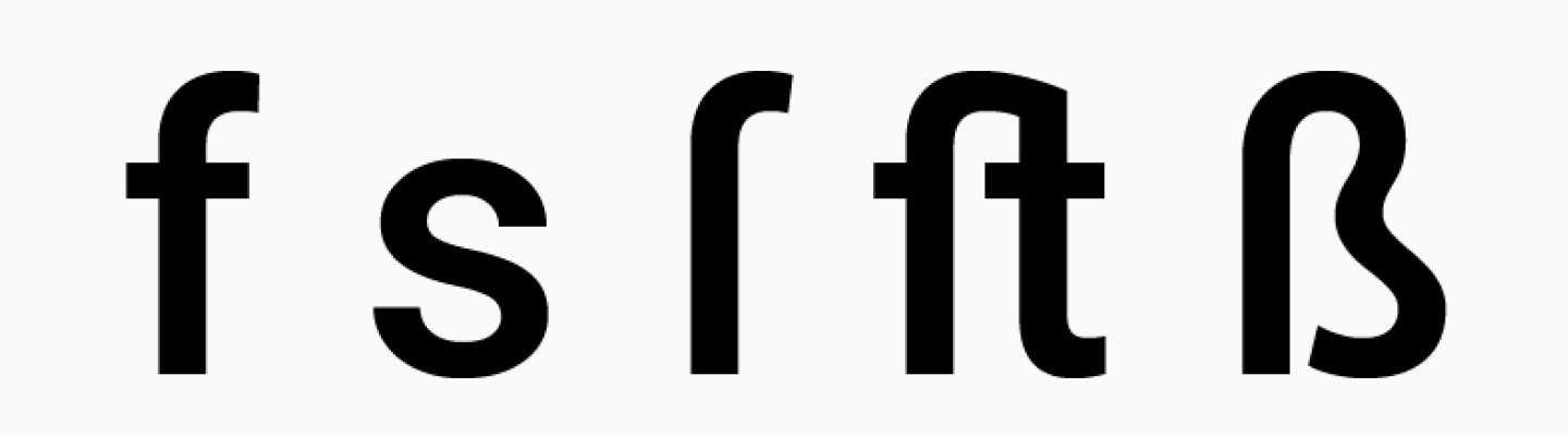
It is important not to extend the serif on the left in the eszett all the way to the crossbar, as in the letter f. Options similar to the example below are incorrect.

In fonts with a historical touch, it is possible to use non-standard combinations of the long s with s which reference Fraktur.
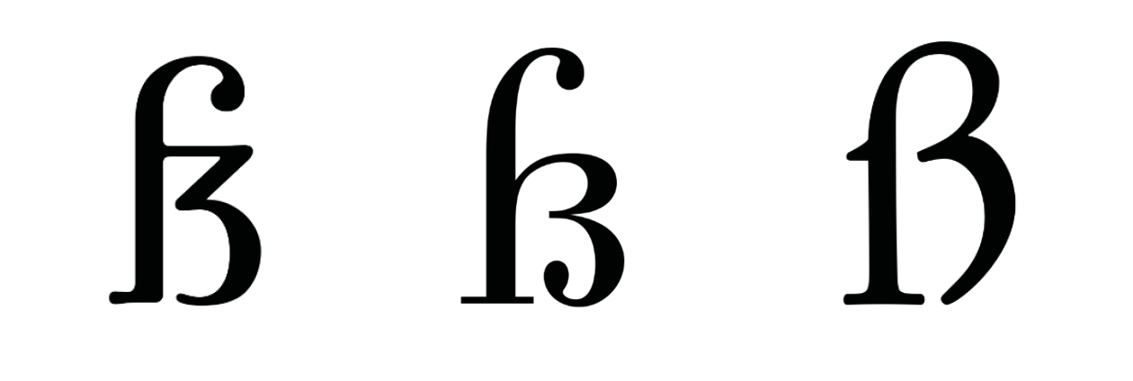
The Sulzbach form is an eszett in which the connection of the long s with the letter s or z is not explicit. For people not familiar with the German language, such a letter will look like a capital B due to the presence of two semi-ovals. When creating such an eszett form, you can rely not only on fs, but also on the number 3.
The right semi-ovals of the eszett in this form should be identical to each other. The horizontal should not be connected to the stem in its length in order to visually separate the eszett and uppercase B. You can end the lower semi-oval with a serif or a drop, depending on the style of the font created.
When drawing ligatures, including eszett, always be guided by the general logic of the font. If the creation of a specific form leaves you in doubt, test the character in the general mass of other characters to assess visual compatibility. Remember that all characters in the font should look harmonious, then the reader will be pleased to look at the typed text, and the designer will be happy to work with the font.
The author of the article: Toma Streltsova, TypeType Font Designer
Materials used in the article.
- https://typography.guru/journal/german-sharp-s-design/
- https://typography.guru/journal/the-capital-%C3%9F-design-can-we-create-an-uppercase-character-from-lowercase-r59/
- https://typefoundry.blogspot.com/2008/01/esszett-or.html
- https://typefoundry.blogspot.com/2008/01/long-s.html
- https://typography.guru/journal/how-to-draw-a-capital-sharp-s-r18/
- https://typography.guru/journal/germanys-new-character/
- https://medium.com/@typefacts/the-german-capital-letter-eszett-e0936c1388f8
- Karen Cheng, Designing Type
- Jan Tschichold, Treasury of Alphabets and Lettering.