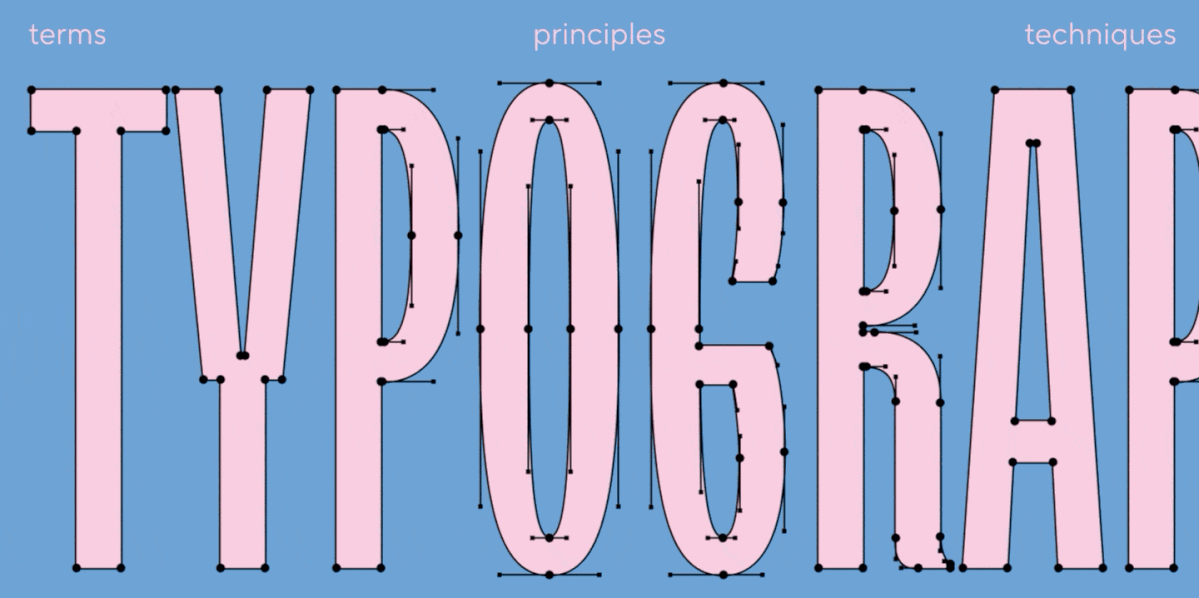
The larger the project, the more noticeable the price of chaos. On a simple landing page, you can manually fix a couple of headings. In an app with hundreds of screens, multiple platforms, different modes (like light/dark themes), and localizations, this approach quickly breaks down. One designer changes the size of a caption, another creates a local style, a third manually tweaks the line height—and within a month, the team no longer understands which values are actually systemic. A systematic approach to typography in Figma is crucial: it helps not only to craft an amazing layout but also to make the design solid and sustainable in real production. In this article, we explore the capabilities of working with typography in Figma, break down the core concepts, and provide practical examples.