Use font subscription! The full font library of 75+ fonts will always be at hand. See more

In our font studio’s 10-year journey, we’ve designed 1.500.000+ glyphs. Try out TypeType fonts online!

We Have a Digital Font Catalog! Looking through our typefaces has become even more convenient. PDF Catalog of TypeType Fonts

Type foundryBlogCustomization of TT Hoves for the legendary brand Telefonica

Customization of TT Hoves for the legendary brand Telefonica

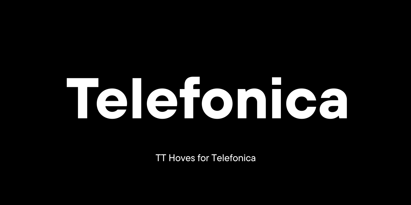
The TypeType team was approached by the Spanish telecommunications company Telefonica with a request to customize the TT Hoves font. Telefonica is one of the largest raditional and mobile phone companies in the world.

The company was completely happy with the font and they only wanted to make one change! However, this customization affected many characters.

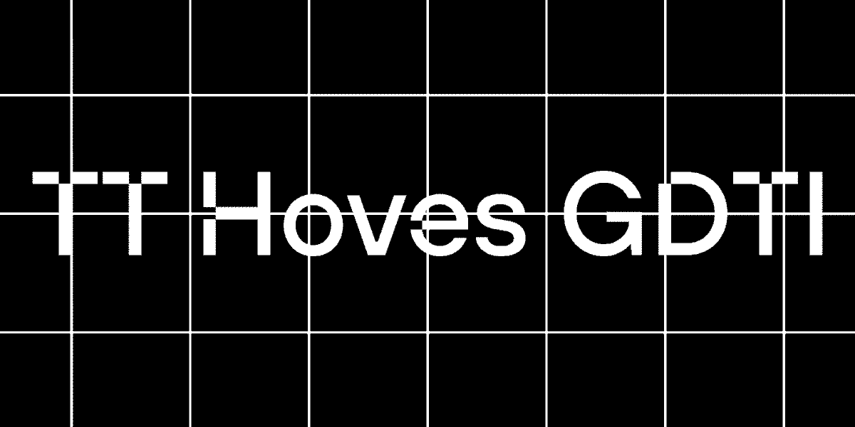
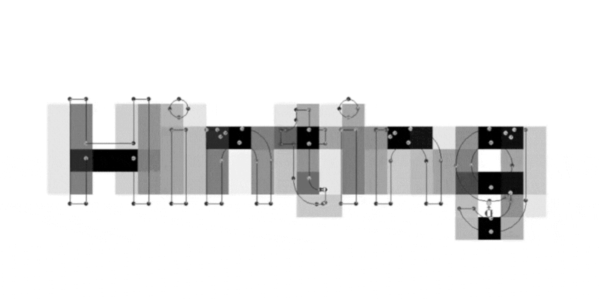
Telefonica wanted to change the appearance of all the dots and change their shape from square to round, eventually getting a customized version of the font with a new name. The TypeType designers got to work. All characters and letters suitable for customization were selected, and next a round dot was added to each glyph.

Customization of TT Hoves for the legendary brand Telefonica
Changing shape of dots from square to round

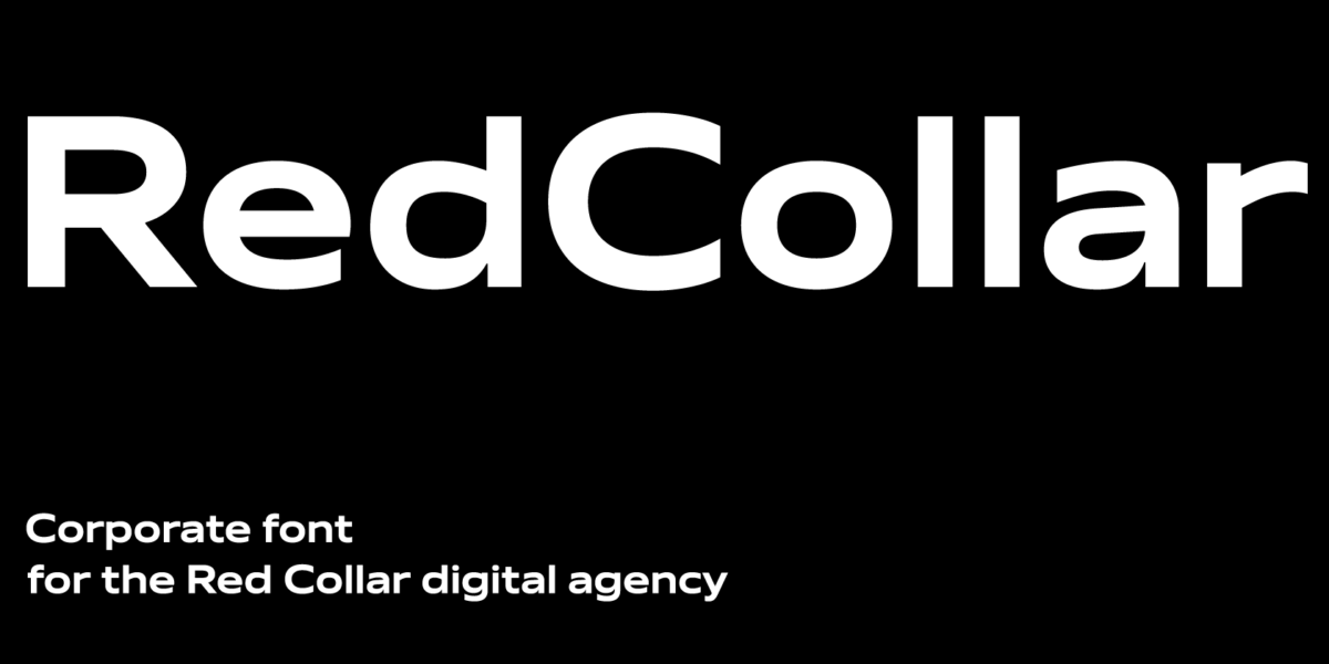
The customized characters were hinted and then the font file was named Telefonica Sans.

The custom version of TT Hoves called Telefonica Sans is now more user-friendly. You can see the result on the company’s website.

Telefonica purchased an unlimited license for the font, so this customization was complimentary.

Latest publications

On Opposite Sides: Wide and Narrow Fonts

On Opposite Sides: Wide and Narrow Fonts

Wide and narrow fonts are among the newest trends in typography, graphic design, and web design. At first glance, some may seem odd and awkward, but when thoughtfully applied, they can infuse a project with freshness, boldness, relevance, and strength. What are narrow and wide fonts, what variations do they come in, and where are they used? Let’s explore this together in this article.

See more
How do you add a font to your computer? 

How do you add a font to your computer? 

How to install a new font on a PC? Users and designers face this question very often. Rest assured, there is nothing tricky in this process! This article provides a step-by-step guide to help you understand how to install downloaded fonts correctly on Windows and iOS-powered computers.

See more
Font Licensing: Complete Guide for Designers and Business Clients

Font Licensing: Complete Guide for Designers and Business Clients

In this article, you will find out what types of font licensing exist, how to choose a suitable font license and use it, how to verify and buy a commercial font license, and how to avoid unpleasant typeface licensing issues whether you are a designer or a client.

See more
Kerning, Tracking, Leading & Spacing in Typography: What’s the Difference?

Kerning, Tracking, Leading & Spacing in Typography: What’s the Difference?

Even seasoned designers sometimes mix up the concepts of kerning, tracking, spacing, and leading. Become a pro at distinguishing them! Learn the definitions of these concepts, explore their differences, and discover some helpful tips on how to use them while working on your fonts.

See more
Branching out: How Scandinavian Sans TT Firs Grew and Found Its Font Pair

Branching out: How Scandinavian Sans TT Firs Grew and Found Its Font Pair

In 2023, we breathed new life into the beloved Scandinavian sans serif TT Firs Neue by dramatically refining and renewing the typeface to comply with cutting-edge standards. Soon after, we introduced the text font pair for this typeface – an elegant TT Firs Text. This article is dedicated to how it all began, why we decided to update TT Firs Neue, what we added and modified, and how TT Firs Text was born.

See more
Top 10 Typography Trends of 2024

Top 10 Typography Trends of 2024

We live in a time when trends shift nearly every day, and typography design trends are no exception. We all encounter typography daily: on the web, in supermarkets, and on shop windows and signs. Outdated design, at the very least, induces boredom; at worst, it fosters distrust in the product or service. However, trendy design looks captivating and attractive.Experts and designers from the TypeType font studio are excited to share the key type trends of 2024 with you in this article. Stay trendy!

See more
15+ Best Magazine Fonts for Perfect Editorial Designs

15+ Best Magazine Fonts for Perfect Editorial Designs

Magazines are a perfect backdrop for typography to express all its dimensions. Fonts, in this case, not only communicate information but also directly influence the design. They deliver the magazine’s message, reflecting its values and ideas. In this article, we discuss how to choose the best magazine font and compile a list of 15 relevant options for editorial designs on various themes.

See more
UniversiTTy: Lesson 9. Uppercase Characters. Detailed Contour Refinement

UniversiTTy: Lesson 9. Uppercase Characters. Detailed Contour Refinement

Welcome to the ninth lesson of our «UniversiTTy»! In this series, we guide you through the process of font design step by step. The font is a cohesive visual system. This can be seen on all levels: global (font type, weight, proportions, contrast, general forms) and at lower scales that encompass all graphic choices in individual characters. Let’s find out together how visual details influence the overall perception of fonts.

See more
15 Best Outline Fonts Approved by Designers in 2024

15 Best Outline Fonts Approved by Designers in 2024

Outline fonts are an excellent tool for adding variety to a design, making it attractive and bold. What do they look like? Where are they used? What font styles do they match?
We covered all these questions in this article and made a selection of the best outline fonts for different projects.

See more

See more

Variable fonts: What’s new in them for designers?

Variable fonts: What’s new in them for designers?

In this article we will tell you about variable fonts and what an interesting and useful, yet underrated instrument they are. We will also mention their disadvantages and nuances of working with them.

See more
Font customization

Font customization

It often happens that existing fonts do not correspond to the needs of a certain project. But font is not a static instrument that functions only the way it was created. To convey the company’s individual style, the font can and should be adapted and customized to one’s needs that may range from simple changes like diminishing the character composition to complex design changes in all glyphs.

See more
Converting TT Hoves Medium into an adapted TT Hoves GDTI

Converting TT Hoves Medium into an adapted TT Hoves GDTI

Monospace, a branding agency from Germany, creates corporate identities and designs for projects. The company believes that through design it is possible to create a brand though which customer interactions will be enjoyable and long-term.

See more
Corporate font for the Red Collar

Corporate font for the Red Collar

In this article we will tell and show how we created the corporate font for the Red Collar digital agency. The spirit that the client wanted to see in the font would be supposed to reflect the agency’s self-positioning: “It’s technological, but affordable; it is brave, bold, but fully responsible for the result”.

See more
TT Ricordi creation story

TT Ricordi creation story

The TT Ricordi font family is a collection of three display heading antiquas designed to significantly diversify the traditional font palette. With that, all three fonts are close in thickness and similar in their character compositions and are featured in the uppercase set and the small capitals set, which replaces lowercase characters.

See more
TT Autonomous creation story

TT Autonomous creation story

Today we want to share with you the short story of the TT Autonomous font creation. We’ll tell you what inspired the designers and what types of fonts are included in the family.

See more
Changing glyph sizes in TT Commons™ Classic

Changing glyph sizes in TT Commons™ Classic

PluralSight has asked TypeType for trial versions of the TT Commons™ Classic and TT Interphases fonts to choose a suitable one. They were attracted by TT Commons™ Classic, but the non-standard size of glyphs made the font unsuitable for several directions.

See more
Font hinting: From first developments to use in practice

Font hinting: From first developments to use in practice

In this article, we will tell you the history of font hinting development. We will share our own experience of working with fonts and explain what tasks hinting solves.

See more
Turning off ligatures in TT Norms® Pro

Turning off ligatures in TT Norms® Pro

The German marketing analytics platform Adjust has addressed TypeType with a request to customize the TT Norms® Pro font. Adjust provides services for company development all around the world.

See more