To a novice designer, web fonts can seem complicated and even intimidating. But there are no reasons for despair, because over time, by studying the information and practicing, you will become a professional.
Moreover, web design is now one of the most sought-after areas. From young startups to companies with a long history, every brand wants to have a website and maybe even an app. The fonts that will be selected for the site and application will become part of the corporate identity.
Since web fonts are increasingly being chosen for the design of sites and applications, we will talk about them.
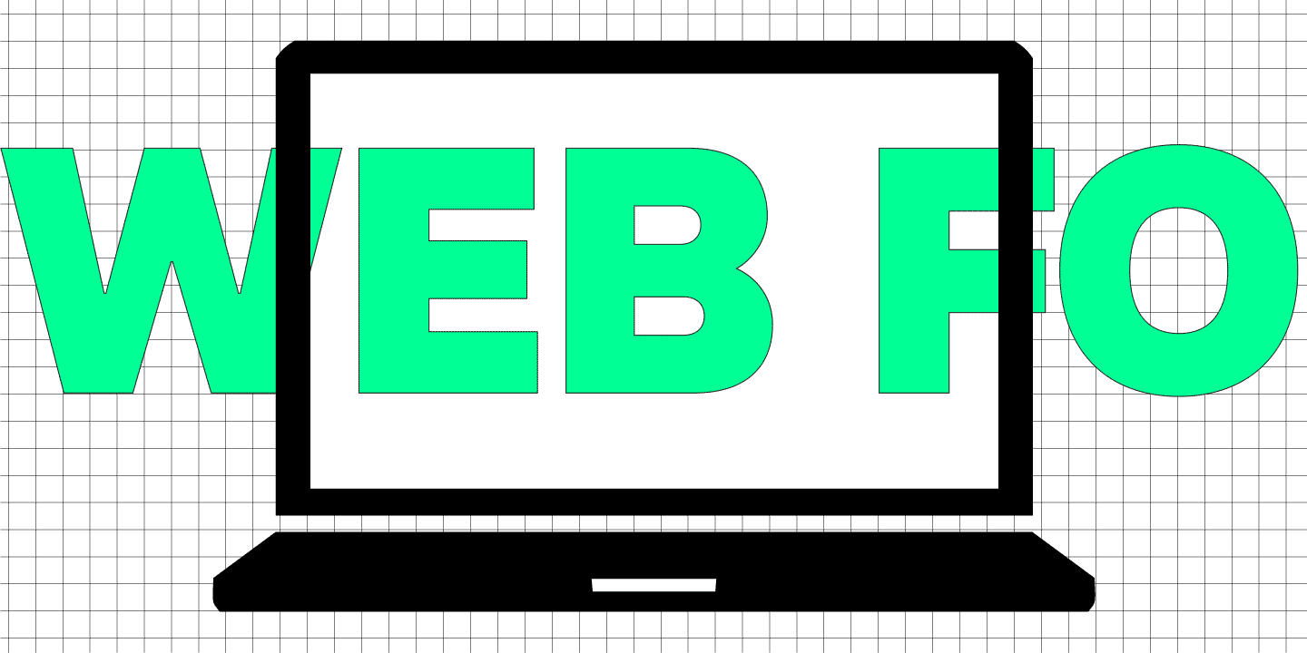
Web Fonts
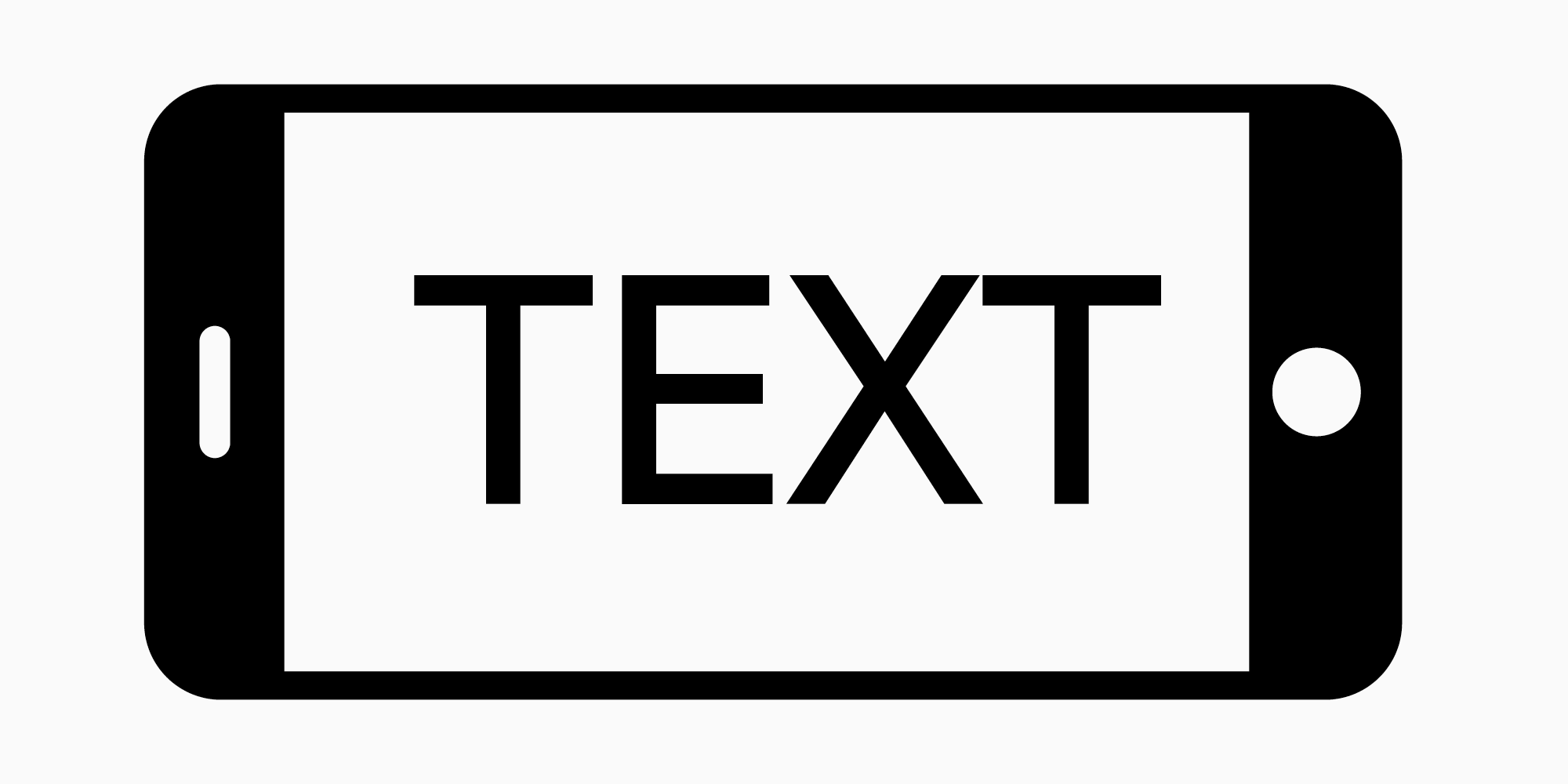
The devices you use (laptop, smartphone, tablet) have pre-installed system fonts. Most websites and applications use fonts that have been uploaded to a web server. These are web fonts.
Website fonts are designed to display well across devices, operating systems, and browsers. Ideally, they are displayed identically, as intended by the designer.
The problem is that the same site will be looked at by thousands of users on completely different devices, ranging from a state-of-the-art smartphone with new software to a pot-bellied computer monitor whose operating system is older than most social networks.
As you might guess, due to technical features, the font cannot look exactly the same for all users. The task of a designer is then to take into account the maximum number of nuances so that the font is displayed for the majority.

Safe or standard web fonts
Safe web fonts are those that support all kinds of operating systems and browsers. No fonts are absolutely safe.
Safe fonts are often referred to as default fonts because they are preinstalled on many devices. This is the reason why they open for most users.

A list of safe web fonts can be found on the Internet, these are well-known typefaces. Exactly this constitutes the problem of using such fonts for the designer. These fonts were used so often that they began to look trite and boring to the user. With them, it is difficult to emphasize the character of the brand, so such fonts are rarely made part of the corporate identity. However, a novice designer should get to know them.
Installing custom fonts on a website
We have reached the most interesting part of the article!
Using standard fonts is relatively safe, but boring for a designer. If you want to choose a different font, modern typography offers a large selection of websites fonts in a variety of styles.
All these fonts are called non-standard.
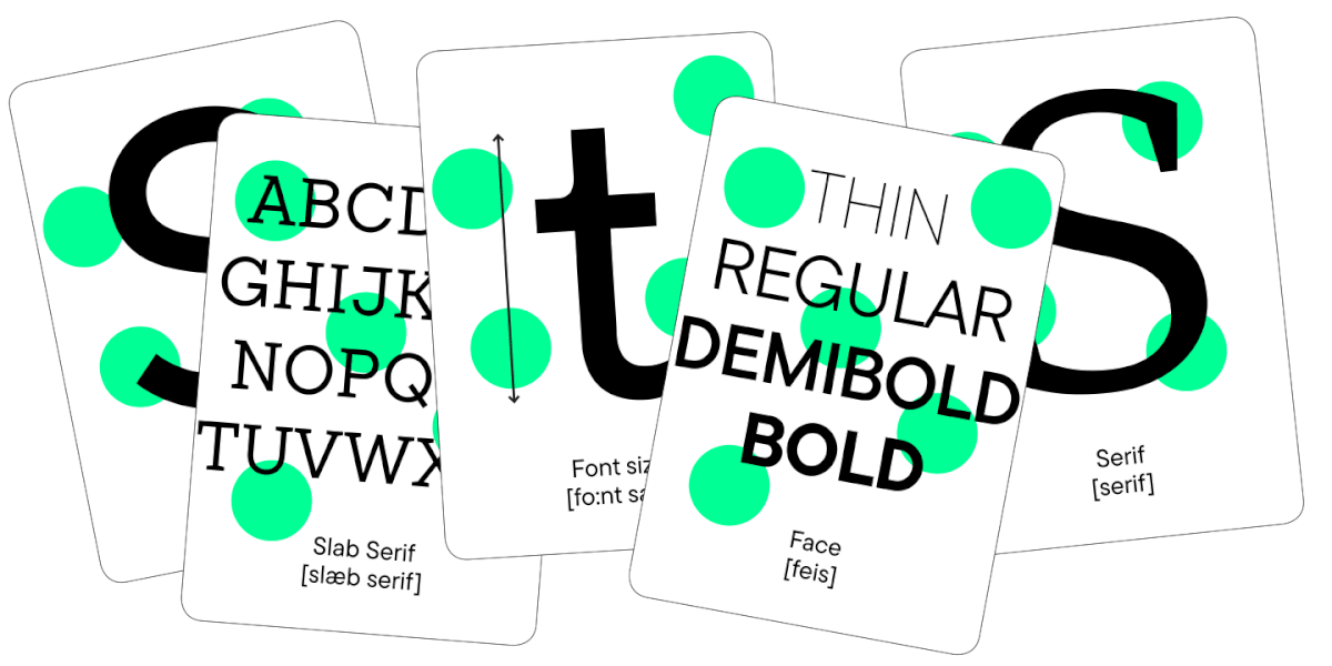
They may differ:
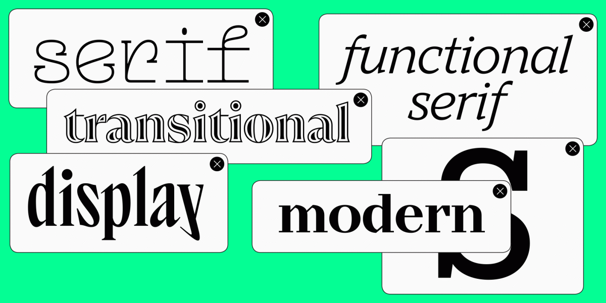
- by type of font: serif, sans serif, slab type;
- by purpose: text, display or heading;
- by character: strict or graceful, neutral or daring;
- by fullness: a family can include several subfamilies and styles;
- by character set, number of styles and language support.
Much more important is that they will differ in quality. The better the font is made from a graphical and technical point of view, the more likely it is to be beautifully and correctly displayed on the maximum number of devices.
What to pay attention to?
- The reputation of the studio or designer who created the font. Ask other designers about their experiences, read reviews, and look at real websites and mobile apps that use the fonts you’re interested in.
- Kerning, readability, contours. Best of all – in different sizes. Many studios offer to download a test version of the font to try it out for free. For example, TypeType studio’s trial fonts are absolutely identical to commercial ones in terms of composition and technical characteristics.

When you have already selected and purchased the required font, what remains is to install it.
If you are using WordPress, you can install the Use Any Font plugin, which allows you to upload fonts to your site.
Otherwise, you can use your site’s host to upload the font. The first thing you need for this is an appropriate license that allows you to use the font on the site. For example, for TypeType, this is a web license.
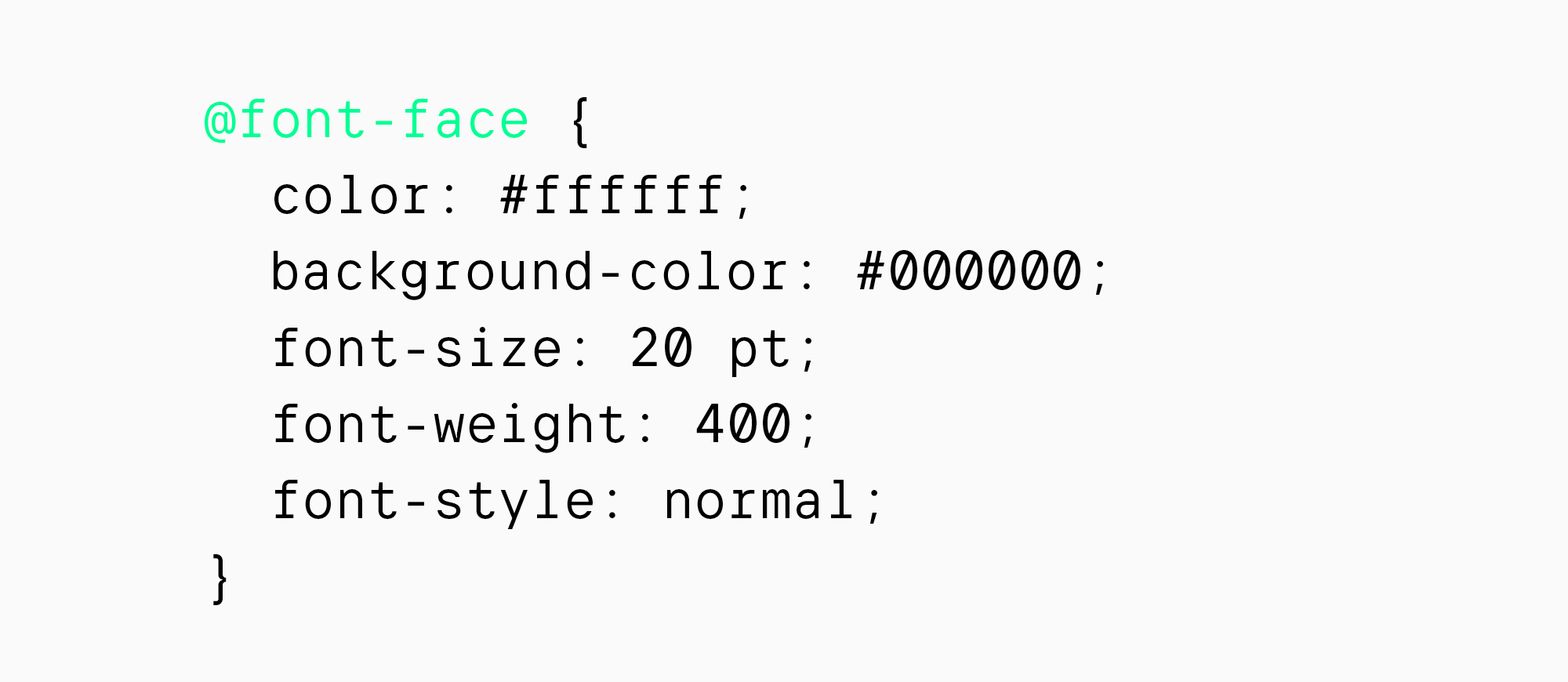
You’ll need font files in the required formats (more on that in a moment), which you’ll need to put into the CSS via the @font-face rule. You need to specify the name of the font, the address of its location and weight.

Later, you can use the @font-face rule to format text by choosing the font style, size, and color. You can also choose a fallback font from among the safe ones, which will be displayed if a non-standard web font fails to load on a user’s device.
About font formats and sizes in web design
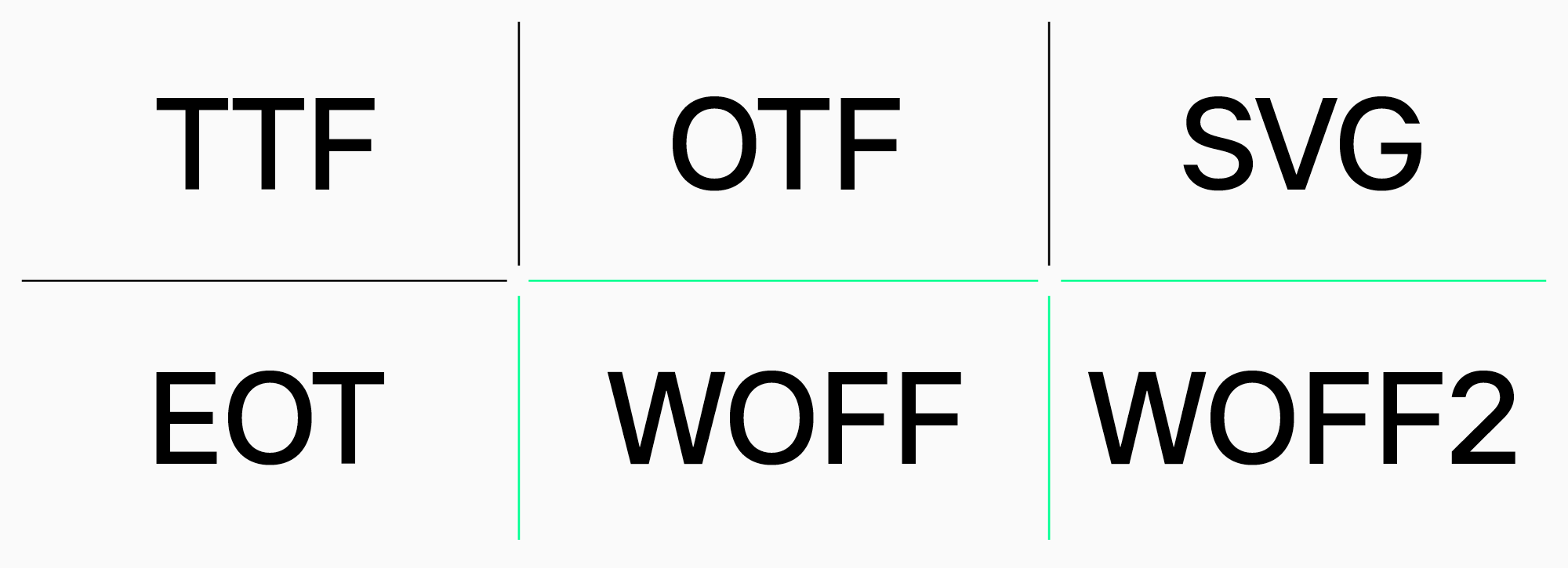
Web fonts can have different formats.
Fonts in the following formats are used in web design:
- TTF (TrueType Font);
- OTF (OpenType Font);
- SVG (Scalable Vector Graphics);
- EOT (Embedded Open Type);
- WOFF and WOFF2 (The Web Open Font Format).
You can use multiple formats at the same time to increase the chances of a font being displayed on different devices. The most popular formats for web design are WOFF and WOFF2, which are displayed on most modern devices.
Web font size is another important criterion. The lighter the font file, the faster the font will load on the site. For example, if you purchased a font that has extended Latin and Cyrillic, and you only need the standard set, we can reduce the weight of the font. If you are using a TypeType font, please ask for customization. We’ll decrease the weight of the font file by removing languages or characters you don’t need.
Color, style and font size on the site
Using the @font-face rule, you can control how the font will be displayed on the site. You can set the background or font color, size or style.
- Use the “color” property to select the font color. To change the text background, use “background-color”. You can use both the color name and the RGB code.
- Use the “font-size” property to select the font size. The size can be specified in pixels or use the em value.
- And, of course, you can choose italic or bold for selected text passages. Use “font-style” and “font-weight”.
Testing
The most important thing when working with websites fonts is testing.
After completing the work, check the result on all available devices, browsers and operating systems.
It is better to involve all your friends in design testing than to receive unpleasant comments from the customer later after the project is delivered.
What fonts to choose for websites
Even among fonts of high quality and well suited for web design, it can be difficult to choose the right one for a project.
We already wrote an article about typography, in which we talked about the main types of fonts. In it you will find recommendations for choosing the right font for different projects.
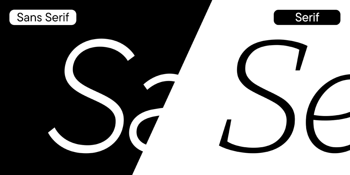
And in the article “Serif and Sans Serif: Font Differences,” we talked about the two most popular font categories. Check it out if you want to know what each of these fonts has to say about a brand.
Mobile apps and websites typically use two fonts. For headings – larger and more expressive, and for text arrays – more neutral.
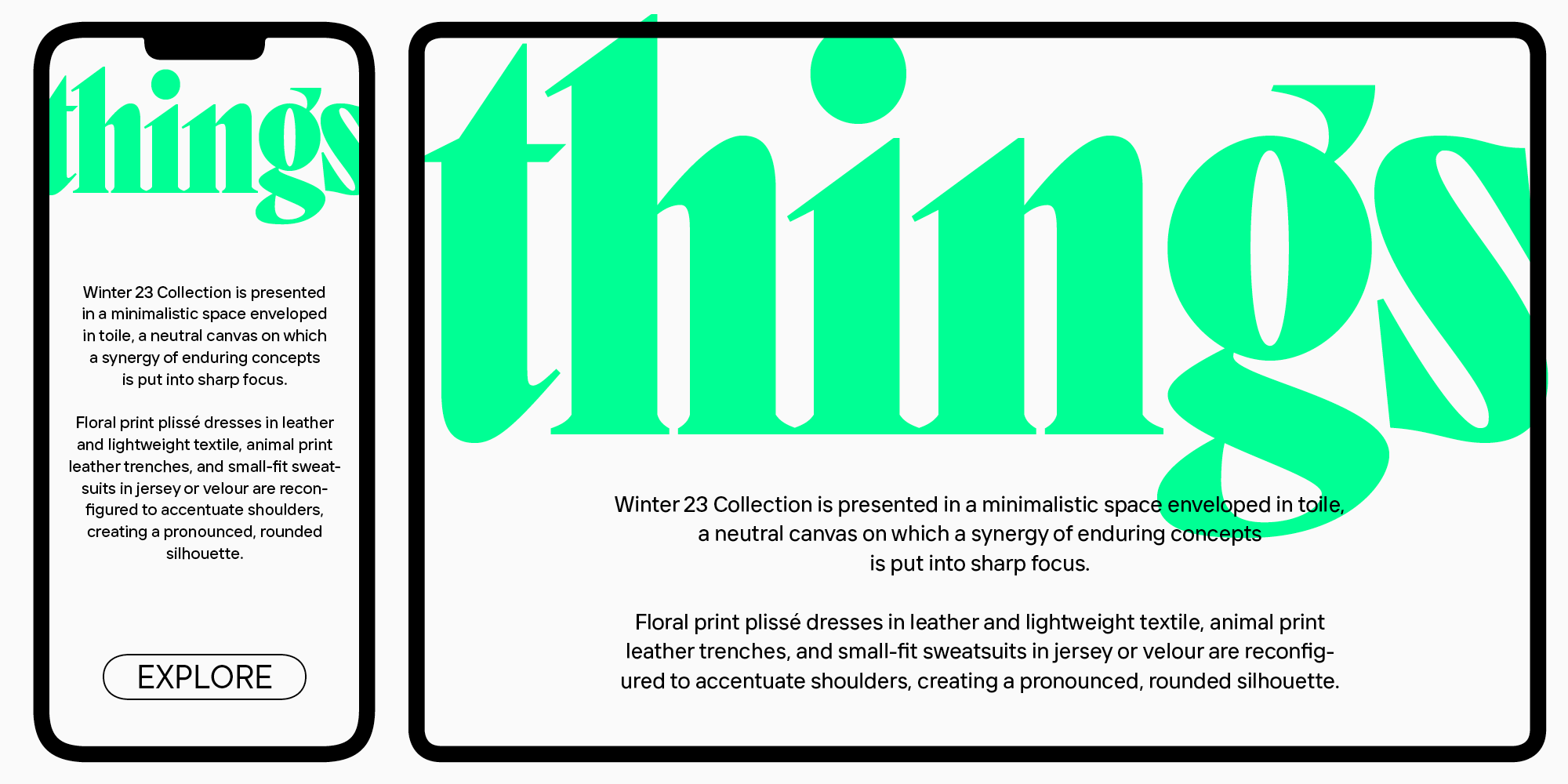
When choosing text fonts, pay attention to high readability. Most users visit websites from mobile devices, and they should feel comfortable when reading text. It is better to choose a neutral font that will not distract from reading.
Pay attention to the accompanying design factors – too bright and contrasting text on a dark background is impossible to read, as your eyes will quickly get tired.
Website font combinations
When choosing multiple fonts for website design, be careful. You should not use more than 2 fonts and more than 3 styles on one site. It is better to be minimalistic, because this reduces the page loading speed and makes the design more neat.
We wrote an article about font pairs and how they are used in design. Learn how to choose fonts using the studio’s bestsellers: TT Norms® Pro sans serif and TT Norms® Pro Serif serif.
Top 10 Best Web Fonts for Websites by TypeType
We share a selection of 10 studio web fonts that look stylish on websites and mobile applications.
Let’s start with text fonts.
They are safe to format large arrays of text due to their high readability and neutral character.
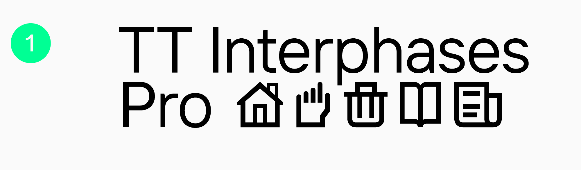
TT Interphases Pro
It’s not just a good web font, it’s the perfect font for mobile appы and website interfaces. Created based on extensive research.
Neo-grotesque with uni-width proportions, legible and flawless.
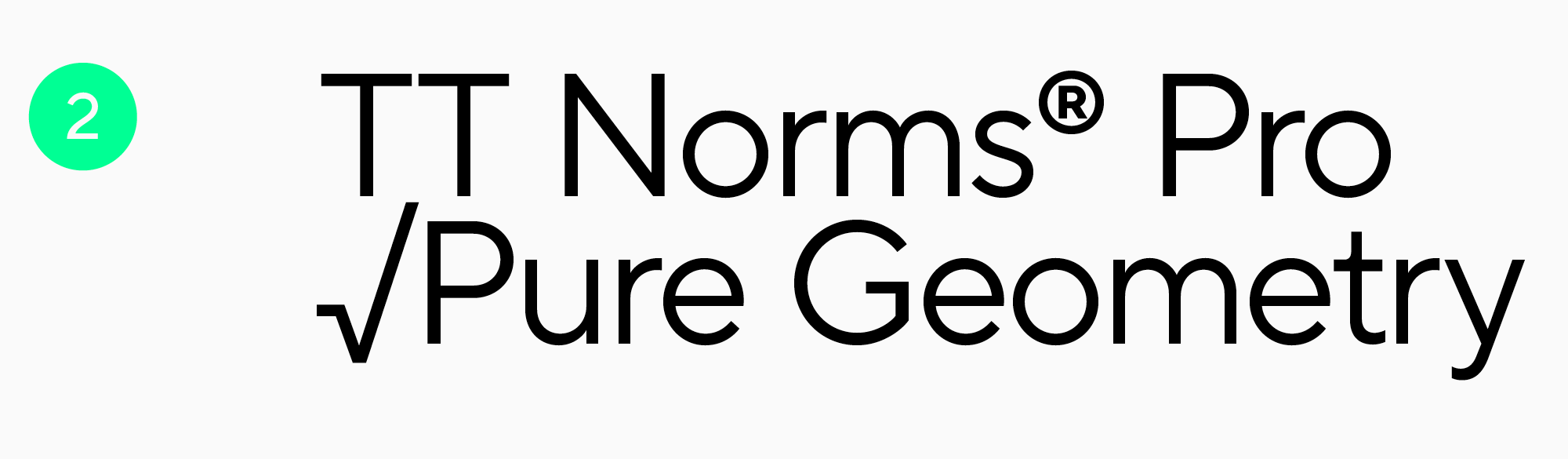
TT Norms® Pro
It is difficult to count the number of sites designed with TT Norms® Pro – there are more than a thousand of them. Among them are the brands Cartoon Network, CSN, Pinarello and others.
A geometric sans serif whose neutral character and versatility are familiar to many designers.
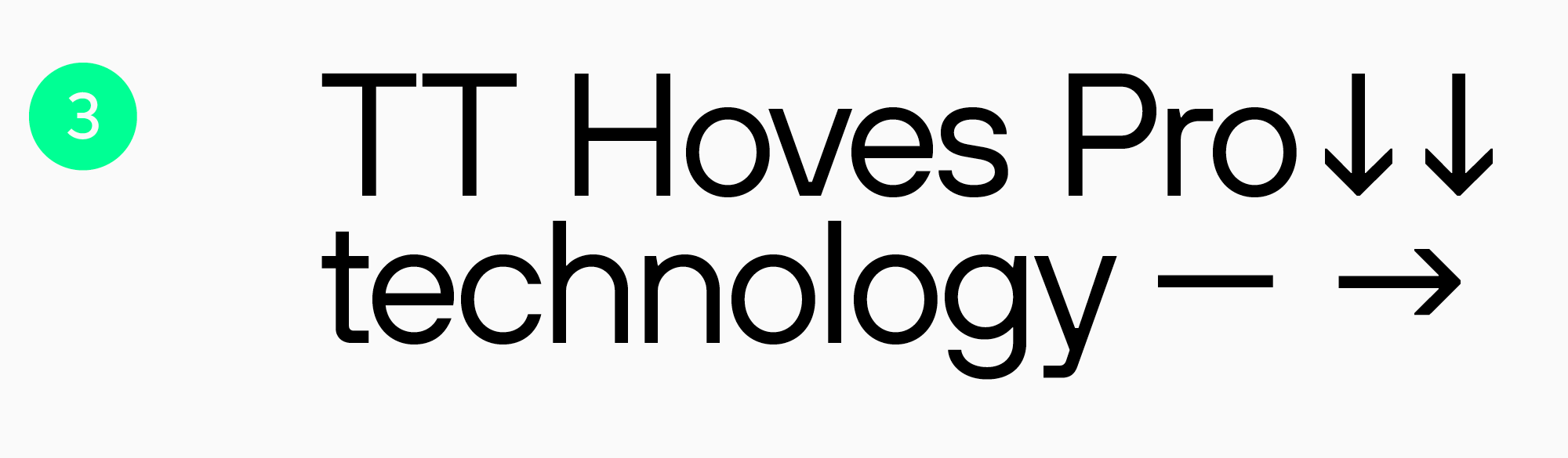
TT Hoves Pro
The font is used for the websites of Telefonica, True Digital, Studio Lenzing and other companies. A universal sans serif with a recognizable but stern character.

TT Livret Text
Modern, versatile and aesthetic text serif. The studio’s most popular serif. Headings on websites are often set in more expressive fonts. Here we are sharing the best display web fonts.
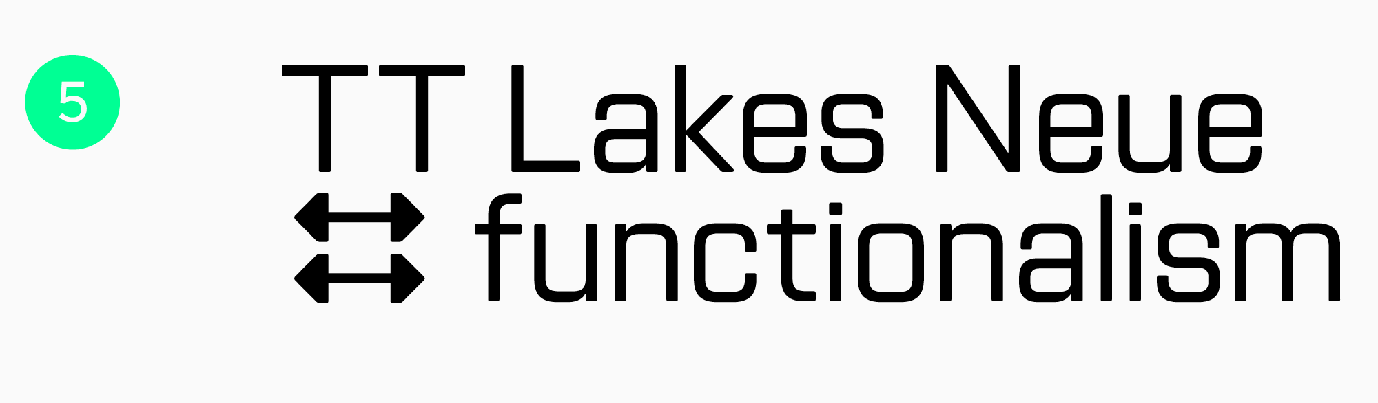
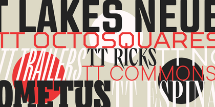
TT Lakes Neue
A large family of geometric sans serifs where you can find stylish technological sets. The nature of the font can be controlled using different weights and stylistic alternatives. Can be used for both headings and text.
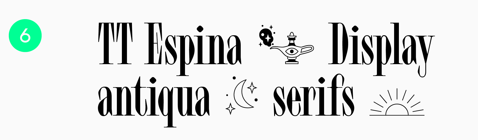
TT Espina
An elegant serif with narrow proportions and sharp serifs. Ideal for the luxury segment.
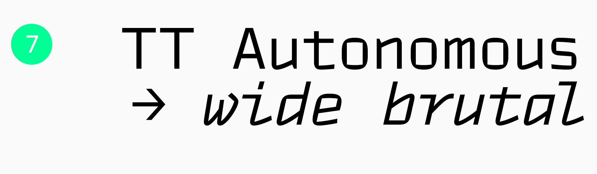
TT Autonomous
Font with wide proportions, suitable for tech projects. Stylish sans serif for a variety of tasks.
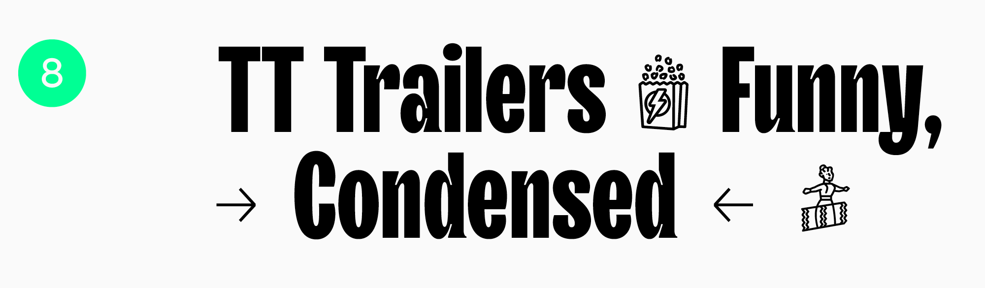
TT Trailers
Conceived as a typeface for the film industry, TT Trailers has gone beyond this and has become a favorite of many major brands.
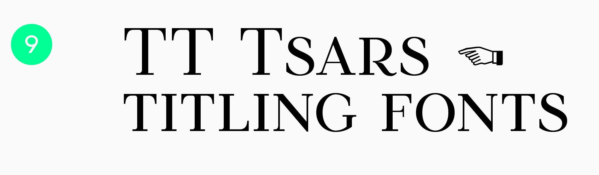
TT Tsars
Serif with a refined character. The elegant shape of serifs will make headings expressive and memorable.
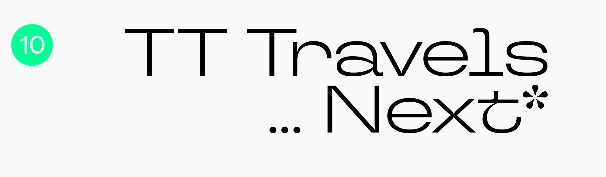
TT Travels Next
Cutting-edge sans serif for headings.
Share your favorite web fonts with us and ask web design questions on social media.