In almost any musical track where vocals play the main role, there is more than one voice part. Sometimes you don’t notice it right away, but the moments that make you get goosebumps are supplemented by another part – a tone lower or higher in order to accentuate and enhance the effect. Often such fragments are performed by backing vocalists so that the difference in the listener is more emotional thanks to the difference in tones.
A font can be easily imagined as a voice, because it not only conveys information to the reader, but is also a source of emotions. We have said before that the voice of a brand is its font. It’s time to talk about how to amplify the main voice of the brand using type pairs, and what the smart ways to manage the combination of typefaces to produce the desired effect on the reader are.
Moreover, using the example of creating TT Norms® Pro Serif, you can learn how font pairs are created within the same family and where they are best used.
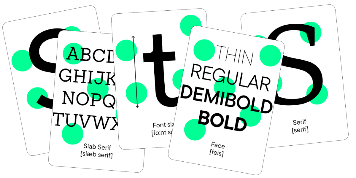
What is a font pair?
Not all fonts will look nice in the same project. Designers know that choosing even one suitable font for a project can be difficult, and finding the perfect pair is even more difficult. But first, let’s find out what is generally called a font pair.
A font pair is a combination of two fonts in one project. The peculiarity is that in such a combination each font has its own task. As a rule, one should attract attention and the other should convey information and not interfere with reading the text. Headings and emphases are set in the first typeface, and the main text array is set in the second.

An important factor is that there must be chemistry between the two selected fonts, they must complement each other well. Otherwise, magic will not happen, and the reader will not experience the emotion inherent in the brand.
The process of choosing such fonts is creative. There is no set of rules that determines exactly whether fonts will fit together or not.

What font pairs are for
Of course, you can use one typeface for a brand without making the task more complicated by searching for a pair. This is the easiest and safest way for a designer.
The truth is that this path is not always suitable. Human attention works in such a way that it is difficult for us to focus on monotonous things for a long time, we need anchors. When reading, such anchors are sections of text that stand out visually.
The font pair helps to direct the reader’s attention. A larger font size and an expressive font that differs from the one in which the bulk of the text is set will help to read the title. Highlighting functions in the main body of the text will be taken over by italics or bold.
By using two different fonts, you will make it easier for the audience and strengthen the emotional message of the brand.
Font combination principles
You can find dozens of articles about font pairs, but none of them provide clear rules for choosing a one. Many components are responsible for the chemistry between fonts, not all of them can be formulated as instructions.
However, we will talk about creating a font pair for the studio’s best-selling TT Norms® Pro, so that later we can provide recommendations from the studio. They will help in the future when choosing a harmonious combination of fonts.
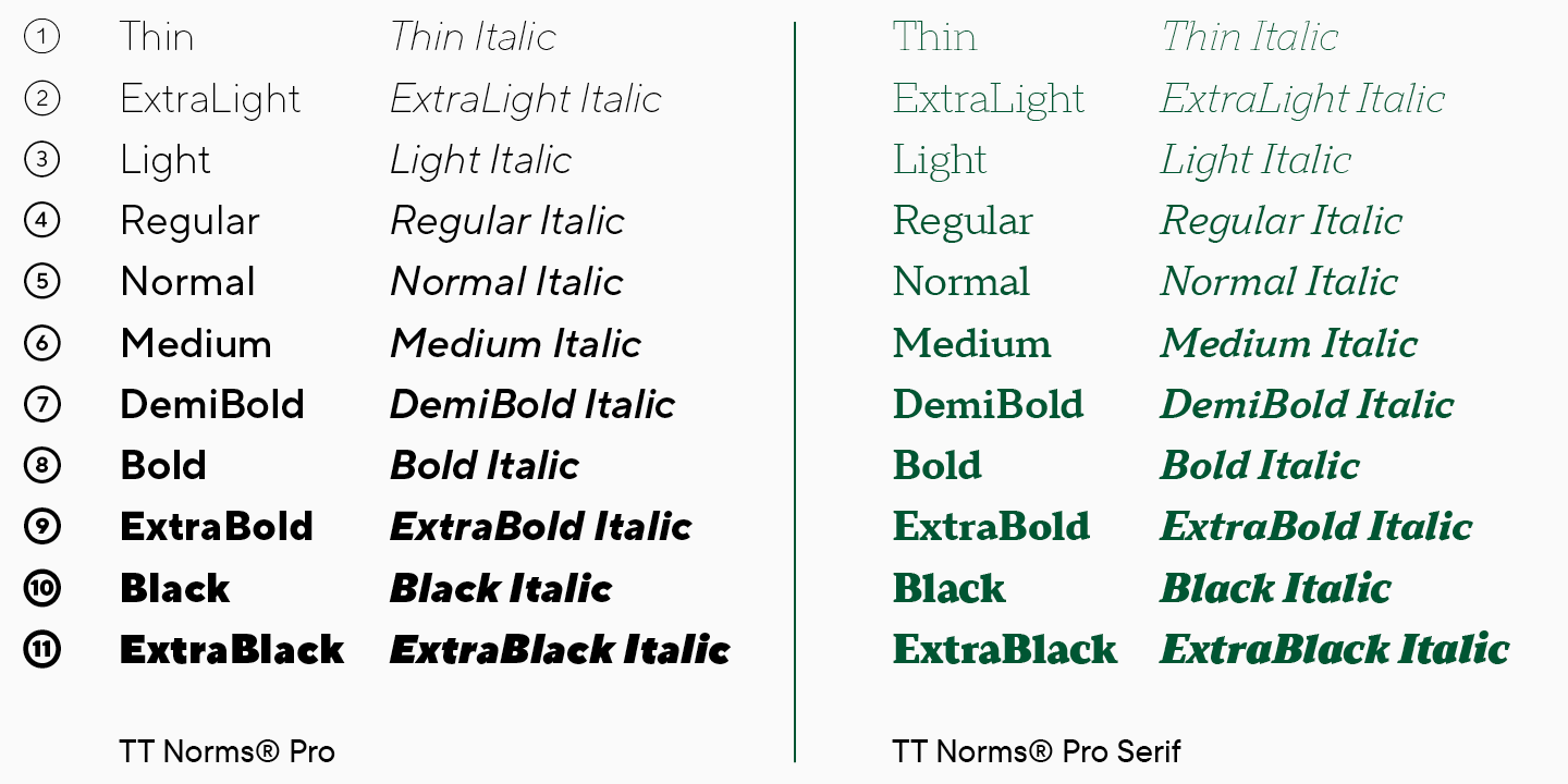
TT Norms® Pro Sans Serif and TT Norms® Pro Serif
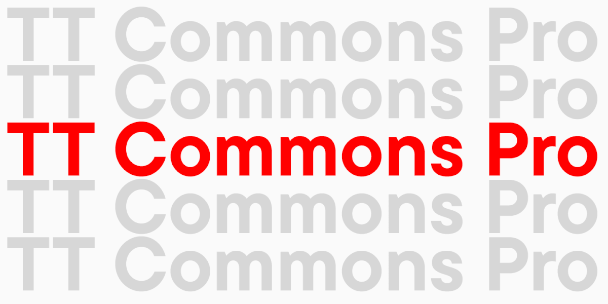
TT Norms® Pro is TypeType studio’s number one bestseller. The font has become the voice of brands like Cartoon Network, Sartorius, Intercom, CSN and many more.
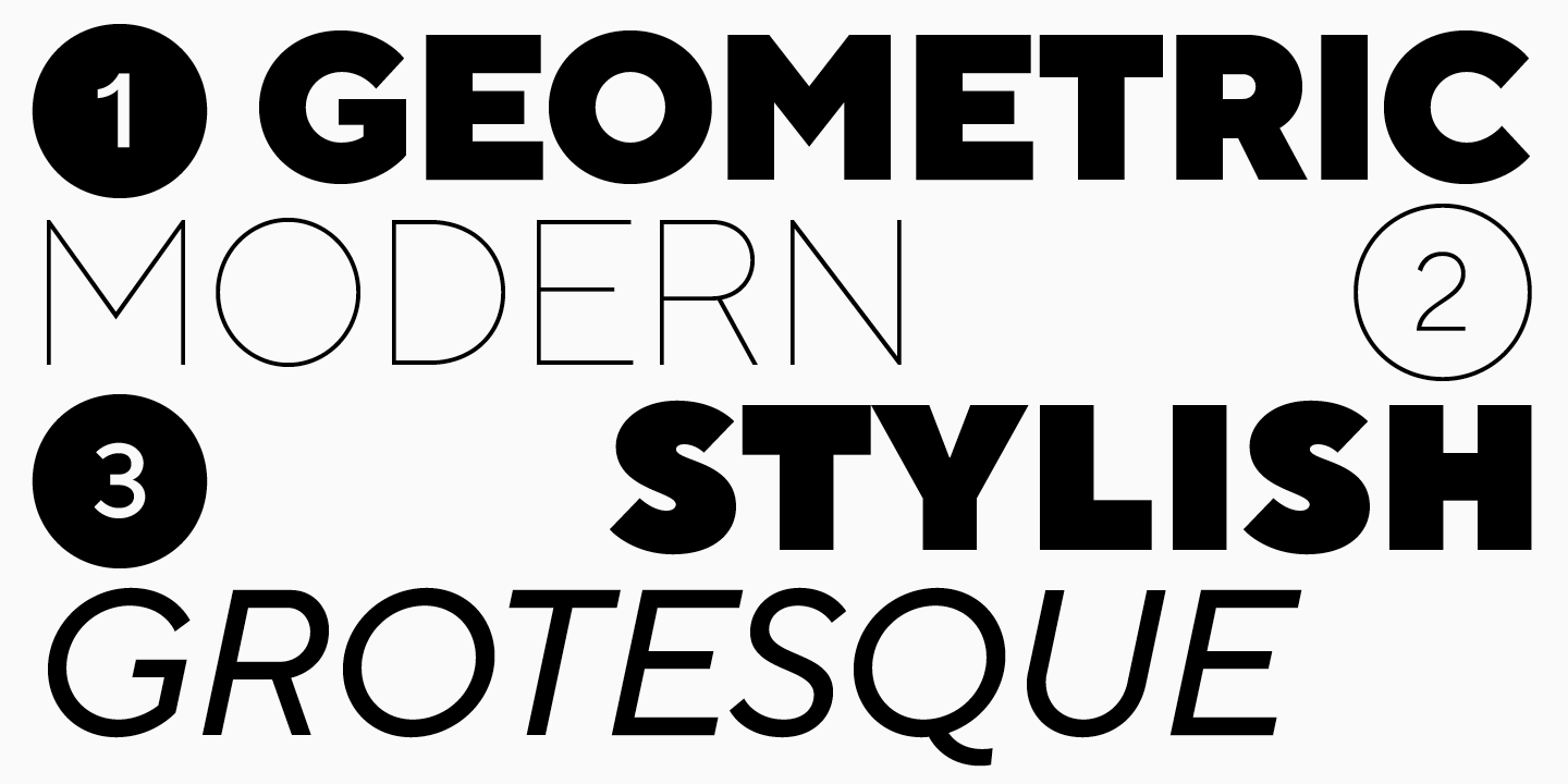
Part of its popularity is thanks to the fact that TT Norms® Pro is a geometric sans serif with a neutral character. This is a versatile typeface, modern and stylish, its character can be easily adapted to different areas.
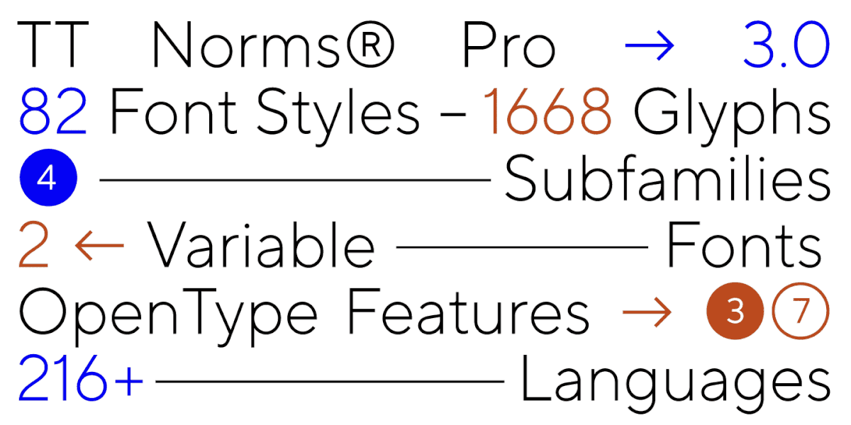
The font family has been expanded several times, with addition of a monospace version of TT Norms® Pro Mono, new styles and languages. Due to its versatility, choosing a font pair for TT Norms® Pro is not difficult, but TypeType studio decided to develop the perfect pair and create a serif font that would harmoniously complement the sans serif.
We wanted to create not just an addition to the classic version, but a text font that designers can use on its own or in combination with other fonts.
We started with a research project in which we studied large font families from other studios and authors, in which both serifs and sans serifs were present. In the test version, we were exploring how similar to TT Norms® Pro we would want to see the new serif.
The final version of TT Norms® Pro Serif is a balance between the similarity of characters and the visual difference in forms.
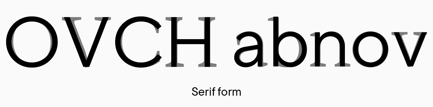
TT Norms® Pro is a sans serif with low contrast and moderate character. As you know, serifs and high stroke contrast are notable for serif fonts, but changing these two components is not enough to create a pair.
In order for the fonts to blend flawlessly and have chemistry between them, you need to add something else that will make the serif a truly standalone font.
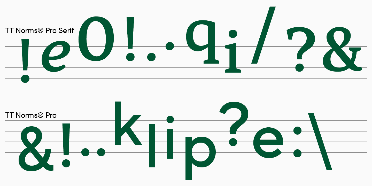
TT Norms® Pro Serif has its own distinctive features.
- The font has become harder. The inflows of the arches and the shape of the semi-ovals have changed.

- The circles of signs remained round, and ovals have become more dynamic. In TT Norms® Pro, the oval is vertically symmetrical, while in TT Norms® Pro Serif, a slope appears in round characters.

- The letter g changed its shape and became two-storey, which is typical for most serifs, but rarely found in grotesques.

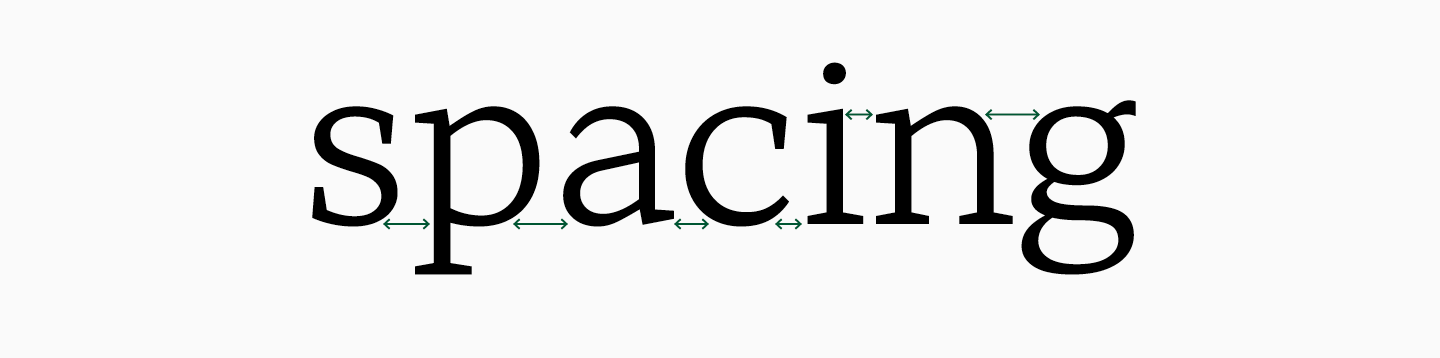
- The font has become slightly wider due to the serifs, but the spacing looks denser as the serifs visually take up more white space.
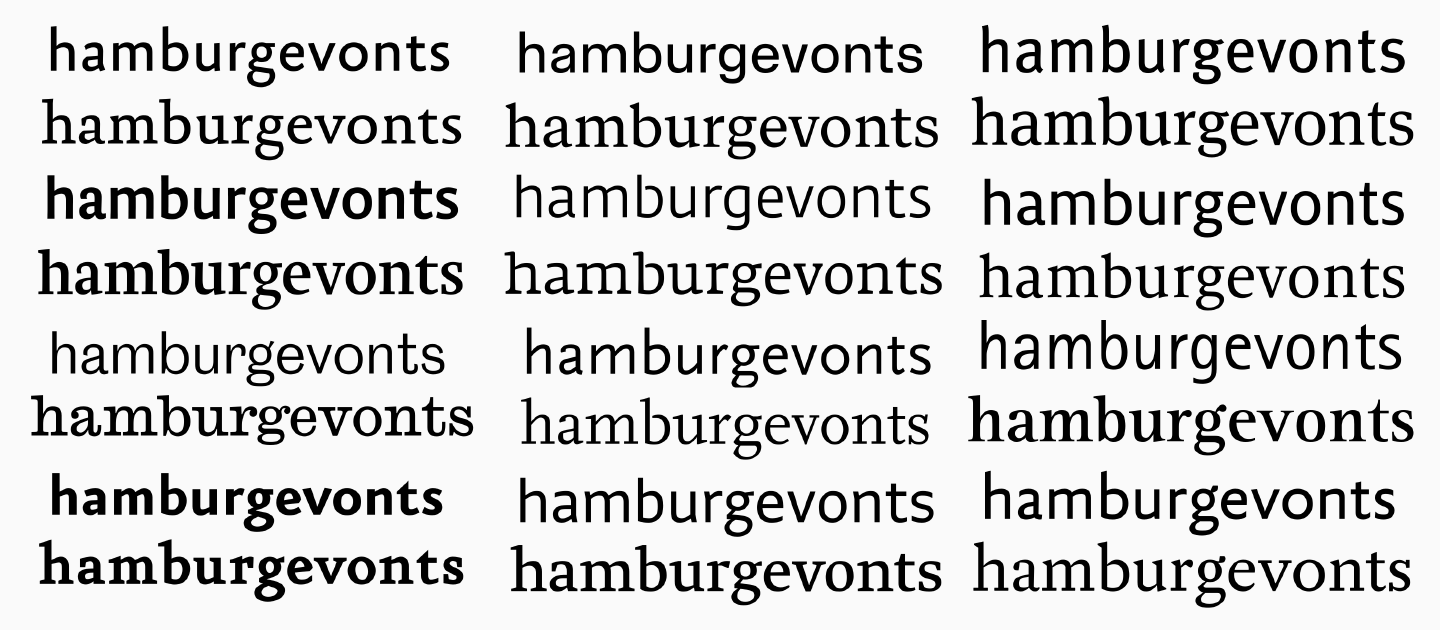
Despite the differences, the characters of the fonts are similar in many ways. This can be perceived visually and is apparent when looking at the structures carefully.
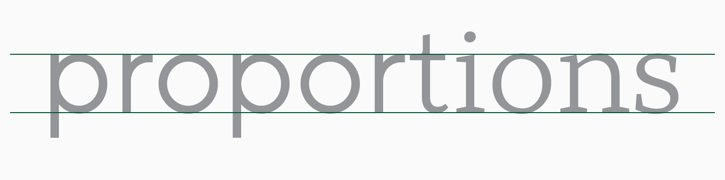
- The height and proportions of the characters remained the same. This makes it easier to use them together, because you can put fonts side by side, even on the same line, without losing visual harmony.
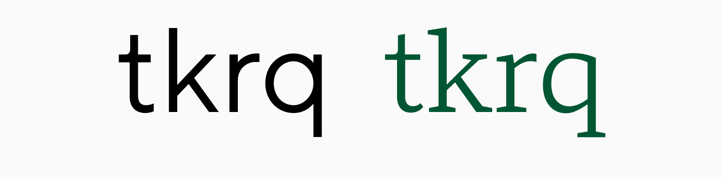
- The same openness of apertures and the similar construction of many characters, such as t, k, r, q, help fonts blend together.
- The character set of the fonts is almost identical, TT Norms® Pro Serif has extended Cyrillic and Latin, a variety of currencies and punctuation marks.
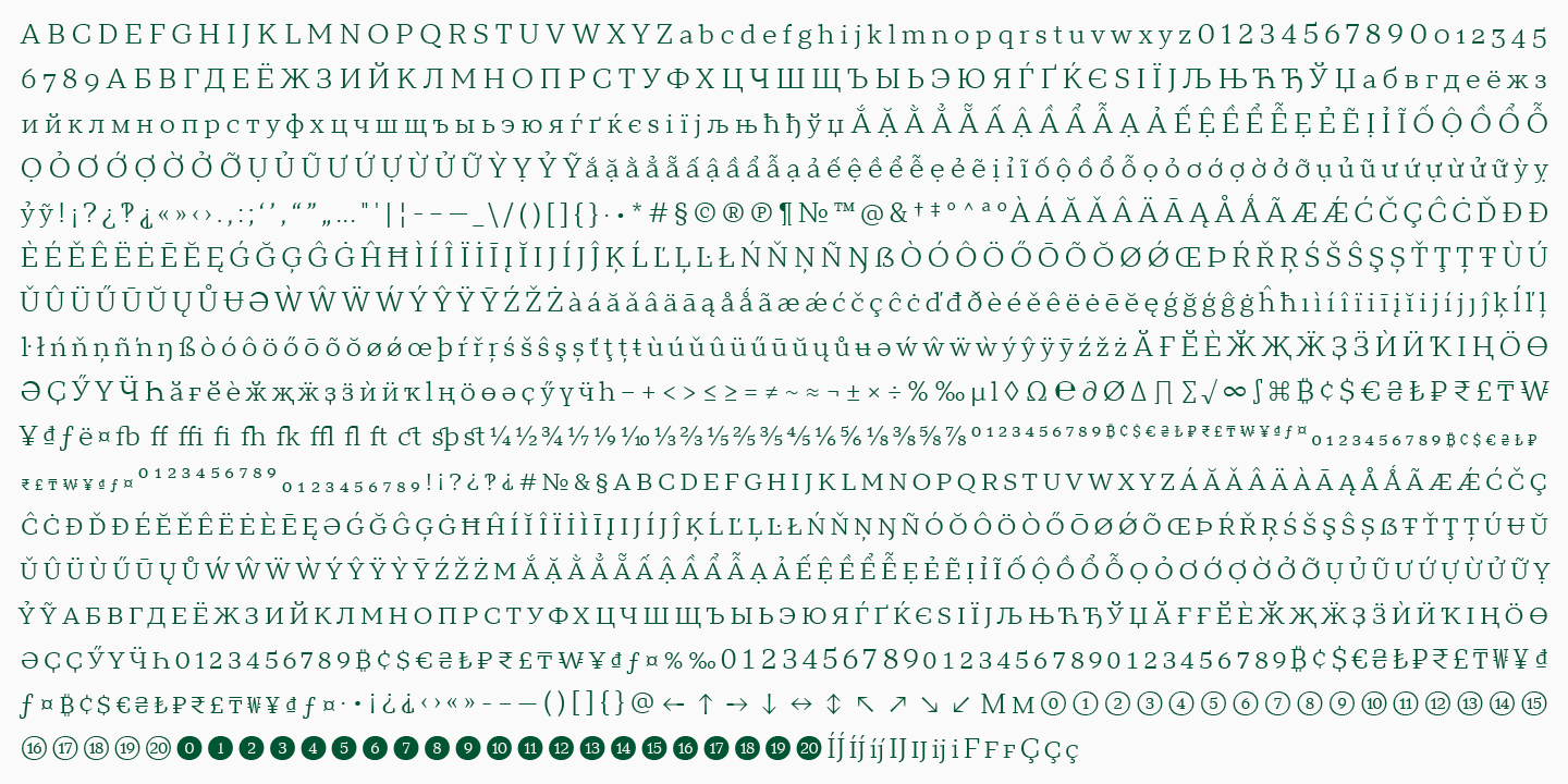
- Familiar OpenType features have been added to the new serif to make the font functional.
It will be easy for designers to work with the new sans serif if they are familiar with TT Norms® Pro. There will be no problems even when choosing styles, because in the serif the names are the same as for TT Norms® Pro fonts. Despite the differences in stem weights, the serif fonts were designed to be compatible with the TT Norms® Pro fonts and make it easier for designers to use typefaces in pairs.
A nice bonus of TT Norms® Pro Serif is the italics, which are completely different from the oblique sans serif styles. We have created real italics, where the shape of characters was drawn from scratch. We started from the forms of serif characters without drawing too much on the sans serif.
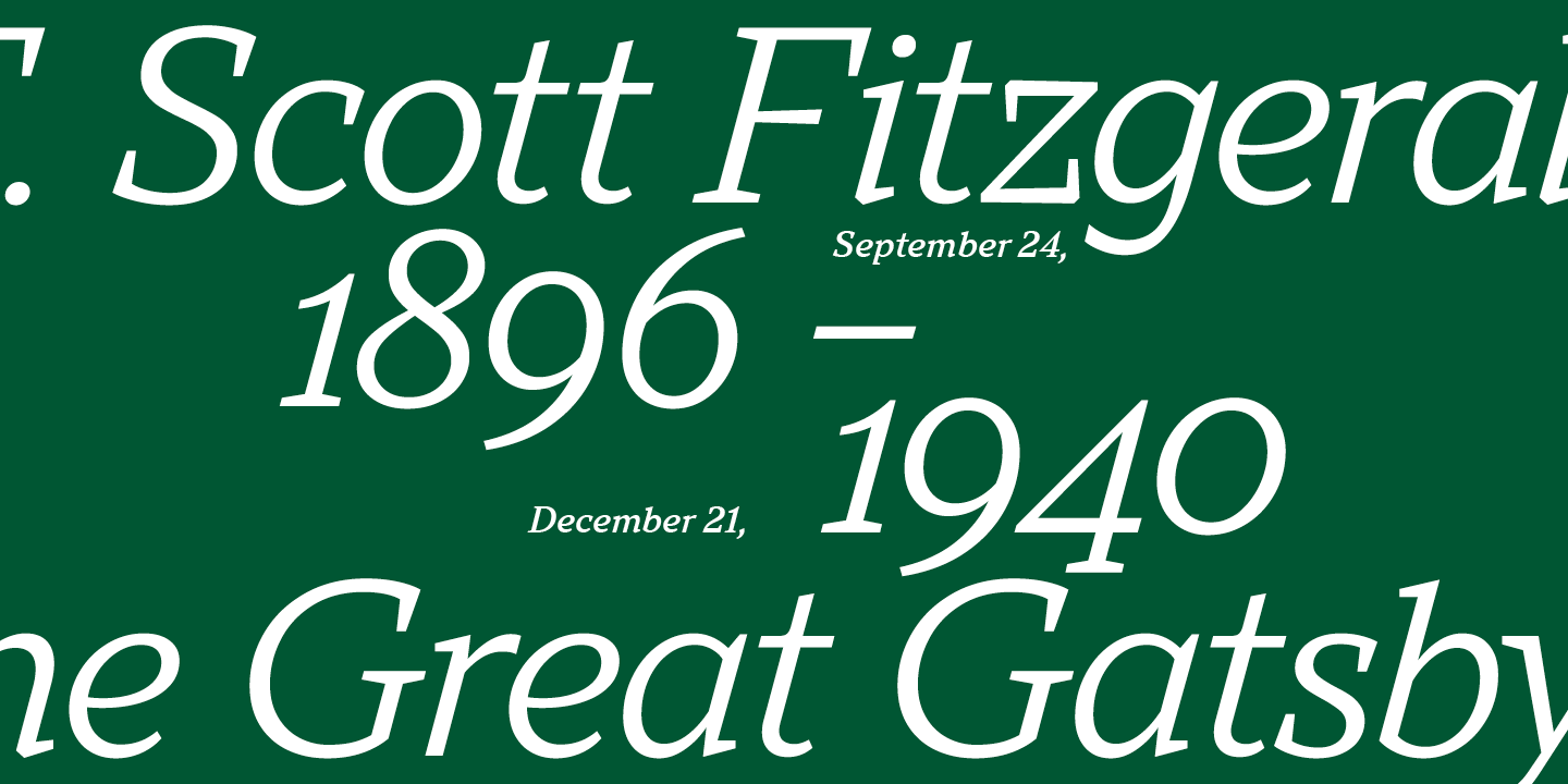
The slanted faces of TT Norms® Pro Serif are ideal for emphasizing text set in TT Norms® Pro. Italics really grab the attention of the reader, while looking harmonious, because in their forms you can still recognize the character of the original TT Norms® Pro.
The font pair of TT Norms® Pro sans serif and TT Norms® Pro Serif serif is a duo in which one font complements the other. And while many are well acquainted with the nature of the modern, universal and neutral sans serif, the more conservative and strict textual serif is yet to be met. How exactly to combine these fonts, you can choose for yourself.
Recommendation on how to combine fonts
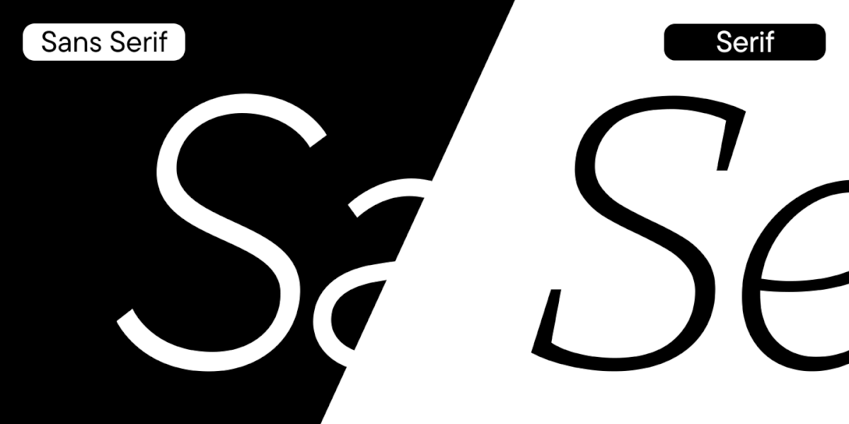
The combination of a sans serif and a serif is a common variant of a font pair. There is an explanation for this, because in order for fonts to be combined with each other, several criteria must be met. Fonts should be different, have something in common and together make the necessary impression on the viewer. The latter is a bit like magic, because there should be chemistry between the fonts that allows you to evoke emotions. But the first two criteria can be explained, and we have prepared recommendations that will help you choose a font pair in the future.
- Fonts must be different from each other. Sans serifs and serifs can often be seen together, because their designs initially have differences in serifs and contrast. However, choosing any serif and sans serif does not imply choosing a font pair.
- Fonts must have intersection points. They may be similar in design of some characters or have the same proportions, refer to the same historical era or have a similar character.
- Fonts should look well together. This is a difficult criterion, because it is only intuitively possible to determine how attractive fonts are in combination. However, there is a way to understand compatibility. Try to look at the font from a distance and imagine its character as if you were describing a person. Answer these questions: what this person is wearing, how old they are, what kind of voice they have, what style of clothing they prefer. By imagining the look of the font, you can guess what character is missing next to it. This may be a character that complements the first one by having the missing features.

Don’t be afraid to experiment by trying different combinations of fonts, trust your intuition. Visual experience, which allows you to easily find pairs among various fonts, comes with tenure in the field.
Where to use font pairs
We see font pairs every day when walking around the city or browsing websites. For example, when designing posters and posters, two fonts are almost always used – one for a bright headline, the other for information about an event or project.
Headlines on websites, books, magazines and newspapers are often set in a separate font. Some brands use a second font for a separate site block if its content is fundamentally different from others. This method can be used by companies that want to separate the commercial block from the social block or highlight a blog with longreads.
Font pair examples
At the end of the article, we will share several examples of font pairs that harmoniously match each other in projects.
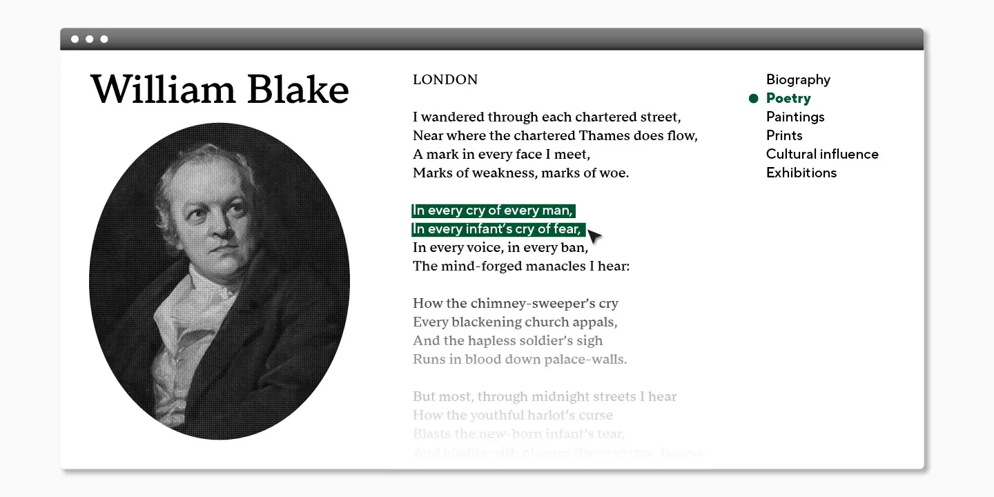
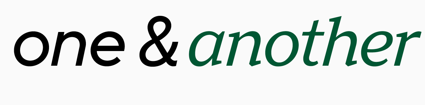
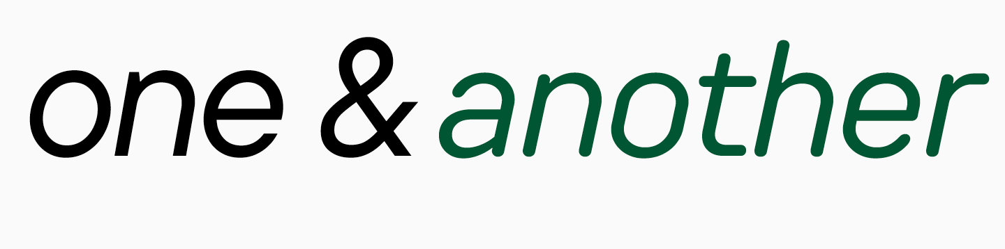
- Neutral sans serif and conservative text serif. Fonts: TT Norms® Pro Serif and TT Norms® Pro.
An already familiar pair that is perfect for use in books or for website design.
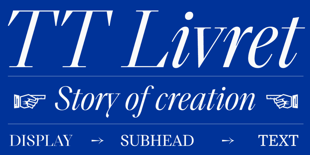
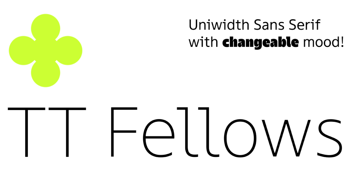
2. Elegant display serif and humanistic sans serif. Fonts: TT Livret Display + TT Fellows.
The elegant serif draws attention to headlines, while the bulk of the text is set in a soft and friendly typeface.
3. Display font and text serif. Fonts: TT Ricordi Marmo + TT Livret Text.
If you set the heading in an expressive and catchy font, it will not go unnoticed. For an array of text, it is better to choose a font that will not distract from reading.
Conclusion
Picking two fonts that fit perfectly together, conveying emotion and information to the reader equally well, is no easy task. However, when using two typefaces, the designer has more opportunities to convey the values of the brand, placing accents where necessary.
Combine different fonts, enjoy the process and choose the best pairs.
FAQ
What is a font pair and why is it important in design?
A font pair is a combination of two fonts used in one project. Usually, one font attracts attention in headings or accents, while the other presents information clearly in the main text. A well-chosen pair helps communicate both meaning and emotion.
How do font pairs improve readability and visual hierarchy?
Font pairs guide the reader’s attention by separating different levels of information. A more expressive or larger font can highlight headings, while a calmer text font supports comfortable reading in body copy.
Why is combining serif and sans serif fonts a common pairing strategy?
Serif and sans serif fonts often work well together because they create visible contrast while still allowing balance. A sans serif can provide neutrality and clarity, while a serif can add a more traditional, editorial, or expressive tone.
What makes two fonts compatible or “work well” together?
Compatible fonts usually have both similarities and differences. They should differ enough to create contrast, but share enough structural or stylistic features to look harmonious in the same layout.
What does “font pairing chemistry” mean in typography?
“Font pairing chemistry” means that two fonts visually and emotionally complement each other. If this chemistry is missing, the pair may feel random, and the design will not communicate the intended mood clearly.
How was TT Norms® Pro Serif designed to pair with TT Norms® Pro?
TT Norms® Pro Serif was created as a serif companion to TT Norms® Pro. It keeps many structural features of the original sans serif, such as proportions and openness, while adding serif-specific details, a more conservative tone, and true italics for emphasis.
What are the key differences between TT Norms® Pro and TT Norms® Pro Serif?
TT Norms® Pro is a modern, neutral geometric sans serif, while TT Norms® Pro Serif is a stricter and more conservative text serif. In the serif version, the forms became harder, the ovals more dynamic, the lowercase “g” became two-storey, and the spacing feels denser because of the serifs.
What similarities help TT Norms® Pro and TT Norms® Pro Serif work together?
The two typefaces share similar character height, proportions, open apertures, and construction principles in many letters. Their character sets and OpenType functionality are also close, which makes them easier to combine in one project.
Where can font pairs be used: branding, websites, editorial design?
Font pairs can be used in branding, posters, websites, books, magazines, newspapers, and separate content blocks within a brand system. For example, one font can be used for headlines and another for event details, longreads, or body text.
What are the best practices for choosing and combining font pairs?
The best practice is to define the role of each font: one for emphasis and one for information. A good pair should convey both emotion and clarity, place accents where needed, and make the design easier for the audience to read and understand.