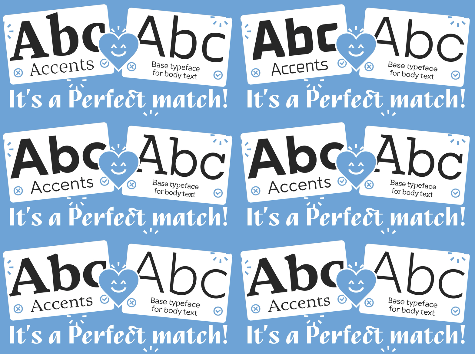
The type system of a project is rarely built around a single typeface. Be it in an interface, a presentation, packaging or a brand identity, the designer must do several jobs at once: create emphasis, separate headings from body copy, maintain the brand’s character, and keep everything readable. That is why combining two type families is not a decorative trick, but a way to organize information and give the project an easily recognizable voice.
The work starts with function. One typeface might take the large headlines while the other handles long passages of text; one can be expressive and the other quiet. In our article on TT Norms® Pro and TT Norms® Pro Serif, we pointed out that there is no universal formula here. Whether two fonts go together depends on letter proportions, contrast, character and a number of smaller details, and in the end you have to see them side by side.
At TypeType, we pay close attention to font pairing and design some of our families as pairs from the very beginning. In this guide, we will cover the basics, explain how to choose a pair for websites, presentations, logos and branding, walk through font pairing examples from our catalog, and look at the online tools and generators that can make the search faster.
What Is Font Pairing and Why It Matters in Typography Design
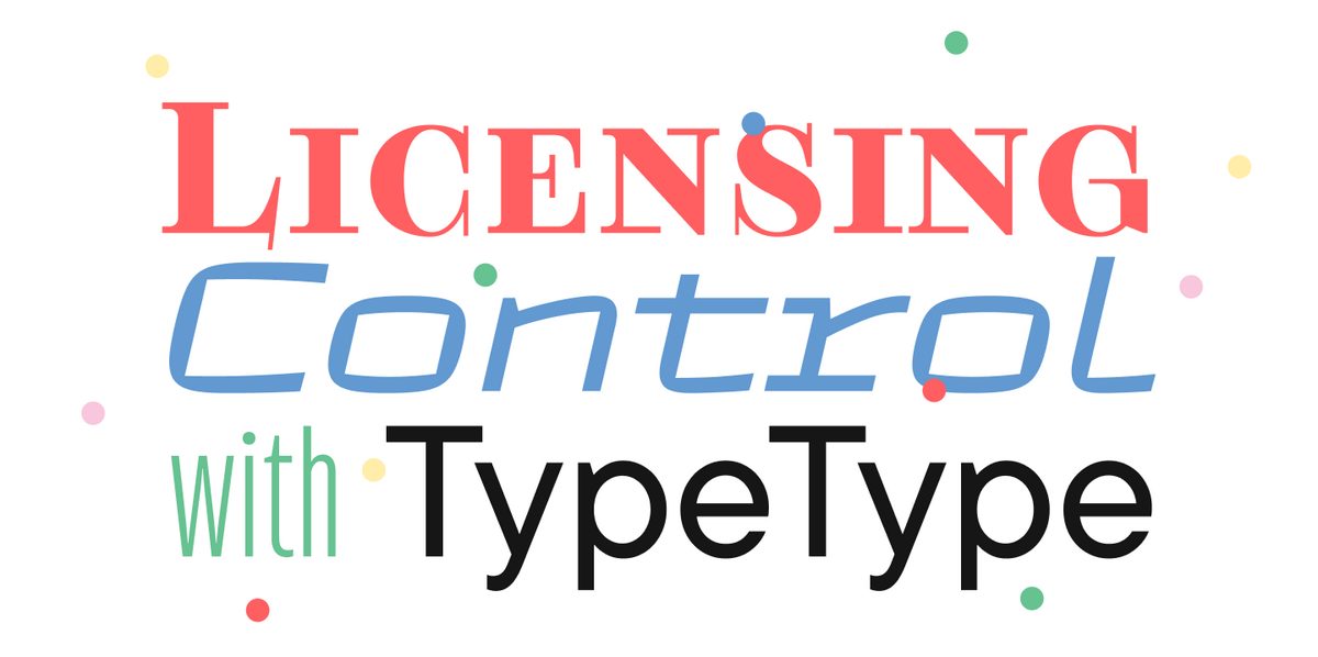
So, what is font pairing? It is the use of two different typefaces in one layout, where each has its own role but the two read as a single system. An expressive serif might set the headings while a neutral sans carries the body text. It can also work the other way round: a dense display sans becomes the main voice of the project, and a calm serif supports it in the longer passages.
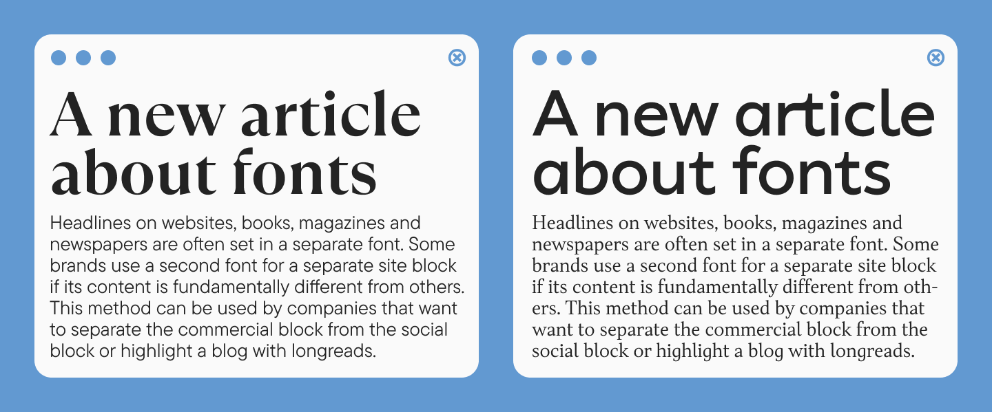
The point is more than just aesthetics. A good pair builds visual hierarchy, so readers know where to look first without having to think about it. This matters most on websites and in apps, where people rarely read a page from top to bottom. They scan it. In presentations and branding, giving each typeface a specific role helps steer attention. In editorial design, it separates levels of text without extra graphic devices like rules, boxes or colored panels.
Font Pairing Basics and Principles
Core Principles of Combining Typefaces
The first principle is contrast. Two fonts that are almost identical will not work well together. The difference must be clearly noticeable in order for this to work. Contrast can be achieved through classification, width, saturation, the degree of ornamentation and other characteristics of the typeface.
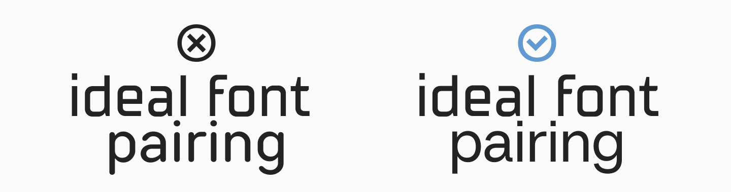
The second principle is balance. If one typeface is very striking and distinctive, the other should be more understated, acting as the ‘workhorse’ whilst the first focuses on attracting attention and building brand recognition. This division not only helps to clearly define roles, but also avoids excessive garishness and visual clutter.
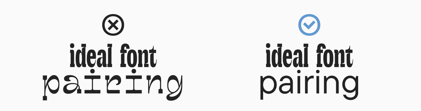
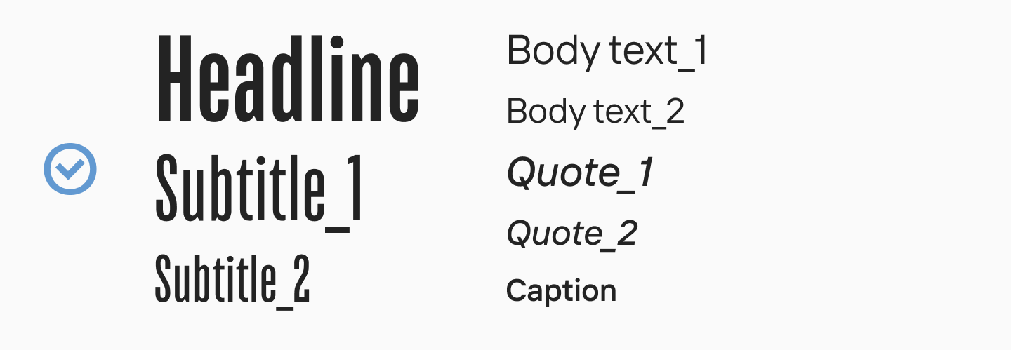
The third principle is hierarchy. Even before choosing specific names, it is worth assigning roles: headings, body text, captions, figures, navigation and quotes. This will help you choose typefaces for specific purposes, rather than relying on intuition.
The fourth principle is harmony. Although the typefaces in a pair should be different, they must have something in common to ensure they work well together. For example, they might belong to the same era, share similar graphic techniques, or have similar styles. Successful combinations usually share common characteristics but contrast in one or more key aspects.
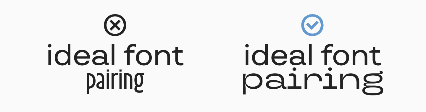
Font Pairing Rules Designers Should Follow
Two families are enough for most projects. A third one earns its place only when it has a clear job of its own, such as a monospaced typeface for code or a family with special figure styles for tables and data. Anything beyond that usually adds noise rather than structure, and the reader stops noticing which text level is which.
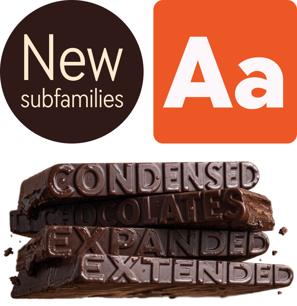
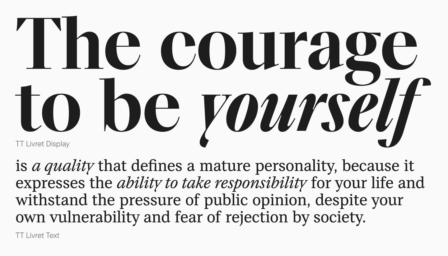
Sometimes you don’t need two families at all. A pair can be found inside a single family, since its styles and subfamilies may differ quite a lot. In that case compatibility is not something you have to worry about: the type designers planned from the start for these styles to go together. TT Livret, for example, has separate Text and Display subfamilies.
Don’t combine two typefaces just because you like each of them on its own. First check whether they really go together by putting them next to each other in the layout. If the difference is hard to spot, it is better to look for another partner, or to use two weights of the same family and get the contrast from size and weight instead.
Assign roles early. Long text needs a neutral, legible typeface that stays comfortable over many lines. Headlines are short and set large, so they can take something more expressive. Deciding this at the outset keeps you from squeezing a display face into body copy, where it will almost certainly struggle.
Font Pairing Guidelines for Beginners
- Always start with the project’s main typeface. If the brand already uses a particular font, you are not choosing two new ones; you are looking for a partner for the one it has. If the brand has an established visual identity, let that guide the search too, so the new typeface fits the colors, imagery and tone that are already in place.
- Look at the whole family, not just the regular style. Multiple weights, true italics, alternate characters and variable axes all widen what you can do with it. In large digital products this matters a great deal, because a single well-built family can cover a surprising number of tasks, from small interface labels to big promotional headlines.
- Once you have a candidate pair, test it in real conditions: on the actual background, in the roles and sizes you plan to use. This is also the moment to check that both families have every character and feature the project needs, whether that is currency symbols, fractions or support for the languages you publish in.
How to Choose the Right Font Pair That Works Together
Serif and Sans Serif
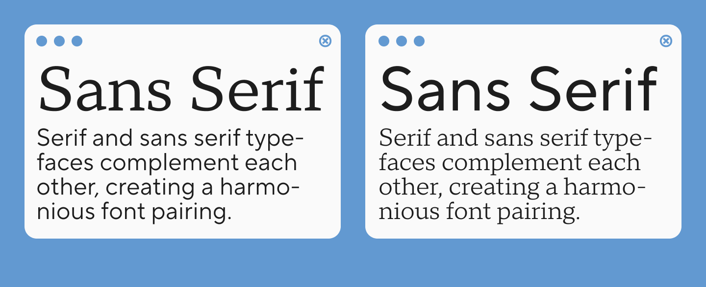
Serif combined with sans serif is a classic combination. The elegance and humanistic features of one typeface are set against the more neutral, geometric design of the other. But that is not enough: one must compare the proportions, shapes and overall character.
The safe option is a serif for headings and a sans for body text. It works well in editorial projects, landing pages, presentations and brand systems. The reverse setup is just as viable: a neutral sans gives you clear headings and navigation, while a serif brings a more literary feel and a stronger rhythm to long reading passages.
One of the clearest examples is TT Norms® Pro with TT Norms® Pro Serif. The first is a functional geometric sans; the second is a neutral, elegant serif developed on its basis. Because they share proportions and construction principles, the two go together naturally even though they belong to different classes. That is one of the more tried-and-true ways to get contrast and harmony at the same time.
Script and Serif / Sans
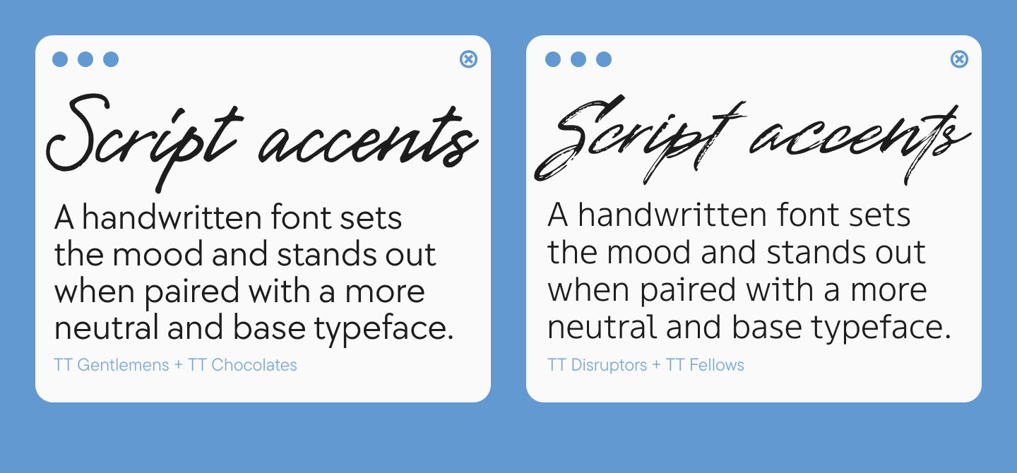
Script and handwritten typefaces are best used in small doses. They work well in logos, short quotes, packaging design or as accents, but are rarely suitable for long paragraphs. That is why they are usually paired with a calm sans-serif or a legible serif typeface. Script and sans serif font pairing tends to feel more modern, while a script with a serif usually looks more formal.
The key test is not whether ‘the two typefaces look nice together’, but whether the page structure is maintained. If the handwritten typeface already sets a strong emotional tone, the second typeface should help the reader to read and find their way around.
TT Gentlemens, for instance, works as an expressive script accent, with the humanist TT Chocolates as the more functional base. TT Gentlemens has a dynamic design that combines clarity with elegance. TT Chocolates is a friendly humanist sans with a dense texture and well-balanced proportions.
Modern Font Pairing Ideas
Several directions stand out in 2026: the return of expressive serifs, interest in high-contrast and large-scale compositions, softer and more “human” shapes, multilingual support, large families and variable fonts. More and more often, type is one of the main building blocks of a visual system rather than simply a way of delivering text.
However, following trends should not become the goal. What matters more is whether a pair suits the brand and whether it will keep working for several years. A fashionable combination that looks good in a single campaign is weaker than a calm system that can scale across a website, an app, packaging and presentations. One practical approach is to put a modern sans next to a classic serif: the sans keeps the design modern, the serif gives it depth, and the pair ages more slowly than two trend-driven faces would.
Logos and Branding
In a logo, recognizability comes first, so you can afford more character. But a logo rarely lives on its own. It sits alongside the website and the rest of the visual identity, and that needs to be taken into account from the start. If the logo is based on a decorative or handwritten style, opt for a more neutral text-based version for your communications. If the logo is set in a clean sans-serif typeface, it is worth using this typeface for accents as well.
It is important that the secondary typeface family does not copy the logo’s design too literally. It is far more effective to maintain the overall mood — for example, a sense of formality, softness, technological sophistication or a retro feel — whilst retaining enough differences to ensure a clear hierarchy.
Best Font Pairing Examples in Graphic Design for 2026
There is no universal ranking here: as the examples below show, the best combination always depends on the task.
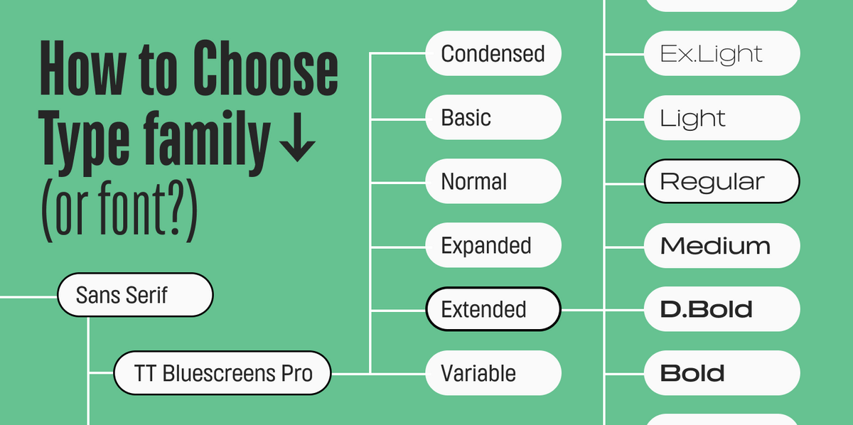
For websites. A neutral text typeface plus a more distinctive one for headings, with both rendering well on screens of different sizes. You could use TT Bluescreens Pro for large accents and TT Firs Text for the main text. TT Bluescreens Pro is built on narrow proportions and meant for expressive use, while TT Firs Text was designed specifically as a versatile geometric text sans.
For presentations. Contrast in terms of scale and weight works well here: large headings must be legible from a distance, whilst the text on the slide must not appear too scattered. It is important that both typefaces remain legible even from a distance, so it is best to go easy on decorative styles.
For branding. In visual identity design, it is particularly useful to have pairs where one element defines the character, whilst the other scales the system across interfaces, documents and long-form texts. Here, one can focus on more striking and interesting solutions, which can be paired with basic, versatile sans serifs.
TypeType Font Pairing Examples
Below are a few examples from our own catalog, each built on a different kind of contrast.
TT Dott + TT Rounds Neue

TT Dott is an experimental pixel sans built on a circular module and intended mainly for large accents. TT Rounds Neue is a soft rounded sans with a calmer personality and a wide range of styles. In a pair, the first font might be responsible for the festival-style, high-tech or playful elements, whilst the second takes care of the subheadings and body text.
TT Bluescreens Pro + TT Firs Text

Here the contrast comes from width and function. TT Bluescreens Pro is a narrow display neo-grotesque that really stands out in large formats. TT Firs Text is a quieter text typeface with an even texture. This combination is perfect for digital projects, tech branding, posters and presentations.
TT Ricks + TT Regins Subhead
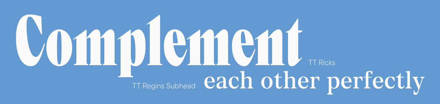
This pair is trickier, because both typefaces are serifs with strong personalities. TT Ricks is a narrow, sharp, high-contrast serif with spiky serifs. TT Regins Subhead is a subfamily of a Didone-style serif, designed for softer accents and text setting.
TT Wellingtons + TT Norms® Pro Serif

TT Wellingtons is a modern humanist sans that references the movement of a broad-nib pen. TT Norms® Pro Serif is a neutral, functional serif. This combination is suitable for editorial design, presentations, and cultural and educational projects: the sans lends a lively, contemporary feel, whilst the serif adds a calm, literary touch.
TT Gentlemens + TT Chocolates
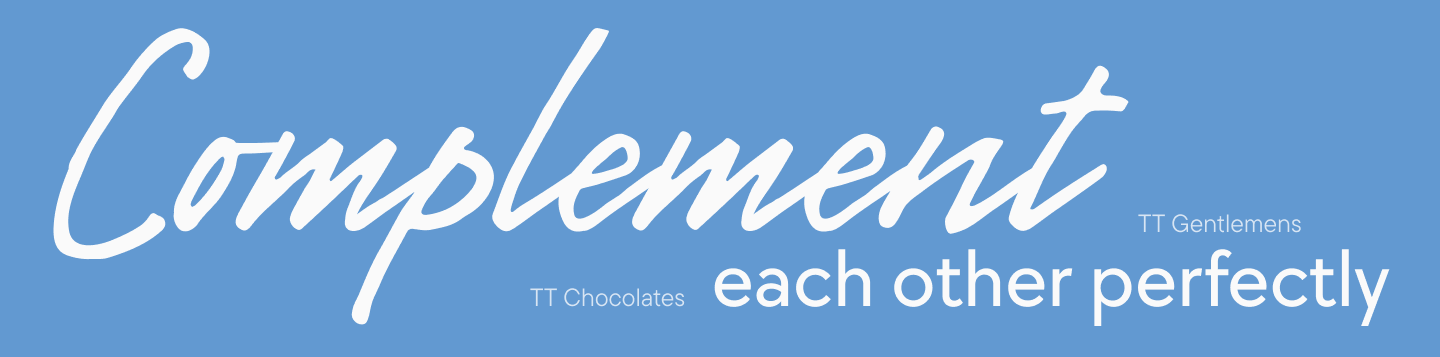
The handwritten TT Gentlemens is best kept for occasional accents, such as a logo, a short quote or a product name. TT Chocolates handles the text and the more functional roles. This combination works particularly well where a friendly, elegant or food-related character is required, without compromising readability.
All typefaces in the TypeType catalog feature extensive language support, including Cyrillic.
Font Pairing Chart: Quick Reference for Designers
The table below sums up the main points of this guide. Use it as a quick guide, then check every decision in your own layout.
| Task | First Typeface (Role) | Second Typeface (Role) |
| Website / App | Expressive Display (Headings) | Neutral Sans (Body Text) |
| Editorial Design | High-Contrast Serif (Titles) | Neutral Serif or Sans (Copy) |
| Branding | Distinctive & Decorative (Accents) | Universal Sans (Information) |
| Presentation | Wide or Heavy Sans (Scale) | Clean, Legible Text Face (Slides) |
| Logo | Script or Decorative (Identity) | Functional & Neutral (Support) |
Best Font Pairing Tools, Websites, and Generators
Online tools are handy when you need to quickly broaden your search or check the direction you’re heading in. But they have a systemic limitation: most of them work primarily with free font libraries like Google Fonts.
Font Pairing Tools and Websites
Figma Google Font Pairings is a ready-made library of combinations built from Montserrat, Lato, Open Sans, Roboto, Lora, Raleway and other popular families. It saves time because the options are already arranged in pairs, but language support and OpenType features still need to be checked separately.
Fontshare Pairs is a section of the Fontshare library with ready combinations. It is a good extra source of ideas, especially if you are tired of seeing the same Google Fonts everywhere. Before using a pair, check which weights and styles each family actually includes.
Fontpair offers more than a thousand curated combinations drawn from Google Fonts and Fontshare. You can preview each pair with your own content and save the ones you like, which makes it convenient for building a shortlist before a client meeting.
AI Font Pairing Generator and Finder Tools
Fontjoy is probably the best-known AI font pairing generator. It creates a set for a heading, subheading and body text, lets you lock a font you want to keep and regenerate the rest, and lets you type your own copy, such as a company name, into the preview. Its creator, Jack Qiao, describes the idea behind it quite openly: fonts are mapped along dimensions such as weight, obliqueness and the presence of serifs, and good candidates are those that match in some dimensions but differ clearly in another. That is the same similarity-plus-contrast principle described earlier in this guide, only calculated by a neural network.
AI UI Designer Font Pairing works as a generator of ready combinations of Google Fonts, with filters by style and use case, a live preview and CSS export. It is well suited to prototyping websites, when you need to get from an idea to a working mockup quickly.
A font finder solves a different problem: you have seen a typeface you like and want to know its name so you can build a pair around it. WhatTheFont from MyFonts compares an uploaded image with its catalog and returns the closest matches; its mobile app lets you simply photograph a poster, a logo or a package. Font Squirrel Matcherator does a similar job with JPG, GIF and PNG files, though its developers note that script and connected fonts are hard for it to recognize.
Font Pairing Testers and Apps
Generators and similar tools suggest pairs, but it helps to see how combinations behave in real projects. Typewolf collects examples of fonts used on well-designed websites, along with recommendations for similar typefaces, suggested pairings and free alternatives. Fonts In Use is an independent, searchable archive of typographic design indexed by typeface, format and topic, which makes it useful for studying real examples of pairs in branding, packaging, books and signage.
Among design apps, Canva has a set of preset font combinations in its Text panel, and typing a font name into the search shows presets built around that font. It is a quick way for non-designers to find a workable pair. For the simplest test of all, the Google Fonts site works as a basic tester: it lets you type your own text into the preview and compare several families at the same size.
Font Pairing Tips and Ideas for Better Design
Start with function, not looks. First decide what should be read first, second and third. After that it becomes clear where you need an accent and where you need neutrality.
Test using real text. Brand names, long paragraphs, numbers, dates, buttons and captions quickly reveal issues that go unnoticed in an alphabetic sample.
Match the mood of the brand. A bank, a coffee shop and a gaming studio need very different voices. Describe the character you want in two or three words before you start browsing, and use that description to guide your search.
Mix modern and classic deliberately. A modern sans next to a traditional serif is a reliable way to get contrast, as long as the two share something, whether proportions, x-height or overall rhythm.
Don’t try to fix a bad match with settings. If two typefaces conflict, adjusting tracking or line spacing rarely saves the situation. It is better to go back and reconsider the combination.
Compare at several sizes. Something that looks great in a 72px heading can lose its character at 24px. The reverse happens too: a good text typeface may look a little too plain in a large headline.
Check the system as a whole. A successful pairing should work not just on a single screen, but in menus, cards, forms, tables, presentations and printed materials — wherever the brand is present.
Common Font Pairing Mistakes to Avoid
Mistake 1: Using too many families. When every block of text has its own voice, the hierarchy disappears and the page turns into visual chaos. Two families, or three at most, are enough.
Mistake 2: Not enough contrast. Two similar typefaces with almost identical shapes often look like a technical error, as if part of the text had fallen back to a system font. If you want the text to feel consistent, it is simpler to use different styles of one family. If you use two families, the difference should be obvious.
Mistake 3: Getting the hierarchy wrong. Problems start when roles are never assigned: the body text is set in a heavier or more expressive face than the headings, or headings and subheadings end up almost the same size. The reader can no longer tell what matters most.
Mistake 4: Clashing personalities. A vintage serif, a futuristic tech sans and a script accent can each be beautiful on their own, but together they need a very strong concept. Without one, the composition looks random.
Mistake 5: Skipping real-world testing. A project may need specific styles, localization or particular OpenType features. An attractive combination that can’t be used reliably shouldn’t be considered a success.
Conclusion: Mastering Font Pairing for Modern Design
Working with fonts pairs is always a matter of striking a balance between structure and character. Rules help to avoid haphazard decisions, but truly expressive typography emerges when these are complemented by experience, curiosity and a willingness to try something new.
So don’t be afraid to experiment with unexpected combinations: the more you compare, analyse and test typefaces, the more freely and precisely you will be able to make your choices.
FAQ
What is font pairing in typography?
It is the use of two typefaces in one project, where each has a different typographic role, for example one for headings and the other for body text.
How do you choose the right font pairing?
Decide what each typeface needs to do, then compare their proportions and character. To go together, they should differ noticeably but still share something. Finally, test the combination with real content at the sizes you need.
What fonts go together best for modern design?
Usually a clean modern sans combined with a more expressive serif or display face. A related pair, such as TT Norms® Pro and TT Norms® Pro Serif, is a reliable choice because the two share proportions.
What is the best serif and sans serif font pairing?
There is no single best one. A common and dependable setup is an expressive serif for headings and a neutral sans for body text, ideally two typefaces with similar proportions.
How many fonts should you use in one design?
Two are usually enough. A third makes sense only if it has a separate role that the existing typefaces can’t cover, such as code or tabular data.
What are the main font pairing rules?
Keep the number of families small, avoid fonts that look too similar, assign roles in advance and test the pair in a real layout at different sizes.
Are there AI font pairing generators?
Yes. Fontjoy is the best-known example: it uses a neural network to suggest combinations that are similar in some respects and contrasting in others. AI UI Designer also offers generated pairs with filters.
What are the best font pairing tools and websites?
Fontjoy, Figma Google Font Pairings, AI UI Designer, Fontshare Pairs and Fontpair for finding combinations; Typewolf and Fonts In Use for seeing pairs in real projects. Most of these services focus on free libraries.
How do you test font combinations before using them?
Put them into a real layout with your actual copy, colors and sizes. Check headings, body text, numbers and buttons rather than relying on placeholder text or alphabet specimens.
What font pairing works best for logos and branding?
One that matches the brand’s character and stays recognizable at the required scale. A logo can use a more decorative typeface, but it should come with a functional family for everything else.