This article continues our publication series dedicated to the backstage of typography. To share her experience, here is Julia Gonina—TypeType Art Director and the creator of TT Livret, TT Fellows, TT Autonomous, and TT Ricordi Todi typefaces. We will talk about the very beginning of working on a typeface, which is the task outlining.
Before you begin designing letters and forming the font, it is essential to carry out initial preparation to get a clear idea about the project’s outcome. In this article, we will focus on the essence of this preliminary stage and the importance of this work, describing and analyzing the process of task outlining.
Formulating the task and how it influences the process of font development
Every project should begin with outlining the task. If you are determined to complete the project successfully, the task becomes your foundation. It shapes the project’s framework, answers questions, and helps make justified decisions.
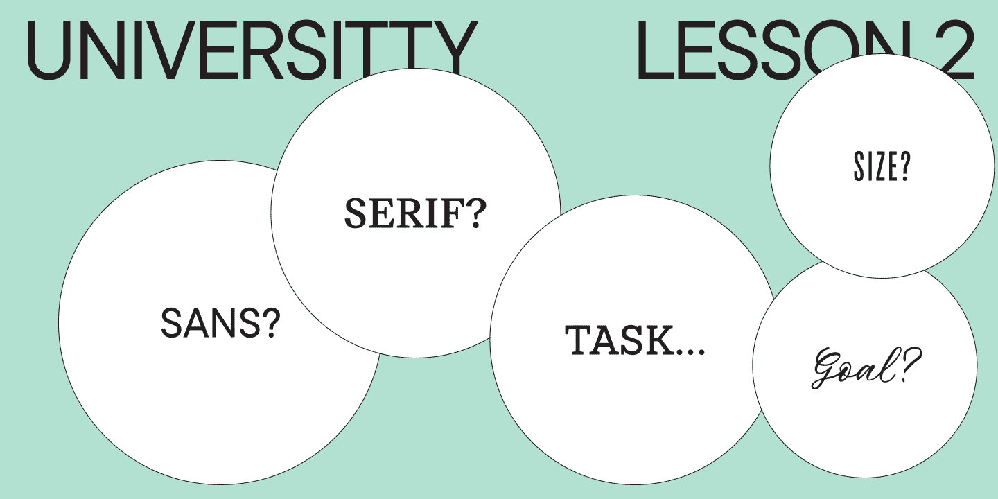
If you do not have an external task (for example, a brief from a client), you need to set it yourself. Below, I will list the main questions that will help you decide on the work direction. After that, I will show you how your answers to these questions may influence both graphic and technical decisions you make.

- What is the purpose of your font? Is it a versatile font that will suit multiple contexts? Or do you want to create a modern font for posters? Perhaps, your font will be used for book printing or the design of magazines? In general, what will be the use context of the typeface you want to create?
- How will you present your font? Is it a modern typeface on the edge of the latest trends or a simple and timeless classic? Or maybe an attempt to reconstruct a century-old font in its original form?
- What character will your font possess? Is it bold, conservative, friendly, aggressive, strict, or informal? Or does it have other traits?
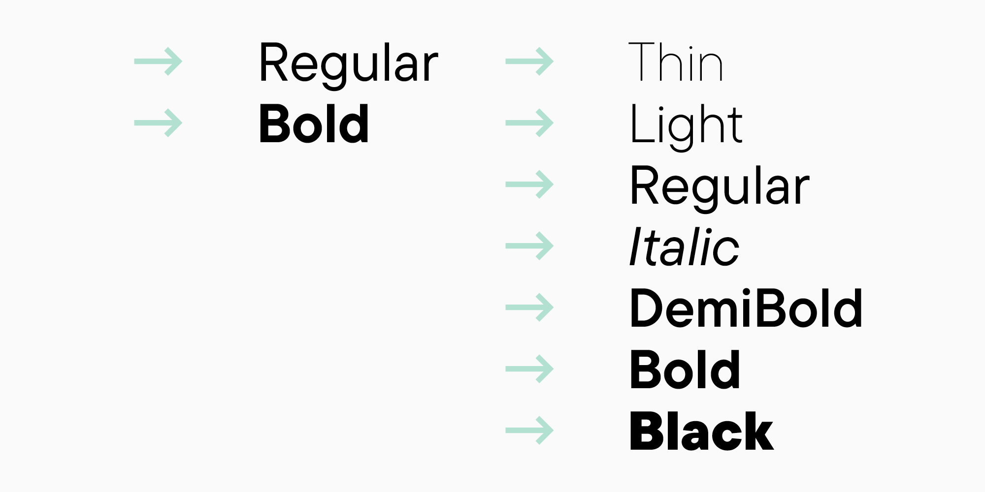
- How do you imagine the font family? Will it be large with a wide range of weights—from the thinnest to the boldest—or vice versa, with a minimal and thought-trough number of styles? Are you planning to design different versions for small and large sizes? Or provide your user with a ready-made font pair, for example, a serif and a sans serif?
- What will be the preferred size for your font? Will it be for text blocks, headings, or both?
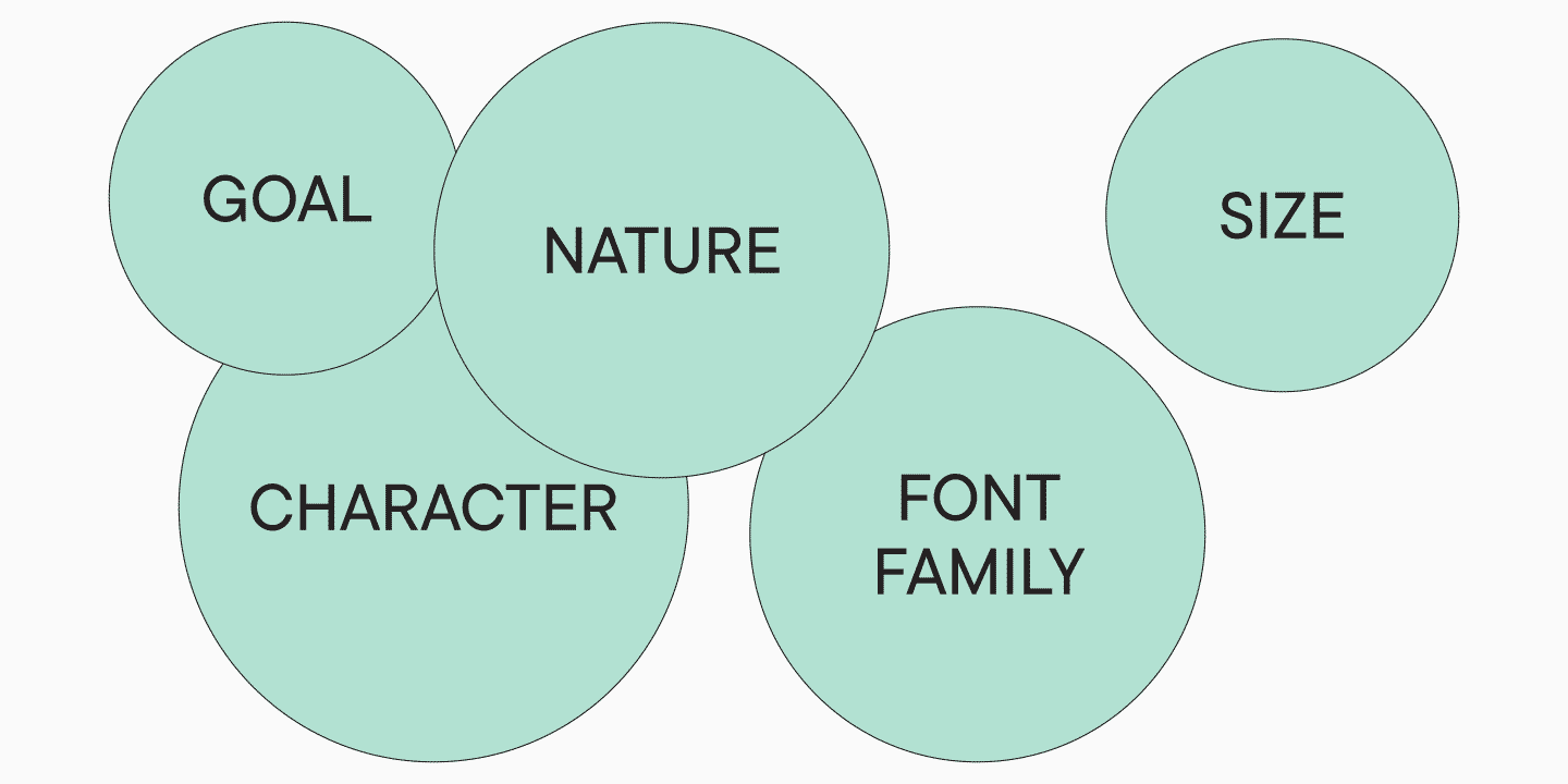
These questions will help you better understand what kind of project you are creating. They will allow you to step back and take a good look at your idea. Like an artist who, before starting a portrait, makes sketches, defines the size, and chooses a technique and materials, you need to have a clear vision of the entire project before designing a font.
It is easy to demonstrate how much it is easier to work on a project when you understand it. The answers and ideas on what to draw and how start appearing on their own.
Are you planning to design a font for a newspaper? Then, it is essential to make it compact and reduce ascenders to save as much space as possible. If your goal is versatility, perhaps, you will have to control your creative side better. Took a historical original and want to turn it into a modern typeface? Analyze carefully the features contemporary fonts possess to implement them into your project naturally. Do you see your font being used only in large sizes as a self-contained graphic statement? In this case, you will have to perfect all the outlines, curves, and shapes of letters and add elements that people would want to take a closer look at. Are you designing a legible font? Then the beauty of outlines takes a secondary role, and a steady rhythm becomes the focus. And the contrast, in this case, should not be abused.

Font and font family specifications
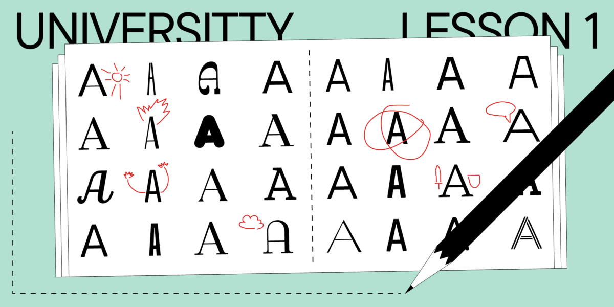
If you have answered the above-listed questions, you already know the use context of your future font, so you can define who may be your competitors. It is time to conduct small research and learn about other designers’ decisions in similar situations. Make a collection of 5-10 relevant fonts that match your idea and analyze them.
Let’s see how this might look using an example. Suppose you are designing a modern, functional serif that your user is visually accustomed to. First, look at the most common serifs. These are the system typefaces, such as Times New Roman, Georgia, New York, and Noto Serif. To this list, you can add some popular free fonts from Google Fonts (PT Serif, IBM Plex Serif) and also some widely used variants, like Litereta, designed for Google Play Books.
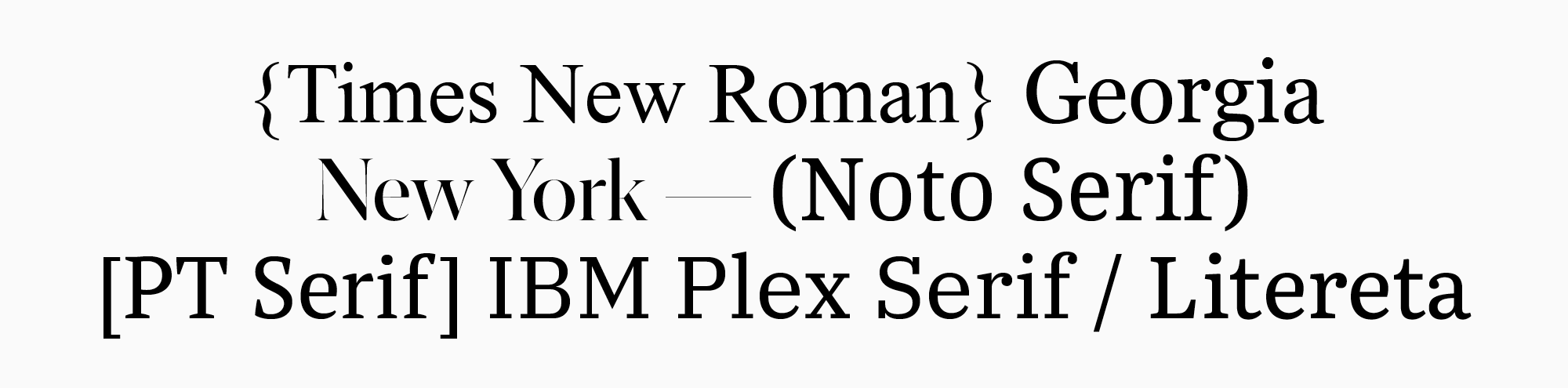
Given that it is a modern serif you want to create, you could categorize the resulting list into contemporary and non-contemporary fonts to analyze the difference between them. Times New Roman and Georgia, designed in the 20th century, will end up in the second category. To complete the picture with modern fonts, you can separately add some serifs that you particularly like, and that match the spirit of your idea.
If you need a functional serif, what functions are you thinking about? To begin with, you could consider its use in the text. But why not consider using the font for headings as well? In this case, you could add a display subfamily, significantly enhancing the font’s functionality. Then you could expand the research and look for examples of combinations of a text and a display font subfamilies in one typeface. Analyze what graphic and technical features of these fonts should remain the same, which ones may differ, and why.
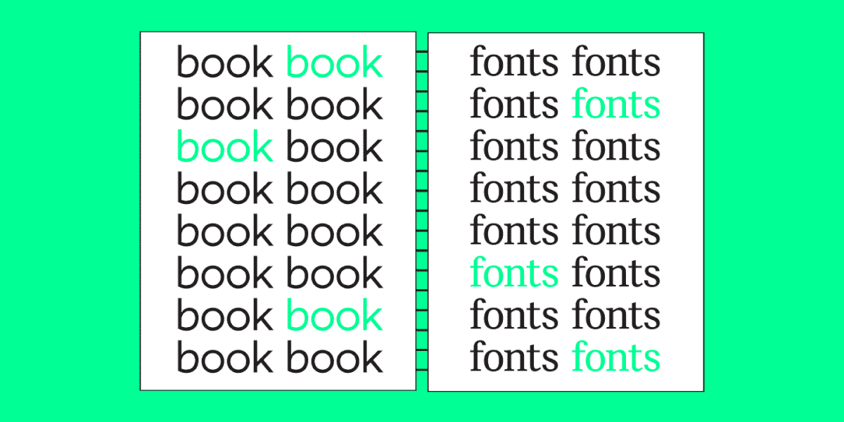
The more details you study, the better. Ideally, you should look at these fonts printed, compare the feelings they evoke, and highlight the ones closer to you.
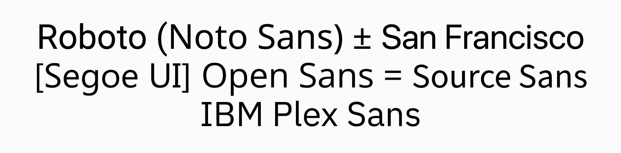
Let’s look at another example. Suppose you want to design a font to use specifically in interfaces and mobile applications. It is better to start with the list of the most popular fonts in this category as well. First, these are the system fonts, like Roboto, Noto, San Francisco, and Segoe UI. Then some free fonts, such as Open Sans, Source Sans, and IBM Plex. Why these fonts? Everything for the user’s convenience. If the font is not too different in its technical characteristics from the most common variants, users will not have problems adjusting to your new font.
The next steps of the research will be the following:
- fonts metrics measurement (the height of the uppercase and lowercase letters, the weight of the main font styles);
- graphic analysis of the fonts (at least, which category they belong to: Geometric, Humanist, Neo-Grotesque);
- character set research (does the font require any specific symbols?);
- font families research (is it worth limiting yourself to just a set of weights and italics, or is it better to think about other subfamilies?).
Look closely at the fonts and deconstruct them:
- Which category, or categories, does it belong to? For example, there are mostly Neo- and Geometrical Grotesques.

- How many font styles are there in the families?
- How different are italics from roman styles?

- How strong is the contrast?

- Do these fonts have static or dynamic proportions?

- Are their apertures more closed or open?

- How much do uppercase characters differ from lowercase ones in height, and how high are the ascenders?

The above-listed examples are simplified versions of the actual cases that lead to fonts included in the TypeType’s collection. They show a possible logic direction during the analysis of future projects. Your logic may differ from these examples, and your conclusions will also remain personal. For instance, you can follow the path of the most popular fonts and design your typeface for it to take its place beside them. Or, on the contrary, create a product that would stand out.
Regardless of your decision, this stage will help you understand the context your font will exist in. You will also decide what you want your font family to consist of and what qualities you want your typeface to possess. These decisions will likely change during the work process, and it is absolutely normal. The main thing is that now you have a steady foundation.
It also happens that you already have an idea, you have made first sketches and even drawn something in a font editor. In that case, you can start with the analytics later, after the initial visual searches. But practice shows that you should not exclude this stage.
Character set
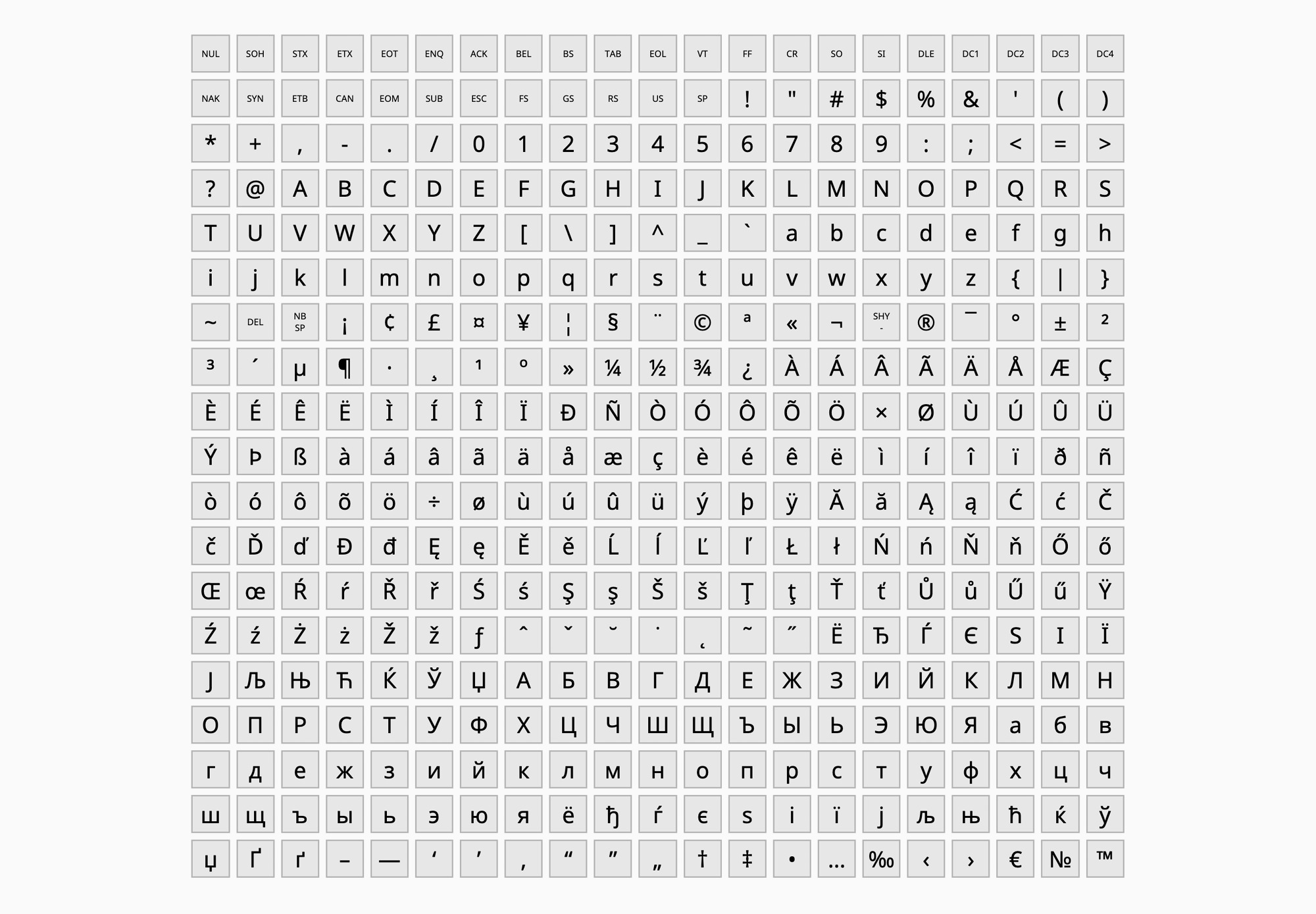
So, it is time to think about the content. To prepare the font for being used by someone besides you, the font has to support at least a basic minimal character set, which goes far beyond the Latin alphabet.
In the beginning, it could be difficult to determine the main components of the font on your own. As a starting point, I recommend using character sets developed by corporations such as Apple or Microsoft. You can alter them later or leave them unchanged.
When adding characters to your font, you will see that each character has its unique number in the U+0000 or uni0000 format. This is a code in the international standardized Unicode system, which enables the recognition of characters from your font across various platforms. Learn more on the official Unicode website.
To my mind, the Microsoft sets 1250, 1251, and 1252 together make a rather functional character set.
You can use a convenient service to compose your own character set, also combining the existing ones.
At TypeType, we use our own character sets that we have developed during the work process and more than once corrected, taking into account the users’ feedback. If you work on fonts for a long time, you will likely form your own preferences regarding character sets.
To add more structure to your knowledge about the characters that could be in a font, we will take a closer look at one of the sets we use at TypeType.
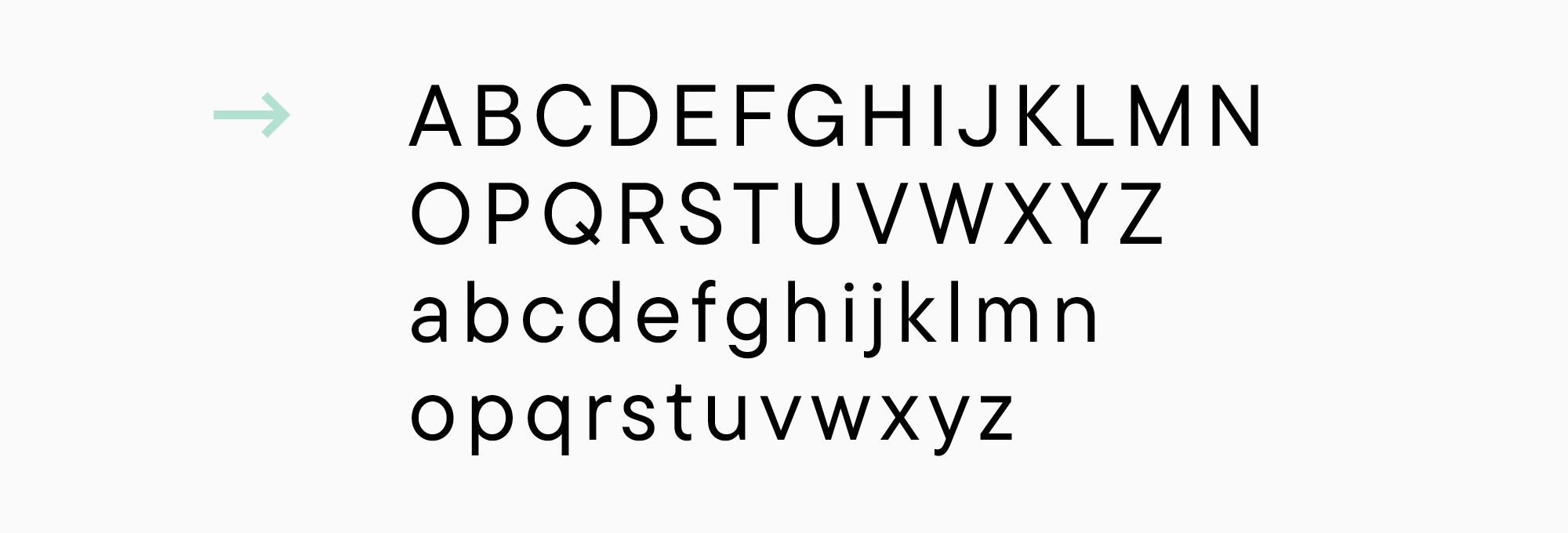
- Basic Latin character set. This is what we call the Latin alphabet—the foundation of the entire font.
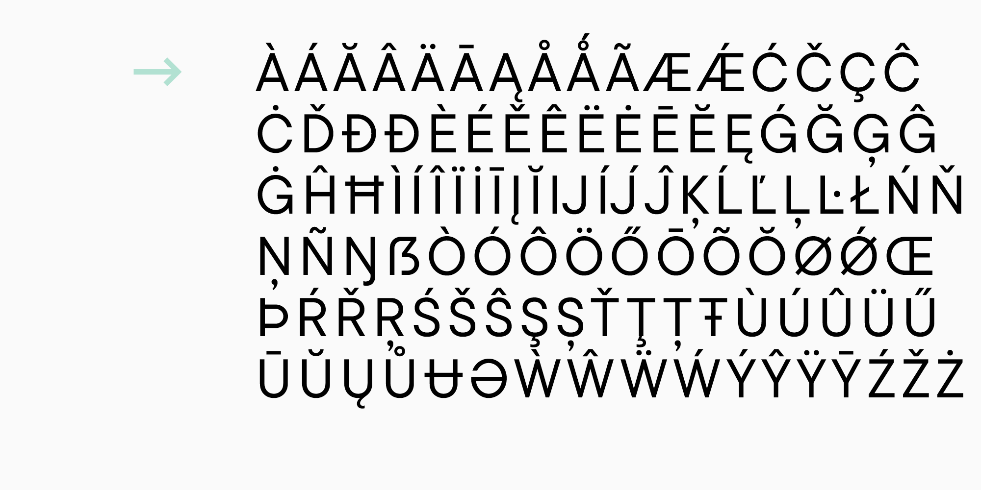
- Extended Latin character set, which includes the characters of Western and Central Europe.
- Cyrillic character set, which includes Russian and Western Cyrillic languages.
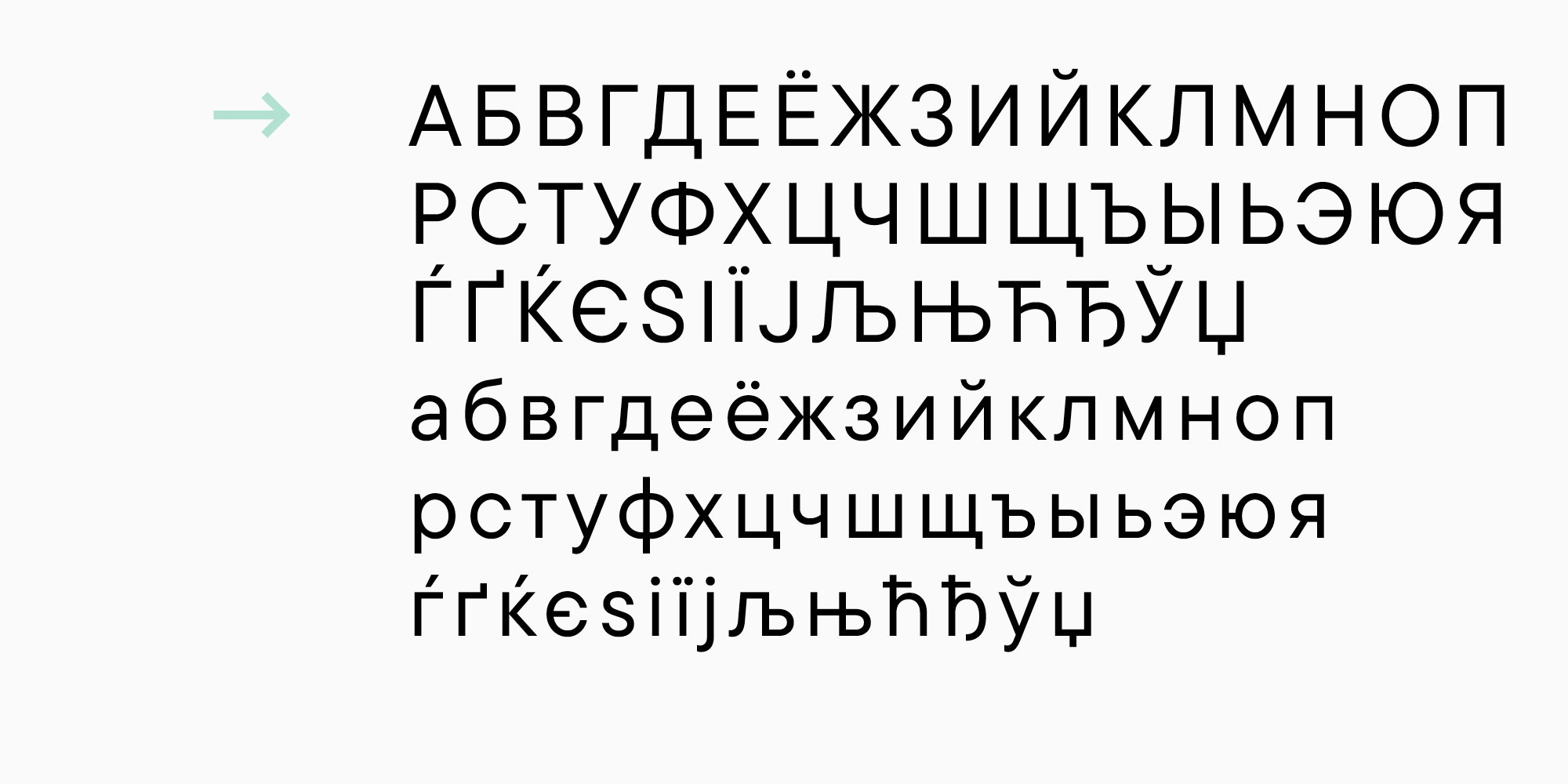
- To capture this linguistic variety, we need specially drawn diacritical marks (in our case, different variants of lowercase and uppercase characters).

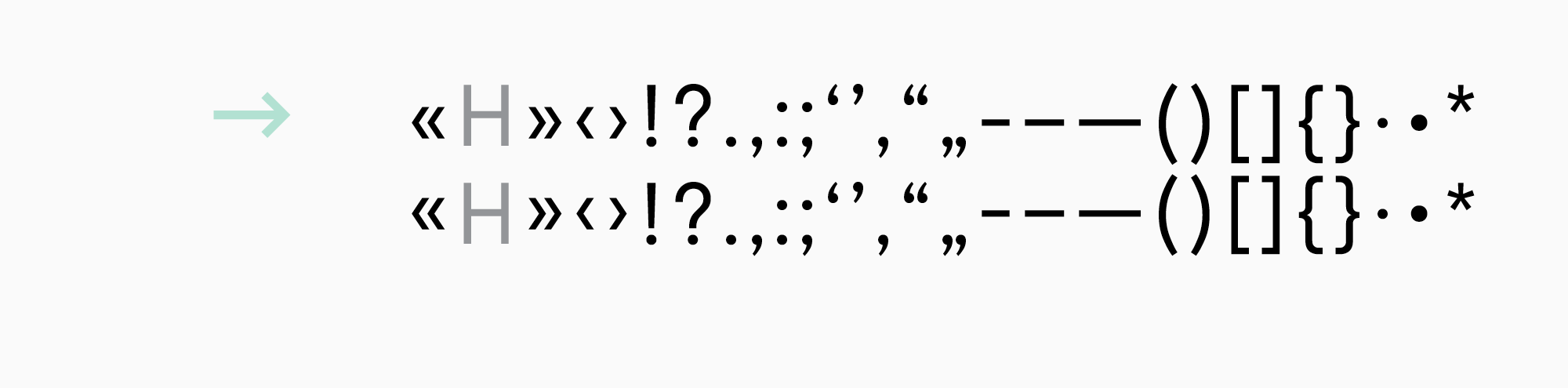
- Punctuation marks with their case-sensitive versions are also needed where necessary.
In the process of drawing, it is common to align the central punctuation marks and symbols (like brackets or dashes) to look better with the lowercase characters. In such cases, when typing with only uppercase characters (with the All Caps feature on), brackets will seem lower than desired. To fix this, the characters aligned with the uppercase letters are drawn separately, and the case feature is written.
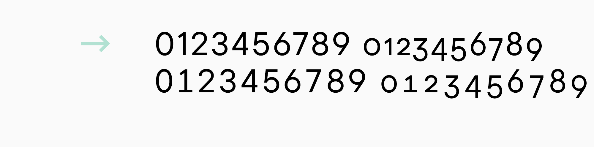
- Four types of figures: lining figures (aligned with uppercase characters), non-lining figures (aligned with lowercase characters), and their tabular versions (they have equal em-spaces and are convenient to use in tables).
- Besides, figures appear as numerators, denominators, inferiors, and superiors. You can see these figures in fractions, footnotes, or chemical formulas. Masculine and feminine ordinals (1а – prima, 1o – primo) fall into this category as well.
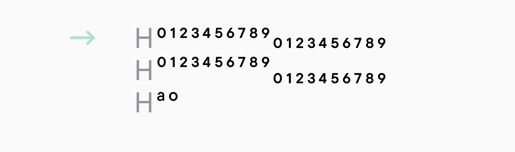
- Numerators and denominators can be used in fractions right away.

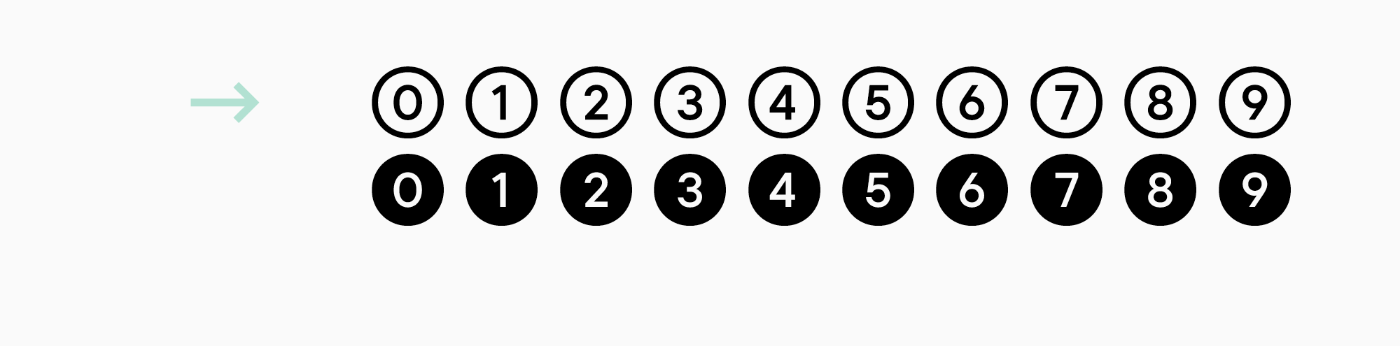
- One more version of the figures is circled.
- Currencies and their tabular versions.

- Symbols with the case-sensitive version of @.

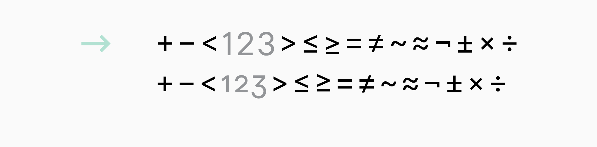
- Basic mathematical symbols with their versions for the non-lining figures if necessary.
The same logic as with the case-sensitive versions applies here. Initially, mathematical symbols are aligned with the lining figures, so they might look too high-positioned when used alongside the non-lining characters. In this case, a lower-positioned version of them is drawn for the non-lining characters.
- Arrows can be handy.

Do not forget about the space character and .notdef (a symbol shown in the font editor when a user tries to type a character not included in the font).
Think whether your font needs small caps or not. It will obviously expand the character set, but it will also add more functionality to the font.
Small caps are a scaled-down version of the uppercase characters. It is usually a little higher than the lowercase characters and has a similar weight. It is used for abbreviations or when typing in uppercase is needed.

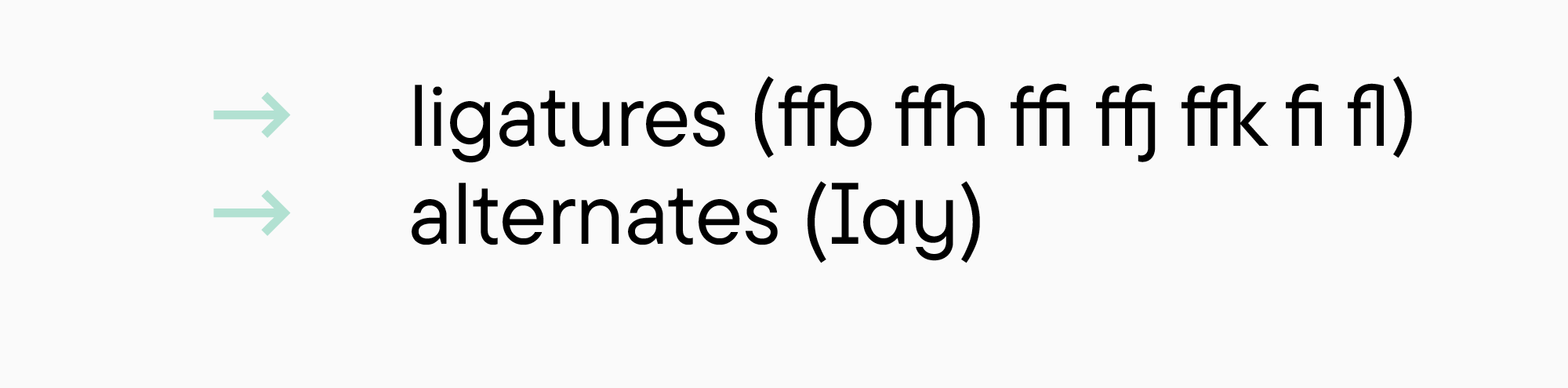
Apart from the characters listed above, ligatures and stylistic alternates often appear during the process of designing a font.
A character set like this (672 characters) is larger than the combination of Windows 1250, 1251, and 1252 (369 characters without the technical symbols). We use this character set as a foundation that we can expand as well as downsize if needed.
Result
All the advice mentioned above is by no means intended to limit your creativity while working on a font. They will only help you create an outline you will use to guide yourself through the process.
By following these recommendations, you will get a brief for your font. Let’s see what it may look like for a serif and sans serif I mentioned in the examples.
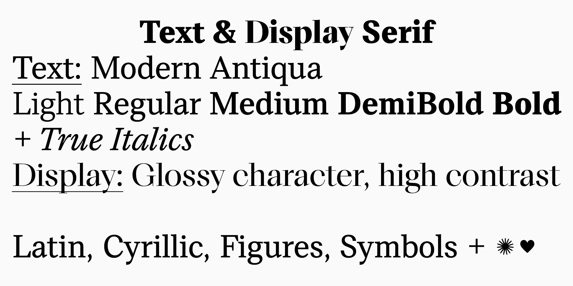
Brief 1. A functional and modern serif.
The family must have variants for text and headings.
The text variant is a modern serif that can be used in long texts. It mustn’t scare off users—it should be familiar to the modern eye and should not have an old style feel. The look of the serif should be modern and have the property of still being relevant in the long run.
The font family must not be too big, but it would be good if it provides enough functional font styles (5 weights at best). Italics are designed according to their own logic (not just slanted font) and will have a modern version of the old-style construction.
The variant for headings is a font with a more pronounced “magazine” style. It will be possible to use it in large sizes.
The text subfamily will be low-contrast, static, and have medium apertures. The heading subfamily will be high-contrast, with dynamic proportions and closed apertures, but the constructions of characters will be the same as in the text variant. The height of the lowercase characters in relation to the uppercase ones is neither tall nor short. The ascenders are equal to the uppercase characters or a little bit higher.
The character set must cover the European Latin and Western Cyrillic writing systems and have all types of figures, essential punctuation marks and symbols. Also, the font must have small caps and a small number of decorative elements.
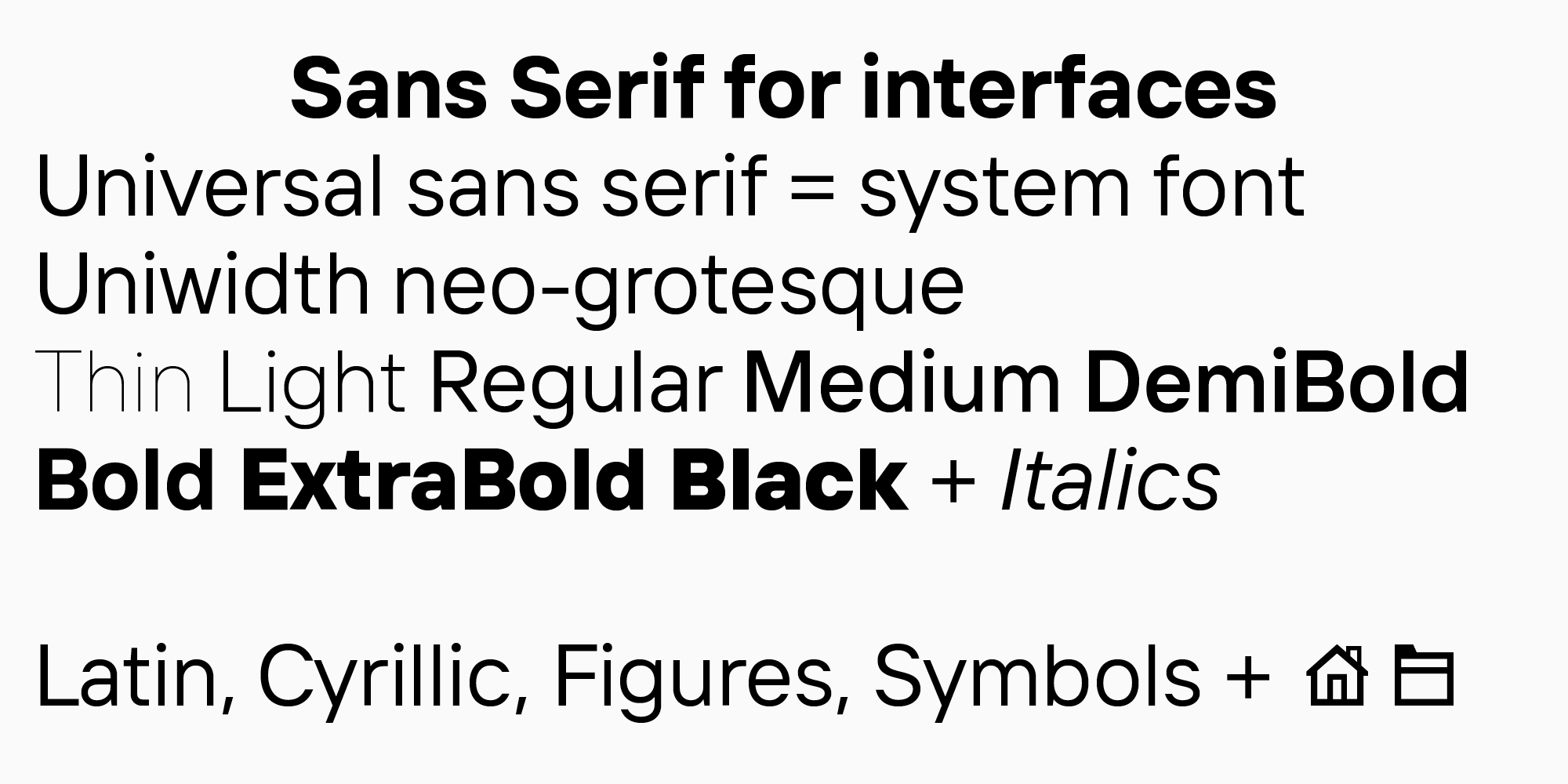
Brief 2. A sans serif for interfaces.
We are designing a versatile sans serif to use in interfaces. It is crucial that it replaces system fonts safely, meaning that its proportions and metrics should be average in this category as well as its character. Also, as shown by the research, the font must fall into the category of Neo-Groteques. Respectively, the proportions will be static, and contrast will only appear as optical compensations. Apertures will be medium or closed. The font family must have a large weight palette (8-10) and slanted font.
The character set must be comprehensive, with expanded Latin and Cyrillic sets, all types of figures, all necessary punctuation and symbols. Also, a set of the most common icons used in interfaces must be added.
Final thoughts
A font is a large and complex system where it is easy to turn away from the path, get lost, and forget where your creative thought was headed. Or get caught up in a constantly growing amount of work. That is why a font design can be challenging to complete, and projects remain unreleased.
However, if you have a more or less clear idea of the final product and systemize all your tasks, designing a font becomes more than achievable. Proceed step by step—and you can do it all!