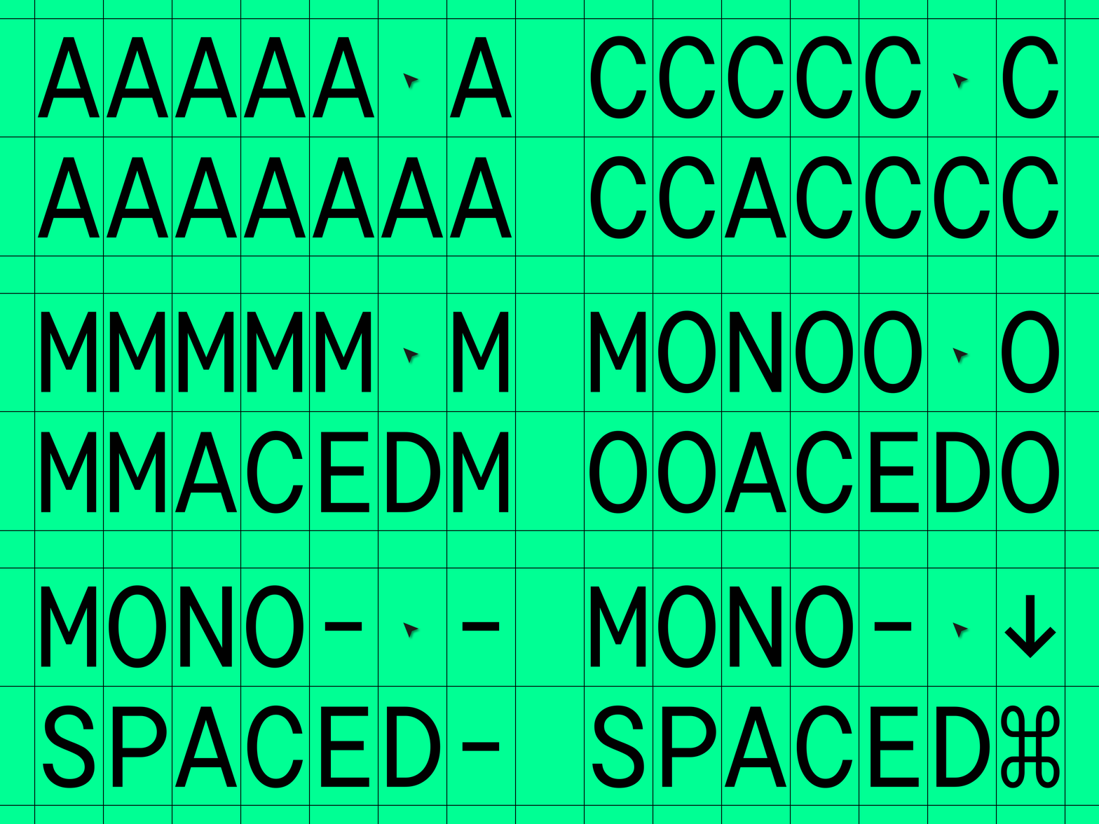
Monospaced fonts are actively gaining popularity among designers. What is even more interesting is that the scope of their application is also expanding.
The times when fonts like these were only used for coding have gone. Today monospaced fonts adorn the pages of magazines, the packages of popular brands, signs and menus, websites, and more.
If you are not yet familiar with these fonts, take them into account. They are too charming not to have at least one in your collection.
What is a monospaced font?
A monospaced font is a font where all em-spaces have the same size. That means all letters and characters occupy the same amount of horizontal space, have the same width.

In traditional proportional fonts, the space occupied by each character varies based on its individual shape. So the glyphs i, l, f are the narrowest, and a, m, w are the widest.
Due to this, a font looks balanced, and well-made kerning, which is the process of adjusting the space between pairs of characters, improves text comprehension. A good font only has a limited amount of extra whitespace.
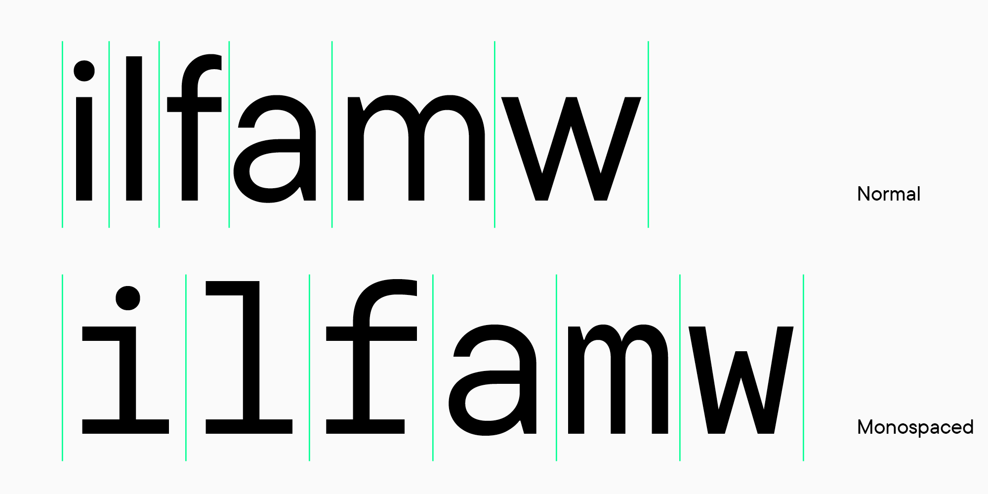
Monospaced fonts are extremely different. Many characters look unusual because letters are located in one em-space. The letters m, w, м, ф, and other letters with similar anatomy look condensed, too narrow. And between two initially narrow i, l, j, f, t, an unusually large amount of whitespace becomes apparent. Such symbols are designed with wide serifs and cross bars to partially fill this space. Kerning is not used for monospaced fonts.
Why monospaced fonts look like this
Have you ever associated monospaced fonts with texts typed on typewriters? The thing is that the first monospaced typefaces were specifically designed for typewriters. Typewriters required a specific typeface due to the mechanical limitations that restricted the carriage movement to the same distance for each character.
Technologies have significantly advanced, but monospaced fonts remain. Coding became their new domain.
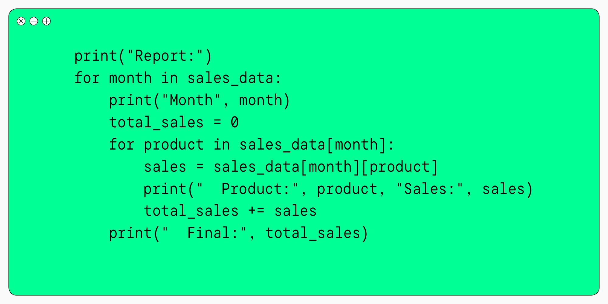
Programmers found it convenient that all characters had the same width. This way, it was easier to find errors in code because of its specific layout. Similar lines are located one below another, so each missing or wrong element can be easily spotted during quick skimming.
Coding and monospaced typefaces are still inseparable, and this is not likely to change in the nearest future. Font studios release convenient typefaces every year, always keeping in mind the aesthetics of the designed font.
Modern usage
As mentioned earlier, the main domain where monospaced fonts are used is programming. Like any other fonts, many people in this domain use default typefaces. Others purchase typefaces that are more appealing and convenient for work and install them instead of default ones.
Large and medium-sized brands order a monospaced subfamily from font studios within the corporate font family. Fonts like these are especially frequently purchased by IT companies.
Recently monospaced fonts have begun to expand into other fields.
Young brands and art-project designers became the first to take advantage of the unique typefaces. Mono fonts started appearing on magazine covers, in exhibition design, coffee shop and game café menus.
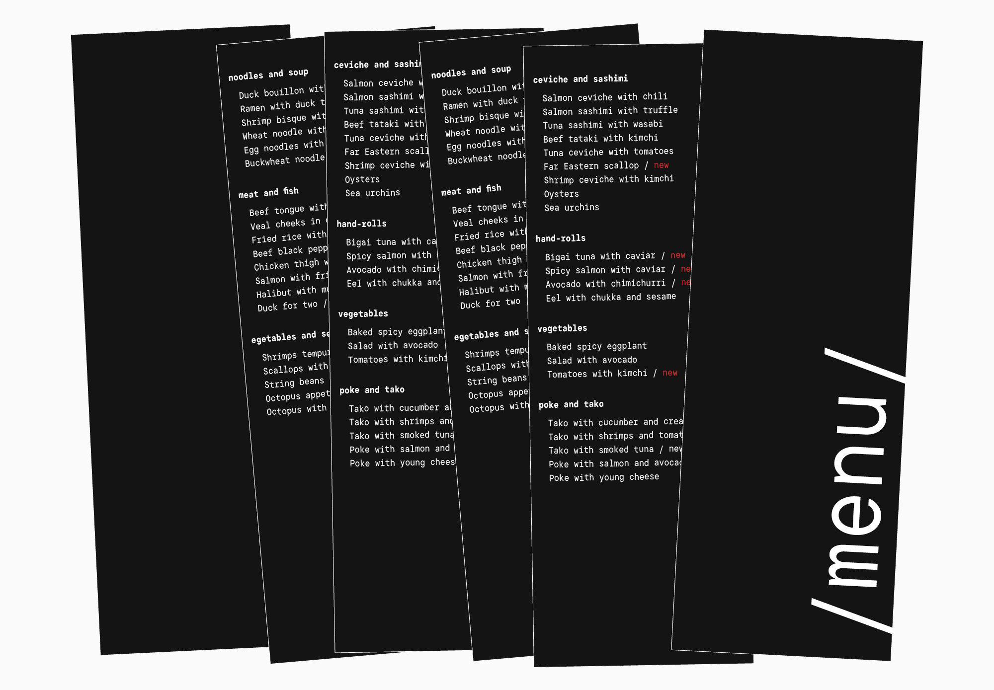
Today it is common to see monospaced typefaces in website headings, restaurant signs, and packaging designs. More and more designers are being charmed by unique fonts with unusual proportions and use them in their projects. Font studios have caught the trend and are developing increasingly aesthetic typefaces with monospaced proportions.
Mono fonts are becoming more popular and often appear around us, so it has become easy to read them. They attract attention and are capable of looking both futuristic and elegant.
How typeface designers make monospaced fonts aesthetic
Several years ago, we began expanding the TypeType font families by adding monospaced typefaces. At first, we did it because of the developers’ requests, but later we felt a passion for designing this font group. Realizing that these typefaces broaden the horizons of visual art and inspire unusual design choices, we decided to continue our journey in crafting monospaced fonts. Especially considering their significant popularity.
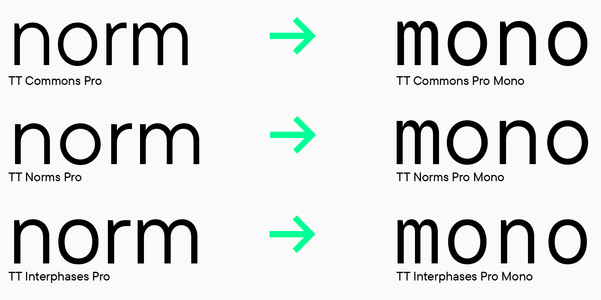
How fonts with equal em-space are designed
It may seem that taking a standard typeface and simply adjusting its proportions is enough. Of course, it can be done like this, but the result will be far from appealing.
Even if we take the popular bestseller of the studio, the character set is developed by the typeface designers from scratch. The main goal in such projects is to keep the visual recognizability of the font family while creating an aesthetic and practical mono font.

Several years ago, we conducted research to identify the main patterns in designing the proportions of a monospaced font. We analyzed dozens of typefaces of other brands, did test sketches, and experimented with the font in a set.
After this research, we developed our own standard for the em-space—600 points. This size makes a font look aesthetic and remain practical for programmers.
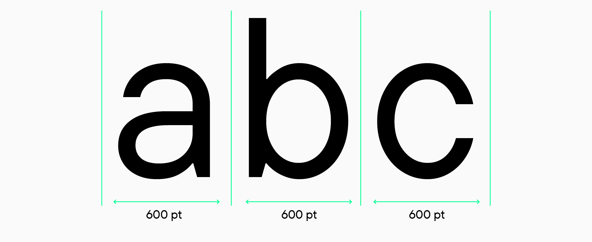
Each monospaced font of our studio has its distinctively shaped glyphs and personality, which is why designers easily choose a suitable one.
The studio’s monospaced fonts have a set of various font styles. Moreover, we are designing a variable version of our monospaced typefaces, making our fonts even more technological.
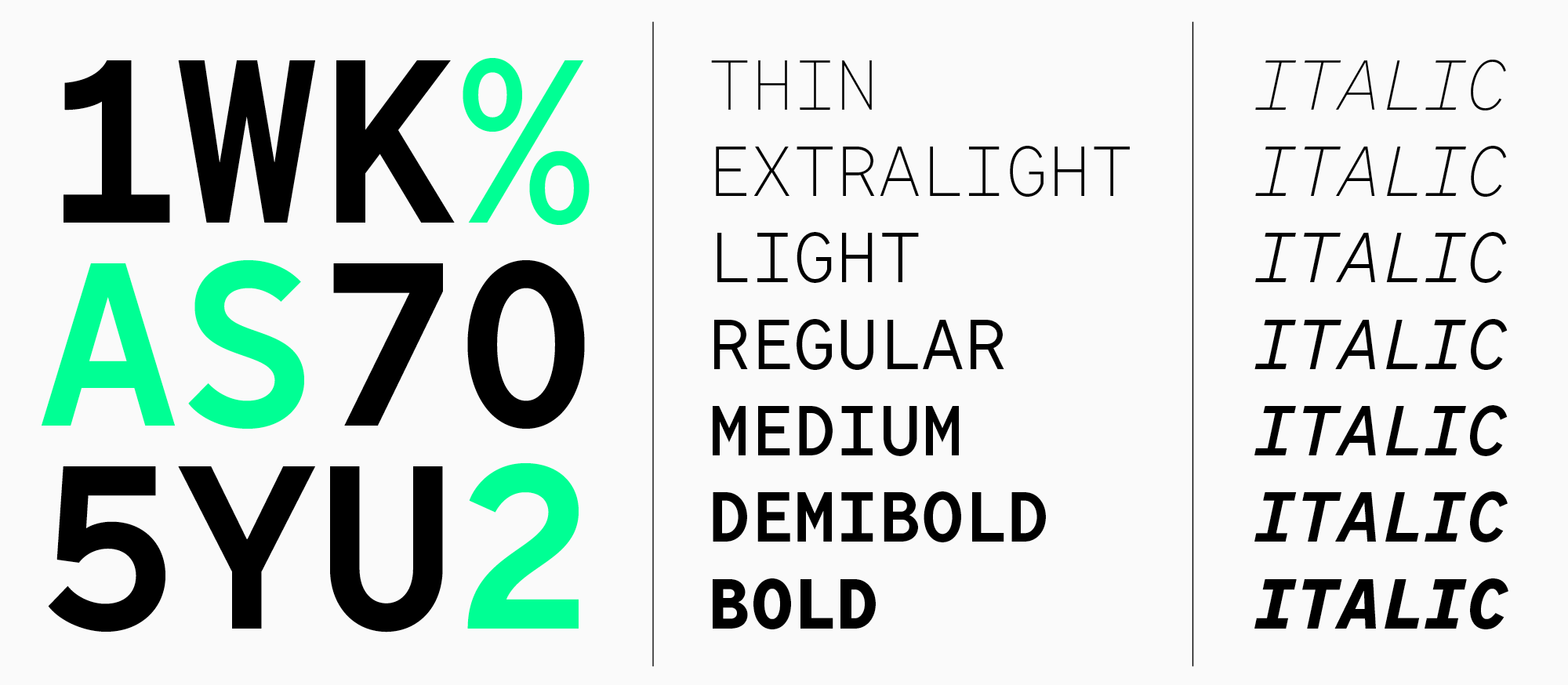
Best monospaced fonts for designers
We have chosen the best monospaced fonts for coding and design. Let us introduce the collection of the most beautiful and practical bestsellers, preferred by many global brands.

1. TT Norms® Pro Mono
The monospaced subfamily adopted the main font’s features, which are elegance, functionality, and quality. The typeface supports more than 270 languages. It contains 15 font styles: 6 roman, 6 italic, and a variable font adjustable on the axes of weight and slope.

2. TT Commons™️ Pro Mono
Like classic TT Commons™️ Pro, it has a peaceful character and is highly functional. The typeface supports more than 270 languages. Like the previous one, it contains 15 font styles: 6 roman, 6 italic, and a variable font adjustable on the axes of weight and slope.

3. TT Interphases Pro Mono
The top-selling monospaced font. Because of its unusual glyph shapes and pleasing nature, it has become a popular choice among developers and designers.

4. TT Autonomous
A futuristic typeface inspired by unmanned electric vehicles. The monospaced subfamily consists of 6 font styles. The family includes appealing true italics that accentuate the text more compared to the italic font styles.

5. TT Fellows
The first unispaced font of the studio—a middle ground between monospaced and proportional fonts. Not suitable for coding, it is surprisingly convenient for design. An individual font style has different-sized em-spaces, like ordinary proportional fonts. However, in each subsequent font style, characters change weight but stay within the set em-spaces. Due to this, the designer can change font styles while maintaining the layout. It would not be easy to find an alternative to this friendly and beautiful typeface.
For programmers, a monospaced font is a familiar tool. In our studio’s collection, you will find a font that would have great quality and be both practical and appealing.
Even if you are far from coding, take note of monospaced typefaces. Their popularity in design will not slow down, so we will have many wonderful projects with mono fonts in the future.


