top_banner_ttsupermolotneue0326
TT Knickerbockers
2 styles
Type foundryFonts & StylesSans SerifTT Knickerbockers

TT Knickerbockers

TT Knickerbockers is a typeface duo celebrating New York City. It pairs a monumental sans serif with an energetic script to capture the city's dual nature.
Single style: from $43.99
Full family: from $69 2 styles

Buying Options

Choose the fonts and licenses you want. Then, press the "Add to Cart" button

Any questions about the font or licences? Write us.

Choose the fonts you want

Package offer:
per style $34.50
from  $69
2 styles
from  $69
from $43.99
from $43.99

Any questions about the font or licences? Write us.

Select font licenses

You must specify a font package or style before selecting a licence

Choose the licenses you want

On request
On request
On request
On request
On request
On request
On request
On request
On request
On request
No selected items
Total
$0

Testers

TT Knickerbockers
Size
Features
Turn on all

TT Knickerbockers Script

Ideal font pairs with TT Knickerbockers

What is a font pair, and what does it serve for?

A font pair is a combination of two fonts within one text block. Most often, one of the fonts in a pair is a more expressive headline font, and the other one serves to communicate information. Such fonts complement each other and help designers solve various tasks, like highlighting key elements, adding emotional expressiveness to the project, or separating semantic blocks.

How to choose fonts for a project: Several general recommendations

To begin with, establish the project's tone. Choose the fonts that stylistically match the main idea. After that, you need to determine the functions of each font in the project and their hierarchy: which font will complement the design and which one will serve to attract attention as the main element. You need to assess the difference between the fonts and decide what kind of information each of them should convey. First, we recommend choosing the base font you will use most, and then you can find a suitable pair for it.

Core principles of font pairing and recommendations from designers

The main rule you should follow when matching two fonts is that both similarities and differences must be visible between them. You can highlight the coherence of fonts by the following characteristics: contrast, proportions, width, openness of characters, individual letter shapes, and overall tone. Feel free to experiment with different combinations. We also recommend analyzing the projects you like: this way, you can enhance your visual skills, elevate your knowledge base, and gain confidence in dealing with typography.

Description

About font family TT Knickerbockers
160+ Language support

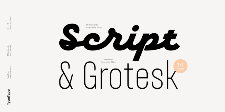
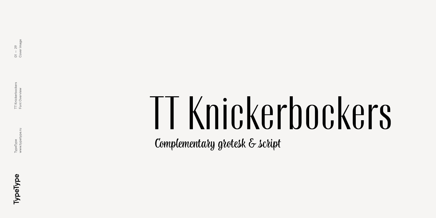
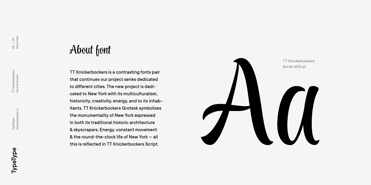
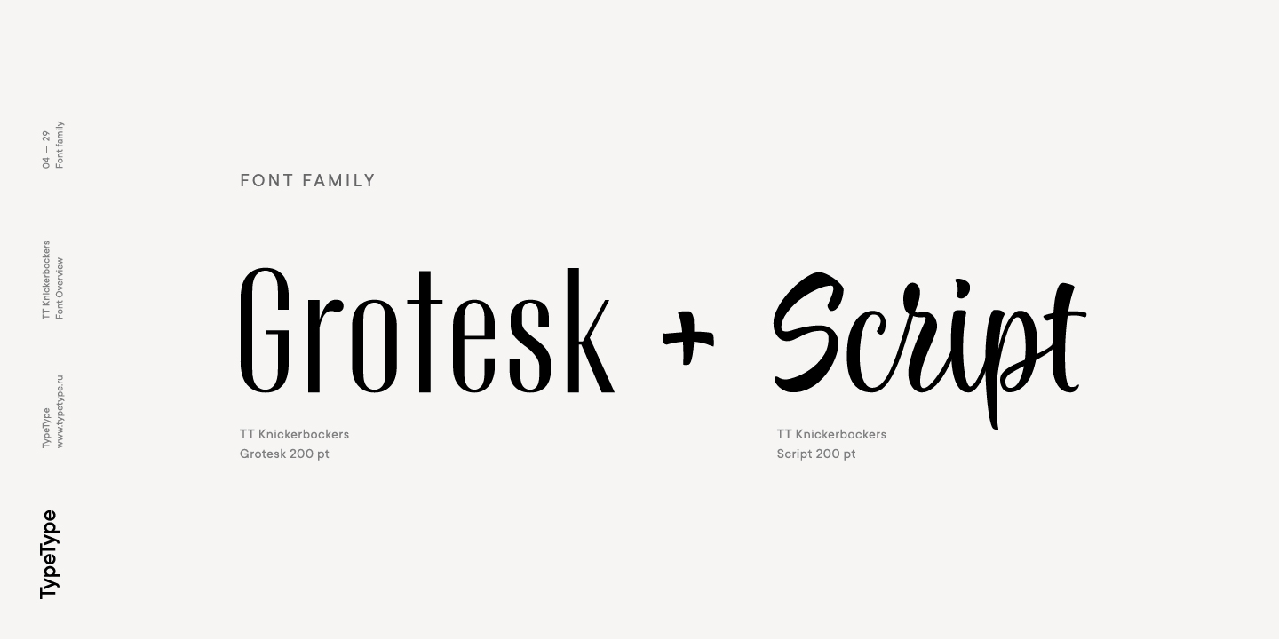
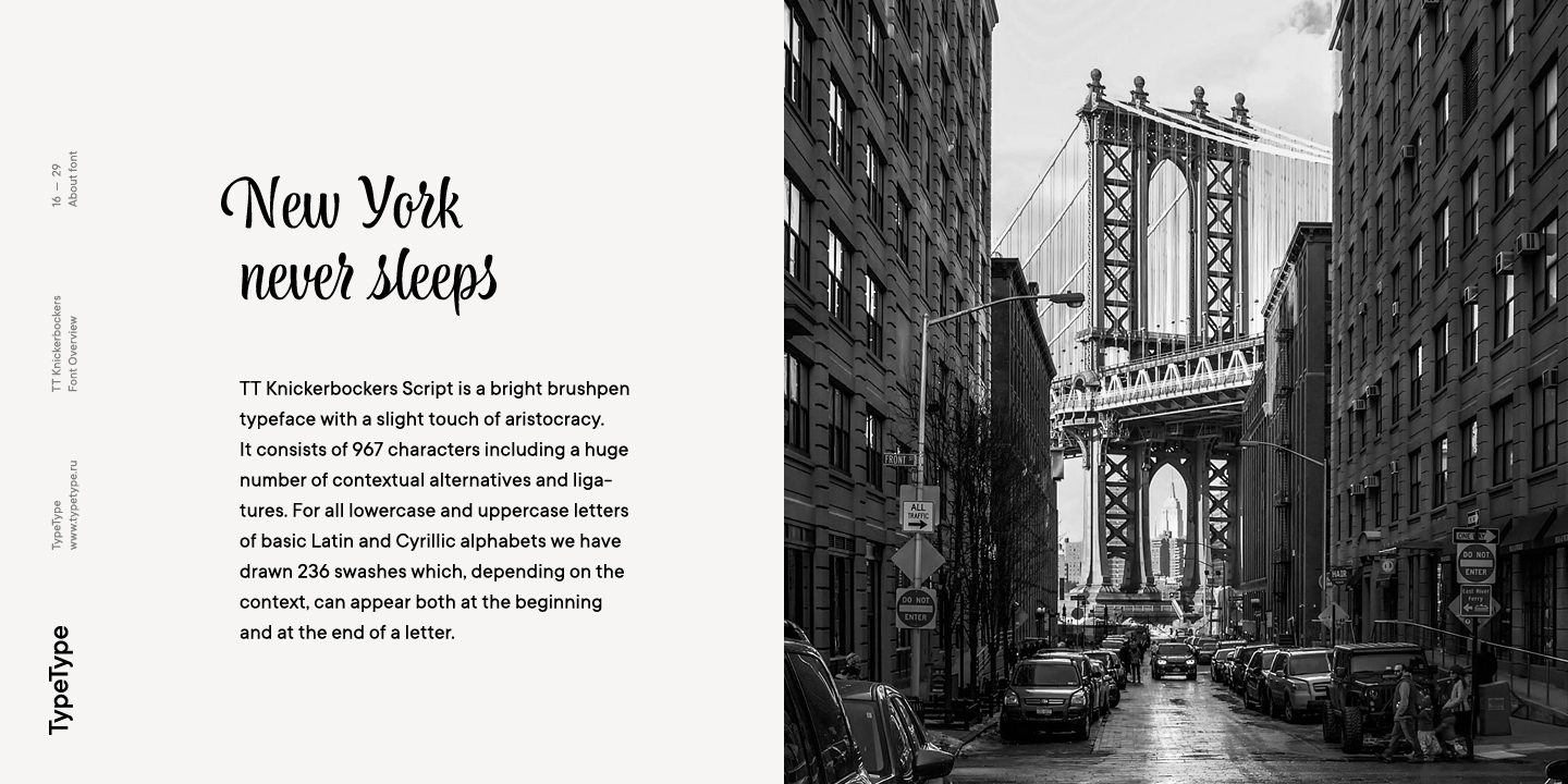
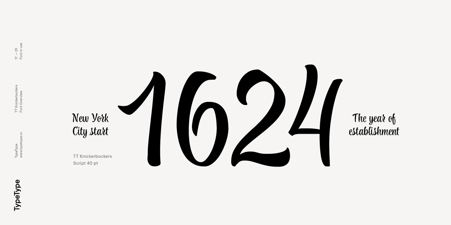
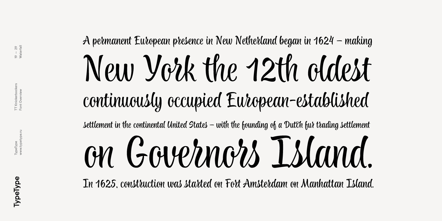
TT Knickerbockers is a contrasting pair of fonts that continues our project series dedicated to different cities. The new project is dedicated to New York with its multiculturalism, historicity, creativity, energy, and to its inhabitants. TT Knickerbockers Grotesk symbolizes the monumentality of New York expressed in both its traditional historic architecture and skyscrapers. Energy, constant movement and the round-the-clock life of New York—all this is reflected in our TT Knickerbockers Script.

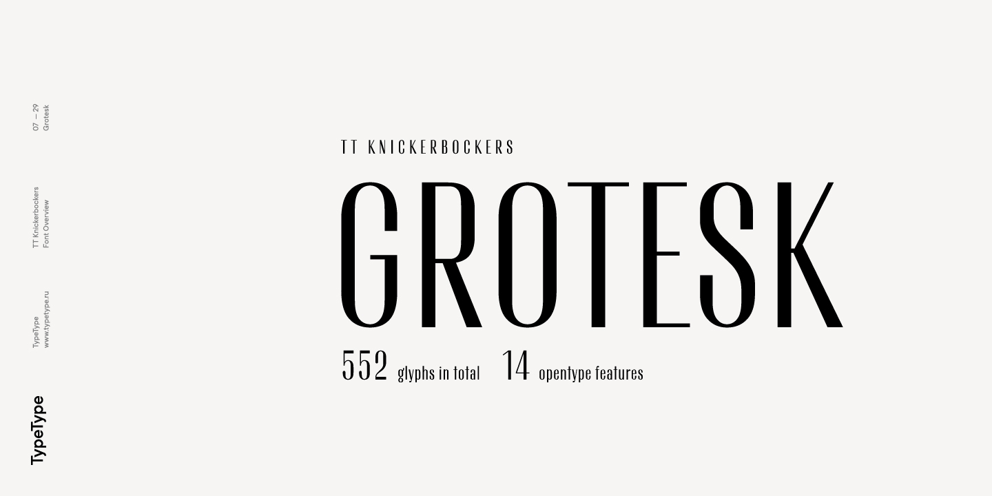
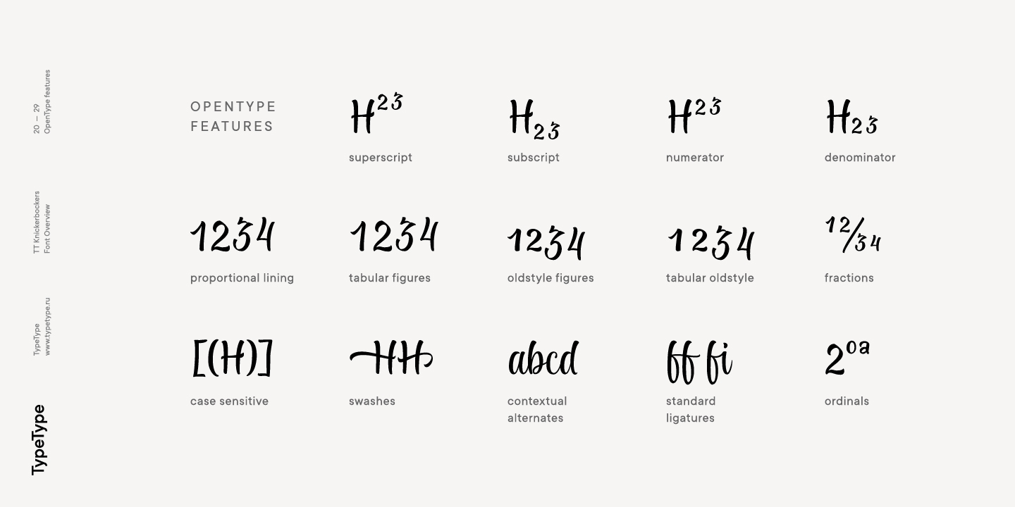
TT Knickerbockers Grotesk is a narrow contrast sans-serif with characteristic elements sending us back to the 19th century. There’s also a reference to antiqua fonts to be noticed in the font: where in traditional antiqua there would be serifs, TT Knickerbockers Grotesk features a straight stroke ending, and traditional drops (finals, tails and ears) are substituted with rounded strokes. In TT Knickerbockers Grotesk you will find unusual characters, stylistic alternatives and ligatures. The following OpenType features are implemented: ordn, case, frac, sups, sinf, numr, dnom, onum, tnum, pnum, liga, dlig, salt, ss01.

Release date

25 July, 2017

Additionally

Specimen

Download font specimen (pdf)

Poster Images

Graphic presentation at Behance

Custom version

Looking for a custom version of this font?

Character Set

Basic Latin Basic Cyrillic Extended Latin Stylistic Alternates, Standard and Discretionary Ligatures|salt,liga,dlig Lining Figures, Currencies Old-style Figures|onum Punctuation, Symbols, Mathematical Symbols, Arrows
A B C D E F G H I J K L M N O P Q R S T U V W X Y Z a b c d e f g h i j k l m n o p q r s t u v w x y z
А Б В Г Д Е Ё Ж З И Й К Л М Н О П Р С Т У Ф Х Ц Ч Ш Щ Ъ Ы Ь Э Ю Я Ѓ Ґ Ќ Є Ї Љ Њ Ћ Ђ Ў Џ а б в г д е ё ж з и й к л м н о п р с т у ф х ц ч ш щ ъ ы ь э ю я ѓ ґ ќ є ї љ њ ћ ђ ў џ
À Á Ă Â Ä Ā Å Ã Ą Æ Ć Č Ĉ Ç Ď Đ È É Ě Ë Ė Ê Ē Ę Ğ Ģ Ķ Ĺ Ľ Ļ Ł Ì Í Î Ï İ Ī Į Ń Ň Ņ Ñ Ò Ó Ô Ö Ő Ō Õ Œ Ø Þ Ŕ Ř Ŗ Ś Š Ș Ş Ť Ţ Ý Ÿ Ù Ú Û Ü Ū Ű Ů Ų Ź Ž Ż à á ă â ä ā å ã ą æ ć č ĉ ç ď đ è é ě ë ė ê ē ę ğ ģ ķ ĺ ľ ļ ł ì í î ï i ī į ń ň ņ ñ ò ó ô ö ő ō õ œ ø þ ŕ ř ŗ ś š ș ş ť ţ ý Ÿ ù ú û ü ū ű ů ų ź ž ż
a à á ă â ä ā ą ã å l ĺ ľ ļ ł I Ì Í Î Ï İ Ī у ý ÿ u ù ú û ü ű ū ų ů а y ў ff fi fl ft ffi ij ct st sp
0 1 2 3 4 5 6 7 8 9 $ ¢ ¤ ¥ £ ƒ
0 1 2 3 4 5 6 7 8 9
! ¡ ? ¿ « » . , : ; ... ' " | ¦ _ \ / ( ) [ ] { } · * # % § © ® @ & ° ^ - + < > = ~ ¬ ± × ÷

OpenType features

TT Knickerbockers TT Knickerbockers Script
salt | Stylistic Alternates

alуu

alуu

liga | Standard Ligatures

fl ft ffi

fl ft ffi

dlig | Discretionary Ligatures

ij ct st

ij ct st

onum | Oldstyle Figures

1638

1638

case | Case Sensitive Forms

({[H]})

({[H]})

numr | Numerators

H123

H123

swsh | Swashes

a b c d

a b c d

liga | Standard Ligatures

ar ch ff

ar ch ff

frac | Fractions

1/2 1/4

1/2 1/4

onum | Oldstyle Figures

1638

1638

case | Case Sensitive Forms

({[H]})

({[H]})

sups | Superiors

H789

H789

Similar fonts

10 font styles
2 font styles
8 font styles
Buy font