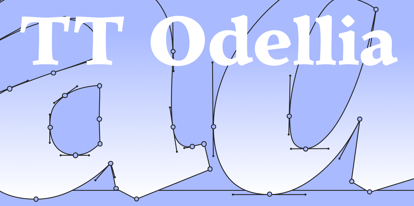
We recently released TT Odellia—the first old-style serif in the TypeType collection, inspired by Venetian typefaces and classical music.
The project’s author, TypeType’s Head of Type Design Marina Khodak, shared how this font was created, what makes it unique, and why it is relevant today.
Act 1 — From tradition to distinctiveness
The project began in July 2023 for two reasons: the absence of old-style serifs in the TypeType collection and my strong desire to work on a font in this category. At the time, it seemed to me that the old-style serif was the embodiment of the absolute pinnacle of a type designer’s mastery. Now that the font has been released, of course, I no longer think so. I believe it is a specific milestone for me, but one I have already passed—even if I spent exactly three years climbing up to it.
Before moving on to the sketches, I studied existing old-style serifs and settled on a specific type—the choice fell on the Venetian serif (the earliest and most calligraphic form). I looked at 15th-century publications and digital interpretations based on these fonts: Adobe Jenson Pro, Centaur, Ladoga, and Leksa.
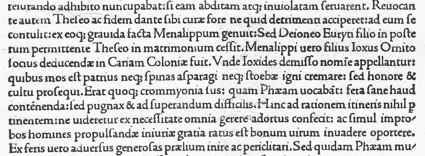
The old-style serif is also called humanist due to its deep connection with historical handwriting. A number of features stem from its origins: a slanted stress axis in the curved elements, triangular serifs on the upper elements of the characters, the specific shape of the letter ’e’, and a rather low contrast of strokes. All these details inspired me greatly, especially when looking at early publications. In the initial stages, I tried to make the font as soft and smooth as possible. I saw in it the wear and tear of old metal type, the roughness of paper, and the flow of ink.
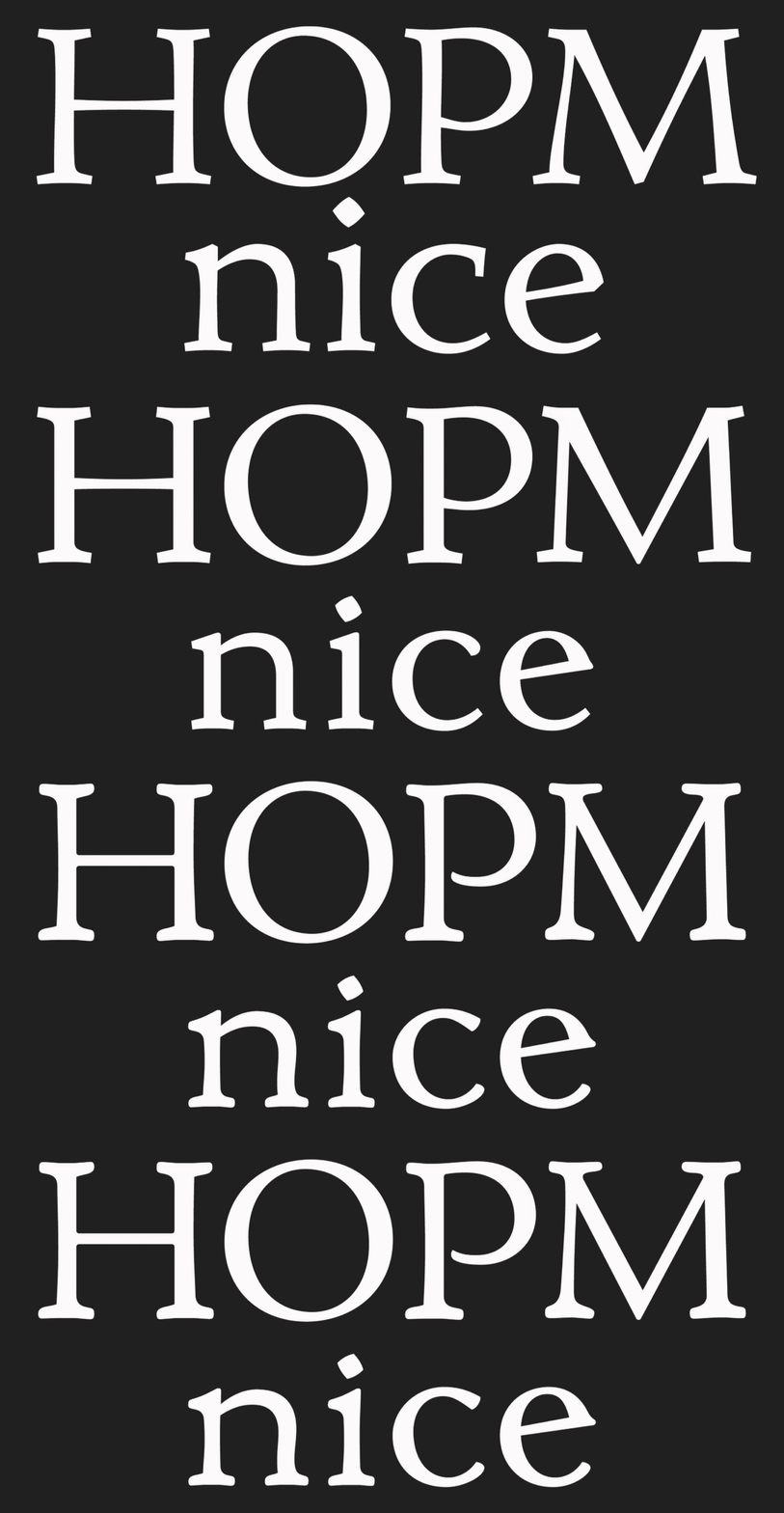
It was a good start, but I didn’t see my own reflection in these graphics. Until, at some point, I decided to clean up all the contours and add softness to the font little by little, like a spice—just the right amount. Once the balance was found, I immediately recognized my font, and the work took off.
Act 2 — Finding the balance
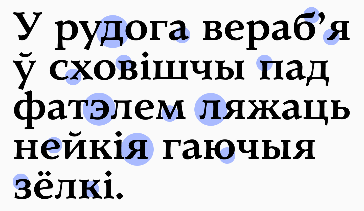
This font is about balance and juxtaposition. The natural humanist character, enclosed in a precise vector form, looks contemporary and distinctive. The Cyrillic turned out particularly well thanks to the design solutions in the basic forms—’б’, ’д’, ’л’—and the vertical serifs in ’з’ and ’э’.
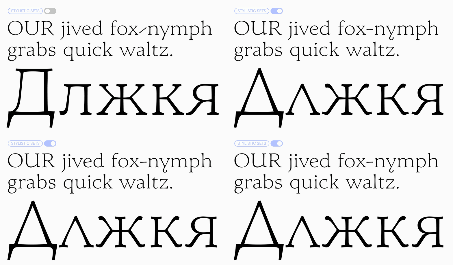
By toggling the stylistic sets, you can achieve a more traditional look of an old-style serif or a more modern one: for example, diamond-shaped dots and punctuation marks can be replaced with round ones, and dynamic hyphens with more familiar horizontal ones. Alternate versions of the letters ’y’ and ’U’, as well as a set of triangular ’Д’, ’д’, and ’Л’, ’л’, also help to enhance the historical context.
I had to search for the right forms for ’Ж’, ’К’, and ’Я’, choosing between more static graphemes and a variant with teardrop terminals. The Latin ’R’ features a characteristic leg with an overshoot. For a long time, I tried to harmonize all of this and apply similar graphic solutions across all characters. In the end, I managed to reach an agreement with myself and with the letters: now, the default set features more static and strict forms, while the softer and friendlier ones reside in a stylistic set.
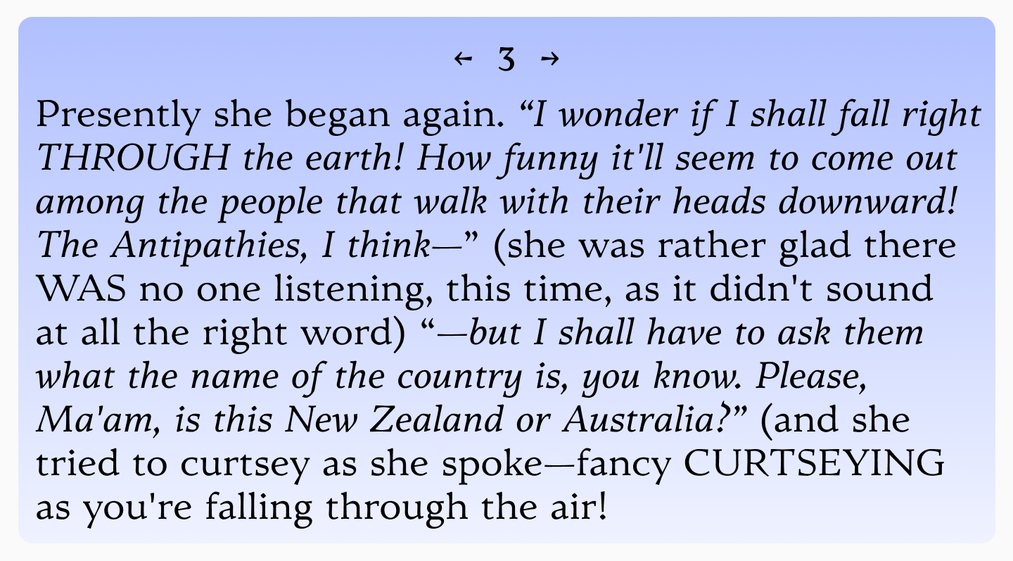
I decided to make the italic styles more dynamic. I wanted them to contrast with the upright styles. The main slant angle is quite small and typical for this type of font—10°—but some elements slant up to 18°. There is a certain freedom and a slight imitation of handwriting in the dynamics of the slants, the active arches, and the ascenders and descenders. The italic works as a fully-fledged text font (as it did historically) and stands out beautifully in running text.
Act 3 — Unity of opposites
I love it when a font has a story, and here, the main theme for me became duality and juxtaposition: I like to think that conceptually, this font fully matches the characteristics of old-style serifs, but at the same time, it is not old-fashioned. A modern design combined with a historical foundation, engineered today using modern tools—this is TT Odellia.
The name “Odellia” is a derivative of the names Odette and Odile, the white and black swans from Tchaikovsky’s ballet. I listened to a lot of classical music while working on the font, and it was this very piece that answered the question of what the font meant to me.
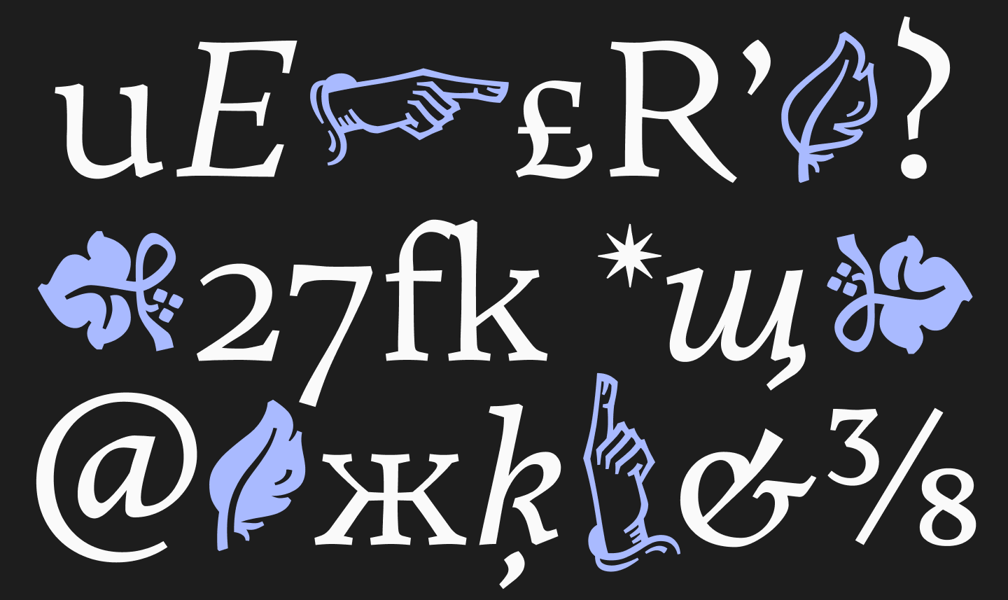
The font is complemented by a set of technical symbols and icons. Arrows, manicules, fleurons, and, of course, a black and a white feather as an Easter egg.
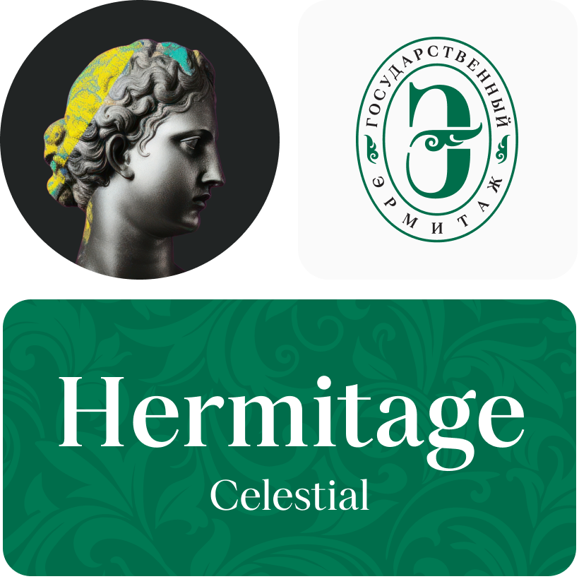
It was interesting for me to work with TT Odellia as a fully-fledged text font. And all the qualities of an old-style serif have ensured excellent legibility even at 6–8 pt sizes. However, thanks to its expressive design, it also shines in medium and large point sizes. The font is suitable for various fields: it will play harmoniously in projects related to music, history, and art, and will become a workhorse for setting running text in literary publications, menu layouts, or label design.
This project became a great challenge, support, and refuge for me for several years. With joy and excitement, I am releasing it into the world. Now, it is no longer mine; it is yours 🪶