It is often believed that by analyzing a person’s handwriting, you can make judgments about their character. However, why judge someone when it is possible to create a typeface out of the handwriting of a person who made a significant contribution to science?
In this article, we delve into a project of this kind.
About the project
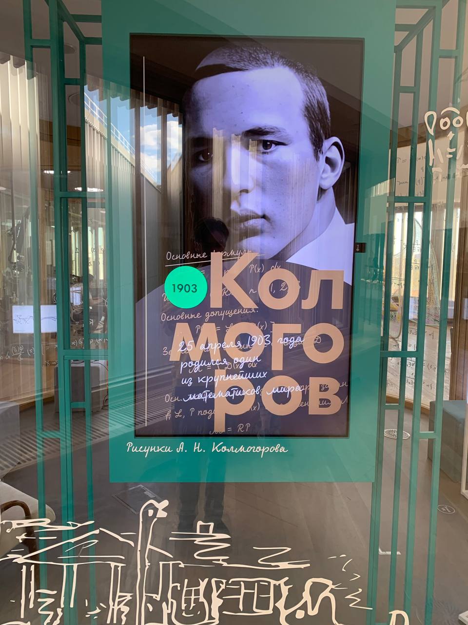
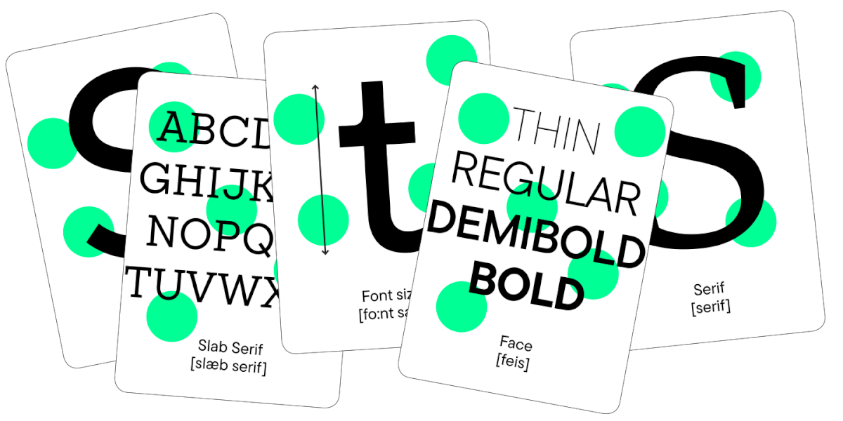
The typeface recreated from Kolmogorov’s handwriting is a TypeType studio and Skolkvo Innovation Center’s joined project brought to life to celebrate the Russian mathematician’s 120th birthday.
Andrey Kolmogorov is a renowned mathematician of the 20th century, recognized worldwide. He made an essential contribution to the creation of the modern probability theory and authored numerous scientific publications on the set theory. Kolmogorov was a member of the French Academy of Sciences, the National Academy of Sciences, the Royal Society of London, and many other scientific organizations.
The Skolkovo team addressed our studio in December, 2022 with an offer to design a typeface based on Andrey Kolmogorov’s handwriting.
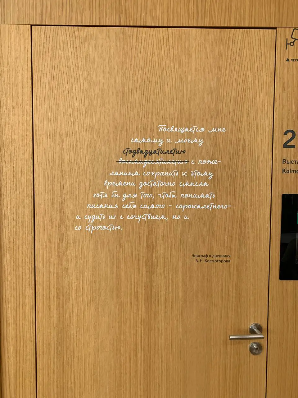
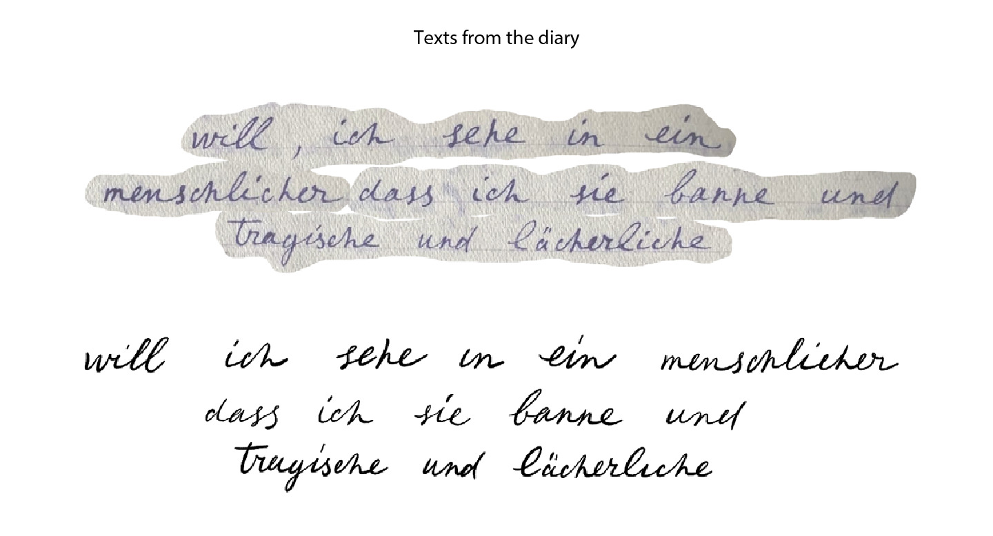
The scientist’s diaries served as a reference for the font family design.
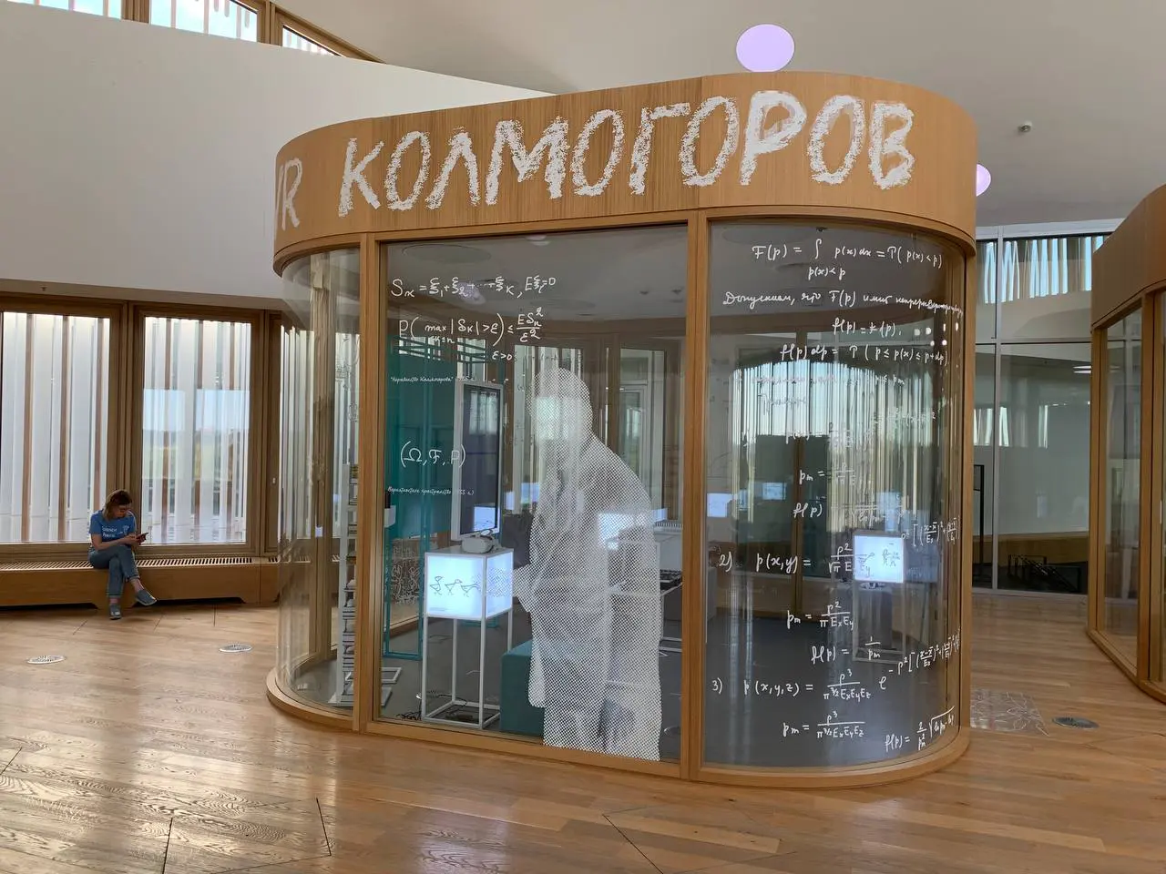
The typeface was created for large-scale use, including wall decoration, various inscriptions, and poster design.

Handwriting analysis and first sketches
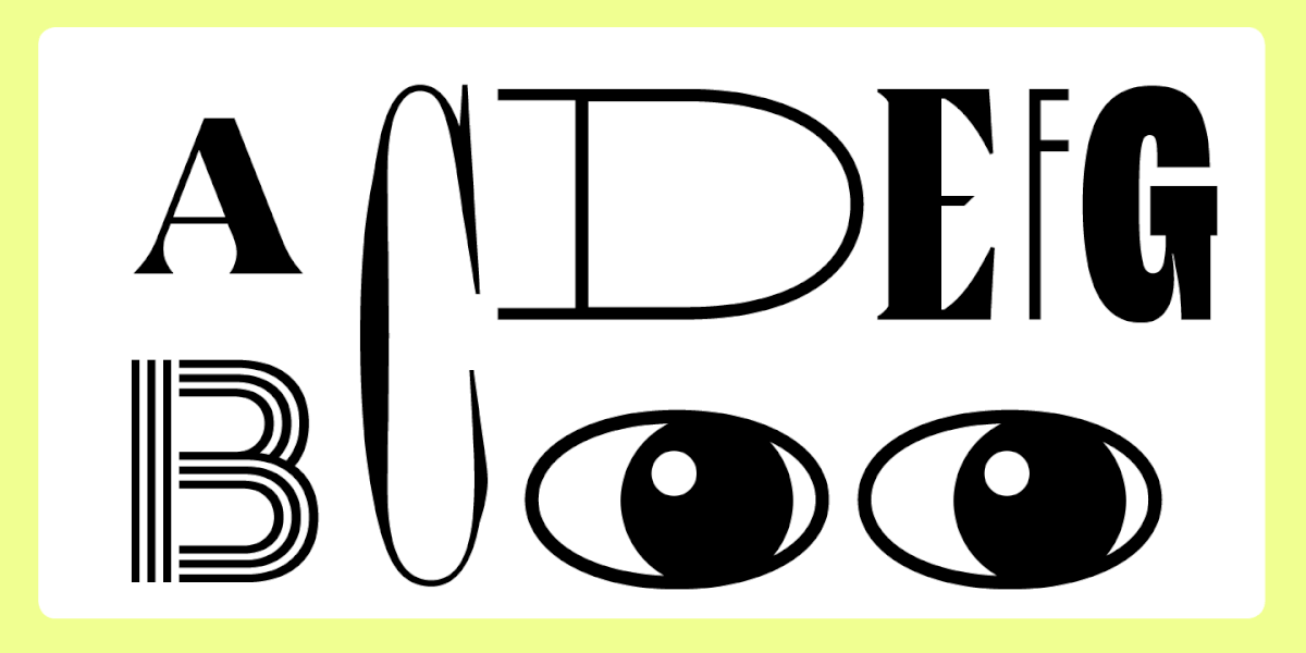
Creating a handwritten typeface requires a delicate balance between the imaginative flair and technical skill of the typeface designer. On the one hand, it is essential to convey all the distinctive forms of the reference handwriting. On the other hand, the typeface needs to serve as a tool that designers can effortlessly utilize for their tasks.
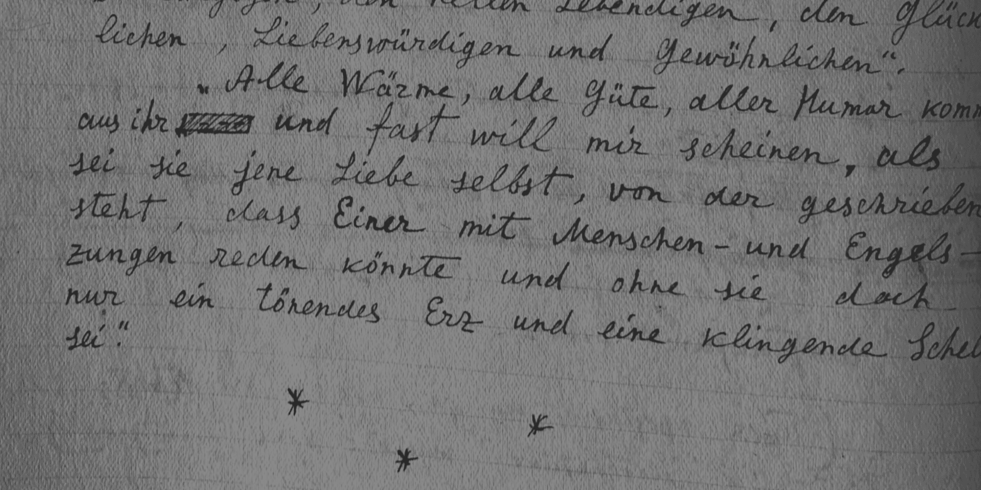
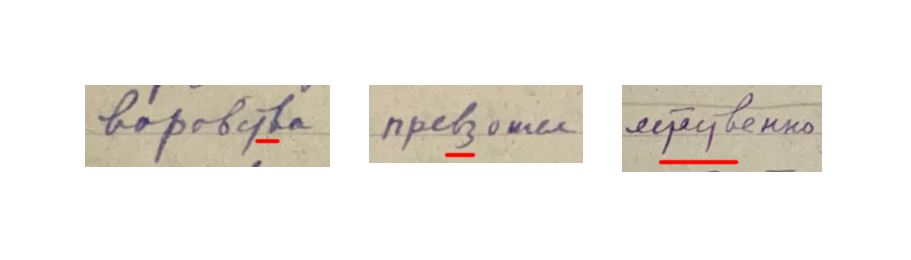
Our work on the typeface began with a thorough examination of Andrey Kolmogorov’s diaries. We used several pages of the scientist’s notes to identify the main graphic features of the future typeface.
Various factors influence a person’s handwriting, such as their emotional state, the tool used for taking notes, and writing speed.
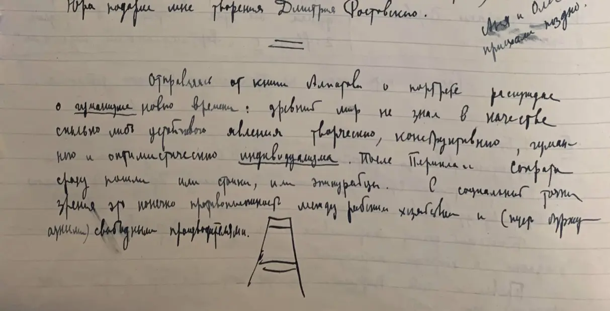
The images above show that Kolmogorov’s handwriting had changed from neat to scribbled. The letters fluctuate between demonstrating a clear rhythm or becoming barely distinguishable. The tool was also being switched. In the early period, letters were written with a ballpoint pen, while in the later period, the scientist adopted a fountain pen for writing. This fact complicated the search for the forms suitable for the typeface.
We based the typeface on the most legible handwriting. Graphics for the missing characters were borrowed from other notes and recreated in a similar but more readable style.
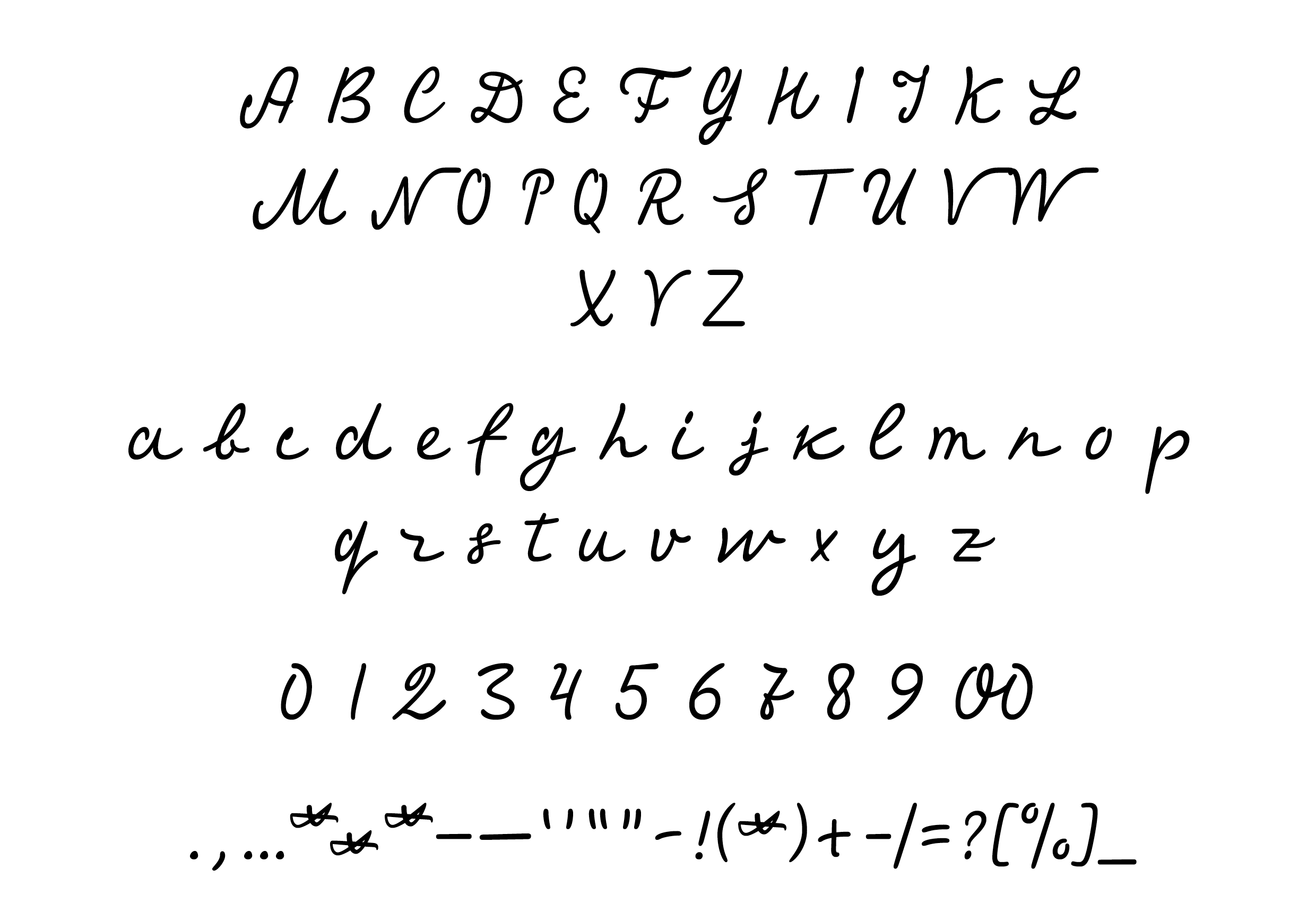
Designing Cyrillic and Latin alphabets
Most often, the typeface development starts with the Latin alphabet, although it is not a strict rule in typography. For this project, we had to start with the Cyrillic alphabet and work our way into the Latin alphabet and mathematical symbols.
There were two possible options when working with the source:
- take the characters, trace them, and refine the contour using a typeface editor;
- trace the letters on a tablet, then polish and finalize them using a typeface editor.
The quality of the source files of the diaries was not good enough, so we decided not to use the first option and start with the second one. To check how well this option would work, we chose a test phrase, “mathematical discoveries,” written by hand in a typeface design software.
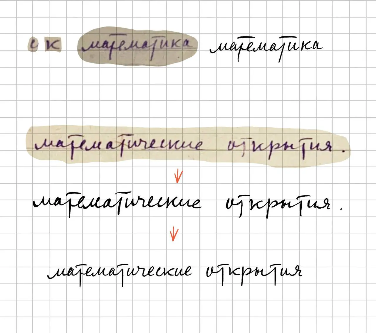
After approving the test phrase with the Skolkovo team, we began the vectorization of “mathematical discoveries”.
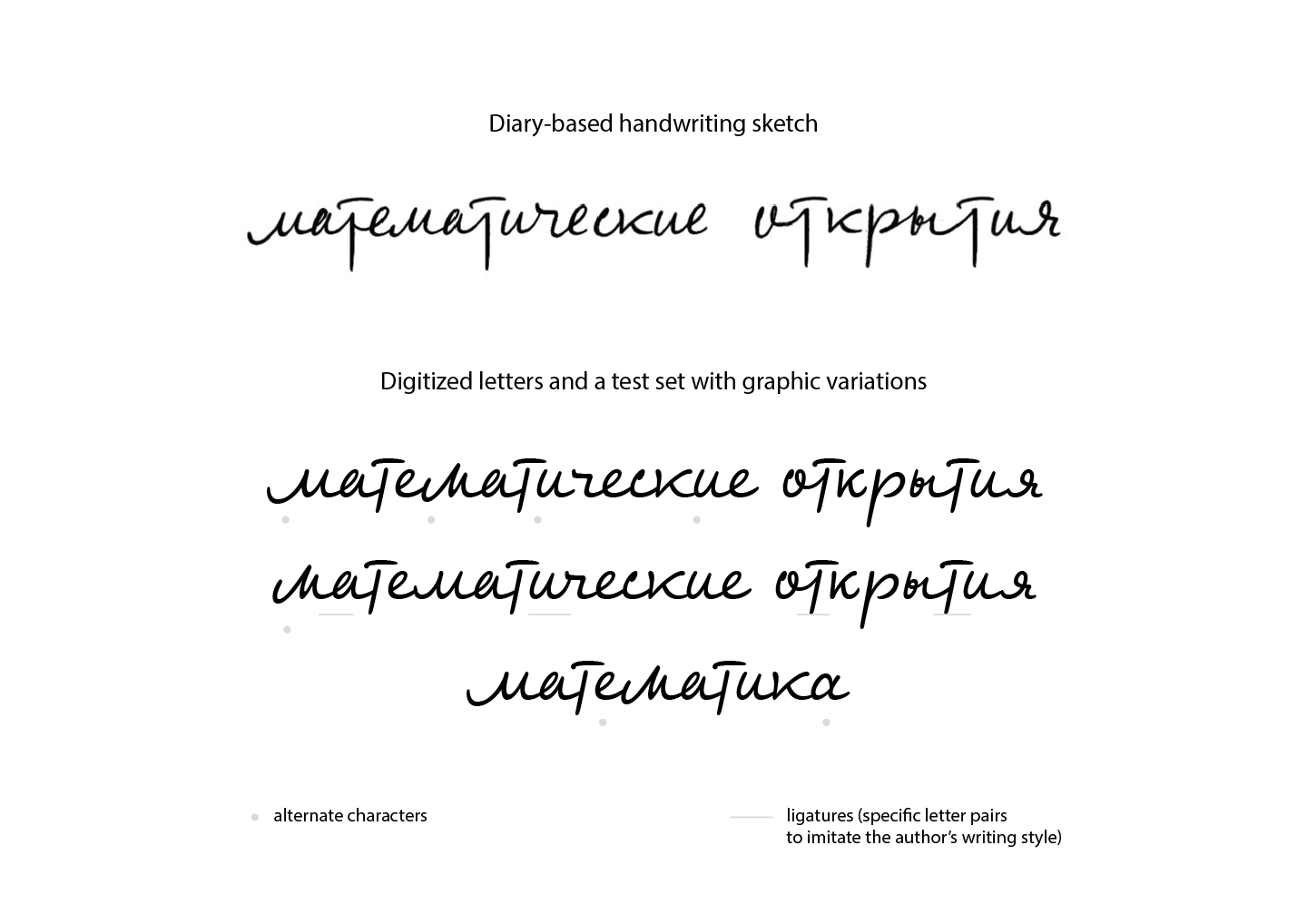
The images above show the difference between the “о” and “м” letters’ graphics in the handwritten and vector variants. All characters in a typeface are a system of interconnected glyphs, not a separate phrase, so we had to achieve better letterform recognition. To do that, we gave some of the glyphs more traditional forms. For example, in Andrey Kolmogorov’s handwriting, the letter “о” might be recognized as a cursive Latin “v”.
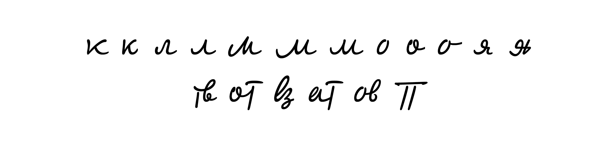
We designed several alternate characters for certain letters to increase the typeface’s diversity and better show the vibrancy of handwriting.
Once the test phrase and stylistic alternates were approved, we proceeded to design the lowercase and uppercase Cyrillic alphabet characters.
There were no uppercase “Ц, Щ, Ш, Ъ, Ы, Ь, Э, Я” in the diaries, so we designed them taking the graphics of the rest of the characters as an example.
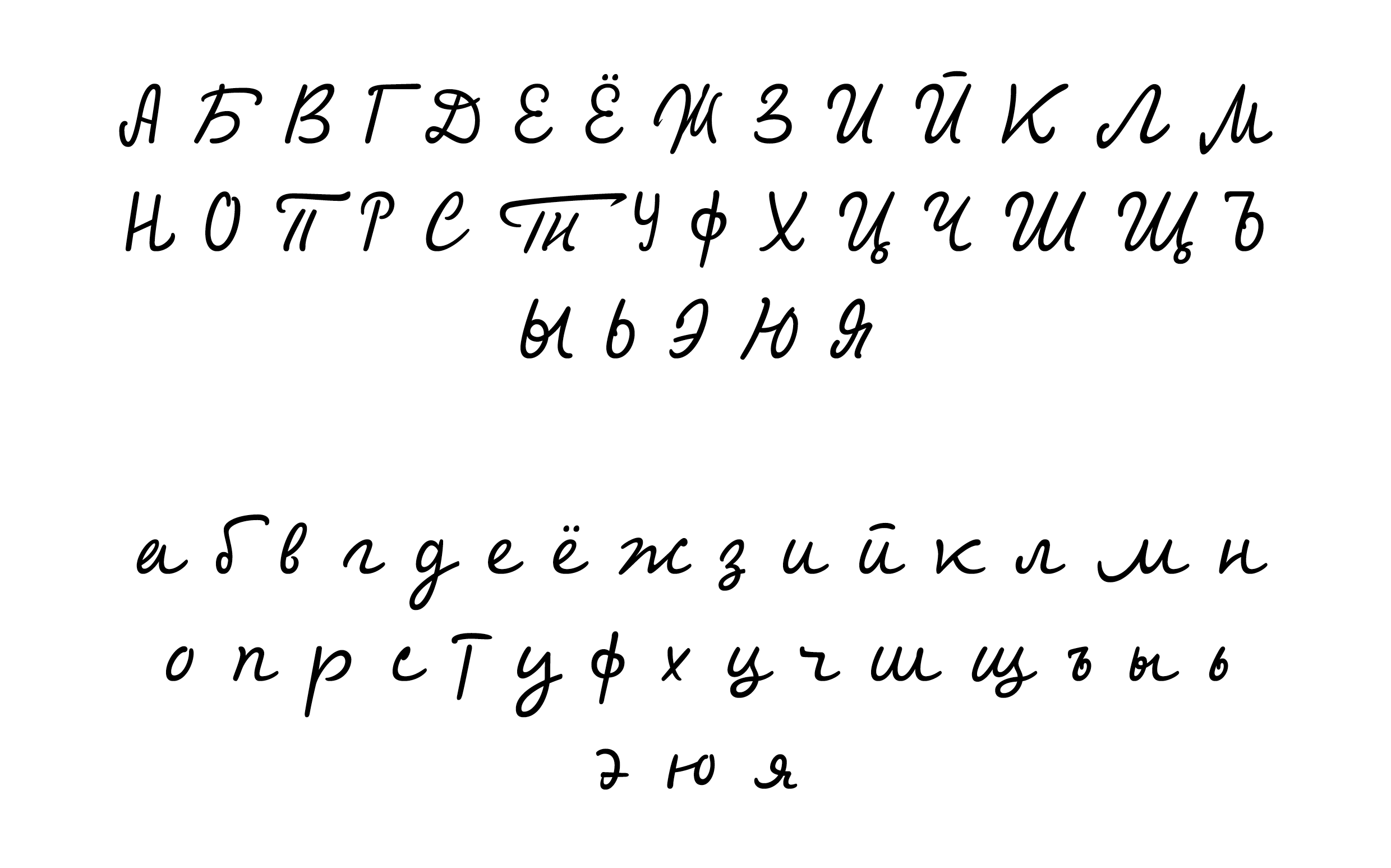
The same logic was applied to the designing of the Latin alphabet characters. First, we approved the test phrase and then designed the character set.
Kolmogorov’s Latin handwriting was more rhythmical and neat in those notes we analyzed. The progress with the Latin characters was quicker and resulted in a final set that was smooth and had consistent posture.
Kolmogorov’s diaries include many notes written in German, which is why we added German diacritical marks to the typeface.
At the end of the graphic work, we also added figures, mathematical symbols, and punctuation to the typeface.
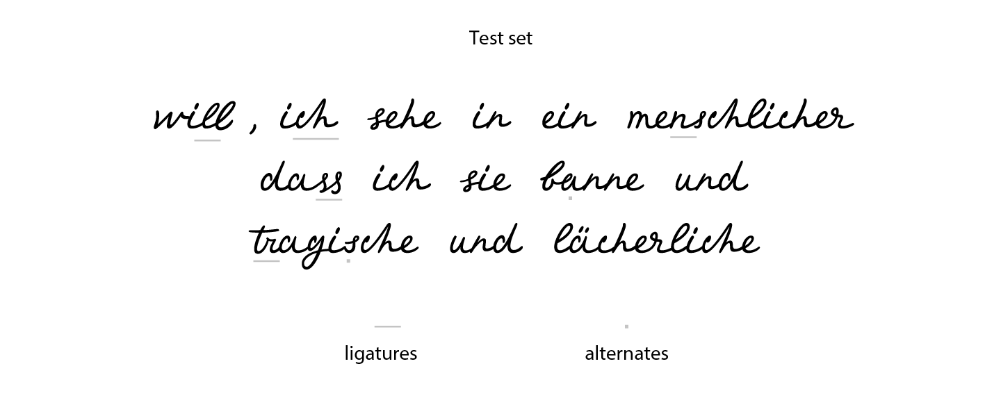
Ligatures
Ligature is a design element of a typeface that combines two glyphs into a single form. In a typeface, ligatures are created for aesthetic purposes and to improve readability. In handwriting, ligatures naturally appear because of the high writing speed, and every person develops a unique manner of connecting letters.
Andrey Kolmogorov’s handwriting was rich in distinctive ligatures, so we wanted to capture and incorporate them into the typeface design. We created them as context alternates.
The image above shows a peculiar form of the letter “т”. It is rare in modern handwriting, but this manner of writing the character is often found in handwritten inscriptions of many Soviet book artists.
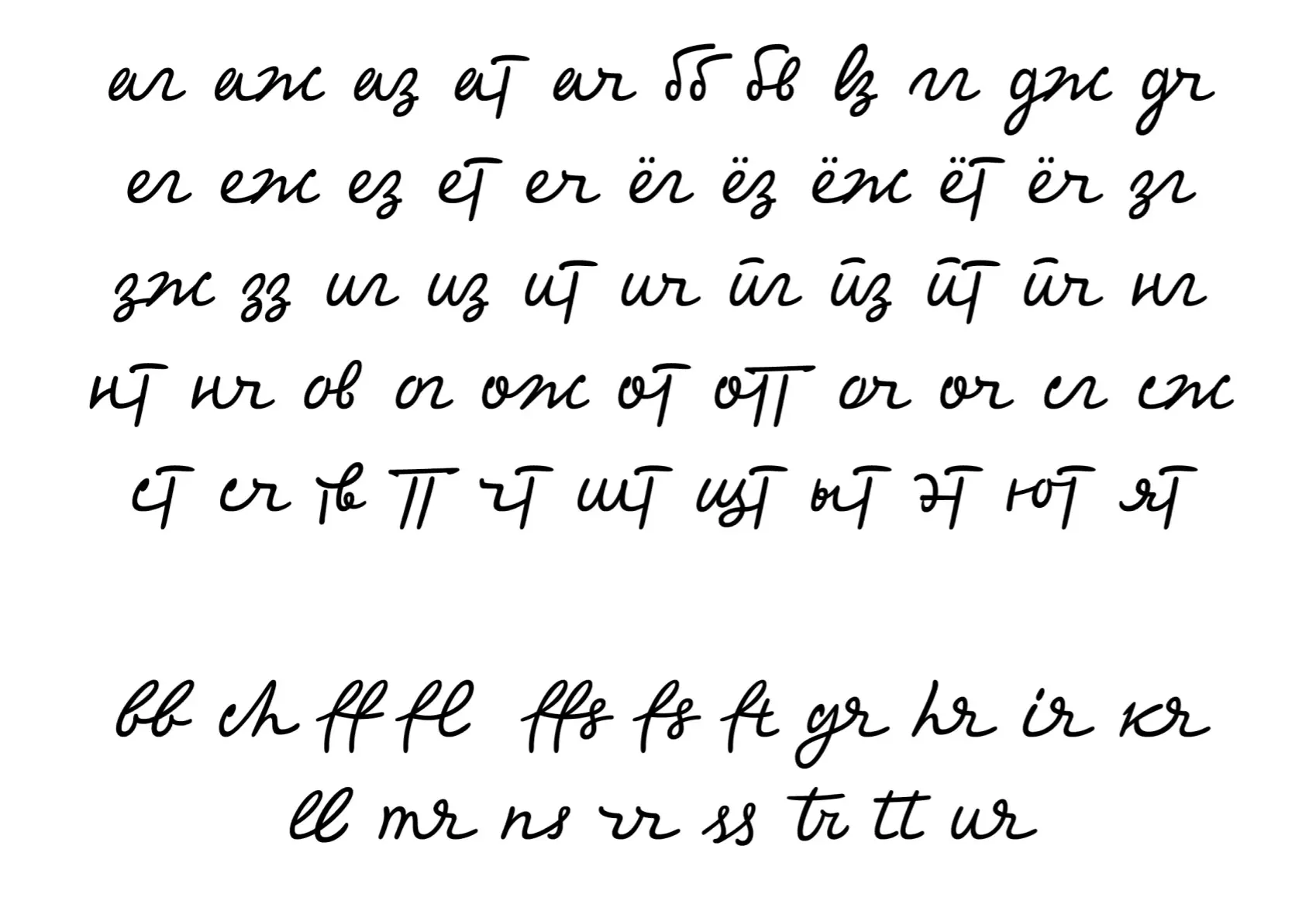
The collection ended up being extensive and diverse, with a significant part of it consisting of ligatures designed for Cyrillic characters.
Mastering
Once the character set was completed, we began the technical phase of the typeface development.
Kerning is one of the main stages of the typeface’s technical development because, after it, the typeface acquires its finished and aesthetic look.
While working on the typeface based on Kolmogorov’s handwriting, we created kerning pairs for a limited number of characters: lowercase + uppercase, lowercase + lowercase, and uppercase + uppercase. We also included alternates and ligatures in each pair. After that, the rest of the glyphs with the same forms and letterspaces were added to classes, so kerning pairs for such characters were created automatically.
However, a handwritten typeface comprises numerous letters with different letterforms. Even insignificant differences play an important role, so after working on the kerning classes, we manually checked each pair.
When kerning was finalized, we wrote the code for context alternates. It included all possible alternates and ligatures in one OpenType Calt feature. We needed to put all the alternates in the correct order, so they worked correctly and did not interfere with one another.
While writing the code, we tested the typeface in the big blocks of text to identify its weak points and implement improvements. During testing, certain glyphs were partially redesigned. All the alternate glyphs of this OpenType feature are activated via Calt for both Cyrillic and Latin writing systems. This functionality is automatically enabled in numerous graphic editors, which is convenient for designers as it allows them to use the complete typeface functionality without requiring any additional steps.
The finalized typeface was approved by the Skolkovo team and now serves to beautify the exhibition stands and walls at the Skoltech exhibition.