This article is not an ordinary one. If you have not heard about it yet, we have launched a new project for everyone who is in love with fonts. As part of this initiative, we will release articles on typography regularly. Each article of the series will explore one useful subject. The main thing is that you will not only immerse yourself in the industry but also meet our wonderful TypeType team of typography experts as they share their knowledge and experience.
Join us, even if you have never studied typography but really want to begin! We promise to portion the information, explain all the difficult terms, and support your first steps with practical guidance.
Typography specialists are also very welcome to join, as it can certainly be helpful to exchange expertise and engage in the workflows of your fellow industry members. It gives you a new way of seeing familiar things, occasionally discovering inspiration for future projects!
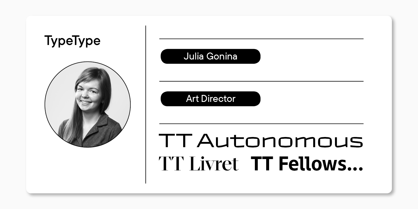
The topic of this article is typeface categories. Here with you is our art director Julia Gonina. The typefaces she oversees consistently make it to the shortlists and win prizes in competitions (Granshan, European Design Awards, Modern Cyrillic, Sreda New Design Festival, and more).
Julia is also the author of the studio’s typefaces, such as TT Livret, TT Fellows, TT Autonomous, and more. You may have heard or seen her as a guest speaker on TDS, Mail Design Conf, Design Weekend, and among the jury members at the Bold Italic type school graduation.
P.S. Prepare a pen and a notebook to write down new book titles! We are sure they will become a handy addition to your collection.
Type Classifications
Currently, there is no definitive classification system for typefaces that would enable you to categorize any hand-drawn typeface. Some of them are always in between groups.
Nonetheless, it is possible to find sources that give detailed type classifications in books and on the internet. We will focus on some of them.
Typeface Categories
The most widespread classification was created in 1954 by Maximilien Vox, and in 1962, it was adopted by the International Typography Association (ATypl). Over time, different organizations and scholars have added new elements to it, resulting in multiple interpretations of this classification being available today. It is worth noting that more than fifty years have passed since the said classification was introduced. So the tendencies have changed, new styles and trends have emerged.

I want to share some useful resources that will help you research the issue of classifications and form your own view of the typeface world.
- In Robert Bringhurst’s book The Elements of Typographic Style, you will find a detailed chronological account of typeface evolution.
- The book Letter Fountain published by Taschen presents a modern and compact type classification with references to Maximilien Vox.
- On designhistory.org, you can explore a brief review of various classifications sorted by their authors.
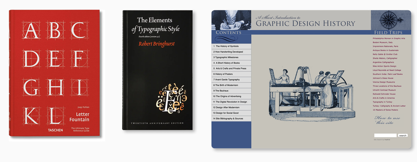
In this article, I will not prioritize the diversity of classifications. Instead, I will try to describe the fundamental categories of typefaces in a simple and accessible manner. This information will be enough to get an initial understanding of what kinds of typefaces generally exist; on top of that, you can layer on more complex classifications in the future.
Let us start with the question that beginners often ask: “Why do we need classifications? Isn’t it possible to work without this knowledge?” Of course, it is. Modern typefaces do not often belong to a particular historical category, and this is not necessarily a negative aspect. Typeface designers rely more on their own watchfulness, sense of aesthetics, and relevant preferences. However, the above-said applies to experienced professionals, so beginners will find it helpful to learn about the base typeface structure to avoid getting lost in the variety.
We will cover the simplest things first: what categories of typefaces exist and what is the difference between them. Imagine a letter’s skeleton that only shows its construction. To get a character with weight and special features, the skeleton must gain this weight. There are various ways to do it.
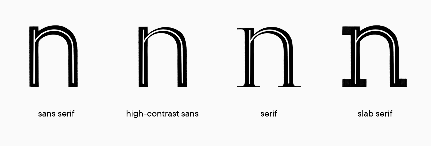
You can evenly build up weight throughout the skeleton and get a sans serif. If you add contrast to weights so that letterforms have both heavy and light strokes, as if the letter is written with a nib pen, you will get a high-contrast sans. Add serifs at the ends of strokes to the high-contrast sans, and you will get a serif typeface (also called Antiqua). Or you can go back to sans serif (also called Grotesk) and add serifs that would fit the width of the strokes and design a slab.
These were the four most popular typeface categories. In their turn, sans serif, high-contrast sans, serif, and slab typefaces can be further categorized based on variations in glyph structures and the weight distribution within these structures.
Gerrit Noordzij, in his book The Stroke: Theory of Writing, distinguishes two approaches to weight and contrast distribution within a letter’s skeleton: translation and expansion. I recommend you take a look at this book or at least add it to your list for future reading.
To summarize these approaches briefly and plainly, in the first case, we imagine that we outline the letter’s skeleton with a wide-nib pen or flat brush positioned at an angle. Even if you are not familiar with calligraphy, imagining a flat nib pen is easy: simply take two pencils, tie them together, and draw a line. The thickness of the line will vary depending on the angle of holding the writing tool.
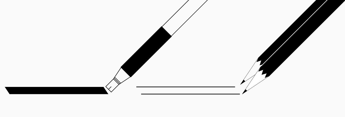
In the calligraphic tradition of the foundational hand, it is common to hold the writing tool at a 30-degree angle. So, the lines ascending diagonally to the right will be thin, and the lines descending diagonally to the left will be thick. The bowls become inclined to the left in this case.
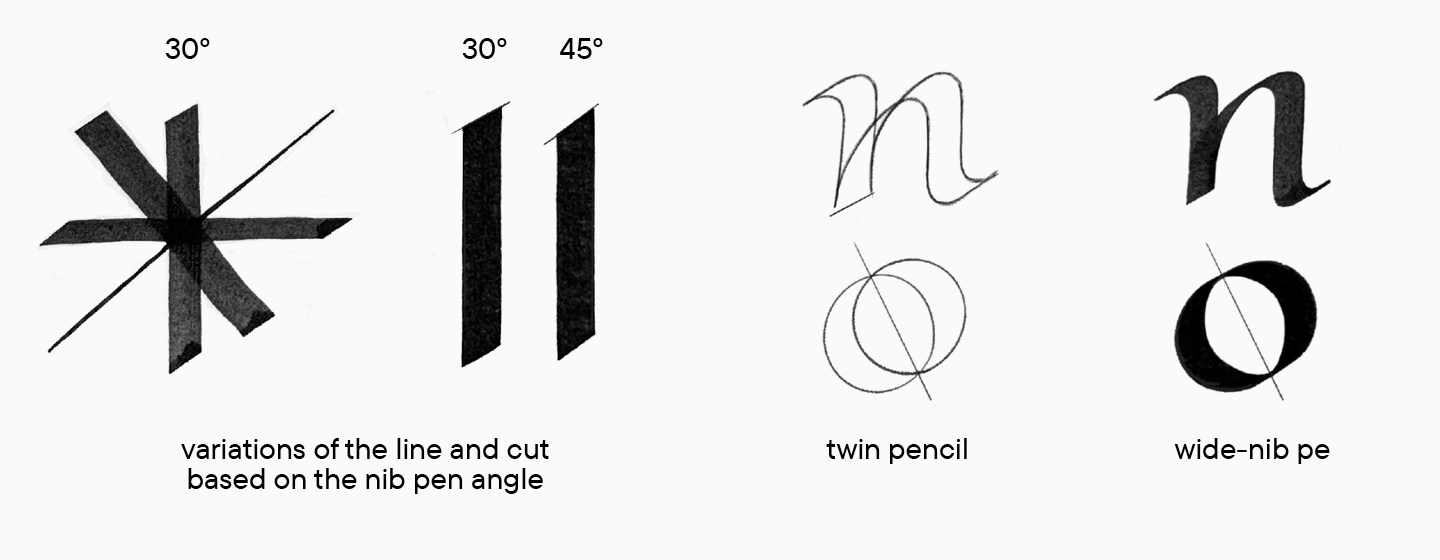
In the other case, we outline the letter’s skeleton with a writing tool that thickens a line when pressured, such as a brush or a pointed pen. Let us return to calligraphy again. We will put pressure on the lines going downwards and release it for the lines going upwards. This is a technical point because if you take a pen and try to draw a line upward with pressure, you will fail. So, the lines going upwards will be thin, and the lines going downwards will be thick.
The second approach is different from the first one because the diagonal axis of bowls is vertical, and the contrast distribution will be more constant and symmetrical.
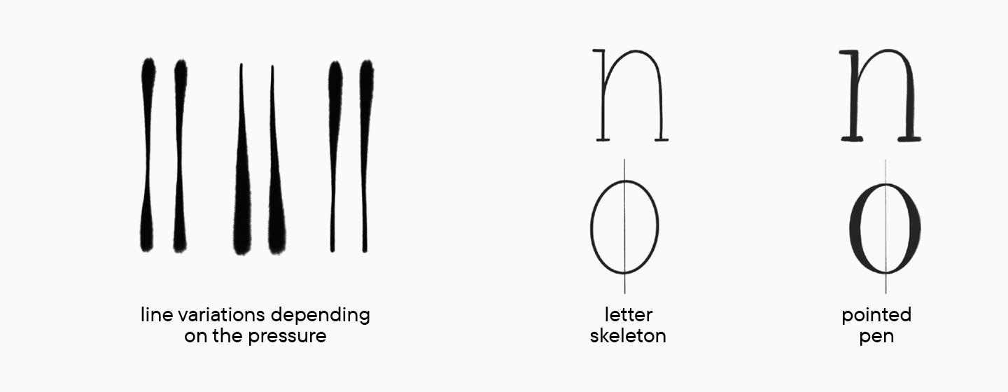
Calligraphy was mentioned here for a reason. Contrast distribution and diagonal axis are two of the fundamental terms in typography. They refer to the essence of a character. Understanding this will help you figure out the typeface classifications.
Let us return to them. As I stated before, my classification is basic and far from being full, but it will help you set reference points in understanding the whole variety of typefaces. I will focus on the types of serifs (Antiqua) and sans serifs (Grotesque) because these are the two most common types of typefaces. In addition, if you can grasp the logic of this classification and transfer it yourself to other groups, such as slabs or high-contrast sans, you will better understand type principles.
Antiqua
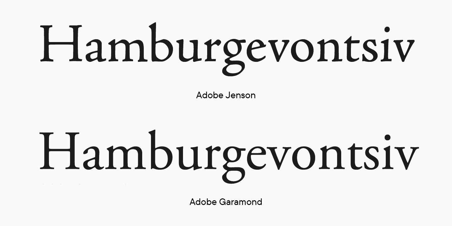
Old Style (or Humanist) serif is based on the first post-Gothic fonts of the printing era, which appeared in the second half of the 15th century.
Special features:
- slanted axes;
- small ear of the letter e, which also has an angled cross bar in the oldest versions;
- upper serifs are large and triangular-shaped;
- lower serifs are mostly rounded;
- stroke contrast is not too distinct.
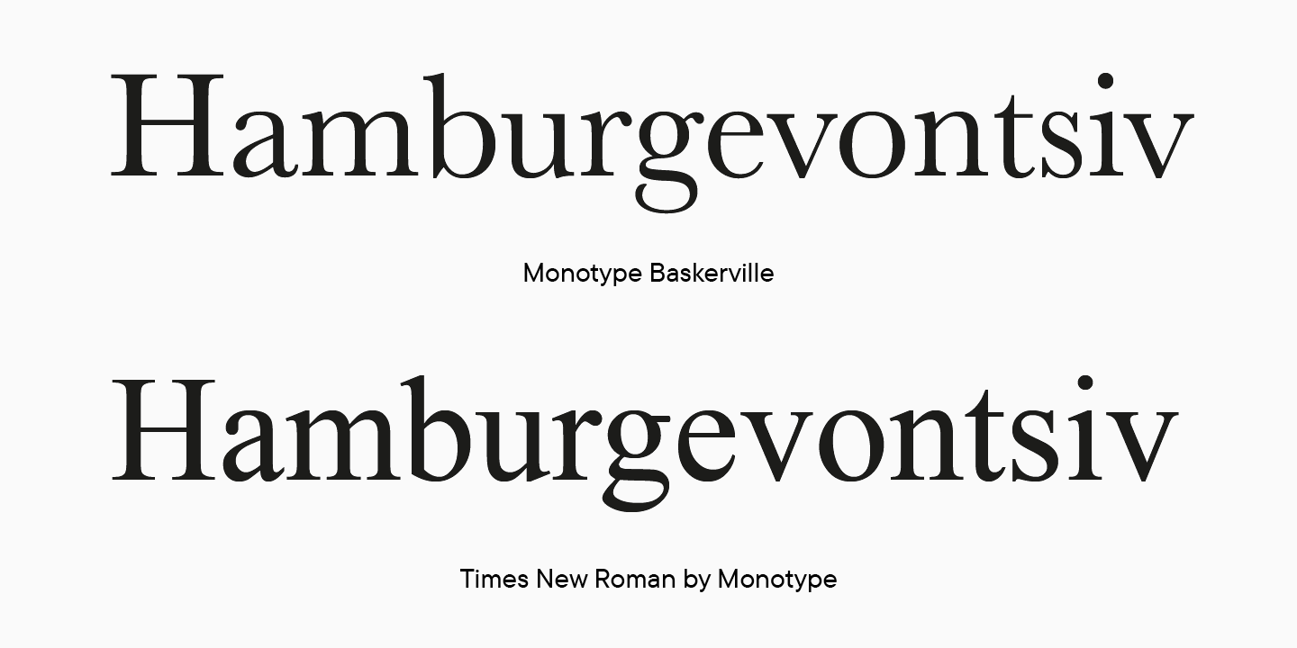
Transitional serif is named so because, historically and graphically, it transitions from Old Style to Modern letterforms. It is generally accepted that Transitional serifs appeared in the middle of the 18th century. Visually, the Transitional serifs have a more refined, contrasting, and hand-drawn style compared to the Old Style serifs.
Special features:
- axes are not as slanted as in Old Style serifs;
- in different letters (o, e, b), the angle of the diagonal axis can significantly vary;
- lower serifs are more elegant, mostly with a curving joint;
- upper serifs are triangular and smaller than in Old Style letterforms;
- some typefaces have distinctive contrast.
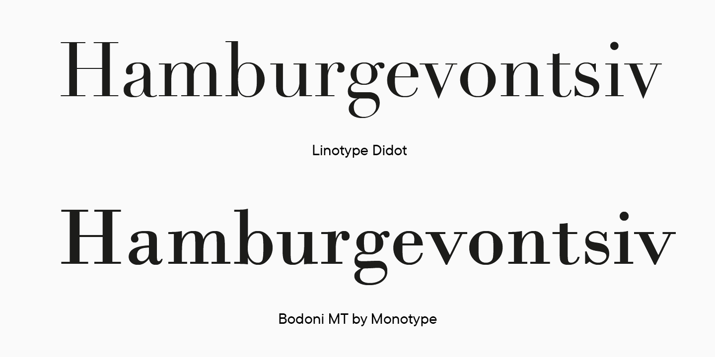
Modern (or Neoclassical) serif appeared at the end of the 18th century. These typefaces are visually more rational and well-defined.
Special features:
- distinctive contrast in typefaces;
- vertical axis of bowls;
- completely symmetrical graphics;
- upright serifs, not rounded or wedge-shaped.
Grotesque
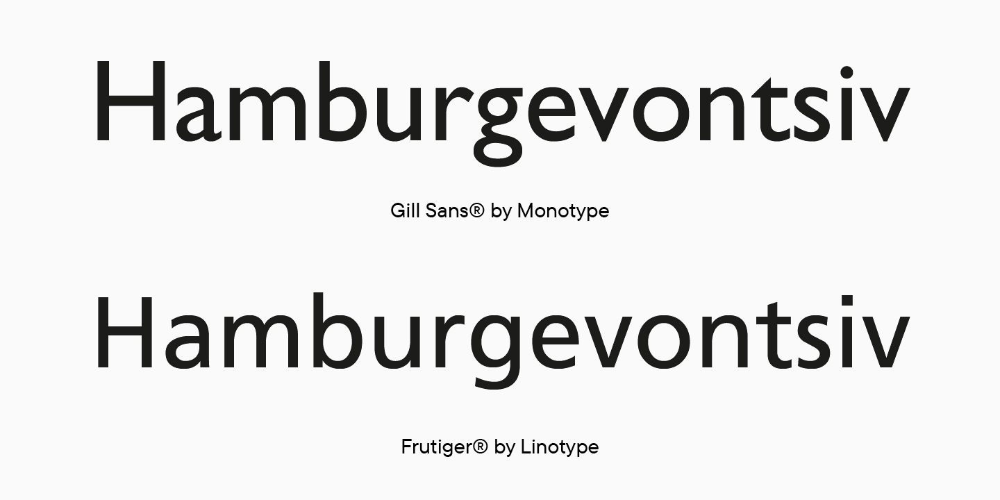
Humanist sans serif is different from others because of its distinctive contrast of thin and thick strokes.
Special features:
- open apertures;
- glyphs a and g most often gave double-story shapes.
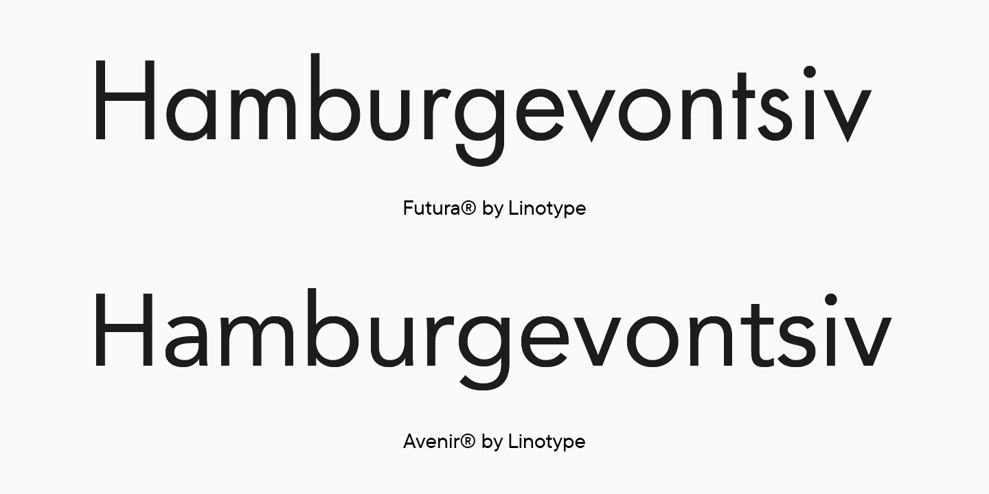
Geometric sans serif has geometrically arranged shapes.
Special features:
- ovals tend to be more rounded;
- symmetrical arcs;
- contrast is not visually noticeable and only serves as optical compensation.
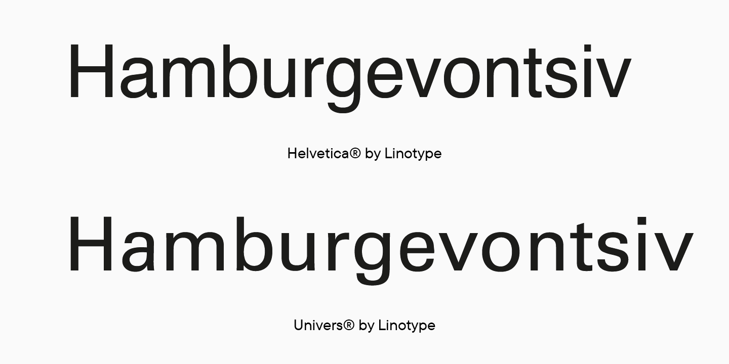
Neo-Grotesque is a heritage of Swiss design.
Special features:
- static glyph proportions;
- little or no contrast;
- squared bowls;
- closed apertures.
Now you have a basic understanding of serifs and sans serifs. It is worth highlighting that they are currently the most widespread typefaces in the industry. At the beginning of this article, I also mentioned slabs and high-contrast sans. However, there exist many other categories of typefaces besides these ones, such as Script, Gothic and other historical styles, Decorative, Ornamental, or Symbol. The list can go on.
In addition to the brief theory overview, I aimed to provide practical advice that will help you grasp the underlying logic for designing letters.
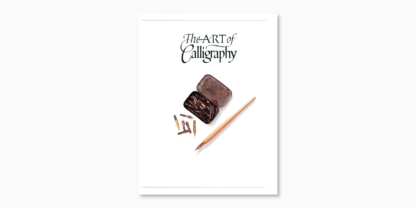
Moreover, calligraphy skills, even the most basic ones, will really help you understand the logic of letterform construction. If you are new to calligraphy, note down the source that will help you learn.
I am referring to the book The Art of Calligraphy. I have chosen several chapters that are very useful to consider.
- Foundational Hand by Edward Johnston, which both calligraphers and type designers use to begin their training.
- Humanist Minuscule is the historical context of the Foundational Script.
- Imperial Capitals is about uppercase letters that are more than 2000 years old.
- Italic and Copperplate will help understand the topic of italics.
Historical classification
The basic type classification you have just learned about is based on type anatomy.
However, typefaces are closely interconnected with society and the world and are an integral part of the artistic environment where they exist. That is why it is more accurate to link type classification to ever-changing artistic styles following one another.
The historical context of this topic is well described in Robert Bringhurst’s book The Elements of Typographic Style. Everyone familiar with the evolution of artistic styles in Europe from the first centuries BC to the 20th century will particularly fancy this book. The others have an opportunity to study this ample and fascinating topic and broaden their horizons.
Add this book to the list of useful resources, and I will give its brief overview.
Handwriting development
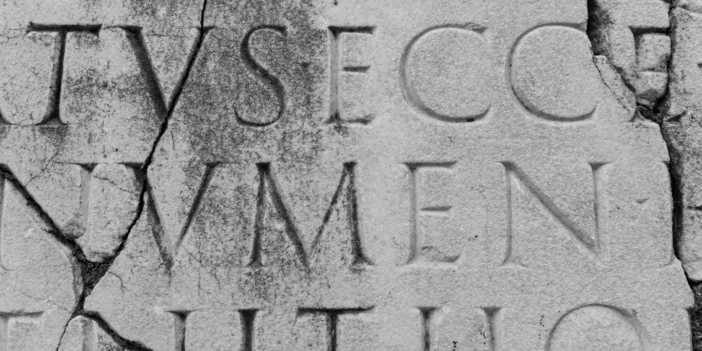
The longest period of time that began with monumental letters carved in stone, first by the Greeks and then perfected by the Romans. As we know now, the Roman monumental typeface is the prototype of modern uppercase letters. The letters were written naturally using a flat brush, giving them their special features: open apertures, low contrast, dynamic bowls, lively and elegant serifs.

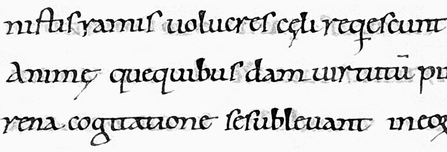
Handwriting evolved, giving rise to different variations based on their purpose or regional influences. What interests us the most is the Carolingian minuscule developed approximately in the 8th century under Charlemagne. This minuscule was written with a flat writing tool and has later become the prototype for lowercase letters.
First printer fonts
After the printing press was invented in Germany in the 15th century, the handwriting relevant for that time and area was set in metal. It was Gothic then.
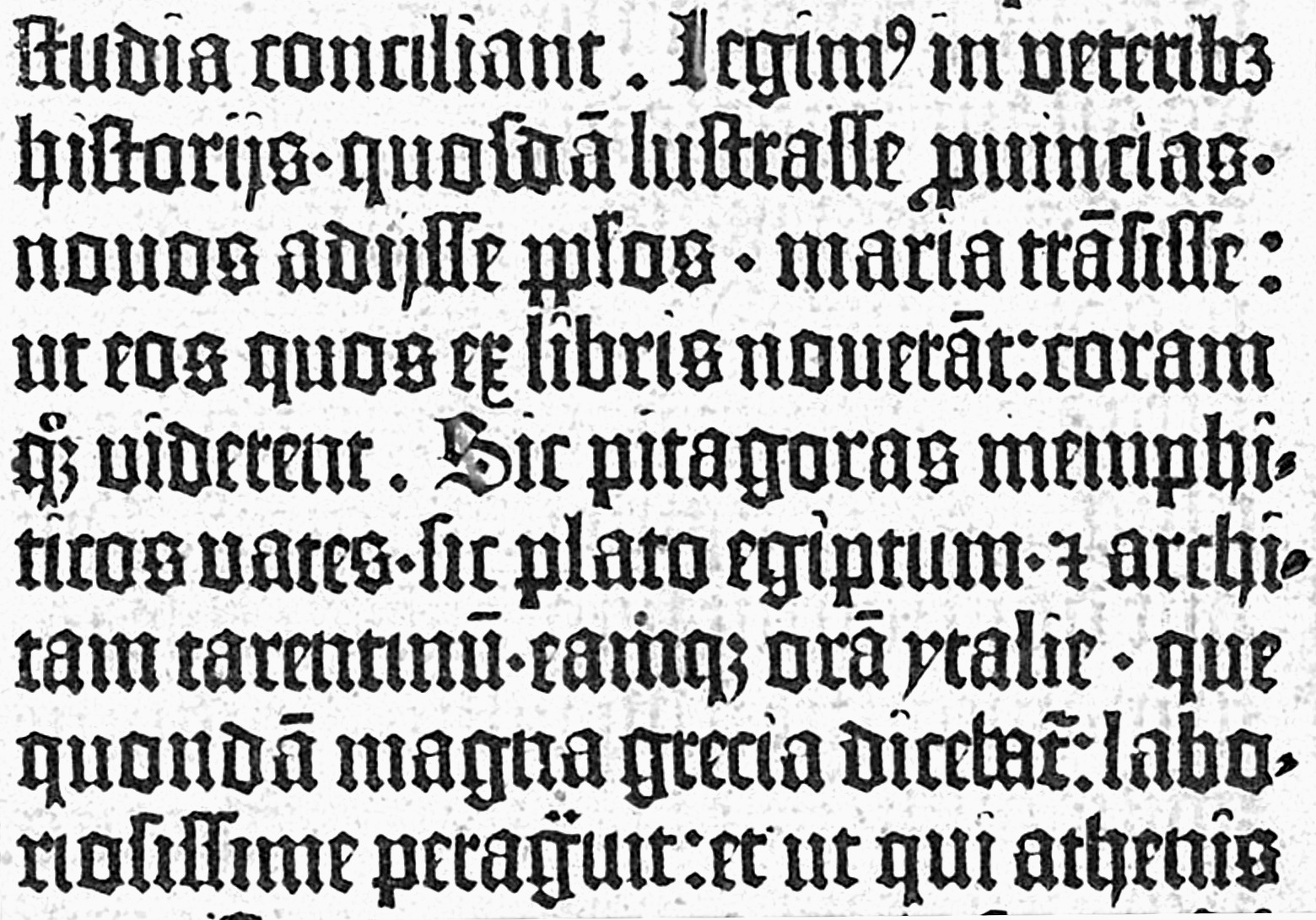
However, soon the invention came to Italy, where it gradually acquired a more familiar form.

Renaissance
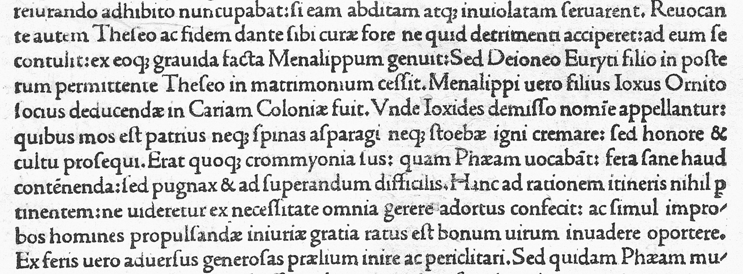
Fast enough, in the 15th century, printing type turned from German Gothic to Italian Humanist minuscule, which developed on the Apennine Peninsula. The masters imitated this writing with a wide-nib pen and inherited its characteristics: moderate contrast and dynamic diagonal axis of the ovals, lively serif shapes, an inclined cross bar in e, circular bowls, not rounded end elements. Do you see the similarities with the previously described Roman monumental?
Author examples: Nicolas Jenson, Claude Garamond
At the same time, the first italic fonts appeared and were based on common handwriting. Take Ludovico Vicentino degli Arrighi as an example. He was a papal scribe and author of a textbook on writing in italics. Later he began developing his own italic fonts.
Francesco Griffo’s typeface that he developed for the Aldo Manuzio publisher is considered the first italic.
Author examples: Francesco Griffo, Ludovico Arrighi.
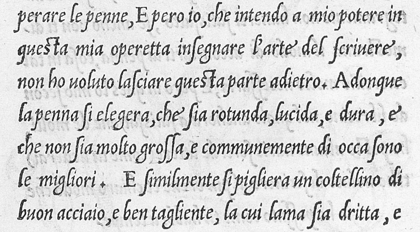
The main features of these italics are the Humanist diagonal of ovals and overall typeface dynamics, as in romans. Narrow forms are noticeably narrower than upright ones, which is especially noticeable in rounded glyphs, which turn from a circle into an oval. There is a 10-degree slope, whereas, in the first italics, the uppercase glyphs were upright.
Interestingly, for quite a long time, italics minded their own business and did not intersect with romans in use.
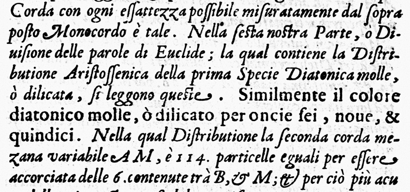
In the Renaissance, mannerisms can be distinguished as a separate subcategory. The inscriptions of this style featured elegant embellishments, such as flourishes or deliberately angular shapes. In the same period, printing houses began to combine roman styles with italics within the same book and to add slanted capital characters to italic fonts.
Baroque
Little by little, typefaces were moving away from looking handwritten in a Humanist manner and taking on a more drawn look. It becomes apparent in the typefaces of the Baroque era.
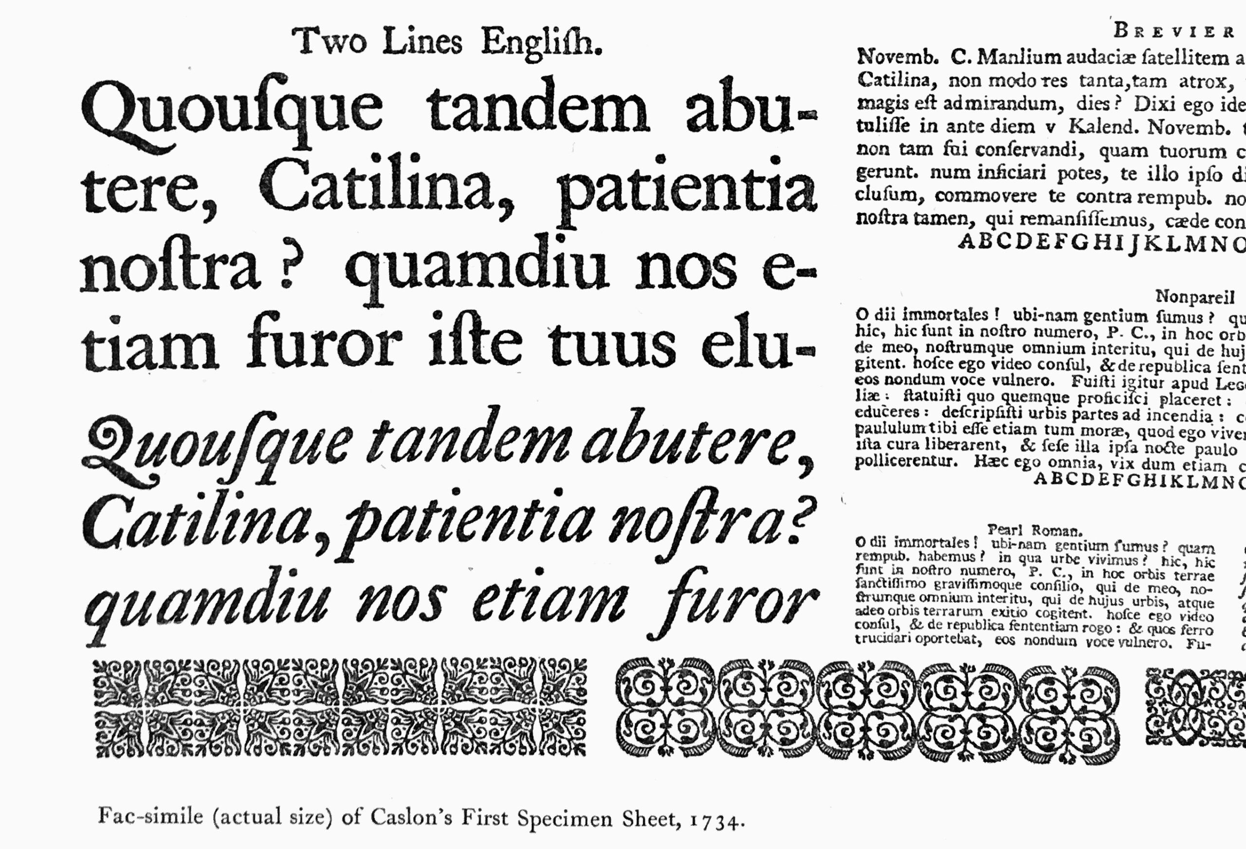
The main features of baroque typefaces are variations in ovals’ diagonal axes and more distinctive contrast compared to Humanist typefaces. Shapes have gained precision, which is especially noticeable in the serifs, which have become sharper. Such typefaces’ aperture is more closed, and terminals look more like drops. The slant angle of italics became more pronounced, reaching 15–20 degrees.
Author examples: William Caslon, Miklós Kis, Jean Jannon, Christoffel van Dijck.
Rococo
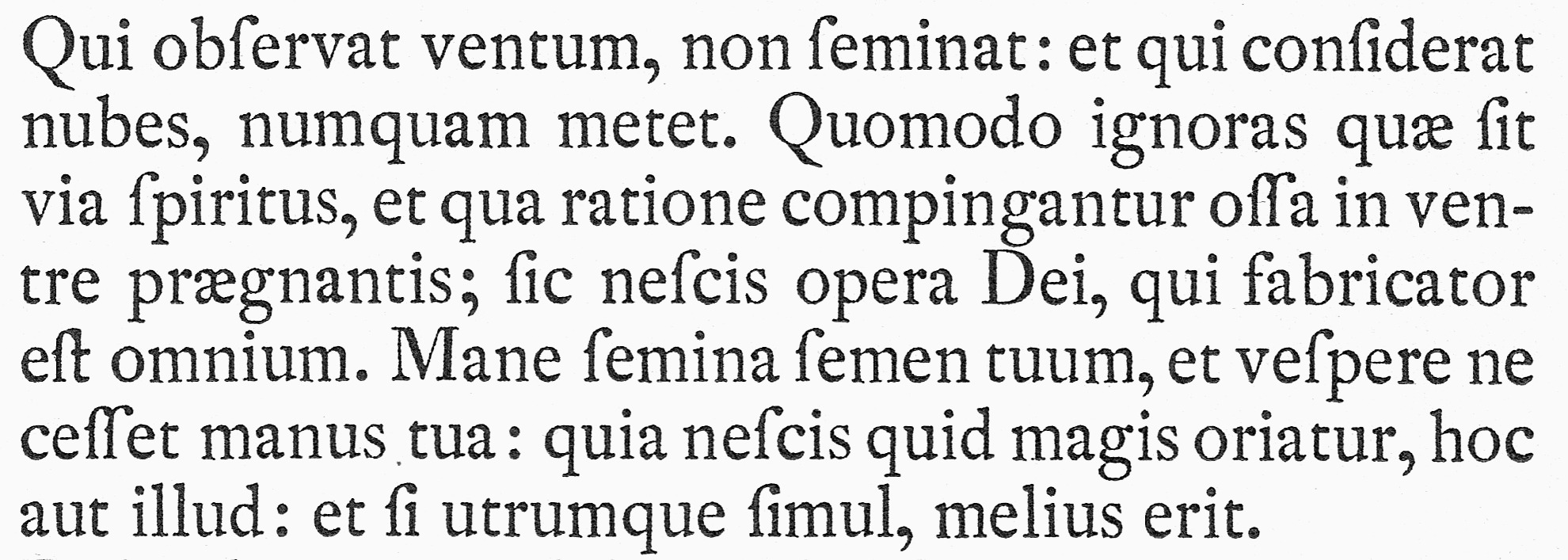
There are very few representatives of typefaces in this style, so they are frequently paired with Baroque-era typefaces. Rococo can be recognized by the addition of subtle decorative elements to the letters, which can be described as graceful embellishments.
As an example, take the typefaces designed by the Dutchman Joan Michaël Fleischman and Jacques-François Rosart.
Neoclassicism
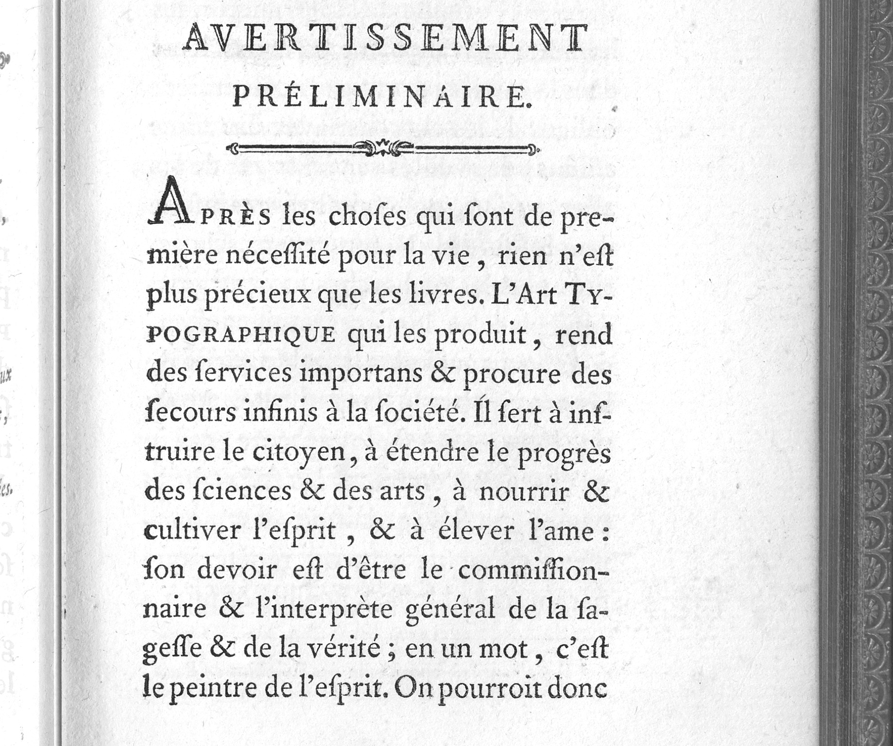
During the neoclassical era, the shapes became more static and rational. The logic of the wide-nib pen remained, but the axes of bowls became mostly vertical. The letters are clearly drawn, not written. Such typefaces have thin, flat serifs with rounding. Italics have the same features as during Baroque, the slant varies at about 15 degrees. The overall mood of the graphics is restrained, calm, and rational.
Author examples: Fournier, Baskerville, Bell.
Romanticism
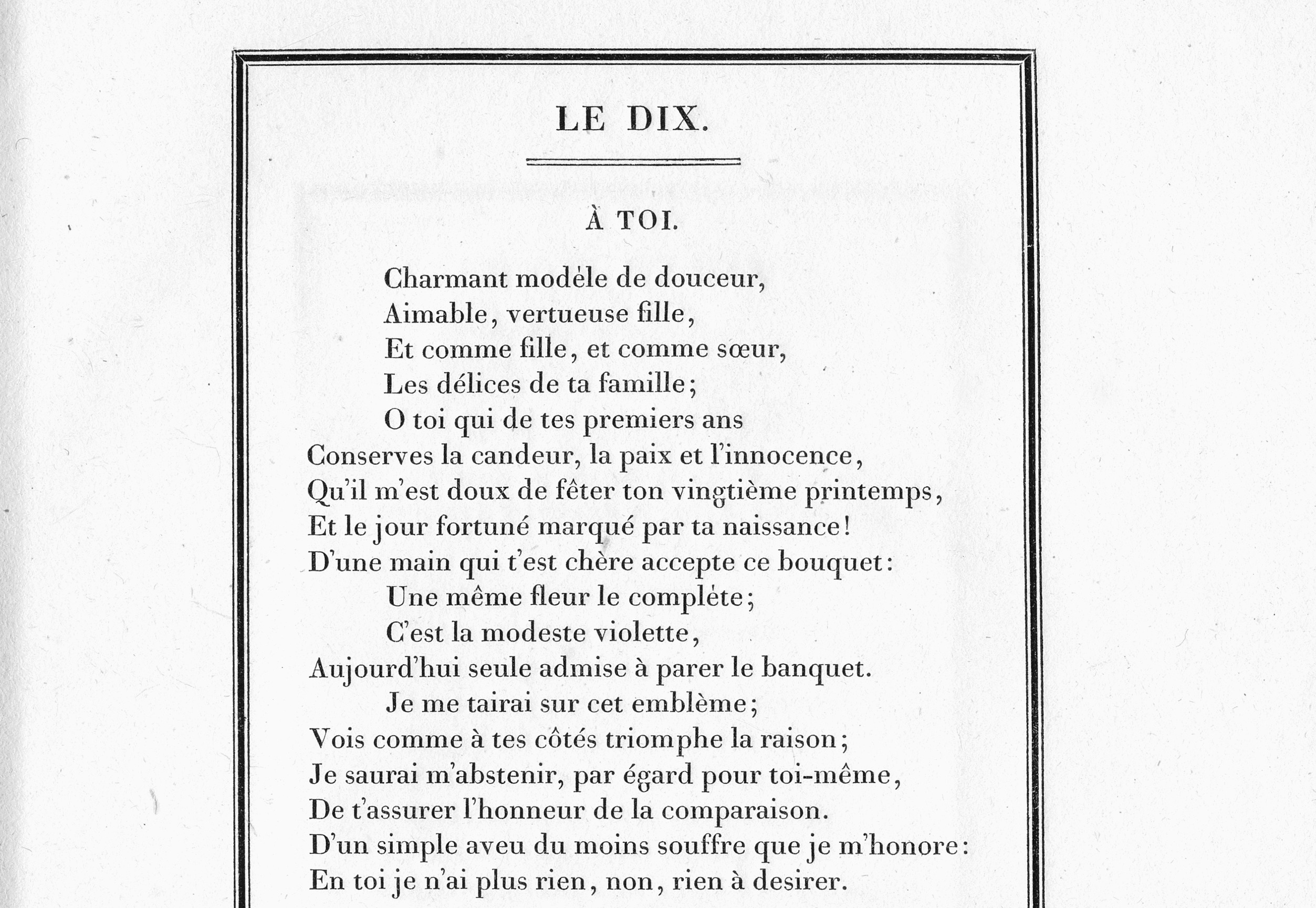
This movement emerged simultaneously with neoclassicism during the 18th and 19th centuries. Here you can observe a fundamental change in typeface graphics. All previous movements were based on writing with a wide-nib pen, which implied a smooth change in the stroke’s weight from thick to thin. Later, a pointed pen became popular, so the typefaces followed the new trends. In Romanticism, you can notice the abrupt change in contrast and strictly vertical slope axis of bowls. Among other features, the drops became well-defined circles, abrupt and thin serifs appeared, and the aperture became closed. Italics followed the new contrast distribution logic as well: they became wider and more similar to roman styles in shape. From being independent, they turned into companions of roman fonts.
Author examples: Didot, Bodoni, Walbaum.
Realism
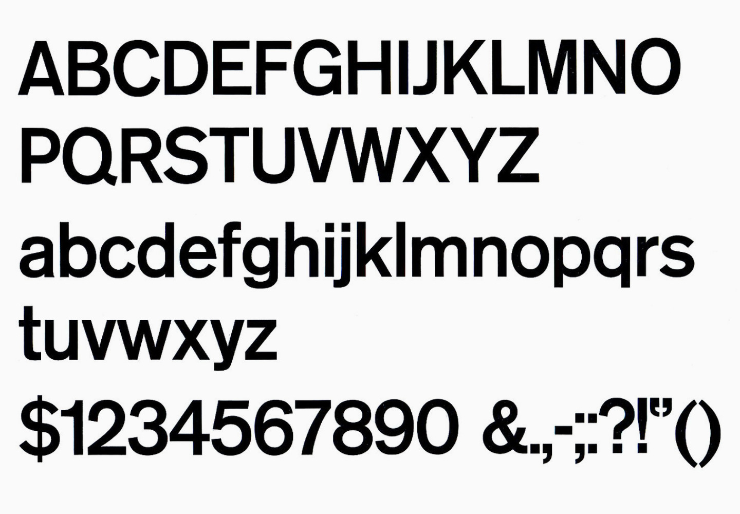
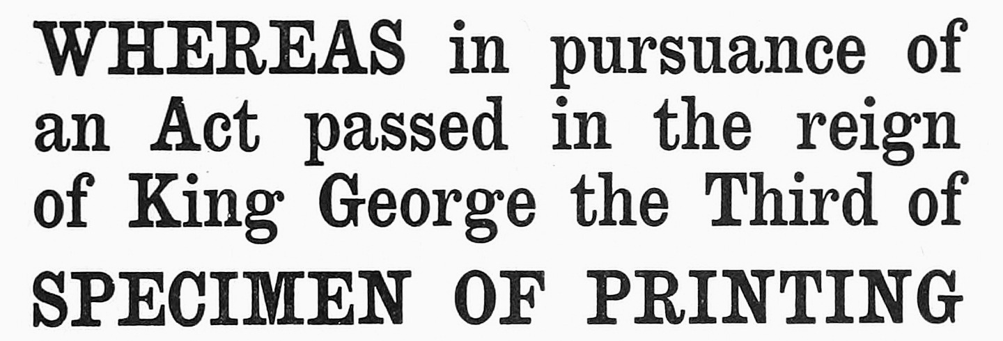
In the late 19th and early 20th centuries, sans serifs and slab serifs entered the scene. Despite having inherited their skeleton from neoclassical typefaces, they were brutal and rough. The main features of the movement are little or no contrast, rough slab serifs of their absence, and closed apertures.
Typeface examples: Akzidenz Grotesk, Clarendon.
Modernism
Modernist typefaces come in a wide range of styles, but they share a common goal of innovation, simplifying patterns, and embracing international influences, thereby breaking away from conventional national associations.
Gill Sans, designed by Eric Gill in 1926, is considered one of the most prominent representatives of modernism. Now this typeface is assigned to Humanist sans serifs. At the core of Gill Sans lie classic roman monumental proportions. It has open apertures and lively plasticity of graphics.

Another well-known modernist typeface is Futura, designed by Paul Renner in 1927. This typeface, like Gill Sans, has proportions similar to classic ones, although its graphics is geometrical, almost constructed with a compass and ruler. When we talk about geometric sans serifs, Futura comes to mind first.
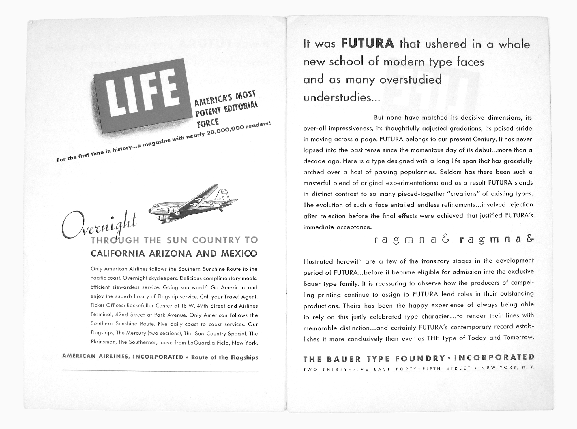
One of the most popular modernist typefaces is Helvetica (Neue Haas Grotesk), designed by Max Miedinger in 1957, based on the Akzidenz Grotesk typeface. Upon its launch, the font quickly gained global recognition and became an iconic representation of Swiss design. Helvetica and other similar typefaces are usually assigned to the Neo-Grotesque group.

Postmodernism
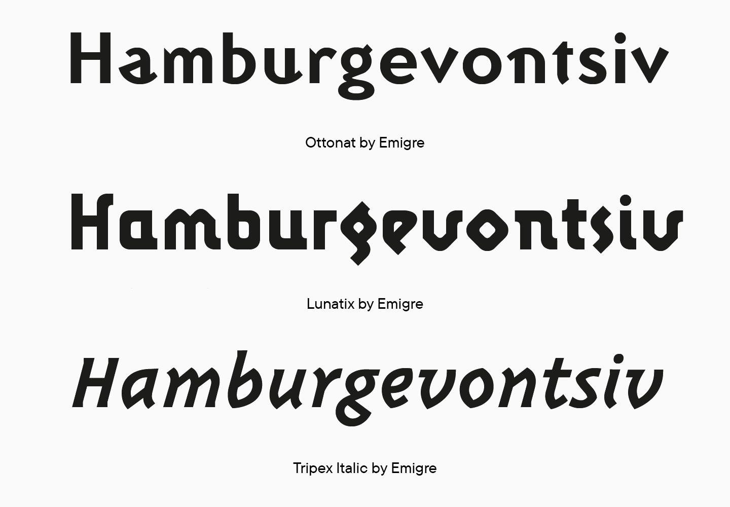
In the late 20th century, postmodernism emerged as a movement that brought together various styles distinct from modernism. Like all postmodern art, typefaces are characterized by a mixture of styles, an allusion to historical forms with the addition of modern technology, playfulness and randomness of forms. However, this art is not random—it is carefully thought-trough, disassembled to basic components, and reassembled again. The American studio Emigre Fonts can be called an icon of postmodernism in the type world.
Undoubtedly, there is a lot of additional information to be explored concerning typefaces. Yet, an abundance of information can result in a cluttered mind, particularly as the suggested books can provide knowledge and company for several enlightening evenings.
We are leaving you here with fresh thoughts to think about and a list of references mentioned in the article.
References:
- Robert Bringhurst, The Elements of Typographic Style
- Gerrit Noordzij, The Stroke: Theory of Writing
- https://www.letterfountain.com/classification.html
- http://www.designhistory.org/Type_milestones_pages/TypeClassifications.html

