ttgertika
Type foundryFonts & StylesSerifTT Phobos
Buy font Try out the font

TT Phobos

Single style: from $35 Full family: 14 styles from $169

Any questions about the font or licences? Write us.

Choose the fonts you want

Choose the fonts and licenses you want.

Then, press the "Add to Cart" button

25% OFF when you combine Desktop and Webfont licenses

Package offer:
per style $12.07
from  $169
14 styles
from  $169
from $35
from $35
from $35
from $35
from $35
from $35
from $35
from $35
from $35
from $35
from $35
from $35
from $35
from $35
Show all

Any questions about the font or licences? Write us.

Select font licenses

You must specify a font package or style before selecting a licence

Choose the licenses you want

The license is suitable for anyone who plans to use the font in logo design, images for websites and social media, as well as in print media, souvenirs, and merchandise.

This license is purchased by the number of workstations on which a designer will use the font.

Desktop license is paid for once. Full license text

On request

If you plan to use the font in headings or text blocks on your project site, choose this commercial font license.

Purchase price depend on the number of site visits per month.

Webfont license is paid for once. Full license text

On request

To use the font in applications for iOS, Android, Windows, Linux and other operating systems.

When choosing a license, we do not count the number of application downloads, but focus only on the number of created applications.

App license is paid for once. Full license text

On request

Suitable for placing banners, digital ads and posters on the Internet, as well as for advertising on social media.

The license options differ depending on the number of ad impressions.

Digital Ads license is paid for once. Full license text

On request

This license is for the use of a font in video content: blogging, on a YouTube or TV channel, in online or offline broadcasts.

Font license options depend on the amount of video content that uses the font.

This license is paid for once. Full license text

On request

Video game developers’ license. Allows you to embed a font in the video game code.

This license is paid for once. Full license text

On request

Suitable for those who will be using the font in e-books, magazines, interactive PDFs, or other publications.

This license is paid for once. Full license text

On request

The license is suitable for use on special sites and applications where users can create a product using the selected font without an additional font license.

This license is paid for once. Full license text

On request

This is the case when a font is not limited to one area of application, and you want to discover all the possibilities it offers.

For those who purchase an unlimited licence, we often make font customisation as a gift.

Unlimited license is paid for once. Full license text

On request
No selected items
Total
$0

TT Phobos

About font family

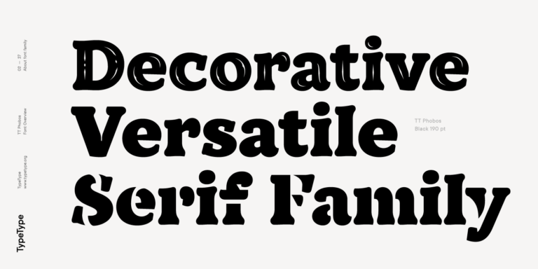
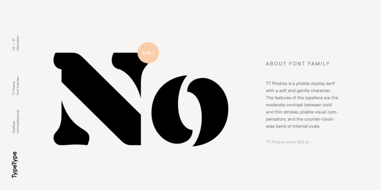
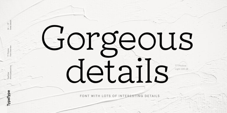
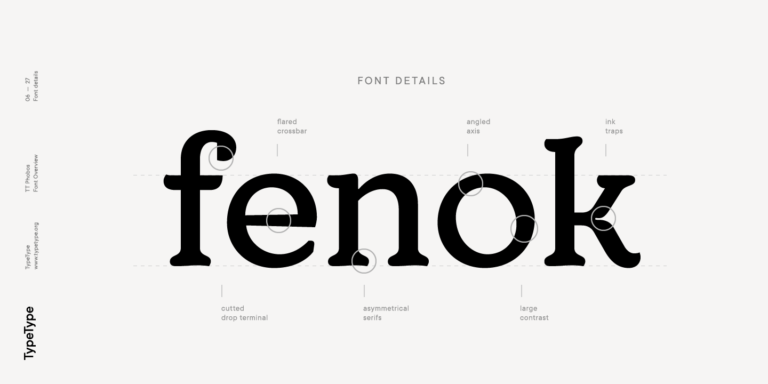
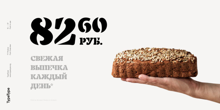
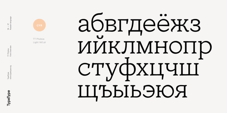
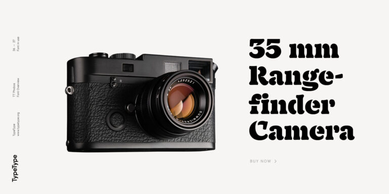
TT Phobos is a pliable display serif with a soft and gentle character. The features of the typeface are the moderate contrast between bold and thin strokes, pliable visual compensators, and the counter-clockwise bend of internal ovals. In addition to 6 weights and 6 italic, TT Phobos also includes two original decorative fonts, inline and stencil.

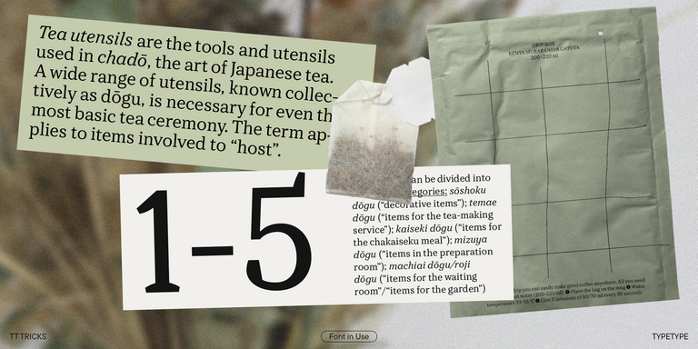
Despite its pliability and display character, TT Phobos is dynamic enough and is well suited for text arrays even in large text blocks. The serifs of letters are completely asymmetrical and bring in dynamics when reading the text from left to right. Thanks to the harmonious contrast of black and white forms and internal negative spaces of the letters, as well as its broad letter spacing, the typeface is well read in small sizes. In this case, the character of the letters is completely preserved, partially thanks to the exaggerated elegant visual compensators.

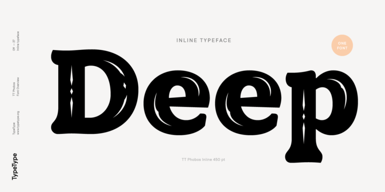
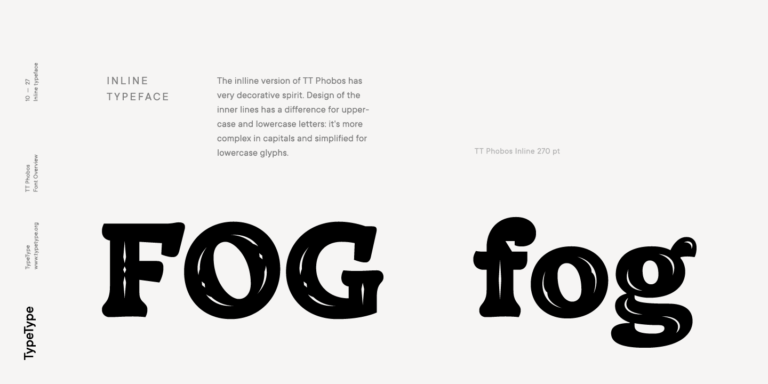
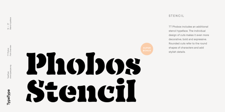
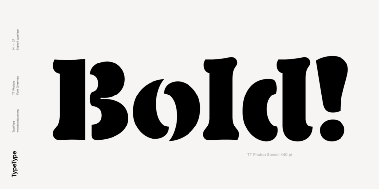
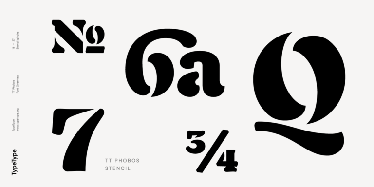
The ornamental pattern used in TT Phobos Inline varies for capital and lowercase letters. Capital letters implement a more complex double inline with a rhombic element in the middle, and in the lower case features a simplified form of the inline, made in a single movement. Thanks to the original cutting, TT Phobos Stencil stands out for its expression, and the rounded cuts add even more visual style to the font.

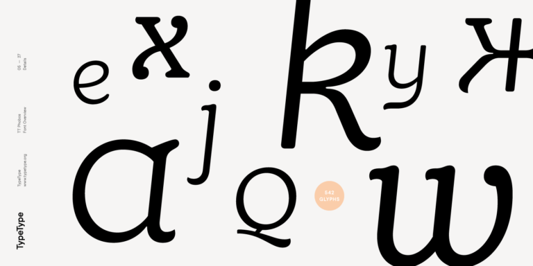
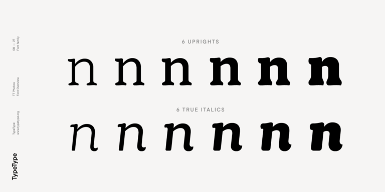
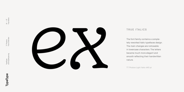
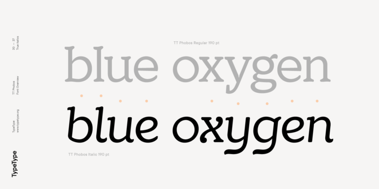
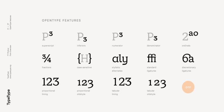
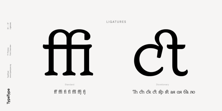
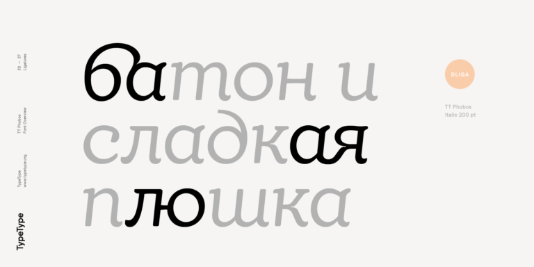
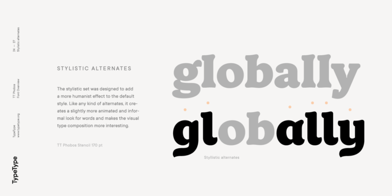
TT Phobos consists of 14 faces: 6 weights (Light, Regular, DemiBold, Bold, ExtraBold, Black), 6 Italics, inline and stencil. There are 17 ligatures in TT Phobos, including several Cyrillic ones. The typeface has stylistic alternates, which adds an italic effect to the upright fonts, and a little solemnity of the upright version to the italics. In addition, we have not forgotten about the old-style figures and other useful OpenType features, such as ordn, sups, sinf, dnom, numr, onum, tnum, pnum, liga, dlig, salt (ss01), frac, case.

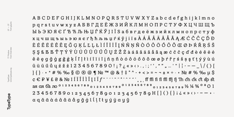
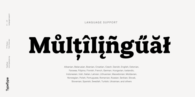
160+ Language support

Team

Ivan Gladkikh—head of the project
Nadezhda Polomoshnova—lead type designer
Marina Khodak—type designer, author of decorative typefaces
Victor Rubenko—hinting specialist

Release date

May 29, 2018

Additionally

Specimen

Download font specimen (pdf)

Poster Images

Graphic presentation at Behance

Custom version

Looking for a custom version of this font?

TT Phobos
Size
Otf
Turn on all

A pliable display serif with a soft and gentle character

TT Phobos
Size
Otf
Turn on all

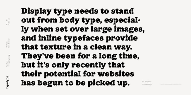
TT Phobos is dynamic enough and is well suited for text arrays even in large text blocks. Thanks to the harmonious contrast of black and white forms and internal negative spaces of the letters, as well as its broad letter spacing, the typeface is well read in small sizes. In this case, the character of the letters is completely preserved, partially thanks to the exaggerated elegant visual compensators.

TT Phobos
Size
Otf
Turn on all

The serifs of letters are completely asymmetrical and bring in dynamics when reading the text from left to right

TT Phobos
Size
Otf
Turn on all

The ornamental pattern used in TT Phobos Inline varies for capital and lowercase letters

TT Phobos
Size
Otf
Turn on all

magic style fifth (5)

Show more

OpenType features

salt | Stylistic Alternates

agly

agly

liga | Standard Ligatures

fl ffj

fl ffj

dlig | Discretionary Ligatures

ck st

ck st

onum | Oldstyle Figures

1638

1638

case | Case Sensitive Forms

({[H]})

({[H]})

sups | Superiors

H0123

H0123

Ideal font pairs with TT Phobos

What is a font pair, and what does it serve for?

A font pair is a combination of two fonts within one text block. Most often, one of the fonts in a pair is a more expressive headline font, and the other one serves to communicate information. Such fonts complement each other and help designers solve various tasks, like highlighting key elements, adding emotional expressiveness to the project, or separating semantic blocks.

How to choose fonts for a project: Several general recommendations

To begin with, establish the project's tone. Choose the fonts that stylistically match the main idea. After that, you need to determine the functions of each font in the project and their hierarchy: which font will complement the design and which one will serve to attract attention as the main element. You need to assess the difference between the fonts and decide what kind of information each of them should convey. First, we recommend choosing the base font you will use most, and then you can find a suitable pair for it.

Core principles of font pairing and recommendations from designers

The main rule you should follow when matching two fonts is that both similarities and differences must be visible between them. You can highlight the coherence of fonts by the following characteristics: contrast, proportions, width, openness of characters, individual letter shapes, and overall tone. Feel free to experiment with different combinations. We also recommend analyzing the projects you like: this way, you can enhance your visual skills, elevate your knowledge base, and gain confidence in dealing with typography.

Similar fonts

Choose the fonts and licenses you want.