
Open five websites of well-known brands and compare the first impression each one makes before you read a single line of copy. Imagine Chanel, Toyota, Apple, Fender and Rolex. Different products, different audiences. And every one of those identities is using typography to establish a recognizable voice and a visual rhythm.
Restrained for Toyota, technological for Apple, premium for Rolex. Those are brand systems that have run one family across shopfronts, packaging, apps and advertising for decades, until the typography itself became part of what people recognize.
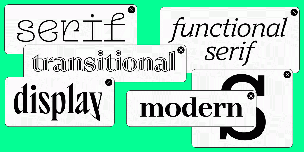
The category took its place in visual communication almost a century ago and hasn’t given it up since. It still runs branding, interfaces, editorial layouts, packaging and signage. What changes from project to project is which visual character the job can carry.
So: logos first, then digital products, print, display work, and which of our families suits each.
Best sans serif fonts for books and body text
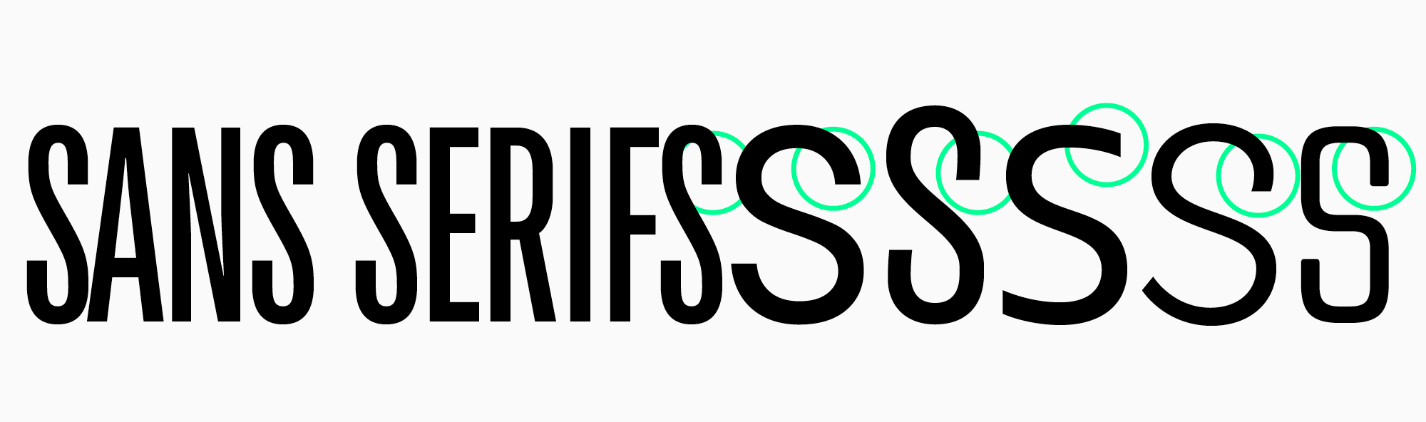
Two families can both be sans serifs and share almost nothing else. Proportions, contrast, spacing, the character of the letters: all of it moves, which is why the best sans serif typefaces are the ones where a clear idea survives the technical execution. The neighbouring serif category is built on different logic again.
Which one wins depends entirely on the job. Four hundred pages of body text want calm texture and a rhythm that doesn’t tire you out, where a title or a campaign can take as much personality as you dare give it.
You can sort them by historical origin, by construction, or by what they were drawn for. Pick whichever of the three gets your shortlist down fastest.
The usual stylistic grouping runs: old-style grotesques, neo-grotesques, humanist and geometric fonts.
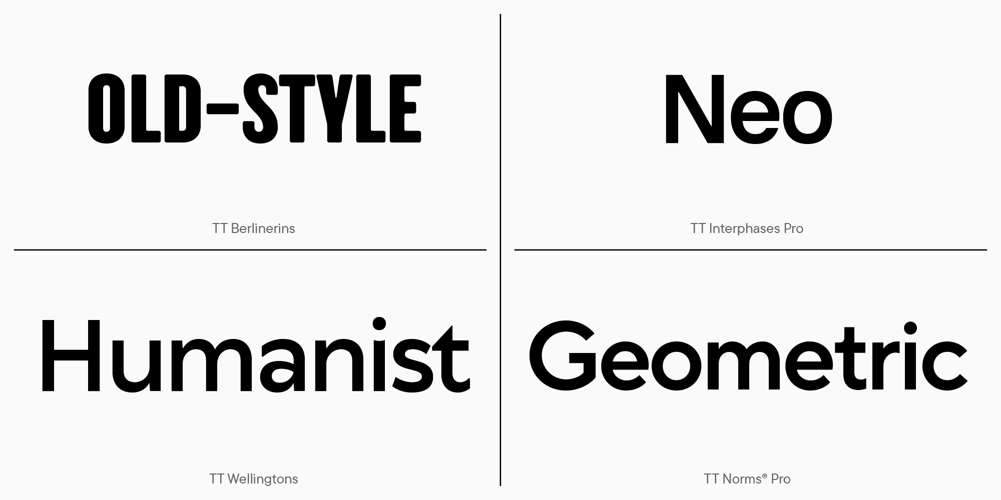
By function, they split more simply into text fonts and display fonts.
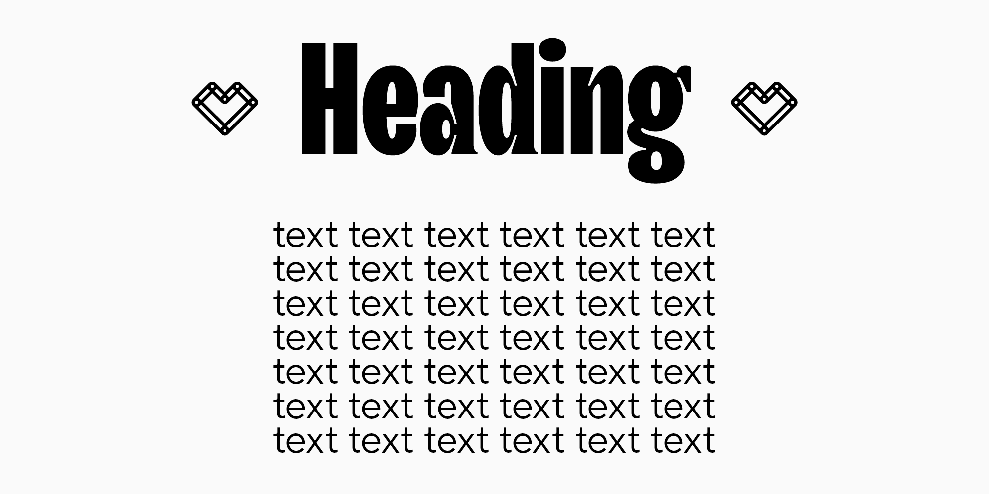
The most common sans serif fonts belong to one of those groups. There’s also a rarer neighbour, the high-contrast font that drops its serifs entirely, which we’ll come back to.
The cleanest fonts get their effect from precise proportions and balanced spacing, not from decoration. Even so, the top sans serif fonts have a voice of their own. Neutral has never had to mean anonymous.
Best sans serif fonts for websites and digital products
Screens are less forgiving. A font has to stay clear at 11px, scale without falling apart, and keep a capital I from looking like a lowercase l. On a resume in particular, legibility and a calm hierarchy beat novelty every time, which is most of what makes the best sans serif font for resume work.
Because a font has to hold together at small sizes and across wildly different screens, websites and digital products add a difficulty of their own. What survives are the sans serifs that keep their letterforms distinct and their spacing steady. Books and magazines test the same thing more slowly: weak rhythm takes a page or two to show up, and then it’s all you can see. The most readable sans serif font for any particular interface is the one that performs in the actual product, not the one that looks best in a specimen.
TypeType recommendations
Universal families
These are the workhorses: concise, technically developed, and happy to move between formats without complaint. What you want from one is a family that can carry a whole hierarchy, from a 72px headline down to a footnote, and still look like itself at both ends.
Geometric, humanist and neo-grotesque construction can all do that job. For sheer readability out of minimal form, the Swiss approach still has the strongest reputation. Warmth is what it trades away.
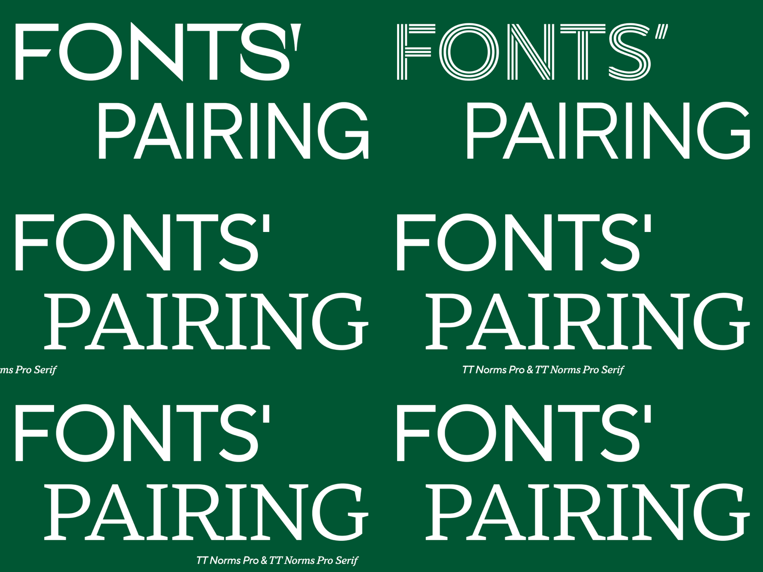
In the TypeType collection, a useful starting trio is TT Commons™ Pro, TT Norms® Pro and TT Hoves Pro.
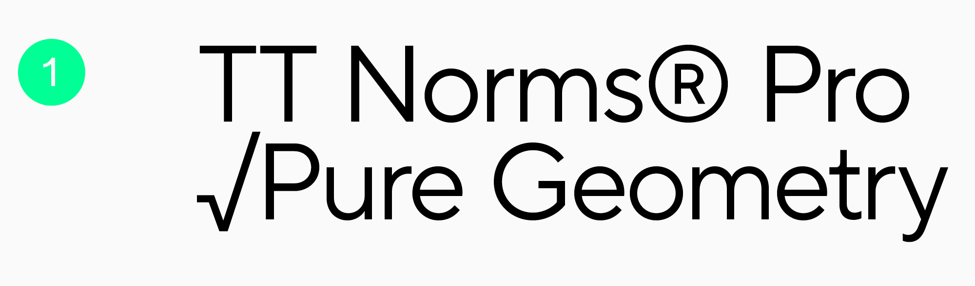
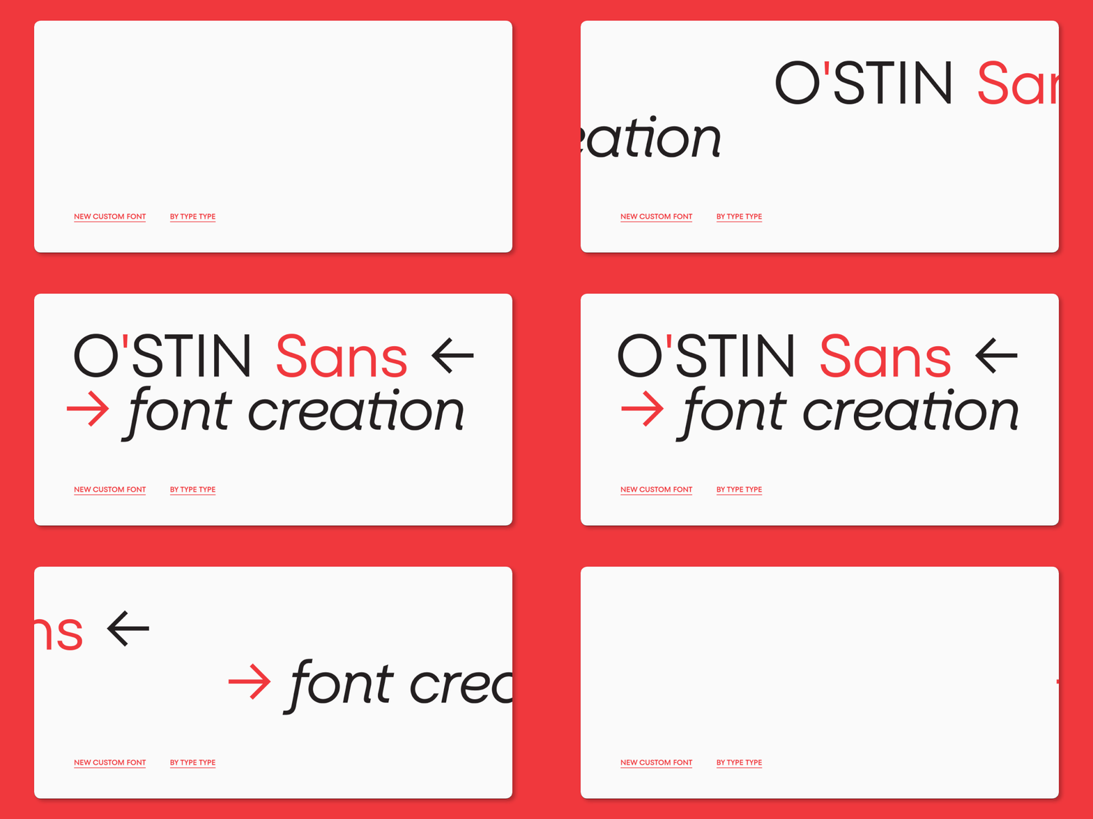
TT Norms® Pro is the obvious reference point for large identity systems and broad multilingual work. It has turned up in the visual language of more than a thousand international brands, Cartoon Network, Tom Tailor and CSN among them. Roughly what you’d expect from one of the most used sans serif fonts in circulation.
The family supports more than 275 languages, including Bulgarian, Greek and Vietnamese. For an international identity that breadth is often the deciding factor.
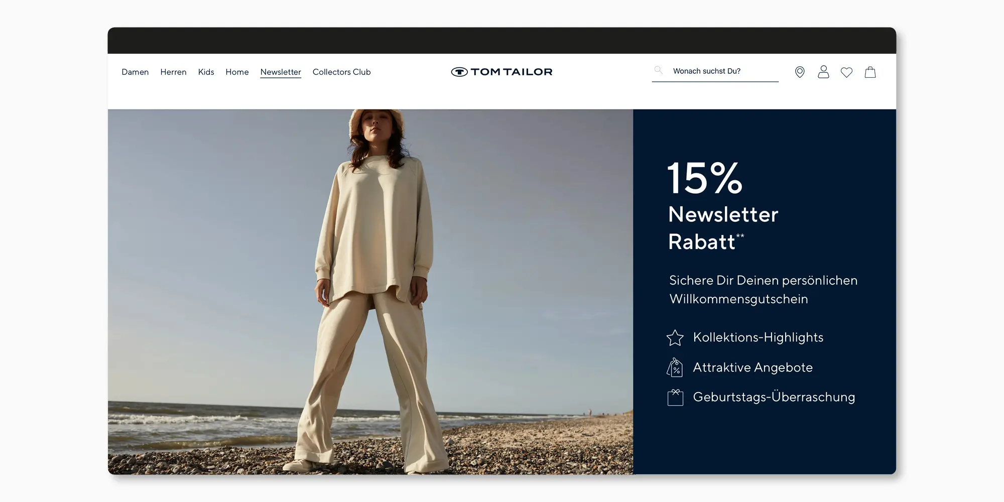
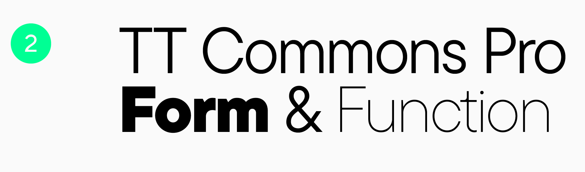
TT Commons™ Pro is another studio bestseller, with an extensive character set behind it. Uniqlo, Commercetools and Typo have all used it. Among the most popular sans serif fonts we make, on that evidence.
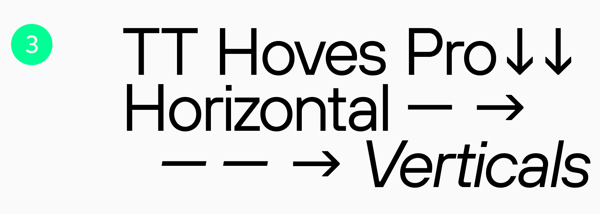
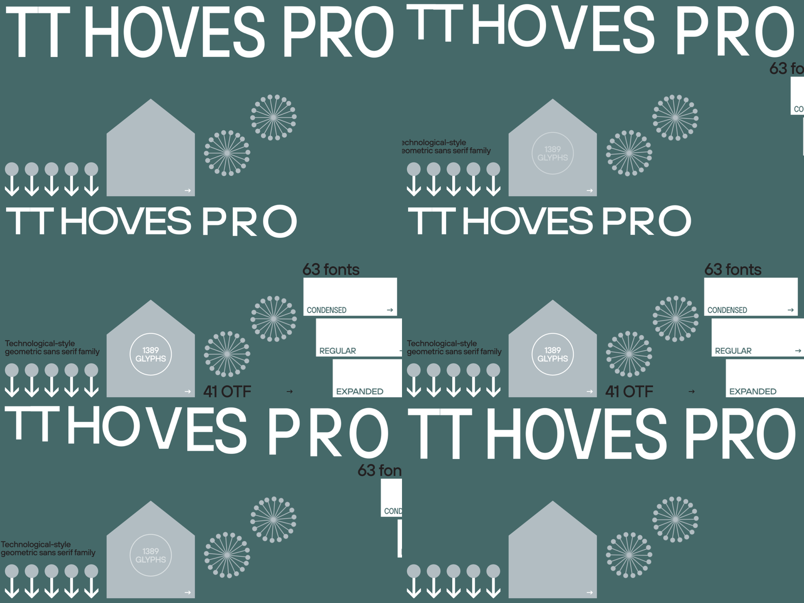
TT Hoves Pro brings broad European and Cyrillic support, a large style range and an expanded character set. It’s the one to reach for when a system has to feel elegant and still do everything.
We keep adding to these families, new styles, OpenType features, characters. It matters most in print, where the best sans serif fonts for print are the ones with spacing you can trust and enough styles to build a hierarchy out of.
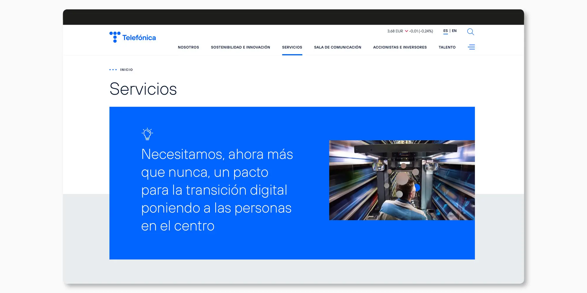
Display families
Display fonts are drawn for headings, short statements and identity work, anywhere the size is big enough that personality becomes part of the message. A poster wants impact first, and the best bold sans serif fonts get it from weight, proportion and rhythm. Not from ornament.
Three TypeType examples sit in this group: TT Rounds Neue, TT Travels Next and TT Frantz.
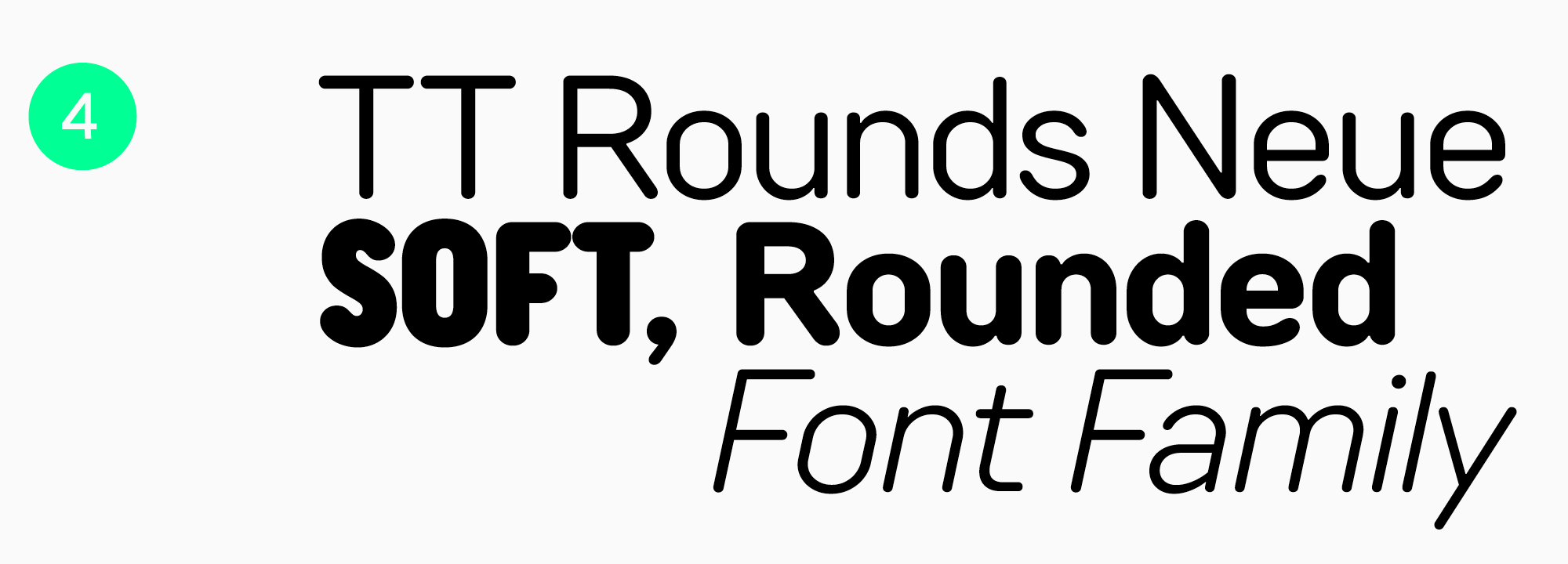
Soft shapes, friendly tone: TT Rounds Neue keeps getting picked for eco-oriented brands, children’s products and socially focused projects. Start here for the best rounded sans serif fonts.
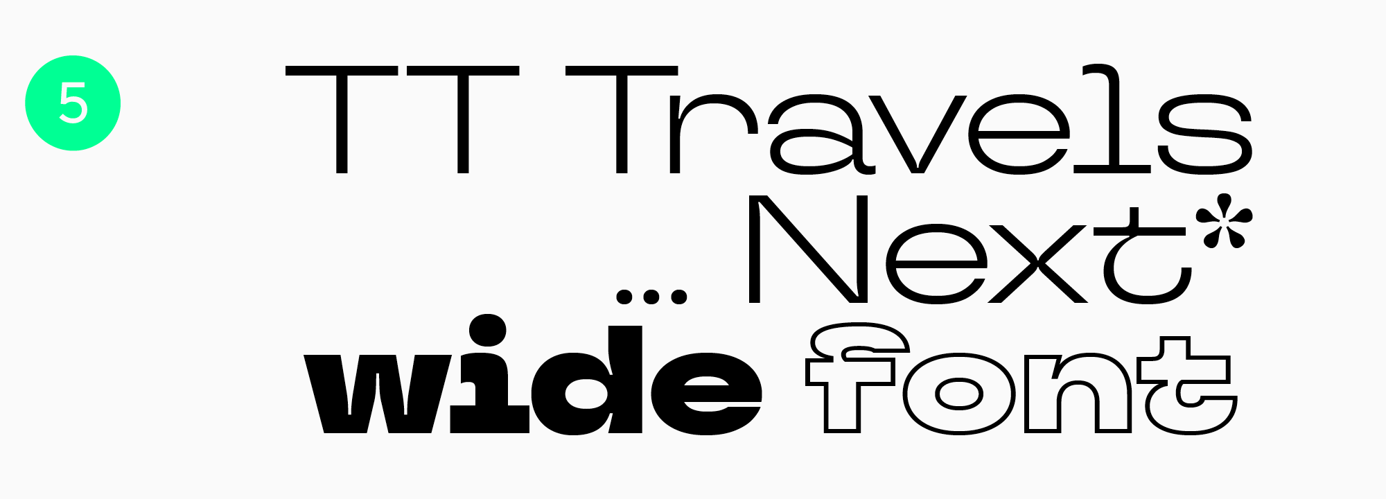
TT Travels Next is a wide-proportioned display design with an assertive contemporary character. The wide proportions suit expressive identities and titles, as long as the width is doing something for the concept and not just filling the line.
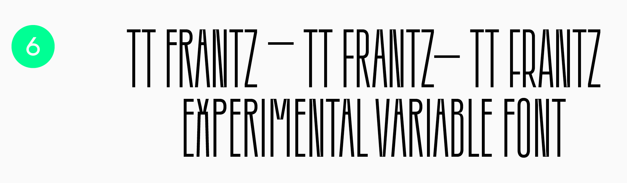
TT Frantz is an experimental variable font whose crossbar can be raised or lowered. Move that one axis and the whole visual rhythm changes while the composition stays compact. Memorable, for an experimental layout.
Humanist fonts
The best humanist sans serif fonts keep an open, readable construction while letting a few details nod toward handwriting or calligraphy. That softness is the whole point of the category. A strictly geometric design has no way to produce it.
In our collection this direction runs through TT Fellows and TT Wellingtons.
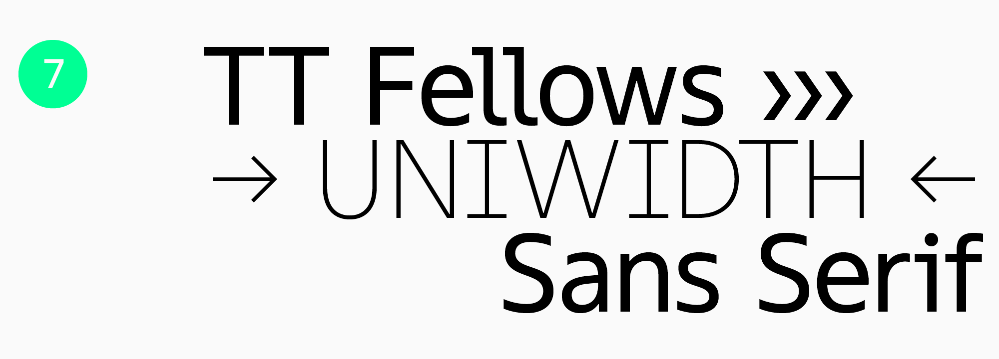
TT Fellows was the studio’s first uniwidth family and became a bestseller soon after release. Character widths stay put when the weight changes. Shift style and the layout stays where it was. For presentations that one property does more work than anything else, and it is what makes TT Fellows one of the best sans serif fonts for presentations.
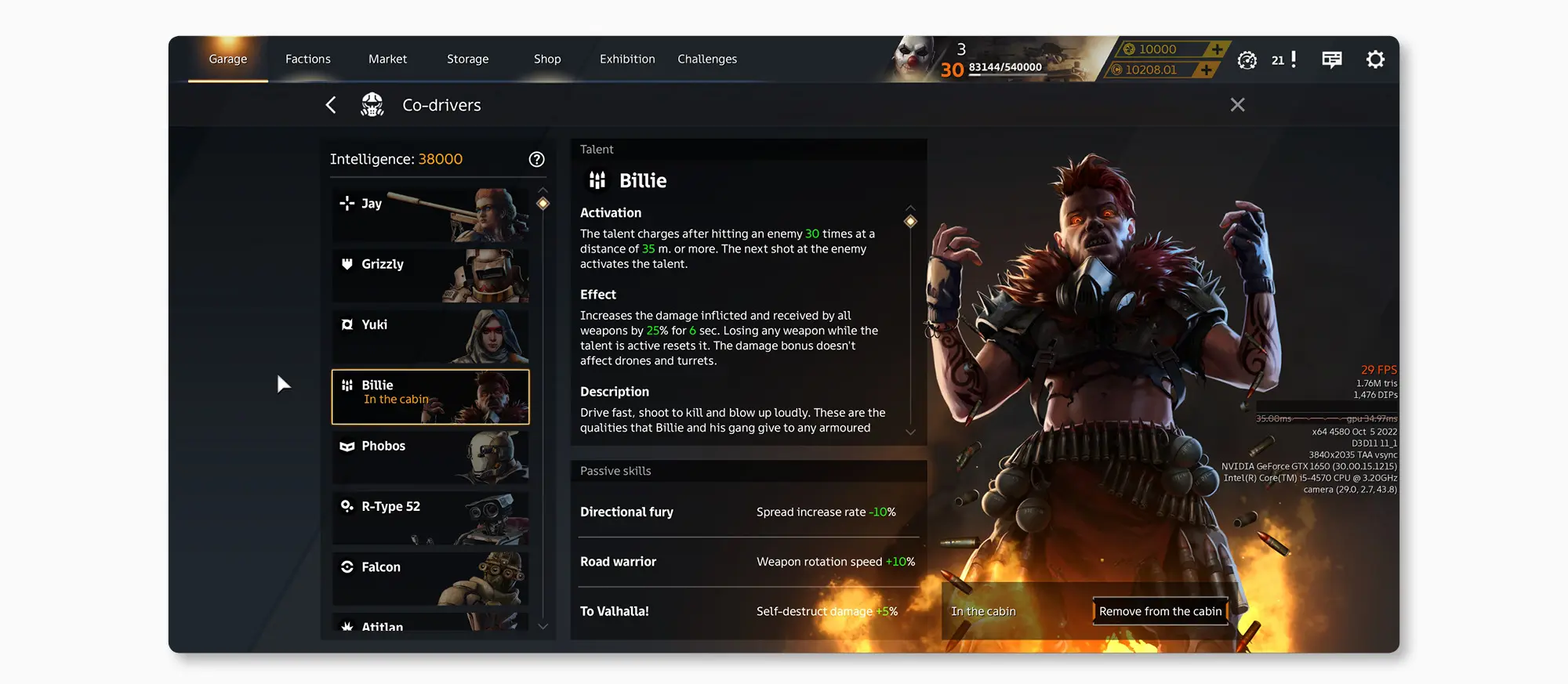
TT Wellingtons takes its shapes from the movement of a broad nib. The soft letter lines that come out of that were a hallmark of English humanist type in the twentieth century, and they still look lively in a contemporary layout. It sets headings and blocks of text equally happily, and it holds up in web work, print, film and video titling, and signage.
Geometric fonts
Geometric construction starts from the circle and the straight line, with proportions worked out rather than drawn by eye. It’s where most people end up when they’re after the best modern sans serif fonts for logos.
Our collection covers it with TT Commons™ Pro, TT Norms® Pro and TT Hoves Pro, along with TT Fors, TT Chocolates, TT Travels and TT Firs Neue.
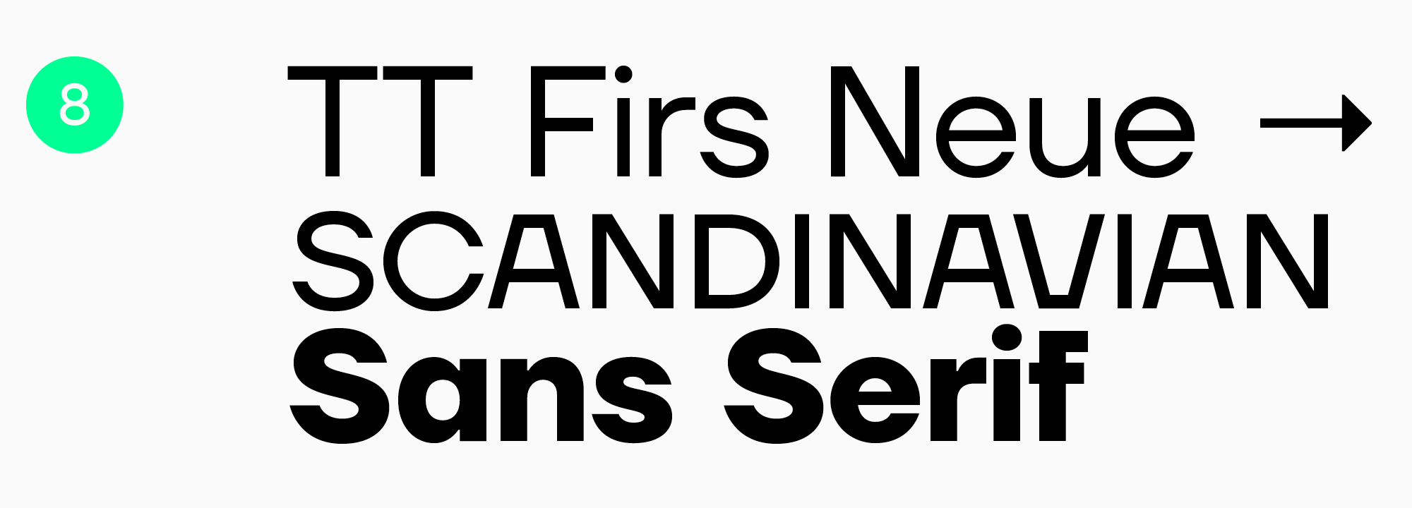
TT Firs Neue has a character you’ll recognize again once you’ve seen it. It also stretches further than most. Worth testing when a logo needs personality and the same font then has to hold a paragraph together.
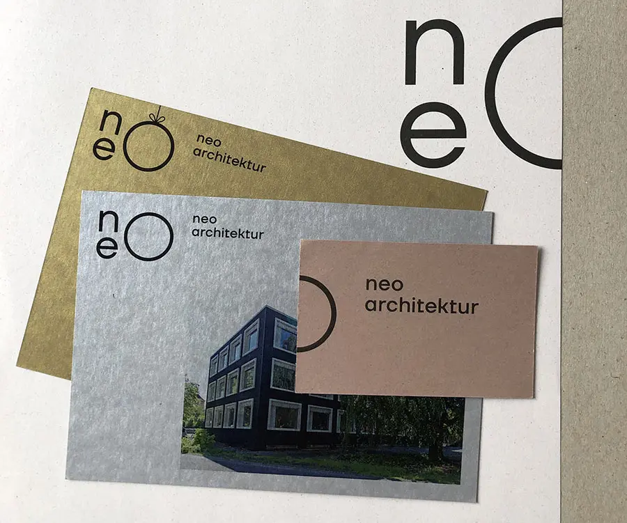
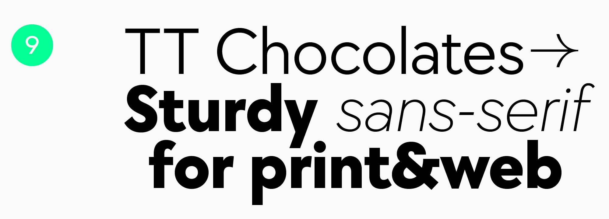
TT Chocolates sets dense and friendly at once, and it holds up through continuous reading. Proof that compact spacing doesn’t have to be uncomfortable.
Neo-grotesques
Low-contrast and concise, neo-grotesques go almost anywhere. Reach for one when a project needs a neutral voice and a hierarchy that behaves predictably from the first mockup to the last screen.
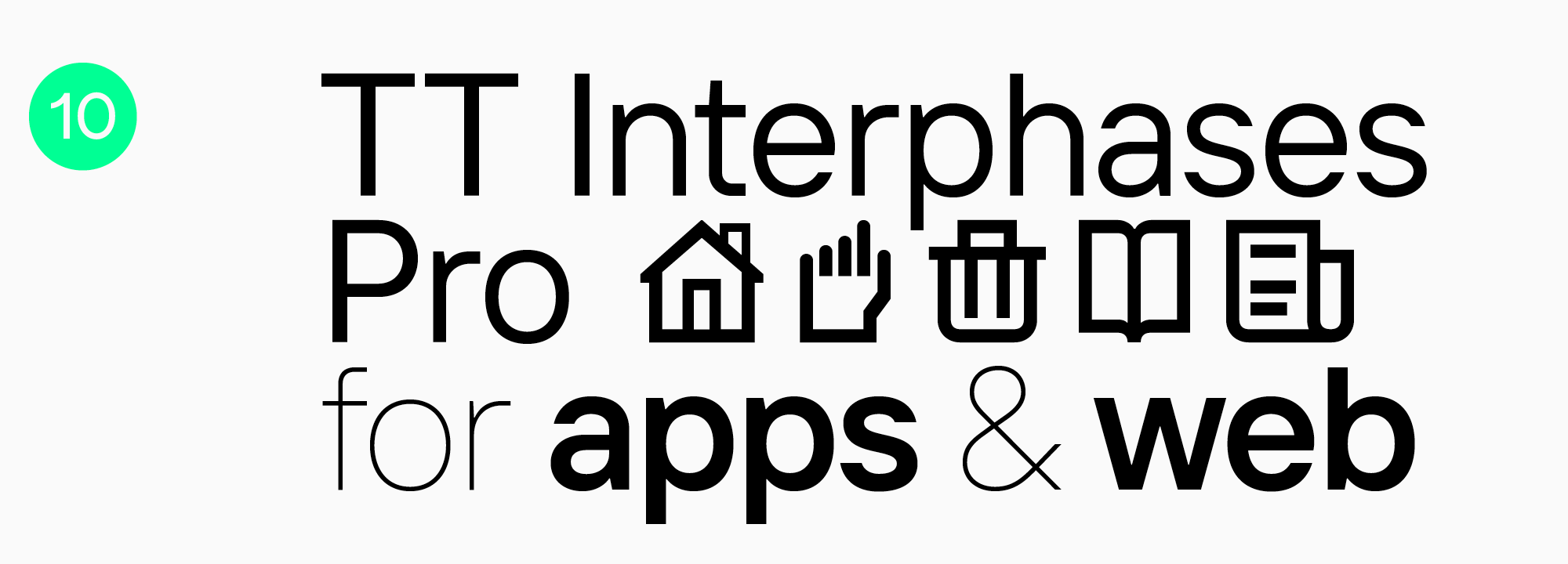
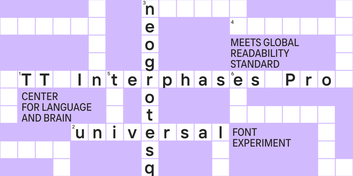
TT Interphases Pro was drawn for interfaces, so it stays clear at the sizes interfaces actually use. Broad language support and an extensive character set come with it. Usually the next thing a digital product asks for.
High-contrast sans serifs
Pronounced stroke contrast, and no conventional serifs at the ends. The combination gives titles and short headlines a refined editorial feel that no classic sans serif can produce.
TT Ricordi Allegria and TT Knickerbockers are our examples.
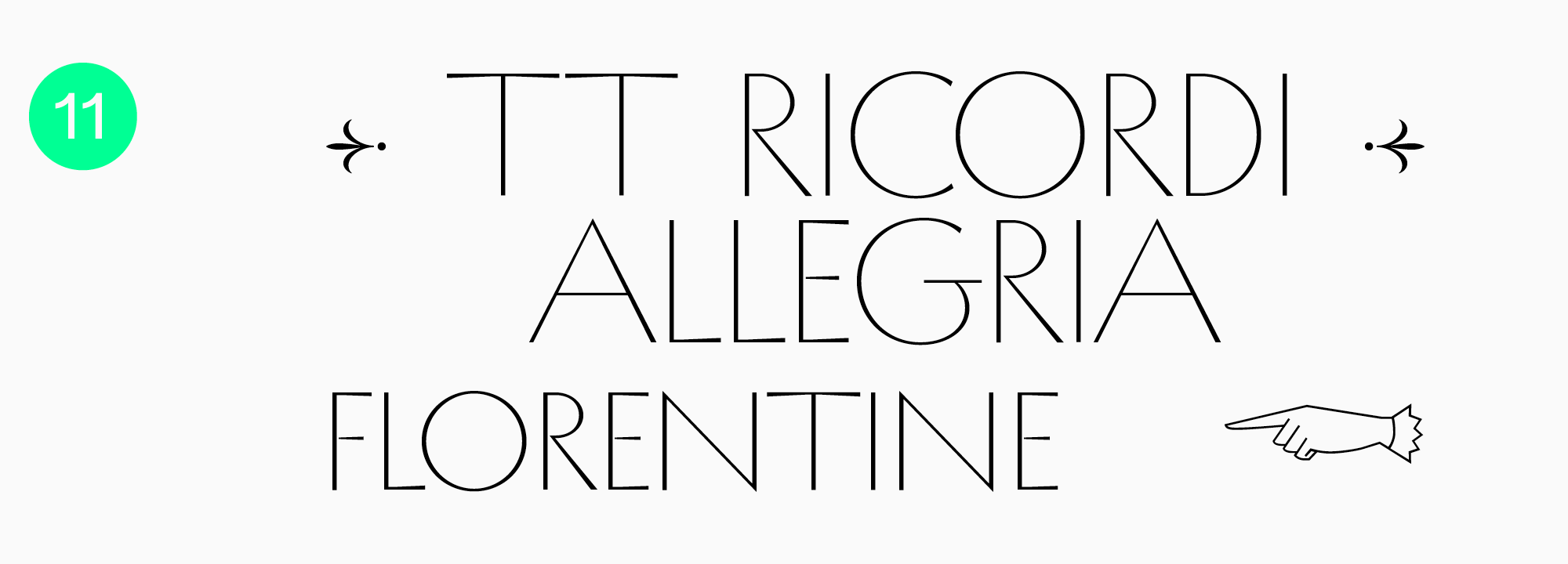
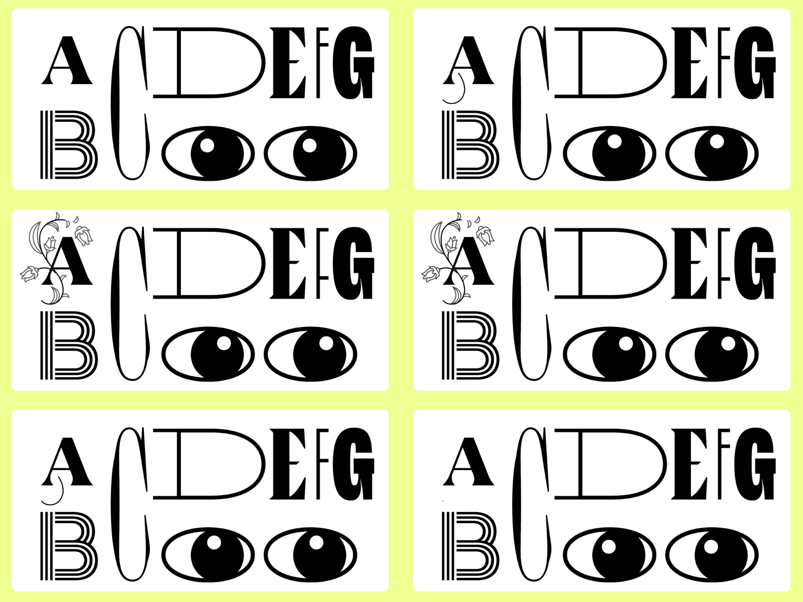
TT Ricordi Allegria is a sophisticated display font with variable width proportions and a refined, decorative rhythm.
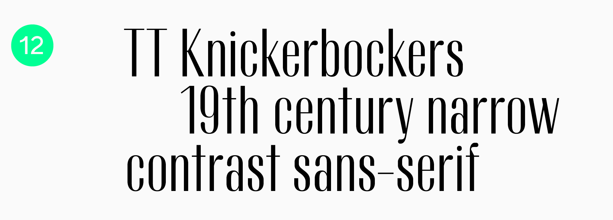
TT Knickerbockers is a high-contrast display font with subtle hints of serif detailing. That unusual construction works particularly well in titles and decorative headlines.
Choosing by task and proportion
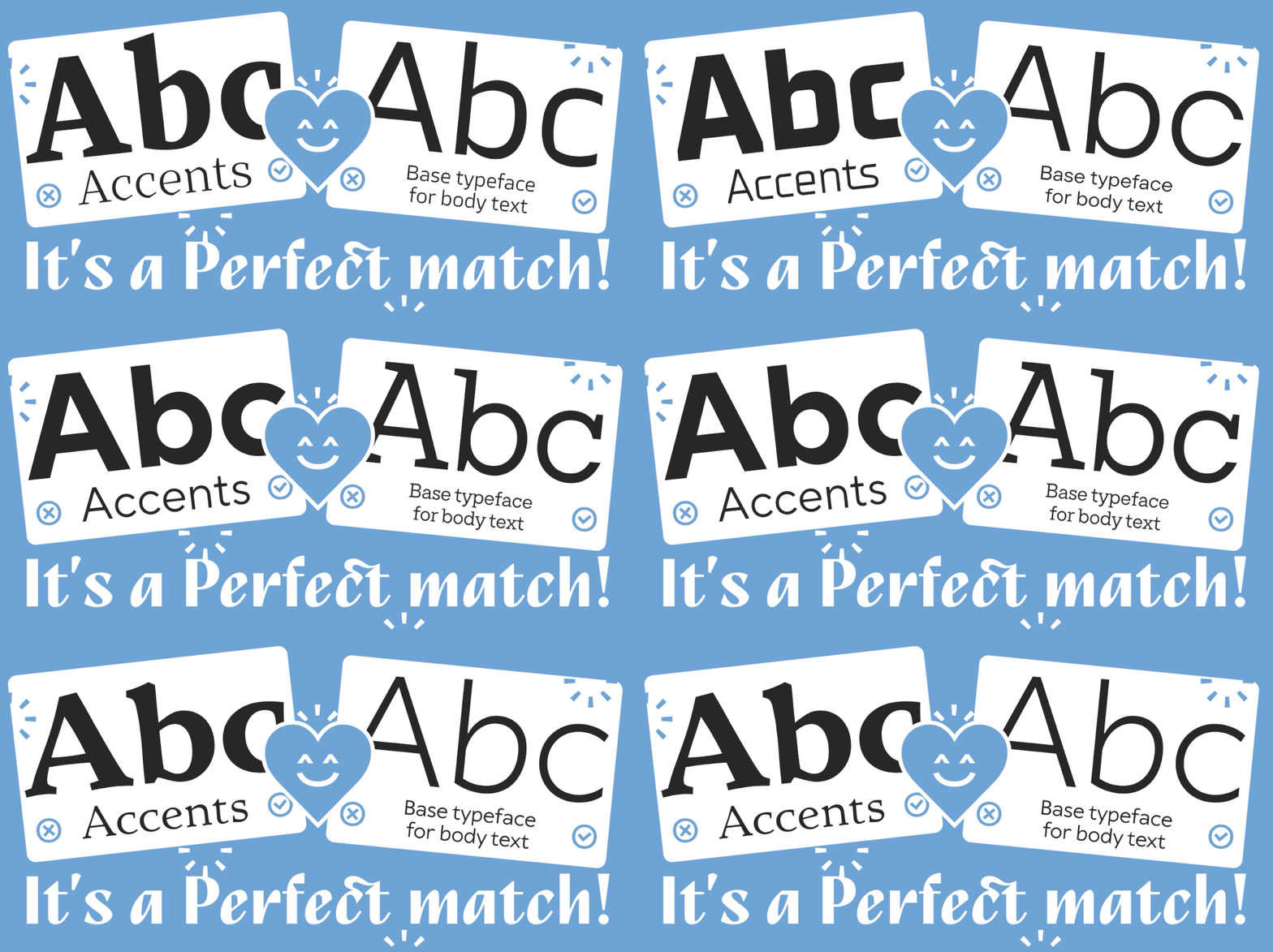
Tight space sends you to the best condensed sans serif fonts. A hierarchy built on two distinct voices makes it a question of pairing instead. Either way the font should solve the layout problem first and bring its personality along afterwards.
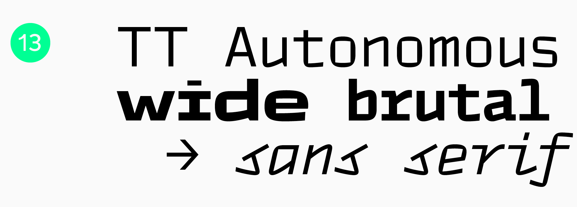
TT Autonomous is a technological font with rugged, almost monospaced proportions. Mechanical engineering, technology, AI projects. It can carry a high-impact title system on its own, too.
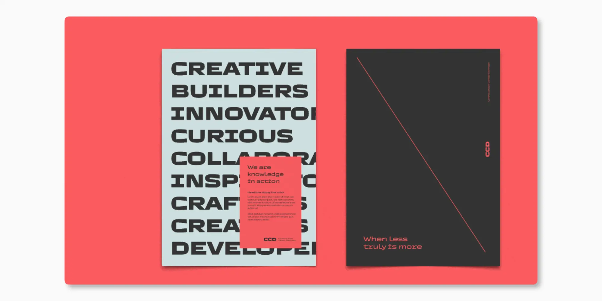
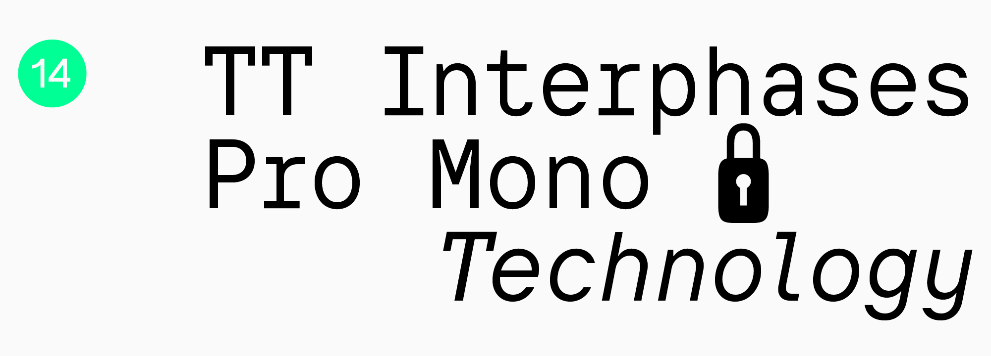
TT Interphases Pro Mono is the monospaced subfamily of TT Interphases Pro. It works in programming environments, obviously, but also in branding, packaging and headlines, wherever equal-width rhythm can be used as a graphic device.
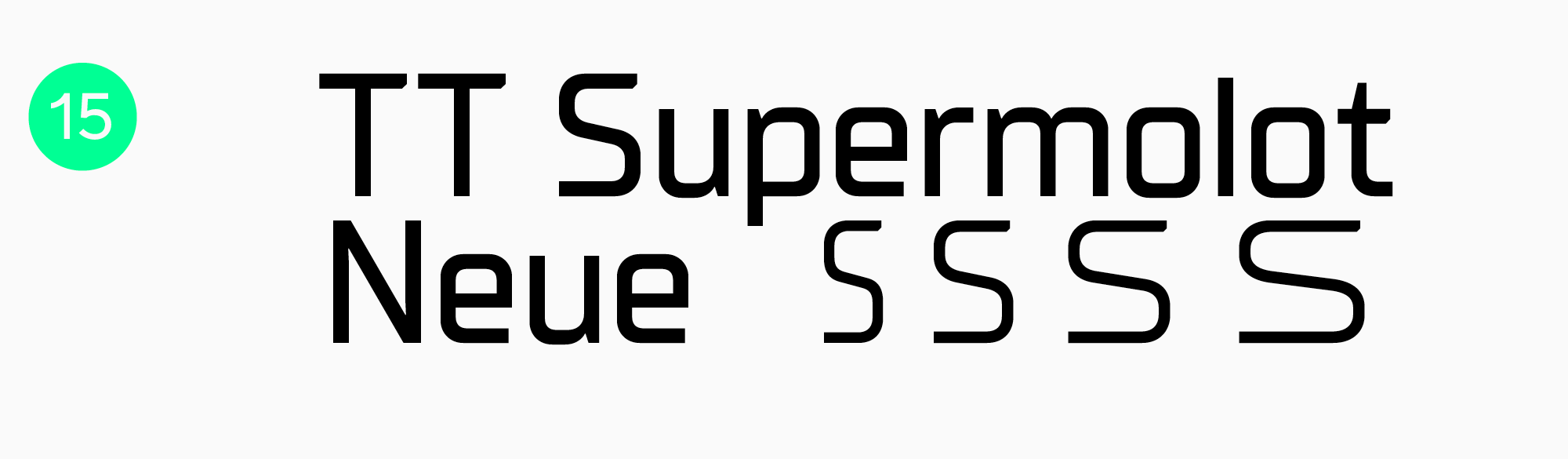
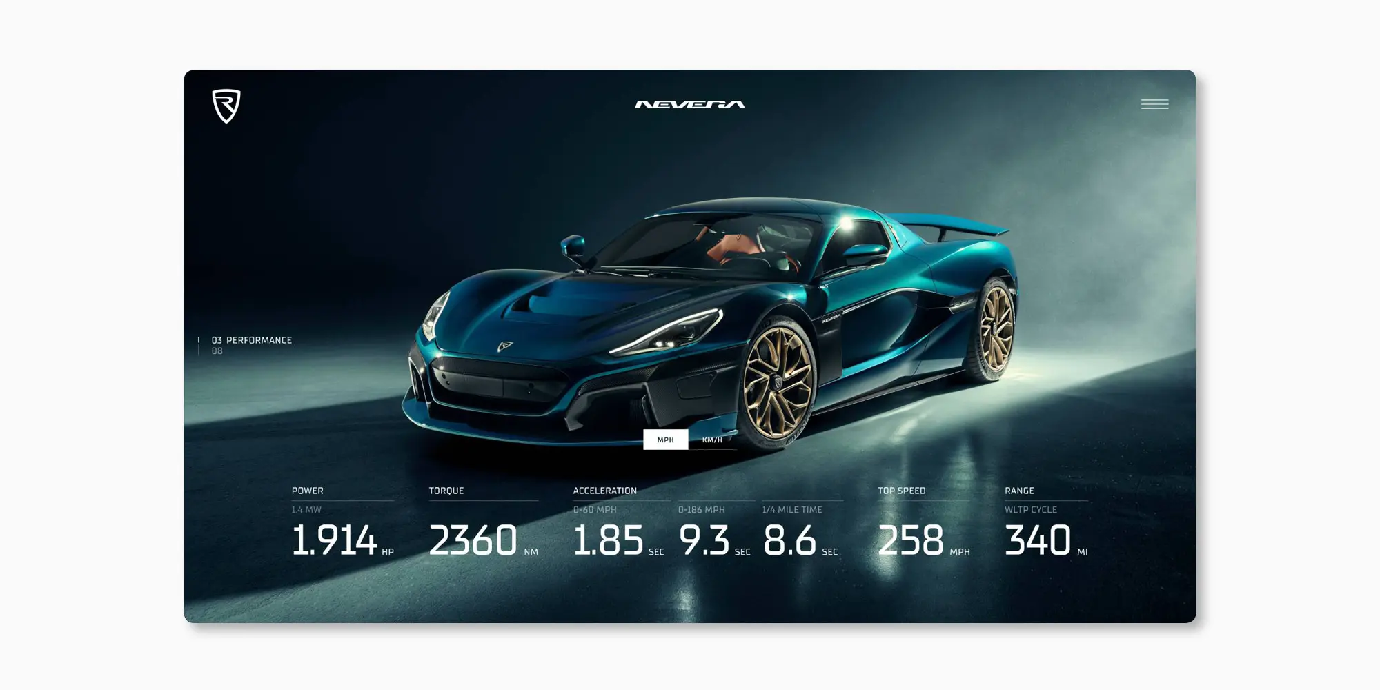
TT Supermolot Neue is technological too, with a broad set of coordinated styles behind it, so one system can run from restrained to considerably louder without changing font.
Between them, these families cover the universal, display, humanist, geometric, neo-grotesque, high-contrast and technological directions. Test every candidate where it will actually live, with the real language set and the real content, because a specimen sheet has never yet exposed a bad decision. The best sans serif fonts are the ones still working two years into the brand.
A shortlist narrows fast once the task and the audience come into it. For identity work, set the exact brand name. For long-form, compare full paragraphs at several sizes. Then share what you picked and tag TypeType studio.
FAQ
What are the best sans serif Google Fonts to use in 2026?
In 2026, key trends will remain variable fonts for maximum flexibility and humanist sans serifs, which can be found in the Google Fonts or TypeType libraries.
Which sans serif fonts are ideal for resumes?
For resumes, it is logical to use “workhorses”: concise, with good readability and a strong technical base. Any universal font will work perfectly: TT Commons™ Pro, TT Norms® Pro, and TT Hoves Pro.
What are the best sans serif fonts for body text and long reading?
Universal sans serifs with a neutral character and good readability in running text are best suited for this.
Which sans serif fonts work best for logos and branding?
Many brands choose a universal and concise sans serif, for example, TT Norms® Pro. For more “distinctive” branding, display sans serifs are suitable: among the popular ones are TT Rounds Neue, TT Travels Next, and TT Frantz.
Are there free sans serif fonts suitable for professional projects?
Yes, there are. However, strictly check the license for commercial use. Free fonts often lack broad language support or proper technical adaptation. For professional projects, we recommend fonts from proven studios. TypeType typefaces offer trial downloads for testing.
What are the best bold sans serif fonts for emphasis and headings?
Display sans serifs are suitable for accents—they are designed for headers and large inscriptions and provide a brighter character. Popular display fonts include TT Rounds Neue, TT Travels Next, and TT Frantz.
Which modern sans serif fonts are popular among designers today?
Among universal modern sans serifs, TT Commons™ Pro, TT Norms® Pro, and TT Hoves Pro stand out. Among display (decorative) options—TT Rounds Neue, TT Travels Next, and TT Frantz.
What are the best sans serif fonts available in Canva and Adobe?
In Canva, popular and universal fonts are considered the best: Inter for modern design, Montserrat for headers, and Open Sans for text. In Adobe Fonts, professional classics are available: the benchmark Helvetica Now, geometric Futura PT, and universal Gotham.
Which sans serif fonts are optimal for websites, presentations, and posters?
Sans serifs are actively used in web (sites, apps) and corporate materials, and increasingly in identity and even game interfaces. For universal tasks, TT Norms® Pro, TT Commons™ Pro, and TT Hoves Pro are suitable.
What sans serif fonts work best in Microsoft Word and for print materials?
Universal and functional fonts with a strong technical base are perfect for corporate documents. Therefore, for Word documents and printing, it is logical to use the universal TT Norms® Pro, TT Commons™ Pro, or TT Hoves Pro.