The font is part of the brand, responsible for the emotional context of the information communicated. Is it possible to complement these associations and expand the audience by changing the corporate font?
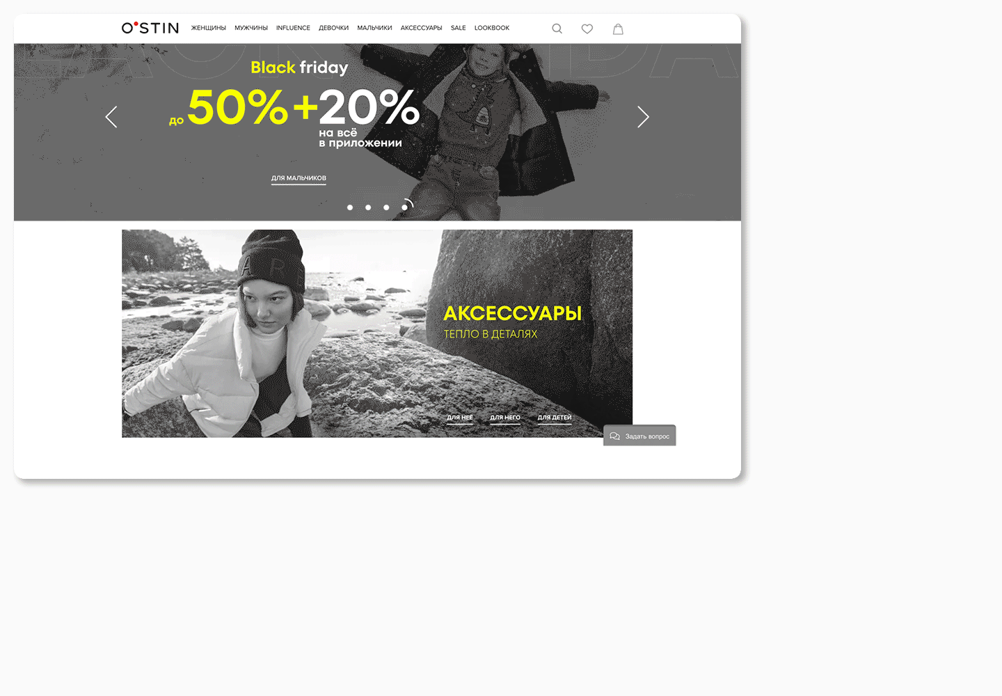
The brand O’STIN contacted us with such a request. The typeface that TypeType was to develop was part of the rebranding. The company planned not only to update the corporate identity, but also to expand its target audience.
O’STIN is a popular brand of casual clothing and accessories. Buyers fell in love with O’STIN for the variety of assortment and affordable pricing.
By the time the O’STIN team approached us for a corporate font, the conceptual part of the rebranding was completed. The goal of all the changes was to attract a new audience while maintaining the existing one.
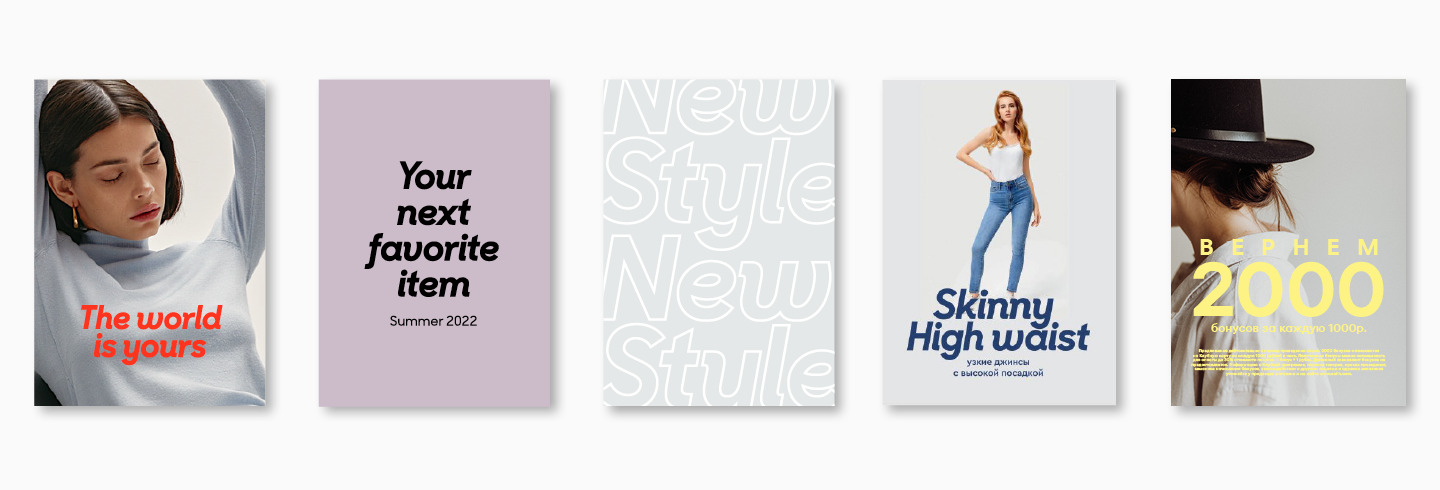
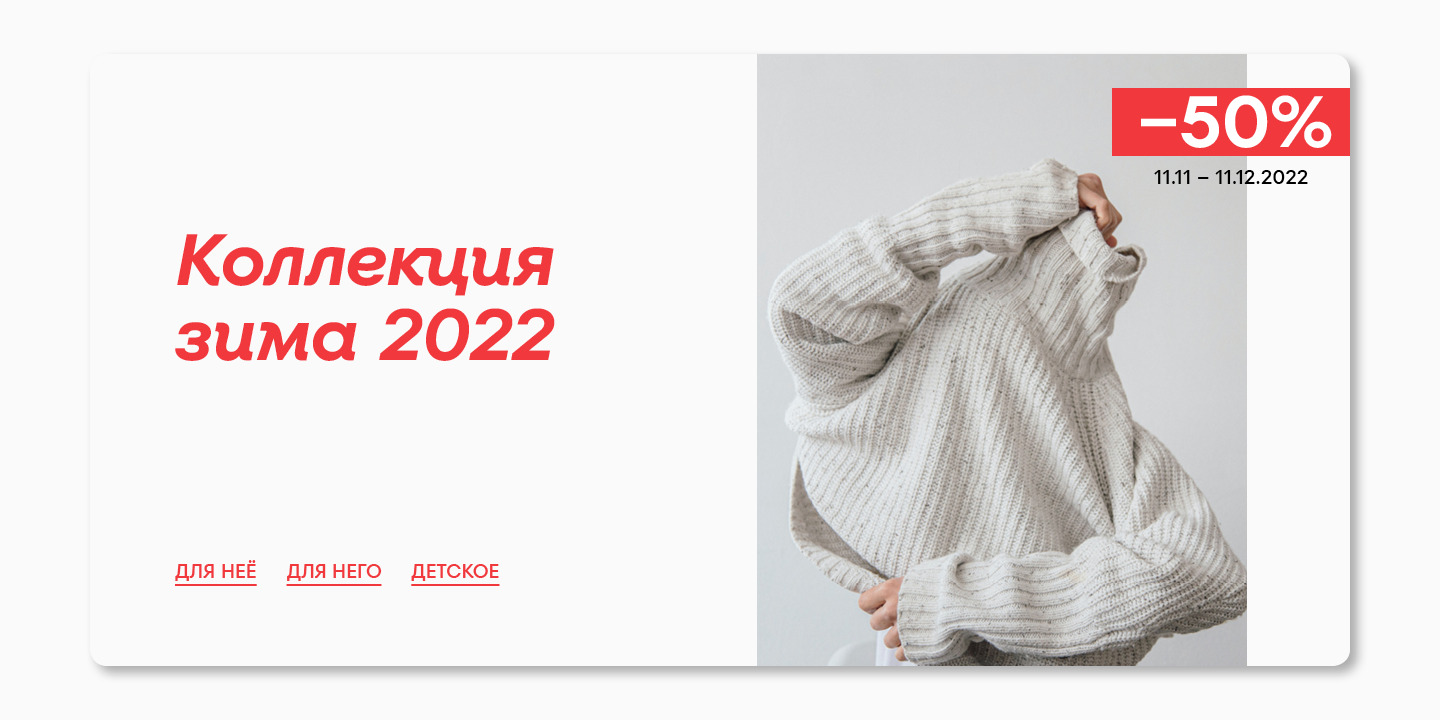
Many people know O’STIN as convenient and practical clothing, focusing on the rational factors. The brand wanted to become more attractive to those who, when choosing clothes, are guided by the emotional characteristics of the brand. Practical and everyday pieces are great, but they can be used to create unique looks for different occasions.
Concept discussion
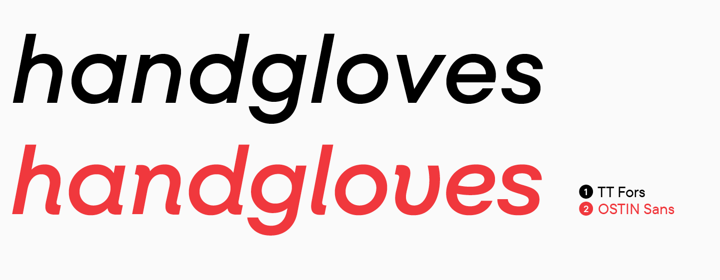
The font played a leading role in updating the corporate identity. Already at the preliminary stage, it became clear that the typeface should include both upright styles and Italics. This approach met the needs of the rebranding: upright and strict sans serif is comfortably perceived by a rational audience, while dynamic and bright Italics could attract the attention of an emotional one.
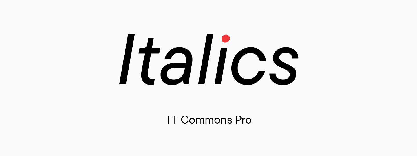
It is worth clarifying that we are talking about true Italics, that is, not just slanted fonts. The difference is that in slanted styles, the designs in the letters do not change, while true Italics are a separate font with newly drawn character shapes. True Italics are featured in such TypeType studio’s fonts as TT Livret or TT Rationalist.
We had to understand how the concept of two fonts in corporate style can work for the brand, how this approach corresponds to the chosen goals and what we, as a studio, can offer from our side.
First of all, our team presented O’STIN with two work strategies, each of which had advantages.
- In the first case, we could develop a completely new font from scratch. This is a laborious process that takes more time, but the result is a unique typeface.
- In the second option, we proposed to choose a sans serif from the TypeType collection, which suits the main requests, and customize it. In this case, Italics will also have to be drawn, because all the studio’s sans serifs feature oblique styles are created without changing the design of characters, and they are not Italics. This option requires fewer resources, which speeds up the process, but the final font is based on an existing commercial font.
After long discussions, we settled on the second option. From that moment, work on the O’STIN corporate font began.

Research part
Any TypeType font starts with research. At this stage, we collect all the information about the future typeface, analyze competitors and decide what the final composition of the font will be.
During the research phase for the O’STIN font, we had to find out:
- whether the use of upright sans serif styles and true italics will really help to achieve the goal of attracting a new audience while retaining the old one;
- what category of sans serifs is best to choose from;
- what font from the TypeType collection would be best suited for the basis of the O’STIN corporate font.
The O’STIN team provided us with a detailed review of the market. Competitor brands included in the selection could be divided into two groups: those that attract the attention of a rational audience and those that appeal to an emotional one. We took this information as the starting point of our own research.
After analyzing the corporate styles of companies focusing on typography, we found certain patterns.
- Fonts for brands in the rational part of the market were exclusively functional. This is a logical decision, because in this case, the font should first of all convey information about the company and its products. The font in this approach must not necessarily be part of the corporate identity and be directly associated with the brand. Moreover, many brands in this segment can use different fonts in communications, choosing a font for a specific task – for example, announce discounts, inform about a new collection, or share news about the company. As the main typeface, neo-grotesques are more common, although in such cases it is not always possible to distinguish the main font.
- • The emotional segment of the market treats type differently. The typeface of such companies is responsible for associations with the brand, broadcasts its values and attitudes. At the same time, a corporate font can have a relatively neutral character with a touch of something else, and not be bright and defiant. This is due to the fact that the font still transmits information and should not interfere with perception, causing emotional associations rather unconsciously. This font is the link between all brand communications. The very fact of having a corporate font that conveys the character of the company shifts the brand towards an emotional audience. It is curious that geometric sans serifs are popular in this segment.
These insights helped us realize that the mere fact of having a corporate type family would move the O’STIN brand into a more emotional category, especially if the font is a geometric sans serif. The use of true italics will make it possible to give the character of communications a more pronounced tone.
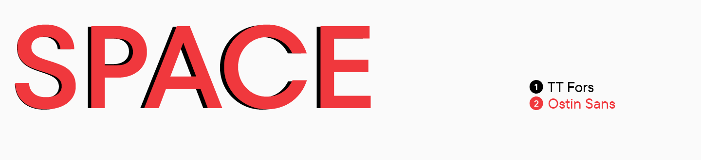
It was necessary to choose a font from the TypeType collection, on the basis of which a corporate typeface would be created. There were two main contenders: TT Fors and TT Chocolates. Opinions on the candidates were divided, so an internal survey was conducted among designers and those not connected with the type industry. They had to describe the proposed font with three adjectives.
The adjectives were divided into several groups, including the key ones: emotionality and rationality. After collecting the results, we calculated how many adjectives of each category were in the fonts we were interested in.
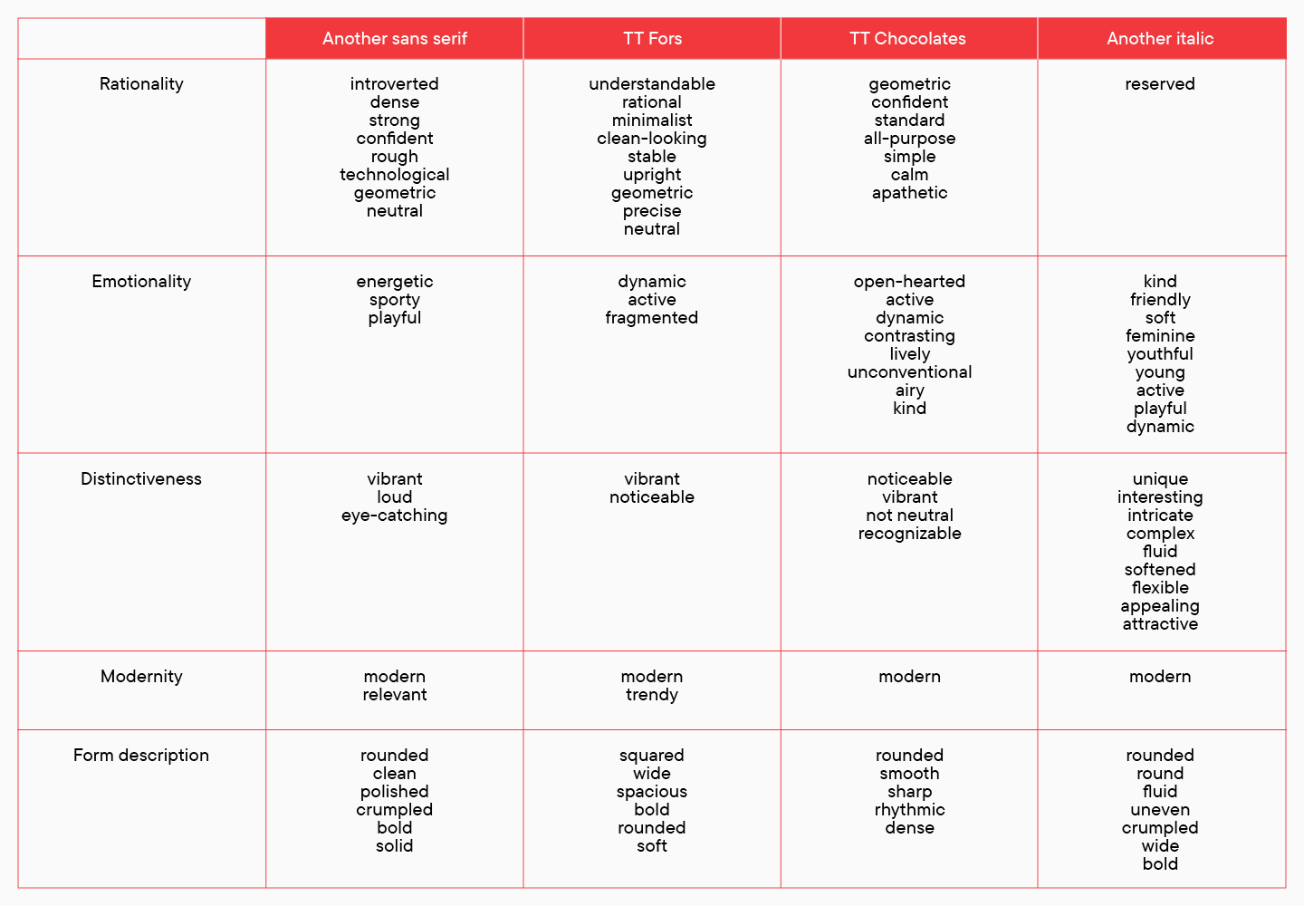
As a result, TT Fors was more often described as rational, while TT Chocolates received an equal number of rational and emotional descriptions. Based on this, TT Fors was chosen by the team as the more appropriate typeface for O’STIN’s corporate typeface.
Customization of upright styles in TT Fors
When the bulk of the research was over, we reached the point where we had to define font characteristics. First of all, it was necessary to find the required number of styles.
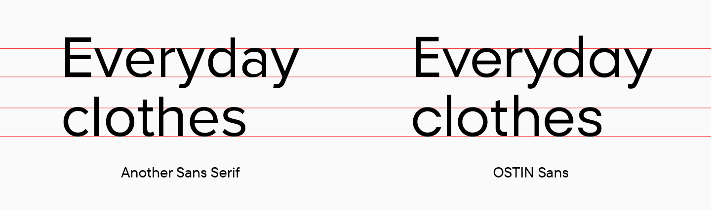
Previously, O’STIN had a main font. The team liked it and it was familiar to the designers, so we took into account its characteristics when creating the corporate typeface.
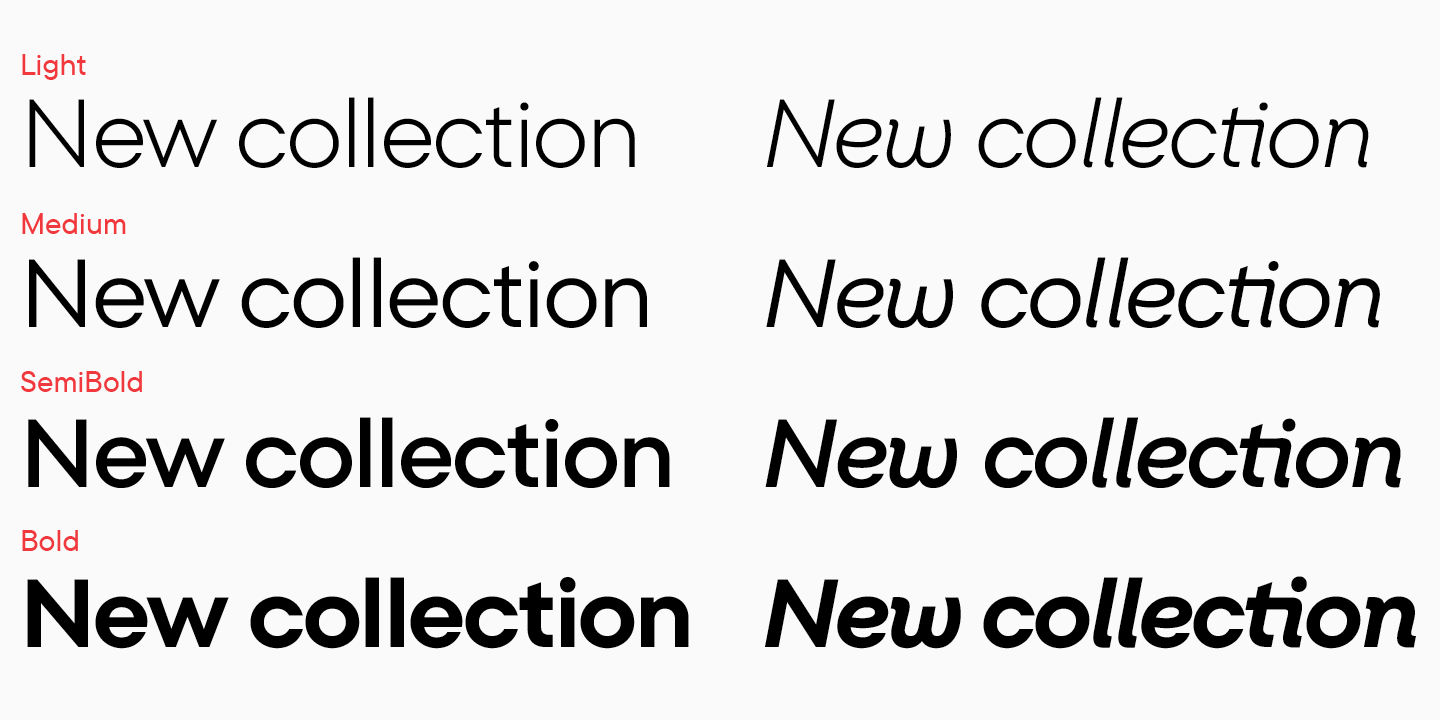
These considerations were included in determining the number of styles. We settled on 4 upright fonts and 4 italics based on the O’STIN team’s plans for the font and potential needs. The font used on the company’s website was also an argument. The fact is that the company did not plan to change the design of the site itself, including the layout, which means that the new font should be able take the place of the old typeface without any problems.
Of course, it was important for us to know the opinion of the O’STIN team about TT Fors. We gave the font for testing, so that in the process of getting acquainted with the font it became clear how convenient it was to use. This included looking for feedback on changes that the O’STIN team would like to see in the font. A corporate font should be comfortable to use, intuitive and pleasant.
After testing by O’STIN, we have made a number of changes.
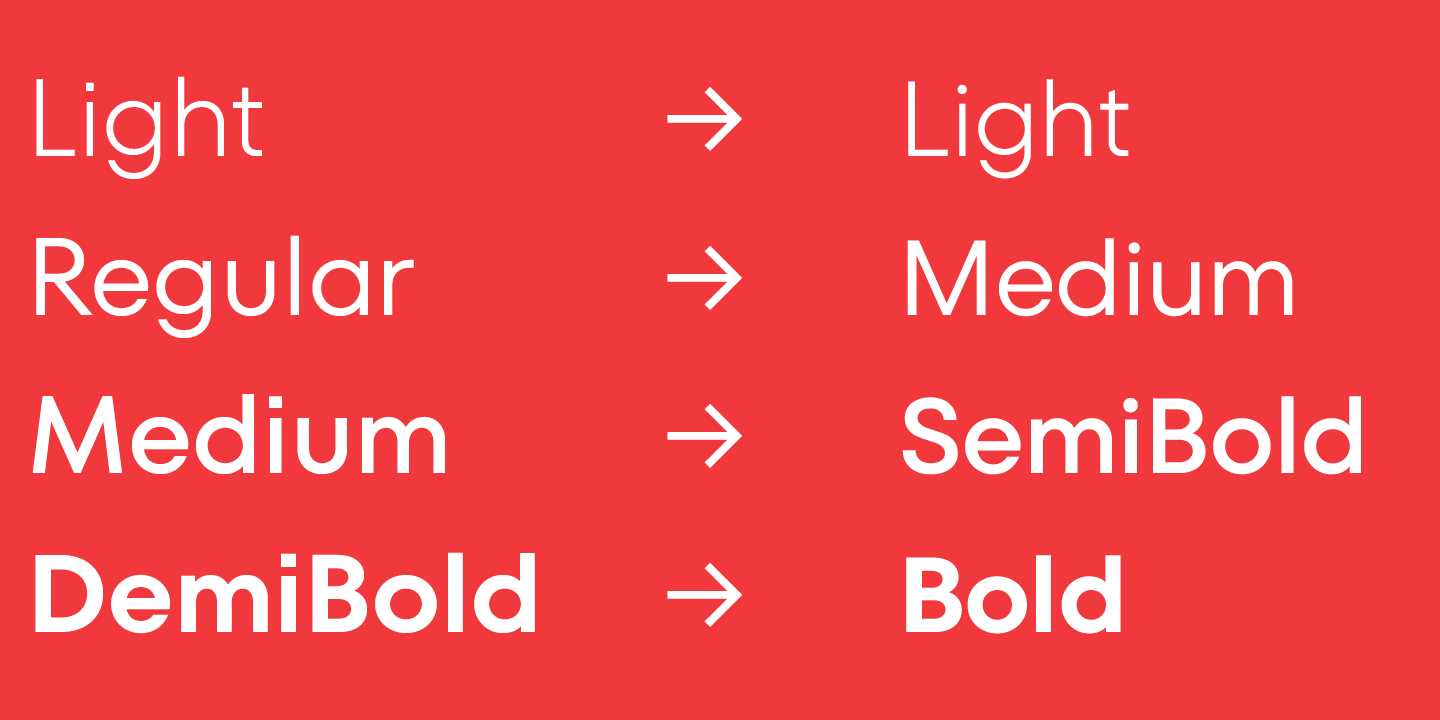
- Changed the names of the styles to those that would be more familiar to the team. For example, TT Fors DemiBold became Ostin Sans Bold and TT Fors Medium became Ostin Sans SemiBold.
- Increased spacing for capitals.
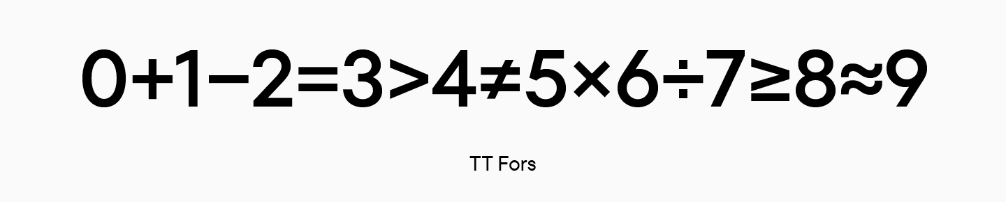
- Changed the shapes of some numbers and the sizes of mathematical characters.
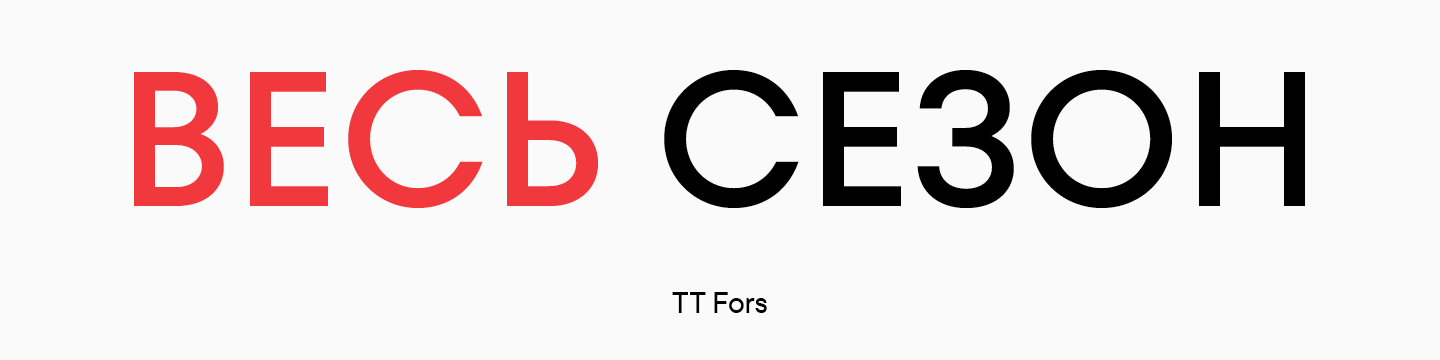
- For example, the word ВЕСЬ seemed too wide to the O’STIN team. TT Fors is based on classical proportions referring to Roman monumental inscriptions. For the O’STIN font, we kept the logic of contrast in proportions, but softened this difference a bit.
- We added graphical features to make the font unique and adapt to the brand.
We will consider the last point in detail in a separate chapter, but for now let’s move on to creating italics.
Creating true italics (cursives)
The work on upright styles and italics was carried out in parallel by two teams, as the project time was limited.
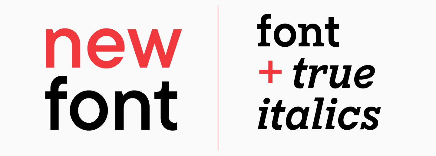
So, italics in sans serifs are really a rare case. In fact, true italics may not even be found in every serif. Such a font is more difficult to create, but its expressive properties are much higher than those of obliques. In addition, italics can be used as an independent font, giving the text a more pronounced character.
This was the O’STIN case. Italics essentially act as the second font in the typeface set, being responsible for emotionality.
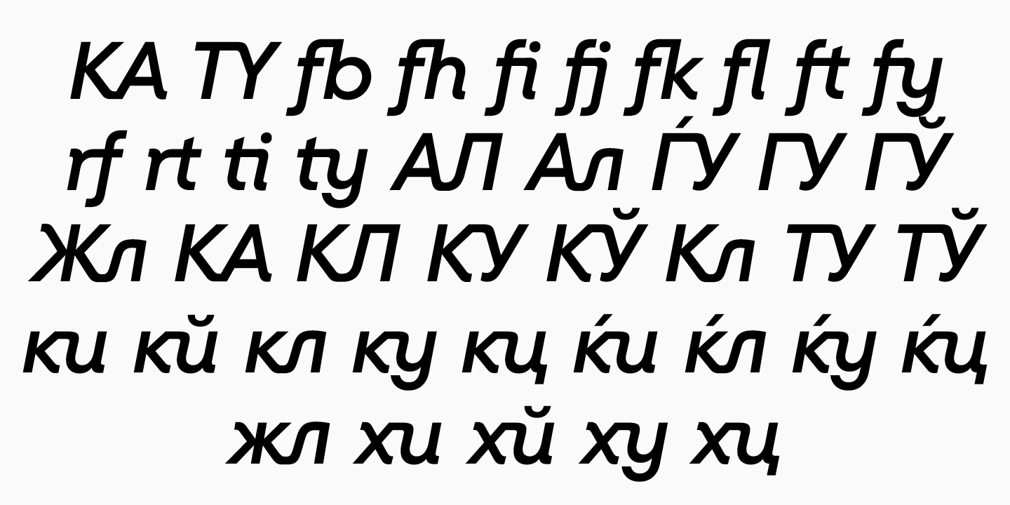
As we said, in true italics, the characters are not slanted, but are drawn anew. In fact, there are many buts here, because the shapes of the characters should be based on the nature of the main font, besides, some characters will simply be oblique. As a rule, it is the uppercase characters, numbers and some symbols that are inclined. We based such characters on the oblique characters from TT Fors’s faces.
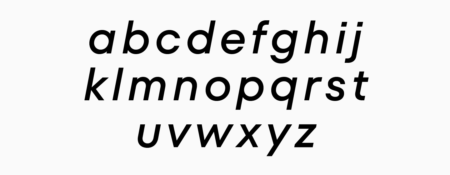
A greater amount of work was dedicated to the creation of lowercase characters, because they completely change their forms.
- We added softened stroke entries and exits.
- Corrected character proportions to match the new graphics harmoniously.
- For some of the characters, the constructions were completely changed, for example, in Latin e, v, w, y. Some of the characters remained almost untouched, such as b c o q.
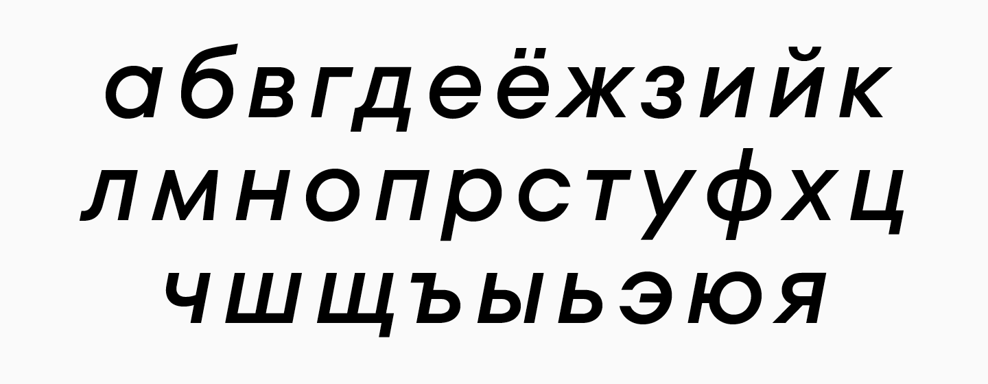
- Almost all Cyrillic characters were changed.
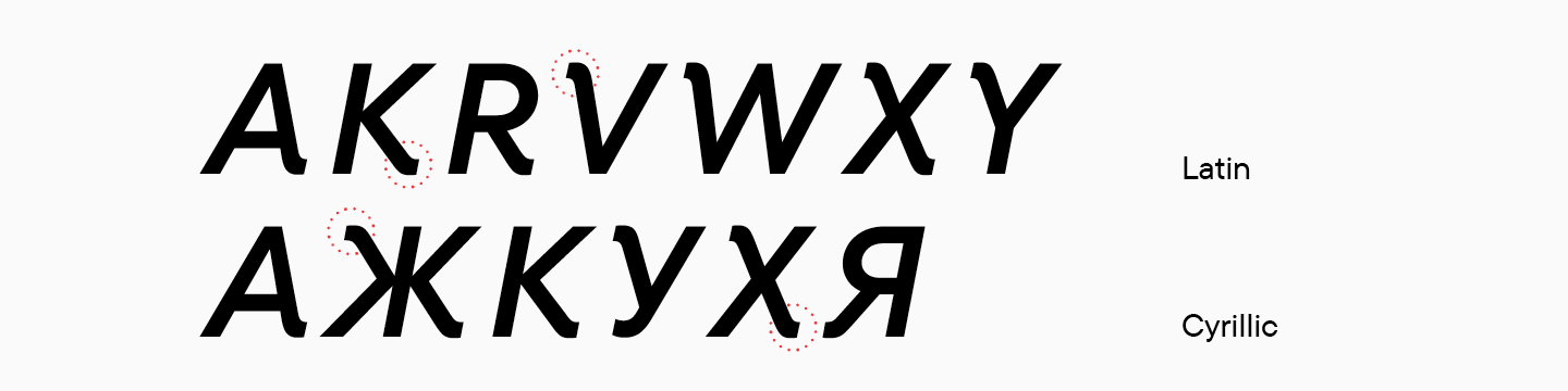
- We added several details to uppercase characters, visually separating them from the source font.
Each stage was tested so that the result met the expectations of all participants. To make the font more original and attractive, we have worked out sets of ligatures.
The last graphical stage remained – adding visual features to upright styles.
From TT Fors to Ostin Sans. Adding graphic features
Finished italics looked expressive and original. At the same time, the upright styles looked too similar to the original TT Fors, and we wanted to fix this. Having received approval for this stage, we began to look for the missing details that would help the customized TT Fors become the O’STIN corporate font, recognizable and unique.
First of all, we wanted to unite upright styles with italics, that is, connect them graphically. After testing several options, we settled on adding smooth entries and exits to diagonal strokes, borrowing the solution from italics.
Graphic searches were carried out on one style, Bold, because it is the most expressive. Having agreed on the final version, we transferred the solutions from the bold face to the rest, including the lightest one.
The changes affected the entire character set, that is, 680 characters in each of the 4 styles. After agreeing on the result, we sent the font for O’STIN to the technical department.
Technical work on the font
The technical part of working on a font may seem boring, because it does not involve creative searches and original solutions. However, this is an important part of font development, because errors at this stage will render the typeface unusable. The refinement of the algorithms and the well-thought-out logic of the actions of the technical department is what allows TypeType to produce not only attractive, but also functional fonts.
We won’t describe the whole process of working on Ostin Sans, but will cover the key features of the technical work.
- Leading.
Leading is a setting for the vertical metrics of a font. In the course of communication with the O’STIN team, we decided to set the vertical metrics to be identical to the font that was previously used in most of the brand’s materials. This would make it easier for designers to update the font, because the layout will not be changed completely, which means that it can be corrected rather than re-configured. In the process of such a solution, the new font, despite its different nature and character, gets the technical continuity of the original font. Such a solution is especially important when working with websites and mobile applications, because the re-layout of such a large amount of interactive materials will entail serious additional expenses.
- Kerning.
We painstakingly do kerning for each of the studio’s typefaces, because the perfect font rhythm improves readability in both large and small sizes – especially when it comes to a corporate font of a well-known brand, which many people will look at on a daily basis. In a separate step, we created kerning tables for upright and italic styles. As a result of such manual and time-consuming work, it is possible to avoid the appearance of random “holes” between individual combinations of letters and “overflows” of letters on each other.

- Hinting.
Manual hinting is something any TypeType font can boast. For the O’STIN typeface, this stage was especially important, because users will see the typeface in a variety of sizes from various devices. Hinting allows to improve the font pattern for display on screens in a small size on Windows and Linux. Since the font was intended, among other things, to work on the company’s website and in the application, we approached hinting thoroughly.
Of course, there were more technical nuances in the development of the font, but we will not dwell on them in detail. If you are interested in how the technical work on the font goes, you can read other articles from TypeType on the studio’s website.
The development of Ostin Sans took 3 months. This is a fairly short deadline of time to create a corporate typeface, which we managed to meet thanks to the polished process of creating large font families and a well-coordinated team.
In the course of work, the project acquired a new spirit and became an independent, elegant and unique typeface. With the help of italics, we managed to solve not only the typographic, but also the strategic marketing task of O’STIN. We are grateful to the O’STIN team for their trust.